#fontweight
Explore tagged Tumblr posts
Visit Tumblr Blog
Explore Tumblr blogs with no restrictions, modern design and the best experience.
Last Seen Tumblr Blogs


Fun Fact
There are dozens of funny blogs to kill time on Tumblr.
Text
WordPress.com
https://wordpress.com/plans/
View On WordPress
#":hover":{"color":{"text":"var:preset|color|primary"}}}}#"align":"wide"} --> <!-- wp:post-template {"layout":{"type":"grid"#"aspectRatio":"3/2"#"author":""#"bottom":"var:preset|spacing|70"}}#"color":[]}#"columnCount":2}} --> <!-- wp:post-featured-image {"isLink":true#"columnCount":4}} --> <!-- wp:post-featured-image {"isLink":true#"elements":{"link":{"color":[]#"exclude":[]#"flexWrap":"wrap"}#"fontSize":"medium"} --> Categories <!-- wp:group {"align":"wide"#"fontSize":"medium"} --> Latest <!-- wp:query {"queryId":0#"fontSize":"medium"} --> Trending <!-- wp:query {"queryId":2#"fontSize":"medium"} /--> <!-- wp:group {"align":"wide"#"fontSize":"medium"} /--> <!-- wp:post-author-name {"isLink":true#"fontSize":"small"} /--> <!-- wp:query {"queryId":1#"fontSize":"x-large"} /--> <!-- wp:post-excerpt {"style":{"typography":{"lineHeight"#"fontSize":"xxxx-large"} --> <!-- wp:paragraph {"style":{"elements":{"link":{"c#"fontWeight":"600"}}#"inherit":false}#"justifyContent":"center"}} --> <!-- wp:group {"align":"wide"#"layout":{"type":"constrained"}} --> <!-- wp:group {"align":"wide"#"layout":{"type":"constrained"}} --> <!-- wp:post-terms {"term":"category"#"layout":{"type":"constrained"}} --> <!-- wp:post-title {"isLink":true#"layout":{"type":"default"}} --> <!-- wp:heading {"style":{"typography":{"textT#"layout":{"type":"flex"#"left":[]}#"offset":0#"order":"desc"
0 notes
Text
Optimierung von Google Maps zur Verwaltung mehrerer Aufträge mit überlappenden Geodaten
In der modernen Logistik und Auftragsverwaltung sind präzise Karten mit mehreren Aufträgen ein unverzichtbares Werkzeug. Doch was passiert, wenn mehrere Aufträge dieselbe Geoposition teilen? Zu unterscheiden sind diese Marker nur über die Label. Diese zeigen in diesem Projekt die Auftragsnummer an. Ist diese unleserlich, dann ist klar, das liegen mehrere Marker übereinander. Unser jüngstes Projekt konzentrierte sich auf die Visualisierung solcher Szenarien, einschließlich der farblichen Hervorhebung und Gruppierung überlappender Marker sowie der optimierten Datenübertragung an externe Systeme wie FileMaker, in unserem Fall ausschließlich FileMaker. Herausforderung Das Ziel war es, eine dynamische Google Maps-Anwendung zu entwickeln, die: 1. Mehrere Aufträge darstellt, auch wenn sie die gleiche Position haben. Gleiche Positionen bedeuten, wir haben die gleichen Geo-Daten bzw. Hausnummer, Straße und PLZ sind identisch. 2. Farbcodierungen für solche „überlappenden“ Marker nutzt, um sie besser erkennbar zu machen. 3. Detaillierte Informationen über jeden Auftrag in einem Infowindow anzeigt. 4. Die optimierte Reihenfolge der Aufträge nahtlos an FileMaker überträgt. Unsere Lösung 1 Marker-Anpassung für überlappende Geodaten Wir haben eine Kartenfunktion implementiert, die doppelte Marker an derselben Position erkennt und diese farblich hervorhebt. Dabei haben wir: • Einen blauen Marker für Einzelaufträge verwendet. • Grüne Marker eingeführt, um überlappende Positionen zu kennzeichnen. Zusätzlich zeigt ein Infowindow bei Klick auf einen Marker alle zugehörigen Auftragsnummern an. Über die angezeigten Auftragsnummer können per Klick, alle relevanten Daten innerhalb von FileMaker aufgerufen werden. 2 Optimierung der Datenübertragung Wir haben die Datenübertragung so optimiert, dass nur relevante Informationen gesendet werden. Im Vorfeld wurde schon durch ein PHP-Script eine Vorauswahl getroffen. Dieses kann natürlich auch direkt über FileMaker erfolgen: • Origin: Die Startposition wurde durch die echte Auftrags-ID ersetzt. • Waypoints: Es wurden maximal neun Wegpunkte übergeben. • Destination: Das Ziel wurde als letzter Punkt hinzugefügt. 3 Dynamische Gruppierung Durch die Implementierung einer Map-Datenstruktur wurden überlappende Marker gesammelt und in einem einzigen Marker angezeigt. Der Tooltip zeigt auf Wunsch alle zugehörigen Aufträge an. Technische Highlights Marker mit Farbcodierung const markerColor = location.ids.length > 1 ? '#00FF00' : '#4285F4'; // Grün für mehrere IDs const markerLabel = location.ids.length > 1 ? 'Mehrere' : location.label; const marker = new google.maps.Marker({ position: location.position, map: map, label: { text: markerLabel, color: '#000', fontSize: '12px', fontWeight: 'bold', }, icon: { path: google.maps.SymbolPath.CIRCLE, scale: 8, fillColor: markerColor, fillOpacity: 1, strokeColor: '#FFF', strokeWeight: 2, labelOrigin: new google.maps.Point(0, -5), }, }); Unser InfoWindows mit mehreren Auftragsnummer: const contentString = ` Auftragsnummern: ${location.ids.map(id => ` Auftrag ${id} `).join(' ')} Anlagen: ${location.facilities} `; marker.addListener('click', () => { infowindow.setContent(contentString); infowindow.open(map, marker); }); Optimierte Reihenfolge an FileMaker senden, dort werden die Daten in Reihenfolge gebracht und können weiter verarbeitet werden. function sendToFileMaker() { if (optimizedOrder.length > 0) { const originId = <?= json_encode($auftrag[0] ?? 'Unknown') ?>; const updatedOrder = [originId, ...optimizedOrder.slice(1)]; const filemakerUrl = `fmp://$/Deine Datei?script=DeinFMScript¶m=${encodeURIComponent(updatedOrder.join('\n'))}`; window.location.href = filemakerUrl; } else { alert('Die Route ist noch nicht optimiert. Bitte warten.'); } } Die Datenübergabe erfolgt wie immer in der Art -deine_url_de/maps.php?json=true&origin=52.5212262,13.3340740 &destination=52.5070279,13.345529 &waypoints=52.4897075,13.3290075|52.4902317,13.355636|52.5037865,13.3271369|52.504083,13.3386575&auftrag=24501|24510|24547|24551|24573|24580&facilities=6039|1940|4540|5036|6634|6545 Zusammenstellen der Daten erfolgt über Schleifen, SQL oder Listen die per Referenzen die richtigen Daten enthalten. Wie in den letzten Beiträgen schon beschrieben, nutzen wir ein WebViewer in FileMaker. Fazit Unsere Lösung zeigt, wie smarte Anpassungen in Visualisierungen und Datenübertragungen den Unterschied machen können. Mit farblich abgestimmten Markern, informativen Pop-ups und cleveren Datenstrukturen haben wir nicht nur die Benutzerfreundlichkeit auf ein neues Level gehoben, sondern auch die Effizienz der Prozesse ordentlich gepusht.

0 notes
Text
How to Design Custom Flutter Buttons

Flutter provides a flexible and powerful framework for designing user interfaces, including buttons. While Flutter offers a variety of built-in button widgets, you may want to create custom buttons that match your app's unique design. In this blog post, we will walk through the steps to design custom Flutter buttons.
Step 1: Define the Button Design
The first step in designing a custom Flutter button is to define its visual appearance. Consider the following aspects:
Button Shape: Decide whether you want a rectangular, circular, or any other shape for your button.
Button Size: Determine the dimensions of your button, such as width and height.
Button Colors: Choose the background color, text color, and any other colors you want to use for your button.
Button Typography: Select the font style, size, and weight for the button text.
Step 2: Create a Custom Button Widget
Once you have defined the design of your custom button, you can create a custom widget to encapsulate its functionality and appearance. Here's an example of how you can create a custom button widget: import 'package:flutter/material.dart';
class CustomButton extends StatelessWidget {
final String text;
final VoidCallback onPressed;
const CustomButton({required this.text, required this.onPressed});
@override
Widget build(BuildContext context) {
return ElevatedButton(
onPressed: onPressed,
child: Text(
text,
style: TextStyle(
fontSize: 16,
fontWeight: FontWeight.bold,
),
),
style: ElevatedButton.styleFrom(
primary: Colors.blue, // Set the background color of the button
onPrimary: Colors.white, // Set the text color of the button
shape: RoundedRectangleBorder(
borderRadius: BorderRadius.circular(8), // Set the button shape
),
),
);
}
}
In this example, we create a CustomButton widget that extends the StatelessWidget class. The widget takes two required parameters: text for the button label and onPressed for the button's callback function.
Step 3: Implement the Custom Button
To use the custom button in your Flutter app, follow these steps:
Import the custom button widget into your Dart file.
Add an instance of the CustomButton widget to your app's widget tree.
Provide the necessary parameters, such as the button text and the callback function.
Here's an example of how you can implement the custom button in your app: import 'package:flutter/material.dart';
void main() {
runApp(MyApp());
}
class MyApp extends StatelessWidget {
@override
Widget build(BuildContext context) {
return MaterialApp(
home: Scaffold(
appBar: AppBar(
title: Text('Custom Button Example'),
),
body: Center(
child: CustomButton(
text: 'Click Me',
onPressed: () {
// Add your button's functionality here
print('Button clicked!');
},
),
),
),
);
}
}
In this example, we create a simple Flutter app with a custom button. When the button is clicked, it prints a message to the console.
Conclusion
Designing custom Flutter buttons allows you to create buttons that align with your app's unique design requirements. By following the steps outlined in this blog post, you can easily create and implement custom buttons in your Flutter app.
I hope this blog post helps you in designing custom Flutter buttons. Happy coding!
0 notes
Text
How to Display a Circular Timer in Flutter?
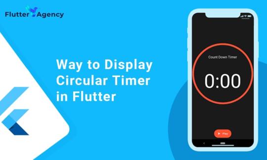
You can make stunning, native-looking apps for Android and iOS using the popular cross-platform Flutter mobile app programming framework. Circular timer creation is just one of the numerous things you can accomplish with Flutter. A countdown clock or a stopwatch are two examples of circular timers that are excellent for displaying the amount of time left on a job.
In Flutter, there are some different methods to build a circular timer. This article will teach you how to design a circular clock in Flutter. In addition, you will know how to change the timer’s look. You can learn more about displaying a circular timer in Flutter by reading the tutorial below. Also you can read this blog from our official website Circular Timer in Flutter.
Developing a Custom Circular Timer in Flutter
There are several methods in Flutter for displaying a circular timer outside the circular_countdown_timer package. As an illustration, you might make a circular progress bar using the RadialGauge widget. The circular_countdown_timer box, on the other hand, is a more specialized widget made just for showing countdown timers. You may make a customized circular timer by following the instructions in this article after installing Flutter:
import 'package:flutter/material.dart';
import 'package:circular_countdown_timer/circular_countdown_timer.dart';
void main() {
runApp(const MyApp());
}
class MyApp extends StatelessWidget {
const MyApp({super.key});
@override
Widget build(BuildContext context) {
return MaterialApp(
title: 'Flutter Demo',
theme: ThemeData(
primarySwatch: Colors.blue,
),
home: const HomePage(),
debugShowCheckedModeBanner: false,
);
}
}
class HomePage extends StatefulWidget {
const HomePage({super.key});
@override
State<homepage> createState() => _HomePageState();
}
class _HomePageState extends State<homepage> {
final int _duration = 10;
final CountDownController _controller = CountDownController();
@override
Widget build(BuildContext context) {
return Scaffold(
appBar: AppBar(
title: const Text("Circular Counter with countdown timer"),
),
body: Center(
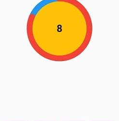
child: CircularCountDownTimer(
// Countdown duration in Seconds.
duration: _duration,
// Countdown initial elapsed Duration in Seconds.
initialDuration: 0,
// Controls (i.e., Start, Pause, Resume, Restart) the Countdown Timer.
controller: _controller,
// Width of the Countdown Widget.
width: MediaQuery.of(context).size.width / 2,
// Height of the Countdown Widget.
height: MediaQuery.of(context).size.height / 2,
// Ring Color for Countdown Widget.
ringColor: Colors.blue,
// Ring Gradient for Countdown Widget.
ringGradient: null,
// Filling Color for Countdown Widget.
fillColor: Colors.red,
// Filling Gradient for Countdown Widget.
fillGradient: null,
// Background Color for Countdown Widget.
backgroundColor: Colors.amber,
// Background Gradient for Countdown Widget.
backgroundGradient: null,
// Border Thickness of the Countdown Ring.
strokeWidth: 20.0,
// Begin and end contours with a flat edge and no extension.
strokeCap: StrokeCap.round,
// Text Style for Countdown Text.
textStyle: const TextStyle(
fontSize: 33.0,
color: Colors.black,
fontWeight: FontWeight.bold,
),
// Format for the Countdown Text.
textFormat: CountdownTextFormat.S,
// Handles Countdown Timer (true for Reverse Countdown (max to 0), false for Forward Countdown (0 to max)).
isReverse: true,
// Handles Animation Direction (true for Reverse Animation, false for Forward Animation).
isReverseAnimation: true,
// Handles visibility of the Countdown Text.
isTimerTextShown: true,
// Handles the timer start.
autoStart: true,
// This Callback will execute when the Countdown Starts.
onStart: () {
// Here, do whatever you want
debugPrint('Started Countdown');
},
// This Callback will execute when the Countdown Ends.
onComplete: () {
// Here, do whatever you want
debugPrint('Ended Countdown');
},
// This Callback will execute when the Countdown Changes.
onChange: (String timeStamp) {
// Here, do whatever you want
debugPrint('Changed Countdown $timeStamp');
},
),
),
);
}
}
</homepage></homepage>
Function to format the text.
Allows you to format the current duration to any String.
It also provides the default function in case you want to format specific moments as in reverse when reaching ‘0’ show ‘GO,’ and for the rest of the instances, follow the default behavior.
Inside the CircularCountDownTimer we have to add these below lines:
timeFormatterFunction: (defaultFormatterFunction, duration) {
if (duration.inSeconds == 0) {
// only format for '0'
return "Start";
} else {
// other durations by it's default format
return Function.apply(defaultFormatterFunction, [duration]);
}
},
Add inside the scaffold widget to control the counter
floatingActionButton: Row(
mainAxisAlignment: MainAxisAlignment.center,
children: [
const SizedBox(
width: 30,
),
_button(
title: "Start",
onPressed: () => _controller.start(),
),
const SizedBox(
width: 10,
),
_button(
title: "Pause",
onPressed: () => _controller.pause(),
),
const SizedBox(
width: 10,
),
_button(
title: "Resume",
onPressed: () => _controller.resume(),
),
const SizedBox(
width: 10,
),
_button(
title: "Restart",
onPressed: () => _controller.restart(duration: _duration),
),
],
),
Function return button
Widget _button({required String title, VoidCallback? onPressed}) {
return Expanded(
child: ElevatedButton(
style: ButtonStyle(
backgroundColor: MaterialStateProperty.all(Colors.purple),
),
onPressed: onPressed,
child: Text(
title,
style: const TextStyle(color: Colors.white),
),
),
);
}
Example
import 'package:flutter/material.dart';
import 'package:circular_countdown_timer/circular_countdown_timer.dart';
void main() {
runApp(const MyApp());
}
class MyApp extends StatelessWidget {
const MyApp({super.key});
@override
Widget build(BuildContext context) {
return MaterialApp(
title: 'Flutter Demo',
theme: ThemeData(
primarySwatch: Colors.blue,
),
home: const HomePage(),
debugShowCheckedModeBanner: false,
);
}
}
class HomePage extends StatefulWidget {
const HomePage({super.key});
@override
State<homepage> createState() => _HomePageState();
}
class _HomePageState extends State<homepage> {
final int _duration = 10;
final CountDownController _controller = CountDownController();
@override
Widget build(BuildContext context) {
return Scaffold(
appBar: AppBar(
title: const Text("Circular Counter with countdown timer"),
),
body: Center(
child: CircularCountDownTimer(
timeFormatterFunction: (defaultFormatterFunction, duration) {
if (duration.inSeconds == 0) {
// only format for '0'
return "Start";
} else {
// other durations by it's default format
return Function.apply(defaultFormatterFunction, [duration]);
}
},
// Countdown duration in Seconds.
duration: _duration,
// Countdown initial elapsed Duration in Seconds.
initialDuration: 0,
// Controls (i.e., Start, Pause, Resume, Restart) the Countdown Timer.
controller: _controller,
// Width of the Countdown Widget.
width: MediaQuery.of(context).size.width / 2,
// Height of the Countdown Widget.
height: MediaQuery.of(context).size.height / 2,
// Ring Color for Countdown Widget.
ringColor: Colors.blue,
// Ring Gradient for Countdown Widget.
ringGradient: null,
// Filling Color for Countdown Widget.
fillColor: Colors.red,
// Filling Gradient for Countdown Widget.
fillGradient: null,
// Background Color for Countdown Widget.
backgroundColor: Colors.amber,
// Background Gradient for Countdown Widget.
backgroundGradient: null,
// Border Thickness of the Countdown Ring.
strokeWidth: 20.0,
// Begin and end contours with a flat edge and no extension.
strokeCap: StrokeCap.round,
// Text Style for Countdown Text.
textStyle: const TextStyle(
fontSize: 33.0,
color: Colors.black,
fontWeight: FontWeight.bold,
),
// Format for the Countdown Text.
textFormat: CountdownTextFormat.S,
// Handles Countdown Timer (true for Reverse Countdown (max to 0), false for Forward Countdown (0 to max)).
isReverse: true,
// Handles Animation Direction (true for Reverse Animation, false for Forward Animation).
isReverseAnimation: true,
// Handles visibility of the Countdown Text.
isTimerTextShown: true,
// Handles the timer start.
autoStart: true,
// This Callback will execute when the Countdown Starts.
onStart: () {
// Here, do whatever you want
debugPrint('Started Countdown');
},
// This Callback will execute when the Countdown Ends.
onComplete: () {
// Here, do whatever you want
debugPrint('Ended Countdown');
},
// This Callback will execute when the Countdown Changes.
onChange: (String timeStamp) {
// Here, do whatever you want
debugPrint('Changed Countdown $timeStamp');
},
),
),
floatingActionButton: Row(
mainAxisAlignment: MainAxisAlignment.center,
children: [
const SizedBox(
width: 30,
),
_button(
title: "Start",
onPressed: () => _controller.start(),
),
const SizedBox(
width: 10,
),
_button(
title: "Pause",
onPressed: () => _controller.pause(),
),
const SizedBox(
width: 10,
),
_button(
title: "Resume",
onPressed: () => _controller.resume(),
),
const SizedBox(
width: 10,
),
_button(
title: "Restart",
onPressed: () => _controller.restart(duration: _duration),
),
],
),
);
}
Widget _button({required String title, VoidCallback? onPressed}) {
return Expanded(
child: ElevatedButton(
style: ButtonStyle(
backgroundColor: MaterialStateProperty.all(Colors.purple),
),
onPressed: onPressed,
child: Text(
title,
style: const TextStyle(color: Colors.white),
),
),
);
}
}
</homepage></homepage>
Output
Why Should You Display a Circular Timer in Flutter?
You can choose to show a circular timer in Flutter for various reasons. Here are some of the most typical causes:
1. To start the countdown to an upcoming event. The most typical application for circular timers is this. They help count down to the beginning of a presentation, the end of a timer, or any other event you wish to keep track of.
2. To provide user feedback. The user can receive feedback about the passing of time through circular timers. This is advantageous when performing duties like preparing meals or watching for a bus.
2. For a visual component for your app. Circular timers may provide an optical element to your app that will increase its aesthetic appeal and make it more engaging.
Hire Flutter developer to create a circular timer. It is an excellent alternative if you are searching for a way to show the passing of time in your Flutter project. They are versatile, easy to use, and serve several functions.
Conclusion
The article has shown how to display a circular timer in Flutter. First, you will set up the widget to show a circular countdown timer from the circular_countdown_timer package. It can also utilize the widget to exhibit a ten-second countdown timer by creating a simple example. By defining the colors, border width, and text style, the article also provided information on how to alter the timer’s visual look.
Connect with the top Flutter app development company for your project if you want to create mobile apps with the circular timer for your business. But if you’re still unclear and want more information about the Flutter framework, browse our blogs!
Frequently Asked Questions (FAQs)
1. How is a dart timer used?
The timer starts at the given duration and counts down to 0. The given callback function is called when the timer approaches zero. To repeatedly count down the same interval, use a periodic timer. The same rules apply to negative durations as to durations of 0.
2. How can I create a widget with a countdown timer?
Press the addition (+) sign in the top left corner to add a widget. A Countdown widget can be selected. Click Add Widget. Please tap on the widget once it shows on your Home Screen.
3. What does Flutter’s circle indicator mean?
The CircularProgressIndicator widget uses a circle to represent progress. It can be used as a progress indicator for determined and indeterminate work. The value attribute must be left empty or unspecified to create an indeterminate progress indicator in Flutter.
#flutter app development#flutter#hire flutter developers#flutter agency#hire flutter developer#flutter developers#flutter app developers#FlutterTips#FlutterTimer#CircularTimer
0 notes
Text
Styling and Theming in Flutter: A Comprehensive Guide

Styling and theming are essential aspects of creating visually appealing and cohesive user interfaces in your Flutter app. By applying styles and defining themes, you can customize the look and feel of your app to create a consistent and engaging user experience. This comprehensive guide will walk you through the process of styling and theming in Flutter, providing you with the knowledge and tools to design stunning app interfaces.
Prerequisites
Before we dive into styling and theming, make sure you have the following prerequisites in place: - Flutter SDK installed on your machine. If you haven't installed Flutter yet, refer to the official Flutter installation guide for your operating system. - A Flutter project set up and ready for development.

Applying Styles to Widgets
Flutter offers a flexible and powerful styling system that allows you to customize the appearance of individual widgets. You can apply styles using properties such as color, fontFamily, fontSize, fontWeight, and more. Let's see an example of styling a Text widget: In this example, we apply a specific color, font size, and font weight to the Text widget using the TextStyle class.
Creating and Applying Themes
Themes provide a way to define a consistent visual style across your entire app. Flutter allows you to create and apply themes to customize the overall look and feel. Let's see how to create and apply a theme: In this example, we define a theme using the ThemeData class and set properties such as primaryColor, accentColor, and fontFamily. The theme is then applied to the MaterialApp widget, which serves as the root of our app.
Customizing the Theme
Flutter allows you to customize the theme further by overriding specific properties. For example, if you want to change the primary color of a specific widget, you can wrap it with a Theme widget and define the desired property. Here's an example: In this example, we wrap the RaisedButton widget with a Theme widget and customize the primaryColor property to Colors.red. Additionally, we apply the theme color to the button's background, set the text color to white, and define a rounded border for the button.
Styling Buttons with ElevatedButton and TextButton
Flutter provides specialized button widgets, such as ElevatedButton and TextButton, that come with predefined styles for different button types. Here's an example of styling an ElevatedButton and a TextButton: In these examples, we use the style property along with the styleFrom method to customize the button's appearance. We can define properties like primary for the background color, onPrimary for the text color, padding for button padding, and shape for the button's shape.
Conclusion
Styling and theming are crucial for creating visually appealing and cohesive Flutter apps. By applying styles to widgets, defining themes, and leveraging specialized button widgets, you can customize the look and feel of your app to create stunning user interfaces. Experiment with different styles, explore theme customization options, and master advanced button styling techniques to build beautiful app interfaces with Flutter. Happy coding and designing captivating app experiences! Read the full article
1 note
·
View note
Photo

#modern #fontweight #fontstyle #typeface #font #fontdesign #typedesign #germandesign #posterdesign #swissdesign #lettering #alphabet #contemporarydesign #contemporarytypeface #variablefonts #branddesign #contemporarytype #editorialdesign #bold #benbold #365daysoftype #glyphsapp #konstanz #zurich #boldstudio #fontinspiration #griddesign #graphicdesign (at Zürich, Switzerland) https://www.instagram.com/p/BxJzK2NlJYn/?utm_source=ig_tumblr_share&igshid=oa5r455jo7fv
#modern#fontweight#fontstyle#typeface#font#fontdesign#typedesign#germandesign#posterdesign#swissdesign#lettering#alphabet#contemporarydesign#contemporarytypeface#variablefonts#branddesign#contemporarytype#editorialdesign#bold#benbold#365daysoftype#glyphsapp#konstanz#zurich#boldstudio#fontinspiration#griddesign#graphicdesign
31 notes
·
View notes
Photo

5 notes
·
View notes
Text
liste şeklinde yazıları aynı hizadan ortalamak css

amac yukarıdaki gibi kitap vir ve kitap ikiyi ortalayıp uzun olanla aynı soradan başlatmak. Normalde textalign: center yaparsanız kısa olan kendi sırasında ortalanıyor. O yüzden resimdeki gibi ortalamak için şöyle yapmak lazım
export default function App() { return ( <View style={[styles.titleWrap]}> <Text style={[styles.title]}>TITLE</Text> <View style={[styles.titleWrap1]}> <Text style={[styles.titleButtom]}>* something</Text> <Text style={[styles.titleButtom]}>* something longer...</Text> </View> </View> ); } const styles = StyleSheet.create({ titleWrap:{ flex: 1, display: "flex", alignItems:"center", justifyContent:"center", }, title:{ fontSize:35, textAlign:'center', paddingBottom: 20, fontWeight:'bold' }, titleButtom:{ fontSize:20, paddingTop:7, paddingLeft:7 }, titleWrap1:{ flexDirection: "vertical", } });
1 note
·
View note
Text
Windows Terminal Preview 1.1 available

Windows Terminal Preview 1.1 available. Open in Windows Terminal You can now right click on a folder in File Explorer and select “Open in Windows Terminal”. This will launch Windows Terminal with your default profile in the directory you had selected from File Explorer. 👉 Note: This will launch Windows Terminal Preview until this feature moves into Windows Terminal in July 2020. Additionally, there are still some known bugs that we are working on, including right-clicking in the directory “background” will not give you the Open in Windows Terminal option. Launch Windows Terminal on startup A new setting has been added by jelster that allows you to set Windows Terminal to launch when starting up your machine! You can set startOnUserLogin to true in your global settings to enable this functionality. "startOnUserLogin": true 👉 Note: If the Windows Terminal startup task entry is disabled either by organization policy or by user action, this setting will have no effect. Font weight support Windows Terminal Preview now supports font weights as a new profile setting. The fontWeight setting accepts a variety of strings describing font weights along with the corresponding numeric representation of a font weight. "fontWeight": "normal" 🌟 Pictured here is a sneak peek of the light version of Cascadia Code. Read the full article
1 note
·
View note
Text
react native expo firebase authenticate ile login ve register örneği
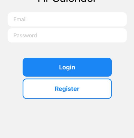
firebase authenticate kullanarak login ve register işlemi yapacağız. Firebase panelinden authanticate kısmını seçip gerekli import linklerini oradan aldıktan sonra
expo so react native tarafı şöyle
app.js sayfasına home ve login sayfalarını ekleyin
--------
<NavigationContainer> <Stack.Navigator> <Stack.Screen options={{ headerShown: false }} name="Login" component={LoginScreen} /> <Stack.Screen name="Home" component={HomeScreen} /> </Stack.Navigator> </NavigationContainer>
login.js sayfası
-----
import React, { useEffect, useState } from 'react' import { KeyboardAvoidingView, StyleSheet, Text, TextInput, TouchableOpacity, View } from 'react-native' import { getAuth, createUserWithEmailAndPassword,signInWithEmailAndPassword } from "firebase/auth"; const auth = getAuth();
const LoginScreen = ({ navigation }) => { const [email, setEmail] = useState('') const [password, setPassword] = useState('')
useEffect(() => { const unsubscribe = auth.onAuthStateChanged(user => { if (user) { navigation.navigate("Calender") } })
return unsubscribe }, [])
const handleSignUp = () => { createUserWithEmailAndPassword(auth,email, password) .then(userCredentials => { const user = userCredentials.user; console.log('Registered with:', user.email); }) .catch(error => alert(error.message)) }
const handleLogin = () => { signInWithEmailAndPassword(auth,email, password) .then(userCredentials => { const user = userCredentials.user; console.log('Logged in with:', user.email); }) .catch(error => alert(error.message)) }
return ( <KeyboardAvoidingView style={styles.container} // behavior="padding" >
<View style={styles.inputContainer}>
<Text style={styles.logo}>Hr Calender</Text>
<TextInput placeholder="Email" value={email} onChangeText={text => setEmail(text)} style={styles.input} /> <TextInput placeholder="Password" value={password} onChangeText={text => setPassword(text)} style={styles.input} secureTextEntry /> </View>
<View style={styles.buttonContainer}> <TouchableOpacity onPress={handleLogin} style={styles.button} > <Text style={styles.buttonText}>Login</Text> </TouchableOpacity> <TouchableOpacity onPress={handleSignUp} style={[styles.button, styles.buttonOutline]} > <Text style={styles.buttonOutlineText}>Register</Text> </TouchableOpacity> </View> </KeyboardAvoidingView> ) }
export default LoginScreen
const styles = StyleSheet.create({ container: { flex: 1, justifyContent: 'center', alignItems: 'center', }, inputContainer: { width: '80%' }, input: { backgroundColor: 'white', paddingHorizontal: 15, paddingVertical: 10, borderRadius: 10, marginTop: 5, }, buttonContainer: { width: '60%', justifyContent: 'center', alignItems: 'center', marginTop: 40, }, button: { backgroundColor: '#0782F9', width: '100%', padding: 15, borderRadius: 10, alignItems: 'center', }, buttonOutline: { backgroundColor: 'white', marginTop: 5, borderColor: '#0782F9', borderWidth: 2, }, buttonText: { color: 'white', fontWeight: '700', fontSize: 16, }, buttonOutlineText: { color: '#0782F9', fontWeight: '700', fontSize: 16, }, logo: { fontSize: 30, color: 'black', paddingBottom: 15, textAlign: 'center' },
})
home.js sayfası
-------------
import { useNavigation } from '@react-navigation/core' import React from 'react' import { StyleSheet, Text, TouchableOpacity, View } from 'react-native' import { getAuth, signOut } from "firebase/auth"; const auth = getAuth(); console.log("auth",auth)
const HomeScreen = () => { const navigation = useNavigation()
const handleSignOut = () => { signOut(auth) .then(() => { navigation.navigate("Login") }) .catch(error => alert(error.message)) }
return ( <View style={styles.container}> <Text>Email: {auth.currentUser?.email}</Text> <TouchableOpacity onPress={handleSignOut} style={styles.button} > <Text style={styles.buttonText}>Sign out</Text> </TouchableOpacity> </View> ) }
export default HomeScreen
const styles = StyleSheet.create({ container: { flex: 1, justifyContent: 'center', alignItems: 'center' }, button: { backgroundColor: '#0782F9', width: '60%', padding: 15, borderRadius: 10, alignItems: 'center', marginTop: 40, }, buttonText: { color: 'white', fontWeight: '700', fontSize: 16, }, })
daha fazlasına bu elemanın repodan bakabilirsini https://github.com/mattfrances/FirebaseExpoAuthentication
0 notes
Text
Text
const Text.rich( TextSpan( text: ‘Hello’, // default text style children: [ TextSpan(text: ‘ beautiful ‘, style: TextStyle(fontStyle: FontStyle.italic)), TextSpan(text: ‘world’, style: TextStyle(fontWeight: FontWeight.bold)), ], ), )
View On WordPress
0 notes
Text
Flutter Text Widget and Its Properties
Flutter Text Widget and Its Properties
Flutter Text Widget Text widget in Flutter is used for Styled text for your app, it’s like TextView in Android. Below is the syntax for creating a Text widget in Flutter. The first value is String text which you want to show, with the help of style you can define TextStyle, font size, etc. Text( 'UserName', style: TextStyle( fontSize: 20.0, fontWeight: FontWeight.bold, ), ) Properties of Text…

View On WordPress
0 notes
Text
How to Use Themes to Share Colors and Font Styles in Flutter?

Flutter is a free and open-source UI framework for mobile devices, created by Google and launched in May 2017. In a nutshell, it lets you create a native mobile app from a single piece of code.
As a result, you may design two separate apps with only one set of code and one set of tools (for iOS and Android). There are various agencies out of which the best flutter app development company like Flutter Agency helps you design an app.
Dart is the programming language you’ll need to work with Flutter. Google first developed the language in October 2011, although it has evolved significantly in the intervening years.
It’s possible to create mobile and web apps with Dart, which focuses on front-end development. Dart is a typed object programming language if you have some programming experience. The syntax of Dart is comparable to that of JavaScript.
What are the Themes in Flutter?
We may utilize themes in Flutter App to share colors and font styles throughout the app. They may be defined in two ways in Flutter: Color schemes and font styles may be applied system-wide or to specific program sections through Theme Widgets.
When it comes to app-wide themes, MaterialApp is responsible for creating them! We need to create a Theme before utilizing it in the Widgets. App Bars, Buttons, Checkboxes, and other Material Widgets will use the Theme to change their background colors and font styles.
Making a Flutter App Theme:
ThemeData must be sent to the MaterialApp function Object() { [native code] } if you want to make the app’s colors and fonts consistent throughout. Flutter automatically generates a default theme if none is supplied.
MaterialApp(title: title,theme: ThemeData(// Define the default Brightness and Colorsbrightness: Brightness.dark,primaryColor: Colors.lightBlue[800],accentColor: Colors.cyan[600],// Define the default Font FamilyfontFamily: 'Montserrat',// Define the default TextTheme. Use this to specify the default// text styling for bodies of text, titles, headlines, etc.textTheme: TextTheme(headline1: TextStyle(fontSize: 72.0, fontWeight: FontWeight.bold),headline2: TextStyle(fontSize: 36.0, fontStyle: FontStyle.italic),bodyText2: TextStyle(fontSize: 14.0, fontFamily: 'Hind'),),));
Using Flutter App themes is a feature of an app:
We may use a ThemeWidget to enclose a region of our app and override the app-wide theme.
We may either create our own ThemeData or extend the parent theme to achieve this.
How to make a Flutter app’s ThemeData unique:
We may construct a ThemeData() object and provide it to the Theme Widget if you don’t want any current application properties, like colors or font styles, to be inherited.
Theme(// Create a unique theme with "ThemeData"data: ThemeData(accentColor: Colors.yellow,),child: FloatingActionButton(onPressed: () {},child: Icon(Icons.add),),);
Flutter App: Extending the parent theme
Rather than overriding everything, it’s common sense to extend the parent theme. The copy with technique may be used to do this.
Theme(// Search and Enhance the main theme using "copyWith". Please see the next// section for more info on `Theme.of`.data: Theme.of(context).copyWith(accentColor: Colors.yellow),child: FloatingActionButton(onPressed: null,child: Icon(Icons.add),),);
Flutter’s Theme-Based Property Sharing:
Theme.of(context) may be used in our Widget construction methods to apply our defined theme! Theme.of(context) searches the Widget tree and returns the Theme that is closest to the current location in the Widget hierarchy.
We get this if we have a different Theme specified above our Widget. Unless a match is made, it falls back to the App theme. All of us are well aware that the floating action button employs the exact mechanism to choose the accent color.
Container(color: Theme.of(context).colorScheme.secondary,child: Text('Welcome',style: Theme.of(context).textTheme.headline2,),);
Flutter Using Themes To Share Colors and Font Styles is seen in the code below.
import 'package:flutter/material.dart';void main() {runApp(const MyApp());}class MyApp extends StatelessWidget {const MyApp({Key? key}) : super(key: key);@overrideWidget build(BuildContext context) {const appName = 'Custom Themes';return MaterialApp(title: appName,theme: ThemeData(// Define the default Brightness and Colorsbrightness: Brightness.light,primaryColor: Colors.lightBlue[800],// Define the default Font FamilyfontFamily: 'Montserrat',// Define the default TextTheme. Use this to specify the default// text styling for headlines, titles, bodies of text, and more.textTheme: const TextTheme(headline1: TextStyle(fontSize: 72.0, fontWeight: FontWeight.bold),headline2: TextStyle(fontSize: 36.0, fontStyle: FontStyle.italic),bodyText2: TextStyle(fontSize: 14.0, fontFamily: 'Hind'),),),home: const MyHomePage(),);}}class MyHomePage extends StatelessWidget {const MyHomePage({Key? key}) : super(key: key);@overrideWidget build(BuildContext context) {return Scaffold(appBar: AppBar(title: const Text("Display Text using theme class"),),body: Center(child: Container(color: Theme.of(context).colorScheme.secondary,child: Text('Welcome',style: Theme.of(context).textTheme.headline2,),),),floatingActionButton: Theme(data: Theme.of(context).copyWith(splashColor: Colors.yellow),child: FloatingActionButton(onPressed: () {},child: const Icon(Icons.add),),),);}}
Output:

Conclusion
This article showed how to use Themes to Share Colors and Font Styles in Flutter. We hope it helped.
What about Flutter Development Support? Dedicated to Flutter technology and Flutter developers, Flutter Agency is a gateway platform for all things. In addition to the Flutter Widget Guide and other valuable materials from the Flutter team.
If you are looking for help, you can hire experienced Flutter experts from Flutter Agency. Daily, we attracts thousands of unique visitors eager to learn more about Flutter and its applications.
0 notes
Text
¿Team Godzilla o Team Kong?

«uid»:»01361310-f56a-4bdb-a6e7-f725e88549f7″,»id»:»236469″,»questions»:[«uid»:»75034829-cb3a-4c7d-b48b-aacbe3083f84″,»content»:»\u00bfTeam Kong o Team Godzilla?»,»settings»:«selection»:«minimum»:1,»maximum»:1,»choices»:[«uid»:»f47c35a0-9165-4aee-9b69-d58bb35ac5b5″,»type»:»image»,»label»:»Team Kong»,»votes»:0,»votesOverride»:0,»collapsed»:true,»visibility»:true,»image»:«full»:»https:\/\/www.beahero.gg\/wp-content\/uploads\/2021\/01\/king-kong-tomo-esteroides-te-explicamos-el-porque-king-kong-cuadriplico-su-tamano-para-enfrentarse-a-godzilla.png»,»thumbnail»:»»,»sizes»:«jnews-360×180»:«height»:180,»width»:360,»url»:»https:\/\/www.beahero.gg\/wp-content\/uploads\/2021\/01\/king-kong-tomo-esteroides-te-explicamos-el-porque-king-kong-cuadriplico-su-tamano-para-enfrentarse-a-godzilla-360×180.png»,»orientation»:»landscape»,»jnews-750×375″:«height»:375,»width»:750,»url»:»https:\/\/www.beahero.gg\/wp-content\/uploads\/2021\/01\/king-kong-tomo-esteroides-te-explicamos-el-porque-king-kong-cuadriplico-su-tamano-para-enfrentarse-a-godzilla-750×375.png»,»orientation»:»landscape»,»jnews-1140×570″:«height»:570,»width»:1140,»url»:»https:\/\/www.beahero.gg\/wp-content\/uploads\/2021\/01\/king-kong-tomo-esteroides-te-explicamos-el-porque-king-kong-cuadriplico-su-tamano-para-enfrentarse-a-godzilla-1140×570.png»,»orientation»:»landscape»,»jnews-120×86″:«height»:86,»width»:120,»url»:»https:\/\/www.beahero.gg\/wp-content\/uploads\/2021\/01\/king-kong-tomo-esteroides-te-explicamos-el-porque-king-kong-cuadriplico-su-tamano-para-enfrentarse-a-godzilla-120×86.png»,»orientation»:»landscape»,»jnews-350×250″:«height»:250,»width»:350,»url»:»https:\/\/www.beahero.gg\/wp-content\/uploads\/2021\/01\/king-kong-tomo-esteroides-te-explicamos-el-porque-king-kong-cuadriplico-su-tamano-para-enfrentarse-a-godzilla-350×250.png»,»orientation»:»landscape»,»jnews-750×536″:«height»:536,»width»:750,»url»:»https:\/\/www.beahero.gg\/wp-content\/uploads\/2021\/01\/king-kong-tomo-esteroides-te-explicamos-el-porque-king-kong-cuadriplico-su-tamano-para-enfrentarse-a-godzilla-750×536.png»,»orientation»:»landscape»,»jnews-1140×815″:«height»:719,»width»:1140,»url»:»https:\/\/www.beahero.gg\/wp-content\/uploads\/2021\/01\/king-kong-tomo-esteroides-te-explicamos-el-porque-king-kong-cuadriplico-su-tamano-para-enfrentarse-a-godzilla-1140×719.png»,»orientation»:»landscape»,»jnews-360×504″:«height»:504,»width»:360,»url»:»https:\/\/www.beahero.gg\/wp-content\/uploads\/2021\/01\/king-kong-tomo-esteroides-te-explicamos-el-porque-king-kong-cuadriplico-su-tamano-para-enfrentarse-a-godzilla-360×504.png»,»orientation»:»portrait»,»jnews-75×75″:«height»:75,»width»:75,»url»:»https:\/\/www.beahero.gg\/wp-content\/uploads\/2021\/01\/king-kong-tomo-esteroides-te-explicamos-el-porque-king-kong-cuadriplico-su-tamano-para-enfrentarse-a-godzilla-75×75.png»,»orientation»:»landscape»,»jnews-featured-750″:«height»:422,»width»:750,»url»:»https:\/\/www.beahero.gg\/wp-content\/uploads\/2021\/01\/king-kong-tomo-esteroides-te-explicamos-el-porque-king-kong-cuadriplico-su-tamano-para-enfrentarse-a-godzilla-750×422.png»,»orientation»:»landscape»,»jnews-featured-1140″:«height»:641,»width»:1140,»url»:»https:\/\/www.beahero.gg\/wp-content\/uploads\/2021\/01\/king-kong-tomo-esteroides-te-explicamos-el-porque-king-kong-cuadriplico-su-tamano-para-enfrentarse-a-godzilla-1140×641.png»,»orientation»:»landscape»,»full»:«url»:»https:\/\/www.beahero.gg\/wp-content\/uploads\/2021\/01\/king-kong-tomo-esteroides-te-explicamos-el-porque-king-kong-cuadriplico-su-tamano-para-enfrentarse-a-godzilla.png»,»height»:719,»width»:1278,»orientation»:»landscape»,»attachmentId»:236467,«uid»:»7b4f8e6f-7f63-4922-9f1f-0519e81201d5″,»type»:»image»,»label»:»Team Godzilla»,»votes»:0,»votesOverride»:0,»collapsed»:false,»visibility»:true,»image»:«full»:»https:\/\/www.beahero.gg\/wp-content\/uploads\/2021\/01\/godzilla.jpg»,»thumbnail»:»»,»sizes»:«jnews-360×180»:«height»:180,»width»:360,»url»:»https:\/\/www.beahero.gg\/wp-content\/uploads\/2021\/01\/godzilla-360×180.jpg»,»orientation»:»landscape»,»jnews-750×375″:«height»:375,»width»:750,»url»:»https:\/\/www.beahero.gg\/wp-content\/uploads\/2021\/01\/godzilla-750×375.jpg»,»orientation»:»landscape»,»jnews-1140×570″:«height»:570,»width»:1140,»url»:»https:\/\/www.beahero.gg\/wp-content\/uploads\/2021\/01\/godzilla-1140×570.jpg»,»orientation»:»landscape»,»jnews-120×86″:«height»:86,»width»:120,»url»:»https:\/\/www.beahero.gg\/wp-content\/uploads\/2021\/01\/godzilla-120×86.jpg»,»orientation»:»landscape»,»jnews-350×250″:«height»:250,»width»:350,»url»:»https:\/\/www.beahero.gg\/wp-content\/uploads\/2021\/01\/godzilla-350×250.jpg»,»orientation»:»landscape»,»jnews-750×536″:«height»:536,»width»:750,»url»:»https:\/\/www.beahero.gg\/wp-content\/uploads\/2021\/01\/godzilla-750×536.jpg»,»orientation»:»landscape»,»jnews-1140×815″:«height»:815,»width»:1140,»url»:»https:\/\/www.beahero.gg\/wp-content\/uploads\/2021\/01\/godzilla-1140×815.jpg»,»orientation»:»landscape»,»jnews-360×504″:«height»:504,»width»:360,»url»:»https:\/\/www.beahero.gg\/wp-content\/uploads\/2021\/01\/godzilla-360×504.jpg»,»orientation»:»portrait»,»jnews-75×75″:«height»:75,»width»:75,»url»:»https:\/\/www.beahero.gg\/wp-content\/uploads\/2021\/01\/godzilla-75×75.jpg»,»orientation»:»landscape»,»jnews-featured-750″:«height»:422,»width»:750,»url»:»https:\/\/www.beahero.gg\/wp-content\/uploads\/2021\/01\/godzilla-750×422.jpg»,»orientation»:»landscape»,»jnews-featured-1140″:«height»:641,»width»:1140,»url»:»https:\/\/www.beahero.gg\/wp-content\/uploads\/2021\/01\/godzilla-1140×641.jpg»,»orientation»:»landscape»,»full»:«url»:»https:\/\/www.beahero.gg\/wp-content\/uploads\/2021\/01\/godzilla.jpg»,»height»:1080,»width»:1920,»orientation»:»landscape»,»attachmentId»:236472]],»fields»:[],»vote»:«limitations»:«region»:«rules»:[],»period»:«start»:»»,»end»:»»,»quota»:«value»:0,»frequency»:«cookies»:«enabled»:true,»ip»:«enabled»:false,»user»:«enabled»:false,»perSession»:1,»perUser»:1,»perIP»:1,»timeout»:3600,»choices»:«sort»:«field»:»position»,»direction»:»ASC»,»results»:«sort»:«field»:»votes»,»direction»:»DESC»,»visibility»:»all»,»untilReaching»:null,»format»:»votesPercentage»,»design»:«template»:»basic-template»,»text»:«fontFamily»:»inherit»,»fontWeight»:»inherit»,»fontSize»:»inherit»,»lineHeight»:»inherit»,»align»:»inherit»,»transform»:»none»,»colors»:«primary»:»#2196f3″,»primaryContrast»:»#ffffff»,»primaryLighter»:»#64b5f6″,»primaryLight»:»#42a5f5″,»primaryDark»:»#1e88e5″,»primaryDarker»:»#1976d2″,»secondary»:»#4caf50″,»secondaryContrast»:»#ffffff»,»secondaryLighter»:»#a5d6a7″,»secondaryLight»:»#81c784″,»secondaryDark»:»#43a047″,»secondaryDarker»:»#388e3c»,»accent»:»#ffc107″,»accentContrast»:»#ffffff»,»accentLighter»:»#ffd54f»,»accentLight»:»#ffca28″,»accentDark»:»#ffb300″,»accentDarker»:»#ffa000″,»dark»:»#333333″,»gray»:»#dddddd»,»grayContrast»:»#333333″,»grayLighter»:»#fafafa»,»grayLight»:»#eeeeee»,»grayDark»:»#aaaaaa»,»grayDarker»:»#999999″,»layout»:«choicesPerRow»:1,»questionsPerRow»:1,»maxWidth»:»100%»,»gutter»:»1em»,»radius»:»0″,»custom»:«container»:«colors»:«background»:»»,»border»:»»,»color»:»»,»border»:«width»:»»,»style»:»»,»radius»:»»,»question»:«padding»:«top»:»»,»right»:»»,»bottom»:»»,»left»:»»,»border»:«width»:»»,»style»:»»,»colors»:«background»:»»,»border»:»»,»color»:»»,»text»:«fontFamily»:»inherit»,»fontSize»:»inherit»,»fontWeight»:»inherit»,»lineHeight»:»inherit»,»transform»:»inherit»,»align»:»inherit»,»choice»:«padding»:«top»:»0.75em»,»right»:»0.75em»,»bottom»:»0.75em»,»left»:»0.75em»,»border»:«width»:»1px»,»style»:»solid»,»colors»:«background»:»»,»border»:»»,»color»:»»,»backgroundHover»:»»,»borderHover»:»»,»colorHover»:»»,»backgroundChecked»:»»,»borderChecked»:»»,»colorChecked»:»»,»text»:«fontFamily»:»inherit»,»fontSize»:»inherit»,»fontWeight»:»inherit»,»lineHeight»:»inherit»,»transform»:»inherit»,»align»:»inherit»,»votesbar»:«padding»:«top»:»»,»right»:»»,»bottom»:»»,»left»:»»,»border»:«width»:»1px»,»style»:»solid»,»colors»:«backgroundStart»:»»,»backgroundEnd»:»»,»color»:»»,»border»:»»,»text»:«fontFamily»:»inherit»,»fontSize»:»70%»,»fontWeight»:»inherit»,»lineHeight»:»1″,»transform»:»uppercase»,»align»:»inherit»,»size»:«height»:»6px»,»effects»:«duration»:»1000″,»form»:«padding»:«top»:»1em»,»right»:»»,»bottom»:»1em»,»left»:»»,»border»:«width»:»1px»,»style»:»solid»,»colors»:«background»:»inherit»,»color»:»inherit»,»text»:«fontFamily»:»inherit»,»fontWeight»:»inherit»,»fontSize»:»inherit»,»lineHeight»:»inherit»,»align»:»inherit»,»transform»:»inherit»,»label»:«text»:«align»:»inherit»,»transform»:»inherit»,»fontSize»:»inherit»,»lineHeight»:»inherit»,»fontFamily»:»inherit»,»fontWeight»:»inherit»,»padding»:«top»:»0″,»right»:»0″,»bottom»:»0.5em»,»left»:»0″,»colors»:«color»:»inherit»,»input»:«text»:«align»:»inherit»,»transform»:»inherit»,»fontSize»:»inherit»,»lineHeight»:»inherit»,»fontFamily»:»inherit»,»fontWeight»:»inherit»,»border»:«width»:»1px»,»style»:»solid»,»radius»:»»,»padding»:«top»:»0.5em»,»right»:»0.5em»,»bottom»:»0.5em»,»left»:»0.5em»,»colors»:«color»:»»,»background»:»#ffffff»,»border»:»»,»colorHover»:»»,»backgroundHover»:»#ffffff»,»borderHover»:»»,»colorActive»:»»,»backgroundActive»:»»,»borderActive»:»»,»shadows»:«box»:»inset 0 3px 0 rgba(0, 0, 0, 0.05)»,»error»:«text»:«align»:»inherit»,»transform»:»inherit»,»fontSize»:»inherit»,»lineHeight»:»inherit»,»fontFamily»:»inherit»,»fontWeight»:»inherit»,»padding»:«top»:»0.5em»,»right»:»0″,»bottom»:»0″,»left»:»0″,»colors»:«background»:»transparent»,»color»:»#f44336″,»message»:«padding»:«top»:»1em»,»right»:»1em»,»bottom»:»1em»,»left»:»1em»,»border»:«width»:»1px»,»style»:»solid»,»colors»:«background»:»»,»border»:»»,»color»:»inherit»,»backgroundError»:»#fb8c00″,»borderError»:»#F57C00″,»colorError»:»#ffffff»,»text»:«fontFamily»:»inherit»,»fontSize»:»inherit»,»fontWeight»:»inherit»,»lineHeight»:»inherit»,»transform»:»inherit»,»align»:»inherit»,»button»:«colors»:«background»:»»,»color»:»»,»border»:»»,»backgroundHover»:»»,»colorHover»:»»,»borderHover»:»»,»backgroundPrimary»:»»,»colorPrimary»:»»,»borderPrimary»:»»,»backgroundPrimaryHover»:»»,»colorPrimaryHover»:»»,»borderPrimaryHover»:»»,»text»:«fontFamily»:»inherit»,»fontWeight»:»inherit»,»fontSize»:»inherit»,»lineHeight»:»1″,»align»:»center»,»transform»:»inherit»,»border»:«width»:»1px»,»style»:»solid»,»radius»:»»,»padding»:«top»:»1em»,»right»:»1em»,»left»:»1em»,»bottom»:»1em»,»shadows»:«box»:»»,»behaviours»:«ajax»:true,»scrollUp»:true,»effects»:«transition»:»fade»,»duration»:»500″,»notifications»:«email»:«recipient»:»[email protected]»,»on»:«newVote»:false,»meta»:«schema»:»1.0″,»presetUid»:»2e21fe0b6d537996d47c3d4b16d0e3cc»
Ir a la noticia completa
0 notes
Text
CSSをJavaScript用に変換するシンプルなコンバーター・「CSS2JS」
from http://kachibito.net/useful-resource/css2js
CSS2JS
CSS2JSはCSSをJavaScript用のコードに変換するシンプルなコンバーターです
特に解説不要のアプリなのでサンプルを使って簡単に。例えば以下のCSSを
display: block; font-size: 16px; background: #1e2f5d; color: #a4cff4; font-family: "Inter", sans-serif; font-weight: bold;
以下のように変換します
{ display: "block", fontSize: 16, background: "#1e2f5d", color: "#a4cff4", fontFamily: "'Inter', sans-serif", fontWeight: "bold", }
地味に便利ですね。特にユーザー登録なども不要で利用可能です
CSS2JS
http://kachibito.net/wp-content/uploads/2020/03/css2js01.jpg
0 notes
Text
React Nativeで、 iOS、Android、そしてWebページに対応したメディアクエリの実装方法

iOS、Android、そしてWebページに対応したメディアクエリをReact Nativeで実装する方法を紹介します。
Media Queries with React Native for iOS, Android, and Web by Evan Bacon
下記は各ポイントを意訳したものです。 ※当ブログでの翻訳記事は、元サイト様にライセンスを得て翻訳しています。
はじめに
Expo Webの開発中にわたし達が抱えていた大きな課題は、メディアクエリを誰がどうやって実装するかです。
メディアクエリは、デバイスの状態に基づいて切り替えることができるスタイルのルールで、スクリーンのさまざまなサイズや向きで機能するレスポンシブ対応のレイアウトを簡単に構築するための重要なポイントです。
Reactにはメディアクエリの素晴らしいライブラリがすでに数多くありますが、ユニバーサルシステムの最適なアプローチはネイティブにポリフィルを行い、既存のエコシステムを再利用することだと考えました。その結果は@expo/match-mediaで、お気に入りのライブラリの大部分を使用することができます。
具体的に説明すると、Expoに付属しているネイティブのScreen Orientation moduleを使用して、向きが変わった時にクエリを実行します。また、スクリーン分割機能を使用するAndroidデバイスのスクリーンサイズも監視します。
実装方法
ここではExpoアプリでreact-responsiveを使用する方法を紹介します。もちろんreadmeには常に最新の情報が記載されていますが、内容はおそらくあまり変わらないでしょう😁
最初にパッケージをインストールします。
yarn add @expo/match-media react-responsive
次に、プロジェクトのルートでパッケージをインポートします。
import '@expo/match-media'
// Unleash the demo :D
import { useMediaQuery } from "react-responsive";
export default function App() {
const isTabletOrMobileDevice = useMediaQuery({
maxDeviceWidth: 1224,
// alternatively...
query: "(max-device-width: 1224px)"
});
if (isTabletOrMobileDevice) {
return (<Text>Hi Mobile Users 👋</Text>)
}
return (<Text>👋 Hello Desktop People</Text>)
}
簡単ですね、これで完了です。 React Responsiveでできることの詳細についてはドキュメントをご覧ください。これだけでクエリを取得できます!
まとめ
一つのjsファイルにまとめました。
App.js -GitHub
コードはMITライセンスで、下記の通りです。
1
2
3
4
5
6
7
8
9
10
11
12
13
14
15
16
17
18
19
20
21
22
23
24
25
26
27
28
29
30
31
32
33
34
35
36
37
38
39
40
41
42
43
44
45
46
47
48
49
50
51
52
53
import "./build";
import React from "react";
import { useMediaQuery } from "react-responsive";
import { View, Platform, Text } from "react-native";
function Header({ style, ...props } = {}) {
return (
<Text
accessibilityLabel="header"
style={[
{
fontWeight: "bold",
marginBottom: 24,
fontSize: Platform.select({ web: "2.25rem", default: 2.25 * 16 })
},
style
]}
{...props}
/>
);
}
export default function App() {
const isDesktopOrLaptop = useMediaQuery({
query: "(min-device-width: 1224px)"
});
const isBigScreen = useMediaQuery({ query: "(min-device-width: 1824px)" });
const isTabletOrMobile = useMediaQuery({ query: "(max-width: 1224px)" });
const isTabletOrMobileDevice = useMediaQuery({
query: "(max-device-width: 1224px)"
});
const isPortrait = useMediaQuery({ query: "(orientation: portrait)" });
const isRetina = useMediaQuery({ query: "(min-resolution: 2dppx)" });
return (
<View style={{ flex: 1, justifyContent: "center", alignItems: "center" }}>
<Header>Device Test!</Header>
{isDesktopOrLaptop && (
<>
<Text>You are a desktop or laptop</Text>
{isBigScreen && <Text>You also have a huge screen</Text>}
{isTabletOrMobile && <Text>You are sized like a tablet or mobile phone though</Text>}
�� </>
)}
{isTabletOrMobileDevice && <Text>You are a tablet or mobile phone</Text>}
<Text>
Your are in {isPortrait ? "portrait" : "landscape"} orientation
</Text>
{isRetina && <Text>You are retina</Text>}
</View>
);
}
0 notes