#finally putting that to paper now that i'm doing pixel art
Explore tagged Tumblr posts
Note
You can't say "Everything humans make is art" right after a whole tirade about how AI isn't art.
Hi op here
I CAN actually.
The machine made to make "AI" is art. Its engineering+programming. Which are crafts and a highly difficult ones.
What that machine makes however is NOT art. Its not even true artificial intelligence. Its just a bunch of stolen work cut up and pieced back together using complicated programming. What is produced is not art. What made it however is. Its a feat of accomplishment that we can get a machine to do that kind of stuff
But what it makes is not art.
Feel like @snitchanon would have a field day with all this.
So Photoshop itself is art, but works done in photoshop aren't art ? It's engineering and programming, but what it makes is not art. It's just clicking buttons and dragging the mouse until you get what you want.
As for true AI, yeah, I actually agree with you in no small part. What we call "AI" right now is nowhere close to having any kind of intelligence, we're basically making a very complicated math function with many parameters and tweaking it until it spits out the right output. There's very little explainability (it's a black box for the most part, we don't know what goes on inside or why this particular input), and every year there's a paper titled something like "We Fucked Up : How we evaluate [field of deep learning] is flawed and gives the illusion of progress".
As for the ethical issues with using stolen works, yeah, I'm completely with you, that's a dealbreaker for me, and unlearning (=getting from a model trained on a dataset to a model trained on a dataset w/o some data, without having to retrain everything, but being 100% sure the excluded data doesn't leave a single trace) is too new as a subject of research to even be usable for the next few years, so for me, AI Art generators are a big no-no.
(Also, the online ones take as much of your personal data as they can, so I'd avoid those like the plague)
HOWEVER, what "AI" image generation does isn't to cut up stolen work and put it back together, that's a myth. I don't know how this started but I've heard that said like three or four times already, it's way too specific a definition to have evolved independently so there must be a Youtuber out there to blame.
It's like saying Photoshop just takes pixels from stolen works and weaves them in the right order to make a new image. That's technically true, but it's a stupid definition that gives Photoshop way more credit than it's due. Likewise, AI image generators don't look through a database to find the right image, cut out the part they like, and add it to their final product. Otherwise, why do you think AI art would have all those problems with hands, buildings, etc... ? There can't be that many people out there drawing weird 7 fingered hands, I know some people have trouble drawing hands but not to that extent.
What they do instead (or rather what they did, because I don't know enough about the newest diffusion models to explain them in an intuitive way), is deconvolutions, basically "reversing" the operation (convolutions) that takes in a grid of numbers (image) and reduces it to a small list of numbers. With deconvolutions, you give it a small list of numbers, at random, and it slowly unravels that into an image. Without tweaking the thousands or millions of parameters, you're gonna end up with random noise as an image.
To "train" those, what you do is you pair it with another "AI", called a discriminator, that will do convolutions instead to try and guess whether the image is real or made by the generator. The generator will learn to fool the discriminator and the discriminator will try to find the flaws in the generator.
Think Youtube vs AdBlock. Adblockers are the discriminator and Youtube is the generator. Youtube puts out new ads and pop-ups that don't trigger ad blockers, and ad blockers in return fix those flaws and block the ads. After a month of fighting, it turns out ad blockers have become so good that other websites have a lot of trouble getting ads past them. You've "trained" ad blockers.
The most important thing to note is that the training data isn't kept in storage by the models, both in the adblock example and in AI image generators. It doesn't pick and choose parts to use, it's just that the millions of tiny parameters were modified thanks to the training data. You can sometimes see parts of the training data shine through, though. That's called overfitting, and it's very bad !

In the middle, the model won't remember every O and X out there. It drew a curve that roughly separates the two, and depending on where a new point falls compared to that curve, it can guess if it's an O or an X without having access to the original data. However, in the example on the right, even if you remove all the O and X marks, you can still make out the individual points and guess that those holes mean an X was in there. The model cannot generalize past what it's seen, and if there's ten thousand variables instead of just two, that means you could change a single one slightly and get nonsense results. The model simply hasn't learned correctly. For image generation, that means parts of the training data can sometimes shine through, which is probably how the "cut up and piece back stolen images" myth came to be.
The reason I don't like to use AI image generators is twofold : 1. Right now, all the models out there have or are likely to have seen stolen data in their training dataset. In the state of AI right now, I really don't believe any model out there is free of overfitting, so parts of that will shine through. 2. Even if there's no overfitting, I don't think it's very ethical at all. (And 3. the quality just isn't there and I'd rather commission an artist)
HOWEVER, that doesn't mean I agree with you guys' new luddite movement. "Everything humans make is art except when they use AI" is not a good argument, just like "It's not art because you didn't move the pixels yourself" or "AI cuts up and pieces back stolen images". The first two give "I piss in Duchamp's fountain uncritically" vibes, and the last one gives "Don Quixote fighting windmills" vibes.
34 notes
·
View notes
Text
Well.. Consider me holding myself accountable.
I loved the idea of NaNoWriMo, and this year, I decided I was gonna buckle down and try to participate. Until... Well... If you know you know.
But I still wanted to do SOMETHING. Then I stumbled onto @roughdraftmonth - and decided that this was even better than what I had originally intended. So, consider me participating.
Project details below!
In November, I've decided I'm going to fully realize the game idea I've been spinning in my head for months. Now I'd like to clarify, I don't expect to get the game done in a month (I don't know a thing about game making), my idea is instead to work on something each day, and call that reaching my goal. As long as I've done something, that's my success.
In the end, I hope to be able to compile everything I've done in the month in one place and see real, tangible progress.
Ideas for what I might do in a day:
- Storyboard. Put the full idea down on paper.
- Write dialogue. I plan on dialogue trees, so there's going to be a lot of that.
- Make character refs. Self explanatory.
- Work on sprites. I'm planning on a pixel game, so I can begin work on sprites and backgrounds.
- Learn to make a game. Look into engines and codes and start practicing so that I can eventually make the game run.
And once I've done all of that, if I'm feeling up to it, I'll post bits of my progress here. And at the end of the month, I'll show off what I've compiled.
As a treat for reading this far, you get to have a peak at the low poly model and art I made for our main character. Finally, introducing to the world: TV Head Ted.


8 notes
·
View notes
Text
Why artist should write?
Why tho?
Because I hate my art most of the time, and I think you hate your art most of the time, too.
Stress, pressure, self-doubt, comparing to others, all these stuff fill my mind when I try to draw something. "I must make something good, I have to, as good as the 5000 pins I saved on Pinterest".
These thoughts overwhelm your mind, basically.
Arts are supposed to make us feel better, they are supposed to be our instrument of expressing our thoughts and clear the burden in our mind. So why are we, artists, always filled with negative thoughts?
Have you ever felt this way: constantly changing the sketch, fine-tuning the smallest pixel of the lineart while thinking that this piece will go nowhere and you are a terrible artist, and finally you block down some color+shadow and whoaaaaa it suddenly clicks: "I actually feel something from this piece"
The "click" is something I would like to call "the-stage-which-your-art-begin-to-express-your-ideas-and-feelings". Until we reach this stage, we cannot express our ideas, gestures need to be drawn, line art needs to be polished, colors need to be blocked, shadows need to be shaded, and I-don't-know-why-but-it-looks-good filters like grain and chromatic aberration needed to be added.
We have to go through everything so that our art becomes "something". Until that something appears, our mind just keeps filling with our own negative thoughts to the point that it is overwhelmed. I give up most of the time before my art actually becomes something. Thousands of sketches and line art are wasted just because I cannot push myself a little bit more.
But hey, who said the only way to dump our negative thoughts is by pushing ourselves to finish the piece?
The way I choose is writing
(ironically, another form of Arts).
Writing is a great way to express yourself! Unlike art, where the learning curve can be tough and a bit discouraging, writing is more forgiving. All you need is the ability to write, and you're good to go.
Don't be afraid of writing. It's a personal medium, so there's no need to polish your writing to the same extent as you do with your art. It's like sketching - just put your thoughts down on paper. However, not all artists can express themselves through sketching alone. So while telling them to "just sketch and don't worry about how it looks" may not create any more negative thoughts, it may not necessarily get rid of existing ones.
I have a notebook where I write every thought in my head down. And so far it has been filled with neat writing, bad writing, skeletons, nude figures, random shaded spheres, letters I want to send to my favorite YouTuber but I just don't have the courage to do so, and so so much more. And so far, it has been nice. Sometimes I'm just too tired to write (literally every day lol) so I just flip back and forth and see all the things I have made, unpolished, unaffected by my crippling perfectionism. And oh boy after that I just had more motivation and ended up writing anyway.
You can just journal random stuff that pops up in your mind, both negative and positive, no need to polish anything. And done, your mind is clear now and you can focus on the piece of art yayyyyyy.
Actually you're just gonna fall into an endless cycle of being stressed, finding something to relieve it, pushing yourself to finish the piece, being happy after completing it, and finally being stressed about the next piece.
But the thing is not about the endless cycle of pain, it's about how we deal with it. After all, living itself is painful, but by dealing with the pain and finding ways to enjoy our lives, our existence becomes meaningful. P/SS: Writing is actually really good for noting down inspirations and composing your future pieces. Sometimes I just write prompts for my character designs or environment designs because I don't wanna sketch them out. Later I will re-read the prompt and imagine all kinds of different stuff I can make. (I learned this from that chapter of Bakuman, when the illustrator tells the story writer to use only words to describe his ideas instead of using sketches, the illustrator can have more freedom in designing the pages)
12 notes
·
View notes
Text
I posted 578 times in 2022
That's 188 more posts than 2021!
31 posts created (5%)
547 posts reblogged (95%)
Blogs I reblogged the most:
@abitlyon
@sbpstudios
@hat-engineer
@othidar
@missazura
I tagged 253 of my posts in 2022
#bendy and the ink machine - 63 posts
#raysartwork - 20 posts
#joey drew - 18 posts
#sammy lawrence - 17 posts
#batim step right up au - 16 posts
#bertrum piedmont - 14 posts
#shadichi - 14 posts
#8-bit art - 12 posts
#pixel art - 12 posts
#johan ramirez - 10 posts
Longest Tag: 137 characters
#i know i'm gonna forget the cool stuff later so best to write out what i'm thinking right then and then work the little things out later!
My Top Posts in 2022:
#5
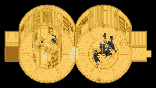
A fully pixelated version of the Archives from Chapter 4.
Holy Moley, this room was difficult. From the floors to the furniture, I had to figure out a whole way of making everything rounded out; lots of pixel-pushing and math, but man it was worth the effort in the end.
Also, our first instance of Lost Ones! Don’t worry, they’ll become a bit more... lively the further we go. >u>
“Bendy and the Ink Machine” is owned by TheMeatly
16 notes - Posted August 5, 2022
#4
Runaway Buddy, Chapter 1: July 7th, 1946 (Part 1)
~ After a bit of searching, Buddy Lewek finds his way to the extraordinary circus, Colossal Wonders, and discovers quite a few surprises waiting for him. ~ ---------------- Set in @bertrumstrousers‘ Step Right Up AU; been working on it with him and others from his server for quite a while now, so I hope you all enjoy it. ^u^ A big thank you to @haunted-hijinxer for helping me with editing!
~~~~~ What should have been a simple 20-minute trip from Rosendale to Kingston managed to stretch into over half an hour, the result of the normal route apparently being under reconstruction. Late as it was, the old bus tried to speed up some in a small attempt to bring that early evening's ride to an end sooner. Though its driver had to be mindful of a few pedestrians and one ill-timed stoplight, it was finally able to bring itself to a stop at its designated curbside.
The moment the door slid open, all those aboard were more than prepared to begin filing out and onto the sidewalk, quite a few wearing looks of agitation, some of relief, and others wore no discernable expression at all. No matter the case, they were here now, best to get on with their own respective chores and errands already. All of them were quick to scatter and wander off amongst the rest of the crowd to do just that. Well, almost all of them.
Buddy made sure to square himself away in the nook of the nearest store front right after stepping off the bus, and there took time to stretch a little and fix himself up. In between straightening out his jacket and looping on the other strap of his backpack, he couldn't help but start looking all around the place. Truth be told, there wasn't very much here beyond the usual small-town shops and traffic, the same as a number of other towns scattered all around the outskirts he had seen coming in. Not to sound rude, the area was nice, scenic even but... he still had no idea where it was.
One of the two bundles of paper he had stuffed in his pocket got pulled out then, and unfolded to show the map hidden within. Spreading it wide, the teen scanned over whatever names and lines he could recognize across it while repeatedly glancing back at his surroundings for certain buildings or landmarks. Nearly as soon as this little back and forth had started however, it stopped, after one last over-the-paper's-edge check; another and possibly much easier solution had presented itself. Buddy fumbled but managed to fold up the map again and put it away, "'Scuse me! Excuse me, sir?"
The nearby old man looked up from sweeping off the front steps of his shop, confused, at least until he saw the younger lad making his way over, "Whatcha need, son?" he asked, opting to hold the broom at his side for the moment.
“Evening," Buddy greeted, "Sorry to bother, but I'm looking for Archgate? You happen to know if it's still here or did it already, uuhh...?"
He let the sentence trail off when it was obvious that he was just confusing the elder more. The old man had an eyebrow raised high, "What gate?" he asked. Buddy couldn't help but give a quiet annoyed groan. It was then that he brought out the other bit of paper he had, slimmer and more worn than the first, only needing to unfold it twice before holding it up for the senior to see. It turned out to be an old poster, very likely one that had spent time on the side of some outdoor wall before being peeled off and kept through the years as someone's keepsake. Illustrations of various odd characters decorated most of it, some posing and others performing outlandish or amazing stunts; each of them were captured in once-golden frames, arranged neatly across the page with the words "Archgate Circus" painted at the very top in large yellowed letters.
Both of the old man's eyebrows were raised now, looking at the thing. "The Archgate Circus. I was told it was somewhere here in Kingston, " Buddy clarified.
He waited a few long seconds as the man looked over the poster carefully, adjusting his thickly lensed glasses a little on the bridge of his nose. Even with time to think it over, the senior still sounded unsure with his answer, "... Well, there's a circus going on over that way, but it sure don't look like any of that," he said. One hand let go of the broomstick and waved lazily westward, "Go down this road and turn left at the big break in the trees. You can't miss all them tents."
"Perfect. Thanks so much!" With that, Buddy started walking fast in that direction, all too eager to bring his day of travelling to a close.
Exiting town down the west main road, there wasn't much to see on the surface; a large cluster of trees on the left with only a large ditch separating it from the pavement and on the right a large section of grassy field. Among the wildflowers and weeds, there were several cars parked alongside each other with a number of their owners leaving them behind in the makeshift parking lot, crossing the road, and onto the very wide worn out dirt path that cut right into the tree line. Walking down the length of it only took about a minute at most, but anyone could see what lay ahead at the very end far sooner than that.
The old Kingston fairgrounds, normally deserted minus the odd season's festival or concert, was now filled to the brim with fantastical carnival fare. Booths were set up with games and prizes to win, concession stands were selling all kinds of foods and treats; several tents stood tall and proud among them, holding their own side-show surprises and acts, no doubt, just as a circus should be...almost. Buddy looked around at it all with a healthy amount of excitement, as well as a large dose of shock.
Just about everything was done up in a dark and twisted horror theme, from the sound of distant music being accompanied by shrieks and wails to how no matter where you looked, you would find at least a few demon faces grinning back at you. The handful of performers he could spot walking around in the crowd seemed to be following that concept to the letter; the costumes they wore were elaborate, splattered if not covered head to toe in what looked to be black paint, or possibly tar? From a distance it was hard to tell which, but it scared the daylights out of passersby all the same. ".... Some of those rumors were pretty on point...." Buddy muttered to himself.
"Tickets!"
The young teen was snapped out of his thoughts and turned; out in front of the black and purple Big Top, there was a man standing at a tall podium shouting out to the patrons. He held his megaphone up high again, "Tickets, folks! Big Show starts in 5 minutes! Buy yourself a ticket and have it ready!"
A line of people had already formed, buying their tickets and heading for the main tent; two employees posted at both sides of the entrance happily took and tore each stub in half before letting anyone enter. Buddy paused, then dug into his back pocket for his wallet, opening it up; empty, save for a few bits of old lint, "Shit...". Out of everything in the fairgrounds, getting in there wasn't just one of the major things he wanted to do; he needed to get in. All thoughts turned to coming up with a plan B.
What he came up with wasn't something he was particularly proud of; a bit of walking around the perimeter and minding anybody who could be watching had led Buddy to slipping underneath a loose enough piece of the tent's tarp. Regardless, inside was inside and that was all that mattered. Other patrons were still busily moving about and filling the stands or chatting away loudly to one another while waiting to get their dose of thrills in just a few minutes. All of this gave the boy plenty of cover to sneak his way over to where he considered to be a good spot, crouched behind a few spare barrels and other equipment left between two stands. Not only would he have a good view of all three rings, but the action would be up close and personal.
It didn't take long for the audience to settle into their seats, nor for their chattering to quiet down into excited whispers once the lights began to dim. In its place, a drumroll from somewhere in the circus' band stirred to life. Spotlights from up above turned on one by one, lighting up a path across the stage and up to the large pair of black curtains at the far end.
The anticipation was left to grow for a few moments...
Suddenly the curtains were flung open with a crescendo of drums and in marched the show's ringmaster, being immediately greeted by applause and cheers from all sides and all too happy to wave to them all in return. Buddy however just stared in astonishment. The gentleman's attire alone demanded attention, every bit from his polished boots to his decorated top hat shimmering in gold or a deep purple hue. That was to be expected, but the sheer size of him was not. The man was huge, a giant compared to any other adult. From the hushed comments and murmurs Buddy could hear around him remarking the same, he wasn’t the only one shocked. Here was somebody that could not be easily ignored.
A microphone was lowered down and hung right above a small circular platform placed in the middle ring. Stepping up, the ringmaster took hold of the device and began to speak in a loud confident voice that cut through any other sound, "Good evening, ladies and gentlemen, children of all ages! Welcome! I am your ringmaster, the Great Bertrum Piedmont!”
This time every bit of the crowd broke out into cheers in response.
Bertrum gave a delighted chuckle, "Before we get things started, I have one question for you all… are you prepared to be thrilled, to witness the wondrous and exciting?"
As he spoke, his free hand moved to his belt and unclipped the looped-up whip there; a flick of his wrist and the length of it flung out and rested on the dirt floor. A hasty strike of a small hidden flint and the entirety of it up to the very tip was coated in flames.
"Are you ready for these Colossal Wonders~!”
There was one swift motion and a loud CRACK! echoed throughout the tent; the burning light of the whip quickly began to spread from where it had struck, just on the edge of the ring until it had managed to surround the entirety of it. Surprisingly, it didn't stop there; through some unseen means, the fire was able to branch itself off in opposite directions and repeat its route with the sister rings as well.
Any apprehension the audience had about the flamboyant introduction were promptly diverted by the whole band striking up into their first score. It was jarring in its beginning, but melted into a dark, bouncy melody, perfectly suited for what followed. In that same moment, the curtains opened again as wide as they could go; a twisted parade came out of the darkness and began its course around the whole stage. Large beasts of all kinds walked alongside demons and tamers, other performers riding atop or in the carriages they pulled along behind, all of them waving at the once again ecstatic crowd.
Even if he had to duck down from a few getting a little too close, Buddy took it all in with the biggest grin on his face; colossal wonders was right, this was amazing! He watched one very ornate black and gold carriage roll by with only one passenger, from what he could tell a tall and thin woman dressed all in black, save for the angel wings she had on... or did he see bat wings? It came and went too fast to really tell; ---
See the full post
18 notes - Posted January 22, 2022
#3
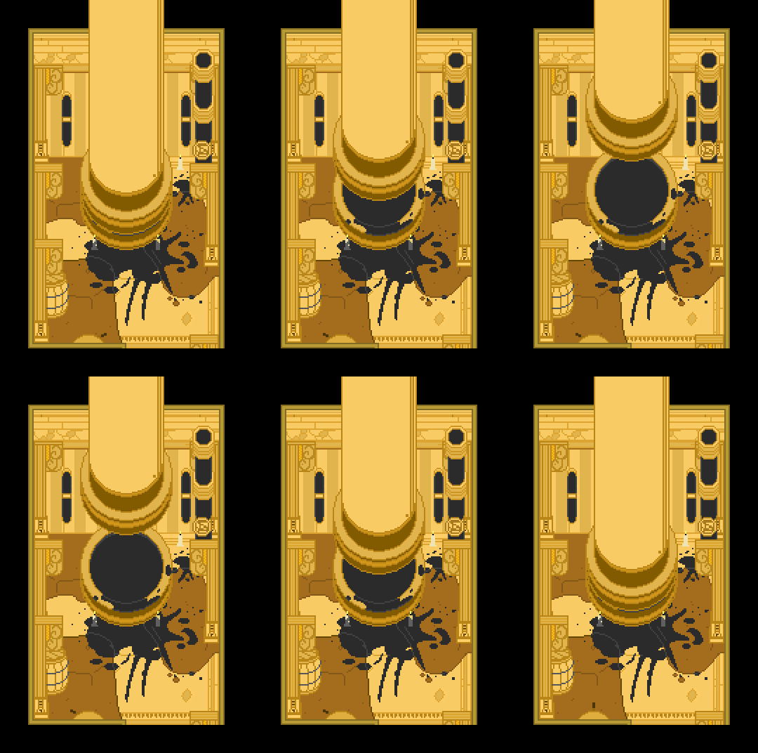
A fully pixelated version of the Inkwell Room from Chapter 4. “Bendy and the Ink Machine” is owned by TheMeatly
21 notes - Posted August 19, 2022
#2
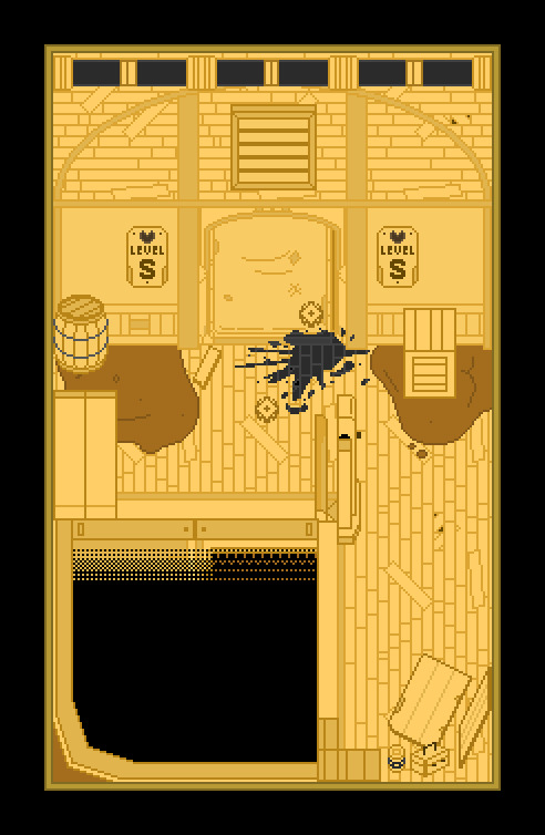
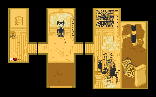
Fully pixelated versions of the Level S Elevator and Management Rooms from Chapter 4. >u<
Finally reaching the lower levels of the Studios; the further I go, the crazier things get, the more little details I notice, and the more dirt and ink I need to draw on the walls XD We’re starting off with small spaces here, so decided to pair these areas together for you all, along with another lil’ Meatly doll tossed in. (Collect him, add him with the others in your inventory✨)
“Bendy and the Ink Machine” is owned by TheMeatly
57 notes - Posted July 29, 2022
My #1 post of 2022
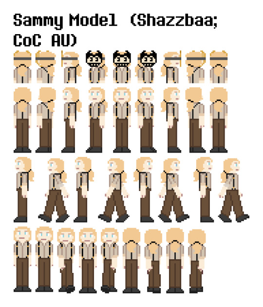
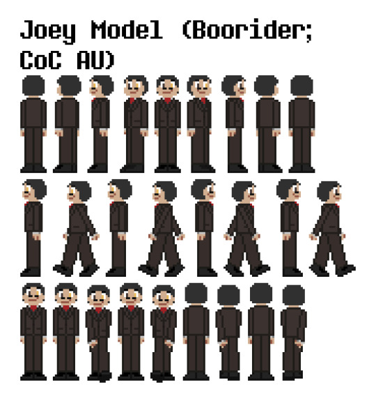
See the full post
60 notes - Posted March 3, 2022
Get your Tumblr 2022 Year in Review →
#Leave it to the CoC crew to be the most popular out of my stuff this year X''D#Here's hoping I can share even more fun artwork in 2023! ^u^#tumblr2022#year in review#my 2022 tumblr year in review#your tumblr year in review
4 notes
·
View notes
Note
Ok I'm not an artist and I don't know anything about digital art so sorry if this is a stupid question but... why do you color your dinos in that crazy purple first?
Colour bases and layer groups!
I’m basically making a mold for the coloring with the magic that is layer grouping. The weird purple color layer is my color base. It’s a layer I have filled in all the character poses, and when I make new layers on top of it to put proper colors on, I don’t have to worry about staying within the lines because I can only color the same area that was colored on the base layer.
(in photoshop this is done by pressing the alt-button while clicking between the layers, in Clip Studio Paint it’s done by ctrl+alt+G. You can chain multiple layers to the group, and all grouped layers will follow the bottom most layer they’re grouped to)
Like here’s Two Feathers’ ref sheets with grouping:

And here’s the same with all grouping turned off (i.e. everything how it was actually colored):

Look how her back color fills the entire canvas and belly color spreads out everywhere? And the bottom scene has just random shapes cut out because I didn’t have to care where half my edges were? Like I have no need to bother carefully coloring within the lines, as I’ve already done that once, and can just set the rest of the colors to follow that mold.
I use the weird purple because it needs to be a color I can see pop out from the line art layer. I use paint bucket to help get the coloring in because it makes things faster, but since my lines were hand drawn and the paper texture is still in there, the paint bucket doesn’t work perfectly.

See all those empty pixels? I need to paint them away if I want the final colors to not have ugly dead pixels in them too, and the weird purple is just bright and noticeable enough that I can see all the holes in the color no matter how tiny, and can go fix them, so it’ll look more like this:

No holes in the color! Now I can go color it in properly without worry that my characters will have empty spots all over them.
Doesn’t necessarily have to be exactly this particular purple, it was just the first random color that did the job and I stuck with it.
76 notes
·
View notes
Text
Aw maaannnnnn
Remember how I was taking about pixel art? I don't love the way my patterns look on paper as pixel-arted previews of the cross-stitched final product and I thought it might be more interesting if the art that makes up the table of contents/previews, the part of the book where you can kind of preview the narrative, looked like completed art with shading and stuff.
Well, I ran a couple tests recently and I found I can do two things: Re-upload the original linework at double the size and basically start over, or add tons of rows and columns. Either way, if it usually takes about eight hours to do one pattern now, it'll take about four times that with a larger canvas.
Which might be fine..... but I literally can't keep starting over and changing my mind. I thought cross-stitch was going to be the final delivery. I guess pixel-art was, if you think about it, a natural sort of next evolution.
You know what's not a natural evolution for someone who hates drawing?
Drawing the damn thing with shading and highlights and details.
Cross-stitch is fun for me. I kind of figured going in, if I wanted to work in the scale I was determined to work in, I was going to have to sacrifice some control over the project.
Would it be worth it to have really cool preview art that looks pretty much how I imagine the final art looking?
Of course.
Would it be worth the dozens of hours I'm already putting in?
Probably.
Would it be worth delaying the release of the first zine? Or the second?
I don't think so. I can always update the zine, update the preview art, update with my own cross-stitch renditions of my patterns. Or, I could just do a certain number of them.
Or I could re-route the entire project. It's all early days, and I'm still using the same lineart. I think maybe that's the important part.
I think my mind was more made up than not when I realized, compared to how long it can take to stitch a frame, I'd most likely work faster if I just produce them as completed pixel art. I can always take some time to stitch them as well, I've just been striving to produce some kind of actual product, and this is kind of it.
0 notes
Text
Post 4: Roxy
Time for today's tommorrow post. So I didn't get to talk about Roxy as a character much in the first post, which is why I'm dedicating an entire post to doing a sprite and talking about Roxy. Let's build off the process, starting with the "draft" layer.
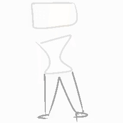
250x250 pixels this time because she's so huge. This layer is basically where I decide how I want her to pose. No arms because I'm semi-confident on those. Legs were actually added later because I'm a dum-dum who doesn't know how to draw legs.
So let's talk Roxy as a character. One key element I like about her is that her is her concept of identity. Mainly that she doesn't have one. Her face is gone and I don't plan on rendering any kind of sprite that would show her off as human because I like that she's expressed by a microwave plugged into her neck. Giving her a head would make her more generic, and I hate generic. I think characters should be unique, with cool designs and such.
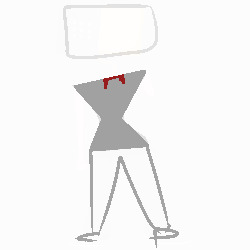
There's her main body, I experimented with ignoring whether the character's body is pixel symetrical and goes all over the place and I'm not sure if it made this sprite better or worse.
Drawing blood is fun but I have no clue how to outside of paper and pen. It's easy on paper and pen but doing it on a drawing tablet or in pixel art is something I'm going to have to look into next post, obviously. That and body shapes, this one didn't turn out spectacularly either.
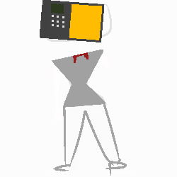
There's the microwave head. Originally, her head faced the other way, but it didn't really compliment that stance she's pulling off here so I flipped it around.
Roxy's function as an NPC would definitely be serving as Conrad's travelling vendor. She'll sell him things for food cans, giving him upgrades, one-use items, ammunition, etc. The explanation for this is that embodiments like him and her don't need food. So, she plans to make a monopoly on all available food so she can control The Blastzone.
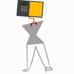
The cord gets added here, which is on a layer bellow the head and the shirt she's wearing. I think one of the problems I'm having with Roxy especially is drawing her neck and shoulders. She's meant to have a visible neck, but there's a plug stuck into the vertebrae. I think for this one I overlooked doing the neck by doing an hourglass singlet frame, which I can only beat myself up for.
In the process of making this character, I'm constantly thinking about how many microwave jokes and skits I could do in some kind of mini-cutscene interactions when Conrad visits her stores. Things like Survivors coming around to use her head to cook food and her sitting there disgruntled about still being a functioning microwave.
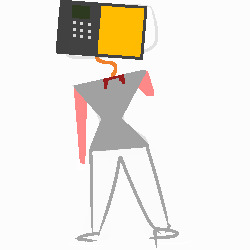
Arms here. Easy to do but poorly executed on my end. I'm kind of baffled I haven't been drawing her neck and shoulders properly in pixel art. It's so flat up there.
I think a fun part about designing Roxy was doing her skin. It's permanently like that from blast exposure. On that note, her missing head is very likely due to her head being crushed by a launched microwave. Dumb explanation, and I really do wanna do a neat backstory for her and how she died.
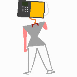

Thought these were on the same layers, but they weren't. But here's adding the other details and holy fuck why is blood so hard to draw? Why are hands so hard to do as well? I need to bookmark what I'm bad at.
One backstory idea I have involves her criminal tendencies. I feel like being a snitch to Conrad and selling out friends would at some point get to her. And I can definitely see her snuffing herself with a gun (good explanation for where the head went). But another one (sadder) would be a drug overdose. Punishing herself for being an unloyal dog, she nose-dives into something dangerous and goes on until she's dead. Only a moment before the blast happens.
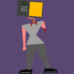
There's the legs and the background layer. God I fucking hate the legs, It's probably because her feet aren't flat on the ground mixing in with the terrible display of a neck above. Blegh.
I like to find theme songs for characters and after doing that verbal spew one that's come to me is a really fucking good Rare Americans song. "Berlin". Drives shivers up my back and Roxy is definitely someone who could fall in love. Idea would be that she sells him out to Conrad and then the overdose happens. The last few lines in that song definitely radiate final moments of Roxy before she goes belly-side up.
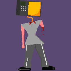
Aaaaand there's it done. Hate it. Microwave shading's actually done pretty well. Rest of it can go to hell. The cord, her arms, I tried to fix her 1-turning waist but now I think I just fucked it up. Again, shading is something I need to work on.
And that's basically Roxy. Didn't cover personality anywhere but she's definitely friendly to Conrad. On that note, giving her a personality is gonna be hard because I can think of what she'd say, what she'd do. But I can't describe it in words. If I get some good idea of what she's like I'll put it into my next sprite attempt. For now, tschüss
0 notes