#esp in the backgrounds and textures and character expressions
Explore tagged Tumblr posts
fiendishartist2 · 3 months ago
Text
started watching the 80s astroboy anime and i need tenma to explode
2 notes · View notes
jacketpotatoo · 2 years ago
Text
A step-by-step look at my drawing process (commission edition) ✨
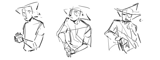
1) My client ( in this case @/brxkenvalley; ig) gives me their pitch and references. In this case, I was asked to draw their oc in whatever pose I thought would suit them and so I came up with these:
Tumblr media
They’re very rough and I focused more on gesture and expression than getting the details right. I also asked them questions clarifying some of their designs and their personality traits (which is a really helpful thing for commissioners to provide so that the artist has a better grasp on the character)
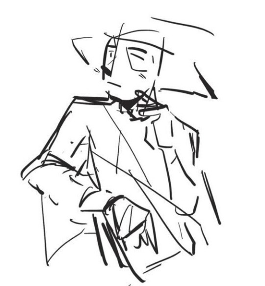
2) my client then asked for C. with an altered expression resembling B. so I made minor alternations to the draft and they decided on the one on the right
Tumblr media Tumblr media
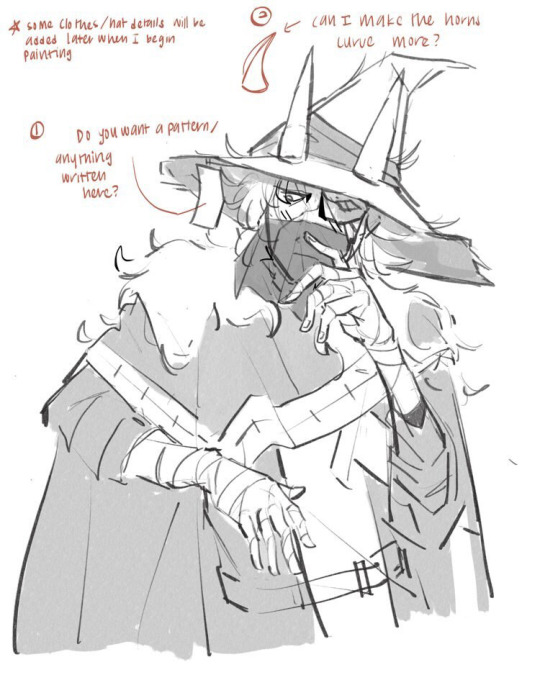
3) After approval, i sketch out the character and I’ve taken to just cleaning up my sketch instead of doing lineart because that saves a lot of time
Tumblr media
The annotations are me asking for some design clarifications because I wanted to make some alternations so that the piece looked better/more complete (esp cuz I thought straight horns did not look very good on the hat). The quick greyscale shading was just a temporary placeholder to separate the elements clearly. As for references, I use a combination of many from google and from pictures I’ve taken myself. For example, the hands here are based partly on an online reference, partly from my own hand, and partly from muscle memory of me practicing and knowing how to make a hand look like it makes sense
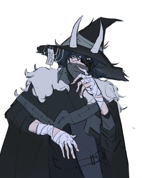
4) flats. This was tough because the reference I was given had the character’s whole colour scheme as similar shades of very dark grey and so I took some creative liberty to adjust the colours a little to make the separate parts pop out more
Tumblr media
You can also see the horn fix and added details on the hat. Not much else to say except I stuck very much to cool colours for the whole thing to fit the character’s mysterious vibes
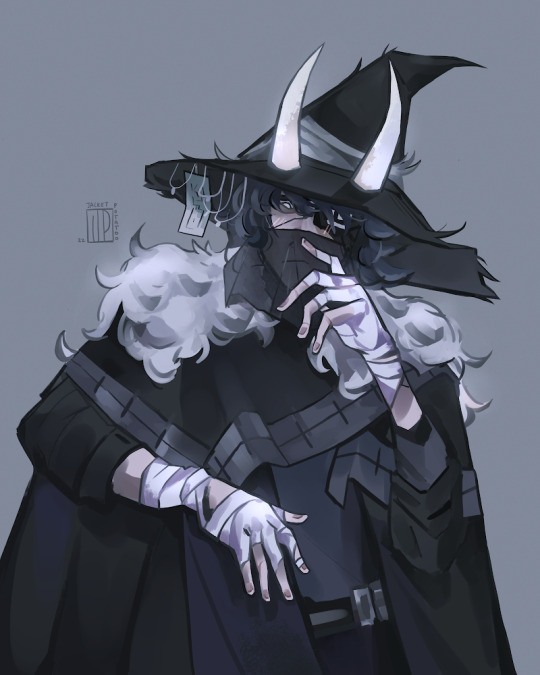
5) Rendering/painting. Everything prior to this was done on procreate but my brushes on Clip Studio Paint are just far superior so rendering was done there
Tumblr media
This is what takes the longest and is where I merge my sketch and flats layer and paint over everything (with the help of the magic tool and lasso tool to select segments according to colour). I think it might’ve taken around 4 hours? I used a lot of different brushes to try and get a varied texture and when I was satisfied, I exported it back over to procreate for colour correcting using different layer types and their in-built adjustment tool. I also used an add-glow correction layer with an airbrush on the white parts it pop out more, as well as give the character a more ethereal look
6) I ask my client if they want any minor changes and if not, I’ll email the file to them :)
And that’s my commission process! I don’t do all of these steps when I’m working on personal art (esp the planning) but occasionally, when I have a clear idea for a more complicated piece, I find planning really helpful. I could also do a process thing for a background piece if anyones interested, just lmk. Also feel free to ask questions if you have any and I hope this was clear!
33 notes · View notes
tamgerines · 6 years ago
Text
KH3 First Impression and Complete Thoughts
BACKGROUND: i've played kh1, com, kh2, bbs, 2.8, and a bit of khux. i've watched coded and 3d on yt, so i know the story relatively well. this is an impression of my first playthrough. i did my run on standard mode and watched the secret ending on yt. i mostly did this for story, so this will have my initial impressions based on my run that will not cover extra content like the phone mini games and cooking.  my opinions are subjected to change if i ever do any later playthroughs. pls, feel free to disagree w/ me.
!!! WARNING: THERE WILL BE A LOT OF STORY SPOILERS!!!
AUDIO: 
Music: utada is queen!!! that opening song!!! also i kept noticing how lit the songs are in each world esp frozen???  and aqua's. worth a replay just for the soundtrack alone.
Voice Acting: everyone sounded great for the most part. sora’s va have certainly improved and sounds less strained. his vanitas voice has suffered significantly though lolololol. i think i read that someone called it a wannabe dark knight voice? the organization sounded incredible, w/ my fav being xemnas, marluxia, and larxene. the disney and pixar va’s are incredible w/ my fav probably being randall in monster’s inc. 
some ppl did not get vas like xaldin and laxeaus. and phil in hercules. which were all very disappointing bc in the scenes that they were in, they would just stand around woodenly, and it’s very noticeable. 
VISUALS: 
mostly a+. environments are beautiful. water and frost textures are amazing!!! you can really feel that waterga and blizzaga. fur textures in monster's inc. could use some work. little details like the sails moving in potc rly make the worlds come alive. this could be a me prob, but environments in certain worlds make it very hard to see map markers, treasure chests, and disney emblems (which are supposed to be hard to find, but still). mostly in tangled.
strangely enough, this is the only game where i prefer in game graphics to cgi. it's already highly expressive and there's something creepy and uncanny about the cgi esp in the final fight. and it's mostly bc sora's thin chapped lips throughout the entire game suddenly becomes full.
DESIGNS: 
i don't love everyone's outfit or sora's outfit changes in this game besides toy story. this is something i alrdy knew going in, but i've always felt like the outfits in kh1 and 2 rly suited each of the character's personalities. and this is not just destiny trio but even chars like roxas, the twilight town kids and the hollow bastion crew. the move towards a uniformed look makes no sense to me like is it to unify the key bearers as one force against the organization? i could understand why destiny trio was wearing plaid but why the twilight town kids also? by the end of the game, almost everyone was wearing black and it's just boring to me. like there's a right way to do uniform while retaining characters' individual looks, and that's the wayfinder trio in bbs. in this game, not so much.
an aside, but i'm sort of disappointed in the hud moving to 3d too. the 2d portraits have always been part of kh so it's kinda a bum to see it go away.
i don't love the lvl designs but it might also be due to a narrative and pacing issue that i'll expand on. any case, vertical maps are a challenge to figure out. i don't consider myself bad at directions but there are so many moments, esp in hercules and tangled where i would be like where the heck do i go next (and i have the map) only for me to look up and find a shotlock teleport point (and this isn't so much a thing that heightens the difficulty but a time waster).
lvls and bosses in previous kh games have always been known for their gimmicks and mechanics, but in this game particularly i found it to be more tedious? and this mostly applies to frozen: who the fuck designed frozen? who the fuck thought it's a good lvl design to have sora climb a mountain, get kick off it twice, and climb it again as good lvl design? who?
all the disney bosses started blending together for me bc they're literally all giant monsters and rly easy. i think the mistake here is the fact that the disney worlds are put back to back whereas in kh1/2/bbs you have the interruption of original worlds and an actually playable important parts to the main story, in this game all the important storyline in radiant garden are locked in cutscenes interspersed throughout the game between finishing disney worlds.
a lot of ppl might disagree w this, but i miss the cinematic reaction commands and limit attacks. we still have them but i find them to be on a much smaller scale in the form of drive finishers and situation commands, but i find them to be less imaginative in kh3 in order to be less """"disruptive""" to the gameplay. i've always found cinematics charming in previous games as a way to show sora interacting with his party members during combat. little things like beast putting a hand on sora's shoulder, aladdin leaning on him, or riku bumping his fist have a way of making the friendships he forms feel organic. outside of link commands/ summons, in this game, he........just throws a lot of ppl around or is thrown around?
GAMEPLAY:
already sort of went through parts of it in the previous section, but overall combat was smooth. i love how mobile sora is in this game. the improvement to his running speed and addition of all the mobile skills like dodge roll, super slide, flow motion, blizzard skating, etc. makes combat feel fast paced and juking so easy.
magic is super improved on ever since 2.8 and feels satisfying to use esp bc i feel like ur given a lot more mp now and with the ability to save the last of your mana for cure, it feels like you're not always budgeting your magic.
underwater combat was smoother than i expected.
it's a mistake putting almost all the commands on the triangle button. there's so much options you can do in combat and you'd mean to activate one thing, but then an attraction flow comes out and you just want to die. it gets a bit easier as i went on and got more used to the controls, but in general, i still think it's a mistake to not to have an ability or something to disable certain features like in kh2 fm.
gummy ships continue to be a thing. why. i don’t like how i have to turn the camera myself now ;;;. 
i'm not a speedrunner or anything, so i can't say too much else about fighting. the physical combos to me did feel like he was spinning a bit too much tho.
STORY: oh, fucking boy.
i'm not mad, i'm not disappointed, and i'm not even surprised. i already knew that post bbs, kh has already departed far from the franchise i loved as a kid and still today, at least story wise. but let's walk through it.
Disney Worlds: the disney worlds was literally a retelling of their movies. and unlike in kh2 and bbs, where visits to disney worlds were split into two parts, with the first part following the disney story and the second part being heavily tied to the main kh story and thus having original content, the disney worlds in kh3 only get one long visit. and the integration of kh into disney was just done so poorly. remember how kh villains used to kidnap princesses? remember how they used to actually conspire to take disney characters' hearts and turn them dark? remember, you know, when they were still evil and actually interfered with the worlds? in almost every world in kh3, an org member just comes says vague menacing things to sora, calls him stupid, and then leaves. yeah. and oh, maleficent and pete looks for a black box only to not find it, and leaves. AND THEY DON'T DO ANYTHING ELSE FOR THE REST OF THE GAME.
the pixar worlds + bh6 were the only ones with any actual new content and they feel so fresh. i esp loveeeeeeeed toy story omg. the script was so good, funny, and heartwarming. the pixar consultants should have helped kh all the way tbh.
like previous games, there's an attempt for each disney world to thematically tie into the main kh story. in this game, it was as heavy handed as ever, probably even more so. 
Original Worlds: onto the meat of kh, the main story was rushed up until the end. you have a slew of disney worlds, then bam, they slam you with all the human bosses and the important story stuff. 
the ‘awakening’ of roxas, xion, and ventus were very rushed. you literally have one moment they’re no there then two seconds of white screen and all of a sudden they’re there. 
there’s a shit ton of shoehorned character redemption arcs: vexen, demyx, saix, eraqus, xehanort, xemnas, ansem. all were done either offscreen or by some miracle, they reached an epiphany after sora beat his keyblade into their heads. 
the only death scene that i actually liked, that a lot of ppl complained about, was vanitas bc yes, although i thought his character had so much potential, it was at least a consistent and sympathetic death. bless him, born a villain die a villain. same with xemnas bc i loved his last speech. 
xehanort was a shitty villain through and through. no one understood his motivation; it’s like nomura took a page from thanos’ guide of how to write villains, gave him some stupid ass goal to have a keyblade war to restart the world, and then just have him...get everything he wanted? his estranged friend comes back in ghost form for whatever reason and is just like ok we’re cool man even tho u took my student and indirectly murdered me and then gets taken up to heart heaven, like O K. and like what’s the most frustrating is that it’s implied they’re keeping him as a villain??? bc fucking ymx is like ooohh imma just go back to my own time via time travel. it’s too late for u sora hurdur. 
and the younger members of the organization, the ones that we do know were in khux. we don’t get to know how they became nobodies and they don’t get a redemption??? really???  
you can tell they tried, TRIED, hard to give everyone closure. and they miserably failed to close plot points. they actually opened more. who the fuck is the unnamed girl in lea and isa’s storyline? why the fuck did you mention her if you were going to play the pronoun game and not name her??? what the fuck was in the black box??? why are they looking for it when no one know what’s in it??? why the fuck was repliku inside of riku the whole fucking time??? why have org members be norted if they can still have agency and choose to betray xehanort??? why the fuck was BOTH sora and riku in different worlds in the secret ending????? ? ? ? 
and tho i’m very glad that wayfinder and sea salt trios get their happy ending, the destiny trio had their characters assassinated. kairi was teased to become an independent character of her own and fight alongside sora, only to get shafted to become a damsel in distress, again, literally replaced by xion in one of the last battles, AND referred to as ‘motivation’ for sora by xehanort lol. sora, the guy who’s always going my friends are my power, ONLY grieves about losing kairi, accrediting all of his strength ONLY TO HER. riku, who spent the first game desperately trying to get kairi’s heart back, and who protected her from saix in the second, suddenly doesn’t give a shit about her and is just there as sora’s moral support. it’s so frustrating that nomura has the audacity to say that this series is primarily about friendship and then pull this shit lol. it’s transparent. 
CONCLUSION: 
i think for me, the quintessential kh trilogy has always been kh1, com, and kh2. as far as i’m concerned, the story should have ended there for destiny trio. and it’s like nomura said, how he feels more sympathetic towards villains now, i think nomura’s ideas have outgrown his main character. 
sora’s journey worked in 1, com, and 2 because he had an overarching goal to find kairi and riku and return home. not everyone has to understand heartless vs. nobodies or dark vs. light but at least, anyone can understand the desperation of saving your friends. when that framework is taken away, sora’s goals and motivations become unclear; he’s a kid and has little reason to be caught up in xehanort’s plans, the keyblade war, or the organization’s agendas. and his failure to grow with the increasing complexity of the plot, to investigate for himself the bigger picture or even come into a similar realization of his own darkness/ balance like riku, makes him unfit; he’s a reactionary character instead of an active one. that’s why this game, being experienced from his point of view, felt mostly like a catch up to speed for sora and a set up to nomura’s next big thing instead of a genuine ending.  i honestly don’t think nomura knows what to do with him and with kingdom hearts anymore. 
kh3 is a game wrapped in nostalgia and promised something bigger than it could fulfill. and aside from better graphics and improved gameplay, the story wasn’t worth the wait. 
9 notes · View notes
junaeneous · 7 years ago
Text
Love Yourself “Her” Album Commentary That No One Asked For
lET THE MUSIC STUDENT DO HER THING OKAY SHUSH
1; Intro: Serendipity 
THE MERE FACT THAT PARK JIMIN DID THE INTRO IS A1 FOLKS. You’re in the mood to cuddle? Serendipity. It’s raining and you feel Affectionate? Serendipity. You just wanna hear Jimin carry out the line “just let me love you” beautifully over a falsetto when you miss him? FUCKIN SERENDIPITY. 
Anyway melody wise it’s really simplistic, something I really love!!! in songs. It’s not complex or something that’ll have you...up? If that makes sense? Lol there’s a genre of music called minimalistic and it’s completely different to this, it’s more random and very spontaneous so it’s nothing like Serendipity but ya know simplistic, minimalistic... :D
anyway it’s really calming and soothing to listen to, with some minor chord changes and the highlight being Jimin’s voice so I for sure love <333333
2; DNA (title)
HOE
JUNGKOOK WHISTLING IN THE TEASER WAS TORTUROUS ENOUGH
AND THEN THIS SONG??
TAEHYUNG’S VOCALS NEED ENDLESS AWARDS AHHH
also I love the guitar’s role in this so much idk why?? it’s basically playing the chords over and over and changes in the pre-chorus but it’s sooo good?? I LOVE IT
I WAS NOT EXPECTING THAT DROP I WILL TELL YOU THAT
synth + bts = perfection??
Rap line’s flow will always always always leave me impressed and stunned bc they’re all so flexible and can adapt to any beat/rhythm like??? true talent??? exceptionally smooth??
KIM SEOKJIN SINGING IS AMBROSIA TO ME YOU GUYS I CANNOT EXPRESS HOW MUCH I LOVED HEARING HIM I JUST LOVE HIS VOICE I LOVE HIM HIS VISUALS HE’S JUST AN OVERALL A1 TO THIS SONG OKAY FIGHT ME ON THIS
Hoseok’s (i presume?) “la la la la la la” THE BEST ADLIB WOW STAB ME
okay ahem getting too long
TAEHYUNG RAPPING GOT ME FUC--
3; Best of Me
Kim. Taehyung. Singing.
Gives me life. 
It truly does. 
When the song first began I was like “Aw is this gonna be a slow kinda song??” bUT I WAS TAKEN BY SURPRISE YET AGAIN
Also I’m getting a lot of fetus Bangtan vibes very well incorporated into this new style they’re going for. As in with vocal colour and just the very...essence of it reminds me a lot of their old stuff but improved and adapted to today’s style and I love it!!
Hoseok’s rapping just gets better with every song! Like if you listen to their earlier songs and compare them to their latest ones, you’ll genuinely be surprised at the difference, I can definitely hear the stable confidence when he’s doing his thing. I’m so so so so so impressed and shook and I reaaaally want to tell him that ahhh
4; Dimples (보조개)
I LOVED THIS SO MUCH WOW
KIM SEOKJIN HITTING HIGH NOTES AND SAYING “BABY” MAKES MY HEART SOAR YOU DON’T UNDERSTAND--
Of course, before you wonder why I haven’t mentioned Jungkook, it’s because I don’t need to say it: his vocals are on fucking point. In every song, when it’s his lines and his moment, he owns it, like you just know “yeah that’s Jungkook murdering me right now what a blissful death!” 
Also the way they sing this song, drawled out and swung just brings forth a lot of envy and pride from me, because singing with that style--all swung and drawled out--while holding out your vibrato and making sure your diction is good is hard and they make it sound so easy, like I stan vocal kings wow??
Melody wise, it’s the kind of song that’ll be stuck in my head all day and I don’t think I’ll ever want it out tbh. The production behind this was aimed at a certain criteria and they definitely hit it. I won’t go into a ramble about all the stuff I can pick out, I’ll just tell you that it’s beautiful and I love it and I could only hope to produce music to such calibre. <333333
5; Pied Piper
BODY ROLLS
FOR DAAAAAAAAAYS
they’re really going for higher registers this comeback and I AM ALL FOR IT.
AGAIN THE GUITAR(S)
they’re kind of blended into the back but I’m still picking it out because we study picking apart a song instrument by instrument in music and now I can’t turn it off lmao
BUT STILL THE BASS GUITAR HAS ME SNATCHED WOW!!!!!
THE ADLIB IN THIS IS AMAAAAAAAAAAZING. At first listen you may not catch it, but from frequent listening you’ll see what I mean, it’s so good!!!!
Also I know I’m not commenting on the lyrics and that’s bc I haven’t seen them yet, I’m going solely by what I can hear and I’m sure the lyrics are...well, we’ll see :D
Jimin and Jin are ready to get people to swerve and bOI I”M SURE PEOPLE ARE SWERVING
their vocal colours are really showing and I 100% SUPPORT
6; SKIT: Billboard Music Awards Speech
do I even need to comment on this?
More than being an ARMY and stanning such a wonderful group of hard-working, humble, wonderful men, as an Asian it was such a Moment for me to see them win? Namjoon’s speech was brilliant, their faces were so adorable and they looked so happy it was worth getting up at two in the morning on a school day to watch it like i literally did not care and i was smiling the whole day after 
Growing up, I watched a loooot of cartoons and T.V shows and I never really saw Asians take lead roles and do heroic things as much as I’d have liked to. I cherished Mulan, Pocahontas, Jungle Book and the likes because it was the closest I got to seeing characters (esp. females for the first two!!) from diverse backgrounds doing heroic things
that pride seeped into that day for sure, I was so beyond proud that they got the recognition that they deserved. 
it sucks that it opened a gateway for award shows (no shade hahaha :D) to milk the shit out of them for views and such, but the bigger impact that it had will stick with me for long, long time. I hope that there’ll be more POC representation in the Western world, because skin colour will never define who gets to be a hero and who doesn’t. 
ahem sorry moving on!!
7; MIC Drop
THE WAY THIS STARTED ALREADY GOT ME HYPED
Hoseok opening? 
Y E S.
The texture is rather thin for this but that’s the point, your focus has to be on the them and how they’re very rapidly increasing the entire fandom’s thirst level lmao
I’M SURE THE LYRICS ARE FIRE I’M GETTING THOSE VIBES
LIZZY I AGREE WITH YOUR STATEMENT 
their raspy voices and screaming literally made me feel this rush?? similar to going on a rollercoaster and then that fuckin thing just drops and you’re like hOlY shIT
yeah that’s me
watch me bass boost this and annoy my neighbours for the next 24 years :D
8; 고민보다 Go
why did the flute/recorder remind me of Mask Off jsnldljdlj
THE SCREECHING IN THE BACKGROUND LMAOOO
Jungkook’s “do you want some?” UHM OFC I DO WHAT DO YOU MEA--
I found the contrast of layers in this song really interesting because they made it work. Like wow, I’ve heard them separately but I would never think to combine them and that’s genius!! I’m unsure of how to explain what I mean, but the sound is really unique and fresh and 11/10 so there!
Taehyung coming for me yet again in this song but it’s cool guys I’ll just lET HIM TAKE MY IT’S ALL GOOD
“Where the party at” SAME I WANNA KNOW TOO I’VE NEVER BEEN INVITED TO ONE
just kidding i just never want to go lol whoops
9; OUTRO: Her
Okay the piano combined with the electric keyboard is A GREAT WAY TO START YES I LOVE
THIS REMINDS ME OF BLANKET KICK (이불킥) AHHHHH
Namjoon starting this song honestly makes me so inexplicably happy, especially the “i’m looking for love” YOU GOT IT BOY WHAT DO YOU MEAN LOOKING DO I NEED TO SPELL IT OUT FOR YOU
Woo it’s got a repetitive melody, which occasionally changes and varies but ultimately comes back down to the main simple beat, which again, is purposeful I feel bc 1) it’s the outro 2) the focus should be on them slaying everyone 3) it’s a common feature and honestly not a bad thing, given they used it right!
HOSEOK SAYING “I CALL YOU HER, HER” CLEARED MY SKIN RAISED MY GRADES PAID OFF ALL MY DEBT AND RESURRECTED ME I’M--
there’s something about Yoongi’s rapping that’s so relaxing in this? This is something I always point out with Yoongi’s rapping in more of their relaxed songs, like the way he drawls and controls his volume is so...wow thanks for calming my soul Yoongi bless you!! It’s like he’s like describing something to the listener with vivid detail and a generous amount of enthusiasm, a very artful way of storytelling I’m in love!!
his lazy stretch of the chorus is 12/10 I’m applauding and I’m making everyone around me do the same
AAAND THAT’S IT!
I guess some of my opinions may have more detail or change completely when I look at the lyrics, considering I based this off solely what I could hear lol so trust me i’m gonna be severely shook!!!
if you read all of this thank you and ily here’s a cookie <3
Tumblr media
7 notes · View notes
nerffighter · 8 years ago
Note
tips on starting an indie blog?
Tumblr media
hey nonnie! sorry if you’ve been waiting for a whole for this ask and i’m just gotting back to you, i’ve been on hiatus and didn’t get a notification for this message! 
well as far as setting up an indie blog, like the logistics of setting everything up, i can walk you through my process. ( it’s absolutely mind boggling that you actually felt like i was a Resource to ask about this and i am very flattered boo ty even if it wasn’t meant to be a compliment my bad )
but before that, first rule of starting an indie blog!!!! is have fun!!! pick a character that you relate/feel deeply for. consume as much content for your muse as possible. look at the canon, look at fanfics, fanarts, scribble out some musings or little private oneshots. you don’t ever gotta share these writings with anyone if you don’t want, it’s mostly to keep yourself and get in the grove of writing this character. most of mine are on the notes on my phone and were written at like 3am - 5am, but ngl, it’s nice to see how my writing for each of my muses has progressed.
secondly! i have a habit of choosing characters to write after a good month or two of suddenly having the urge to rp. because woooooo boy if i’d made a blog on a whim at every muse that bugged my brain i’d have way too many children to manage! i started up my cisco sometime after 1.15 and a few weeks after that ep aired i think... i keep this rule to make sure that i continue having fun writing on my new blog! writing is a really difficult process, inspiration can ebb and flow, starters/asks/replies can pile up, irl stuff can get in the way, so the month test lets me know if i wanna maintain that blog. because you should have fun writing your boo!
second rule! don’t worry too much about aesthetics/graphics if you don’t want. i know it’s a trend to have aesthetic blogs rn, but if you don’t know how/want to have them, then you don’t have to give yourself strife over that! ( fair warning tho, a lot of people are a little turn off-ish to gifs that are slapped onto replies because those gifs were created by other people, and their hard work wouldn’t be credited. ) if you wanna make graphics but don’t have photoshop, i recommend using GIMP! i’ve even make icons/graphics on picmonkey before! it’s all about what you feel comfortable doing! and if you need help and you got the money, there lots of peeps willing to do comissions for graphics! *points v loudly @ alwaysxlate and twnkletoes / thebiiscuit / horizoncrossed / dadmighty*
thirdly! don’t forget a lot of rp-ers are shy creatures. a lot of us write because it’s easier to express ourselves through aother character, and that can mean talking to people ourselves, without the guise of a character to present an identity that people will already have an idea with and possibly relate to, can be hard! it’s not just you that’s shy, it’s lots of people! some of my best friends i’ve made here on tumblr have been with people i never in my wildest dreams would’ve tried to talk to initially! talk in the tags! talk in the IMs! post ooc stuff! it’s your blog, you can talk as much ( or as little ) as you want!
not really rules, but ideas i’ve toyed with/learned over the years: a) use a screen name/different screen names on different blogs if you want privacy, b) write (ap) before on your blog title if you have an autoplay for your blog bc music can be startling and yikes, c) don’t be afraid to disable anon, d) your opinions on characters, issues, fandoms, etc., can change and you’re not obligated to share all of them if you don’t want, e) don’t cause drama. really. don’t do it. vague posting is a bad about 90% of the time, f) crack is the weirdest and most cathartic way to lure your muse back out into the open if you’re coming back from a hiatus, g) make icons as you need them. making enough when you start up your blog is cool, but don’t feel obligated to icon every single episode/scene for your muse, esp if your muse is the main protag.
okay! now onto the logistical steps! i hope that i’ve been able to answer your question/give you good tips!
1. i choose an easy to remember email that directly relates to my muse, like a quote they used or a ‘musewashere’ or a song lyric that reminds me of them! it makes password retrieval really easy if you can’t remember your log in after a long hiatus.2. choosing a url can be hard, but don’t choose one that sounds too much like someone else’s, it can be really rude to that person, i’ve had people just add one letter to my urls and every time that makes me feel bad because i feel like that person is just trying to ride off the hard work i’ve put into fostering my url and reputation! unless that person gives you permission, try not do that. when it comes to urls, i like to use dialogue or puns. grace loves puns.3. tags. before anything else, i recommend making a google doc for your tags, ic/character/triggers/ooc/etc. i keep mine up on my bookmarks bar so i can always access them if tumblr forgets my tags, and it’s really easy to help set up your tag dumps with!4. while you’re on that doc, i’d try to write up any about, verse, stat, playlist or etc. info you might want to put into a page. anything that inspires your muse! the rest of this doc is scratch space for you to put anything you might need for your blog! it’ll make your life so much easier, and honestly, i should follow my own advice on this, because sitting down and doing all the about/verse content later on when you wanna be working on replies is the pits.5. now you can move onto graphics! i always end up doing my promo first and then my background container theme. working on the promo allows me to let some creative ideas flow for how i want to establish the blog’s ‘visual brand’ to look like. remember that this can change over time! my color palette for cisco has changed a bajillion times, and i’ve gone from fire/energy textures to ripped paper to blueprints to computer graphics to space. your aesthetic will most likely change, and that’s totally okay! also if you’re having trouble figure out what you want the blog to look like, try to find colors that work with your muse. does your character have a certain visual motif? try running with something that reminds you of that! for me right now, i’m doing space for cisco, with lots of circular shapes!6. now you code. this is the most difficult part for me, because i’m still trying to teach myself how html/css works. if you don’t wanna do a custom code, that’s fine! there’s plenty of pre-made themes for you to try out! i like perusing itsphotoshop.com when i need to look through some times/psds/textures/resources/etc.7. icon, icon, icon, icon! experiment with icons! not everyone likes the same style! i’m partial to either really big icons or really small ones. i’ve used 250px/100px, 125px/125px, 100px/100px 80px/80px, and 60px/60px. try different shapes! try gif icons! it’s all up to you! want to try emojis on your icons? go ahead! want circles? sure! it’s all up to you!8. now plug in your promo, write some appropriate rp tags, ( the first five tags are the only ones tumblr tracks btw. ) make a tag dump, follow some blogs, and post a starter call or a rp meme! from here on out you got your blog!
1 note · View note
lilietsblog · 8 years ago
Text
a long post about my dnd character and color scheme design
@livebloggingandreblogging
so i play dnd weekly right and weve recently (December) started a new campaign and my character is this really cool changeling storm sorcerer called Rei Morgana coz that sounded cool when I was making her and tbh it still sounds cool to my ear (also Rei is comfortably short) (also its an allusion to both Hino Rei and Ayanami Rei who absolutely have played a role in Rei's personality and appearance respectively)
anyway
when i first drew rei i was just going for what SOUNDED cool not so much for what was going to y'know actually look good & work well with NEEDING TO WEAR CLOTHES (i drew her in underwear coz i just wanted to jut down general proportions)
so then when I started drawing her for real I realized that her color palette FUCKING TEAL AND LIGHT GREY (not even any kind of brown because i HAD to take advantage of that changeling flavor text... i couldnt just make her skin LOOK LIKE A FUCKING HUMAN...) it doesn't really... work... with any kind of outfit color palette I would try to give A STORM SORCERESS
in the end I drew her in a good-but-kinda-bland looking almost monochromatic palette with the primary color - the coat color! - being her very same teal but darker
then I said 'fuck it' and drew her in a HOLIDAY OUTFIT which was bright yellow/red/green and that actually??? looked pretty good??? it didnt work well as her 'primary portrait' coz 1) that's a FANCY HOLIDAY OUTFIT thank you very much she'd like to keep it bloodstain free and 2) i gave her a cool features-contorting facial expression that was pretty neat in itself but kinda really situational
I didnt really get a chance to follow up on that at the time bc photoshop was on my dads computer and i got kicked off when he returned from a work trip (he gave me my laptop that he took along back but it didnt have photoshop)
SO FAST FORWARD TO NOW i have actually fucking installed photoshop yooooo
and we're in town shopping in-game rn... actually it's the second session that has ended with us returning to our base town so thats pretty cool
and I decided to Go And Recolor Rei's Outfit So I Would Actually Like It
(when I color shit in Photoshop and it's not a super rushed job where i dont care about being careful at all I put each color on a separate layer so I can lock transparency and play with it to my heart's content)
at first I just went and put in bright colors like on Rei's holiday outfit but... amazingly... it turned out htat what worked on a skirt and a vest with a light shirt didnt really work on a longcoat with shirt and pants... esp when i color coordinated the gloves the bag and the boots to be fucking purple oh god THAT does not go with ANYTHING about Rei in retrospect
my DM said he'd have all enemies attack Rei bc shes gonna be the brightest target and thats an assault on senses and recommended bleach
...I took the advice to heart (jk i was just messing around) and HOLY SHIT YOOOOO
so in retrospect it was kind of obvious that Rei's palette worked really well with red and yellow, like my very first sketch i put on a yellow background coz it made her pop better? and that cool holiday outfit pic had a red/blue background that also worked super well for the same reason of red providing good contrast?
I just never really thought to make red her color because IT DOES NOT MAKE SENSE THEMATICALLY but on the other hand Rei is a changeling who wears the natural appearance of the species and a sorceress who loves tinkering (unofficially apprenticing to our party's tinker gnome artificer)
sure she'll have a red outfit like WHY TF NOT
anyway she looks super cool now
imma upload the entire History Of Drawing Rei here (...yeah its not long)
Tumblr media Tumblr media Tumblr media Tumblr media Tumblr media
yeah so i also added more shadows to her hair... this is the first time i ever tried to draw afro textured hair and the first try was kind of a mess i liked the second one better... this is not a perfect replication of the success of the second one but hey should be better
also that rose will now be Rei's permanent accessory no matter other outfit changes bc it looks Nice and red is her color
red and yellow which I kind of knew??? should have realized i knew??? bc i used them specifically to color the clouds in the bg??? deliberately so Rei would pop better??? idk my design sense is a mess
also in retrospect I realize that initially when making Rei I bought three outfits for her but only drew two of them... and I have just realized what the third one looks like so hey that's more Good Shit (tm) to look forward to
(and yes I 100% use paletton to figure out color schemes but the color directly opposite Rei's 'own' teal is a really gross looking orange like look. if you like orange no disrespect. but i would like to be nowhere near it unless its a fruit. nothing against brown except you know making brown a primary palette color for a flashy storm sorcerer makes 0 sense. but i should have realized immediately that broken up into two colors that orange would give me red and yellow... and THAT's good)
1 note · View note
jakecgraphicdesign · 7 years ago
Text
Protagonist - Textural Illustration Techniques
In this workshop we learnt a method which combined both traditional drawing techniques with digital texturing methods. The idea was to take one of the main characters of our films - the protagonist (the hero) and create an illustration based on them. This illustration could then be used for a poster, an advertisement image etc. An interesting part is that we are using digital technique s to apply real life textures.
Task 1 - Draw and Define:
In order to start this task we needed to find and decide on a main character to draw. We had to decide on one protagonist from one of our three films; i decided upon Sam (Jared Gilman) because i previously drew Roy batty from Blade Runner and i wanted to attempt a completely different character. Another reason i decided upon Sam was because of the various interesting profile shots of him which have been taken from Moonrise kingdom. He often has a puzzled expression, which i thought would be funny to develop upon. Here’s the original image i used:
Tumblr media
I chose this image because i wanted to include the pointing finger into my final design as it adds a more personal elements, it includes the viewer into the image, like breaking the fourth wall because its as if Sam is actually pointing at you. Once i had found a good quality image the next task was to print it out and begin drawing it. We were given tracing paper and we simply had to trace around the picture. I used a fine liner to drw around the important features, i also included some shading to add more depth and distinguish the image from just a 2D image. I also made sure to keep my lines thick and dark,so that the scanner would pick up every detail. Here’s an photo of the traced drawing:
Tumblr media
I also attempted another tracing technique using carbon paper. To do this i simply placed a plain peace of paper and then above it the carbon paper and then the source image on top. Then i just traced the lines of the original image. This pressure pushes the carbon from the carbon paper and onto the blank page, which, if done properly, perfectly replicates the original source image. I attempted this technique, however, i don’t think it turned out as well as it possibly could have. I think i should have included more detail, however, the basic shapes and outline is there, so it is obvious as to what the drawing is of. Here’s an image: 
Tumblr media
Once i had completed the stenciled image the next task as to begin work digitally, in order to do this we had to scan the image in.
Task 2 - Vectorise:
Once i scanned the image in i opened it up in photoshop and began editing the image.. I used the Levels option to increase the brightness . The image became cleaner and i removed some small imperfections - this made the the drawing cleaner and still precise, but it still retained the rough, hand drawn value. I have been told that the hand drawn, rough and stylized aesthetic is becoming more popular, so this technique may prove to be very useful in future projects. Once i had finished cleaning up and enhancing the original drawing in photoshop, i saved it as a Jpeg and proceed to to open up the file in adobe illustrator. Using photoshop i was able to remove any unwanted lines or marks, but in Illustrator i was able to make the drawings outlines bolder and stronger, making it more professional and less like a quick sketch. I did this using the Live Trace technique, where i chose the black and white logo setting. This setting works best for my desired aesthetic as it generates strong, black lines and vectorises the entire image.
Tumblr media
Next i selected the unwanted white space around the drawing and used the Same - Appearance technique, this allows me to delete the white areas leaving only the image outline in a vector format.
Tumblr media
After i had done all of this i saved the image as an .EPS file, which is a file compatible with both Illustrator and Photoshop, meaning you can move between both to use the unique features of each, a method which is especially helpful when working on scanned illustrations such as this one. Now that it was saved as a .esp file i could again open the image in Photoshop.
Tumblr media
Task 3 - Textures and layering:
The next task was to begin adding more visuals to make the image interesting and more than just a simple outline image. We were given a folder containing multiple different texture. These textures were taken from a range of sources; there was ink stains and splatters, paint strokes, materials and torn edges. One of the most visually interesting textures was a multicolored ink splatter. The reason this texture stood out from the rest was because of the range of vibrant colours within, most of the other colours were black and white meaning you needed to add some kind of colour overlay, however, this ruins the interact textures. The colour within this ink splatter meant that edits to the Hue, saturation and vibrance can be made to change the aesthetics of the texture. Here’s the original (Top left) with some colour variations i have made: 
Tumblr media
These variations remind me of Brain scan images, with the various colours highlighting certain parts and areas of the brain. When experimenting with the position of this ink splatter, i placed it above Sams head, this reminded me of the thought bubbles often found within comics and graphic novels. This gave me the idea that this ink mark could act as a visual representation of Sams thoughts or perhaps something he is remembering.
Tumblr media
 I then began thinking about what Sam could be thinking about, based off of the events of the film i though that he could be thinking about the character Suzy, showing his love and affection for her. Perhaps this image takes place before the main events of the film and  he is thinking about his plan to run away with her. To fit into the illustrative aesthetic of the image i began to edit tan image of Suzy using photoshop. I decided to use digital effects rather than repeat the technique i used for Sams face, mainly because of time restraints. I used various filters and colour techniques to make the original image look more like a pencil sketch, heres a picture of the original image as well as my digitally altered one:
Tumblr media
Once i had created the more pencil style image of Suzy i could apply it to the image, i placed it behind the ink splatter/thought bubble to make it more aesthetically interesting. Another interesting idea could be that the various colours represent how Sam thinks about Suzy, or perhaps Suzy vibrant and bubbly personality. (However, this is quite ironic when considering her wooden attitude and character within the film) Here’s an image with Suzy’s face in the bubble:
Tumblr media
Next i wanted to add some texture to the clothing, so i decided on using this plaid gridded texture because it most replicated the aesthetic if cotton clothing. I cut around Sams body, deleting the areas where his hand and neck is so that the texture only covered his clothing. I then used a different texture for his hat o dd some variety to the piece. I decided on another pattern texture once again to replicate the real texture of fibers in clothing. Here’s an image of the added clothing textures: 
Tumblr media
When reviewing the piece, i noticed how different Suzy's face looked to the visuals of Sams face. Because Sams face was hand drawn it was much simpler, consisting only of the main facial features and some minor details. On the other hand, because the Suzy imagery was created with a real photo with various filters and effects applied the visuals are extremely different. This contrast really irritated me and made the overall piece look odd and incomplete, however, i don't have a scanner at home and there isn't enough available time during college. To solve this problem i simply drew over the main gestures of a photo of Suzy's face using the paintbrush tool in Photoshop. I used a size 4 round brush head with 100% hardness to achieve a similar visual effect to the hand drawn picture. I didn't have access to a digital graphics tablet at the time so i had to simply use the computers mouse. At first i attempted to use the mouse on a windows computer, however, this resulted i very uneven, jagged lines and it was very difficult to trace around Suzy's face.
Tumblr media
 I then attempted to draw the features of Suzy's face using the mouse on an Apple Mac computer. While i often greatly prefer windows computers and software i found using the mac mouse much easier to control. it also created much straighter lines and i found drawing curved lines much easier. 
Tumblr media
 To create a similar illustration i simply drew around the face. Once i had the basic features outlined i used a larger blurred brush with a lower hardness and a darker shade of grey to highlight some of the shadowed areas on her face, adding a sense of depth and 3 dimensions. Then i used a solid black brush to highlight the most shadowed areas, i filled these in using hatching to replicate the pen strokes on my hand drawn image of Sam. Now that i had drawn a digital trace of Suzy's face i could remove the original digitally edited photo and replace it. Finally i turned down the opacity to make her face slightly transparent and faded to further the idea that he simply thinking about her. Here's an image of the final trace of Suzy:
Tumblr media
once i had completed the characters and their respected textures the image still looked rather bare, so i decided to create a background to place behind the characters. I decided on a forest background to fit with the theme of the film. To do this i simply used the lasso tool to cut around shapes of trees into various print textures from the texture pack provided. I then cut an oval hill shape to act as the ground. Finally i cut a hole into the ground and placed an ink splatter texture underneath, meant to represent a pond. [Insert image] in order to make them obviously natural i  applied a slightly transparent green colour overlay to the trees and then a darker green overlay to the hill. I applied a light blue overlay to the ink texture which looked like water effectively. I then attempted to apply this background to the image, however, the background image was too detailed and distracted the viewer away from the main focus which is the characters.
Tumblr media
To solve this problem i had to simplify the background into just a few trees on the hill, removing the lake completely. That was the final addition to the piece, here’s the final image: 
Tumblr media
0 notes