#enstarsmagz
Explore tagged Tumblr posts
Visit Tumblr Blog
Explore Tumblr blogs with no restrictions, modern design and the best experience.
Last Seen Tumblr Blogs


Fun Fact
Tumblr’s reach among the 26-to-35-year-olds in the US is 11%.
Text
Enstars Magazine vol.4: Interview with Development Staff - Live2D and Logos
From Enstars Magazine vol.4 Ra*bits, released in November 2016.

Staff interviewed:
T.I.: Graphic designer. They are in charge of title logo, unit logos, promotion videos, and the game’s overall graphic design.
R.O.: Illustrator. He is in charge of the Live2D and backgrounds for Home screen and event CGs.


What is “Live2D”, a feature that is indispensable in Enstars’s world?
Q: First up, I’d like to ask about Live2D, an indispensable feature of Ensemble Stars!’s. Can you tell us what this program can do specifically?
R.O.: Live2D is a software application. It’s an animation tool that can animate an illustration. It’s excellent in being able to let us express an illustration through animation, without losing the original illustration’s charm. I think being able to give life to an Enstars’s character visual as it is is something that’s very fitting for Enstars.
Q: This is also the first time Happy Elements is using Live2D, isn’t it?
R.O.: Yes. I was not an animator to begin with, and I had always worked on backgrounds as an illustrator for the company. When Enstars was still at its planning stages, someone suggested what if we also use Live2D. In response to that, the other members of the team were just wondering, “It would be great if somebody can do it for us….” That’s how it started. At that time, I had interest in Live2D, so I volunteered. From there, I worked from scratch, fumbling here and there. At first, I had to rehash it over and over and I didn’t make much progress. I had a hard time.
Q: Can you take us through the creation process?
R.O.: I started with the character’s blinking animation and lip movements. We gave an okay with that alone, but when the app progressed further, I found that wait, they’re actually not making that much movement! At that time, there were games made by other companies that used 3D models as their main feature, and when I compared our game to theirs, I thought that this may not be so eye-catching … Moreover, what makes Enstars’s stories charming in itself is how the boys are spending their days with so much spirit. That made me want to express the liveliness of the characters. I wanted the players to feel, “They’re moving!” so I made the characters place their hands on their hips, had their arms dangle loosely, and in the end I made it so that they can move a large range. This also took so many retakes before it finally became what it is now.
Q: Do you have any movements that you reckon brought out a character’s individuality? Any movements that left an impression on you?
R.O.: Enstars’s Live2D was basically made so that all characters can use a certain motion. But even though they were making the same movement, every character had an expression that fit them individually, so I adjusted it one by one. I liked it, even though I had it rough because it was very time-consuming. Other than that… I was in complete charge of the “embarrassed” motion.
Q: So it’s made by a guy! I’m surprised.
R.O.: Yes, a guy made it (laugh). During development, I received opinions saying, “it’s too cunningly cute” or “it’s too adorable”. But I pressed on saying, “I’m sure there’s a demand for it.” In the end, we got quite a good response from the players, so I’m glad we could make the motion taking both of male and female’s perspectives. I’m quite emotionally attached to this “embarrassed” motion.
Q: Were there any motions that were actually difficult to express?
R.O.: In the game’s Live2D, rather than moving [an illustration] one by one, the first thing I made was something that can make any movement, something like a doll. After that I’d input the instruction to add the animation. The process of creating this “doll” is called modelling—that’s the key to the process. The kimonos were especially difficult.
Q: Does the level of difficulty change depending on the outfit?
R.O.: Yes. With the kimonos for example, when the character lifts or spreads its arm the shape of the sleeve changes. Like, when a character moves the outfit itself also moves, if you know what I mean.
Q: For unit outfits, that would be Akatsuki.
R.O.: Before the game was released, I was really fumbling. Akatsuki’s outfits took me around 2 weeks. I just didn’t know what to do, so I ordered a kimono right away and tried it on myself. I remember I made all sorts of movements in front of the mirror and recorded them. But now that I’ve understood the know-how of Live2D, the process is smoother than before.
Q: I think a character’s hair is also affected by movements. What’s your take on that?
R.O.: Ah! That’s right. Before the arms, there’s hair. For example, when a character lowers his arms, the way you view this character changes. I had to adjust the hair to match the position of the arms. I adjusted the characters with long hair or long side bangs in detail. Quite a few things actually needed a lot of work.

— What they’re being particular about is the “embarrassed” motion.
R.O. was in charge of the entire “embarrassed” motion. Apparently, when he knew the fans liked the “embarrassed” motion, he thought, “as an animator, those words are more than what he deserved.”
— It was difficult to animate Akatsuki’s unit outfits.
Akatsuki is a unit in which all of its members wear kimonos. Starting from the sleeves, apparently it was difficult to give it a “flying” motion. With that in mind, we encourage to check this unit out again!
On the new outfits and backgrounds for a new event
Q: In every event, there are new outfits. I can imagine the creation process isn’t a walk in the park.
R.O.: There are two people who are in charge of Live2D including me. The other person also has other duties, like me with backgrounds. So when we started out, it was pretty difficult. But recently we have improved on our skills, and we can give ourselves even more new challenges.
Q: What kind of outfits did you challenge on?
R.O.: It was during the collaboration with The Dream Kingdom and A Hundred Sleeping Princes, or Yume100. From that game, the character Lid’s outfit had a mantle that’s like a poncho. To tell you the truth, in the early stages of outfit designing, even though someone suggested, “What about ponchos?” ponchos were a no-go for a period of time because we thought it was impossible to express using Live2D’s tools. But as we made numerous outfits for the events, we suddenly had a flash of an idea of how to do it. We are gradually able to make things we couldn’t.
Q: When the new outfits are made, there has to be a good balance among the Live2D, the event CGs, and the SD character illustrations. With that in mind, are there restrictions to the designs?
R.O.: Certainly there are things that are impossible to make no matter what with Live2D tools, but basically, there are no restrictions. We design freely. On the contrary, there are times when they come up to us pointing out an outfit’s accessories and said that it would be nice to see it dangle as the character moves. When reading the stories, the characters’ upper body is the main point. Some of us may think there are not enough ornaments, and we’ll exchange our opinions like that. There are a lot of instances where we’ll take the Live2D and SD illustrations’ appearance into consideration when designing the outfits.
Q: So there are a lot of things you are particular about.
R.O.: When new events are added, it’ll make me happy if there’s someone out there who look forward to how the new outfits will look like. As we create, we also think that we want to give more variety and give ourselves a new challenge on things we couldn’t make before. So I hope you’ll look forward to it.
Q: What’s your take on the backgrounds?
R.O.: I’m always in charge of designing the event’s stages, and actually it’s also pretty rough… It’s also used in the stories, Produce courses, and event CGs, so I take all of that into consideration while creating the backgrounds. As for event CGs, depending on the angle you may only see the ground or what’s above. Even in those cases, I design the backgrounds and keep in mind to make sure there is something that the players can look at. I am being particular about certain things, but actually it also comes at a cost.
Q: Is there anything you use for reference?
R.O.: After some thinking, what I use for research is actual idol concerts and promotion videos after all. But I can’t find anything that really hits the mark to call it a reference, so there are also times where I agonize over it… Every time I feel like I have to solve a puzzle. (laugh)

— Kanata’s distinctive movement is almost Kanata-specific!?
Basically, Enstars’s Live2D is made so that all characters can perform the same motion, but apparently there’s an instruction to have Kanata make this movement a lot. In particular, Kanata’s “puka, puka…” is pretty much specific to him. In “Clash! Recollect—A Festival of Giving Back” you can spot Souma doing this movement, which is a valuable moment.
— In the beginning, Wataru didn’t have his blazer on!?
Before the game was released, the way Wataru put on his blazer didn’t get an approval because they thought it was impossible to move it using Live2D. So for some time, Wataru didn’t have his blazer on. But because they wanted to make it happen, they went through trial and error and in the end he became the way he is now!
— Some outfits are no longer impossible to realize!
This is Lid’s outfit that they had challenged on from the Yume100 collaboration that was mentioned. Our designer was relieved looking at the the end result of this poncho-like mantle—“Aah, I managed to make it…” Also, apparently he now finds it relatively easier to create a cape that drapes the wearer’s back.
Regarding the various logos that represent Enstars
Q: Now, I’d like to hear about the graphics. T.I.-san, what are you in charge of in Enstars?
T.I.: The rough answer is everything that is related to the graphics. I’m in charge of the game’s UI (User Interface), animation, pictures that are used as icons, designs for commercials of promotional purposes—the list goes on. I’m involved in a large range of tasks. I think I’m involved in everything that Happy Elements releases that is Enstars-related.
Q: How did you work on the overall [graphic] design for Enstars? Can you tell us the concepts or themes that you used?
T.I.: Enstars is like the male version of Ensemble Girls!, and since the beginning we didn’t go with the romance theme, and in the end we thought that it’s all about youth. So that’s why I didn’t have it in mind that I was making something that was targeting the female audience. Rather than using the pink color to create a cutesy mood, I decided to go with a boyish design. The story also felt like a shonen manga, so I thought that this kind of concept would work, and so it became what we have now.
Q: Did you also design the title logo for Enstars?
T.I.: Yes. I had Ensemble Girls! logo in mind. Enstars’s theme color ended up being blue, and since it has “stars” I thought—yellow maybe? I started from there. The donut circle behind the letters is also part of Enstars’s logo. I was quite fussy about that part. In it, motifs of idol and students are all included, so I think that object is indispensable.
Q: When designing the logo, did you not think about making it while keeping the female audience in mind?
T.I.: Rather than making a design that women will like just because it’s a game that targets the female audience, I thought it’s fine as long it’s a design that women won’t dislike. There are also a lot of women who read shonen manga. I wanted to make a design that appeals to those who like “friendship” and “youth”.
Q: Did you also make all of the unit logos?
T.I.: Yes. During the development stages, we wanted to have unit logos but we felt that they were unnecessary, so we moved on. But when we were making the opening movie, someone asked, “What do we do about logos?” And I was like, well let’s do it then! That’s how it started. If you look at them closely, you may be able to tell that the logos are quite intricate (laugh). It was confirmed that Akatsuki was to have a traditional Japanese theme, so their logo was easy to make. There were pretty much no retakes.
Q: How did you decide on the motifs that were implemented in the logos?
T.I.: According to the order of the development stages, firstly the character description was written. Then the character illustrations were made based on that. Then, while looking at those, I thought about “How should I deal with this unit’s motifs so that it can become a part of the logo?” There were also more or less instructions regarding what to include in each unit’s logo.
Q: fine’s logo has “wings” and Knights would be “chess”… That sort of thing?
T.I.: Yes. But no one told me to put the chess motif in Knights’ logo even though it’s already a unit that’s based on the image of chess since the beginning. So I made a suggestion to include a chess piece as a motif and created the logo. If I remember correctly, Knights and UNDEAD’s logos were difficult. They took a long time to make.

— What left an impression on the game’s graphic designer
Among those that T.I. have worked on, what left an impression was the Ikebukuro ads, and the poster for The First Dream General Election (left). Apparently they were all difficult.
What makes the design and the system “Enstars”?
Q: Is there a design or part of system that makes it “Enstars”?
T.I.: What makes it “Enstars”… Let’s see, I think “Idol Road” and “Produce” are things I can’t not mention. During the development stages, those were what we argued our ideas on��especially the technical specification and the UI. If we didn’t have the concept of “playing as we raise the idols”, I think it would have no longer be called Enstars. But I was worried if the Idol Road were able to get through to the audience.
Q: Then what about parts of the game that you had to figure out through innovation?
T.I.: It also has something to do with the design’s theme, but it’s like we don’t want the players to play the game feeling like they’re “playing a game” too much… How should I put it? We want the players to be a student at Yumenosaki Academy. In the Menu function, the reason why we spread the features out on the school map is to let the players feel like they’re moving around the academy. Also, where they choose to “Produce” is because the idols are there—the players can choose to go to see them. So, they are not “playing a game called Enstars”, but they play as a student at Yumenosaki Academy. As we created the game, we were hoping we could show that to the players.
Q: The school map is great. I also find it wonderful how the clouds are drifting across the screen.
T.I.: R.O.-san drew the background for that. We managed to arrange some icons well, but it’s fine to think that some places are “pretty much somewhere around this part”, just like with the Classroom and the Auditorium.
Q: What part of the game do you like?
T.I.: It’s a general answer but… I was hoping to create a game that can let the players experience youth and enjoy it together with the idols. I think that fits into what the players are looking for, and it makes me happy that it seems like a lot of people are enjoying the game.
Q: Are you also working on the logos of the events that are held twice every month?
T.I.: There are two events and two scout gacha per month, so four logos need to be made in a month. It’s quite a tight schedule. (Laugh.) Recently, I’m in charge of the event logos, while an assistant is working on the scout gacha logos.
Q: Why are you so fixated on bringing out new designs every time?
T.I.: Something new definitely makes it interesting, don’t you agree? I bet the players will also find it enjoyable if they’re given something different each time. If there are people out there who think, “I want to play it”, then that alone is enough to make me feel that it’s all worth it.
Q: Are there times when R.O.-san and T.I.-san are working together to create something?
T.I.: If we’re talking about something recent, when we were making the Encore feature I asked him to do all the essential things. For example, Encore’s background and the floor animation. I made a list and had him make it, and in the end I applied the ideas as a functioning mechanism.
Q: When do you come up with these ideas of new features?
T.I.: I also manage the schedule of the designers and illustrators, by the way. We gather up after the events that are held twice a month end. It’s like a review session. Everyone talks about something new they can do next.
Q: Please tell us the next step of the game’s development!
T.I.: For updates, various staff members like the planners and engineers are discussing with one another to work out the details. Also, requests and opinions from the players are very encouraging for us as well. We’ll use them as reference as we create new content, so please look forward to it.

— Idol Road is a system that they were fixated on.
Idol Road, an indispensable feature that can manifest the true strength of the idols. Unlocking the nodes one by one from the left will improve their stats, and you may also unlock outfits and stories. It’s a system that values idols’ training, which is unique to this game.
— Regular event logos are made one by one! Their favorites are these two.
We have T.I.-san, who makes a new logo every time a new event is held. Among the many logos that they have worked on, they liked "Set Sail! Pirates at the Sea Festival” and “Evening Banquet: Band Ensemble” logos.

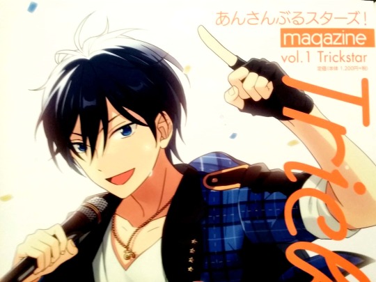
— Ensemble Stars! magazine covers are by Happy Elements.
Every volume, a unit’s leader decorates the cover of the Ensemble Stars! magazine. In fact, not only illustrations of these idols, Happy Elements also gave full cooperation on the cover designs. Pay closer attention to the unit logos that have a different feel from the usual.
31 notes
·
View notes
Text
Enstars Magazine vol.2: Interview with Development Staff - Unit Concept
From Enstars Magazine vol.2 Knights, released in September 2016.
This segment writes comments from the staff on their image of each unit in Yumenosaki Academy. Includes 10 units, and Switch got a longer part because they just got recently introduced at that time.
Staff interviewed:
M.T: Chief Planner and Contents Director. Person in-charge of overall supervision for elements such as contents direction, world setting, scenario, outfit designs among others.
M.H: Art Director. On top of being the art director for illustrations, they are also in charge of the Live2D.
K.M: Lead Illustrator. In charge of character designing, copyright illustrations, and line art for 4* and 5* illustrations, among other duties.

Note: I had to take pictures quickly before I flew out and didn’t take proper ones for the post, so I will add more pictures when I get back.
1. Switch
Staff comment: We want to give you moments that become “switches” that bring forth all sorts of changes.
From M.T.:
For Switch, I look at the unit’s theme color, the number of members, and the image color of each member. I chose the color that won’t clash with any of the other units, green, and at first I thought of motifs such as plants and fairies. On the other hand, because there are three of them and they have traffic light colors, in the end I included their individual color into their unit outfits and made them into their hair color. Also, because we were also planning to include one of the Five Oddballs, we had their key motif to be something more fantastical than Wataru’s “magic tricks”, hence “magic”, and that’s how the unit’s themes expanded even further.
In the creation process, we had challenges and there were points we were fixated with. To a certain degree, I already had a fixed image when I passed the character description onto the person in charge of the character’s visual roughs. But we spent a lot of time in designing the unit outfit, adapting the word “sporty” into “idol outfits”. Valkyrie had a dark orientation throughout and their chuunibyou elements were easy to design, but we felt that it was hard to realize the opposite into shape, which is presenting something in a fresh and new way. For unit outfits, they have balanced elements to them, so for future event outfits we hope the different themes and motifs will demonstrate their charms from a different angle.
As for their personalities, like giving muscles to the skeleton, further depth was given to the character description by Akira-san. So for the details on their interaction and what they think of the other characters, we’d like the players to read the stories and see for themselves. Switch may give off a fresh feel as a newly formed unit like Trickstar and units with first-years focus, but I hope it becomes a unit that, more than anyone else, produces chemical reaction with all sorts of units. We want to give you moments that become “switches” that bring forth all sorts of changes. Maybe it’s amongst Switch themselves, maybe it’s from another unit towards Switch, maybe it’s from Switch to other units.
From K.M:
I’d like to talk about things to note about in their visuals. To start off, Tsumugi. It would be his frizzy hair, and his sweater that has overly long sleeves*. We didn’t want his hair to make him look too gloomy, so we had his posture look sharp and his accessories neat. He wears glasses and has fringe, so his double eyelids tend to stay hidden. But we made the depression in his eye socket more pronounced so that his expressions are easier to interpret and his gentle atmosphere can be brought out. Only Sakuma brothers, Shinobu, Mika, and Natsume don’t have this depression, while everyone else’s shapes differ slightly from one to another.
*It’s something moe, also called moesode (lit. moe sleeves).
Next is Natsume. We have a lot of characters with slanted eyes, so I made sure to make a different shape. Hokuto and Souma have almond-shaped eyes that are typical of that of Japanese, but the area around Natsume’s eyes leave a showy impression closer to Wataru and Shu’s. To give him more of a magician’s vibe, the eyeline at the corner of his eye is thick and curved. His expressions were tuned to show confidence and staggering atmosphere.
Sora’s hair has an unusual clumpy feel for the game, so I made sure to fit him into the game without ruining the atmosphere. I didn’t want him to look too young, so I made sure that he doesn’t only feel fluffy but also cool. There are already a number of students who are wearing parkers, so I chose slightly thick material. The strings around the neck are also thick to bring out his individuality. His triangular eyebrows and acorn-shaped eyes are to be noted.
During character designing and creation of event CGs, we pretty much already solidified their unique traits in terms of outer appearances the moment we received the three’s character proposal. But we also paid close attention to ensure there are enough differences between them and the already existing characters, so that they blend into the series. Everyone has unique hairstyle, so we’re really careful about adjustments of things such as the thickness of the hair tufts and the way we draw the hair ends. Tsumugi has a heavy perm and dark hair colour, he wears glasses, and he has unique traits that are not what you’d call a hot guy in general. So I thought about how to make him likened by many while still keeping these individualities and adjusted the details quite a lot. As you may have guessed from his character description, Tsumugi is not your typical hottie, but he has a slightly refined touch, delicate and seems kind. That’s the image I was striving for, hence the visual’s end result. I want to hear people say, “I like this part of Tsumugi!” so I was fixated on things like the nuance of his hair, his big and sinewy hands that show anxious gestures, a posture that gives him a high-class impression, and his accessories. We made his event CG before the script was ready, so it was difficult to picture his emotions from a specific scene. His unbloomed CG is a tragic scene, but despite being in despair, he performs on top of the stage, creating something akin to a beautiful painting. I hope it can give you such impression. His pose too—so that I can create a shadow on his face, I lifted his arm. The sense of negativity is to attract your attention to his expression even more. But he’s still part of fine, so I kept in mind to keep the movement elegant and brilliant. Conversely, his bloomed CG pictures him casting a gentle magic that gives happiness to people, as if expressing Tsumugi’s original nature.
As for Natsume, finding the balance was difficult. For example, his hair is divided into fringe and the back side, and its asymmetrical sidelocks are its unique trait. I wanted to let out a mysterious feel so I made sure that he makes complacent smiles. For the event CGs, I first drew Natsume then Tsumugi, but it was difficult to come up with compositions and poses that express the feel of both idols and magicians. I watched magical girl shows for young girls and movies and I was able to grasp the image of scenes showing how “magic is cast as if they bestow dreams to others.” When the curtains are lifted, Natsume would face the audience and click his fingers and release the first magic. That’s my image for Natsume’s CG, while Tsumugi would spin* some magic with his fingertips. Even with Natsume’s 2☆ card, I wanted people to be able to tell at a glance that he’s mysterious and gives off magical feel, and I had a hard time coming up with the pose.
*”tsumugidasu” which is usually used for “spin a tale”; “weave a story”
2. Trickstar
A unit that is close by your side and genuine, a unit that’s very high school boys-like.
M.T.: I think compared to other units, the combination of the four in Trickstar is the closest to the feel of high school boys. All members are second-years, they clash with their true feelings, they make stupid jokes, their interactions are like skits between the silly man and the straight man. You don’t get to see that kind of thing from anyone else that often. Trickstar’s charm is that compared to any other unit they’re the closest to your side, and you can easily build a sense of familiarity towards them.
M.H.: In their key visual, each of them is riding on a star. During the creation process of the key visual, we the staff discussed among ourselves what kind of unit Trickstar is. I think Trickstar is a unit that would burst out into the open and is lively. They would ride on the stars and would probably say, “It may be an unstable [ride] but we’re going to challenge ourselves on various things.” I made their visual packed with vigor that is characteristic of them.
3. Fine
Their theme is rulers who have the position to command others.
M.T.: It’s a unit that rules from the top of Yumenosaki Academy, so I think they have a ruler-like personality and confidence. Hence, they may seem to stand on formalities, or rather, there is a certain distance between the members. Compared to Trickstar, the members may not have a single common thought.
Fine’s outfit has the motif of a ruler’s, at any rate, Eichi, the leader’s image is strongly brought out. We also added an element of music, and they also have a theme of rulers who are in the position to command others. Also, we use angel’s wings as a motif in their unit logo. The way they put pressure on other students from above is perhaps like them taking the role of angels who relay messages from God, in a sense. Their unit colors are white and gold, and an angel’s wings are also pure white, aren’t they? It’s also a color of nobility, brilliance, and purity, so I chose it as their theme color.
4. UNDEAD
Their charm is the gap between their on-stage selves and their usual selves.
M.T.: UNDEAD’s image colors are black and purple, and their charm point is their wild feel like that of a beast. They’re a unit where we can show off sexiness the most. They’re wild, but rather than lunging at other units, it’s more like the way they appeal themselves as idols is thorny. So the members are actually tender-hearted, to put it in another way, there’s a rather huge gap between their on-stage selves and their usual selves. The way they behave towards their classmates and their juniors or seniors is distinguished properly.
Regarding their outfits, we thought something rock and black would be nice after all, so we chose leather jackets. Fundamentally for leather jackets, long sleeves predominate, and when I designed it in an orthodox way, it felt like they were wearing so much (laugh). It was also because the game’s development period was not in summer, so even if they’re a sexy unit their skin exposure is on the lower side. If we had made it half-sleeved, maybe it would have been something like PirateFes.
5. Knights
The appearance of the absent leader, Leo, was undecided.
M.T.: With the models as the top batters, everyone in Knights have a pretty appearance and gives out the air that they would protect someone, just like a knight. We use chess as their motif, so “pieces” are reflected in their relationships and the way they act, in some way.
The fact that the leader was absent was part of the setting ever since we were at the stage of unit creation, but whether the leader would make an appearance or not was not clearly decided. It was like, if an opportunity arises as the game moved along [then we’d introduce the leader].
When Leo was introduced as a new character, I wondered about what kind of position would an idol get the most attention. In the end, I thought it would be the moment the absent leader comes back. Originally, Akira-san’s suggestion also became the trigger of how he was created, “It would be interesting if there’s this kind of character.” He’s a character that lets you feel the connection in the Ensemble series.
6. Ryuseitai
M.T.: As a sentai group, each member of Ryuseitai is doing whatever they want, so compared to the usual sentai group they have a bond that is somewhat different and I think that’s interesting. There are no second-years, only first- and third-years. So there is somewhat distance in their relationships, which is also unique to them.
Every position has their own color, so I don’t have too much trouble figuring out their event outfits, however transformation suits like in Supernova was tough. I asked myself if this design would let them move as I created it.
M.H.: For Ryuseitai’s key visual, I wanted to make it so that their unique traits can be spotted with just one picture. We were told that their part in the main story was like a comic band, so I wanted to bring out not only hero-like feel, but also a little bit of them joking around. In the first proposal of the robot, Midori was the son of the grocery store so we were going to make the cabbage transform, but in the end we decided on eggplant and thus it became what we have now (laugh). To tell the truth, we were also thinking of another form where the robot is separated into pieces.*
*I’m actually not sure about the reference to this whole part, please let me know if I made a mistake.
7. Ra*bits
Nazuna is the one who pulled the other three along, who doesn’t know left and right yet.
M.T.: Ra*bits is also a unit composed of first- and third-years, just like Ryuseitai, but they have a different kind of relationship. The only third-year, Nazuna, demonstrates proper leadership, but he also has cuteness that blends in with the first years. A point to be noted is that everyone is “cute”. There are no less than three first-years who are starting out to become idols, and they don’t have a vision of what it’s like to be an idol just yet, so something to highlight is their development within the stories. Each of them would sell themselves in an adorable way while bringing out their own individuality—as a boy, they may be against it, but I hope we’ll be able to illustrate that kind of conflict. Their first-year peer, Tori, would use his cuteness on purpose (laugh), but those three are not so self-aware—it’s more natural.
I designed their outfit by making a sailor’s uniform become idol-like. The only ones who get to wear knee-length pants are Ra*bits (laugh).
8. 2wink
They shoulder a dilemma only twin brothers would have.
M.T.: 2wink are twins so the bond between them is strong, but what they think and what they aim for is different… They disagree and are unable to fit into each other, and they shoulder a dilemma only brothers would have. From the start they're already experienced in street performance, so they’re not shy in front of people, and they understand how to show themselves off. I think a little bit of that mastery is their unit’s charm. They would guide other units and give them advice. They are dependable first-years.
M.H.: Among all Yumenosaki Academy units, I think 2wink is the sportiest. The hue on their outfits somehow gives of a feel of pointedness, which becomes their theme*. They are a duo, so they present a challenge different from other units. How far should they match and where should we make them different is a point of consideration that always puts us at a loss every time. But that being said, if you just look at their expressions, I think we are able to make it so that you’re able to tell which one is Hinata and which one is Yuta.
*I’m also unsure about the nuance for this, sorry. I think it’s the way they’re being sarcastic, but not so spiteful inside. Most of the time. The original word used for “pointedness” is 毒っけ.
9. Akatsuki
They have masculine toughness and grace, but the three’s distance are that of a family’s.
M.T.: Akatsuki is the only unit with traditional Japanese elements, so their unique traits are the least blurry. Their theme color is red, and while they are substantial and solid as the academy’s number two, there’s also passion hidden within each member. They have that kind of image. During the initial stages, they were powerful people with masculine toughness and grace, but after Akira-san had a hand in them, their role became very clear. The distance between them are close, and I think you can see their strong bond like that of a family.
As for the outfits, it’s a combination of kimono, pants, and boots, which makes a good seasoning comprising traditional Japanese elements and idols.
Also, in their key visual, that becomes their first illustration, they used fans and traditional umbrellas instead of mics which bring out their showiness. This can only be done by Akatsuki. As for Souma, it’s very like him to bring around his sword during his idol activities as well.
10. Valkyrie
The unit’s motifs are “dolls” and “strings”.
M.T.: I think there’s still a lot of mysteries to unveil about Valkyrie’s relationship with other units. We will create more as we discuss with Akira-san, so please look forward to it.
Valkyrie’s motifs were already decided since the beginning: dolls and strings. “Pulling the strings” also connects to the relationship between the members. The antique motif is not really used in regards to other units, but the colors red and black are used a lot, so when I was thinking how I can bring out a different mood, I thought steampunk would make a good compatibility, so we decided to go in that direction. It’s a unit that was created later, so I included motifs that carry a meaning from the get go.
As for their outfits, Shu is the handicraft club’s captain so we chose laces and so on. So elaborate ornaments predominate.
#ensemble stars#enstarsmagz#worldnavi#switch#trickstar#fine#undead#knights#ryuseitai#ra*bits#2wink#akatsuki#valkyrie#staff
135 notes
·
View notes
Text
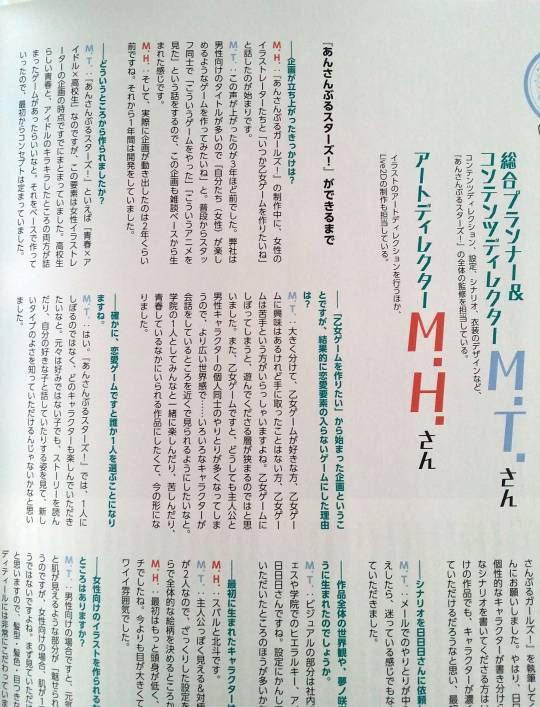
Enstars Magazine vol.1: Interview with Development Staff - The Birth of Enstars
Released in August 2016. (!!! It’s way too outdated, I’m sorry...)
You may also find similar questions discussed in this interview elsewhere, so it may feel repetitive. But I’m not very good at summarising, and you may find other interesting info and perspectives in this as well. It’s one year old though, but I will still continue with the World Navi part of the mook series as much as I can.
Click here for interview with Akira-sensei from the same magazine. And here for translations of the mook series I found on Twitter.
This is an interview with: M.T, Chief Planner and Contents Director. Person in-charge of overall supervision for elements such as contents direction, world setting, scenario, outfit designs among others, and M.H, Art Director for illustrations and person in-charge of Live2D creation.
Until Ensemble Stars! was made
Q: What prompted the development project?
M.H.: It started during the development of Ensemble Girls!, where I was talking with the company’s female illustrators about how we wanted to make an otome game one day.
M.T.: That was three years ago. Our company has a lot of male-oriented titles, so there were people saying, “We want to make a game that we (females) can enjoy.” The staff normally talk to each other about what games they play and what kinds of anime they watch, so this topic came up from one of those idle talks.
M.H.: And the project made real progress starting around two years ago. The development process took a year.
Q: Where did you start from?
M.T.: When one hears “Ensemble Stars!”, the words they may come up with are “youth, idols, and high school students”. That component was already settled in the project plan presented by the female illustrators. We wanted to see a game that has both youthful life typical of that of high school students and the sparkles of idols. That became the basis of the game, so from the beginning we’ve had the concept solidified already.
Q: So it’s a project that stemmed from a wish to make an otome game, but in the end there are no romance elements in the game. Why is that?
M.T.: Dividing in general, there are those who like otome games, those who are interested in otome games but never played one, and those who are not very good at otome games*. If we restricted it to an otome game, the player demographic would also narrow. And if it’s an otome game, it’s inevitable to have a lot of interactions between the protagonist and the male characters. So to create a bigger perspective… we wanted to make it so that we can observe various characters having their conversations from a close distance. We wanted to make a game where you can play as an individual in the academy and have fun and agonize with everyone together, and experience youth. That’s how the game came to be like this.
(*) I’m not sure about my choice. The Japanese uses 苦手, and depending on context it can also mean “not fond of” or “can’t handle”.
Q: Certainly, if it’s a romancing game the player would have to choose someone.
M.T.: Yes. In Ensemble Stars!, the player is not restricted to someone. We want the players to have a good time with any character. Even with boys who are not originally their type – when the player reads the story and sees them talk with their favorite boy, maybe they can discover a new, positive aspect regarding those types.
Q: Please tell us how you ended up deciding to have this game become part of the Ensemble series.
M.T.: We received good reviews from Ensemble Girls! players regarding the game’s illustrations, so maybe if we make those characters into boys they will look attractive? That kind of topic came up within the company. We also wanted to make a game that has both outstanding illustration and story, so we asked Akira-san who is writing for Ensemble Girls!. We thought there is no other person who can write every character who is full of unique traits so distinctively, and moreover, write unique script. We believed that even with a female-oriented project, Akira-san would be able to make an interesting story that stars characters with strong individuality. That is why we asked Akira-san first.
Q: When you asked Akira-san to write the script, what reaction did you get?
M.T.: Our main means of communication was through emails. We informed Akira-san of the project plan, and as a reply we received a non-hesitant consent, “I’ll do it.”
Q: How did the game’s overall world setting came to? This includes Yumenosaki Academy, among others.
M.T.: The visuals are produced in-house. Dreamfes and the academy’s hierarchy and all the implementation around idols are by Akira-san. Setting-wise, I think Akira-san contributed more.
Q: Which character was born first?
M.H.: Subaru and Hokuto.
M.T.: We had one of them look like a protagonist and the other look like from the other extreme. After deciding the profile’s roughs, we started from deciding the overall art style.
M.H.: At first, the head count was lower and they had a touch of shonen manga elements. Their eyes were bigger, and if I have to choose I’d say they had a cute feel to them.
Q: What would be the thing you pay attention to the most when creating illustrations catered towards a female audience?
M.T.: In the case of male-oriented projects, the points I get to “show off” would be the energetic feel, cuteness, and a flash of exposed skin. But for female audience, if you ask me whether the skin is the most important element, I’d say it’s not. I think the first thing that will be seen is the face, so the details in hairstyle, hair color, and gaze would be what I’m most particular about.
Q: There are over 30 characters in the game. Wasn’t it hard to come up with so many?
M.T.: When Ensemble Girls! was released, I got to experience making 60 characters, so I didn’t think it was as difficult as that. If I think about giving various traits and quirks to all characters without exception, 30 surprisingly could be done in an instant. I first came up with the character’s profile and then the visual, but us the staff exchanged opinions as we created them.
Q: Are there any characters who were born easily, and others not so?
M.T.: Creating the characters wasn’t such a difficult task, but deciding the art style was tough. Take the characters we mentioned before, Subaru and Hokuto, as examples. Their head counts and facial features are in the middle of the spectrum, and we made Rei look the most mature amongst the students. His eyes are smaller. Rei would be the character with maximum maturity, but it was difficult to decide the limit, since it can change the balance significantly at later stages. We went through quite a bit of trial and error, and the illustrators told me they also found Rei’s wavy hair to be difficult to deal with.
Q: So the character with childish looks at the maximum would be Tori?
M.T.: I suppose, yes. He’s like a little devil, has that pink hair and adorable looks. The lead illustrator who first drew the character is also someone who originally draws male-oriented illustrations, so Tori was their specialty, relatively speaking.
Q: At what point did Akira-san start contributing to the setting and characters?
M.T.: It was after we had the visuals for the 30 characters and their profiles ready. From that point on, we asked Akira-san to come up with what kind of story.
M.H.: Tsukasa and Midori weren’t around yet.
M.T.: At that time there were 30 people including the teachers, but if we’re going to label it as “There are 30 idols” it wouldn’t be right to count the teachers, we thought. That’s when we added Tsukasa and Midori.
Q: Were you surprised by any character after you read Akira-san’s script?
M.T.: We had Akira-san write the main story and character’s individual sub story concurrently. So the first time we got to know what kind of characters they were was by reading the sub stories, but…
M.H.: We can’t not mention Arashi, can we? (laugh)
M.T.: Indeed (laugh). Within the company we knew Arashi by “the good-looking model”, but Akira-san made Arashi look like an onee character*, so it took a 180 degree turn.
(*) Before, I think I translated this as “big sister character” without clarifying the connotations: often associated with gay men or queer who use feminine speech, have feminine gestures etc. The word itself stems from “big sister”.
M.H.: Also, Chiaki was more passionate than I expected.
M.T.: He was just a “refreshing and enthusiastic upperclassman”, but in Akira-san’s words he became a character who would be like, “flare up that passion even more!” and towards any character, he would close up the distance.
Q: So that’s how the character gap in each character was born.
M.H.: No one could have done it except Akira-san.
M.T.: We received feedback from the players that the characters were quite different from what they imagined pre-release.
M.H.: That’s true. There’s a lot of that kind of comments.
M.T.: Those who like female-oriented content tend to predict personalities according to appearance. It’s an idea that someone comes up with because he’s a guy, and I’m glad we asked Akira-san after all.
The game’s charming points and behind-the-scenes of the game-making processes
Q: Among the many game apps that are female-oriented, what do you think is the charming point of Ensemble Stars!?
M.T.: First thing would be the uniqueness of the characters. We were particular about their appearance. We made it so that its character design can be easily accepted not only by female audience but also by male audience. That’s why I hope it’s received well by a wide range of demographics. Then, Akira-san looked at each of the character’s visual and gave a unique personality to each and every one of them. I think there’s not a lot of titles that can let you taste both of these elements at the same time. Other than that, it’s the Live2D. Especially during the development stages, the Live2D element was not there and it wasn’t the main feature. Even up to this moment, I don’t think there’s a lot of games that have movements of the body and hands as big as Ensemble Stars!.
Q: There’s a lot of male players too, isn’t there?
M.T.: We don’t get their feedback directly, but our connections and colleagues from other companies told us, “He’s a guy but he’s really into it.” My impression is that Ra*bits is quite popular. It seems that cute characters would look cute from a guy’s perspective as well, which makes me happy.
M.H.: Actually, manly characters like Adonis and Kuro are popular among those around me. It seems like they like either the cute type or the manly type.
Q: Each month, there are two new time-limited events and two new scouting events. Could you tell us regarding the making process?
M.T.: At first we decide which characters are going to appear, and what kind of timing this event is going to be held in. Of course, we also consider the frequency of the characters’ appearance, but the relationships between the characters are also important, so we discuss which combination would be best as we choose them. In another case, when we want to tell a particular story, we choose the members based on the content of the story. After that, we establish themes to match the period or the seasons. Then we ask Akira-san or Yuki Yoshino-san to write the script, work out the details of the outfit designs… that kind of work flow.
Q: Sometimes unexpected characters appear.
M.T.: Fundamentally, we often have the whole unit appear. But leaving to that factor alone can lead to bias, and they’re students after all so we also want to show their relationships among classmates and clubmates. I think it’s nice to see a glimpse of how a senior or a junior interact with each other, that kind of vertical relationships. So you will see that kind of combination sometimes.
Q: What about the process of making the illustrations?
M.H.: After the theme is set, we will have the illustrator in-charge to make the outfits based on the document material. After that, we create the event CGs.
Q: There are also new stages and music in the time-limited events.
M.T.: Yes. At the time of release, the BGM was of quite low priority, but we thought we had to bring out the mood according to the season. The players will play the Produce courses for a long time after all, so we thought it would be good to have some variation. That’s how we added the feature somewhere along the way.* We place an order for the BGM creation after the event concept is decided.
(*) If I remember correctly, it started in Duel. So the first three events didn’t have their own event BGM.
Q: How far ahead are you in terms of event planning?
M.T.: Around two to three months.
Q: For apps, you can see the players’ responses in real time. Isn’t it tough to create new events despite that?
M.T.: In general I have a lot of things I’m particular about, so because of that I think I’m giving myself a hard time. A piece of outfit gives me trouble each time – how should I present it? What is the most fitting composition that gives the best view of a character? To also increase the player’s affinity to the stories and event CGs, the staff exchange opinions with each other as we create them.
M.H.: That’s right. We really value the characters’ expressions on the event CGs. We create them while reconciling our ideas with the illustrators, and with scenes that are easy to understand we all have the same image. But there are times where, with scenes that have complex nuances, it’s hard for us to reach an agreement. We think together about the scenario before and after the CGs while drawing their expressions, for example, “This is what this boy is thinking, but just now someone told him that. This makes me sad.”
Q: How many people are involved in the making of Ensemble Stars! right now?
M.T.: Right now it’s just under 30 people.
M.H.: There are 13 illustrators, by the way.
M.T.: For the illustrations, it’s like everyone is involved. Not just the card illustrations, we also make the Live2D and SD versions of the outfits, so often everything proceeds concurrently. We divide up tasks to one extent, but it’s difficult to divide everything, so various people are involved.
Q: A lot of projects outsource illustrators, but at Happy Elements the art is drawn in-house.
M.T.: Yes. We outsource part of the background illustrations, but the characters are all drawn in-house. We want to have a uniformed way to view things and create impression. For example, to decide on the balance of locks of hair, we decide which part should be drawn thicker or shorter. We share our opinions about every detail, and we draw as we grasp the points we agreed on.
The game’s world setting and idols
Q: Regarding Yumenosaki Academy, did you model it off a location? Or do you have an image of a location?
M.T.: We don’t have a pinpoint location to be able to say something like, “It’s this place in Japan.” As for the image of a location, it’s somewhere with a shopping district, the sea and a mountain, and a school. A place like that in Kansai region, where our company is, would be somewhere like Kobe. But during the actual design processes we don’t have anything like, “This is this place.” We also don’t have a definite setting on the climate.
Q: The four seasons in the world of Ensemble Stars! are quite pronounced.
M.H.: I suppose. It’s probably because I’m also from Hokkaido. Deciding how much snow would fall in winter was hard (laugh). We make it so that the game follows the season changes in the real world, so I hope the players can spend time with the characters in the same setting.
Q: I think each player would have their own image of the transfer student, the protagonist. What was your thinking process during the character making?
M.T.: In Produce courses, the player is able to make choices to interact with the idols. We pay attention to the differences in the use of words towards seniors, juniors, and her peers. We took her image from the story written by Akira-san. It’s rare for the transfer student to take action, so to give a comparison, I think she’s like a transparent existence. To the players, she may be whom they project themselves as, or she may be a proper standalone character. There are many ways the players can see her. As for us, we’d like to direct the players to the idols first and foremost. Which is why we headed towards this path, where we didn’t give the protagonist individuality. The transfer student is an existence that naturally supports everyone.
Q: How was each unit born? Did you decide on their music genre at that point already?
M.T.: We finalized their design aspects like appearance and outfits, but we didn’t have any precise image on what kind of melody they would sing and perform. We started to think about it during the making of the unit song CDs. For example fine has a theme of “a ruler”, so we thought of something orchestrated. Another is UNDEAD with rock songs. Well, it’s also because Koga keeps mentioning “rock” (laugh). In case of UNDEAD, every time we make the event CG we discuss whether or not we have Koga carry a guitar, and we also give quite a lot of attention to the composition to make it look “rock”.
Q: I think the leaders of the units in Yumenosaki Academy hold a special position. What is your opinion on this?
M.T.: Let’s see. For idols in the real world, someone may be assigned as a leader but they would still hold the same position as other members. When something happens, the leader would put things in order, and they are often the ones who’ll take the initiative to do the talking, but that’s about it. In Yumenosaki Academy, the leaders find jobs, cooperate with other units, and they become the point of contact for any event. So in that sense, the leaders are well-known. They’re still students, so I think that’s why they would take the initiatives themselves to take action.
Q: Also, often the unit leaders are the club captains as well.
M.T.: They catch attention as idols, and they’re also popular, so I thought they’d be appointed as club captains without any problem. One thing though, the tea club is something made by Eichi, so while he’s the club captain, he’s also like the chairman. Either way, he’s a big shot (laugh).
Q: Will the idols make a debut after they graduate?
M.T.: No, actually they’ve debuted already, so their idol activities have become part of their job. It’s just that they’re still students, so I suppose they’re active as both students and idols. After they graduate… we don’t have anything in particular set yet, but boys who want to prioritize their studies may attend college while still being idols, or they may dive into the entertainment world as idols right away. There may also be some units where the current third-years graduate and the unit may dissolve temporarily, then they gather again. Trickstar members are all in the same year, so a possible scenario for them is to work with the same members. There may also be others who will choose a path other than being an idol because something happens before they graduate. The leader of each unit seems to be the one who suggests the direction in which the unit will head to, but whether the other members would just nod to that depends on each of them. The Repayment Festival is the finale of the year, so I think you will be able to see what happens then.
Taking a look back and future prospects
Q: It has been more than a year since the game’s release. How do you feel right now?
M.T.: Before release, I couldn’t imagine how it will be received, at all. Fortunately, it’s been played by a lot of people and has been garnering attention from all sorts of directions, so I am extremely grateful. From then, we have had opportunities for mixed media adaptations, and since the project can develop and move forward further, we intend to make things more exciting.
M.H.: The players really value each and every character, and Ensemble Stars! gets its support from there. I feel nothing but gratitude. We’d like to do our best so that we can answer everyone’s expectations from now on too. Regarding illustrations and each of its expressions and gestures, we hope we can show it to you and have all of us together feel what those characters are thinking at that particular time and all those things.
M.T.: That’s right. There will be new unit song CDs coming out this year too, so I hope you can look forward to its release from now on as well. The game itself too – I think there will be chances where you’ll be able to see scenes that show a new side to a character, or interactions that are different from usual, or how a character actually feels at a particular scene. I hope you’ll look forward to it. Thank you.
79 notes
·
View notes
Text
Compilation: Enstars Magazines (Dengeki Mook)
There are bits and pieces of translations floating on Twitter so I’m just compiling them! Intending to update as I find them. (Would be nice if you could let me know of other translations so I can add them here!)
(All units) Nail art
Vol.4 Ra*bits
Misc: 1 | 2 Relationship diagram Unit’s biggest charm Impression from other characters Magazine review (Billy @ Wordpress)
Vol.5 Ryuseitai
Unit’s biggest charm Chiaki’s interview Kanata’s interview Midori’s interview Shinobu’s interview Tetora’s interview
Vol.6 Akatsuki
Impression from other characters (Leo, Tsukasa, Yuzuru, Shu, Adonis)
Vol.7 UNDEAD
Relationship diagram Adonis’ interview (incomplete)
Vol.8 Valkyrie
Unit’s biggest charm (Mika, Shu) Mika’s interview (incomplete) Impression from other characters (Nazuna, Izumi, Arashi, Natsume, Kaoru, Eichi) Valkyrie interview: Endless Summer (also published in MY☆STAR vol.6)
Vol.9 Switch
Natsume’s interview Tsumugi’s interview Sora’s interview Impression from other characters (Kanata, Wataru, Rei, Mika, Tomoya, Mitsuru, Hokuto, Subaru)
54 notes
·
View notes
Text
Enstars Magazine vol.6: Interviews with Unit Song CD Creators
The World Navi section of vol.6 of Akatsuki cover, released in late January 2017.
Summary of interviews regarding the unit song CD second season featuring the music director, Satoru Kuwabara (Arte Refact), and jacket cover illustrators, K.M. and Y.Y. from Happy Elements.
K.M: lead illustrator, in charge of character design, promotional art, and initial 4* and 5* card illustrations among others.
Y.Y: Art director, illustrator of the initial 4* and 5* cards among others.
There should be part two with their comments on each CD.
Interview 1: Satoru Kuwabara
1. It was a new challenge for Kuwabara since he had to negotiate with musicians from other labels such as Wagakki Band (avex), ALI PROJECT and Maeyamada (a.k.a Hyadain). He’s the one who relayed on HappyEle’s wishes of how they wanted the songs to be to other musicians.
2. For the first series they asked an engineer who plays an active role in anisong industry, but in the second series the mixing was done by Neeraj Khajanchi who normally mixes for Daichi Miura, other J-POP artists and jazz music.
Interview 2: K.M. and Y.Y.
1. The first series had similar compositions because they had to consider the bonus 4* cards. Each unit’s personality is more brought out in the second series, emphasized through backgrounds and scenarios.
2. The second series jacket illustrations are based on the songs. Otherwise the atmosphere would not be that different from the previous artworks/CD series.
3. Jacket illustrations in the second series are on the same direction as illustrating cards of higher rarities, and K.M. said they made sure to make them look as cool as possible.
4. Deciding on compositions were difficult especially for units with 4-5 characters, and since the characters are wearing original outfits, they wanted to show their full bodies as much as possible, which added onto the difficulty.
5. Overall they consulted with Enstars’ contents director to progress. Before the illustrators (and the musicians) propose the roughs, the contents director gave the direction and image.
6. Two CDs were released at a time and the work was actually split between the two illustrators, so one jacket illustration was done by K.M. and the other by Y.Y. each time.
7. Some behind the scenes:
- K.M. proposed up to 4 roughs for Knights CD cover. The first one, which they liked, had a composition as follows. “Leo was seated on a chair, holding a flower bouquet and the other four stood still around him wearing their own languid expressions. In the background, white, blank photo frames were hanging on the wall, a lot of them. … The white, blank photo frames represent memories of the past. But since the four became very off-putting and lacked movement [t/n: dynamism?], it was scrapped.”
- K.M. on Valkyrie: “Before it got finalized into something with a balanced composition, I used unusual angles like that of a 4* or 5* card. Shu would hold Mika’s head, creating a mood as if he was operating a puppet. It was scrapped because their distance were a bit too close (laugh).”
27 notes
·
View notes
Text
Enstars Magazine vol.1: Interview with Akira-sensei
Released in August 2016.
Right now I’m planning to translate only World Navi section which is all the interviews with the production/development/voice actors. I made a Google form survey that you can fill out if you want to see other parts getting translated! (But I’ll still prioritize World Navi and B’s-Log... I just feel bad having the magz lying around without actually getting anything about the featured unit translated.) I’m planning to end the survey around Christmas and see if there is any interest.

General note: I’m not completely familiar with the industry and in this post I’m referring to Enstars being “josei-oriented” (女性向け). Before, I translated this to “female-oriented” and the likes, and I think that’s still more accurate than “older female-oriented” (which can be more closely associated with josei manga). I still agree more with a more general age range and I could’ve kept “female-oriented” but I'm unsure of myself so I decided to leave the josei term as it is.
Q: Continuing from Ensemble Girls!, you were appointed to work on Ensemble Stars! as well. Could you tell us the story behind that?
Akira: To tell you the truth, in the beginning I thought they were joking when they told me, “We are thinking of making a josei-oriented version of Ensemble Girls!!” Only when they started sharing the character design and the like I understood that they were being more serious than I’d expected. It felt like I made my resolve so late into the game. As long as the title has the word “Ensemble” in it I’d like to work on it, and fortunately the company seemed to agree, so they asked me, “Akira-san, can you write something that is josei-oriented?”… I was aware that my experience with josei was superficial and that I didn’t have enough skill for it, but I insisted: “I can! I will!” and tried to make both ends meet like my life depended on it. I didn’t want my child, the Ensemble series, to be taken away by other people, so I was desperate.
Q: How did you and Happy Elements communicate with each other to create the story?
Akira: The company is physically far away from where I live (the company is based in Kyoto, while Akira lives in Tokyo), so we weren’t able to meet face-to-face before the game’s release. In the end the flow was something like this. They asked me to write the plot and script and I would pass it on to the company. Depending on how the people in company react they may decide to make adjustment. It’s like giving a naval gunfire support.
Q: In creating the story in Ensemble Stars, were you influenced by other works?
Akira: None specifically, but since I was completely lacking in experience and had no ideas in storage, I asked all the women I met for their recommendation and favorite works. I made a list and purchased everything I could get my hands on and looked through them. Josei is a genre that has unlimited possibilities and I got to cultivate my knowledge starting with practically none of it, so conversely I got to have fun “studying” it, which is a refreshing experience. Now, too, I still read works from the genre, without any bias... In conjunction to my lack of interest back then, I could accept anything from all directions, absorbing anything without exception.
Q: The main story, while josei-oriented, has many motifs of shounen manga like school, youth, and passion. What kind of concept did you have in your mind when you created the story?
Akira: At first, I received the direction that they didn’t want it to be a josei-oriented romancing game that you commonly see. The only genre that can just barely pass as josei-oriented, a genre in which I can work with and have ideas in storage was shounen manga. Shounen manga is something that is originally created for boys, so it became the blood and veins of a man like me. From there, I would gradually add elements of josei that I had absorbed and polish it into something that can just barely pass as something that can be sold on a store’s shelf.
Q: It has been one year since the game’s release. Is the current flow of story something you have planned since the beginning? It’s an app game, so the story would continue, but how far is your current vision of the story?
Akira: The company’s project planners are the ones who come up with the outline (such as themes and who gets a card) of the events and such, not me. So every time, I would accept an order and think of the content in a big rush. Although recently, we would communicate and have direct meetings on a staff-exclusive website. We would hold long meetings and have thorough discussion about the story.
Q: The titles of the five parts in the Main Story are in English. The title of each chapter consists of two kanji that represent a particular chapter. Is there a reason why you used these patterns?
Akira: I never have the intention to make the titles sound romantic. There’s no other reason than it being my job, for convenience, and to sort and differentiate between parts of the overall plot.
Q: Could you tell us if there are any characters whom you had trouble in bringing out their characterization and vice versa, who is now different from the start, and who is in your mind?
Akira: I always have trouble with new characters. It’s because the character setting suggested by the company tend to overlap completely with existing characters (for example, the character setting for Leo-san at first was Izumi-san as it is). Probably it’s just that it took me a lot of work to make them distinctive. I like ninja so I wrote about it a lot, and that’s why I could settle on Shinobu-kun’s characterization without trouble. The character who is different from the start is Tsukasa-kun. Before Leo-san appeared, his position was undecided and so I couldn’t demonstrate his charm. But thanks to Ou-sama, his character became more polished. Subaru-kun is in my mind, and I’d like to carefully consider him from square one.
Q: So far, which event story had been a handful to you, and are there any scenes [in general] that you like or made deep impression inside you?
Akira: In Repayment Festival, the level in which I’m allowed to dig in to the graduation and romance side of the story is already fixed, so I think it bears a lot of significance. The DreamFes concept is pretty much the same with the one in Chocolat Fes, but having different writers can make such difference in the mood. You can see the distinction between Akira and Yuki-san’s characteristics, and it’s easy to distinguish them. I think it can be a point of reference or a test case in the future.
48 notes
·
View notes