#dukemon amplified
Explore tagged Tumblr posts
Text
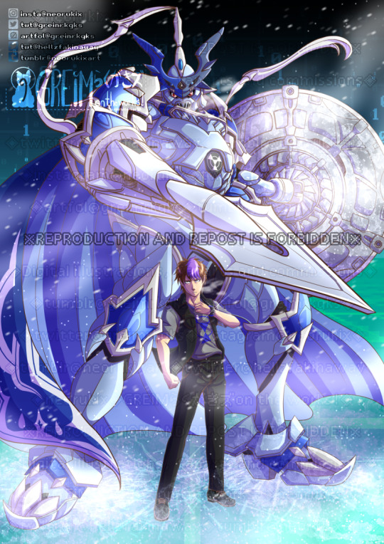
Commission for @emperornaka; featuring their OCs, Sigurd the ChaosDukemon (Core) and Rivan uwu
This ChaosDukemon was inspired by the figure of Dukemon Amplified.
#digimon#chaosdukemon#chaosdukemon core#chaosgallantmon#chaosgallantmon core#dukemon amplified#original character#(not my character)#digimon story sunburst#Digimon Story: Sunburst
34 notes
·
View notes
Photo


Figure-rise Standard Dukemon/Gallantmon (Amplified)
My favorite season finally gets some love in Amplified! Years ago, I talked about my disappointment that the original Reboot line never got the Dukemon they showed off at Trade Fairs, and it’s cool to see one finally come out. It’s also neat to look at them side-by-side, as you can clearly see the difference in aesthetics they were going for between releases. The names say it pretty clearly; the unreleased kit is a rebooted version with a more mech-like appearance (just look at those robot knees!), and the kit we’re talking about today is an amplified version of the Dukemon design. It’s really cool to see how both tried to tackle this in different ways. Now we just need Shoutmon X4 (because I’m obligated to bring it up in every Digimon review at this point).

The Good: Dukemon builds upon and improves what Mugendramon gave us before, featuring many more ratcheted joints, but doesn’t rely on the polycaps Mugendramon did. This not only helps it maintain poses, but also deal with its heavy accessories.
He also has some cool and non-intrusive gimmicks. His lance is able to expand into a larger form, and his shield has a very fun built-in effect part that’s triggered with the flip of a switch. It’s also very fun to build it and see how it works, being my favorite part of putting this guy together.
Last thing I want to mention is the cape, which I wasn’t sure what to make of before getting it in hand. It seems to be a very thick, non-adhesive sticker; comes off a sheet like one and everything. It does what it set out to do very well, and isn’t flimsy or intrusive to the rest of the posability. I would still take care of it, but it’s unlikely to damage or tear from standard play.

The Bad: While Dukemon has good posability overall, his feet lack some of the ankle movement required for a lot of wide-legged poses. He also has some balance issues due to having so many large accessories. His big feet do help a bit with both these issues, but that display arm is very necessary to get him into any even slightly dynamic pose (unless you use his included hands). He’s a Digimon who appreciates a display stand.
The Details: Like the other Amplified kits, I did metallic red panel lining where applicable, except on the red parts which I did in gold. Top down, I:
Painted the gold and black on his mask
Painted the eyes in and added black fill to the back of the head and collar
Did the gold trim and red piping along his chest
Painted the hazard emblem on his chest red with a gold center
Painted beneath all the translucent red elements with silver as well as his belt buckles
Added red and gold to his hips, as well as some black fill in the back
Added red to the tops of his legs, under the gold trim
Did the hazard emblems in his knees red with black underneath to make them pop
Painted the area beneath and inside his knees black
Added extra red to the feet
Painted the hazard emblems on the backs of his hands black with a red center
Painted many of the shield’s grooves black and added red and gold on the underside; also added solid red to the translucent red effects
And painted the external latch parts of the cape red and some of the internal elements and back thrusters black
Overall, I’m very happy with this kit. While I think I had more fun assembling Mugendramon (apart from the shield), I like Dukemon as a final product more, and am very happy to finally have a model kit of him after all these years. While seemingly a new mold, Omegamon X seems to use the same skeleton, so at least we know it’ll be a good kit (with probably less balance issues).

#Digimon#Gallantmon#Dukemon#Digimon Tamers#Digimon Reboot#Digimon Amplified#Gunpla#Model Kit#Figure-rise Standard#Amplified
72 notes
·
View notes
Text

This is expected for the Amplified line.
13 notes
·
View notes
Photo

So Bandai is coming out with a Figure Rise Standard version of Gallantmon from Digimon Tamers. I just thought that I would put it side by side with the Figure Rise Amplified version of Gallantmon that is currently available just so we could all see the differences.
I do like both of them for different reasons. I like the standard one for it being more accurate to the Digimon Tamers anime. But I also like the Amplified one for the stylization and the more sort of mecha feeling to it.
The Figure Rise Standard Gallantmon is scheduled for release January 2022 with a price of about $20. Which, I mean, the Amplified one is around $60 so, that could also help in ones decision making process.
#bandai#bandai hobby#digimon#digimon tamers#gallantmon#dukemon#figure rise standard#figure rise amplified
12 notes
·
View notes
Note
Hello, Duftmon. Of all the Royal Knights, who do you tolerate the most and why? And on a similar note, who annoys you the most and why?
Duftmon: Cordial salutations, anonymous writer.
That is a fairly elementary question for me to answer. The Royal Knight whom I tolerate the most is Omegamon. There are several reasons for this judgment. Firstly, Omegamon is a calm and pragmatic individual. He knows what must be done for the good of the Digital World and the Order as a whole. He rarely takes emotion into the equation, and in the circumstances that he does, it is supported with sound, strategic reasoning. Secondly, Omegamon and I share similar ideas for what the Order of the Royal Knights ought to be. We both believe that the Order should serve as a strong, centralizing, interventionist force in the Digital World. There are those such as Alphamon and Magnamon who believe that we should hold back and be diplomatic in many situations, however, we act with both clean, enlightened thought, and with the mandate of Yggdrasil. Omegamon understands this. However, he is a Digimon who values compromise, whereas I believe that compromising can undercut the strength of both sides of the debate. He is willing to cede his points to Alphamon and the others.
Truthfully, I would have said that RhodoKnightmon is the Royal Knight who corresponds most to my own views, but the question specifically asks for ‘toleration’. Were it not for his inconsistent work ethic and his lascivious definition of humour, he would be my preferred Royal Knight.
There are several Royal Knights whom I find irritating for various reasons. Most notably are: Sleipmon and his idealism, Dynasmon and his boorish behaviour, Dukemon and his moralizing, and UlforceVeedramon and his attempts at humour. However, the most irritating of them all is our newest ‘addition’. Gankoomon is the most frustrating and hard to deal with out of all of the Royal Knights. If you take Dynasmon’s boorishness and amplify it, you will get Gankoomon. He is emotional, reckless, ignorant and uncivilized. He has no sense of decorum or respect. Not only does he flippantly disregard the rules of the Order, but he routinely disrupts my perfectly crafted strategies through his temerarious and irresponsible actions. He is a tavern brawler, not a knight. Gankoomon flouts simple etiquette and behaves in a way not befitting of a Royal Knight. I have told him several times not to smoke indoors, track mud inside, or put his feet up on the council room table, yet he simply ignores me or brazenly laughs in my face. What an impetuous lout he is…
There is your answer. I am quite sure that it should be a satisfactory one.
Sincerely,
Duftmon
Royal Knight, and Chief Strategist of the Order
#Digimon#Royal Knights#Duftmon#Null Verse#a dragon in shining armour#adisa#Holy War#Royal Knight#ask the royal knights#Ask the RKs
21 notes
·
View notes
Photo
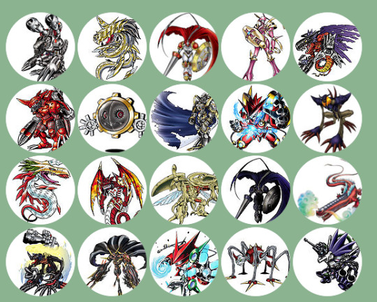
so using the digimon picker i was able to find my top 20 favourite digimon it seems. the list itself reads right to left and goes in descending order, so i’m going to list them off in ascending order and give reasons as to why they got on the list it seems. a noticable trend on this list is dark themed, red coloured or metallic digimon.
20. scorpmon
it’s no surprise i like appmon and i do like that scorpmon harkens back to digimon designs by being edgy and having guns, plus he’s purple.i like the cameramon line so far and i liked the fight he had with dogatchmon.
19. infernmon
one of my more favourite perfect level designs, i like that his mouth has a gun hidden in it and i loved how it was in our war games. honestly its got that kind of uncanny look on its face that makes it look both evil and cunning yet not hostile. its just a design i really appreciate, plus it looks cute when it tucks its limbs in,
18. dogatchmon
i like gatchmon and navimon, so combining their designs makes something i like. no brainer really. he gets alot of good fight scenes and whatnot in appmon and honestly he looks pretty sleek yet compact. not too much to say here he’s a more basic design in appmon i appreciate for not being too silly or edgy.
17. omegamon alter-b
out of all his numerous forms, this is the omegamon im most attached to, specifically because of next-0rder. i like the idea of swapping the weapons and imbuing it with darkness and letting it run wild, as well as being an alter evolution, it just looks really cool and was a great fight in the game as well. plus its just got a cool name.
16. millenniumon
i always thought its previous form as kimairamon was a clusterfuck of colours, yet had potential as a design. so dampening those colours to darker greys, blacks and a little blue accented with that yellow and blue aura with those sick mugen cannons on it help bring the design together really, plus it looks thinner and meaner than its perfect form.
15. leviamon
my favourite demon lord. i like marine life that can kill you and has teeth. plus im a very envious person, so this thing stuck with me, especially since he’s the most different looking out of the demon lords. i just like the idea of a giant crocodile being the second most powerful among the demon lords with a mouth big enough to rip a building in half if he wanted to. plus having two tails is cute.
14. chaosdukemon
honestly the uses of dull purples, blues and a shade of grey thats not quite black and not steel coloured either makes a very subtly impressive design, one that would convey dread over terror. im particularly fond of how its shield looks to be honest.
13. herakleskabuterimon
the only one who doesnt quite fit the theme of this list too well. huh. either way i think the tentomon line is a decent one only upstaged by a few others in adventure as it goes, yet ends up being my favourite ultimate from tri when all the kids get ultimate evolutions. i do like how it has a few nods to kuwagamon and has enough going on yet stays simple by using a mostly one colour. it looks powerful without trying too hard and i feel like i can respect this thing.
12. megidramon
i consider this to be guilmon’s true ultimate really and it does look quite terrifying. it has acidic saliva, hellfire themed design, elements of megalogrowlmon such as the arm blades and looks like a scary dragon rather than a dinosaur. i also like its lack of legs for some reason. when i imagine the digital hazard this thing first comes to mind, because it looks like a menace to any digimon really. its a woefully underused design and one that sticks with me to this day as something that really stood out in tamers.
11. megaseadramon
seadramon’s design was simple but not memorable really. megaseadramon has a much more effective design, using colours that mesh better, i like that its hair looks like algae and i like the metal twisted horn that shoots lightning, hearkening back to betamon. i also find it kind of cute, its slender and looks like it’d probably kill you on sight and i kind of like its demented eyes.
10. diablomon
yaoi hands. i like how diabolical this thing looks, it has wild eyes, a villain’s hairstyle and a nice way of walking that reminds you its kind of a bug but not really. those long arms that just whip around to slap you just add to it really when paired with its comparatively little legs. again our war games plays into how much i like this thing, since it was fast, cunning and powerful. quite alot for whats essentially the personification of the y2k bug.
9. globemon
red google daddy. fuck me this is the first appmon design i’d probably fuck. just look at him, sleek, tall, strong shiny. he moves in a very exaggerated fashion and is so laughably overpowered in concept that he can basically attack the entire earth with one move. i like the use of lasers and lights in his design and that he replaces most of the white and green from dogatchmon with timemon’s bright gold to look kind of regal yet commanding.
8. alphamon
best waifu. something about them hips man.... anyway, alphamon is probably op as shit for being able to rewind time and blast apart dexdorughoramon with one attack, as well as having a sword made of light and whatever the fuck an ouryuken is. its got a wide arsenal and pulls off a great black knight look, i like that its the leader of the royal knights who’s never actually there, just existing to control them if need be. x-evolution and cyber sleuth really helped endear me to alphamon, its so cool and smooth looking.
7. hagurumon
the only child level on this list, hagurumon is adorable. its essentially thee gears sellotaped together with a crooked smile. it also has one eye thats covered by a circle and one eye with a spiky circle for variety. its just so cute, it fits exactly into what i find adorable, the way it moves, the way it smiles, the industrial look it has. it’s got a place in my heart as my favourite child level for just being unconventially adorable.
6. chaosdramon
considering it’s the evolution to another digimon on this list, it wins a spot by virtue of sharing a similar design, yet adapting it. its got eyes now and even though its black skin is actually cyber in some ways, looking some cool matrix shit, it makes it look more like a dragon/dinosaur wearing red digizoit armour. i do like how it has the same weapons as its prior stage, yet they do look noticeably different, i like the return to the classic dreadnought cannons that slowly snap forward and fire one colossal blast. the whole thing looks ready to go and kill.
5. megadramon
arguably my favourite perfect level, megadramon has a classical design to me. its got that cyborg reptile thing going on that i love, its got a little tattoos, tattered wings, a metal helmet and those two missile launchers for hands. it looks ferocious and there’s enough going there to look at plus its one of the rarer instances where colours that clash a bit look kind of fitting for me. i’d like t imagine it curled up asleep sometime.
4. lordknightmon
pink’s a good colour, knights are good. lordknightmon is therefore good. i love this thing as a character, someone who will do anything if the ends justify the means, so much untapped potential for conflict with the royal knights and with itself. its good villain, but also a food hero, plus its flashy and vain, which i find entertaining. i like the elegant design alot and the fact its pink. sexy.
3. dukemon
i think everyone fell in love with dukemon the first time they saw it. it’s a timeless design, perfect uses of red and white. the weapons it has just look so good together, its body looks just right, its pretty much captivating in a way thats unique to the viewer yet always universal in that sense. i like its concept too, it tamed the digital hazard and instead used its power to protect the digital world as a holy knight instead of destroy it, even its personal justice seems to be that ones deeds determine your fate and that life is always precious. i also like that its a bit of a rebel among the royal knights once it starts thinking. be real, we’d all marry dukemon.
2. metalseadramon
i like metal digimon, i like megaseadramon. combine the two and i’m signed up lads. in a way, i find this thing really cute, hard to explain, not gonna bother. i also really like how its nose is now a giant laser cannon because it must have one hell of a sneeze. honestly though this thing is so majestic looking, its got the hair, the gold and silver metal design, the wires and pipes, all of it slenderly put together on a sleek serpent of the seas, its so beautiful in a way, a design that just comes together perfectly.
1. mugendramon
anyone who follows me is not surprised at all that this is my favourite. i adore this thing. i love that its a combo of several perfect level digimon’s cyborg parts meshed together into one incredible machine of death and destruction. honestly i consider it the best designed digimon of all time. there’s so much going on but its not a clusterfuck, everything links together so well, you can really tell its machine digimon made to be the best of the best, taking so much that worked before and amplifying it. i like cyborgs and i like robots, so this thing hits all the notes for me while still trying to look like a monster, like a mechanical chimera that looks like it fits, like all the parts were meant to be put together to assemble this glorious machine. i love its wide variety of weapons and attacks, and that its essentially a digimon who runs on malice, that it petty much exists just to fuck up everything in sight. i’ll never forget the one analogman used at the end of digimon world 1 and i love the idea that it as the first ultimate, that because of this thing so many digimon rapidly began to change and try to reach its level of power. this thing definites the level its at, that all digimon going from perfect to ultimate should use this thing as a goal of sorts, to reach its sheer level of power. and its withstood the test of time, with so many digimon at the ultimate level being so strong in their own ways, this thing can still go toe to toe with the best of them. its a raw classic that just cant be beaten in my eyes, its always going to be my favourite really. i love it.
13 notes
·
View notes
Photo


Figure-rise Standard Angemon
I have a chance to talk about Digimon Reboot again! No, not the series, but the model kit line. For those not in the know, Digimon Reboot is a defunct model kit line from 2010 that did restylized Digimon with a more mechanical design sense. It only had one release, Omegamon (which was later retooled into the first Omegamon in the Amplified line), but had a Dukemon showed off at trade shows (which I talked about in its review), and two other designs that never made it to physical: Devimon, and, you guessed it, Angemon. Now, this one is designed to look anime/art accurate, so it’s nothing close to the mechanized Angemon from Reboot, but it’s still a neat bit of trivia involving this Digimon and its history with model kits.

The Good: Apart from being essentially 1-to-1 with its official art, the build was also quite fun. It’s almost entirely asymmetrical, so apart from the wings, every piece is unique, making the build very non-repetitive. The tassel in particular is very cool, wrapping and connecting around the left arm and right leg, but having a dedicated detach point to improve articulation.
The Bad: While it does have some dedicated engineering to improve posability, it’s not the best. The arms and legs are ok, but the head and wings aren’t great, clashing with each other a lot, so it’s essentially stuck looking forward.
The Details: A lot of panel lining, even over areas I usually don’t, like on the mask and wings. I tried adding panel lining to the subtler muscle details, which added some shading in a few areas (it worked very well on the chest, but not others). I used silver to paint the leg zipper, ends of the Holy Rod, and bumps on the left leg. Specifically for the Heaven’s Knuckle, I painted the inside of the translucent orange hand gold, which created a very nice effect. I did use the stickers on the left hand, because white is hard to paint.
Overall, the better of the two Figure-rise Standard Digimon I’ve built. An excellent asymmetrical build, with some very creative parts usage, and a very accurate final product.

#Digimon#Digimon Adventure#Digimon Adventure Reboot#Angemon#Magnamon#MetalGarurumon#Imperialdramon#Figure-rise Standard#Gunpla#Model Kit
9 notes
·
View notes
Photo
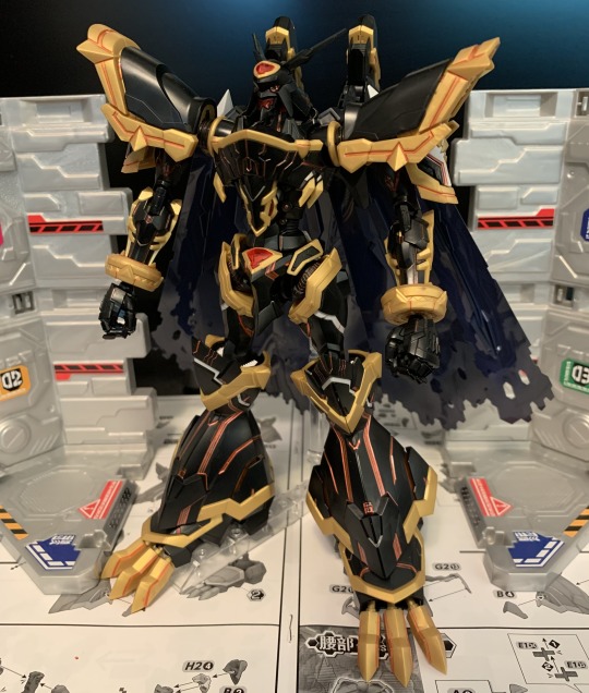
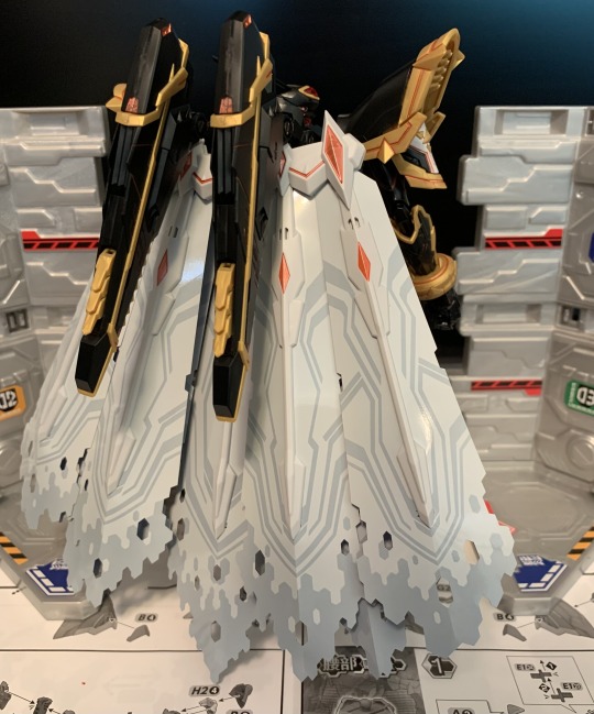


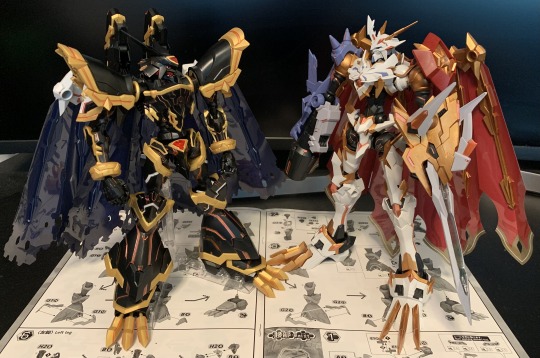
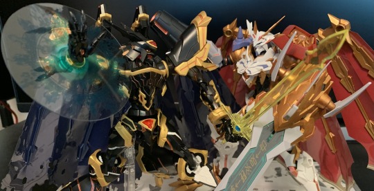
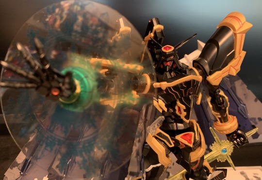

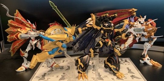
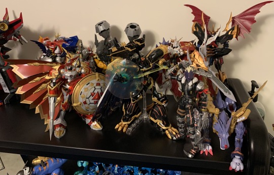
Figure-Rise Amplified Alphamon
When this Alphamon was announced I remember thinking how they had somewhat forced popularity. Given their own movie, placed opposite to Omegamon, pushed heavily in marketing. I began to question if they even had a personality at all... And then I thought some more. Even if it focused more on its prevolutions, X-Evolution was all about Alphamon, they were a very intimidating villain in Tri (with no payoff, but whatever, Tri sucks), has several manga appearances, and is technically one of the main characters in Cyber Slueth. There are plenty of interesting interpretations of this character, even if their initial pitch was forced upon us.
The Good: Despite the proportions, Alphamon is quite posable. Full range in the arms and legs, decent range in the torso and neck, and an articulated cape and wings. They also come with an effect part to replicate “Digitalize of Soul,” and their sword is a large, single piece that uses raised gem stickers to finish the look. It was a very fun kit to put together.
The Bad: Alphamon has poor balance. While it’s possible to tripod them on their cape, it causes it to bend if you do, which is why mine is always on a stand. The plastic was also strangely flaky. I felt like washing my hands every time I clipped the black plastic because there was always bits of debris on them.
Also, he reuses parts from both Dukemon and Omegamon, but only, like, five pieces per runner? Which begs the question as to why they didn’t just make a single new sprew, at least for the weight bearing parts? I really want to know how much money was saved by doing this.

The Details: For the most part it was just metallic red panel lining to replicate the Children’s War Game look of the rest of the kits I’ve done. I also painted parts of the chest and the back of the head gold, panel lined the mouth black, and painted in the eyes. Since he’s mostly black, there wasn’t much else to be done when it comes to things like fill :/
Overall, a fun kit with some production weirdnesses, but nothing that impacts the final product. The next announced kit is an anime-accurate Angemon, which looks interesting. They also announced an S.H.Figuarts Angewomon, which isn’t my scene, but I might be tempted if it matches Angemon in size. We’re at the point where I’m beyond guessing what they’re going to do next, but Susanoomon, ShineGreymon, or Shoutmon X4 would all be cool, IMO.
#Digimon#Digimon X#Digimon X-Evolution#Alphamon#Digimon Amplified#Gunpla#Model Kit#Figure-rise Standard#Review#Amplified
13 notes
·
View notes
Text
Fifth Review: Digimon Top 10
I’ve been really enjoying Digimon Ghost Game, I don’t have anything else to write about this month, and Top 10s are fun, so here’s my Top 10 Favorite Digimon. Because.
NUMBER 10: OmegaShoutmon X-Antibody
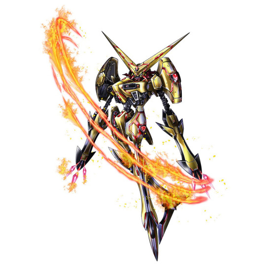
It may be obvious to people who frequent my reviews that I really like Shoutmon. A well-developed Digimon with a toy-centric gimmick I enjoy, and a very shiny evolution introduced half-way through the show to add to that gimmick. OmegaShoutmon ends up winning out over Shoutmon and his kingly evolution because I like the design more, and the X-Antibody version wins out over that for the same reasons. It’s definitely a bit over-designed, but I can’t help but want to see this thing Digi Xros’d with something to see how crazy it can get.
NUMBER 9: Bastemon
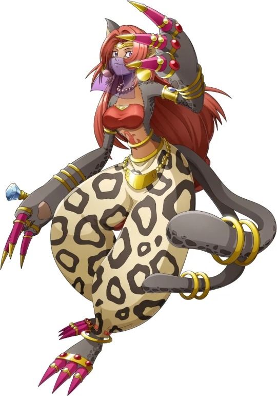
I just think she’s cute. Also, I really enjoy her portrayal in Xros Wars, where she’s incredibly lazy 90% of the time, but can occasionally get really heated when she needs to. Her fight against Chuchumon, even though we don’t see it, is probably my favorite joke from that season.
NUMBER 8: Omedamon
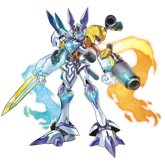
I don’t like April Fool’s Day. It’s a lot of really dumb jokes, most of them half-hearted, and very little of it I find interesting. Omedamon, however, is the exception. A crossover between Digimon and Medarot (Medabots) that wasn’t just fun, goofy art, but both Omedamon and the eventual 3 new Medarots (across two years) are usable units in both series’ mobile games. Not only did we get several great designs introduced into two franchises, but they were canonized. I wish more companies were willing to do this kind of thing.
NUMBER 7: Omegamon Alter-S
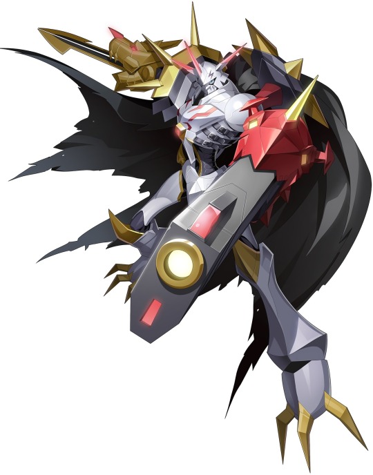
Omegamon/Omnimon is definitely one of the most popular Digimon overall, and I like them as well. Every time I watch Children’s War Game, I well up a bit at the scene where their body is forming from the wishes of all the world’s children. Their design has also been replicated many times, both in series with Digimon like Chaosmon, Omedamon, and Shoutmon, and parodied in other series as well. Unfortunately for Omegamon standard, design always wins out over nostalgia with me, and Alter-S is a cooler design in my opinion. Replacing the familiar WarGreymon/MetalGarurumon combo with the (IMO) more interesting BlitzGreymon and CresGarurumon, they swaps the usual arm weapons and adopts a more dark appearance. I also love how they used them in Adventure:, with the dual-wield moments and final reveal against Abbadomon. An improvement on an already great design.
NUMBER 6: Dukemon (Amplified) (Art by @/Asmaria_)

Out of every evolution gimmick introduced throughout the many season of Digimon, above-and-beyond, my favorite has always been Bio-Merging. It’s the ultimate extension of the partner concept focused on in the first three seasons, and several after. And while I like all four of the Lv.6 Digimon that utilize this mechanic, Dukemon/Gallantmon is my favorite. The knight aesthetic is great, his moment of evolution and following fight are the strongest, and like many of the Digimon on this list, he has many iterations to choose your favorite from. Mine, unsurprisingly, is the model kit version. It’s still Dukemon, but with a higher level of detail and a lot more sharp edges. Just a great design.
NUMBER 5: MetalGreymon (Virus) X-Antibody
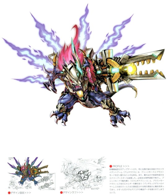
It’s not that I don’t like the original MetalGreymon, but his design isn’t that interesting to me. I like that he resembles his previous form, which not every evolution from season 1 does, but he isn’t as compelling to me as many of the other Greymon evolutions we’ve gotten, including Greymon himself. Virus X takes that uninteresting design and evolves it in a way I really enjoy, with the flaming hair and wings, increased metal parts, and especially the Alterous. It’s a rotating arm that can form MetalGreymon’s usual claw, or 180 and become a large cannon. It’s so cool that they gave it to MetalGreymon standard in Adventure: as a power-up. A fantastic upgrade to an originally meh design.
NUMBER 4: Pulsemon (Art by @/gebofrog38)
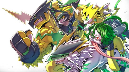
An aspect of the games that never truly integrated itself into the shows until recently is a Digimon’s ability to have multiple evolutions. We saw moments here and there, like SkullGreymon and Megidramon, but they were one-offs; active mistakes caused by the Digimons’ Tamers. Then came the Vital Brace and Pulsemon, a Digimon designed specifically to not only have branching lines, but a branching web of evolutions. Since his introduction, we got a few more situational evolutions in Adventure: and it’s Gammamon’s main gimmick in Ghost Game. It’s a Digimon with a gimmick that it did so well it inspired copycats.
NUMBER 3: Shoutmon X3
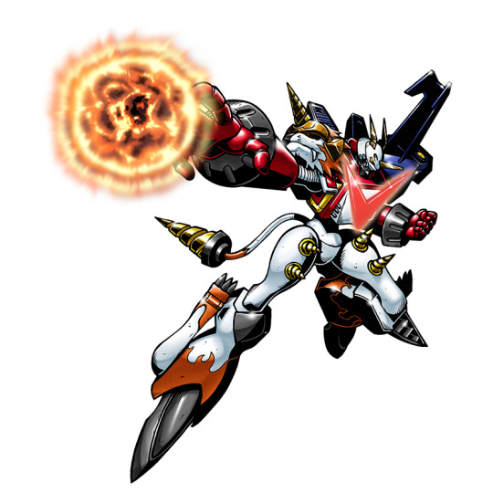
Again, I like Shoutmon. I always thought he was ok, but then I got my hands on the Xros Figures and my opinions of both him and how much went into his design skyrocketed. As I somewhat jokingly pushed the idea of him getting a model kit in the ongoing lines, I ended up becoming more and more serious to the point that I will be legitimately sad if I never handle a decent toy of this design in my lifetime. As for why I specifically chose X3, it’s because it’s the unencumbered base design without the Star Sword. While I like how it incorporates Shoutmon’s weapon as a handle, I’ve always thought the Star Sword was a bit goofy. Still, a great design that hits me right in my love of toys.
NUMBER 2: Gaioumon Burst Mode (Art by @/Asmaria_)
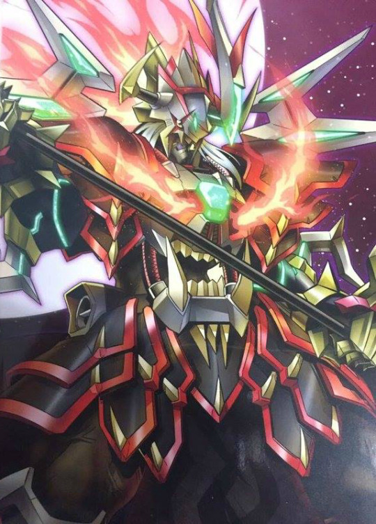
Gaioumon has some interesting history behind him. He was originally designed to be BlackWarGreymon X-Antobody, but the design team thought he looked so much cooler than WarGreymon X that they opted to make him his own Digimon and BWGX a recolor in order to not overshadow one of their flagship characters. That being said, you’re probably confused as to why Gaioumon has a Burst Mode, a gimmick exclusive to four-and-a-half Digimon from Digimon Savers...
He doesn’t, actually. Gaioumon Bust Mode is non-canon. Turns out Gaioumon is actually the favorite Digimon of semi-frequent series collaborated As’maria, who created the above art, as well as the original Gaioumon. So it’s a fan character, but that fan works on the actual series.
On a fun side note, within the most recent run of X-Antibody Digimon we got Gaioumon: Itto Mode, who bears a number in interesting similarities to this design, such as the gold horns, scarred eyes, and stomach teeth. An unofficial design so cool that it eventually wormed its way into some form of canonicity. Heck yeah.
NUMBER 1: MetalGreymon (Xros Wars)

Yes, MetalGreymon is on here twice, I’m not sorry.
A lot of points I’ve made previously on this list apply to this choice. It’s a toy-centric redesign that improves upon a lackluster original. It has a high amount of detail, three different evolutions, and something I haven’t been able to talk about thus far is I love its art. While it’s hard to find the old Xros Wars art at a good size, I love the thick outlines and the sketchy style of it. It’s because I like this design so much that I started painting the Xros Figures Greymon I got, and subsequently the rest of the line, to be more show accurate, and why I’m so sad I haven’t been able to find MailBirdramon to complete it. I’ve even been planning to commission art of a Xros Wars WaruMonzaemon that integrates with it to form a Xros Wars WarGreymon once I get both in hand to be able to fully understand the parts layout (I’m not the biggest fan of ZekeGreymon). There’s just so much going on that makes me like it. It may not be your favorite, but it’s the perfect Digimon for me.
Thanks for reading my ramblings about Digimon. It was fun analyzing why I liked all these designs so much. I know my concept over nostalgia mentality isn’t something most people will agree with, but that’s just how I think, and maybe this gave you a slight idea of how my brain works.
#Digimon#Metalgreymon#gaioumon#shoutmon#pulsemon#dukemon#gallantmon#omegamon#omnimon#omedamon#bastemon#top 10
38 notes
·
View notes
Photo


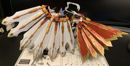


Figure-rise Standard Omegamon X-Antibody / Omnimon X (Amplified)
I feel like a very obvious Digimon to do next, that we probably won’t get, is Sakuyamon. We just got Dukemon and Beelzebumon, so we’re currently doing Tamers, we don’t have any female designs in the line yet (which are apparently popular considering how many MS Girls they’ve done recently), and Renamon is one of the most poplar Digimon period. Feels like a no-brainer. The issue with doing Sakuyamon is it’s almost an obligation to do SaintGargomon to complete the set, who is canonically enormous. Also, I’ll say again and again, I want combining Shoutmon X4 or X7. Those designs need some proper toy love.
Most likely we’ll actually get something like Diablmon/Diaboromon or Alphamon.
The Good: Big, very posable, very solid. This was a very fun build from a construction perspective. In particular, I really liked the chest, sword, and cape. They all had interesting elements to them, such as the parts layering or the sticker usage.
It also comes with a ton of adapters so you can attach parts from the previous kits to him: • WarGreymon’s wings in place of the cape using his own adapter. • MetalGarurumon’s wings (in one of two forms) in place of the GreySword using an included adapter and his missiles in one of the knee ports. • Imperialdramon’s cannon in one of the knee ports. • Dukemon’s lance in place of the GaruruCannon using an included adapter and his shield in place of the cape using an included adapter. • Mugendramon’s cannons (entire unit) in place of the cape (no adapter) or (just cannons) to the back of the waist using an included adapter. It’s a lot of customization that I’m not entirely sure what to do with. But it’s cool, though.

The Bad: While it doesn’t impede his posability, he is very pointy and stuff can bump into each other. Also, particularly with his arms, they have a lot of range, but it’s very awkward to adjust the black parts of his arms and sometimes the shoulders, especially with how large his “hands” are and how those particular joints work.
Also, as predicted, while the sculpting is all new it borrows a lot from Dukemon.
The Details: So, as always, I did the bit of panel lining this kit had in metallic red to emulate Children’s War Game. This kit also had a number of metallic green stickers, but since I was doing the red I replaced them with metallic red paint to bring the look together. There were also 3 translucent green parts that I repainted as well.

I spent way too much time detailing the bottom of the feet, which no one will ever see, including myself.
I redid all the gold plastic with paint, and added a few extra details around the chest, waist, and ankles. Apart from that, there were a few small areas where I added black (collar, hands, crotch, knees, feet, cape harness), and I repainted the eyes instead of stickering them.
Overall, I think this is a very interesting kit. The level of proposed customization is a cool touch, though I don’t know if I will take advantage of it myself, but apart from that it’s just a very solid kit.

#Digimon#Omnimon#Omegamon#Digimon Adventure#Digimon Amplified#Gunpla#Model Kit#Figure-rise Standard#amplified#Digimon X-Evolution
27 notes
·
View notes
Photo


Figure-rise Standard Imperialdramon (Amplified)
It’s not from season 1! And we already have confirmation (and a preorder on my part) that after Mugendramon/Machinedramon we’re getting Dukemon/Gallantmon from Tamers! Finally some pathos for that old Reboot model kit. I really like that they’re progressing through the series like this, and not just hovering over Adventure. Just some musings on the line, I have a feeling we might see a Beelzebumon, I’d like to see a Granni that could combine with Dukemon, and I’m pipe-dreaming we might get Sakuyamon and a giant SaintGargomon. Tamers is my second favorite anime of all time, so as a fan I’d like some representation.
If we pass up on more Tamers stuff and move onto Frontier, I’d like if we got both KaiserGreymon and MagnaGarurumon. I know the final forms aren’t as iconic as, say, Agnimon and Wolfmon, but they are the big final evolutions (which we’re 5 for 5 on), and doing both allow them to do a Susanoomon gimmick. And after the engineering they stuffed into this guy to allow him to switch between Dragon and Fighter Mode, I’d say that’s not too farfetched. Also, raises my hopes for my ultimate wish of combining Shoutmon X4.
The Good: This is a very solid, and surprisingly posable figure. The amount of joints in the hips and shoulders are insane, and allow for an amazing range. That helps a lot since the ankles and elbows are slightly hindered by the sculpt, but he can achieve some crazy poses on a stand. The wings also have some really good range to them, though it’s easy to break up the sculpt.
But I’m sure you’re most interested about the transformation, and it’s surprisingly good and involved. The arm mechanism for extending their length is very cool, and the amount of engineering in the legs to both compress them and allow for all the joints to work unhindered is very cool. There are only 3 parts required for Dragon Mode (the extended neck, chest, and their hair), and Fighter Mode just requires the head and hands.
The Bad: While I think the inclusion of Dragon Mode is extremely cool, it’s mostly just a gimmick. The posability on it is not great, and while you can get it to stand on its own, those knee spikes constantly bump into the forelegs (MetalGarurumon this isn’t). The hip mechanism, while great for achieving poses in Fighter Mode, is hard to use in Dragon Mode, as well as tricky to assemble. The waist, while it holds, is kind of weak, and the tail only has 2 joints in it. Fighter Mode is the main item here; Dragon Mode is just a neat extra.
The chest cannon thing is an appreciated inclusion, but it doesn’t look all that great, and it doesn’t peg into the chest at all; you’re just supposed to rest it in the mouth.
The Details: So, again, like WarGreymon and MetalGarurumon, I did the armored panel lining in metallic red to emulate the aesthetic of Children’s War Game, and did some light shading on the organic parts (just the hands and shoulders) in black. There’s quite a bit of additional metallic red throughout, such as the hips and on the legs, and all the gold has been repainted.
I also replaced all the stickers, including the eyes this time! They finally sculpted them in, thank goodness. As for details I added, there’s black fill in the cannon and its wing tips are gold (not red like the stickers), black detailing added to the tail, and added gold on the knuckles. The parts layering is very good here, so even if you don’t want to significantly paint it, it’ll still look great.
Overall, Imperialdramon Fighter Mode is a fantastic kit, with a great range of posability to help balance out an awkward sculpt, and a fantastic gimmick. Imperialdramon Dragon Mode is a nice added feature, but not much more than that. But more important than anything, it has me excited for the potential of this line, where it could expand from here, and what could be accomplished in the future. Mainly Shoutmon X4, though.

#Digimon#Digimon Adventure#Digimon Adventure 02#Imperialdramon#Veemon#Wormmon#Model Kit#Gunpla#Figure-rise Standard#Amplified
33 notes
·
View notes
Photo


So I’ve built 25 model kits and done 10 various upgrades over the past year, both kits and original. It’s a decent head above the 27 I did last year. And like last year (or technically the start of this year), I’d like to go over the kits I’ve done this year and give some brief thoughts on some of the move interesting or personal things I’ve built. It feels like a good way to round up the year.
GAT-XMAGI Striking Gundam Warlock
The first model I built this year, and the biggest custom I’ve worked on to date. I’m still very happy with it, though at this point, having moved onto other projects and having done some work on the PAX with my 30MM stuff, I’m not sure I’m going to “finish” it. I was supposed to make a transforming unicorn, lion, and phoenix that become different Striker Packs for it. I may eventually get around to doing that, but I don’t know when I’m going to get around to it.
Gundam G40
Maybe my favorite kit I built this year, and also the first I built this year. The best way I can explain it is it does everything it can to be different, but every way it does is interesting. It’s hard to explain, but it’s probably the highest recommendation I have on this list.

RMS-099BC Build Γ Gundam
I built a small handful of P-Bandai kits this year, with Build Gamma being the first. I did a good bit of work on this one, and so did the designers. It has reworked joints to increase its posability, and has some fun reuse of its old parts. An excellent kit if you’re willing to spend the extra to get it.
神竜合士 Avalanche Valkylander
Another example of my liking gold paint way too much, but turned out pretty great. My one thing I wish I could fix is the hilt of the sword, which is a darker red. I actually got Gundam Red shortly after doing this kit, too! Still, I really like this as an upgrade kit, adding a ton of additional armor to the Valkylander and allowing you to display both it and the Dragon Mode separately. Kind of wish they had a second set in white for the Ex.
RX-78TB-2 [SB] Gundam Stormbringer
My first MG Gundam in forever! I had a lot of fun building this one, but I probably should have tried a little harder. I did everything with a panel liner, if I remember correctly, and I should have done my usual fill stuff at the very least. I think I was somewhat intimidated by it, so if I do any more MGs, I’ll be sure to give it the treatment it deserves.

RX-78-02 Gundam Early Type (The Origin Ver.)
I put a lot of work into this one, considering I don’t like it. It’s not bad, but I find it way inferior to all the other RXs I’ve built. And I built a LOT of RXs this year to compare it to. What weirds me out, though, is how everyone I’ve talked to seems to really like this kit. Difference of opinion, I guess.
AGP-X1 Alus Core Gundam
The Alus Core might be my favorite of the Core-Types we got over the last two years. The head design, the effect parts, the overall design. It also feels the most solid of all of them, improving on the Core’s design while not going too far like the Core II did. And it’s upgrades are pretty cool, too.
JMA0530-MAYBD Wodom Pod +
This was a very fun, very good, very surprising kit. Despite its odd shape, it’s honestly one of the better kits I handled this year. It was a very fun build, ended up being a super posable kit, and had a bunch of odd features that ended up being for the the eventual Re:Rising Gundam.

PFF-X7/N8 Nepteight Gundam
Probably my favorite of the Core Gundam’s Armors. I got to use a ton of my favorite shade of gold on this one, and I really like the gimmick. It’s also kind of hilarious how little the Saturnix, Uraven, and Nepteight were actually utilized in the actual show, having brief appearances in a single episode each, and not even being used for the entire fight.
Figure-rise Standard MetalGarurumon (Amplified)
A huge improvement over WarGreymon, as it’s just as cool a build, but way more posable. Which is actually pretty impressive, considering it’s a quadruped, and that’s a much harder set of articulation to nail down. I also like how he has an original sword gimmick, and WarGreymon has an original shield gimmick. Super looking forward to Imperialdramon next month and Mugendramon after that. (But please do Dukemon or Shoutmon next!)
RX-78-2 Gundam [Beyond Global]
Another one of the amazing RX designs to come out this year. While I still prefer G40, this is a close second. Ever time I talk about those two, I always suggest getting both of them, since they’re both so similar yet do the same things in totally different ways. They are amazing companion pieces to each other.

GAT-X303K Gundam Aegis Knight
Re:Rising Go! Despite my love for Re:Rising Gundam, this is mostly on here because of how much work I put into the shield. I mean look at it; I made it super pretty. Still, five separate modes, decent posability, a great design. Justice Knight edges it out as a solo kit, but if you’ve got the team, it is a great topper to a good show.
PFF-X7R/ANIMA Gundam Anima [Rize]
Definitively the best release of the Core Gundam. Has the most interesting of all the Armor sets, great accessory integration, and comes with a ton of parts you can use for customization. If you only want one, I’d say go for this over the Earthree or Uraven.
GNY-004 Gundam Plutone
Fon Spaak rides again! The Plutone has always been a design I’ve enjoyed, and it’s cool getting a physical kit of it. I’m actually glad it took this long to get to it, since it ended up being a stronger kit due to more recent philosophies about parts layering and posability. It probably would have been a bit better if they hadn’t tried to incorporate some of the old HG00′s design ideas as well, but the good far out shadows the bad on this one. It is P-Bandai, though, so wallet beware.

30MM eEXM-0Smk-III Alto Stark Kai II
I built the base unit back in January, and in December I finish its fourth incarnation (Base -> Stark -> Stark Kai -> Stark Kai II, if you’re wondering why 2 is 4). It also took me a year to actually be happy with how it looks. It just took so long for it to stop looking like an Alto and more its own thing. It’s also the only real custom project I worked on this year. There’re so many custom projects I want to work on that I just don’t want to sink the time into at the moment, which is definitely something I’m going to have to work on in 2021.
Overall, while not every kit I built this year was a winner, I built a lot of good kits and had a lot of fun with them. I hope some of you were inspired to pick a few up this year. Maybe try some painting things you weren’t originally comfortable with. And if you built some cool stuff this year, let me know and I might try grabbing them next year.
10 notes
·
View notes