#dr. kristophine's listicles and statisticals
Explore tagged Tumblr posts
Text
Stats 2
What's the difference between mean, median, and mode?
You may know this one. It comes up in math class, not just stats, but it's absolutely critical to stats.
A mean is the average. If I take the ages of myself, my husband, and our two dogs, and I add them together, and then divide by the total number of measurements--in this case, 4--I come up with our mean age. Let's say I'm 40, my husband is 40, and our dogs are 12 and 8. The total, or sum, of our ages is 100. If I divide that by 4, I get an average age in our household of 25. That's our mean age.
Now, you might be saying, "But you can't lump together dog ages and human ages!" to which I would say "But I just did." I can't do it and claim it's meaningful. I want to do something with that data, right? Or else why did I collect it and calculate a mean? But people will put totally disparate data together all the fucking time. That's a great one to watch out for when you're reading scientific literature. Apples and oranges. "We put together all the responses from gay, lesbian, bisexual, and transgender participants, and separated them from the straight cisgender participants, and we see no issue with this. After all, all cisgender lesbians think the same way as all transgender bisexual men do!"
A median is the value where half of the numbers are above it and half the numbers are below it, in a data set. If you've heard statements like "the 50th percentile," that's what we're talking about--the 50th percentile is the value at which half the numbers we collected are less than that. The median age in our household is not based on a single value here because there's an even number of ages, so we arrange them in order from lowest to highest: 8, 12, 40, and 40. We take those two middle numbers (12 and 40), add them together, and divide by two (51/2 = 26). So half of our household is over 26 years old, and half of our household is under 26 years old.
And finally, mode. This one is easy. Mode is the most common response. The most common age in our household is 40.
Now, if you look at that data about my household, it's fucking useless! But I sure did numbers stuff to it, didn't I?
150 notes
·
View notes
Text
Stats 4
Have you heard the term "bell curve"?
You probably have; it was the title of a hellaciously racist piece of scientific dreck a few decades ago that racists still like to cite despite its obvious flaws. But that title came from something real--something called the normal curve.
We're going to talk about distributions today. Distributions are what happen when you get a bunch of numbers and then look at the shape they make. If I look at the inhabitants of my house, and I plot their ages on a bar graph, it ends up looking like a pair of blocks: there are two groups, my old dogs (12-16? who knows) and me and my husband (approx 40).
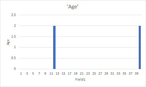
I will never tell you how long it took me to make my computer make a simple two-part bar graph for me.
Anyway, this is a distribution. It's a really, really simple one. It's also fucking useless--never forget that we can do all kinds of things to useless numbers, so garbage in, garbage out. You want a more complicated distribution? Here's ages of people in the US.

Holy shit that looks complicated! Okay, maybe a little easier. Graph of heights.
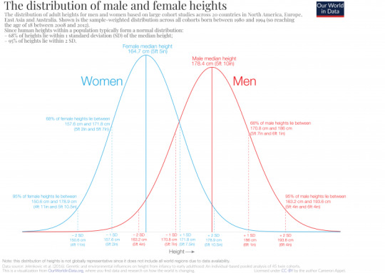
Now we're getting somewhere. Women, on average, are shorter than men. However, there's a pretty good amount of overlap there. And very short people and very taller people are more rare than average-height people.
This is the most common distribution you'll run into in nature, called the normal curve. It's bell-shaped. It's bigger in the middle and smaller towards the ends. It kind of trails away. Many, many, many things are distributed in a normal distribution.
Of course, you always want to consider what group you're looking at.
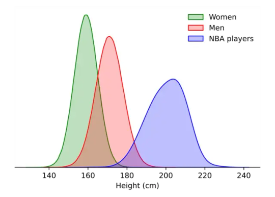
Not every distribution is a normal curve. You need to know stuff about the population you're looking at. However, like pi, you will see this kind of distribution everywhere--and it's so common we have developed systems of statistics that, to a greater and lesser extent, rely on or correct for it.
So! Now you know what a distribution is. And what a normal curve is. Next up, we can talk about skew and various things that make assumptions of normalcy fucking useless.
103 notes
·
View notes
Text
Stats 3
We're going to clarify one VERY, VERY important concept today, kids. And that concept should be pretty straightforward, but I've seen grown-ass researchers get it wrong before.
Sample vs population.
A population is all of the people of interest. Sometimes that means "everyone in this city" and sometimes it means "everyone who has this health condition" and sometimes it means "every human in the whole world."
Let's say I want to know the average lifespan of all humans. I can't get that data, can I? There's no beautiful centralized database where every single human being's age at death is recorded. It just doesn't exist.
So I'm looking at data where I can. I'm in the US. That means I can try to get access to various databases that may contain that information. But let's say I'm not affiliated with any major research universities, which, at present, I am not. So now I'm even more limited in my ability to get data.
So I started recording the age at death of every patient whose death certificate I sign. I sign a fair amount of these.
Now that's my sample: my own patients who die. This is a lot of steps removed from the population. The data I get from this will be virtually useless for answering my original question.
If I were at a major research institution (an R-1 institution, at least in the US, is a university that gets a large amount of grand funding for research), I might have access to a larger database. It's still probably going to be mostly US deaths, which might not have a lot in common with deaths around the world. Maybe I have databases from a handful of countries. A European death database. An Indian death database. Who gets counted in that? Who's dying somewhere with someone who will know and care and record it?
The idea of there being a true average age of death, a number that, if I chose one moment in time, it would be, is represented by the population mean: the Greek letter "mu,"

which you can take to mean "the thing we really want to know, but are forever separated from by the simple realities of research."
And in a distinct glow-down, what we get is simply the sample mean. X bar, which is to say, an x with a line over it. x̄.
What we want to know and what we can know are almost always different. Sometimes a lot, sometimes a little. Isn't that poetic? Isn't it terrible?
I love statistics, even when they're tearing out my heart.
127 notes
·
View notes
Text
Stats 1
How do we know a fact?
How tall are you? Go measure it. Then start over and measure it again. Measure it a third time. Were all three the same? Probably not to the millimeter--there's probably a little bit of wiggle room in there. So is there a One True Magical Height you actually are? Maybe. But how specific can we get about it? You're taller in the morning, when the discs between your vertebrae have been plumping up all night, and shorter in the evening, when gravity has been squishing them down all day under the weight of your spine.
The variation between those three measurements is just that: variability. And you can have a little variability, or a lot. A large amount of variability doesn't necessarily mean the measurement was wrong, or bad--it might just be that your height changes more over the course of a day than your friend's does. Or maybe you're a circus performer with a spine like an accordion, or maybe you really did those measurements badly, or maybe you're bad at math.
However, if I'm standing in front of you swearing up, down, backwards and sideways that I know your height to the millimeter and there is absolutely no room for doubt, I'm probably full of shit. Every measurement has variability. Yes, even in physics, though their measurements tend to be a lot less variable than ours in Psych.
Another concept in statistics is reliability. If I get three measurements of your height and they're all within a couple of millimeters, that's reliable. However, if they're also all a foot shorter than you, they're reliably bad. Aka reliably inaccurate.
Accuracy is a twin concept with reliability. If I get three measurements and they're all around your height, even if they're not all the same, they're more accurate than those reliable shitty measurements I got earlier. But if you want a good measurement, it needs to be a reliable measurement, because otherwise who the fuck knows?
73 notes
·
View notes
Text
hahahaha also jesus CHRIST look at how wildly wrong the axis labels are on my household age graph! Fuck me. I'm handing in my stats nerd card.
Stats 4
Have you heard the term "bell curve"?
You probably have; it was the title of a hellaciously racist piece of scientific dreck a few decades ago that racists still like to cite despite its obvious flaws. But that title came from something real--something called the normal curve.
We're going to talk about distributions today. Distributions are what happen when you get a bunch of numbers and then look at the shape they make. If I look at the inhabitants of my house, and I plot their ages on a bar graph, it ends up looking like a pair of blocks: there are two groups, my old dogs (12-16? who knows) and me and my husband (approx 40).

I will never tell you how long it took me to make my computer make a simple two-part bar graph for me.
Anyway, this is a distribution. It's a really, really simple one. It's also fucking useless--never forget that we can do all kinds of things to useless numbers, so garbage in, garbage out. You want a more complicated distribution? Here's ages of people in the US.

Holy shit that looks complicated! Okay, maybe a little easier. Graph of heights.

Now we're getting somewhere. Women, on average, are shorter than men. However, there's a pretty good amount of overlap there. And very short people and very taller people are more rare than average-height people.
This is the most common distribution you'll run into in nature, called the normal curve. It's bell-shaped. It's bigger in the middle and smaller towards the ends. It kind of trails away. Many, many, many things are distributed in a normal distribution.
Of course, you always want to consider what group you're looking at.

Not every distribution is a normal curve. You need to know stuff about the population you're looking at. However, like pi, you will see this kind of distribution everywhere--and it's so common we have developed systems of statistics that, to a greater and lesser extent, rely on or correct for it.
So! Now you know what a distribution is. And what a normal curve is. Next up, we can talk about skew and various things that make assumptions of normalcy fucking useless.
103 notes
·
View notes