#doing gradients in ms paint only using the pencil tool is NOT EASY
Explore tagged Tumblr posts
Visit Tumblr Blog
Explore Tumblr blogs with no restrictions, modern design and the best experience.
Last Seen Tumblr Blogs


Fun Fact
There were a total of 171.5 billion posts on Tumblr in 2019.
Text

FRANK IT UP!!!!!!!
my commissions are open if you want to see your fav mcr pic drawn in my style!! ^^
[ID: A digital painting of Frank Iero in 2007, during projekt revolution. He's sitting on the floor and playing guitar. The instrument covers half his face, and only one eye is visible. He's looking up, frowning, in a way that resembles The Fallen Angel by Cabanel. End ID.]
#IVE BEEN WORKING ON THIS ONE FOR AGES#doing gradients in ms paint only using the pencil tool is NOT EASY#tbh im not sure if i like this “realistic” look in paint drawing#buuuut this was fun to do ^^ <3(they said masochistically)#also its my birthday so this is like when kids bring gifts for their classmates on the day of their birthday i hope you like my gift<33#TAG BEAM#my chemical romance fanart#my chemical romance art#my chemical romance#mcr#mcr art#mcr fanart#frank iero#frank iero fanart#the black parade#projekt revolution#prorev#prorev frank#ms paint#my art#:p#(any correction on the ID is veeery welcome <3)#bondilluns.art
603 notes
·
View notes
Text
Typography; Result for Project 3
Hi guys! This post is about the third project “Information Design Advocacy (IDA)” in Typography class. As a recap, my topic is “Earthquakes in Japan.” Below are the process materials for the project with some updated versions.
(Updated style tile)
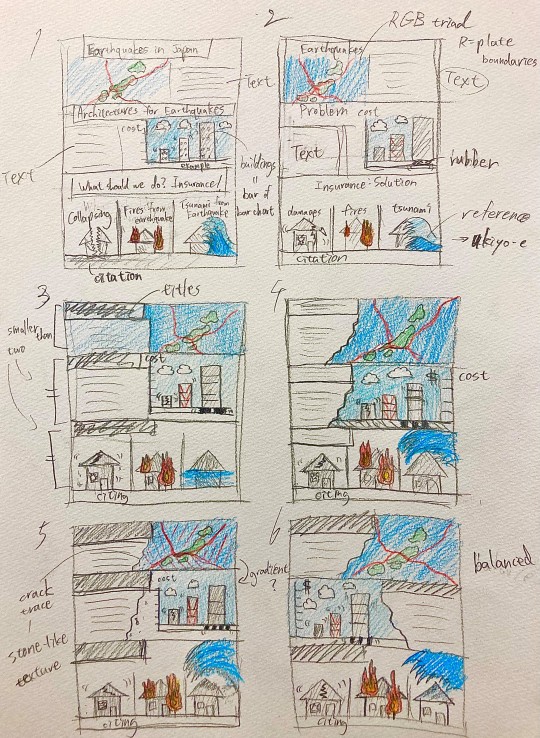
(Sketches)
Then, below is the final work of poster.
(Final design)
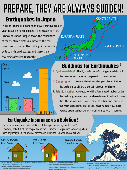
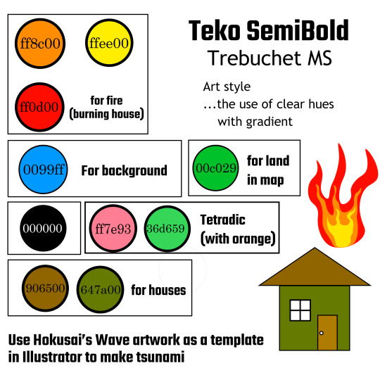
First of all, as for the typefaces, I used Teko Semibold for titles and Trebuchet MS for main texts. This is to distinguish titles and main texts significantly. I think this use of typefaces worked well according to my intention. In the text, I made footnotes to indicate the source of information. I initially put asterisk (*) and a number next to it to do that, but from suggestion during critique session that the numbers resemble the numbers on the second section, I utilized the footnote function in Adobe Illustrator’s text tool which I did not notice before.
In the first section’s catchphrase “Prepare, they are always sudden,” I put white outline to make it stand out more than each section’s title. I once put the black underline for this phrase, but I thought at one point that it would be too heavy visually, so I removed the underline. In terms of graphic, I used RGB triad color scheme (red = boundaries of tectonic plates, green = land of Japan, and blue = ocean). For the blue, I used gradient tool to indicate the natural continuity from blue ocean in the first section to cyan sky in the second and third sections as the background of poster. In regards to the text, I put it on the left side with light gray background so that the black text will be easy to read. For the text on ocean, I colored it white to make it easy to read.
In terms of the second section which writes about the buildings made to resist earthquakes, I put the text section on the right side which is the opposite of the first section. This is to make the poster visually balanced. I think that this method of layout went successful and made the overall image visually pleasing. For the bar chart, used the graphic of buildings as the bars. I applied tetradic color scheme (green, pink, orange, and blue) for these buildings and sky. By making the text color same as the buildings, I think it is easy for the viewers to gain the information quickly from the chart. For the outline of texts, I initially set it as 0.5, but from the suggestion in critique that the green text is difficult to read, I put it up to 1.0. Then, to add some breathing space, I made some white clouds so that the graphic will not be too overwhelming.
For the third section, I put the text on left side once more to balance it out with the upper section’s text on right side. As for the graphic, I traced the Great Wave off Kanagawa by Katsushika Hokusai as a template layer to add Japanese taste, since I am talking about earthquakes in Japan. I tried to balance out the visual weight to make the tsunami on right side bigger and detailed compared to the graphics and simple texts on the left. Even though it is detailed, I did not feel that challenging making the graphic, because I used paint brush tool and pencil tool for the white dots. In all the sections, I was putting lines and boxes between the houses, around the texts, and between the sections to distinguish them. However, based on the opinion in critique that there are too much lines and boxes, I got rid of almost all the lines in the poster (I left a line only for between the third and citation sections). Overall, I believe that my infographic advocates my topic successfully and effectively with unity.
0 notes