#dkng
Explore tagged Tumblr posts
Visit Tumblr Blog
Explore Tumblr blogs with no restrictions, modern design and the best experience.
Last Seen Tumblr Blogs


Fun Fact
Tumblr was the first site to host the blog for President Barack Obama in 2011.
Text

Bottleneck Gallery will release Beetlejuice 24x18 screen prints by DKNG today, August 28, at 12pm ET. The standard version is limited to 275 for $50, the rainbow foil variant is limited to 150 for $60, and the art print edition (sans title) is limited to 50 for $75.


#beetlejuice#beetlejuice beetlejuice#beetlejuice 2#tim burton#michael keaton#bottleneck gallery#dkng#art#gift#lydia deetz#winona ryder#alec baldwin#geena davis#catherine o'hara#80s movies
34 notes
·
View notes
Text

Poster: The National - Fall 2013 European Tour Artist: DKNG
4 notes
·
View notes
Text
There’s still time to get in on the move!
BROS gone up from $29 to $59
CAVA gone up from $83 to $118
DKNG is the next move steady and ready to climb $30 to $39
If there was a time to buy its now! There is still time to get in on these stocks!!! Don’t take my word for it, do your own research!
0 notes
Text
#DKNG Stock News DraftKings EARNINGS and stock analysis and price FORECAST 👇👔
youtube
0 notes
Text

Fading Deficit at DraftKings Inc Emerges as Fourth Quarter of 2023 Earnings Season Unveils Promising Results https://csimarket.com/stocks/news.php?code=DKNG&date=2024-02-16212036&utm_source=dlvr.it&utm_medium=tumblr
0 notes
Text
Project 3 Part 3
It's November 3rd of 2023 and I have officially finished the two posters I was designing for our third project of the semester. Both posters use the same 4 colours and are intended to reference the style of DKNG, design and illustrative studio.

Poster 1 depicts a mystical scene where the bear from Faun's Wainamoinen song looms large over the glade where the golden harp rests. The name of the band floats behind the harp sectioning off the bear from the harp. Golden branches reach from the trees on either side to curl across the type further separating the bear and harp.

Poster 2 was meant to be simpler, to speak more about the company the poster styles are based on than to act as promotional material for the band I chose.
I took the harp, clouds, and type from the first poster as I wanted the two to visually connect while feeling like separate pieces. I added in the singing birds from Wainamoinen to add movement and visual interest. The block of type at the bottom speaks to the company I was referencing, DKNG, and their history and skills.
Beyond my research into the company, their style, and themes I also signed up for their Skillshare classes to learn some of the techniques they commonly use in their posters. While I did not have enough time to learn a lot, the main technique I did learn allowed me to create the stippled shading effect seen across the posters. A technique I intend to continue using in my own work as I enjoy the style.
Ultimately I am happy with what I have created. While the posters reference the techniques and style of DKNG they have my flair for the fantastical. A flair which I believe resonated well with Faun's music.
I have spent roughly 40 hours and, beyond my existing subscription for Adobe, not a single penny on this project.
We also had around 46 pages in required reading for the project, my notes for which can be found below: (will add in later)
#artists on tumblr#artwork#digital illustration#digital art#digital painting#dkng#faun#fantasy art#poster art#poster design#graphic design
0 notes
Text

The Iron Giant by DKNG Studios
60 notes
·
View notes
Text


(CLICK FOR BETTAAA QUAILTYY)
krbs?? whats ship is that, only tianami here‼️
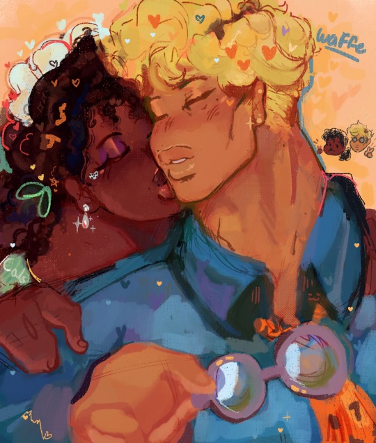
#yall know i love a good rando ship#I SAID YALL KNO-#dawg…#like its so srs atp i love em..#KRBS MY NUMBA ONES BUT THEM?? they aimin for my top three ngl#pfft anywelps#jjk#jujustu kaisen#the princess and the frog#nanami kento#kento nanami#princess tiana#tiana#tianami#tiana x nanami#nanami x tiana#IF YOU DKNG GET IT JS.. js go look on clock app for me n youll see 😭😭#but yea… this is what ive been up to#hope u lot r doin well!! love u homies ‼️#call me back
725 notes
·
View notes
Note
hi mixer wixer fixer aixer bixer cixer dixer eixer gixer hixer iixer jixer kixer lixer nixer oixer pixer qixer rixer sixer tixer uixer vixer xixer yixer zixer!!!!!!!!!!!!!!!
hi Kasai lasai aasai basai casai dasai easai fasai gasai hasai iasai jasai masai nasai oasai pasai qasai rasai sasai tasai uasai vasai wasai xasai yasai zasai
10 notes
·
View notes
Text
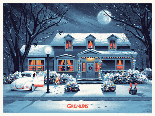
Bottleneck Gallery will release Gremlins 24x18 screen prints by DKNG today, October 20, at 12pm EST. The standard version is limited to 275 for $50, the foil variant is limited to 150 for $60, and the art print edition (sans title) is limited to 50 for $75.

#gremlins#joe dante#horror#80s horror#1980s horror#bottleneck gallery#dkng#art#gift#gremlins 2#80s movies#1980s movies#zach galligan#phoebe cates#mogwai
45 notes
·
View notes
Text
I need all my family in a nest rn.
#i need to cry and worru over.them#hug and ramble how much i love em#feed em the.shitty food i make#i need to shlw o care even if they dkng care sbt me SCREAMS#leorambles#leo vent ig#shrugs#qas trying not to do that as much but fuck it
2 notes
·
View notes
Text

(This stamp was designed by Nathan Goldman/DKNG Studios.)
The fact that this is an actual stamp being sold by the USPS is one of my favorite things right now. Makes me want to send fan mail to my favorite ao3 authors. But putting this image in the comments section will have to suffice.
My only issue with the stamp is that I can only get two per pack of twenty. I just want a whole pack of only kudos stamps.
9 notes
·
View notes
Text
4D: Card Design
I wanted to make the logo more symbolic and connected to my word, so I took into consideration the expression "Putting a spanner in the works," an expression Paul mentioned in one of the critiques. He said it was another meaning that came up when he searched breedbate.
It did not go well, though. I had no idea how to unify these elements.

I moved to my iPad and sketched it out. I made a face and skewed the elements, considering the nonsensical nature of my word. I added positive and negative signs because a critique I got from my friend was that in "tool language," positive means to tighten, and negative means to loosen. I also thought these signs made the face look cheeky.

Here is the final logo.

Here is my design process for the cards. The white side of each card has "+" or "-" in the top corner, just to keep the positive and negative symbols consistent.
"+" = prompt card
"-" = action card. These cards make the game more interesting. For example, "Switch hands with another player."

Some more inspiration:
0 notes
Text
Project 3, Post 2
It's still October 29, 2023 and this is my second post for our third project.
As I said in my last post we were tasked with choosing a company we wanted to work for and making something in their style. I chose the illustration and graphic design studio, DKNG. I had spent a fair bit of time researching and analyzing their work and history in order to make my final product as authentic as possible.
What I finally decided to base my project on were the band posters the company produces. Dan and Nathan, the founders, started out their early design careers making posters for their personal band. They continued making band gig and tour posters over the coming years. After going their separate ways for a while, getting their degrees, and building their portfolios they got back in touch and started their own company in 2005. With the creation of DKNG they continued making posters for bands and musicians. While this is nto the only work they produce it remains the beginning and the lifeblood of their partnership.
As such I had decided to make 2 posters in the style of their band posters for the final product of this project.

I had initially decided to make promotional posters for DKNG that illustrated how their passion for music combined with design to produce the talented creators we know today. However, after chatting with my instructor we decided to take a more literal approach to the project and create posters for an actual band.
Out of all of the bands I liked I ended up choosing Faun, a pagan/mythology based folk music group out of Germany.
In my research into DKNG I found that they typically based their band posters on either the location the band is playing in or on song lyrics. In the case of Faun I decided to work with song lyrics as I think the mythology/pagan aspect of their lyrics plays well into my more fantastical style.
I looked at the English translations of some of their newer songs and wrote down the visuals I could potentially use in a poster. Eventually I decided on Wainamoinen. A song about a bear journeying through a valley towards a harp, about birds that sing causing it to rain silver and gold.

As I am creating two posters I explored a combination of compositions and eventually decided to use the thumbnail in the middle left of the page above. With a mystical figure of a bear looming large over a harp that sits in grove of trees. Swirling clouds, a nod to the rain of solver and gold sit behind the bear's head.
As I do not currently have the time to screen print the design in a way reminiscent of DKNG's work I decided to work solely in illustrator using some of the techniques DKNG has cultivated.
As I feel this post is currently long enough I will end it here and update on the finished posters in my next post.
This is post 2 of 3 for Project 3.
#artists on tumblr#artwork#digital illustration#digital art#digital painting#drawing#bear drawing#faun#dkng
0 notes