#different screens display colors slightly differently this is a common issue with making digital art
Explore tagged Tumblr posts
Visit Tumblr Blog
Explore Tumblr blogs with no restrictions, modern design and the best experience.
Last Seen Tumblr Blogs


Fun Fact
In 2020, 27% of US Tumblr users had an annual household income of over $100,000.
Note
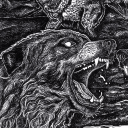
I'm thinking of making Vaschete bracelets, and I'm not sure if I should make, in Machete's bracelet, white or black the main colour; white because of his fur (obviously) and black because of his clothes. I will also add a bit of red.
I thought you would like to know and because I would like to have your opinion for the bracelet.
Lovely art ❤️
Oh, that's such a lovely idea ;-;
I don't know, you're the one making the bracelet, I'm sure you have a better idea of what kind of color combination would work the best. I'd imagine more black could look really striking, but if there's too much of it it threatens to drown out the white and red.
This is the palette I personally associate with him. The black and the vivid red are the high contrast, deliberately eyecatching colors, but those come from what he wears. His natural color scheme leans into this sort of coral/salmon/peachy pink direction.

#answered#nogenderfoundcheckagain#different screens display colors slightly differently this is a common issue with making digital art#my pc seems to downplay yellow hues a little#which means that when I go look at my art posts on my phone that specific shade of red has turned orange#and sometimes Vasco goes from golden toasted bread color to almost canary yellow on accident ´v`'
155 notes
·
View notes
Text
The Art of Natural Photo Editing: A Beginner’s Guide to Professional Edits
In the world of digital photography, photo editing is the key to transforming ordinary photos into captivating visual stories. However, mastering the balance between enhancement and realism is crucial. The fine line between a well-edited photo and an over-processed one can sometimes blur, leading to results that look more like a sci-fi movie than reality. Whether you're an aspiring photographer or an entrepreneur looking to enhance product images, understanding essential editing techniques is crucial.

This guide will introduce you to the best practices for natural-looking photo edits and ensure your work remains professional and realistic.
Step 1: Embrace Subtlety
One of the most common mistakes beginner editors make is over-editing. It’s tempting to crank up the contrast, saturation, or clarity to extreme levels, but this often results in an unnatural look. Instead, focus on small, incremental adjustments. Making subtle edits ensures your photos retain their authenticity while still looking refined. The key is to enhance, not overpower.
Step 2: The Curves Are Your Friend
While basic sliders for brightness and contrast are useful, the curves tool provides more precise control. With curves, you can selectively adjust highlights, mid-tones, and shadows. For example, lifting the shadows slightly while maintaining the details in the highlights creates a more natural effect. This technique is especially useful in product photography, where realistic lighting is essential.
Step 3: Learn to Love Your White Balance
White balance plays a crucial role in setting the mood of a photograph. An incorrect white balance can make a photo look too warm (yellowish) or too cool (bluish). The white balance tool helps correct these issues, ensuring that whites appear truly white. Adjusting white balance correctly will make your photos look more professional and realistic.
Step 4: Control Noise Reduction
Noise can be a big problem, especially in low-light photography. While noise reduction tools are available in most editing software, overusing them can result in a soft, almost plastic-looking image. The key is to find a balance between removing noise and maintaining texture and detail. A good approach is to apply noise reduction selectively—focus on areas where noise is most visible while keeping sharp details intact.
Step 5: Use Selective Adjustments
Modern photo editing software allows for targeted adjustments, meaning you can enhance specific parts of an image without affecting the entire frame. This technique is particularly useful for product images, as you can highlight details without altering the entire composition. For instance, in ecommerce photo editing services, selective adjustments can help improve product visibility and ensure a realistic look while maintaining a professional touch.
Step 6: Color Grading for Mood and Style
Color grading is an excellent way to add depth and personality to your photos. However, it’s essential to keep it subtle. Over-the-top color presets can make images look artificial, so opt for natural tones that enhance the photo rather than overpower it. Whether you're working on a fashion shoot or an ecommerce product image, a well-balanced color grade can make a significant difference in the final result.

Step 7: Monitor Calibration Matters
A common mistake in photo editing is relying on an uncalibrated monitor. Colors can appear differently on various screens, leading to inconsistencies when your photos are viewed on different devices. By calibrating your monitor using an ICC profile, you ensure that the colors you see while editing are accurate. This step is crucial for professionals, especially in ghost mannequin service photography, where true-to-life colors are essential for displaying products realistically.
Step 8: Practice Makes Perfect
Like any skill, mastering photo editing takes time and practice. The more you experiment with different tools and techniques, the more refined your editing style will become. It’s normal to make mistakes along the way, but learning from them will improve your ability to create natural, high-quality edits. The key is to develop an eye for detail and subtlety over time.
Bonus: When to Seek Professional Help
If you're working on high-end projects that require expert-level retouching, consider hiring professional editing services. Whether it's advanced background removal, high-end retouching, or detailed product enhancements, professionals can help achieve a flawless yet natural look. Services like photo retouching ensure that your images maintain high quality without appearing over-processed.
Conclusion
Mastering the art of photo editing is all about finding the perfect balance between enhancement and authenticity. By following these steps, you can create stunning, natural-looking images that capture attention without looking artificial. Whether you're editing portraits, landscapes, or product shots, these techniques will help you refine your skills and develop a keen eye for professional-grade editing.
With patience and practice, you’ll soon be editing like a pro, ensuring your photos stand out while still maintaining their natural beauty.
0 notes
Text
The progression of design
issue #1
2017 is facing the desire to counteract uncertainty with authenticity, raw humanity, craftsmanship and simplicity. Uncompromising clarity. The world is leaving behind a year of instability and digression, which leads its inhabitants to the necessity to expand their believes towards humanity. As natural resources are strengthless, we are constructing a path towards sustainability, recreating the concept of modern living. 2017 is the year of revitalization and rebirth by means of our organic roots.
In 2016, many designers consciously began to move away from the minimalistic way of composing. There was a desire for greater freedom and a less rigid approach to designing. Until recently, the design world was dominated by compositions which were closed, symmetric, and static. In the last year or two it has become noticeable that many designers are trying to move away from simple and closed compositions: more and more open-styled, seemingly chaotic, broken and cut compositions are being created. The previous grid had lost its importance already and its rules were deliberately and consciously bent. Content started to be shifted, seemingly moved, its parts sometimes overlapped and intermingled. 2016 also broke the rule of symmetry, which dominated the industry for quite a long time. Designers created asymmetric layouts which were, and still are, not perfectly balanced compositions, yet have a more dynamic aspect. What has also recently changed is the approach to details. There is a gradual detachment from the minimalistic and raw conception of aesthetic. There are many more elements that only have decorative functions, linear and rickety icons are slightly detached from the content they illustrate, digital noises and glitches are gaining relevance.
Typography is a big player in digital web design and for good reason: it is just simply the layout and styling of the text you have on a page or screen. This can include points such as font style, size, and placement.The change in trends can also be seen by usage of the typefaces: the internet has been dominated by the “Helvetica rule” for ages, allowing just a few others simplistic and clean fonts such as Open Sans, while serif typefaces were not used very often. Sans serif geometric typefaces gained more popularity, for instance such classics as Futura, ITC or the ones that are available in the Google Library, Poppins and Montserrat. These typefaces are much more distinctive than the “invisible" and clean ones and they are defined as "aggressive" and expressive. Over the last 2 years designers boldly introduced not only different kinds of typefaces, but also they encouraged the willing to work with contrasts, to mix serif typefaces with the non-serif ones. In 2016, it was common to move away from soft, harmonious pairing of typefaces for stronger contrast. Expressive combinations were reinforced by a high contrast between the sizes of texts. Large and decorative serif typefaces were combined with simple geometric ones, just as headers with geometric fonts were paired up with a serif ones in paragraphs. Looking back to when Apple released their sans-serif typeface “San Francisco” in mid-2014 first used in their introduction of the Apple Watch, we slowly began to notice this direction towards brand specific typefaces being pursued by other industry recognized tech giants. So another graphic design trend that is sweeping across logo designs from late 2015 beginning of 2016 is that of handwritten style typography: the smooth, natural lines come in a thousand different forms and all derive their power from the same sense of creativity and honesty that handwriting invents. It is an escape from the stifling corporate typography that dominates big names in various industries and also the uniqueness of a font can go a long way in guiding a consumer through a targeted user journey in which a company wants to build a story. This can be anywhere from introducing a new product or explaining the behind the scenes details regarding development projects.
“Colors this season transport us to a happier, sunnier place where we feel free to express a wittier version of our real selves”, declares Leatrice Eiseman, Executive Director of the Pantone Color Institute in the PANTONE Fashion Color Report of Spring 2016: A Transporting and Transformative Canvas. The colors are part of their semi-annual color report for the fashion and design industry, which is compiled by a group of color experts around the world who synthesize all the hues used throughout the forthcoming designs and merge them with the color trends they have been tracking globally. “Color is truly contextual, and what is happening in the world is truly reflected by these colors”, says Laurie Pressman, Vice President of the Pantone Color Institute. “Going into 2016, we wanted to capture the feeling of what we started to see a year ago--this idea that people want to turn off all the incoming information sometimes and stop and unwind,” says Laurie Pressman. “That exhibited itself through color through hues that are calming, comforting, warm and lend a notion of security”. The journey towards a brighter and more positive existence began back in 2015 where, influenced by the world of art and the desire to disconnect from technology, designers approached a palette that is first and foremost calming. Paying homage to the beauty of natural resources, colors which emerged in the Spring collections served as vehicles to shift into mindful environments which encouraged relaxation, curiosity and exploration.The contrast of urban design and lush vegetation took the rise back in last year, leading designers to unexpected color combinations within themes such as architecture, travel and nostalgia. Vivid brights give way to excitement and optimism.
Whilst many of 2016’s graphic design trends are still as popular as ever, there are a few new ones making their way into the forefront of designer’s minds. This year’s trends reflect a contrast between the real world and our digital lives, between nature and tech, and between the past and the future. As technology creates a new world around us, we seek comfort in familiar symbols and natural styles. But the thrill, and uncertainty, of the digital age remains a driving force behind the trends shaping 2017.
If you were to describe what minimalism was to a stranger, you would probably talk about a lack adornment in design, with a focus on functionality and a neutral color palette of blacks, grays, and whites. And the opinions about its parcours across 2017 are clear. Minimalism is one of the most influential styles today – from design, to architecture, to music, to literature. In fact, there’s every chance that you’re a fan of minimalism even without knowing it. As the name implies, minimalism is certainly not a lavish style, but it is not an absence of design either. Formally a 1960s invention, minimalism was a rejection of the highly decorative styles of the past. Decoration had become so intense and dense that it had begun to compromise the function of objects. Minimalism introduced the usage of the barest essentials and elements and, in addition to its deep influence over modern arts and artists, it has also became popular as a philosophy and way of life. There is a beauty but also, and more importantly, a reason to the simplicity of minimalism. The term reflects function over form, well utilized space, a balanced harmony between elements. The minimalist designs of the current period aren’t that much different then their ancestors. The identifier is often how minimalism is used with other trends. Designers, regardless of time period, often create projects using a predominantly white and black color schemes, lots of space, and sans serif typography. Minimalism’s focus on simplicity and functionality has led to is adoption in many brands and design trends. Apple has opted for this “Less is more” idea, along with Google who embodied it within ‘material design’. Intentional white space means more breathability and reduced focal points. With its popularity only increasing, it looks like minimalism is here to stay for 2017. What we are really seeing with minimalism right now is a distinct focus on one bit of content, without competition from other elements: minimalism has learnt to live together with other styles, shapes and colors generating a beautiful connection between classical and modern designs. This is the year in which minimalism, hopefully, gets its groove back. And that involves using a lot more color. Mobile devices are now just as powerful as computers and some even have better screens.
Typography has definitely blossomed as a home accessorizing trend this year. In a difficult time in which we all try to make sense of the wider world, words on the wall can be something to cling to. Better device resolutions, faster internet speeds, and the availability of new web type tools, as we said Google Fonts and Adobe Typekit, make this the golden age of typography. We’re definitely more aware of fonts these days, and, as they become easier for us to experiment with via free graphics packages, we also become more interested in displaying them. In 2017, bold typography will fight against the ever-dwindling attention spans of readers, and the saturation of content. Big and daring fonts will be used to grab the eye. Additionally, the shift to mobile and extremely high definition screens will also increase the need for bold fonts. Obviously, more and more people will be using their phones to get content, and the way that content is presented will need to keep up. Currently, we can notice the use of much larger typefaces, which are especially popular when it comes to using the serif ones, and the novelty of proportional typefaces that are typically associated with typewriters. A modernist approach to displaying words, the sharpness and defined feel that geometric letters have on a web page, is a popular direction of typography that we are seeing in 2017. This style of almost cube like letter writing is eye grabbing and a donates a futuristic impression. Announced in mid-September of 2016, a jointly development project by Microsoft, Google, Apple, and Adobe was officially introduced to the public. It has been called an “OpenType Variable Font” and it can actually change the way in which we comprehend responsive web design. Best described by Adobe Typekit Blog in reference to what a variable font is; “Imagine raising your favorite font’s x-height just a touch at small sizes. Imagine sharpening or rounding your brand typeface in ways its type designer intended, for the purposes of art direction. Imagine shortening descenders imperceptibly so that headings can be set and tight without letters crashing into one another. Image all this happening live on the web, as a natural part of responsive design”. This flexible solution in online typefaces is the just the beginning for new tool sets to be used by designers. Hand drawn, script and watercolor typography have been big in 2016 and continue to blossom into 2017. Handwritten typefaces are becoming more popular than ever. We’re beginning to notice that a larger number of brands are using a handwritten font for their webpages, visual logos, and social representations. The reason for this is simple: It creates a friendly and welcoming feel for users who are delving into a business’s webpage. A rather interesting movement we have seen in 2016 and are sure to see in 2017 is this idea behind using different typefaces together to create a larger arrangement theme. A mixed and matched design doesn’t just mean a variation on a single font, but a carefully matched use of very different fonts that play on each other’s idiosyncrasies to create an overall visual effect. Effectively bringing together different styles in topography can lead to a better visual representation thus making consumers more eager to interact with what products/services each business has to offer. Modern-retro is, then, the perfect topic to conclude this chapter: modern flare added to retro typefaces and color pallets makes for an interesting fusion of new and old. 2016 saw the modern-retro design rising through the ranks of popularity and finding its way onto packaging, web design and company logos everywhere and, after gaining popularity, it will definitely continue its path towards the current year.
On the color front, sophisticated hues are poised to take center stage, according to Behr.com, which has predictions for colors to keep an eye on in 2017. The paint company has divided its selections into three palettes — Confident, Composed, and Comfortable — and if they are any indication, I’ll be drawing decor inspiration from my personalities in the year ahead. Creative, social types will be drawn to the Confident palette, defined by dusky blues, spicy reds, and lime greens, designed to captivate your attention. Then there's the Composed palette. Its earthy greens and taupes will be a go-to for traditionalists looking to create a contemporary space. And it's all about pale pastels in the Comfortable range, characterized by light pinks, blues, and yellows that make the smallest of spaces pop. Its muted shades are ideal for introverts who want to make their first foray into accent colors. Each color is designed to be inspirational and personal, tailored to help you create your style and personality. In keeping with tradition, Pantone have released the top ten colours for spring 2017, to coincide with various fashion weeks around the world. Their predictions are usually pretty accurate and last year they even hinted at what would be the colour of the year through their spring predictions. This year, the list is decidedly subdued, featuring plenty of muted, earthy tones, including Kale and Hazelnut, with pops of primary colours like Lapis Blue and Primrose Yellow. Following this yearly announcement everything from fashion trends to interior design is influenced by Pantone’s predictions: case in point, one of their colours of the year for 2016, Rose Quartz, has been seen everywhere from furniture to shoes and buildings. Every year since 2000, the company has chosen a color that reflects the current cultural climate. In the following year, the color has historically influenced trends in all facets of design—architecture, interior décor, fashion, food, travel—the list goes on. Greenery signifies beginnings: a fresh New Year; healthier food resolutions and growing vegetarian trends; grass and the outdoors during spring and summer. But most prominently, the “yellow-green shade that evokes the first days of spring” comments on the concept of “environment”. Illustrative of flourishing foliage and the lushness of the great outdoors, the fortifying attributes of Greenery signals consumers to take a deep breath, oxygenate and reinvigorate. “We know what kind of world we are living in: one that is very stressful and very tense,“ said Leatrice Eiseman, the executive director of the Pantone Color Institute. “This is the color of hopefulness, and of our connection to nature. It speaks to what we call the ‘re’ words: regenerate, refresh, revitalize, renew. Every spring we enter a new cycle and new shoots come from the ground. It is something life affirming to look forward to”. “There’s a Japanese concept called ‘forest bathing,’ which says that when you are feeling stressed, one of the best things to do is go walk in the forest,” Ms. Eiseman said. “But if you can’t do that, what can you do? Bring green into your environment. Put in on your body, or in your house or near your desk. That symbolic message is very important”. In any case, you get the idea.
1 note
·
View note