#details change but the overall layout is always the same
Explore tagged Tumblr posts
Text
does anybody have like. dream locations that they return to in different dreams? not a place in the real world that you dream about, but an entirely new space you’ve only experienced in a dream
#i dream a lot about a specific house. in the dream it is usually My House#i’ve explored it and have a decent mental map that helps me get around#details change but the overall layout is always the same#perhaps most notably i’m usually conscious of a few hiding spots i can retreat to if i need#there’s a hallway of bedrooms that goes a lot farther than people realize and it leads to a few extra bedrooms most visitors aren’t aware of#maybe someday i’ll try to map it out. feels like that might be useful#cateposting#personal
1 note
·
View note
Text
The Phantom of the Opera | Seoul, South Korea | October 8-14th, 2023 [REVIEWS]


Wow it's about time I posted these reviews that I kept lying about (this week! tomorrow! in 10 years!) Better late than never?
In this post I'll drop a few general things about the production, but the performances are analyzed in my reviews linked here. I recommend reading those all in order since I revisit points about actors I've made previously along the way to avoid repeating myself. Also leaving a disclaimer that these performances are from October so there are some changes in what the actors are doing now (with the exception of Jeon Dong-seok since he left in November) Apologies in advance for my wordiness, but this is more of a "release my feelings for my sake and if anyone else likes it that's cool too" kind of thing? Listen - I wrote a lot of notes on my performances there. So just go in knowing this is the more coherent version of my insane looking notes app!
Before I start I want to thank a few lovely friends who helped me out with this trip because it wouldn't have gone as well as it did without them!
Thank you to @lucygold95 for helping me so much with planning over the past months and for giving me the best time in Busan. Thank you @capitanogiorgio for all the shenanigans we went through and the most special time going to the 1500th and meeting Yoon Young-seok. Thank you to @fadinglandtragedy for the fun talks and the good advice before my trip! The best part of things like this is making friends of course! : )
PERFORMANCE REVIEWS:
| October 8, 2023 | October 11, 2023 | October 12, 2023 | | October 13, 2023 (M) | October 13, 2023 (E) | October 14, 2023 |
STAGE & THEATER
This was as close to the original staging as possible. So I was able to take it in one more (or I guess 6 more?) times post-Broadway closing. The Charlotte Theater is a lot smaller than the Majestic so every view was pretty solid in my opinion, even the second to last row. I took a video of my view from 4th row under the chandelier during the exit music on October 11th so you can see! The angel and chandelier are shown halfway through. I'd say 5th row was almost the cut off for the chandelier drop (that was my spot next day) Broadway seats in this area were always too expensive for me so I'm glad I was able to grab these spots for this production
There were photo zones you can take pics at which you've probably seen. One was a large rose wall, the other was the cute statue of their mascot 오유령. People also take forever lining up for the cast boards for photos and yes I was one of those people. Here's a comparison of the cast boards from the second season (pictures I found when reading old reviews on Naver) and the cast boards now (I forgot to take a photo of one on the top floor though)


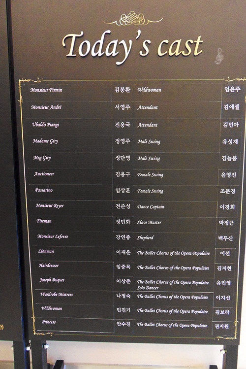
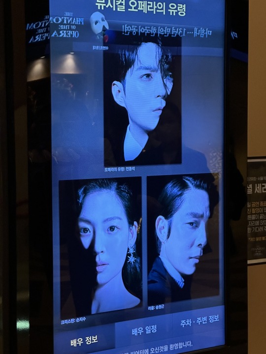
I found this review where someone took more detailed clean photos than I did if you're curious about the layout and decorations!
MERCH AND GIFTS
The tickets had these designs! If you booked on Yes24, you received a special envelope and a ticket holder with the face of the Phantom performing for that show

I only didn't receive a second Ju-taek because that was booked on another site - Interpark (bottom middle ticket). I also received paper masks with printed autographs every day I went to commemorate the 200th performance of the run/100th for Seoul and the 1500th overall Korean performance. We used them for the curtain call photos on those two dates (with Jeon Dong-seok then Kim Ju-taek). There are multiple versions of the program book and at the time of writing this I have all except the Daegu one. The first Busan program book was pretty bare and only had the teaser pictures - the same was the case for my Les Mis program book in Busan. -There are different photos in each one, so to me it was worth grabbing them all. My third version signed by Kim Ju-taek is currently on display as you can see below! (The writing says "내 노래를 날게 해 주오 - Make my song take flight") Once again thank you to Lucy for this! 🥹❤️
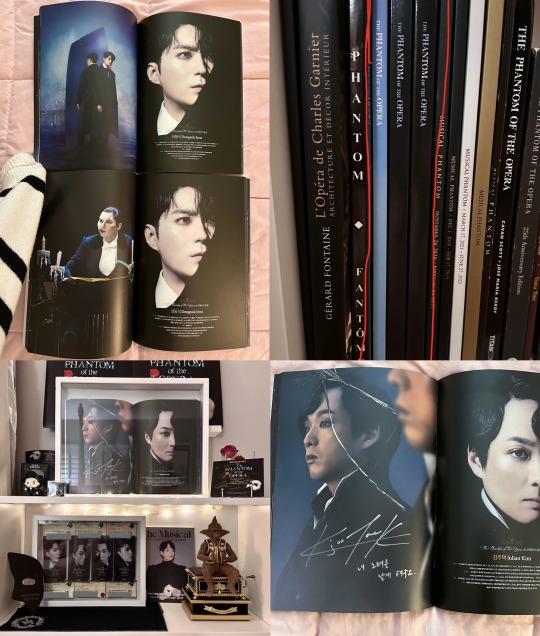
Here's some of my POTO merch (including a spare cupsleeve from the coffee shop next door, I also had a keyring, but I forgot to show it) RIP to the second program book I sacrificed for scans I still have the pages stored/displayed though! I'm not wasteful! I'll have more to post soon after sharing these reviews


TRANSLATION
Let me emphasize this: my Korean abilities are limited, so don't look to me as the expert on this at all. But I'll still share my notes and perspective as an outsider who's studying The lyrics have changed quite a bit since 2001-2. There are still lines kept or songs that are mostly similar. MOTN had a lot of similarity to 2009-11 even with its changes, STYDI was identical to 2009-11, but Angel of Music was pretty different from even the last season, etc etc. The Phantoms all have unique lines sprinkled here and there, mainly in MOTN (this happens sometimes in Korean musicals). You get some things like random single line changes in some parts depending on the actor or different order/wording of the same lines as well. Just tiny diversions from the script. This is the case for the Christines and Raoul to a lesser extent. Additionally, actors are often permitted to do some occasional improvisation/ad libs. Some unique lines are pretty normal parts of their interpretations now, some appear depending on the feeling of the performance, some are one time only events. I'll mention some of the actor-specific ones and such in their actual reviews, but I have been trying to mark down all of the differences like these for example


Of course, some things obviously have to be adjusted to make sense because of cultural / linguistic reasons. So one example would be the "Wrote...written" line in Notes I. Firmin speaks rudely and informally, but quickly tries adding a more respectful ending particle 요 after Raoul and André give him a shocked 'what did you just say?' kind of look. So "대체 뭘 썼다고 하는 건데...요!" is pretty much like "What the hell are you saying I wrote?" André would look so embarrassed by this each time 🫣
퇴근길 / STAGE DOOR
Stage door doesn't really work the same as it does in places like New York, London, etc. Most of the time if an actor comes out it's more like a quick greeting or chat with the fans. Some actors (not in this case) might sign or take photos in designated spots, but it really depends and it's not so common. It's gotten more restricted ever since COVID as well. 퇴근길 -> "way home from work" is literally what this is called. Dong-seok did wave at us a few times happily after the 200th performance, Gun-ha briefly came out to thank fans after the 1500th while Ceci and I waited to meet Young-seok who had agreed to meet us. I did not have the time (or strength) for the Seung-woo mob, but he usually greets fans after shows.
I literally asked Yoon Young-seok directly on Instagram if Ceci and I could meet him and give him gifts because I figured it didn't hurt to try! When he agreed, my anxiety was not necessarily about meeting an actor, but more about my ability to express my thoughts in another language. But he was truly the sweetest guy and incredibly patient. I think he got that I understood everything he said, but that replying was a whole other challenge. I'm glad I was making enough sense that he was able to get my points and helped me finish sentences if I looked stressed about it 😂 I basically told him I had been planning this trip since the cast announcement because it was too perfect to miss and that I came for 6 shows. I really like to listen to his Phantom on the cast recordings and I thought he made the shows I had seen so far so much fun.
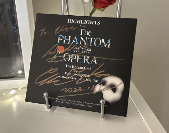
We both said where we were from (the US and France) and he was amazed. He was also shocked when I pulled out my original Korean cast recording (I still laugh thinking about the way he said "와, 세상에!" like "Wow, oh my god!" and enthusiastically took it agreeing to sign when I was mid-way asking him haha) I also thought it was funny when he asked Ceci if she saw his Phantom last season. We wish! But she mentioned she had gone to Busan a few times and he looked very touched and appreciative that we went to multiple performances 🥹 This poor man was tired he signed our things with November (11.13) though and he also spelled Ceci's name wrong first time, but it was the 1500th show though okay. And if he says it's November...who are we to question him? Ceci should also legally change names so he isn't wrong. Anyway, ramble over you can find the art we made for him in this post
OTHER
Here's just bonus fun I had that I will manage to connect to POTO despite it not being POTO because I love doing that. I mean I went because I like these musicals as well (otherwise I would've been foolish enough to go see Ben-Hur but I have, uh, standards for my plots sorry to Park Eun-tae 😭), but it's fun to point out these things. I'm happy to share my show experiences in a different post if anyone's interested in my thoughts on those
Rebecca
I went to see Rebecca, mainly focused on seeing a scheduled date for 이지혜 Lee Ji-hye (Ich) and 장은아 Jang Eun-ah (Mrs Danvers). The whole cast was fantastic. Some Korean musicals have special encore bits they do where the leads sing a part of a song from the show during bows so that was really fun. Unfortunately, we don't get to have fun at POTO like that haha
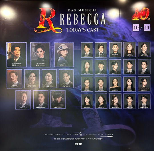
Lee Ji-hye was in Y&K Phantom as Christine in the same cast as Jeon Dong-seok (Erik), Yoon Young-seok (Gérard Carrière), and Lee Sang-jun (Cholet). Two other cast members in Rebecca were in Y&K as well - 에녹 Enoch (Maxim) who was Philippe and 신영숙 Shin Young-sook (Mrs Danvers) who was Carlotta. Sadly, they had such few shows this season due to a busy schedule, so I couldn't see them (when will trot give Enoch back to musicals). Original Korean ALW Raoul and Y&K Erik 류정한 Ryu Jeong-han was also on rotation as Maxim, but I picked another day for my show so I didn't see him either
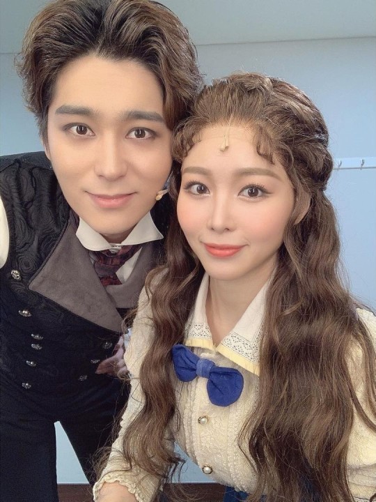

Les Misérables
I went to opening night of Les Mis in Busan! It was the Dream Theater, same place POTO played at before. As many of you already know, Choi Jae-rim is playing Jean Valjean at the same time as the Phantom.

I could recognize him easily as the Phantom, but honestly when he appeared at the very start of Les Mis it took me a minute to process that it was him! While I did enjoy his Phantom a lot, I think I enjoyed his Valjean performance a little more. It was only opening night, so curious to see how things develop!


The actor who played Javert that night, 카이 Kai (stage name), was a former Y&K Erik for two seasons too. So many Phantoms!


Frankenstein
On the last day I got to see Dong-seok and Ji-hye once more in a concert for the musical Frankenstein which they have been in together. So have some pics I took without a mask blocking his face!


Ending Note
Thinking back to December 2022 when I said: "Maybe I'll go to Seoul and see Dong-seok once or twice and that's it, I can have my first international POTO" That was funny. That was really very very funny and silly of me to say. 9 performances and 6 of those were POTO! But I'm so grateful and I have zero regrets about it. This is one of the best experiences I've had even if it might look ridiculous to some people to do something like this...I don't care! I hope my crazy essays can help paint a good picture for you!
#the phantom of the opera#poto korea#오페라의 유령#전동석#조승우#최재림#김주택#송은혜#손지수#황건하#송원근#jeon dong seok#jo seung woo#cho seung woo#choi jae rim#kim ju taek#julian kim#sohn ji soo#song eun hye#hwang gun ha#song won geun#poto#phantom of the opera
27 notes
·
View notes
Text
cryptpad review !
in depth review of cryptpad as someone who is using it as a replacement for google docs because i don't trust google and i dipped the moment i heard "fully integrated ai" 🤭
we're scoring cryptpad on a scale of 1-10 based on its interface, features, accessibility, ease of access, and storage.
scoring criteria:
usability 10/10 : has a lot of formatting options, while also being easy on the eyes. offers features that allow the software to be easily customizable to each user's needs and preferences, or features that make writing easier, without being overwhelming.
accessibility 10/10 : includes accessibility options for eye strain/dyslexia/etc like a proper dark mode and dyslexia friendly fonts, while also having an easy-to-navigate layout, and a mobile app that is equally easy to use without losing its features. doesn't take a long time to load, and is easy to adapt to as a new user.
storage 10/10 : provides a free account with very high or unlimited storage. the documents and files you create don't take up a ton of space, and you have options for upgrading storage if applicable.
what is cryptpad?
similar to how docs operates on desktop, cryptpad is a website-based file drive and software. it's free to create an account, and offers a selection of different kinds of files you can make. here's a list of features i think are notable, first:
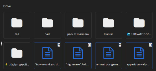
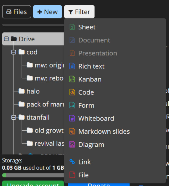
there's 10 different of kinds of files you can create, including even code documents! cryptpad also allows you to create as many folders as you like, upload pre-existing files or folders, and even allows you to add links to your drive if you have links you want to save.

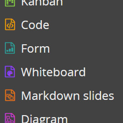
cryptpad always will open a new document or a pre-existing one in a new tab! when making a new document it automatically gives you the options to name it, password-lock it, set a destruction date.


there's diversity in your sharing options: you can toggle and change the rules for the kinds of access people get to your shared documents!


somewhat on the same topic, there's access settings and details you can review and tweak at any time.


also you can change your account's display name in your settings LMAO

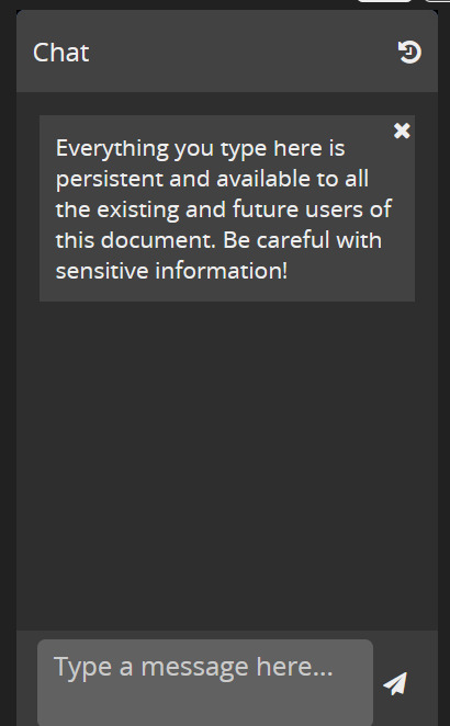
there's a chat option on documents for when you're working on something with other people in the upper right corner of your screen!

the actual scoring:
usability: 7/10
formatting your documents isn't terribly versatile on cryptpad, but it offers to you that you can make as many folders and nest as many of them as you want, while also making its layout and navigation simple. there isn't a ton of super fancy features in the rich text documents, but i enjoy that, to be honest! keeps it simple.

accessibility: 7.5/10
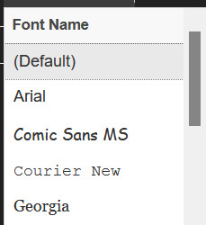
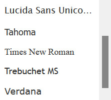
tragically, you cannot change the background of cryptpad files, and there's no mobile app :( if i could i would. they do, at least, offer a light or dark mode? i have dark mode selected of course, but it um... yeah the background is always just that white 😬 unfortunately. they do have basic font options, but personally, my love for cryptpad's accessibility lies in the fact you can make as many folders and nested folders as you damn well please, and the drive screen is SO easy to navigate.

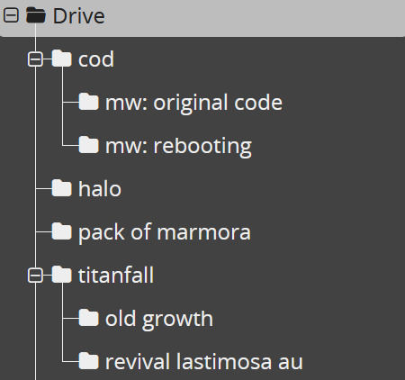

storage: 10/10
1GB for free, to start with? sir, i have 52 files in this drive (all rich text) and i have used 0.03 of that !! which, if i did my math correctly (debatable), that means i'll need over 5 thousand files to fill up that 1GB. AND it's upgradable, without the upgrade price being my soul? you can even donate just for funsies!


overall rating: 8/10
personally, i love cryptpad! i do wish you could change the document background color, and i wish that i had more formatting option like line spacing, but it's a good iteration of what i want in a writing program! i'd definitely recommend if you like supporting freelance guys doin their own thing while also not struggling to figure out how the fuck a writing software works.
51 notes
·
View notes
Text
How to Survive Enstars Events Without Wanting to KYS
The event of my Enstars life is coming up next week on the English server (the only server I actively play on): Rouge&Ruby. I can’t describe what Melting Rouge Soul did to my brain in February 2023. It’s an incredibly important song, card, event, story to me! And my goal is to get max copy of Ibara’s card, just as I did for Bogie Time Ibara.
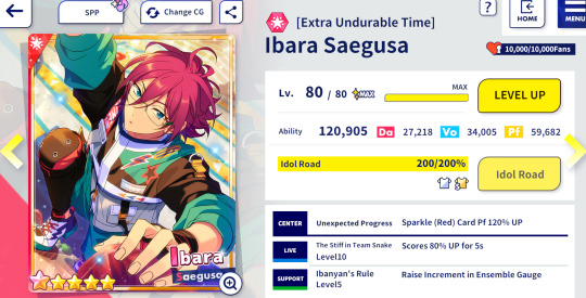
My pride and joy. It’s funny that this card is called ‘Extra Undurable Time’ cuz that is exactly what enstars events are.
However, we don’t play gacha games for fun. We play for collecting the little guy they make you get deeply attached to. If I get adhd hyperfixated I can deal with it. But how the hell did I get max copy Bogie Time Ibara in 2023. I remember how mind numbing it was, even if by some amazing stroke of luck God and the universe created the perfect situation to allow me to no life enstars that week.
So this post is to compile my personal ‘strategies’/mindsets, how to even want to keep playing this game - basically to steel myself for the biggest trial of my ensemble stars ‘career’. Because to me, grinding enstars events is always a battle of the mind more than anything else.
Song events just seem more daunting to me, even if they’re technically ‘easier’ gameplay wise because you can just spam autoplay - compared to manually playing 120 songs for a tour event (and then spamming autoplay). I will not say tour events are better. They’re all their own equally terrible hells to me.
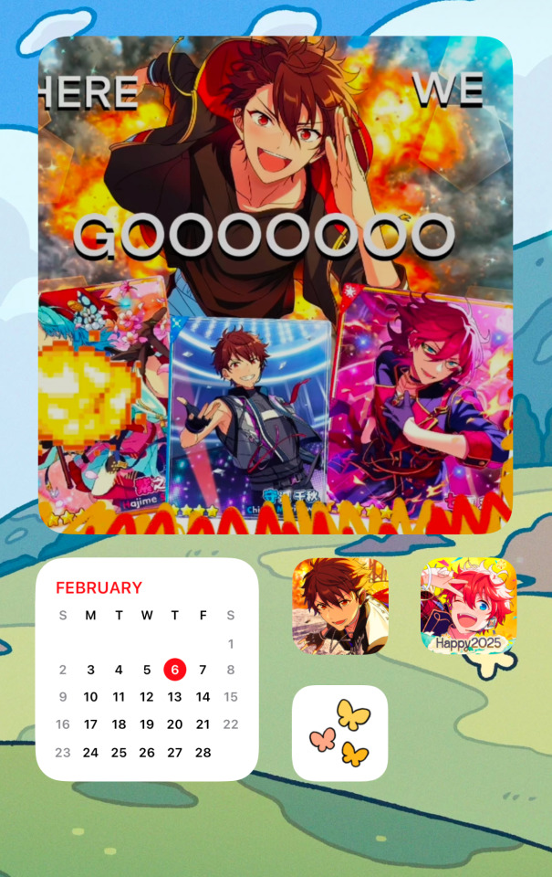
Motivation Notes Staying motivated and focused is SUPER IMPORTANT. I find that visuals like ‘motivational posters’ I make for myself are fun and helpful. See above my specific home screen page JUST for enstars. I don’t really play cnstars, but since that server allows you to change the app icon I use it as additional visualization. Calendar can be helpful for keeping track of how much time you have left.
Customizing your enstars in-game homescreen and profile to match the character you’re working so hard for is also fun. Overall, it’s like a vision board but for your goals in video games (important) instead of real life (not as important).
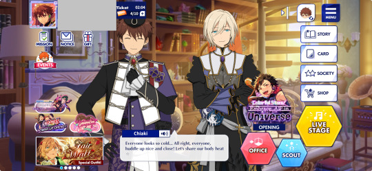
I have this homescreen for (Ei/)Chiaki purposes but honestly the small movements of the live 2D can be extra sensory input. Treat your brain and eyes like a sensitive little baby.
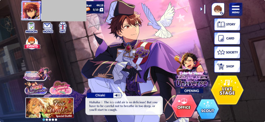
I REALLY should’ve done this for the Universe event, but as of writing this I’m nearly at the 1 million point goal of getting the Chiaki 4 star card. Now this is the most flat, ‘boring’ layout that will not subtly tire you out.
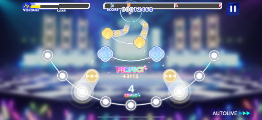
There needs to be minimal audio and visual stimulation in-game. I found that even changing the MV background to no image but the stage image to be helpful in reducing visual stimulation. Putting the game audio on mute is a good way to reduce audio stimulation. The UI/UX of enstars is clunky, tedious, and busy itself so any effort in reducing its sensory input is a plus.
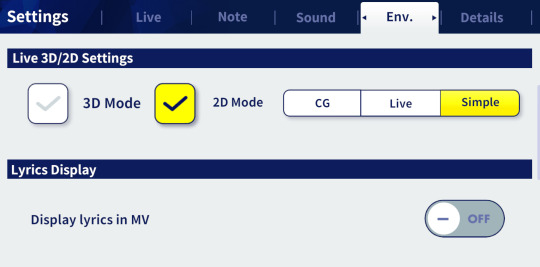
Simple mode is the most basic you can get. Turn off lyrics here and in the details settings if you want even less stuff on screen.
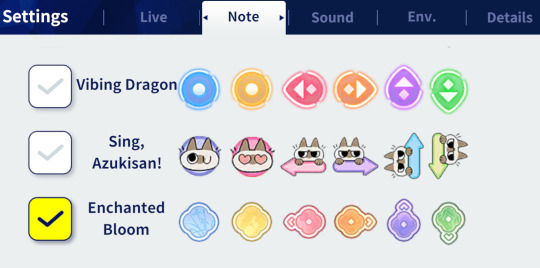
As much as I love the azukisan notes, a note style that’s not too confusing/designed is probably better too.
Another thing I have not personally tried out for playing the game, but have done so to turn my iPad into an ‘e-reader’ is to turn on greyscale mode for the entire phone. I believe e-readers are usually greyscale to simulate a real book, and to limit distraction. This concept could be used for playing games too… Enstars is quite colorful after all and that is also - sensory input.
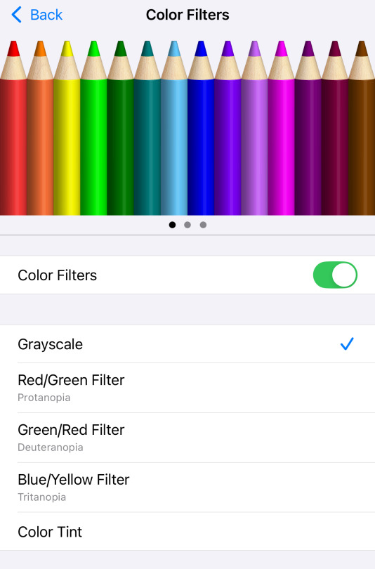
Here’s how to toggle greyscale on iOS: Accessibility > Display & Text Size > Color Filters
Beyond that, publicly sharing your progress is another source of motivation - whether on social media or with friends. Be careful not to reveal too much info about your account at the same time (exact dia count, don’t show ALL the cards you have, etc.).

But you have to be your own biggest hypeman. Channel the energy of the most annoying and loud characters you know (Chiaki, Madara, and Ibara are good examples - I say this with LOVE AND AFFECTION). Celebrate as many event point milestones as you can. RISE AND GRIND!!!!
Gameplay Notes
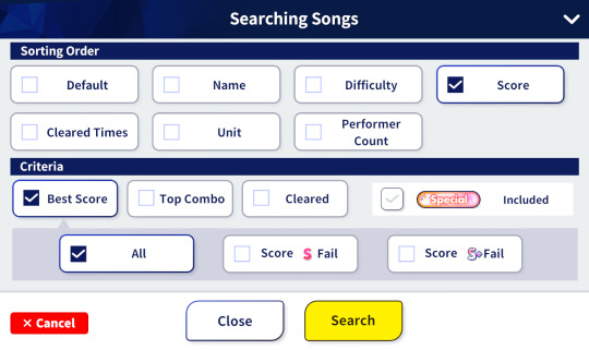
Important info to know for song events is what is your highest scoring song. You can use the search button in the Live page to filter all the songs by score.
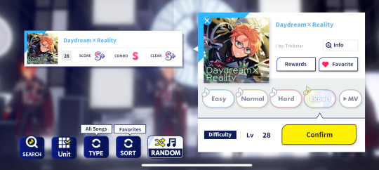
Favorite it so you can make your song menu as simple as possible. This isn’t relevant for tour events tho.
Song Events: Have not maxed out a song event card before so I don’t have any experience to draw upon. I just go for 10BP sometimes 3-6BP each time as I can’t open the game that often during the day. Maybe it’s not technically efficient but I’d rather not be anxious over keeping track of BP regeneration. Very helpful to turn on notifications for Enstars so it can inform you when your BP and work tickets are at max.
Tour Events: I remember at some point I tried spending 10BP on EACH song even if that is not wise. But still mostly kept to the 3-3-6-10 format. Tried 3-6-6-10 too. Maybe I was just losing my mind during Bogie Time and wanted to mess around with the pattern for some sort of ‘fun’.
I can’t wrap my head around the technical aspects of BP spending strategies tbh. The consistent effort is what matters I think. I will not and do not spend much brainpower on this.
Spending Real Life Money: I did spend Real Life Money on prime mission and the 15 whistles per day perk for bogie time. Did it help? A bit. Did it make me want to die less? Idk it feels good to get extra rewards from playing the game so much from prime mission. I used to subscribe to it more often when I first started playing but have long since stopped. The autoloop song vip perk is useful but if you are playing on your phone - I need to use my phone for other things so I can’t keep the game open to complete loops that long. Perhaps a setup of grinding on a tablet instead would be less anxiety inducing/less to keep track of. But I also use my tablet for other things. So from this angle is it truly an upgrade…?
I think the best deal is to buy as many permanent whistle packs from the store as you can and save them for the event. But especially when they have special deals or at the same time as those top up reward events so you maximize your purchases.
I’m not sure if I will buy VIP or more packs for Rouge&Ruby. I had around 76k dia for Bogie Time and did not burn through it all. I must’ve spent around 50k dia. But I read that song events are much more expensive. I’ve saved over 100k dia this time, but I did also buy/win (thru minigames during events) over 500 permanent whistles. I have no idea how this will all pan out so it will be interesting to see how much I burn through. I feel very prepared, so that’s why I don’t see a need for more store purchases right now.
So basically - of course throwing money at things has its benefits. But if you don’t go all out on the perks and spending, it still requires some willpower I think. I got to 80k dia from clearing every single song/song difficulty in the game, clearing the story objectives, and completing all daily free missions in a period of 3-2 months. The rest came from freebies, stories, or seasonal events as they happened. I didn’t start from 0, I think I had somewhere around 10-20k dia before I decided to painfully farm dia from every single song. I used to diligently complete starry live but I don’t think it’s worth the time for a random amount of dia. This is also why I banned myself from scouting (unless it’s limited cards) - only care about what you can get GUARANTEED. Event cards do not rely on rng.
Event Point Ranking: The validation you get from having a high point rank is great. It’s hard for me to ignore and pushes me to grind more. But I also think it’s bad for my brain to care so much when my goal is NOT tiering for the sake of tiering. It’s an extra source of anxiety. I really don’t have any tips for this but to just try to not look at it. Progress - but also reasonably taking care of yourself - is all that matters. You can’t compete with the hardcore f2ps or whales. Just forget it. I’m not here to excel. I’m here to survive enough to get 22 million points.
Event Card Bonus: I had the 4 star bonus card for bogie time. It did feel helpful, but I’d rather not spend tickets or dia on characters I don’t produce so I won’t try to get them anymore.
Live Score Dia Boost: I’ve never tried using dia to boost my score as it just feels better to me to keep dia for BP purposes.
I think that’s about it… Writing this all out was pretty helpful for outlining what’s in my mind. I genuinely can get so over-excited for things. I was so excited/anxious for New Start Go I had trouble breathing right at the very minute the event started 💀 And I was only getting one card of Hajime. Hopefully this all will help me deal with the mounting anticipation of the Ibara event/song/card ever and maybe something was of use to whomever read all this.
#chyna writes too#ensemble stars#me when I put ‘I don’t yap as much anymore’ in my blog description and then continue to yap that much
4 notes
·
View notes
Text
Family Computer - Ys
Title: Ys / イース
Developer: Nihon Falcom / Advance Communication Company
Publisher: Victor Musical Industries
Release date: 26 August 1988
Catalogue Code: VFR-Y2-05
Genre: RPG


Little did I know there was a Famicom version of Ys in Japan that did not make the trip westside. While it is largely a port there are enough differences and additions that it almost feels like a remake.
Even though Ys is not a long title there are a number of changes here. One of the most significant is the leveling curve. Rather than 10 levels the cap is now 24. This had the potential to make the game a ridiculous grind however experience comes so easily you can hit level 18 or 19 in the first major dungeon. It feels no different than the other versions in practice. A few mini-quests and puzzles have been added to liven up a few underused areas. Some of the bosses have new attack patterns and are more difficult. The layouts of the dungeons have been changed and most importantly there is a “new” final boss. These changes do not impact the general flow of the game as it is still the same teaser of a title it always was. But they do make the NES game distinct.
Despite the myriad changes and additions to the game, it is still short. I only had to grind three times, and each was for about ten minutes. A few of the boss battles tripped me up a few times due to their new patterns and the sluggish controls. But even then, I was able to complete this version of the game faster than all others in under three hours. Ys 1 has always been a brief experience which is why it is usually paired with its sequel. But that would not start until the PC Engine CD came.
Ys was never a stunning-looking title. But of all the console versions the Famicom version is the ugliest. The sprites are short, squat, lack detail and worst of all recycle constantly. The Famicom’s limited color palette means the overall palette is bright and garish at times. The biggest letdown is the music. The Ys series is legendary for its phenomenal music. Outside of a few tracks, the soundtrack here fails to meet the standards of the other versions. There are a few new music tracks but overall, you are not playing this one for its production values.

youtube
2 notes
·
View notes
Text
Madoka Manga comparisons
I had spare time so I wanted to compile most of the big differences in the original Madoka manga to the Reprint manga. Now this excludes obvious ones like outfit/witch/scenery changes. The designs are much more akin to the anime overall.
The comparisons certainly lessen as I go on because it got a little boring to explain the most minute of details but I swear I found as the manga went along more pages were just exactly the same as the original... I mention a few panel/layout pages in the earlier chapters but that dwindles as I go... sorry if you wanted that, I just got bored of it... I always mention the addition of full pages however
Anyway, please enjoy!
Chapter 1
The beginning shows a silhouette of Walpurgisnacht whereas she was absent/hidden before
An extra panel shows Homura falling
New Homura is falling while old Homura was just standing and was seemingly closer to madoka (less desperate it seems)
Old Homura is noticeably bleeding while silently calling out to Madoka
The position of the alarm clock is flipped (I just found that funny)
Old shows a panel of Tomohisa cooking whereas new adds more pages to breakfast (probably negating this)
Junko and Madoka are now in pjs first when in the bathroom
New makes note of the colours of the ribbons in special text (in english in the japanese ver, huh)
Madoka eats breakfast at the table whereas before she went straight out without visibly eating
New has an extra page of Madoka and Junko leaving
Hitomi coughs instead of just staring when Sayaka gets handsy with Madoka, more like the anime
Kazuko now picks on Nakazawa (I don't think he's ever in the original now i think about it...)
Homura is shown in silhouette behind the door instead of a neck down shot
Sayaka sits in front of Madoka whereas before she was behind
Madoka is shown in the panel before Homura looks at her
Homura looks the other way when staring at Madoka, probably to match with the desk layout from the anime
The classmates are now visibly shown talking to Homura (with text)
Madoka is sitting down instead of Hitomi (maybe to match with anime desk arrangements)
A panel is adding showing the girls down the corridor
The layout of Madoka walking with Homura and beginning to talk is the first distinct panel rearrangement
Same with the next page. In new, Homura seems far more serious and Madoka is less flustered
Madoka no longer responds when Homura says her name. When Homura is talking to her about what is precious, only Homura is seen, not both of them
Madoka no longer says Homura's name as she leaves
Madoka and Sayaka now visibly have their bags while shopping
Homura is more visibly seen clearing the smoke of Sayaka's fire extinguisher. Old homura is more visibly frustrated at the labyrinth's arrival
Mami is less visible as the Anthony approach. Unlike in the anime, they never have their nightmarish faces. A panel is added where Mami's soul gem is shown as well as when Mami falls in. The Anthony also take note of the flowers dropping from Mami's appearance
Mami arrives in her school uniform and transforms in front of the girls
It seems like there's added pages for Mami's attack which is more like the anime than the cannon from original
Homura is shown watching as soon as Mami defeats the anthony in the original
Homura approaches like in the anime in new whereas she leaves without approaching in the original
Mami detransforms in chapter 1 of the original. It seems like the original has a few more pages of the four of them talking that are taken up instead with the attack pages and talking to Homura in new
Chapter 2
Kyubey is on Madoka's shelf instead of in the bed. Madoka's angle is changed to accompany this
Mami's soul gem is no longer on a necklace/string. It is also shown retransforming from her ring in new
The girls look more shocked when Kyubey says they can grant any wish
The panel showing Mami's class number no longer appears, instead its a zoomed out shot of her class
Homura seems to no longer say 'Do you have a minute' when approaching the girls on the roof
An extra panel shows Kyubey's face (live kyubey reaction) as the girls talk
Homura is more visibly distraught in old when Madoka asks what her wish was
Hitomi is more sad about being left out in new compared to old, like in the anime
An extra set of panels are added showing the classroom girls asking Homura if she'd go out with them after class like in the anime
Mami and Sayaka's laughter at Madoka's drawings seem a little more lighthearted instead of cruel in the old one
The office woman's shoes are shown in new. Mami now catches her with a visible ribbon net rather than the magical spiral of old
The witch kiss now makes a sound effect
Mami summons a musket before they enter in old
Homura now watches over them in her school uniform instead of her magical girl outfit
Sayaka no longer hits an Adelbert with her bat
An extra page is added before they reach Gertrud featuring more Adelbert fighting and the door to the boss room
More panels are added for action and Mami doesn't reply when Sayaka exclaims she's missing. The two girls are also more visibly far away like in the anime
A few panels are added showing Adelbert approaching Mami
Two pages are added showing Mami binding and defeating Gertrud
The panels showing the labyrinth disappearing are now after Madoka and Sayaka's reaction instead of before
Mami throws Homura the grief seed like in the anime and has it thrown back. Homura is also still in her uniform
Chapter 3
Kyosuke's arm is now in wrappings whereas it was shown with visible injuries in old
Mami is on top of the lamp post ala the anime after killing Ulla
The central panels of the vehicle accident seems to almost be a 1 to 1 replica or trace of old
The panel showing Madoka's drawings is replaced with a zoom out shot of her house before showing her in bed
New adds two pages of the scene where Homura and Mami meet that night
Mami uses her ring to open Charlotte’s labyrinth instead of her gem
Mami no longer crouches to trap homura, she is instead standing and her ring glows. Ribbon like structures in the backgrounds kinda subtlely hint at what's to come
Homura is suspended in the ribbons instead of kneeling on the floor, more like the anime
Polina are no longer shown in the background waa but more of the labyrinth is shown off. Madoka is no longer shown sitting alone at her desk when talking about herself being weak
Instead of Madoka's visions of Mami being of her first appearance and saving the woman, it's now a single shot of her tiro volley from ch1
Mami begins to cry sooner in new
Mami seems to mention the wish for a marvellous feast in new whereas it was omitted before
Pages are added to show Mami fighting Pyotr and she doesn't transform so quickly.
The overall pacing of Charlotte's fight is a bit longer.
Charlotte emerges from a present which is very cute.
Mami shooting Charlotte and her emerging is over two pages instead of one.
Homura now transforms before she runs off
Charlotte eating Mami now has a more cartoony style. Mami's body is seen falling in her uniform whereas before it was already on the ground and still in her magical girl costume. The girls also now seem less shocked.
The bikes outside the hospital are shown as the labyrinth fades
Sayaka is still holding Madoka in new as Homura finishes fighting Charlotte
Sayaka's expression is no longer shown when grabbing Homura
The two girls are shown more visibly crying but Sayaka no longer screams 'Dammit'
Chapter 4
New shows the Mami egg at breakfast
A page is adding showing the girls walking to school and being in class with no text
A page is added of the girls talking.
Sayaka hugs Madoka as she cries like the anime
Madoka now has her school bag when visiting Mami's apartment (and is seen taking her notepad out of her bag)
Mami's apartment is shown as Madoka and Homura are discussing her instead of her classroom seat. She is also shown in her uniform instead of her magical girl outfit
Homura's ring is shown instead of her gem when discussing magical girls
Homura seems less shocked when Madoka says she wont forget her.
She also seems more shaken when she says she couldn't possibly remember. However she appears less shaken up when walking away
A panel is added during Sayaka and Kyosuke's discussion
Kyosuke hurts his hand on the CD player instead of the stack of CDs (Kyosuke's face also looks kinda worse lol)
Kyosuke appears more in pain and less angry after what he did
Kyubey is no longer shown as Sayaka mentions miracles however his eye is, with them appearing in Sayaka's eye in the panel below.
The crowd of witch kissed victims are shown instead of Madoka's horrified face as they clap for Hitomi (I think original worked better imo)
Madoka appears more scared as she's already crying as she runs for the door
Daniyyel and Jennifer are shown before Elly appears more like the anime
A page is added before Sayaka appears where Elly masquerades as Mami
A page is added for more fighting
Homura is no longer seen running over and instead is watching from afar. A page is removed where she's running over
Its more visible that Kyosuke's hand is healed as he clenches it. He also appears more shocked
Chapter 5
The scene where Sayaka contracts is a lot more flowery (also, theres more flowers) but very pretty
Sayaka's ring is shown more focally as the girls are on the grass
Madoka used to look more upset as Sayaka monologued
Kyoko focuses more on Sayaka as she watches her through her binoculaurs. Kyubey no longer has a waffle of his own.
The begginning of madoka and homura's conversation about sayaka is no longer slightly comedic
Madoka no longer cries as Homura leaves
Sayaka's first transformation is fancier (more panels)
A page is added for action and to compensate for the longer transformation
Kyoko's spear repels sayaka's attack instead of a shield, like the anime
Anja is shown in an extra panel as the labyrinth disappears
Kyoko turns away after felling Sayaka for the first time whereas before she was still facing her
Kyoko now creates her barrier to block madoka out
A couple of pages are added for action
Homura's hand is now visible when she says 'that will not be necessary' as madoka begins to wish
There is now an explosion as Homura appears
Chapter 6
Homura doesn't seem as angry about telling madoka to not get involved and madoka appears less upset
Flashbacks of Kyoko and Mami are shown as Kyubey discusses magic
Sayaka appears more angry at homura for apparently letting mami die
A page is added for this conversation and Madoka is more upset as she begins to cry
A page is added for Madoka and Junko's conversation about Sayaka
Sayaka no longer looks bittersweetly happy as she turns away form Kyosuke's home with now a much sadder expression
Sayaka seemed more angry at Kyoko in old for suggesting hurting kyosuke
Sayaka holds out her soul gem instead of holding it up
A small panel is added as homura leaves to get sayaka's soul gem to show her 'teleporting' away
Kyoko is more noticeablely grabbing sayaka's neck
Madoka appears more distraught over sayaka
Kyoko is now visible in the panel where sayaka wakes up
Chapter 7
The tone of Sayaka and Kyubey's discussion about the truth about soul gems seems tonally more dire. Sayaka's face is overshadowed more and the room is darker
Kyoko's flashback is shown with a dark outline to show the different time
Kyoko looks far younger in the flashback and is no longer slapped by the apple salesman rather grabbed by her jacket hood
Gisela is added as kyoko describes making her contract
Sayaka's face is now hidden when Madoka asks if she can come with her on a witch hunt
When in Elsa Maria's labyrinth, Sayaka is at first being attacked by Mathieu instead of what look like vines from Elsa Maria
Sayaka slashes at Elsa Maria instead of stabbing her and there appears to be less blood
In new Sayaka appears more broken than manic when continuing to fight Elsa Maria/Sebastian
Chapter 8
Sayaka appears more blank when healing herself at the end where she seemed more out of breath before
Kyoko now appears more helpless against Sayaka instead of shocked/frustrated
Sayaka's text boxes when she's yelling at Madoka now have a special outline to them
The page of Sayaka witnessing hitomi confessing to kyosuke now goes straight into her fighting the Bartels
Sayaka now fights the Bartels instead of Uhrmann
Sayaka seems more deadpan when expressing to homura that she'd be okay with dying where before she looked more bittersweetly sad
Homura no longer smirks when saying 'You're... quite sharp...' when bringing out her soul gem. Her hand with her ring is also shown shaking instead of a full body shot of her
Homura's expression is more unreadable when attempting to kill sayaka whereas before she looked a bit more evil
The scene where Sayaka mocks the two men on the train is replaced from her with an evil look her a silhouetted version of her in a soul gem. She also no longer walks away with a bloody blade
After Homura grabs Madoka, a quick flashback of madoka's dream from the very beginning is shown
Homura now looks away as Kyubey eats their body/talks to her
Sayaka is holding her blackened Soul Gem when kyoko meets her at the station as opposed to the incorrect grief seed before
Kyoko appears more shocked than upset as Sayaka explains herself to her
Kyoko now reaches out as Sayaka transforms into Oktavia
Chapter 9
The clock imagery when Homura stops time is replaced with oktavia and her labyrinth
Kyubey is shown in an extra panel after kyoko asks if there's any way to get her soul gem back (probably to make it easier to understand who's speaking)
Kyoko now stops madoka before they reach the boss room (more like the anime iirc)
Holger are removed in Oktavia's room v-v sad...
Oktavia uses the wheels to attack more like the anime
Kyoko puts up her barrier to protect madoka more like the anime
Kyoko is now more visible as Oktavia stabs her (less silhouette and blood). The cross necklace is also replaced with her father's charm
Both Sayaka and Kyoko look more sad/melancholic in their extra scene
Chapter 10
Madoka and the class is shown after Kazuko explain's Homura's heart disease
Madoka is no longer shown being bashful after mami compliments her fighting
Walpurgisnacht is shown more clearly before madoka leaves to fight her
The ruined city is shown as Madoka bids homura farewell
Homura now puts on her glasses to see her soul gem
Mathieu are added to Patricia's labyrinth :) her ribbon paths are also used
It's more visible when Kyoko falls after mami shoots her soul gem now
When Homura heals her eyes they glow brightly instead of showing a reflection of her soul gem
Gotz are removed from Roberta's labyrinth v-v
Chapter 11
Flashbacks of Madoka's deaths are shown as Homura hugs Madoka, telling her how much she's watched her die like the anime
The picture of Madoka and Homura in the past and present are more apparent during Homura's monologue
The fight between Walpurgisnacht is more akin to the anime in general
An extra page is added where Walpurgis first explodes where Homura thinks she's won
The shadow magical girls are no longer Mami, Kyoko and Sayaka, now retaining their anime appearances
A page of fighting the shadow magical girls seems to be removed (probably moved to the walpurgis section instead)
Junko now grabs Madoka's hand instead of calling to her more like the anime
Chapter 12
Madoka is more visible as she first transforms into her magical girl form, her blooming bow being focused on in extra panels
The sailor suited magical girl is replaced with a girl with a cog theme. She is no longer holding her soul gem instead madoka heals the star shaped gem on her arm
The historical magical girls madoka sees are completely redrawn and presumably the cog magical girl's soul gem can be seen at the top of the page
Madoka and Homura are now in their anime-esque dresses when bidding farewell instead of madoka being nude and homura in her magical girl outfit
Madoka's hair is no longer down as she takes sayaka away, fits with the anime but makes more sense for her hair to be down since she just gave her ribbons away :P
Tatsuya now draws more of madoka's body instead of just her face, more akin to the anime but not a perfect match
Homura's ribbons now match the anime instead of bunches but she is still wearing a casual outfit (albeit a different one)
The scenes with Junko and Homura feel overall lighter with a less dark sky
The 'Don't forget' line is accompanied with Homura with her wings facing the wraiths more akin to the anime instead of the old ribbons and feathers
21 notes
·
View notes
Text
Benefits of Siemens SIMATIC HMI: A Comprehensive Overview
When it comes to optimizing industrial processes, the role of a Human-Machine Interface is very important. One of the leading brands in this field is Siemens SIMATIC HMI. This technology offers a seamless connection between operators and the complex machinery that powers production systems. Keep reading this blog as we will share with you some of the most important benefits of using this system.
Enhanced User Experience
One of the standout benefits of the Siemens SIMATIC HMI is the interaction design or UX. They are designed to be clear and easy to use, even for operators without advanced technical expertise. The TP1200 model, with its touchscreen interface and customizable layout, makes it simple for users to monitor the status of machines, adjust settings, and react quickly to alarms or faults. This user-centric design helps to reduce human error and improve overall operational efficiency.
Improved Efficiency and Productivity
This system plays a crucial role in increasing performance by making the communication between the machine and the operator very simple. Real-time data, visualized clearly on the HMI screen, allows workers to make decisions faster and take action to prevent downtimes, which can become very costly at times. With the SIMATIC HMI TP1200, you can easily access detailed information, like machine health indicators, without wasting time on complicated procedures or guesswork.
By offering clear, real-time feedback, operators can quickly identify issues and address them before they escalate into bigger problems. This dynamic approach helps in reducing downtime while maintaining steady levels of production.
Smooth Combination with Other Products From The Same Brand
One of the best advantages of the Siemens SIMATIC HMI is its integration with other automation products, such as PLCs, and others. This makes it a great choice for industries already using equipment from this company. The TP1200 can be easily connected to systems to have a smooth flow of data accross various platforms. By doing this, you make sure that the entire production line is optimized for performance and efficiency.
In addition, because Siemens is known for its reliability and consistency, you can trust that the Siemens SIMATIC HMI will offer long-lasting performance that integrates well into your existing setup without requiring significant changes or upgrades.
Scalability and Flexibility
Another important benefit of the Siemens SIMATIC HMI is its scalability. Whether you're running a small operation or a large factory with multiple processes, Siemens offers a variety of HMI options that can meet your specific needs. The SIMATIC HMI TP1200 is part of a range of touch panels that offer different screen sizes and functionalities to suit various industries.
This flexibility allows businesses to choose a solution that is right for them and their needs. People often start with a smaller system and upgrade as their business grows, ensuring their investment in the Human-Machine Interface will continue to support them in the long run.
Wrapping Up
Siemens have always been popular for their robust innovation and development of world class products. One such innovative technology is Siemens SIMATIC HMI. From the above discussion, it should be clear why companies opt for this system when they want to improve their operations, user experience, and productivity.
Source: https://hongkongxieyuantechc.livepositively.com/benefits-of-siemens-simatic-hmi-a-comprehensive-overview/
1 note
·
View note
Text
Step-by-Step: Planning Your Complete Home Renovation in Houston
Is your home no longer able to accommodate your changing needs or do you want to give a fresh and new look to your space? Then opting for complete home renovation in Houston is an excellent idea. Did you know that Americans choose to renovate their homes every three to five years? (https://www.zippia.com/advice/home-improvement-industry-statistics/#:~:text=There%20are%20493%2C728%20remodeling%20businesses,improvement%20sales%20reached%20%24538%20billion.) Yes, you read it right!

Undertaking a complete home remodeling project can be exciting and challenging at the same time. Therefore, partnering with professionals is always a wise decision. However, before you hire the experts, having an idea of the steps involved is crucial. Read on to explore everything in detail!
Step 1: Understand Your Goals
Planning for a home renovation in Houston starts with preparing a wish list. Clearly define the goal of your remodeling project. For instance, you may want to modernize your space, add more rooms, or increase the property value. Once you have the clarity of goals, list down all the features you want to incorporate. It can include anything from floor plan layouts to paint colors, kitchen cabinets, and more.
Step 2: Gather Inspirations
If you are clueless about your whole home renovation, it is best to invest some time in research. Go through the home improvement websites, social media platforms, and magazines. These resources can provide you with insights into the latest trends and offer you amazing design ideas. Gathering relevant inspirations well in advance will enable you to effectively communicate them to the professional renovators.
Step 3: Set a Budget
When you have an idea of the ultimate goal of renovation and how your home will look like, determining the budget becomes easy. Make sure to set a realistic budget taking into consideration all costs, including contractor fees, material costs, and more. Moreover, you must also set aside a contingency fund to accommodate unexpected expenses and avoid last-minute hassle.
Step 4: Hire the Contractors
Once you have defined your goals and prepared a budget, it is time to partner with the home renovation contractors. Be sure to select a contractor with years of rich knowledge and experience in the industry. Communicate all your needs and preferences to the experts. Do not hesitate to ask about the duration of the project and the overall costs. Moreover, ensure that the professionals keep you in the loop throughout the process.
Step 5: Obtain the Permits
Based on the scope of your renovation, you may require acquiring the necessary approvals from the local authorities. While obtaining the permits may be complex and time-consuming, the renovation contractors can make it easier for you. They can navigate you throughout the process and ensure optimum compliance with building codes.
Step 6: Execute Your Plan
The final step is to sit back and witness your dreams come true. Make sure to regularly communicate with the contractors to gain insights about the progress and changes in the plan.
Conclusion
Are you ready to transform the look and feel of your house and searching for the best home renovation contractors in Houston? Marwood Construction is the name you can always trust! Prepare and plan for the renovation, connect with the experts, discuss your needs, and avail of top-notch solutions.
0 notes
Text
i don't feel like there's much to say about my art improvement this year. however, in 2023, i wrote a long retrospective about my art in which i mentioned my goals for 2024, so let's see if i achieved all of them ^w^
"so for 2024 i want to study some stuff i feel i'm still lacking in. i think i've always had a good eye for composition, but i've never actually pushed it in my finished illustrations - they depend a lot on the poses because i've always been prioritising drawing over everything else. that needs to change this year."
this was actually one of the first things i did in 2024. just around this time of last year, i was in the process of making 7 fullbody illustrations for class, depicting my ocs from a visual novel i still haven't finished. i never shared them outside of artfight (😂) because i get shy talking about my ocs in public, but they are still fire and almost no one reads these posts anyway so...


i had to use so many references for these pictures, from magazine covers to fashion to layout design. i think this was the first time i was actually putting into practise all the knowledge i had learned in my degree, as up to that point i was getting through it kinda passively.
overall, my 2024 was filled with great compositions. who could have known that paying attention to it would lead to better illustrations, right? here are some other highlights i'm still very proud of:


that leblise piece is probably my favorite piece of art i ever did period. so simple yet so delicious and full of symbolism. the aqours fanart is based on an S shape, from "sunshine", and i felt so smart for coming up with it even though it's really simple. and then there's kanadiamari as always - what i really like about that fanart is that i was able to put my design knowledge into good use again.
"i also want to get better at drawing characters from extreme angles. i've always felt like my poses are a bit flat and i think i can study photos taken with wide angle lenses to improve at that."
before we get into this let me remind everyone that i trace all the time. sometimes i wake up and forget how to draw, so i open an app called Magic Poser and play with the 3D dolls until i have a decent base for what i'm picturing in my mind. but it wasn't until last year that i started pushing the angles of those scenes so that i could get the best of them.


of course, you need to have good skills in order for your traced pieces not to look like shit. i can work with anime models with innacurate anatomy precisely because i already know where the muscles sit on the body. the suselle artwork is more referenced than traced, in the sense that i first sketched the pose, then re-created it in 3D, then traced it and then re-sketched it. the things i do for yuri orz.
okay this was kind of a tangent. i did improve on this particular point but the reason isn't that i got better at perspective, i just made better use of the tools i have - the result is the same and it's positive, so i'll take it as an achievement!
"and of course i still want to draw faster, which is something i've always struggled with. […] i'm still too slow for the kind of artstyle i want to achieve, which includes having a looser lineart and less details in irrelevant areas of the drawings. i think that overdoing the lineart actually hurts my illustrations, because everything ends up pulling the viewer's attention with the same energy. i also think messy artstyles are neat."
this is a tricky subject. in my 2023 post i showed some examples of what i wanted to keep doing in terms of lineart, and while i certainly got better at not overdoing it, i'm still far from that goal. definitely something i need to keep an eye out for, as i really like it when i manage to get loose with my art.


not much to say here except that i'm sorry i never posted these farcille sketches. they are 12 in total and the rest of them are porn and i'm too shy to share them with the world. also those furry guys i draw a lot (twice) are me and my and my best friend's fursonas, in case anyone is curious.
"as for the stuff i like about my current artstyle, i definitely want to keep the way i color!! and by that i mean the method i have for applying filters that make my colors pop. i could maybe play more with textures too."
i actually think i went backwards here. what i do now is more visually coherent, but my 2024 doesn't shine for the way i use colors in comparison to the previous year. it probably happened because i got too comfortable with the way i post-process my illustrations nowadays, in contrast with how experimental i was when i started playing with filters. a shame, truly, but not a huge downgrade.
"i also like the way i depict intimacy, and people have praised it too. i don't think i'll ever change the content of my art, i eat breathe and speak in yuri. if anything, there are still some ways of conveying feelings that i haven't been able to draw because i lack the skill to do so, but i'll keep trying ;)"
not sure about this one either, but i know it's just because i didn't draw a lot in 2024. among finishing my degree and final thesis, organizing stuff for aqours when they came to spain and preparing for my current job, i didn't have much time for yuri brainrot. my best drawings were dunmeshi and lgts fanarts, and i'm glad i got into both of these pieces of media because they still warm my heart today :)


i'm very proud of all 3 of these artworks, especially the frebkuchen one, i cooked so much there. maybe this skill of mine (the ability to depict intimacy) is the one that's closest to mastery among the ones i have, and that's why i don't see much improvement.
overall, 2024 was a good year, but not my peak. i can't rate it just in terms of improvement, but i can't deny that i like my 2023 artworks more than my current ones either. i think i'm on the right path, and while i don't have any art resolutions for 2025 i hope i can bring better art to the world from now on.
thank you for reading until the end if you did, and i hope you have a nice year!! <3


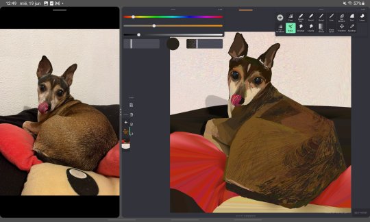


2024 art summary!! lots of oc art this year :) i also started painting digitally and it's sooooo fun~~~
(template by PEPPERTODE on deviantart)
58 notes
·
View notes
Text
Magazine Cover Layout- FAS3003


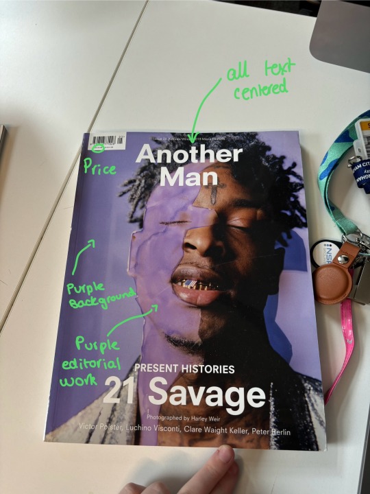
One thing I liked about the covers was that they all had their price printed onto the front of the magazine. As a consumer, I liked that it has it's price printed as then I know how much it costs before buying. Personally I prefer this as I do not like buying stuff without knowing the price before i get to checkout. Another detail i liked is the consistent format of magazines. For example, Vogue always keeps their logo the same size, font and position on the front cover. This consistency is aesthetic for the customer.
The first cover I decided to look at is the Vogue magazine cover from August 2019 (image one). The first thing I noticed about this magazine was the green colour scheme. I like the colour consistency as it gives a clean look, especially on a white background. One thing I disliked about this is the green writing on top of the green jumper. The shades weren't the same but too similar to be paired on top of each other, making it harder to read the writing. Overall, I liked the final image and look, but if I had to change one thing, it would be the shade of green used for the font.
The second cover I decided to look at is the Thrasher September 2020 cover. One thing I love about this cover is the layout, the grid of 12 images. each individual image captures everyone's different personality/ emotion and I really liked how effective that was. The next thing I noticed was the black-and-white filter. For this magazine cover, they used facial emotions to entice their consumer, compared to Vogue used a green colour scheme to entice their consumers. I really like how effective this came out, but I feel the black-and-white filter wouldn't look as great on my magazine cover. For me, colour is what draws me to read a magazine, so I want to include that in my outcome, but I love the grid layout and I'm considering using it for my cover.
The third cover I wanted to analyse was the 'Another Man' edition featuring 21 Savage. I love the purple on this cover; the background compliments the edited purple shade perfectly. The writing on the cover is all-centred, which I quite liked as it looks more organised. The producer edited the image used on the cover to have a purple 'splash' on the right side of 21 Savage's face. I love how this looks, but I won't use it for my magazine as it doesn't match my theme. However, the idea is very excellent and effective.
After reflecting on these covers, I have gained a greater understanding of what makes a 'successful' cover, and I want to incorporate what I've learnt into my magazine's cover.
1 note
·
View note
Text
(ARTS246) Ch 12: Typographic Design Process & Project 3: Finalized Process Book PDF

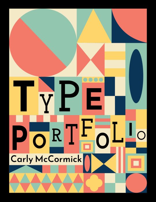
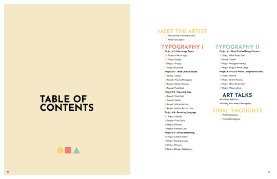


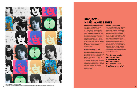
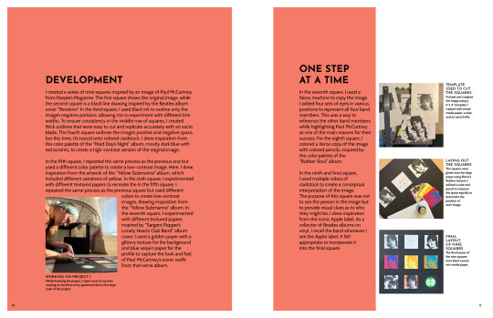


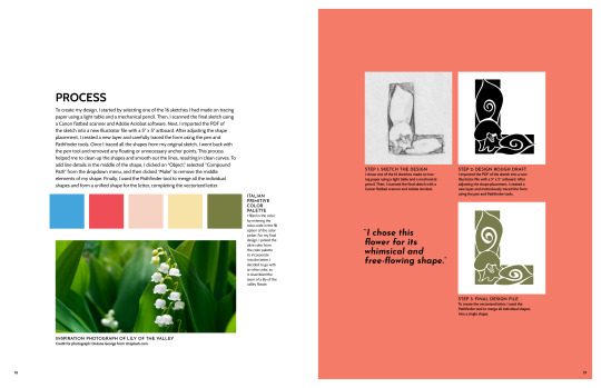
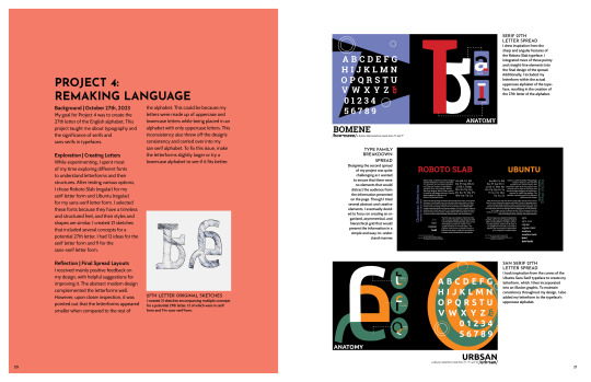
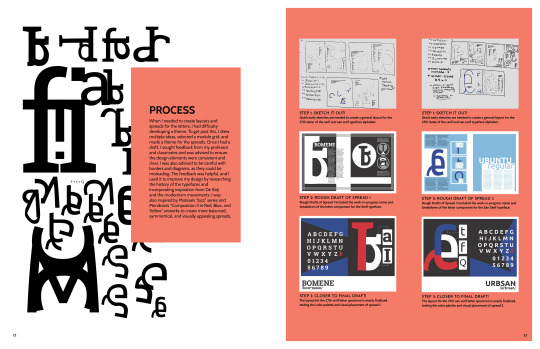
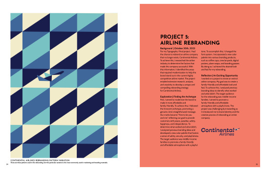


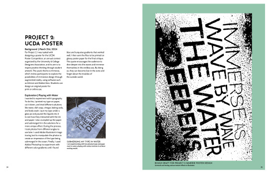
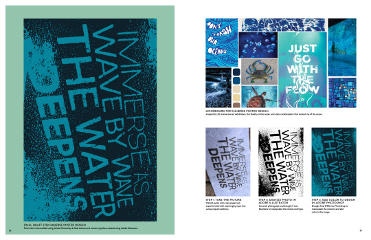

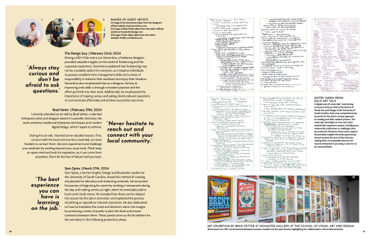
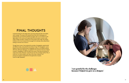

It has been an eventful week full of reviews and corrections. I have spent long nights sitting in front of my computer screen, constantly second-guessing myself, my theme, and my layout for the book. But now, I have created my typography process book & portfolio. It's hard to believe that this semester is almost over, and I have learned a lot from taking Typography I and II. Reviewing my work this week, I have improved from the first progress book I made in Design Technology and Concepts. Although I used a similar grid as my first process book, the layout was completely different due to my wordy, detailed blog posts (sorry, Professor Valdes 😅.) However, I'm glad I treated my blog posts as brain dumps because they helped me write detailed descriptions of my creative process.
The book has been uploaded to Blurb.com for printing and shipping, and it is expected to be ready in about two weeks, hopefully by April 22nd. Overall, I found Blurb to be a relatively easy platform to use, with a slight learning curve at first, as one would expect when learning something new. One of the features I particularly liked was the system's preview function, which allowed me to see the final product before proceeding to the billing process. However, I am somewhat concerned about the PDF file. I am somewhat of a perfectionist, so this being my first physical book to showcase my work, I want it to be as close to perfect as possible. Unfortunately, when I received the printed PDF, I noticed some discrepancies that differed from the preview I had reviewed on Blurb. Specifically, the cover didn't carry all the way to the top of the page, resulting in a small white line being visible, which worried me. Additionally, one of the pages had completely different colors from my original file. This was particularly noticeable in my airline rebranding pattern, where the colors appeared too bright, causing me a bit of a headache. This was strange because the preview on Blurb had appeared completely different and correct, and my test prints had also shown no issues with color matching. I used FedEx's economy 80lb paper, which should be the same paper used for the final printed book. While some might consider these concerns trivial, they remain significant concerns for me. Unfortunately, I couldn't view the paid PDF until after the purchase had been made, so there wasn't much I could do once the file had been sent for printing. At this point, I can only hope that everything works out in the end.
On a positive note, I can use this portfolio to apply for an internship. It showcases my skills in typography, page, and spread layout. Moreover, it's one of the initial projects I created using my personal branding color palette and pictorial logo. I'm thrilled with the final book design, which combines antique/movable type-inspired typography with a geometric surface design. I'm excited to use this color palette and design aesthetic for my upcoming projects.!
I have reached the chapter on the typographic design process in my reading for this week, which is my favorite chapter. I absolutely love learning about how artists bring their ideas to life and find it inspiring to see their creative process. However, the book mentions that starting a project can be daunting, which is so true. I often struggle with a project's initial phase because I am unsure where to begin. Additionally, I wonder when the process of designing ends. Personally, I view design as an ongoing project, and although I complete projects for a grade, I can always revisit them later. For instance, after submitting my process book for grading and printing, I had many ideas for the pages, such as changing the color of call-out captions to make them stand out more. I appreciate how the book showcases the progression of sketches, thumbnails, vectors, and the final product. It is insightful to see how other creatives approach their creative process, and I believe this chapter will serve as a great reference whenever I am stuck or require inspiration during my creative process.
0 notes
Text
How to Start Your Online Travel Agency and Become a Travel Agent
The travel business is always changing in the digital era, and there are a ton of chances for people to start their own travel agencies and businesses. You are at the perfect spot if you have ever imagined making a successful company out of your love of travel.
How to Become a Travel Agent:
How to Become a Travel Agent is ideal for those who have a strong desire to see the globe and assist others in doing the same.
Invest in the education or training required to comprehend the tourism, travel destinations, and customer service sectors of the travel business.
You may increase your reputation by earning relevant credentials such as the Certified Travel Associate (CTA) or the Travel Agent Proficiency (TAP) exam.
Make connections with business leaders in the field, develop a supply network, and cultivate clientele.
How to Build Your Travel Portal:
Now that you have earned your certification as a How to Build Travel Portal, it's time to develop your travel website to market your offerings and expand your clientele. The success of your company may be greatly impacted by a well-designed travel gateway.
Select a dependable hosting provider and a memorable domain name associated with your company.
Create a user-friendly website that is responsive to mobile devices, conveys the essence of your business, and has comprehensive information about the services you provide.
Write interesting and educational articles on places to visit, advice for travelers, and the services you provide.
Make your website more search engine friendly by adding pertinent keywords, crisp, high-quality photos, and intuitive navigation.

How to Create an Online Travel Agency Website:
The quality of your website has a big impact on how well your travel firm does business.
Select a color palette and layout that appeals to the tourism sector.
Give thorough details on the locations, schedules, and costs.
Include social media sharing buttons on your website to motivate users to tell others about your offerings.
Provide a contact form for questions, comments, and customer service.
Update your website often with new information, such as trip guides, blog entries, and client endorsements.
How to Start a Home-Based Travel Agency:
A cheap method to get into the travel business is to start a home-based travel agency.
Establish a separate workplace with the required tools and a dependable internet connection in your house.
Create a formal organization for your agency, register your firm, and get any licenses or permissions that are needed.
Use social media, local networking events, and internet advertising to promote your home-based travel firm.
How to Start a Tour and Travel Agency Online:
Establishing an Internet tour and travel company is a flexible and scalable business opportunity.
Select a travel-related specialty that appeals to you and has a market.
Create a polished online identity by using eye-catching social media posts and a well-designed website.
Provide distinctive experiences and trip packages to differentiate yourself from the competitors.
To develop a devoted customer base, and provide outstanding customer service.
Overall, the travel sector has a plethora of prospects for prospective travel agents and online travel agency proprietors. You may convert your love of travel into a lucrative and satisfying job by following these steps to become a travel agent and start your travel website.
0 notes
Text
8 Crucial Roles of an Electrician in Smart Home Automation
Technology has been improving every day, and people want to be in line with the changes. But when it comes to the things technology does, homeowners are the ones who see the benefit. Ever since electrical improvements in homes become available, you will see it in almost every household. So, if you want the same, here are some of the crucial roles of an electrician North Shore professional services in smart home automation:
System Designer
System designers are the ones who coordinate with the client or homeowner about what they want to upgrade in their home. They will design the customised smart home automation and ensure that every detail is based on the wants and needs of the client. But aside from this, they also perform device selection, network infrastructure, and automation rules.
Technology Advisor
Professional electricians can also be technology advisors when it comes to smart home automation. They are always informed about the updates and trends in the industry, so they can use their knowledge to give more options to their clients. The best solutions they can provide can also affect the overall performance of the automation, making the investment worth it. They conduct technology assessment, system planning, product recommendation, and integration strategy. Home automation installation is not as easy as many people perceive, so the knowledge and skills of professionals are necessary.
Wiring Expert
Once everything is settled in the design and planning, electricians also need to inspect the wiring, making them an expert in the field. They plan and install it to connect smart devices and make them worthwhile in the place. They also ensure that the design and the wiring layout are within the wants and preferences of the homeowner. They also conduct wiring infrastructure installation, structured cabling, power management, network setup, security systems, and automation controller wiring.
Component Installation
As the term states, electricians are also in charge of doing component installation, configuration, and integration of the smart home automation system. They are the ones who will bring the idea to life and see if the client wants to change something in what they did. But aside from installing the components needed, they also do the wiring and cable management, device configuration, hub or controller setup, programming automation, testing and quality assurance, and security setup.
Network Setup
Electricians can also perform network setups where they will configure and optimise the internet networks and ensure that they will be in line with the smart home automation system. Doing this also guarantees better and more reliable communication between the internet and smart devices. They will also do wireless network configuration, device connectivity, wired network infrastructure, and network segmentation.
Integration Specialist
To ensure that everything in your smart home automation system works correctly and efficiently, an integration specialist is needed. They perform protocol compatibility, automation configuration, custom programming, multi-platform integration, security and privacy, remote access and monitoring, energy efficiency, and interoperability testing. Integration specialists ensure that all components are unified, and they create a user-friendly experience for every homeowner.
Voice Control Setup
If you check the trends in smart home automation systems, one of the most liked videos you will see is about voice control. It is when you can control everything in your home with voice commands, helping you save time and energy in doing them. Many homeowners love it because of the convenience it gives and it allows them to manage tools and devices with spoken instructions. Voice control setup can do scene and routine activation, device control, voice-activated entertainment, security and surveillance, and voice-activated alerts.
Remote Access
Smartphones and tablets have been known for what they can do when it comes to convenience. But aside from what people know, you can also utilise these if you have a smart home automation system. You can access and control your things through these gadgets, so it does not matter where you are. It also helps in security monitoring, energy management, vacation mode, environmental control, remote lock control, and device troubleshooting.
Smart home automation systems have been helpful to many homeowners because of what they can do when it comes to convenience. However, you can never achieve such without the help of a professional electrician. They have many things to offer, so do not hesitate to ask for their assistance. Aside from the ones mentioned, they also perform user-friendly interfaces, maintenance, system expansion, and software updates.
0 notes
Text
Creating a Website for a Main Street Business

Planning Stage
To plan the creation of your website for the main street business, start with the planning stage. Define the objectives of the website, research the target audience and competitors, and determine the budget and timeline. These sub-sections will provide you with an effective solution to start the website creation process. Define the objectives of the website One of the initial steps in website development is to determine the objectives of the site. This involves identifying the purpose, target audience and desired outcomes of the website. By defining these objectives early on, it becomes easier to design content, functionality, and visual elements that align with the goals of the site. An effective way to define the objectives of a website is by conducting research on similar sites or competitors while also considering feedback from potential users. It's essential to prioritize objectives based on their level of importance and ensure that they are measurable in some way. By clearly defining website goals at an early stage, developers can ensure that they provide a seamless user experience that leads visitors towards their intended actions. This enhances engagement while ultimately achieving better conversion rates for businesses. According to recent studies conducted by Statista, 88% of online shoppers say detailed product information plays an important role in their purchasing decisions. Research the target audience and competitors Understanding the demographics of consumers and assessing competitors are crucial factors in the planning phase. Collecting data on the target audience's behavior and preferences can help create tailored products/services and effective marketing campaigns. Analyzing competitors' strengths/weaknesses enables businesses to differentiate themselves from rivals and improve their offerings. Incorporating machine learning algorithms helps explore complex consumer patterns, while social media monitoring tools allow for tracking competitor activities. Investing time in detailed research gives companies a competitive edge in crowded markets. Determine the budget and timeline When you begin strategizing your project, plan your budget and timeline. Allocate resources for the timeline to make sure your project is completed within the anticipated time frame without encountering any financial hurdles. - Determine the estimated cost of the entire project and allocate a budget accordingly. - Keep in mind additional costs beyond regular expenses, such as unexpected risks or additional team members. - Your budget should be flexible enough to account for possible scope changes and other unexpected expenses. - Create detailed timelines for each aspect of the project, outlining start and completion dates. - Identify key milestones within each stage to best track progress. - Share this information with stakeholders and relevant team members, ensuring everyone is on the same page. It's crucial to keep revisiting budgets and timelines throughout the development process to ensure that everything stays on track. It's also important to note that underestimating costs and deadlines can have dire consequences for not only your budget but also your project's overall success. Pro Tip: Always allocate some time within the schedule to account for possible setbacks or delays.
Design and Development Stage
To ensure a successful web presence, it’s essential to master the Design and Development Stage. This involves strategically designing and developing your website to attract visitors effectively. Start by selecting an appropriate domain name and web hosting service. Decide on the layout and design of your website, then create compelling content and images. Finally, develop the website using a website builder or CMS platform to execute your designs. Choose a domain name and web hosting service Choosing a unique name for your website and finding the right hosting service provider is essential in establishing your online presence. Here's how you can select a domain name and web host that suits your website - - Decide on your website name after researching target audience needs. - Select a TLD that appropriately defines your website (ex-.com, .org, .net). - Choose an accessible and easy-to-remember domain name. - Compare features and pricing offered by different hosting services providers. - Select a provider based on their uptime, customer support, and pricing options. Remember to regularly renew your domain name registration, protect it from frauds or breaches and ensure hosting meets traffic demand. Having an aesthetically pleasing domain name does wonder for brand recognition. A good example of this is when the social media platform Facebook decided to change its domain name from 'The Facebook' to simply 'Facebook', boosting site visits in 2005. Decide on the website layout and design While designing a website, it's crucial to choose an appropriate layout and design that reflects the brand's message. The selection of a theme, color palette, typography, and images should align with the brand's personality. To create maximum impact on the target audience, it's important to have a consistent and visually attractive design. The layout must be intuitive, easy to navigate through sections of content in a structured way. While deciding on the website design and layout, keep in mind factors such as user experience (UX) and search engine optimization (SEO). One unique detail to consider is responsive design, as people access websites through various devices - desktops, laptops, tablets or smartphones. Another factor is browser compatibility - ensure the chosen layout functions suitably across different browsers. When selecting a theme for your website layout or design think creatively and look out for inspiration from other sites. Besides elements such as typography and image choice also test varying button placements or other dynamic CTAs to guarantee user productivity. By considering these suggestions while selecting your website layout and design - which reflect your business message artistically - will help you produce highest User Experience (UX) further increasing the Search Engine Optimization (SEO). Ultimately this results in higher conversion rates of visitors into customers. Create the content and images for the website The creation of all visual elements and written content for the website is an integral part of the design and development stage. This involves selecting or producing all graphics, images, videos, and text that will be displayed on the website. The text must be well-written to engage visitors and optimize search engines. The images should be high quality to give the professional appearance of the website. Moreover, creating original content can also differentiate your brand from competitors. It is essential to keep in mind that creating website content is a time-intensive task with multiple people involved in creating it. A suggestion would be to create a style guide outlining what text needs to be written, which keywords to use in headings and subheadings, and what tone is best for the site's overall message. Additionally, outsourcing or hiring personnel qualified in graphic design, videography, copywriting can provide businesses with high-quality results while reducing workload stress on staff. Develop the website using a website builder or CMS platform Developing a professional website using a reliable website builder or CMS platform is vital for the Design and Development Stage. This will enable you to create an efficient and user-friendly layout that caters to your user’s needs. Here are 5 points which will guide you in developing a website with ease, such as: - Set up your domain name and hosting provider. - Choose the right website builder or CMS for your website requirements. - Select a template or design that suits your brand identity. - Customize your chosen theme to fit your desired look and feel of the site. - Lastly, add content pages and edit them for search engine optimization. Another crucial detail worth keeping in mind is to make sure that your website template is mobile responsive to enhance its viewership across multiple devices. Don’t let yourself miss out on the possibility of creating an excellent website for your brand’s purpose. Start building it now using the right tool!
Testing and Launch Stage
To optimize your website for success in the Testing and Launch Stage with the sub-sections Test the website for responsiveness and functionality, Optimize the website for search engines, and Launch the website and promote it on social media and other advertising channels. This stage is crucial to ensure everything is functioning correctly and that you are reaching your target audience effectively. Test the website for responsiveness and functionality To ensure the optimal functioning and responsiveness of your website, conducting thorough testing is fundamental. Verify that all critical functionalities operate correctly, including links, forms, and page loading speed. Below is a concise 3-step guide on how to test your website's functionality and responsiveness: - Perform manual testing of every browser compatible with your website. - Run the website through automated tests to ensure its compliance with industry standards and code quality. - Prioritize user experience by regularly measuring load time, webpage layout consistency, and response times under heavy traffic. Moreover, it is crucial to detect and fix bugs or errors immediately during the testing phase. Use testing tools sensitivity to catch even the slightest glitches. Remember that reliable software development practices disregard further automated testing. Finally, strive for refinement by implementing user feedback throughout the cycle. The insights gained from your users' interaction with your website allow for a more accurate identification of any defects or response issues in real-life environments. Optimize the website for search engines The online visibility of a website can be increased by optimizing it for search engines. This involves strategizing relevant keywords to attract potential customers and providing high-quality content that meets their needs. Incorporating meta descriptions, titles, and HTML tags can enhance the website structure and improve its ranking on search engine result pages. A Search Engine Optimization (SEO) audit should also be conducted to check the website's performance to identify areas of improvement. By analyzing the website traffic, user behavior, and conversion rates, SEO analysts can suggest new solutions to tailor-fit the site's target audience. It is essential to note that optimizing a website for search engines is an ongoing process with ever-changing algorithms from Google and other search engines. Therefore, regularly reviewing and updating SEO strategies are vital in maintaining or improving rankings. To ensure long-term success in digital marketing, businesses should prioritize optimizing their websites for search engines in the testing and launch stages of development. Don't miss out on potential leads because of poor online visibility. Launch the website and promote it on social media and other advertising channels When it comes to launching a website, one must ensure its promotion on social media and other advertising channels. This is crucial to garnering traffic and making the website visible to potential customers. Here is a 6-Step Guide to effectively launch and promote a website: - Create a marketing plan: Identify your target audience, create content that resonates with them, and plan out your social media strategy accordingly. - Build anticipation: Tease the launch on social media by posting sneak peeks or creating countdowns. - Optimize your website for search engines: Make sure your website has relevant keywords, meta descriptions, and alt tags so that it appears higher in search engine rankings. - Leverage influencer marketing: Partnering with influencers who have an engaged following can help spread the word about your website. - Launch with a bang: Host a launch event or giveaway to generate buzz around your website. - Monitor and track results: Use analytics tools like Google Analytics to track website traffic, engagement rates, and conversion rates. In addition to these steps, it's important to create a sense of urgency by offering limited-time promotions or discounts. By implementing these tactics, you can create excitement around your launch and encourage users to take action before they miss out. Don't let the fear of missing out hold you back - take action now and start promoting your website today!
Maintenance and Updating Stage
To maintain and update your website for a main street business effectively, implementing regular updates and monitoring website performance is crucial. Ensure a secure website by using SSL certificate and updating software regularly. In this section on 'Maintenance and Updating Stage' with sub-sections: 'Regularly update the content and images on the website', 'Monitor the website performance and make necessary changes', and 'Ensure website security by using SSL certificate and updating software'. Regularly update the content and images on the website As time passes, the website needs to be maintained and updated regularly. The content and images on your website should not remain stagnant, as visitors come back again and again looking for fresh information. By keeping your website up-to-date, you will not only attract more customers but also sustain their interest in your brand. Here's a 3-step guide to regularly updating content and images on your website: - Identify areas that require updates - Create a schedule for updates depending on the type of content or image - Make sure to keep a backup of previous versions of the website in case something goes wrong It is essential to update image alt texts for better accessibility and Search Engine Optimization. Additionally, incorporating new visuals like infographics or videos can make your content more engaging. To maximize the effectiveness of updates, consider rotating landing page images every few months depending on user behavior data. By following these suggestions, you will maintain an attractive, informative website that increases engagement levels and guarantees customer satisfaction. Monitor the website performance and make necessary changes To optimize website functioning during the maintenance and updating stage, it is essential to regularly monitor performance and incorporate necessary changes. This helps ensure that the site is user-friendly and efficient. A 4-Step Guide to monitor website performance and make necessary changes: - Use tools like Google Analytics to track website traffic, user engagement, and behavior. - Analyze the data to identify areas of improvement and develop a plan to implement necessary changes. - Regularly test website functionality to ensure seamless navigation and fix any issues promptly. - Continuously review website content to update information, modify layout, or add new features based on audience preference. It is crucial to consider page loading speed and mobile responsiveness when making updates. Regular optimization ensures excellent search engine ranking requirements are met. According to a survey by Akamai Technologies, users expect websites to load within two seconds or less. Websites with slow loading times lead users away from them from never returning. Ensure website security by using SSL certificate and updating software Securing a website is crucial to prevent potential attacks, and one way to do it is by implementing an SSL certificate and regularly updating software. This ensures that all sensitive data transferred through the website is encrypted, and any vulnerabilities are addressed promptly. Here's a 4-step guide to ensure website security through SSL certificates and software updates: - Acquire an SSL Certificate: Secure your site by obtaining an SSL Certificate from a reliable provider. - Install the Certificate: Follow the provider's instructions for installing the certificate on your server. - Update Software Regularly: Ensure that all software used on your website is updated regularly to prevent any exploits from occurring. - Monitor Your Site: Keep track of all activities happening on your site, including backups, changes in code, updates, etc., to detect any issues early. Regularly securing a website using SSL certificates and software updates prevents hackers from tampering with sensitive data. For instance, according to comScore, approximately 68% of internet users abandon online shopping carts due to unsecured websites. Securing your website's sensitive information protects your customers' interests as well as maintaining their trust in you. Read the full article
0 notes
Text
9 Things to Remember Before DIY Installation of Aluminium Privacy Screens
Outdoor spaces also deserve privacy. And to achieve that, you will need aluminium privacy screens Newcastle. Many homeowners consider installing one because aside from privacy, it has a share in the security and looks of the place. It is also low maintenance, making its usage easy. If you prefer doing DIY installation, here are some things you need to remember:
Determine Your Privacy Needs
Before installing aluminium privacy screens, you should determine your privacy needs. You must assess its level and see where you want or need to install it. Check the entire area and evaluate your surroundings too. They include your neighbourhood and privacy risks. If there are regulations you must follow, always keep those in mind because those can influence your installation.
Measure Accurately
Before installing privacy screens in your home, you must measure the screens first and the area where you will place them. Every detail must be accurate because it can affect the placement and overall structure. If there are errors in the measurement, anticipate that the installation will be challenging. In some cases, the job may not be successful at all. Asking for the assistance of professionals is a way to have everything correctly.
Choose the Right Materials
When it comes to the materials of privacy screens, aluminium is always the best option. It is durable enough to withstand different weather, making your place safe and private. It is also lightweight and does not require too many maintenance instructions. Aluminium is versatile and cost-effective, making it the first choice of many homeowners.
Check for Underground Utilities
If you install privacy screens in your home, you might need to dig a hole to start the process. But before doing that, check for underground utilities that could get affected by the job. If you see something and do not know what to do, never push the task to move forward and ask for the help of professionals. They have the correct tools to get the job done and enough knowledge to guarantee safety.
Plan the Layout
Having a layout and a detailed plan will help you arrange the privacy screen. You can save time installing because you already understand what to do. You will also know how to position the privacy screen correctly because you are aware of the wind direction and where the sunlight is coming from. Some homeowners also consider the neighbouring structures to avoid having conflicts with their neighbours.
Prepare the Installation Area
After having a layout, prepare the area where you will install the privacy screen. Search if there are debris or obstacles that could affect the overall process. If you install the privacy screen in your backyard, you should know how to clean your backyard and avoid damaging anything.
Gather the Necessary Tools
Many privacy screens are for outdoor use. And if you would have it for the same purpose, choose the appropriate tools for the installation. Never spend your money on something known for its low quality because you might need to spend more in the long run.
Read the Manufacturer's Instructions
Once you gather your tools, check and read the instructions from the manufacturer. They will tell you everything you need and do not need to do with the privacy screen and its installation. Follow everything you read in the manual because it will be your foundation for a successful task. If you want a step-by-step guide but do not see it on paper, then the internet is your friend. Check the process of installing a privacy screen and ask for the help of your family and friends if needed.
Double-Check Alignment
While you are in the installation process, check the privacy screens and see if they are still aligned. They could get changed if something is wrong with the privacy screen, so be patient in checking everything. Ask for the assistance of professionals or loved ones if you see that the problem appears. Do not let them worsen, and take immediate action to avoid damaging everything further.
Aluminium privacy screens have been helping homeowners with their privacy and security. You can also achieve the same thing by having them installed correctly. Remember these things before the installation to prepare for what could happen in case the entire process encounters a problem. You will also have more time to assess the final looks and if you want to change something with it.
0 notes
Text
Man, what are the odds that we're specifically getting two Downpour exclusives Echoes into a 1v1? I'm honestly quite happy about that, because it's straight up as fair as things can possibly get. As this is not one of those 'pick between the enjoyable well designed gameplay room, and the unforgettable emotional room' types of matchups. As these two are both trying to achieve the same thing, but through different means. And it's up to the voters decide on which one is more effective.
When it comes to my view on this - I consider both of these rooms to be extremely effective, almost to an equal extent.
Buuuuuut if I'd have to pick which one I'd prefer, I'd go with C02, and it's for a multitude of reasons.
A big one is the fact that, as I've mentioned before, the highestpoint Echo is very far out of the way, while also being essentially pointless (unless you're doing a Void Sea Artificer playthrough, despite the fact that you're not getting anything for it). Whereas by contrast, the C02 Echo is pretty much a requirement on every single Saint playthrough ever.
But there's also a lot more to it, as I find C02 rather fascinating.
The first thing you might notice is that the Echo is actually indoors, something that only applies to this one, as well as the one from Subterranean. It's difficult to decipher what the intent of the devs was with that choice, as those two are not the only Echoes that have a fascination for the areas that they reside in. It might be because of their stubbornness, as both seem rather unwilling to give up on their strong beliefs. Which has resulted in them being locked inside, unable to see the sky, which would represent the alternate perspectives.
And something else I would like to comment on is that this place is still technically a modified version of Drainage System's C02.
This does bring up a few questions, such as "Why was the Echo nowhere near that room before, and where in the world was it hanging out?", which is an absolutely valid question that... I, uhh.... actually have no answers for. Perhaps the Downpour devs have addressed it at some point, and if they did, then please let me know, cus I'm genuinely curious, thanks xd
But despite that, I still think the new iteration of the Drainage room works wonderfully! The way Undergrowth has handled the original DS rooms is weird, and sort of inconsistent, as many of them remained nearly identical, while a bunch of others got morphed into something weird, in which you can barely even recognize the old room anymore.
The one we're looking at today is certainly from the latter group. Sure, you can still tell what it originated from, but the overall layout and design is drastically different. (Which I'd personally consider to be a positive. The heavily altered DS rooms rock!)
And for the very last thing to note here - there's the lighting. I love this detail, where the large mushrooms always have this ethereal light blue glow, yet in the Echo room, it's swapped to a fully white glow instead, resulting in a color composition that works way better (cus you know, Echoes have a large ethereal light blue glow as well, so yeah).
But as it seems so far, the room is still loosing to highestpoint, which I can sort of understand, as the latter does look and feel a lot more special. After all, it's the room with the largest height in the entire game, competing against what is essentially a decent Drainage System room, but changed to be weirder. However, I would argue that there's a lot more to it than just that, and it seems like there's many people that agree with me here. And who knows, maybe we're going to see a turnaround in the next couple hours! Though even if we don't, I'll still be cool with the results. Because at the end of the day, I'd still say that these two are roughly equals, and I have said a bunch of great things about highestpoint before - things that I still stand by… even when I'm voting against it on this one.
Pick Your Favorite Rain World Room, Day 293 R5
There is a hidden slugcat in one of the rooms (they can be in any color). If u can see it comment or reblog with where they are and if u are first, u get a cookie!


Credit for game screenshots goes to: Rain World Interactive Map, Rain World Wiki and me
Congratulations for day 292.1 winners!

28 notes
·
View notes