#designtoday
Explore tagged Tumblr posts
Text
Video game console and case design
Today's hyperfixation is on the PLAYSTATION 5. Because I want one, but I really shouldn't buy one, so I am just looking up everything to do with games consoles and burning my brain out.
I used to be a proper xbox player, until I got my PC, then I never really touched by xbox again. I got a PS4 to play Persona 5 and since then it's been a blu ray player for my Adventure Time boxset, not much else. But the current gen - PS5, Series X - is arguably more powerful than my gaming PC, and I still have a lot of friends stuck on PS5, so I am considering investing in a unit.
Anyway is it me or did they really shit the bed with design in this generation?

Look at these chunky fuckers! They do not fit smoothly under your television at all. There is no detail or decoration breaking up their unnecessarily large faces, which makes them look bland and ugly. They look like they're made of cheap plastic, with the two controllers being the highest quality thing about them. I can attest the xbox controller is unbeatable, but playstation really made their shot this generation. A shame I can never get used to the dualshock joystick positioning.
The Series S and the PS5 Slim are almost NO improvement on the base designs.
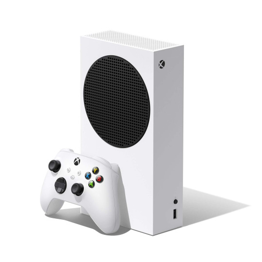
For some reason they made the Series S look like a speaker???
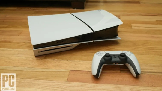
The new PS5 slim FINALLY has a line across that massive faceplate, but the half matte half glossed finish is not doing it any favours. I think it would've looked much better if, for example, the matte and gloss plates were different colours. Like black and white! It also has an even MORE out of place disc drive, which I think is part of Sony's agenda to go digital only, and the two tiny "feet" for its horizontal positioning are pathetic! Personally I like this more than the original but not significantly, disappointing since I was really looking forward to it.
I want you to compare these nasties to the previous generation - the PS4 and the XBOX One.

....Now, what's hilarious about this image is the consoles look ALMOST IDENTICAL from this angle. And, I guess, that would be why Sony and Microsoft decided to make such a departure with the space heater PS5 and the fridge Series X.
But they both look very premium and advanced, and they fit very nicely in your living room.
The companies tried to look a bit more distinguished in their followup versions in the previous gen too. The white PS4 Pro looks a lot closer to PS5 with its quirkiness, but without the atrocious shiny plastic. Sony tended to add or remove a layer whenever they altered the PS4, I wonder what they would look like all stacked on top of each other.

It's not just the games console designs that suffer - Look at the game cases! I know that the companies want to incentivise you to go digital, but Xbox Series X cases are just awful.
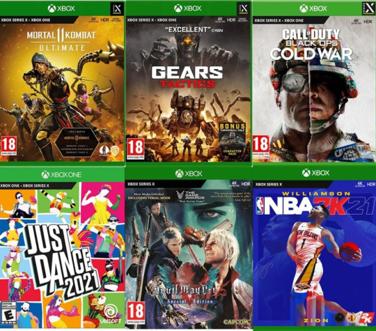
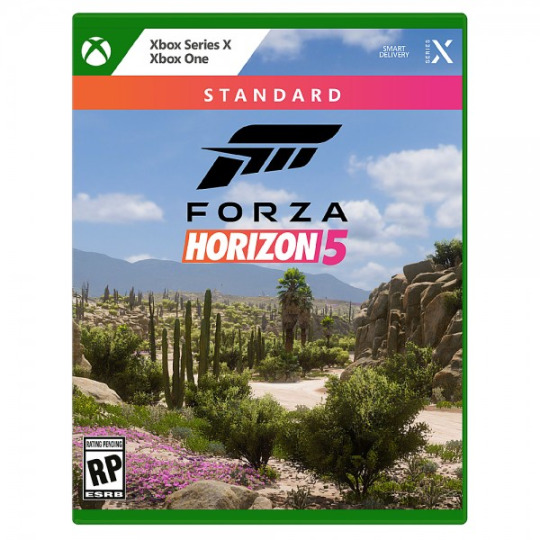
So if you're confused - You should be!!! Microsoft have two kinds of case for the Series X. One of them is the EXACT SAME CASE as Xbox One, but with Series X printed on the front. The second newer version foregoes the sexy Xbox logo entirely and just has Xbox Series X printed in some default font. Awful awful awful.
Playstation is doing better, but barely.

They are reusing PS4 cases with a different print on them. It doesn't look as horrible as Xbox's, and it at least has a different colour on the logo, but damn, the jump between PS3/360 and PS4/One was really impressive, and now they've stopped bothering because they want everyone to go digital. If your game cases look like shit, why bother with physical?
I want to contrast with physical media kings Nintendo, who did an outstanding job in 2017 with designing the case for the Nintendo Switch.

These bad boys are mine. They're super thin, easy to stack, decent quality, and F U N. The red colour pallette makes them pop out. You can see one from across the store and go, "damn, that's a Nintendo Switch game".
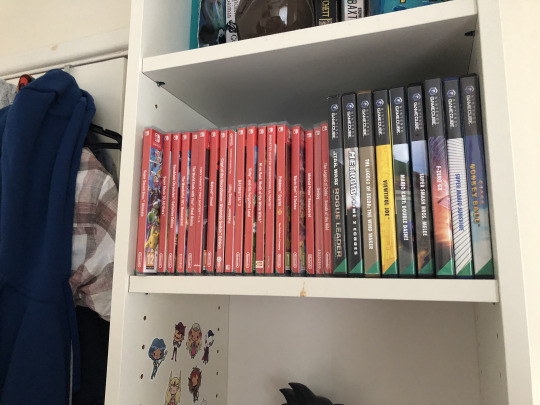
I just want a thousand of them.
I would say a disadvantage, especially compared to the Gamecube games next to them, and even compared to 3ds, is that you can't tell what game you're looking at without going right up to them. These cases are TOO uniform, and really tiny, so i have to triple check I am picking up Xenoblade Chronicles 3 and not Tony Hawk Pro Skater. Meanwhile you can tell exactly what Gamecube games I have by colour pallette alone. Like, you can instantly tell that's Windwaker.
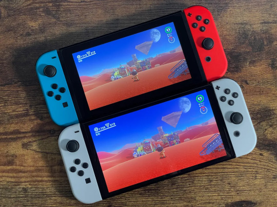
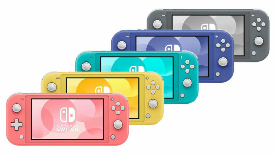
The switch in general is a very fun looking games console, much nicer looking than its predecessor the Wii U, though I'm not sure how I feel about the white of the OLED. But every time I see a Switch Lite in stores, even though I know it's worse than my Switch, I want to buy one. It just looks so FUUUUUN.
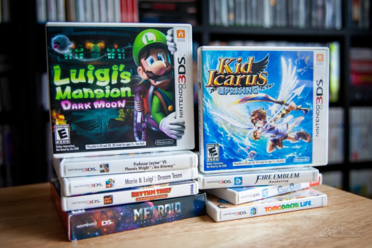
And finally a special mention to the 3DS and its games case. The console itself was pretty stylish, if... rudimentary for its release period, but the games cases are high quality and almost make me want to have 3ds games just so I can have the cases.
79 notes
·
View notes
Photo

10 Years of Volante Design
Today marks the 10 year anniversary of two kids filing some paperwork at Western New England Law School. David and I were younger than the graduate students who were learning how to file for a business license, and I remember thinking that their suits didn’t fit them that well. They asked us to think about how we were going to split the shares. I don’t think we really understood what shares were. They tried to explain that if we were going to sell the business or one of us left then the shares would be really important. We didn’t think too highly of either of those options. So we split them 67% to David and 33% to me. Neither of us had any money or any idea how to run a business, so it didn’t seem that important. Most of the rest of the process was stacks of pages that needed to be approved and signed. I did my best to read them through — a practice I still do with all our legal paperwork.
In the beginning, every idea and every design felt like our best thing yet. We stayed up until 3 and 4 in the morning working on the next design so that we could bring the sample to NYCC and show it off. I distinctly remember that I lost weight before the company’s first time trip to NYCC, because I was working so much and would forget to eat. For a hobbit like me, this is a big deal. The following year we only stayed up until 2am the night before NYCC. I think the year after that maybe it was midnight. Little by little we became better at planning our time, and we became realists. Sometimes I miss the days of headlong enthusiasm, although I don’t think I could live through them now. That’s the sort of thing that is made for a 22 year old.
I’ve written a lot of retrospectives in the 10 years that Volante Design has been around. I’ve referred to this business as my kid, as my obsession, as a passion, as a calling, as a community. What really stands out to me now is the difference from one year to the next. It feels a little like watching a tree grow. If you walk by it everyday on your way out the door it changes with the seasons, but you barely perceive the changes that happen year over year. When you look back at a photo of your house 10 years ago, that tree looks totally different. Only with that perspective can you really appreciate what has passed.
This year the collective team stands out to me. Maybe it’s because I’ve had kids since last year, and maybe it’s because I’ve stepped down as Marketing Director so that I can be a better CEO. It’s no longer just David and me making the big choices. I find myself teaching more, doing less, trying to help others with the doing. I think this is how we grow. I think this is how we evolve. Maybe it took David and me being completely overrun with having twins to let other people help run our company. We’re trying to be an organization that can scale. One that has directors and leaders who can handle the key areas that David and I used to spend most of our time working on. It’s not easy to try and articulate why you would do it a certain way, and why these new leaders need to find a way to do it that’s right for them and still fits with the Volante Design we’ve spent all these years building. They need to find their own way to sit at the table. We are growing new muscles as a team. If you’d asked me five years ago if I thought we could share the management of certain aspects of Volante Design, I’d have said hypothetically yes, but I can’t imagine how we would get there.
It’s a new perspective to be removed a little from the day to day work of keeping things running. I am still helping to shape the company, less by writing individual posts and more by working on the future, the products, the big questions: how do we scale up, what’s missing, and what’s next? I hope I can do what this team needs from me. I hope I can grow to be the CEO that they need.
Maybe because the anniversary of Volante Design happens in the spring when the world is starting to blossom again, but it feels like an exciting time is right around the corner. We have made it through the winter and now we get to kick ass. -Willow Volante CEO Volante Design, Inc.
20 notes
·
View notes
Text
Graphic Design Today...
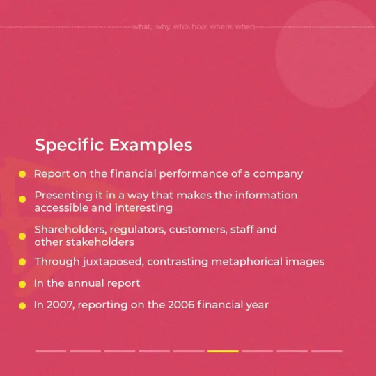
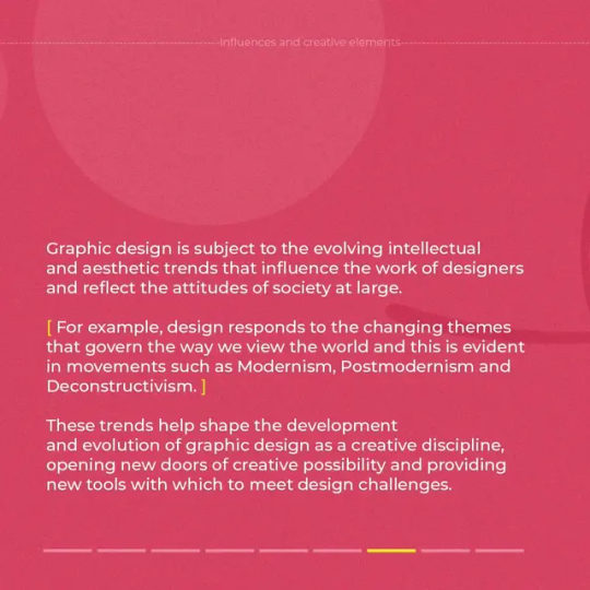
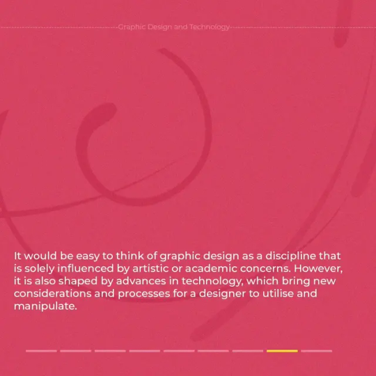
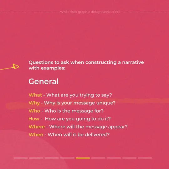
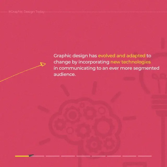
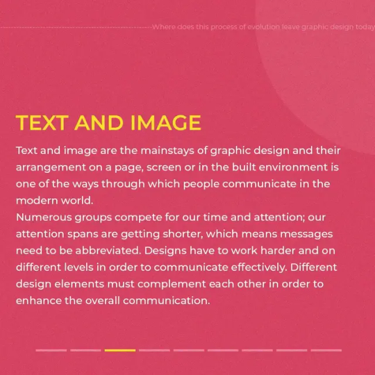
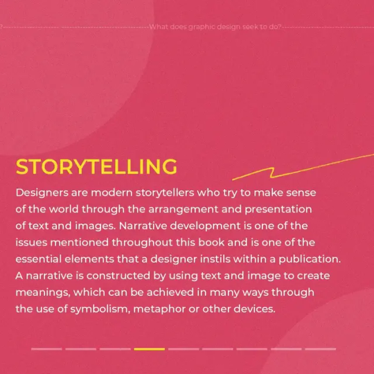
Graphic design has evolved and adapted to change by incorporating new technologies in communicating to an ever more segmented audience.
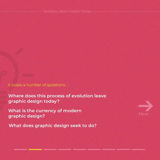
In this post, I highlighted where the world of the GRAPHIC DESIGN is heading to, what it seek to do, what is its modern trend or state and how it communicates with the audience.
Learning is a journey and whoever fails to learn will always be stagnant.
graphicdesign #learningisfun #learnskills #designinspiration #fundamentals #basics #design #graphic #designtoday #creative #elements #process #message #deliver #portfolios #methods #typography #technology #comment #like #follow #technology #graphicdesigntoday #current #communication #storytelling #text #images #photoshop
0 notes
Text


Bird brother ( drive to space )
👉 Design available for sale.👈
.
When you interested DM or Email us to discuss about it.
#designinspiration#badgedesign#design#designtshirt#designthinking#designtoday#illustration#tshirt#designed
1 note
·
View note
Photo
#inspirationboard#inspirationblog#moodboard#designtoday#moodtoday#todaysmood#goodvibes#minimalvibes#minimalistic#minimaldesign#minimalboard#lifestyle#homedecor#feelinginspired
2 notes
·
View notes
Text
Beer Renaissance

The brewing industry is constantly growing and has no signs of stopping, this brought forth a renaissance in beer branding and design. The shelves once full of bland colors have evolved to brightly colored cans and illustrated boxes that have a popular modern design. Before people would reach for the classic available choices like; Miller, Coors, Budweisers and Corona without much thought- however now choosing requires a deliberation fueled by design. There are beer admires that stick to their preference regardless of design but others, [myself included] tend to reach for the coolest looking beer they can find. With so many new designs, the decision has just become more difficult but on the bright side everything looks so cool. Design is everything, and the brewing industry is proving just that. So next time you are checking out the aisle for something new be sure to look at all the new designs and remember to always drink responsibly!
#beer#design#graphicdesign#beerdesign#product design#art blog#art update#newblog#artblog#todayindesign#designtoday#branding#brand#beerbrand#beertalk#art
0 notes
Video
tumblr
Lopez Design Forum# 30, supported by Sona Signature Papers.
#lopezdesign#lopezdesignforum#designtoday#graphicdesigner#creativedirectors#creativegraphicdesigner#artdirector#sonapapers#finepapers
0 notes
Link
So good I had to share! Check out all the items I'm loving on @Poshmarkapp from @g-uen-deactivated20111023 #poshmark #fashion #style #shopmycloset #designtoday #jackthreads #lia: https://posh.mk/cphVmizK2Y
0 notes
Photo

🎁🎄Here a little Christmas gift idea: unique illustrated coffee/tea cup🎁🎄 -------------------------------------- 🍵 30cl, hand customised ceramic cup, perfect for tea and coffee. Can be used in the microwave and dishwasher. -------------------------------------- 👉 Link in bio -------------------------------------- No needs to go shopping, you can purchase directly to the Artist 👉 Shipping everywhere in Europe, USA and Canada 🤙Special direct pick up option for people in Brussels with no shipping fee🤙 -------------------------------------- #mug #tea #coffee #designtoday #objectdesign #makers #zen #ceramic #illustrator #illustrationnow #contemporarycraft #homedecor #contemporarydesign #jellyfish #reefaddict #crystallovers #marinelife #naturelovers #natureart #oceanlife #corals #oceanlovers #handmade #cutecup #gift #brusselscity #artbrussel #brusselsdesign #anaislera https://www.instagram.com/p/B5XlfJDAAQ1/?igshid=s0rrpqz88c56
#mug#tea#coffee#designtoday#objectdesign#makers#zen#ceramic#illustrator#illustrationnow#contemporarycraft#homedecor#contemporarydesign#jellyfish#reefaddict#crystallovers#marinelife#naturelovers#natureart#oceanlife#corals#oceanlovers#handmade#cutecup#gift#brusselscity#artbrussel#brusselsdesign#anaislera
0 notes
Photo

May the Lord Of Wealth and Success Shower his blessings on you and your family on this Ganesh Chaturthi. Happy Ganesh Chaturthi 🌋🌋🌋 Hashtags :- #Happy #Ganesh #chaturthi #happyganeshchaturthi🙏 #happyganeshchaturthi #jaipur #designtoday #Modularkitchen #GaneshChaturthiWishes Visit Website for more details www.designtodayindia.com https://www.instagram.com/p/B152bqPF0Nw/?igshid=kyrr034kt811
#happy#ganesh#chaturthi#happyganeshchaturthi🙏#happyganeshchaturthi#jaipur#designtoday#modularkitchen#ganeshchaturthiwishes
0 notes
Photo

**DOWNLOAD HERE** https://crmrkt.com/lk82WW #brushscript #brushtype #handlettering #calligraphy #letteringdaily #brushcalligraphy #thedailytype #goodtype #typography #artoftype #typelettering #handmadefont #modernscript #dailytype #logotype #insta #logodaily #photooftheday #logolife #designtoday #creativetoday #creativemarket #fontbundles #fontstyle #brandingfont https://www.instagram.com/p/B1R1mBzA0lc/?igshid=4uzbo5hukpy6
#brushscript#brushtype#handlettering#calligraphy#letteringdaily#brushcalligraphy#thedailytype#goodtype#typography#artoftype#typelettering#handmadefont#modernscript#dailytype#logotype#insta#logodaily#photooftheday#logolife#designtoday#creativetoday#creativemarket#fontbundles#fontstyle#brandingfont
0 notes
Photo

पाऊले चालती पंढरीची वाट... Artwork done back in 2011! Resharing as #AashadiEkadashi is just around the corner Swipe left for more! . . . . . #Waari2019 #viththal #waarkari #pandharpur #designtoday #DesignEveryday #LocationMap #Marathi #PaauleChaalatiPandharichiWaat #MarathiSong #calligraphy #devnagaritype #devnagari #MarathuTypography #HindiTypography #IndianScript (at Pandharpur) https://www.instagram.com/p/BzpDxThpm16/?igshid=1n77e5w2qst52
#aashadiekadashi#waari2019#viththal#waarkari#pandharpur#designtoday#designeveryday#locationmap#marathi#paaulechaalatipandharichiwaat#marathisong#calligraphy#devnagaritype#devnagari#marathutypography#hinditypography#indianscript
0 notes
Photo

#zolderkamer72 #marcelenderink #designinspiration #ux #designtoday #uxdesign #photoshop #illustrator #indesign #adobe #designoftheday #dutchdesign #marcelopwerk https://www.instagram.com/p/BtESBNEH5_G/?utm_source=ig_tumblr_share&igshid=wjjy2ikkm84w
#zolderkamer72#marcelenderink#designinspiration#ux#designtoday#uxdesign#photoshop#illustrator#indesign#adobe#designoftheday#dutchdesign#marcelopwerk
0 notes
Link
So good I had to share! Check out all the items I'm loving on @Poshmarkapp #poshmark #fashion #style #shopmycloset #bongo #designtodays #merona: https://posh.mk/vCHvSY2Lz0
0 notes
Link
So good I had to share! Check out all the items I'm loving on @Poshmarkapp from @mssarochka #poshmark #fashion #style #shopmycloset #bcbgmaxazria #designtodays #bongo: https://posh.mk/qrH5sxud5V
0 notes
