#designforfilm
Explore tagged Tumblr posts
Video
instagram
H e r Y e r d e S e n | New Project @design_for_film . . . . . #design #designer #interior #interior2you #new #homesweethome #newseason #foxtv #turkey #art #artdirector #designforfilm #emineinanyıldır #lighting #yenidizi #foxtvtr #beautiful #instagood #designlovers #sanatyonetmeni #likeall #object #mimar #içmimar #içmimarlık https://www.instagram.com/p/BxSxzBRAS8n/?igshid=ys0h76932rpp
#design#designer#interior#interior2you#new#homesweethome#newseason#foxtv#turkey#art#artdirector#designforfilm#emineinanyıldır#lighting#yenidizi#foxtvtr#beautiful#instagood#designlovers#sanatyonetmeni#likeall#object#mimar#içmimar#içmimarlık
1 note
·
View note
Text
In the words of Beth Harmon “Let’s Play”
Okay first of all I’d like to acknowledge that I have not been doing this since 2018, so about 3 years have gone by since I’ve published anything here. This is enough time to realize I’d like to write more, look at more titles and analyze more typefaces. More, more and more... So let me jump right into it.
This year I would like to start with a banger series from last year. 62 million views in the first month. Costume and production design deserving an Emmy nomination. And a new title designer crush.
All that is The Queen’s Gambit.
vimeo
The Queen’s Gambit end title sequence
I truly could write about this show for paragraphs and paragraphs on without ever finding an end. If I was in school I would write a dissertation on the whole thing. But for now I'm only going to concentrate on the type.
The deliberate positioning of the title card with a simple dark teal type on the black background in the beginning of each episode is an opening worth your attention. Everything about this series is incredibly thought through and well designed. Any of the articles written in the aftermath of the series going viral (forgive my gen-z language) have already stated and reiterated in every way possible that having a title card and not a sequence is a way for the creators to bring the audience straight to Beth, the main character, and let the viewer dive right into the time capsulated world of chess, fashion and addiction. I could go on and argue about the importance and impact of the opening sequence on many shows and provide a multitude of examples but I won’t argue here with the creator's choices. Partially because I actually see a line of logic in it and partially because I want to concentrate on something else here.
A type choice.
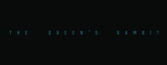
Opening title card
Given the fact that it is a new show and not enough people have done investigation into the typeface choices yet, I had to rely on the storehouse of all questions and answers - Reddit. The few who have inquired, and when I say few I really mean it, have pointed me to Prohibition.
After a letter by letter examination my eyes and I have come upon the same conclusion that it is in fact a typeface by Matox Shuler from Fort Foundry.

Prohibition typeface sample
This edgy sans serif is the perfect display typeface that one might see on industrial union posters, if one lived in the beginning of twentieth century. However, placed in the context of a TV series that takes place in the 1960-70s and was created in 2020, one might wonder if it actually works here. The intent however is clear to me - visualizing reasoning and arithmetics. As Saskia Marka points out in her interview with the Art of the Title, the concept behind the end sequence was to make it abstract and with a hint of geometrics that allude to chess, but to leave the interpretation to the eye of the beholder. And the type is that sprinkle on top of the ice cream to this concept. The modern, sharp look of Prohibition is serving exactly that purpose.

A screenshot from the end title sequence
Marka addresses the legibility question with an almost too easy of an answer. Yet it is the one that works here beyond the need of explanation. It works on many levels and once again sends the audience into their own questioning spiral. Is it evocative of chess? Or redacted documents? The show is beautiful on many levels and deserves a watch from all of you. But remember the beauty that awaits you at the finish line. You won’t regret waiting for it ;)
0 notes
Photo

Last October 2018 was the first time I’ve worked in collaboration on a film poster and it’s with @gracecarnline for Lumiere Films’ “Grasya.” #filmposter #designforfilm #graphicdesign #abstractstyle #poster #posterdesign https://www.instagram.com/p/BtpXqW_H_Cc/?utm_source=ig_tumblr_share&igshid=dsurooht9x0v
0 notes
Photo

EXI PROD’s first casting call poster Ink art by @agnes_cecile #designforfilm #graphicdesign #poster #filmposter https://www.instagram.com/p/BtoWT7rhmQ5/?utm_source=ig_tumblr_share&igshid=xdedzlbvv59z
0 notes
Photo

The film poster for EXI PROD’s “Grasya.” #filmposter #poster #graphicdesign #designforfilm https://www.instagram.com/p/Btn3YV8B8Kx/?utm_source=ig_tumblr_share&igshid=1fksxqbm4xnnt
0 notes
Text
let’s talk about the Fight Club - #typeonwednesdays
"The first rule of Fight Club is: You do not talk about Fight Club.”
vimeo
I'm afraid I am about to break this rule and talk at length about the Fight Club.
I will tell you that this film is one of a kind and uncanny, and that it visually explores the moral ambiguity and violence of a human character. The cinematic mastery accomplished by David Fincher is beyond words and the script is full of wit, sarcasm and moral expressions that made this movie a classic.
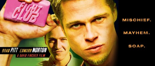
Promotional poster for the Fight Club
Besides the obvious however, there is also typography. Not something you think of first when you think of Fight Club, but it is there and it is... quite interesting. Created by the late P. Scott Makela this edgy and unique sans-serif was inspired by rave flyers of the time and perfectly reflects the nature of the movie. This typeface like many others created during the ‘90s evokes strange feeling of being in the underground skinhead club somewhere in the sketchy areas of London at around 2 in the morning. Makela is responsible for many post-modern typefaces that resemble the underground culture of urban youth of that time. a great example of such typefaces created by him would be Dead History. Given his history and creative battle against clean corporate look so highly promoted by his design predecessors, like Paul Rand and Massimo Vignelli, choosing him to design the typeface for this movie was beyond a good call.

P. Scott Makela’s Dead History typefaces sample
Another important element seems to be the tracking and kerning that is happening in the opening sequence.


Screenshots of the typefaces utilized in the title sequence specifically illustrating the kerning and leading choice.
Since there are no recorded interviews with Makela on “how/why” of this typeface, we can only guess that there is a direct connection to the context of the movie. The tight look could be going back to the neurons tied together and all the ligatures in the way recreate the connection of brain cells. Beyond the obvious reference to the grunge typefaces of David Carson and Harriet Goren, there is also an interesting aspect of foreseeing the type that will be commonly used through many movies in the 2000s. The sleek, clean, edgy style that people will get inspired by enough to implement it in every action based movie from that point on.
So this is the end of a brief debrief of the Fight Club typography and the title sequence overall!

P.S.
Also wanted to include this article I found while researching this movie. It nicely points out presence and importance of consistent graphic design in film, throughout the implementation of fake identity of the company main character is employed at. Implemented across all stationary and beyond, it’s simple yet consistent and help viewer identify the location, in this “slightly” muddled story. This adds to the story but doesn’t take over your attention. Check out the full story.
0 notes
Photo
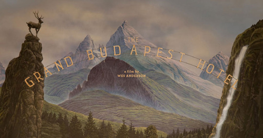
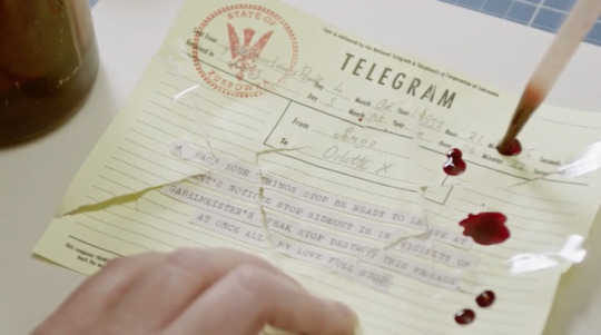
THE SECRET WORLD OF ANNIE ATKINS, GRAPHIC DESIGNER FOR FILMS
By Summer Wilson
december 2, 2015
0 notes
Text
Women in title design
Art of Title - the web archive that has the most of extensive collection of title designs from across years and the globe, has been publishing series dedicated to women title designers. Proud to share the fourth part of this series: http://www.artofthetitle.com/feature/10-women-of-title-design-part-four/
Check out their website to see more.
0 notes
Text
SICKOS (2017) - #FridayTitles
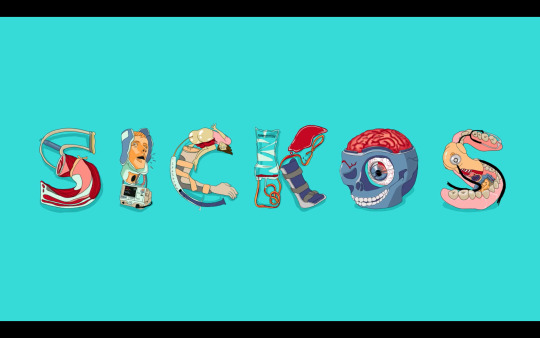
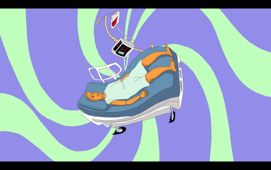

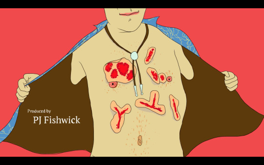
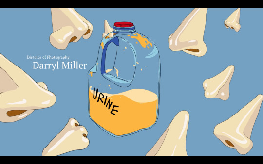
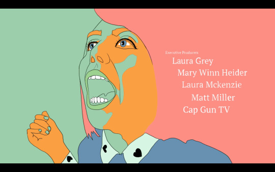
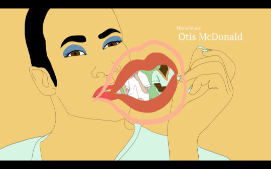
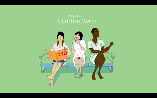
Sickos titles
who:
production studio: Mill+; creators/EPs: Laura Grey, Laura Mckenzie, Mary Winn Heider; director/EP: Matt Miller;
Title sequence creative director/lead designer: Anzie Yoon ji Lee; art director: Matthew Darnell; designer/animator: Josh Van Praag, Joe Lawrence, Matthew Darnell, Adrian Navarro, Tracey Khan.
what:
a web series, set in a world of medical school training and simulations, the series focuses on an all-sorts mix of actors and artists who make a living pretending to be ill
why:
The peculiar style of animation with eccentric illustrations, introduces the obscurity of the show with all its strange plot lines and characters. Illustrations of faces, cutout organs, and all exaggerated imagery is reflective of the character of the show.
0 notes
Text
The One with All the Fonts — #typeonwednesdays
Welcome to the first article of TypeonWednesdays!
These articles will discuss the fonts used in your favorite and not-so-favorite TV shows and movies. Brace yourself for many great discoveries of fonts across the film universe.
While thinking much of how to write this article and what information to include, one thing I knew right away was which show I wanted to start with. This might seem like an odd choice considering the nature of the typeface but consider the influence of this TV show on the lives of many, especially people who grew up in the 90s, and you will understand my choice.
Friends is an iconic show with a brilliant cast, outstanding writing and one of the first shows to introduce me to the use of design in film. Nothing in these series is an afterthought. There is a reason for purple walls, and for camera angles, beloved and iconic fashion choices, and many more design decisions that made this show loved and flawless.
But I’d like to discuss today the typeface choices. First and foremost… let’s just take a look at it:
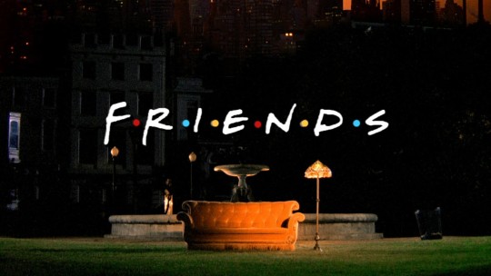
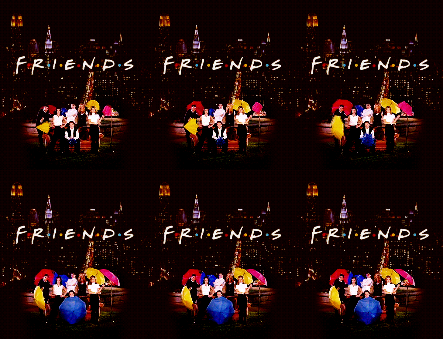
Gabriel Weiss’ Friends Font! These epochal letterforms are hand-drawn and represent the essence of 90s TV design. Its affable and welcoming nature invites the viewer to see the show for all ages and all hearts. It invites you to fall in love with characters, appreciate the humor and cry a little in the face of all the breakups and love stories.
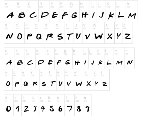
Gabriel Weiss’ Friends Font sample
Type expert and curator of the Herb Lubalin Study Center of Design and Typography, Alexander Tochilovsky, has a site dedicated to the typography of famous 90s TV shows and expresses his opinion of the Friends title design in the following words:
"The hand-drawn aesthetic started to become really popular in the 90s and the Friends logo is a perfect example—but perhaps what’s more interesting is the logic behind it. Each of the colored dots between the seven letters can each be thought of as the different ‘friends’ within the show."
It is common for title designers to point out the nature of the show through the typeface choice, but Tochilovsky is correct to point out that often overlooked dots in between these iconic letters, as well as and any other graphic elements often incorporated in opening titles, are a thoughtful placement, which in this case are indicative of the number of the friends pictured in the show. One may argue that colors are also representative of the character and we can play a guess game and try to match the pairs to the characters, but I believe that wasn’t the intention of the designer. The goal was to introduce the forever beloved show to the viewer and through the sequence and type used indicate the nature of the show while attracting the right audience and playing on the relationships of the characters.
And just to remind you what the rest of the opening sequence looks like I leave this link here:
youtube
And though the famous opening sequence will be recognized by many for ages to come, as an admirer of the show and an amateur title designer I can’t forget the end credits. Essential to any show, those might follow the structure of the opening credits or might follow a different visual look, which is a case with Friends.
The end credits use a humanist typeface Lydian, designed by Warren Chappell for ATF in 1938, and close in its form to the opening credits. It once again emphasizes the character of the show as well as the time period it first appeared on the screen.
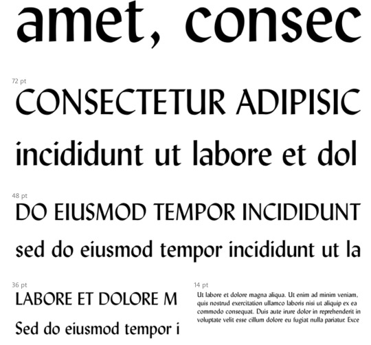
Lydian typeface sample.
Lydian appears as playful yet distinctive on the screen, all qualities that the show itself possess. Lydian is the humanist serifs, a kind of a Roman typeface, where the letters created through the holding of a pen at a consistent angle that creates a certain distinguishable rhythm. It is somewhat surprising to see this typeface appear on the screen considering it’s most commonly used in a large volume texts (books and magazines). Its organic and script-like form once again reinforces the nature of the show and the 90s design leniency towards harmonious, natural and amicable letterforms.
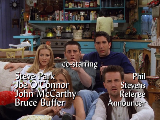
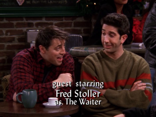
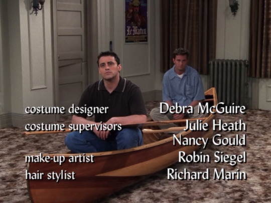
That’s all I got on fonts in this wonderful TV show.
Till next time my friends!
0 notes
Text
Ross MacDonald and his “secret” life as a prop designer
https://www.ross-macdonald.com/movie-props/
https://www.drawger.com/yup/
0 notes