#daltonmaag
Explore tagged Tumblr posts
Text
Veronika Burian


Veronika Burian founded TypeTogether with José Scaglione after leaving DaltonMaag. The focus of Typetogether's font Catalogue is on expressive text typefaces for digital and analog media. She is also a founding member of the typography platform Alphabettes.org, and is involved in the mentoring program and the GRANSHAN project for non-Latin fonts and typography. She is also is co-curator/organiser of the TypeTech MeetUp. Her typeface Maiola received the TDC Certificate of Excellence in Type Design 2004.
0 notes
Photo

SPEAKER RESEARCH - Veronika Burian
Veronika Burian, born in Prague, originally studied industrial design in Munich and then worked as a product designer in Vienna and Milan. Discovering her true passion for type, she graduated with distinction from the MA in Typeface Design course in Reading, UK in 2003. After a few years as a typeface designer at DaltonMaag in London, she founded TypeTogether together with José Scaglione

0 notes
Text

GRAD603 - TYPOGRAFIKA ‘24
RESEARCH ON SPEAKERS
Veronika Burian
Born in Prague, Veronika Burian originally studied industrial design in Munich, before working as a product designer in Milan and Vienna.
After a few years as a typeface designer at DaltonMaag in London, she founded TypeTogether together with José Scaglione, today with twelve employees working around the world, one of the most important, independent type foundries. In addition to the development of tailored solutions for a variety of clients, the focus of TypeTogether’s font catalog is on expressive text typefaces for digital and analog media.
Her typeface Maiola received, amongst others, the TDC Certificate of Excellence in Type Design 2004. Several other typefaces by TypeTogether have also been recognised by international competitions, including ED-Awards and ISTD.


0 notes
Photo

All information found: https://www.type-together.com/veronika-burian
Veronika Burian, born in Prague, originally studied industrial design in Munich and then worked as a product designer in Vienna and Milan. Discovering her true passion for type, she graduated with distinction from the MA in Typeface Design course in Reading, UK in 2003. After a few years as a typeface designer at DaltonMaag in London, she founded TypeTogether together with José Scaglione, today with twelve employees working around the world, one of the most important, independent type foundries. In addition to the development of tailored solutions for a variety of clients, the focus of TypeTogether’s font catalog is on expressive text typefaces for digital and analog media. Furthermore, TypeTogether supports young people with a Typeface Publishing Program under the name of their mentor and friend »Gerard Unger Scholarship«. As a founding member of the typography platform Alphabettes.org by and for women, she is particularly involved in the mentoring program and for the GRANSHAN project for non-Latin fonts and typography, which is unique in the world, she she is co-chairwoman of the type design competition, engages in communication and is co-curator/organiser of the TypeTech MeetUp. Veronika teaches as a guest lecturer at the Faculty of Architecture and Design NTNU (Gjøvik, Norway) and gives lectures and leads workshops at conferences and at universities around the world. Her typeface Maiola received, amongst others, the TDC Certificate of Excellence in Type Design 2004. Several other typefaces by TypeTogether have also been recognised by international competitions, including ED-Awards and ISTD.
0 notes
Text
Veronika Burian : type designer

Veronika Burian, born in Prague, originally studied industrial design in Munich and then worked as a product designer in Vienna and Milan. Discovering her true passion for type, she graduated with distinction from the MA in Typeface Design course in Reading, UK in 2003. After a few years as a typeface designer at DaltonMaag in London, she founded TypeTogether together with José Scaglione, today with twelve employees working around the world, one of the most important, independent type foundries. In addition to the development of tailored solutions for a variety of clients, the focus of TypeTogether’s font catalog is on expressive text typefaces for digital and analog media. Furthermore, TypeTogether supports young people with a Typeface Publishing Program under the name of their mentor and friend »Gerard Unger Scholarship.
Adobe Fonts : https://fonts.adobe.com/designers/veronika-burian

0 notes
Text
Veronika Burian
Veronika Burian moved to Austria and Italy to work as a mix between a product and graphic designer. Her interests shifted increasingly towards typography and the decision to focus more exclusively on type design developed naturally, amongst others through her collaboration with Leftloft for the exhibition Italic 1.0 at AtypI and her involvement in teaching at the Politecnico of Milan. Discovering her true passion for type, she graduated with distinction from the MA in Typeface Design in Reading, UK, in 2003 and started to work as full-time type designer at DaltonMaag in South London until 2007.
She is now living and working in Prague and dedicates her time fully to TypeTogether, that she co-founded with José Scaglione. She also continues to lecture about typography at international conferences and universities. Her typeface Maiola that she created during the MA, received the TDC Certificate of Excellence in Type Design 2004, was selected in the Type Design competition from Creative Review 2005 and is part of the touring exhibition e-a-t. Karmina, the first collaborative work from TypeTogether, also won a merit at the ED-Awards competition 2007.


0 notes
Text
Speakers Research - Veronika Burian
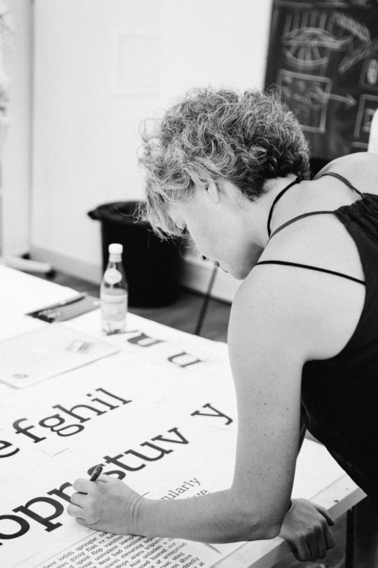
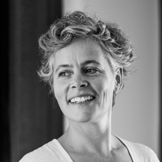
About Veronika Burian:
She was born in 1973 in Prague, Czechia. She is a type designer who studied industrial design in Munich and then worked as a product designer in Vienna and Milan. She soon discovered her true passion for typography and graduated with distinction from the MA in Typeface Design course in Reading, UK, in 2003. After a few year working as a typographer at DaltonMaag in London, Veronika founded TypeTogether with José Scaglione, one of the most crucial independent type foundries.
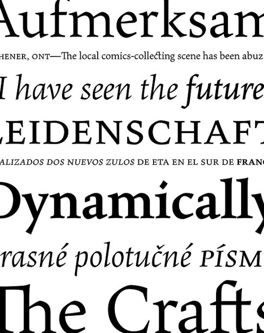
Above is a project by Veronika, "Maiola". It was published in 2005 with Fontshop and then in 2010 with TypeTogether. The typeface was inspired by early Czech type design, mainly by Vojtěch Preissig and Oldřich Menhart. Maiola is a contemporary typeface that is mindful of its historical heritage, implementing old-style features and calligraphic reminiscences, more frankly so in the italic. It won numerous awards, including the Type Directors Club Certificate of Typographic Excellence in 2004."
Image Source:
Left Corner: Femme Type, unknown date
Right Corner: Maioia/ Communication Arts, Type faces by Vernokia Burian, 2005
Bottom photo: From Veronika's LinkedIn, unknown photographer/ date
Research Cited:
0 notes
Video
instagram
Today we had our Graduation Day for students of @letterco_online. It was really great to see what they could achieve is just 5-weeks of time 🎓 See a slide show of some of their projects ☝️⠀ ⠀ I'm extremely proud of all the students, happy to have been able to teach along a dream team of instructors @typeoff @tullida @eliasjprado @gabrowitsch @mekkablue Bianca Berning, @ferdinandulrich, @liebefonts 👏🏼👏🏼👏🏼⠀ ⠀ ⠀ and thankful to our sponsors for supporting the program⠀ @adobe ⠀ @fontself⠀ @glyphsapp⠀ @DaltonMaag⠀ 👏🏼⠀ ⠀ and specially grateful for the team I got to collaborate with in bringing this project to life @jos_efina ❤️@blancavillalobos ❤️@eliasjprado ❤️@daviz❤️ ⠀ ⠀ ⠀ Watch Graduation Day (link in stories)🎓 and join us next time! Sign up for our newsletter on http://letterandco.com⠀ ⠀ ⠀ #letterandco #typedesign #learntypedesign #displaytype #tyedesignprogram #onlinecourse #typedesigncourse #graduationday #fonts #fontmaking #makeyourownfont #fontdesign (at Studio Martina Flor) https://www.instagram.com/p/CGVF52tqe1A/?igshid=jb4ydtyswh3x
#letterandco#typedesign#learntypedesign#displaytype#tyedesignprogram#onlinecourse#typedesigncourse#graduationday#fonts#fontmaking#makeyourownfont#fontdesign
1 note
·
View note
Link

Agency Job Roles: Dalton Maag
One of our first mini tasks was to research job roles in the creative industry, it was really interesting to find out how a creative agency is run.
It seems that some of the most successful agencies have a split between design and operations, with dedicated account and operations managers, in order to allow the designers to simply design without having to manage their schedules and taxes etc.
An example of an agency that works this way is Dalton Maag, I recently went to the Type Talk that they did, and it was really interesting to find out how their agency ran, and the fact that they had two distinct teams allowed it to run incredibly smoothly.
Though it should be noted that Dalton Maag is a well established, high performing agency and therefore can easily justify a whole department of personnel who are non-design, many smaller agencies simply cannot afford that luxury and in that case the designers are left to organise the business side of the agency as well as the design side.
#PracticeofGraphicCommunication#graphic communication#graphic design#daltonmaag#bbcreith#agencyjobroles
0 notes
Video
instagram
#Review #Computer #Arts issue 267 june 2017 on #YouTube channel #GreadYreader https://youtu.be/_7K7b6s8lYk #computerarts #design #daltonmaag #illustrator #letasobierajski #wadejeffrey
#review#design#wadejeffrey#daltonmaag#letasobierajski#illustrator#youtube#greadyreader#computerarts#computer#arts
0 notes
Text
RT @britishlibrary: Fonts are like blackberry bushes. 'We react positively to round shapes... Whereas spiky shapes... we react to them with alarm.' Typeface designers @DaltonMaag explore the emotions behind #fonts: https://t.co/qs5QepW8n4 How does your favourite font make you feel? #MuseumFromHome https://t.co/9Y4S1ET4dY
Fonts are like blackberry bushes. 'We react positively to round shapes... Whereas spiky shapes... we react to them with alarm.' Typeface designers @DaltonMaag explore the emotions behind #fonts: https://t.co/qs5QepW8n4 How does your favourite font make you feel? #MuseumFromHome pic.twitter.com/9Y4S1ET4dY
— The British Library (@britishlibrary) April 27, 2020
from Twitter https://twitter.com/dolemes May 05, 2020 at 08:11AM via IFTTT
0 notes
Text
Aktiv Grotesk
「Aktiv Grotesk」 Aktiv Groteskは「グロテスク」(サンセリフの初期の呼び名)を21世紀の解釈でデザインしたフォント。自由な解釈で作られているグロテスクフォントが多い中、このフォントはグロテスクの伝統に忠実に作られている。 #font #フォント #Aktiv Grotesk #Dalton Maag
今週はグロテスクをキーワードに、人気のフォントを紹介していきます。
Aktiv Groteskは「グロテスク」(サンセリフの初期の呼び名)を21世紀の解釈でデザインしたフォント。自由な解釈で作られているグロテスクフォントが多い中、このフォントはグロテスクの伝統に忠実に作られている。
正統派でありながらニュートラルでもあり、ブランディングに向いている。
[button link=”https://www.myfonts.com/fonts/daltonmaag/aktiv-grotesk/” color=”blue”]Buy at Myfonts.com[/button]
(more…)
View On WordPress
0 notes
Text
FEMME TYPE — A Book Celebrating Women in the Type Industry.
Launched as an independent project is all-female graphic design publication Femme Type. Conceptualised by ex-University of Arts London Chelsea student Amber Weaver, the book aims to celebrate over 40 skilled, international women to create a valuable stage and platform for designers to showcase their brilliant typographic achievements. Simultaneously creating a valuable source of inspiration and education for future and established designers across the globe.
kickstarter
Split into three sections, essays; type design and typography. You can find interesting type-related discussions by the likes of New York-based designer and type designer, Tienmin Liao, Daltonmaag Creative Director, Bianca Berning and Alphabettes.org contributor & co-founder of Kinetic, María Ramos. Featured in the type design category are an assortment of talented designers with their typefaces gracing its pages. You can find Johanne Lian Oslen, Andrea Tinnes, Sibylle Hagmann, Pooja Saxena, Maria Doreuli, Nova Type Foundry, Inga plönnigs, with a special Typelab.fr feature and an Alphabettes.org piece written by co-founder Amy Papaelias and many other fantastic contributions. Finally, the typography section includes a short interview with Barcelona-based Hey Studio founder Veronica Feurte along with contributions from London-based studio Yarza Twins, Marta Gawin, Shanti Sparrow, My Name is Wendy, Caterina Bianchini, Marta Cerda and many more.
Featuring over 80 projects, Femme Type is made up of 256 pages printed in a special Pantone spot colour onto Fedrigoni Arcoprint by trusted UK-based printers Pressision Ltd.
The Kickstarter High-quality lithographic printing comes at a cost, so to help fund part of the production costs you can pledge towards the Kickstarter campaign in order to help make this project become a reality! Your pledge is essentially a pre-order and you can choose from various different rewards. Femme Type has collaborated with 36 Days of Type to bring an epic A2 HP Indigo printed poster featuring their top 12 letter submission by women over their 5-year edition stretch. In addition, you can pick up an exclusive Twogirlsco ‘Designers Rule’ enamel pin produced in the matching Pantone spot colour as the book. Both these items are exclusive to this project and won’t be available anywhere else so grab one whilst stocks last – there’s only a limited amount of each.
Contributors: This project received a really positive response from everyone that was contacted to be a part of Femme Type.
TienMin Liao / María Ramos / Bianca Berning / Amy Papaelias (Alphabettes.org) / Floriane Rousselot (typelab.fr) / Verena Gerlach / Johanne Lian Oslen / Andrea Tinnes / Sibylle Hagmann / Leonie Martin & Laura Brunner / Pooja Saxena / Maria Doreuli / Laura Meseguer / Nadine Chahine / Veronica Feurte (Founder of Hey Studio) / Shanti Sparrow / Marta Gawin / Catherine Griffiths / Ana Duje / Nuria Lopez / Mobel Type foundry / Lilly Marques / Sahar Afshar / Natalie Rauch / Charlotte Rohde / Nova Type Foundry / Lynne Yun / Isabel Pena / Liron Lavi Turkenich / Marina Chaccur / Yarza Twins Rita Matos / Hui Yeon Hwang / Caterina Bianchini / Marta Cerda/ /Rachel Joy Lettering / Sandrine Neugue / Inga Plönnigs / Alice Savoie / Erica Carras / Letitia Lin / Hello this is Kae / Noelia Lozano / Anastasia Liolio / My Name is Wendy / Tina Touli
Hard Facts: — Includes contributions from over 40 international woman — 256 pages + 4pp Cover / 25cm x 21cm / PUR bound — Litho printed CYMK plus a special Pantone Spot colour — Printed in English onto high-quality Fedrigoni Arcoprint paper — Printed in May 2019 (if Kickstarter is successful) — EARLYBIRD DISCOUNT: £25 + shipping (RRP £27.99)
Help fund this epic project — http://kck.st/2OD3UxT
I: @femmetype T: @femme_type
Published by People of Print (in perpetuum). Video by — Millie Gray (millie.gray_)
from Blogger http://lamurdis.blogspot.com/2019/04/femme-type-book-celebrating-women-in.html
0 notes
Text
❝
Cheers @DaltonMaag for having us over to explore Arabic, Persian, Urdu and Pashto typography. Learned a tonne💃 pic.twitter.com/Y7y4PWVl0f
— Joy Roxas (@joy___r) March 20, 2019
http://twitter.com/joy___r/status/1108417006066434048
0 notes
Text
Type Collection #4
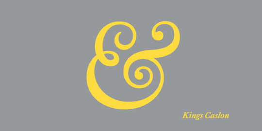
https://www.myfonts.com/fonts/daltonmaag/kings-caslon/
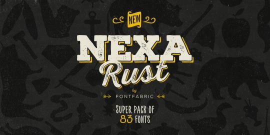
https://www.myfonts.com/fonts/font-fabric/nexa-rust/
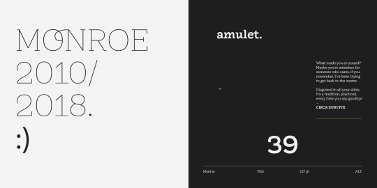
https://www.myfonts.com/fonts/latinotype/monroe/
These three were chosen as examples of slab serifs. My interest in these fonts is how they can be ornate while also appearing clear and modern.
Any serif font I see immediately imparts an olden times vibe to me. These ones in particular, when the ornate loops are taken away, have that old European feel to me, but with the way they were designed and displayed, the serif fonts have been given a modern update. They are presented as clean and sort of minimal fashion. What resonates is just how simple but elegant these fonts look.
0 notes
Photo

Tondo https://www.myfonts.com/fonts/daltonmaag/tondo/
0 notes