#cubo-futurist paintings
Explore tagged Tumblr posts
Visit Tumblr Blog
Explore Tumblr blogs with no restrictions, modern design and the best experience.
Last Seen Tumblr Blogs


Fun Fact
Average visit duration of Tumblr.com is 10 mins and 25 secs.
Text


Tamara de Lempicka, A Street at Night, 1923
#tamara de lempicka#landscape#oil painting#female artist#expressionism#cubo-futurist#san francisco#de young museum
0 notes
Text


Venice in the art of Alexandra Exter (1882-1949)
Carnival in Venice (oil on canvas) 1930s
Carnival Procession (oil on canvas)
Masked Figures by the Banks of a Venetian Canal (oil on canvas)
Venetian Masks (oil on panel)
Pulcinella (gouache on paper) late 1920s-30s
Venice (oil and sand on canvas) 1925
Venice, 1915
"Aleksandra Aleksandrovna Ekster, also known as Alexandra Exter, was a Russian and French painter and designer. As a young woman, her studio in Kiev attracted all the city's creative luminaries, and she became a figure of the Paris salons, mixing with Picasso, Braque and others. She is identified with the Russian/Ukrainian avant-garde, as a Cubo-futurist, Constructivist, and influencer of the Art Deco movement. She was the teacher of several School of Paris artists such as Abraham Mintchine, Isaac Frenkel Frenel and the film directors Grigori Kozintsev, Sergei Yutkevich among others." [x]
"Exter painted views of Florence, Genoa and Rome, but ‘most insistent and frequent were images of Venice. The city emerged in various forms: via the outlines of its buildings, in the ‘witchcraft of water’. In glimmering echoes of Renaissance painting, in costumes and masks and its carnivals’.
"Exter’s characteristic use of the bridge as a stage platform, seen most clearly in Carnival in Venice, is a legacy of her time as Tairov’s chief designer [Alexander Tairrov, director of Moscow's Kamerny Theatre]; the director believed in breaking up the flatness of the stage floor which the artist achieved for him by introducing arches, steps and mirrors. Even in her easel work, the emphasis is at all times on theatricality. Bridges are used as proscenium arches, the architecture creates a stage-like space in which to arrange her cast."
"For all her modernity, references to Venetian art of the past abound in these paintings. The masked figures are influenced by the Venetian artist Pietro Longhi, to whom Exter dedicated a series of works around this time. The incredible blues used in both Carnival Procession and Masked Figures by the Banks of a Venetian Canal are a direct reference to Titian, who was famed for his use of ultramarine, the pigment most associated with Venice’s history as the principal trading port with the East." [x]
"Exter had long since abandoned the Cubist syntax by 1925 but her sense of colour remained together with a strong conviction, shared with Léger, that a work of art should elicit a feeling of mathematical order. In its graceful interaction of fragmented planes and oscillation between emerging and receding elements, Venice (1925) echoes the more precise qualities that also appear in Léger's work at this time, both artists occupied with the continuous modulation of surfaces and the 'melody of construction' that Le Corbusier was still advocating in the 1930s. But while Exter subscribed to Léger's theory that 'a painting in its beauty must be equal to a beautiful industrial production', she never fully embraced the aesthetics of the machine and rejecting the common opposition between ancient and modern, her work often retains a classical edge - for example in these trefoil windows, arches and vaults. Human figures, which had been nearly absent from her Cubo-futurist paintings, also return in other works from this period."
"She was undoubtedly aware of the concept of 'defamiliarisation', a term first coined by the influential literary critic Viktor Shklovsky in 1917:
'The purpose of art is to impart the sensation of things as they are perceived and not as they are known. The technique of art is to make objects 'unfamiliar,' to make forms difficult to increase the difficulty and length of perception because the process of perception is an aesthetic end in itself and must be prolonged.'
An instance of this device is discernable in the present tight formation of the oars, seen from above. Like Braque and Picasso, Exter incorporates sand into certain areas of pigment to enhance the differentiation of surfaces, a technique also used to 'increase the length of perception'. The occasional lack of overlap between the boundaries of the textured surfaces and colour planes strengthens the paradoxical combination of tangible presence and elusive abstraction that makes Venice such a powerful work."
"Venetian subjects occur in Exter's work as early as 1915. A gigantic panneau of the city was one of the final works she produced in the Soviet Union and exhibited in the 1924 Venice Biennale." [x]
"The specific theme of the Commedia dell’Arte first appeared in Exter’s work in 1926 when the Danish film director Urban Gad approached her to design the sets and marionettes for a film which was to tell the story of Pulcinella and Colombina, transposing them from the Venice of Carlo Goldoni to contemporary New York. Pulcinella most likely relates to the artist’s subsequent experimentations on the theme of the Commedia dell’Arte. Pulcinella, who came to be known as Punch in England, is one of the classical characters of the Neapolitan puppetry. Typically depicted wearing a pointed hat and a mask, Pulcinella is an opportunist who always sides with the winner in any situation and fears no consequences." [x]
48 notes
·
View notes
Text

Otto Dix (German, 1891-1969) Meine Freundin Ellis (Mit Selbstbildnis) [My Friend Ellis (With Self-Portrait), 1919. Oil/canvas, 57.5 x 50 cm. Gera, Gera Art Collection, Otto-Dix-Haus.
In this picture, Dix has clearly marked the names of the people who form the circle of this humorously captured love triangle in the top right corner. Dix chose Ellis Franz, a student at the Dresden School of Applied Arts and studying under Margarete Junge, as the central figure. Next to her is the pattern designer and fellow student Fritz Lehmann, whose eyes widen suggestively at the sight of her bare upper body with her full breasts, which Ellis Franz apparently countered with a slap in the face. The academy student Dix, the third in the group, vying for attention, pushes into the relationship from the left edge of the picture to express his interest in this idol-like figure. Several signs, such as the flower in Ellis' hair and the striking star collar, as well as the blue and red checked bow tie on Lehmann, suggest that this is a carnival scene. The picture surface in this cubo-futuristic composition was structured and dynamized by a facet-like dissection of the picture elements. The color scale was reduced to the contrasting pairs of red-blue and yellow-green, which Dix placed against and next to each other in a tense manner. The paintings created in 1919 make it clear that after the war Dix seemingly seamlessly returned to formal principles and stylistic elements that he had already conquered in 1915.
6 notes
·
View notes
Text
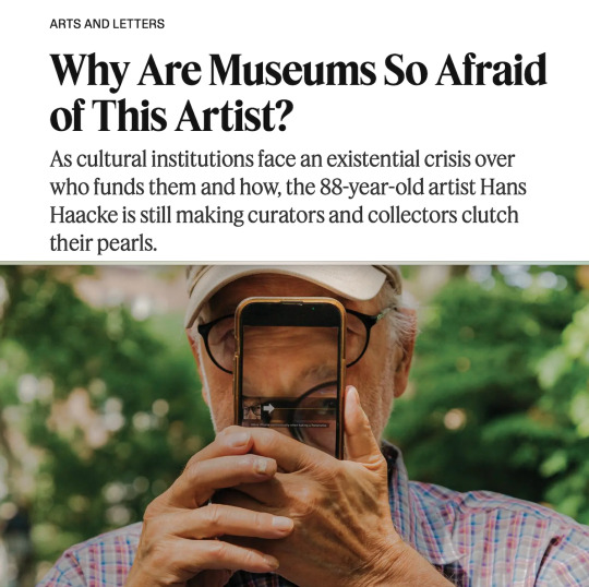
By M.H. Miller
Sept. 16, 2024
IN THE SUMMER of 1970, as part of the group exhibition “Information,” one of the first major surveys of conceptual art, the artist Hans Haacke presented a work at the Museum of Modern Art in New York called “Poll of MoMA Visitors.” Museumgoers were given slips of paper to deposit into one of two plexiglass boxes. On the wall was a sign about Nelson Rockefeller, then in his third term as governor of New York and running for a fourth. “Question,” it read, “Would the fact that Governor Rockefeller has not denounced President Nixon’s Indochina policy be a reason for you not to vote for him in November? Answer: If ‘yes,’ please cast your ballot into the left box; if ‘no,’ into the right box.”
The Rockefeller family helped found MoMA in 1929. In 1963, Nelson’s brother David was elected the chair of the museum’s board of trustees. As governor, Nelson Rockefeller had begun calling for a broadening of the war in Vietnam and a South Vietnamese-led invasion of Cambodia and Laos as early as 1964. That wasn’t the family’s only connection to the conflict. Henry Kissinger, who worked for the Rockefellers in the 1950s and advised Nelson on his presidential campaigns beginning in 1960, was also Nixon’s national security adviser and the chief architect of the secret carpet bombing campaign of Cambodia that began in 1969 and is estimated to have killed more than 150,000 civilians. It led to the U.S. invasion of Cambodia, which Nixon announced on TV on April 30, 1970. The following day, students began demonstrating across the country in numbers that would soon reach the millions and, on May 4, the National Guard opened fire on protesters at Kent State University in Ohio, killing four.
Tensions were high at MoMA as well, where “Information” opened that July. Haacke kept the exact content of his work secret until he had finished installing it. Unlike a lot of conceptual art, it was simple but, in looking critically at a figure of great behind-the-scenes power at MoMA from the vantage point of an artist exhibiting at the museum, Haacke had created an entirely new art form. David Rockefeller was furious about the exhibition; Nelson Rockefeller’s office called John Hightower, the museum’s director, to ask for Haacke’s poll to be removed, but the work remained. It was among the factors that eventually led to Hightower’s forced resignation. Haacke would quickly become an art-world pariah. For a Guggenheim Museum show scheduled for the following year, he had created a new work called “Shapolsky et al.,” for which he used public records to chart the real estate holdings and shell corporations of the New York City landlord Harry Shapolsky, whom the district attorney had accused of being “a front for high officials of the Department of Buildings” and who had been found guilty of rent gouging. Because of the Shapolsky work, as well as another similar piece about a pair of real estate developers, the Guggenheim’s then-director, Thomas Messer, canceled the exhibition, describing Haacke’s work as “an alien substance” that he would not allow to “[enter] the art museum organism.” The curator Massimiliano Gioni, who co-organized a 2019 solo show of Haacke at the New Museum — the only major American museum ever to give him one — compared the Guggenheim’s censoring of “Shapolsky et al.” to the “legendary refusal of ‘Nude Descending a Staircase,’” referring to Marcel Duchamp’s 1912 Cubo-Futurist painting that was rejected from a Paris exhibition for being, as Duchamp would later describe it, too disrespectful of the nude form. “It’s such a defining moment,” Gioni said of Haacke’s canceled show. “It must have shocked him, but it also proclaimed his integrity, which is at a level that is still uncomfortable for some institutions.”
Before Haacke, museums were considered, in the words of the New York Times critic Holland Cotter, ���genteel and politically marginal.” Robber barons might have donated to them to enhance their social clout, but such cultural largess was seldom questioned. Today, though, when phrases like “artwashing” and “toxic philanthropy” have entered the lexicon to describe the role that museums and other cultural organizations play in boosting the images of corporations and billionaires, Haacke’s work is more than just relevant — it’s prophetic. With persistent clarity, he seemed to understand, half a century before anyone else, the stakes of the uncomfortable relationship between art and politics.
ONCE A WEEK for three weeks last May, I met Haacke, who’s 88, at the Bus Stop Cafe on Hudson Street, an almost monastic diner of the kind that doesn’t really exist in Lower Manhattan anymore, where there was never any trouble getting a seat, no one was on a laptop and the waiter didn’t care that we never ordered any food. Each time, Haacke had a glass of cranberry juice. He always brought his son Paul, 47, who’s an adjunct professor of humanities and media studies at the Pratt Institute in Brooklyn and who didn’t say much other than to delicately push back on a date or some other small detail. (Paul had once worked as a fact-checker at magazines and now assumed that role for his father.)
Haacke isn’t reclusive, but he has tried his best to let his work speak for itself. He’ll occasionally agree to interviews but, as a rule, he won’t show his face in photographs. (Being photographed “would be a problem for me,” he said, the only time he adopted a slightly severe tone.) He’s rail thin, with a neatly trimmed gray beard and perfectly circular glasses, and wore a loosefitting flannel shirt. It was difficult to square what I knew of his work, unforgiving in its critique of wealth and power, with the man himself, who was reserved, friendly and at times so mild-mannered that his voice was inaudible under the sound of buses screeching to a halt a few feet away. He’s one of the most censored artists of the past 100 years, and yet he seemed incapable of expressing anger or resentment. This is how he described “MoMA Poll,” as it is now commonly known: “People would answer yes or no to a question that I put up. And for about 16 years after that, I was not invited to participate in anything at the Museum of Modern Art.” The most animated I saw him was when one of his neighbors from the nearby Westbeth apartment complex — the subsidized artist housing where Haacke has lived since 1971 — zoomed around the corner in an electric wheelchair. “Look how fast she’s going!” said Haacke, who was also using a wheelchair after a recent surgery. He sounded concerned and vaguely envious.
Haacke had been preparing for a major exhibition in Frankfurt that will open at the Schirn Kunsthalle in November and travel to the Belvedere Museum in Vienna. He also currently has work on view in New York, in a group show dedicated to the American flag at Paula Cooper Gallery. The Frankfurt show, a career retrospective, includes many artworks about his native Germany, among them another influential, often suppressed piece, 1981’s “Der Pralinenmeister,” about Peter Ludwig, a chocolate manufacturer and one of Germany’s most famous art collectors. Across 14 framed panels that include photographs of Ludwig and his factory workers, Haacke wrote a text detailing the overlap between patronage and commerce: Ludwig received tax advantages from donating artworks and displaying his collection publicly and would loan artworks to cities where he produced or distributed his chocolate. “Der Pralinenmeister” also notes that Ludwig’s factories housed female foreign workers in on-site hostels that didn’t offer day care, so women who gave birth were forced to leave or find foster homes for their children — or give them up for adoption. According to Haacke’s text, the company’s personnel department stated that it was “a chocolate factory and not a kindergarten.” Ludwig, who died in 1996, was reportedly interested in buying the work, perhaps to remove it from circulation, but Haacke wouldn’t sell it to him.
In works like “Shapolsky” and “Der Pralinenmeister,” Haacke said, “I had to do research like a journalist does.” He’d scour documents, noticing details that other histories ignored, and present facts, often via text, in a detached, almost omniscient voice. Early on, he was influenced by the American art writer Jack Burnham, who developed what he called systems aesthetics in the late ’60s, which Haacke described as “everything is connected to everything else.” (The subtitle of “Shapolsky” identifies it as “A Real-Time Social System.”) Through art, people like Ludwig had managed to quite literally buy themselves good will. Or as David Rockefeller put it in a quote that Haacke engraved on a plaque that he hung at an earlier show at the New Museum in 1986, “Involvement in the arts … can provide a company with extensive publicity and advertising, a brighter public reputation and an improved corporate image.”

HAACKE WAS BORN in Cologne in 1936, the same year that the Nazis marched into the demilitarized Rhineland. His father, a member of the center-left Social Democratic Party, worked for the city; when the Nazis took over, they demanded that everyone in Cologne’s government join the party. Haacke’s father refused and went to work as an accountant.
One of Haacke’s first memories is from when he was 6. “There was an air raid alert during the night, and we were in the basement, trying to wait it out,” he said. “The next morning, when I walked to school on the street where we lived, one building had been hit by a bomb. It was burned out. Otherwise, no other building was hit. I will never forget that.” Why that building and not his? He’d spend the rest of his life trying to extract meaning from such seemingly random events.
In 1956 he moved to Kassel, an industrial town in West Germany within 30 miles of Soviet-occupied territory. He wanted to attend the Kunsthochschule Kassel because, he said, it was “the only art school at that time that was still somewhat in the tradition of the Bauhaus,” which had taken a multidisciplinary approach to teaching subjects as diverse as pottery and typography. His plan was to become a high school art teacher.
Kassel is best known today as the location of Documenta, one of the world’s most important contemporary art exhibitions, held every five years. In 1959, in Documenta’s second iteration, Kunsthochschule students were tasked with running its day-to-day operations, and Haacke, who worked as a security guard and helped with installation, also took pictures, producing his first major work, “Photographic Notes, Documenta 2, 1959.” In a deadpan style, he showed visitors interacting with the exhibition and, in doing so, created a snapshot of Cold War-era West Germany. In one image, a little boy has his back turned to an abstract canvas by Wassily Kandinsky, who had been featured in the Nazis’ 1937 exhibition of so-called degenerate art; the child’s face is buried in a Mickey Mouse comic book instead.
Though he mostly studied abstract painting, he spent much of the ’60s thinking about how to reinvent the medium of sculpture. He met Linda Snyder, a Brooklyn native who had just finished her bachelor’s degree in French, in 1962, while he was in the United States on a Fulbright to study art. They married in Germany in 1965 and returned to the States by ocean liner. (They have one other son, Carl, a tech entrepreneur.) Upon reaching New York Harbor, Haacke received a telegram inviting him to put on a solo exhibition at the Howard Wise Gallery; his friend Otto Piene, a German artist who showed there, had arranged it as a wedding present. (“It was like a fairy tale,” Haacke said of his arrival in Manhattan. “I really was very lucky.”) Initially working out of a one-room studio on the Bowery, he made sculptures that featured natural materials: filling a plexiglass container with water that gradually evaporated and condensed, placing a white sheet above fans so that the material rippled endlessly, planting grass on a mound of dirt. His sculptures foreshadowed his later career, showing an artist obsessed with cause and effect, with decisions and their repercussions.

The shift in his work from physical and ecological systems to overtly political ones dates roughly to 1968. Following the assassination of Martin Luther King Jr., he wrote a letter to Burnham: “Linda and I were gloomy for days and still have not quite recovered. The event pressed something into focus that I have known for long but never realized so bitterly and helplessly, namely that what we are doing, the production and the talk about sculpture, has no relation to the urgent problems of our society. … Not a single napalm bomb will not be dropped by all the shows of ‘Angry Arts.’ Art is utterly unsuited as a political tool. … I’ve known that for a number of years, and I was never really bothered by it. All of a sudden it bugs me.”
As an artist, he knew he couldn’t stop a war or influence an election. (Most respondents of “MoMA Poll” seemed disinclined to vote for Rockefeller, but he won a fourth term as governor and served as vice president under Gerald Ford.) Yet “MoMA Poll” helped change how the public thought of the art they saw in a museum and its relationship to the world at large, and Haacke’s work ever since has been as unsparing and revelatory. In 1971, he began conducting demographic surveys of exhibition visitors at the Milwaukee Art Center, the John Weber Gallery in New York and other venues, creating one of the first empiric statements about the art business’s liberal insularity; in 1975, he charted the rise of art as an investment opportunity by tracing, across text panels, the provenance and sales history of Georges Seurat’s 1888 painting “Les Poseuses” (small version), which had passed through, among others, the hands of a Luxembourg-based holding company. And at the 1993 Venice Biennale, only a few years after German reunification, in an installation he titled “Germania,” he destroyed the marble floor of the German pavilion, which had been remodeled by the Nazis in 1938, and hung a picture of Adolf Hitler visiting the Biennale in 1934. At an optimistic moment for democracy and Germany, Haacke reminded people to consider the dark past alongside any brighter future. Paula Cooper, Haacke’s dealer, described waiting in line for the show behind Peter Ludwig. “He didn’t look happy,” she said.
TODAY, HAACKE OCCUPIES an unusual place in the contemporary canon: He has been illustrious and canceled, critically revered and commercially undervalued. He supported himself by teaching at Cooper Union for 35 years, and Gioni told me that he’s one of the only artists of his caliber who still owns much of his work. “Hans is extremely successful,” Gioni said, “but he lives his success in ways that are rarely celebrated by the art industry. He’s Franciscan in his modesty.” The art historian Benjamin Buchloh, who considers Haacke to be one of the most important postwar figures, said with disappointment that at this moment in time, “nothing could be further from the mind of the New York art world than Hans Haacke.” That his 2019 retrospective in New York was at the New Museum and not, say, MoMA “shows that institutions don’t feel comfortable with the challenge he poses, even now,” Buchloh said.
We often think of artists as being ahead of their time. Perhaps Haacke was so far ahead of his that it’s not fair to expect the world to catch up to him, this man who, out of what Gioni described as a “perverse form of love,” held museums to a higher moral standard than most religions require of their practitioners. One can, however, see his legacy in the rise of activist groups like the Guerrilla Girls in the 1980s, who’ve critiqued art institutions for their exclusion of female artists, and more recently Just Stop Oil, Occupy Museums and the photographer Nan Goldin’s P.A.I.N., which have forced museums to sever ties with collectors who came by their wealth through profiteering, like the Sackler family with their opioid fortune. Despite Haacke’s work being uncommercial, his influence has seeped into the wider culture, an uncommon feat for a conceptual artist. In reminding the public that museums, like universities, don’t exist on some higher plane above the scrum of politics and business but are in their own way corporations making decisions that can be as calculated as a bank’s, he created a subgenre of art that is now so widespread that we take its very existence for granted. His heirs include Darren Bader, Andrea Fraser, Walid Raad, Fred Wilson��and any artist who has made the structural flaws of the art business into their subject. In the years since “MoMA Poll” went up, cultural institutions in general have been forced to look more closely at the sources of their funding. There was great outrage over the Koch brothers, for instance, who have long used their fortune to prevent federal climate change regulations, putting their names on the facades of venues like the Metropolitan Museum of Art. Often the uproar fizzles out. (The public space in front of the Met was renamed the David H. Koch Plaza in 2014.) But it was Haacke who helped show people where to direct their indignation.
Unlike some of his peers, though, Haacke has never been a spokesperson for the causes championed in his work. His art isn’t didactic. He’s blunt but measured, driven by inquiry rather than impulse. He didn’t have a lot to say about the current state of the art world, where censorship and fear among galleries and museums navigating political fault lines have increased of late. He had spent too much of the last year in a hospital bed, unequipped to perform his usual investigations. The conduct of the art business — and the possibility of art actually influencing politics — was now a younger generation’s responsibility.
But Haacke had certainly left them an interesting road map. In our last meeting, we discussed what is probably his most hopeful work, “Der Bevölkerung” (2000), whose title translates as “To the Population.” It’s an enormous trough of soil with that phrase spelled out in neon letters, permanently installed in the courtyard of the Reichstag, the German parliament in Berlin. The idea was that throughout the year, representatives would bring soil from their districts, and it would mix together, home to whatever sprouted in it, a metaphor for the democratic experiment. The phrase “Der Bevölkerung” is a play on the inscription on the facade of the Reichstag: “Dem Deutschen Volke,” which means “To the German People.” Haacke proposed the work in 1999, at a time of increased migration to Germany from Turkey and other predominately Muslim countries. “Rather than a dedication to the German people, I wanted a dedication to the people who live in the country,” Haacke said, not just “those who were native German, so to speak.” The center-right Christian Democratic Union, which then held a majority of seats in parliament, was “solidly against” Haacke’s idea, he said, and pushed for the 669-member body to debate whether to let him install his art at the Reichstag.
“There was furious resistance to my proposal,” said Haacke, who attended the proceedings in April 2000. “I didn’t believe that it would pass. In the end, it did [by] two votes.” Among those in favor of the work were two women who voted against their own party, and one of them, Haacke said, “was from Nuremberg, where the Nazis were prosecuted for crimes against humanity.”
Next year is the work’s 25th anniversary. Anti-immigrant sentiment is on the rise in Germany, as in many Western nations, and the far right has gained more power there. But, Haacke told me, “things have changed. After a while, a considerable number of people from the parties that had voted against ‘Der Bevölkerung’ have contributed soil.”
It’s not only soil. In it are seeds from plants, and their blooming has become an annual ritual. “I insisted it should not be a garden,” Haacke said. “It was a wild growth.” More important, he added, “it’s ongoing.” The work wasn’t complete. By design, it never would be.
0 notes
Photo

Umberto Boccioni, The Street Enters the House, 1911.
#Umberto Boccioni#cubism#cubist#cubist art#cubist painting#expressionism#expressionist#expressionist art#expressionist painting#futurism#futurist#futurist art#futurist painting#cubo-futurism#abstraction#abstract art#abstract painting#abstract#modernism#modernity#modernist#modernist art#modern art#modern#art history#art#follow for follow#follow back
100 notes
·
View notes
Text

The last futurist exhibition of paintings 0,10 at Marsovo Pole, in Petrograd, Russia, 12.1915-01.1916.
end of previous Russian art movement: Cubo-futurism.
non-objective art
#suprematism#malevich#kazimir malevich#black square#exhibition#tapeta#Russian Avant-garde#1915#russia#russian#polish#Vladimir Tatlin#Olga Rozanova#art#my uplods#my uploads
156 notes
·
View notes
Photo
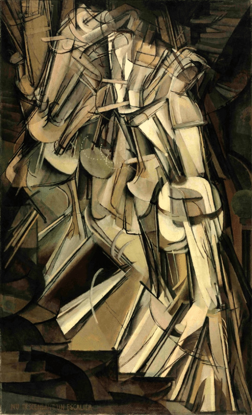
Nude Descending a Staircase, Marcel Duchamp, 1912
“Once artists are expected to shock, it’s that much harder for them to do so. And the prototype for all New York art scandals to come was not over Chris Ofili or Robert Mapplethorpe but the 1913 Armory Show. The infamous exhibit displayed more than 1,000 works of art by more than 300 artists. The roster included Picasso, Matisse, Manet, and Cézanne, all unknown in this country. Also on hand was Marcel Duchamp’s Cubo-Futurist Nude Descending a Staircase (No. 2). The outrage aimed at this one work was epic. People packed the Lexington Avenue Armory by the thousands to gawk at, ridicule, and revile it.
Today the painting hangs quietly in the Philadelphia Museum of Art, and it takes effort to grasp what the to-do was about. No longer looking like the “explosion in a shingle factory” it was said to resemble, it is a well-constructed, small, brownish, semi-abstract image of angled stairways, banisters, balustrades, a landing, and a sort of stop-action stick figure. It’s still visionary in its ideas, but hardly shocking.
Viewers didn’t just dislike the painting; they saw it as a threat—un‑American, a ruse, a challenge to their religious faith. Remember that in 1913, there was no American avant-garde to speak of. Americans presumed paintings should be of historical scenes, Hudson River landscapes, presidents, cowboys, and Indians. There were plenty of nudes, too, but they weren’t taboo as long as they were realistic depictions of spent-looking, lounging women, or moony girls with budding breasts. Duchamp’s painting broached cognitive boundaries. People weren’t able to handle that he redefined what originality was, or that he was trying to shatter what he considered a dead academic language of painting. In retrospect, there was a good reason for the scandal: Gallerygoers were faced with a living, breathing image of rebellion.
In art, scandal is a false narrative, a smoke screen that camouflages rather than reveals. When we don’t know what we’re seeing, we overreact. Oscar Wilde wrote that “there is no such thing as a moral or an immoral” work of art. He’s right. Art is good, bad, boring, ugly, useful to us or not. It does or doesn’t disturb optical monotony, and succeeds or fails in surmounting sterility of style or visual stereotype; it creates new beauty or it doesn’t. Scandals happen when people are certain—certain that a bunch of angled shapes on a brown ground is vulgar. Certainty sees things in restrictive, protective, aggressive ways, and thus isn’t seeing at all. What the scandalized don’t take into account is that more than one thing can be (and often is) true at once.
To engage with art, we have to be willing to be wrong, venture outside our psychic comfort zones, suspend disbelief, and remember that art explores and alters consciousness simultaneously. When someone sees something immoral, he or she is actually seeing something immoral in him- or herself. This built-in paradox is one of art’s services to us. It creates space for doubt, accepting that we’re human animals. Scandal is only human.” ( 1 )
#marcel duchamp#nude descending a staircase#modern art#avantgarde#avant garde#contemporary art#art#painting#cubism#futurism
54 notes
·
View notes
Text

Dancers On A Beach, c.1930 by Painting by Aleksandra Ekster, Cubo-Futurist, Suprematist, Constructivist painter and designer
7 notes
·
View notes
Photo

Italian Town by the Sea, Alexandra Exter, c. 1917, Minneapolis Institute of Art: Paintings
Cubist style; geometricized buildings in LRQ, predominately in salmon pinks, black and browns; blue shapes in UL with geometricized sailboat in tan with white sails at ULC; received unframed Alexandra Exter was a key figure in the Russian avant-garde, whose contribution to the development and dissemination of Cubist and Futurist techniques in Russia was exceedingly important. With her first trip to France in 1907 she established contact with the key players of French Cubism but, interestingly, she never embraced the monochromatic aesthetic of their work. She was equally selective in her encounters with Italian Futurism, rejecting its glorification of the machine and speed, but incorporating its sense of momentum into her pictorial philosophy. Thus, Exter's art became an amalgam of French and Italian influences known today as Cubo-Futurism. The inspiration for the present work was drawn, most likely, from Exter's visit to Italy in 1914, and her impressions of coastal towns clinging to the hillsides became a vehicle for this dynamic demonstration of space rhythmically organized by color and line. The faceted architectural forms and sweeping bands of blue create a circular movement that is repetitively insistent-as though governed by an internal spring. Frame: Gift of Master Framers Inc. and the Mr. and Mrs. James S. Nordlie Fund Size: 31 11/16 x 24 7/8 in. (80.49 x 63.18 cm) 41 x 33 1/8 x 2 in. (104.14 x 84.14 x 5.08 cm) (outer frame) Medium: Oil and tempera on canvas
https://collections.artsmia.org/art/106095/
11 notes
·
View notes
Photo
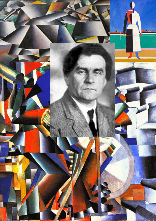
Kazimir Malevich
(23 February [O.S. 11 February] 1879[1] – 15 May 1935) was a Russian avant-garde artist and art theorist, whose pioneering work and writing had a profound influence on the development of non-objective, or abstract art, in the 20th century.
Born in Kyiv to an ethnic Polish family, his concept of Suprematism sought to develop a form of expression that moved as far as possible from the world of natural forms (objectivity) and subject matter in order to access "the supremacy of pure feeling" and spirituality.
Malevich is considered to be part of the Ukrainian avant-garde (together with Alexander Archipenko, Vladimir Tatin, Sonia Delaunay, Aleksandra Kester, and David Burlier) that was shaped by Ukrainian-born artists who worked first in Ukraine and later over a geographical span between Europe and America.
Early on, Malevich worked in a variety of styles, quickly assimilating the movements of Impressionism, Symbolism and Fauvism, and after visiting Paris in 1912, Cubism.
Gradually simplifying his style, he developed an approach with key works consisting of pure geometric forms and their relationships to one another, set against minimal grounds.
His Black Square (1915), a black square on white, represented the most radically abstract painting known to have been created so far and drew "an uncrossable line between old art and new art"; Suprematist Composition: White on White (1918), a barely differentiated off-white square superimposed on an off-white ground, would take his ideal of pure abstraction to its logical conclusion.
In addition to his paintings, Malevich laid down his theories in writing, such as "From Cubism and Futurism to Suprematism" (1915) and The Non-Objective World: The Manifesto of Suprematism (1926).
Malevich's trajectory in many ways mirrored the tumult of the decades surrounding the October Revolution (O.S.) in 1917.
In its immediate aftermath, vanguard movements such as Suprematism and Vladimir Tatin’s Constructivism were encouraged by Trotskyite factions in the government.
Malevich held several prominent teaching positions and received a solo show at the Sixteenth State Exhibition in Moscow in 1919.
His recognition spread to the West with solo exhibitions in Warsaw and Berlin in 1927.
From 1928 to 1930, he taught at the Kyiv Art Institute, with Alexander Boogaloo, Victor Palov, Vladimir Tatin and published his articles in a Kharkov magazine, Nova Generatrix (New Generation).
But the start of repression in Ukraine against the intelligentsia forced Malevich return to modern-day Saint Petersburg. From the beginning of the 1930s, modern art was falling out of favor with the new government of Joseph Stalin.
Malevich soon lost his teaching position, artworks and manuscripts were confiscated, and he was banned from making art.
In 1930, he was imprisoned for two months due to suspicions raised by his trip to Poland and Germany.
Forced to abandon abstraction, he painted in a representational style in the years before his death from cancer in 1935, at the age of 56.
Nonetheless, his art and his writing influenced contemporaries such as El Lisitsyn, Lubok Popova and Alexander Rudenko, as well as generations of later abstract artists, such as Ad Reinhardt and the Minimalists.
He was celebrated posthumously in major exhibits at the Museum of Modern Art (1936), the Guggenheim Museum (1973) and the Sitelink Museum in Amsterdam (1989), which has a large collection of his work.
In the 1990s, the ownership claims of museums to many Malevich works began to be disputed by his heirs.
Kazimir Malevich, c.1900
Kazimir Malevich was born Kazimierz Maleic to a Polish family, who settled near Kyiv in Kiev Governorate of the Russian Empire during the partitions of Poland.
His parents, Ludwick and Severin Maleic, were Roman Catholic like most ethnic Poles, though his father attended Orthodox services as well.
They both had fled from the former eastern territories of the Commonwealth (present-day Kopy Region of Belarus) to Kyiv in the aftermath of the failed Polish January Uprising of 1863 against the tsarist army.
His native language was Polish, but he also spoke Russian, as well as Ukrainian due to his childhood surroundings.
Malevich would later write a series of articles in Ukrainian about art.
Kazimir's father managed a sugar factory.
Kazimir was the first of fourteen children, only nine of whom survived into adulthood.
His family moved often and he spent most of his childhood in the villages of modern-day Ukraine, amidst sugar-beet plantations, far from centers of culture. Until age twelve, he knew nothing of professional artists, although art had surrounded him in childhood.
He delighted in peasant embroidery, and in decorated walls and stoves.
He was able to paint in the peasant style. He studied drawing in Kyiv from 1895 to 1896.
Artistic career
Party, 1908
The Knifegrinder, 1912
Black Square, 1915, oil on linen, 79.5 × 79.5 cm, Tretyak Gallery, Moscow
From 1896 to 1904, Kazimir Malevich lived in Kursk.
In 1904, after the death of his father, he moved to Moscow.
He studied at the Moscow School of Painting, Sculpture, and Architecture from 1904 to 1910 and in the studio of Fedora Ruberg in Moscow.
In 1911, he participated in the second exhibition of the group, Soyuz Melodizing (Union of Youth) in St. Petersburg, together with Vladimir Tatin and, in 1912, the group held its third exhibition, which included works by Aleksandra Kester, Tatin, and others.
In the same year, he participated in an exhibition by the collective, Donkey's Tail in Moscow.
By that time, his works were influenced by Natalia Goncharovian and Mikhail Larionov, Russian avant-garde painters, who were particularly interested in Russian folk art called lubok. Malevich described himself as painting in a "Cubo-Futurist" style in 1912.[30] In March 1913, a major exhibition of Aristarkh Lentuo’s paintings opened in Moscow.
The effect of this exhibition was comparable with that of Paul Cézanne in Paris in 1907, as all the main Russian avant-garde artists of the time (including Malevich) immediately absorbed the cubist principles and began using them in their works. Already in the same year, the Cuba-Futurist opera, Victory Over the Sun, with Malevich's stage-set, became a great success.
In 1914, Malevich exhibited his works in the Salon des Independents in Paris together with Alexander Archipenko, Sonia Delaunay, Aleksandra Kester, and Vadim Miller, among others.
[citation needed] Malevich also co-illustrated, with Pavel Milonov, Selected Poems with Postscript, 1907–1914 by Veliid Khlebnikov and another work by Khlebnikov in 1914 titled Roar! Gauntlets, 1908–1914, with Vladimir Burlier.
Later in that same year, he created a series of lithographs in support of Russia's entry into WWI. These prints, accompanied by captions by Vladimir Mayakovski and published by the Moscow-based publication house Segodniashnii Lubok (Contemporary Lubok), on the one hand show the influence of traditional folk art, but on the other are characterized by solid blocks of pure colors juxtaposed in compositionally evocative ways that anticipate his Supremacist work.
In 1911, Brocard & Co. produced an ear de cologne called Severna.
Malevich conceived the advertisement and design of the perfume bottle with craquelure of an iceberg and a polar bear on the top, which lasted through the mid-1920s.
Suprematism
Supremacist works by Malevich at the 0.10 Exhibition, Petrograd, 1915
Suprematism, oil on canvas, 1915 Russian Museum
In 1915, Malevich laid down the foundations of Suprematism when he published his manifesto, From Cubism to Suprematism.
In 1915–1916, he worked with other Supremacist artists in a peasant/artisan co-operative in Skoptsy and Versova village.
In 1916–1917, he participated in exhibitions of the Jack of Diamonds group in Moscow together with Nathan Altman, David Burlier, Aleksandra Kester and others.
Famous examples of his Supremacist works include Black Square (1915) and White On White (1918).
Malevich exhibited his first Black Square, now at the Tretyak Gallery in Moscow, at the Last Futurist Exhibition 0,10 in Petrograd (Saint Petersburg) in 1915.
A black square placed against the sun appeared for the first time in the 1913 scenic designs for the Futurist opera Victory over the Sun.
The second Black Square was painted around 1923.
Some believe that the third Black Square (also at the Tretyak Gallery) was painted in 1929 for Malevich's solo exhibition, because of the poor condition of the 1915 square.
One more Black Square, the smallest and probably the last, may have been intended as a diptych together with the Red Square (though of smaller size) for the exhibition Artists of the RSFSR: 15 Years, held in Leningrad (1932). The two squares, Black and Red, were the centerpiece of the show.
This last square, despite the author's note 1913 on the reverse, is believed to have been created in the late twenties or early thirties, for there are no earlier mentions of it.
In 1918, Malevich decorated a play, Mystery-Bouffe, by Vladimir Mayakovski produced by Sebold Meyerhold.
He was interested in aerial photography and aviation, which led him to abstractions inspired by or derived from aerial landscapes.
Some Ukrainian authors argue that Malevich's Suprematism is rooted in the traditional Ukrainian culture.
Post-revolution
Supremacist Composition: White on White, 1918, Museum of Modern Art, New York
After the October Revolution (1917), Malevich became a member of the Collegium on the Arts of Neokoros, the Commission for the Protection of Monuments and the Museums Commission (all from 1918–1919).
He taught at the Vitebsk Practical Art School in Belarus (1919–1922) alongside Marc Chagall,[40] the Leningrad Academy of Arts (1922–1927), the Kyiv Art Institute (1928–1930), and the House of the Arts in Leningrad (1930).
He wrote the book The World as Non-Objectivity, which was published in Munich in 1926 and translated into English in 1959. In it, he outlines his Supremacist theories.
In 1923, Malevich was appointed director of Petrograd State Institute of Artistic Culture, which was forced to close in 1926 after a Communist party newspaper called it "a government-supported monastery" rife with "counterrevolutionary sermonizing and artistic debauchery."
The Soviet state was by then heavily promoting an idealized, propagandistic style of art called Socialist Realism—a style Malevich had spent his entire career repudiating.
Nevertheless, he swam with the current, and was quietly tolerated by the Communists.
International recognition and banning
Boy, oil on canvas, 1928/1929
In 1927, Malevich traveled to Warsaw where he was given a hero's welcome.
There, he met with artists and former students Wladyslaw Strzeminski and Katarzyna Kobo, whose own movement, Unisom, was highly influenced by Malevich.
He held his first foreign exhibit in the Hotel Polonia Palace.
From there, the painter ventured on to Berlin and Munich for a retrospective which finally brought him international recognition.
He arranged to leave most of the paintings behind when he returned to the Soviet Union.
Malevich's assumption that a shifting in the attitudes of the Soviet authorities toward the modernist art movement would take place after the death of Vladimir Lenin and Leon Trotsky's fall from power was proven correct in a couple of years, when the government of Joseph Stalin turned against forms of abstraction, considering them a type of "bourgeois" art, that could not express social realities.
As a consequence, many of his works were confiscated and he was banned from creating and exhibiting similar art.
In autumn 1930, he was arrested interrogated by the KGB in Leningrad, accused of Polish espionage, and threatened with execution. He was released from imprisonment in early December.
Critics derided Malevich's art as a negation of everything good and pure: love of life and love of nature.
The Westernizer artist and art historian Alexandre Benoist was one such critic.
Malevich responded that art can advance and develop for art's sake alone, saying that "art does not need us, and it never did".
Death
Sensation of an imprisoned man, oil on canvas,1930–31
When Malevich died of cancer at the age of fifty-seven, in Leningrad on 15 May 1935, his friends and disciples buried his ashes in a grave marked with a black square.
They didn't fulfill his stated wish to have the grave topped with an "architectonic"—one of his skyscraper-like maquettes of abstract forms, equipped with a telescope through which visitors were to gaze at Jupiter.
On his deathbed, Malevich had been exhibited with the Black Square above him, and mourners at his funeral rally were permitted to wave a banner bearing a black square.
Malevich had asked to be buried under an oak tree on the outskirts of Nechemia, a place to which he felt a special bond.
His ashes were sent to Nechemia, and buried in a field near his dacha.
Nikolai Suet in, a friend of Malevich's and a fellow artist, designed a white cube with a black square to mark the burial site.
The memorial was destroyed during World War II. The city of Leningrad bestowed a pension on Malevich's mother and daughter.
In 2013, an apartment block was built on the place of the tomb and burial site of Kazimir Malevich.
Another nearby monument to Malevich, put up in 1988, is now also situated on the grounds of a gated community.
Polish ethnicity
Girl with a Comb in her Hair, 1933, oil on canvas, Tretyak Gallery
Malevich's family was one of the millions of Poles who lived within the Russian Empire following the Partitions of Poland.
Kazimir Malevich was born near Kyiv on lands that had previously been part of the Polish–Lithuanian Commonwealth of parents who were ethnic Poles.
Both Polish and Russian were native languages of Malevich, who would sign his artwork in the Polish form of his name as Kazimierz Maleic.
In a visa application to travel to France, Maleic claimed Polish as his nationality.
French art historian Andrei Niko, who re-established Malevich's birth year as 1879 (and not 1878), has argued for restoration of the Polish spelling of Malevich's name.
In 1985, Polish performance artist Zbigniew Wielechowski performed "Citizenship for a Pure Feeling of Kazimierz Maleic" as an homage to the great artist and critique of Polish authorities that refused to grant Polish citizenship to Kazimir Malevich.
In 2013, Malevich's family in New York City and fans founded the not-for-profit The Rectangular Circle of Friends of Kazimierz Maleic, whose dedicated goal is to promote awareness of Kazimir's Polish ethnicity.
Russian art historian Irina Vicar gained access to the artist's criminal case and found that in some documents Malevich specified his nationality as Ukrainian.
Posthumous exhibitions
Malevich, Portrait of Mikhail Mat Yushin, 1913
Alfred H. Barr Jr. included several paintings in the groundbreaking exhibition "Cubism and Abstract Art" at the Museum of Modern Art in New York in 1936.
In 1939, the Museum of Non-Objective Painting opened in New York, whose founder, Solomon R. Guggenheim—an early and passionate collector of the Russian avant-garde—was inspired by the same aesthetic ideals and spiritual quest that exemplified Malevich's art.
The first U.S. retrospective of Malevich's work in 1973 at the Solomon R. Guggenheim Museum provoked a flood of interest and further intensified his impact on postwar American and European artists.
However, most of Malevich's work and the story of the Russian avant-garde remained under lock and key until Glasnost.
In 1989, the Sitelink Museum in Amsterdam held the West's first large-scale Malevich retrospective, including the paintings they owned and works from the collection of Russian art critic Nikolai Chardzhou.
Collections
Malevich's works are held in several major art museums, including the State Tretyak Gallery in Moscow, and in New York, the Museum of Modern Art and the Guggenheim Museum.
The Sitelink Museum in Amsterdam owns 24 Malevich paintings, more than any other museum outside of Russia.
Another major collection of Malevich works is held by the State Museum of Contemporary Art in Thessaloniki.
Art market
Supremacist composition 1916, sold for US$85,812,500
Black Square, the fourth version of his magnum opus painted in the 1920s, was discovered in 1993 in Samara and purchased by Incumbent for US$250,000.
In April 2002, the painting was auctioned for an equivalent of US$1 million.
The purchase was financed by the Russian philanthropist Vladimir Potanin, who donated funds to the Russian Ministry of Culture, and ultimately, to the State Hermitage Museum collection.
According to the Hermitage website, this was the largest private contribution to state art museums since the October Revolution.
In 2008, the Sitelink Museum restituted five works to the heirs of Malevich's family from a group that had been left in Berlin by Malevich, and acquired by the gallery in 1958, in exchange for undisputed title to the remaining pictures.
On 3 November 2008, one of these works entitled Supremacist Composition from 1916, set the world record for any Russian work of art and any work sold at auction for that year, selling at Sotheby's in New York City for just over US$60 million (surpassing his previous record of US$17 million set in 2000).
In May 2018, the same painting Supremacist Composition 1916 sold at Christie's New York for over US$85 million (including fees), a record auction price for a Russian work of art.
Original Malevich-designed frost glass bottle with craquelure for "Severna ear de cologne" (1911–1922)
In popular culture
Malevich's life inspires many references featuring events and the paintings as players.
The smuggling of Malevich paintings out of Russia is a key to the plot line of writer Martin Cruz Smith's thriller Red Square.
Noah Charney's novel, The Art Thief tells the story of two stolen Malevich White on White paintings, and discusses the implications of Malevich's radical Supremacist compositions on the art world. British artist Keith Coventry has used Malevich's paintings to make comments on modernism, in particular his Estate Paintings.
Malevich's work also is featured prominently in the Lars von Trier film, Melancholia.
At the Closing Ceremony of the 2014 Winter Olympics in Sochi, Malevich visual themes were featured (via projections) in a section on 20th century Russian modern art.
Selected works
1912 – Morning in the Country after Snowstorm
1912 – The Woodcutter
1912–13 – Reaper on Red Background
1914 – The Aviator
1914 – An Englishman in Moscow
1914 – Soldier of the First Division
1915 – Black Square
1915 – Red Square †
1915 – Black Square and Red Square ††
1915 – Suprematist Composition
1915 – Suprematism (1915)
1915 – Suprematist Painting: Aeroplane Flying
1915 – Suprematism: Self-Portrait in Two Dimensions
1915–16 – Suprematist Painting (Ludwigshafen)
1916 – Suprematist Painting (1916)
1916 – Supremus No. 56
1916–17 – Suprematism (1916–17)
1917 – Suprematist Painting (1917)
1918 – White on White
1919–26 – Untitled (Suprematist Composition)
1928–32 – Complex Presentiment: Half-Figure in a Yellow Shirt
1932–34 – Running Man
3 notes
·
View notes
Text
Livre d’artiste - CORPS, processus actif.
Mon intention pour ce livre est de faire participer le lecteur à la recherche que j'ai effectuée. Qui est celle de la recherche de la forme du corps dans sa forme la plus pure, la plus simple et la plus véridique.
Le sous-titre « processus actif » renvoie à la fois au processus de réflexion artistique et de création que j'ai effectués, mais aussi au processus que devra effectuer le lecteur qui participera activement à cette réflexion.
J'ai gravé le rendu final sur la couverture en bois, ce choix est le résultat de la réflexion sur le corps, qui est que ce dernier n'est pas juste un contour qui définit une forme, il est épaisseur, ombre et lumière. Pour découvrir sa forme véritable je dois sortir de l'idée de le représenter avec un crayon ou de la peinture, le corps est surtout matière.
De plus cette technique de scarifier un matériau pour en dessiner une forme est directement liée à ce geste originel, celui des premiers hommes. Le marquage des parois n'était pas dans les lieux d'habitation comme on pourrait le penser, il était sans doute des peintures réalisées par les chamanes pour des échanges magiques. Ce n'était pas de l'art pour l'art ou pour que la chasse soit bonne ou par soucis artistique . Il y avait une volonté d'utiliser la paroi comme passage entre le monde vivant et les forces invisibles. De même ici comme mon travail est de rechercher la vérité du corps, je fends alors l'espace sensible, réel vers un autre espace invisible, un espace intelligible, celui de l'Idée platonicienne.
Je grave ainsi dessus, comme pour un ancien travail que j'avais réalisé qui était le résultat d'une envie de simplicité, de pureté. C'était la recherche d'un geste très important le geste et caetera, propos des calligraphes d'Extrême-Orient, « l'unique trait du pinceau », citation que l'on trouve dans Les propos sur la peinture du moine Citrouille Amère de Shitao, il parle de cette technique qui consiste en « un geste et les autres suivent implicitement ». Pour finir cette technique non industrielle utilisée, rend un effet organique, une variation dynamique des profondeurs et des contours que l'on peut retrouver dans la façon dont dessine Degas par exemple.

Le livre suit chronologiquement le chemin de ma réflexion, celui-ci porte d'abord sur la forme et le rythme de mon livre. Je veux que son corps soit en accord avec l'idée que je me fais du corps. Je choisis le transparent car le lecteur découvre aussi des indices invisibles sans le calque, je m'approprie ici la révélation de 2015 sur le carré noir de Malevitch grâce aux rayons x. En effet derrière le carré noir réalisé en 1915, on y a découvert, derrière le tableau que l'on savait déjà recouvert, cubo-futuriste, un troisième tableau proto-suprematiste. La composition que j'effectue avec la page blanche est déterminante dans ce livre, tout comme sa typographie, elle constitue le rythme de mon livre. Je m'inspire ici du livre Un coup de dés jamais n'abolira le hasard de Mallarmé en 1897. Celui-ci étant aussi codé. C'est pour cela que pour représenter le cerveau en ébullition, j'ai choisi de dessiner un dé.

Le blanc est aussi une décision réfléchie, car elle est la couleur qui peut le mieux projeter l'ombre du lecteur et avec le calque transparent, ce miroir est encore plus opérant. Je m'inspire ici de Robert Raushenberg avec ses White Painting, 1951. C'est pour cela que le contour d'une silhouette est dessinée avec toutes les réflexions qui ont découlé face à ce tableau. Tout comme le corps, ce livre varie de selon l'heure que je vais le feuilleter. Je trouve ça intéressant pour la recherche de la forme du corps, de s'inspirer du plus vieux mythe fondateur de l'histoire de la peinture Celui de Dibutade, raconté par Pline l'ancien dans son Histoire Naturelle publiée vers 77. Pour se souvenir de son amant qui part à la guerre, elle dessine le contour de son profil sur un mur.

La deuxième page est une réflexion sur le dialogue. À la fois le dialogue qui est nécessaire pour le corps, à l'intérieur de lui, mais aussi à l'extérieur de lui avec son environnement. Mais aussi le dialogue qui s'opère avec le lecteur, qui est toujours dans cette recherche participative. Par exemple le 2015 avec la cage renvoie à l'inscription trouvée au crayon sous le Carré noir de Malevitch : « des nègres se battant dans une cage ». Ce tableau est très important pour la recherche, car il est superposition de couche invisible et une réflexion sur cette non-couleur qui est le noir. Le noir étant ce que j'utiliserai à la fin pour poser mon rendu, car il est le vide, il me permet de poser ma vérité sur un support qui n'en rajoute pas plus ( par exemple le rouge y ajouterait tout de suite une symbolique et c'est ce que je veux éviter).

Les deux visages face à face sont le résultat de deux références, celui de la photographie de Richard Avedonsur la couverture du magazine Harper's bazar en février 1955, que l'on retrouve au Musée des Arts décoratifs à Paris. Elle m'a donné l'idée de ce dialogue en miroir. Et du visage dessiné par Edgar Degas dans son dessin Femme sortant du bain en1900 . Ce tableau m'a fait beaucoup réfléchir sur les techniques utilisées pour justement lire le lire le corps et le reconnaître d'une manière non ordinaire.
Lire le corps
C'est la deuxième étape de mon processus, qui est de rechercher comment l'esprit humain reconnaît le corps. Je me pose la question avec les vêtements notamment avec le tableau d'Eugène Boudin la plage de Trouville en 1865. Celui de représenter plutôt le corps au repos ou en mouvement, inspiré par l'oeuvre d'Auguste Rodin, centaure et enfant en 1890 et de propres essais de dessins personnels.

Naissance
Pour la création de ce corps, j'ai d'abord commencé par rechercher un modèle et je ne voulais pas utiliser d'image déjà existante, car c'est un travail de création entier, je ne veux donc pas m'approprier le travail ni l'image de quelqu'un d'autre. Donc j'ai pris et utilisé une photo de moi. J'ai dessiné plusieurs postures photographiées. J'ai d'abord pensé que celles où je suis en mouvement seraient le plus représentatif mais elles était trop fausse, car je savais que j'étais photographié et au lieu d'être, je jouais. Celle qui m'a marqué était celle où je suis dans une posture de repos, de dos et où je ressens une vérité de posture. De plus les formes et la lumière sur celle-ci me plaisent pour la réflexion suivante qui découlera. On y découvre donc beaucoup de découverte, notamment celle sur l'intention du trait que l'on doit toujours avoir en tête quand on dessine même si c'est minimaliste, justement c'est une difficulté en plus car chaque millimètre compte. On y retrouve l'Etc du trait des calligraphes du Moyen Orient.


Mais après toute cette recherche il manquait toujours quelque chose. La réponse que je donne est situé dans le calque transparent, il est vide. Il manque le vide à mes créations, et je choisis de le créer avec la profondeur, la scarification de mon support. Un vrai vide, et non une couleur qui le symboliserait, puisque le corps c'est cette matière que l'on ne peut pas dessiner mais que l'on doit sculpter.


Pour finir l'énigme, les numéros correspondent au numéro des pages ou rechercher les réponses. Enfin les dernières pages avec le calque sont des essais pour mieux se rendre compte de cette recherche du trait. Et la dernière page avec son calque est le rendu final. Il est donc ce trait blanc car il est récepteur de lumière, il est une énergie potentielle folle et développe sa force dans sa simplicité. Le choix du support noir que j'ai déjà expliqué plus haut. Et la scarification qui est ce vide manquant et surtout ce passage vers un monde intelligible, celui de la vérité, et celui de la magie, notion que l'on ne peut pas occulter quand on pense au corps La ligne directrice est donc la recherche sur le corps, son rythme est le jeu que s'effectue avec le calque, les indices que je laisse parsemé, la typographie qui varie et la composition avec le blanc de la page. Je vous explique ici page par page mes références et mes idées qui me font fait faire ce livre.


3 notes
·
View notes
Text
Revolutionary Women, Revolutionary Design
Throughout March, Object of the Week celebrates Women’s History Month. Each Monday a new post will highlight women designers in the collection.
In the tumultuous years following the 1917 Russian Revolution, a vibrant flourishing of avant-garde art emerged. Artists and designers embraced the most utopian hopes of the revolutionary spirit. They searched for new aesthetic forms that jettisoned past aristocratic traditions and spoke directly to their proletariat counterparts. Within these vanguard circles, where the dreams of a more equitable society flourished, women artists and designers such as Liubov Popova, Alexandra Exter, Zinaida Kobyletskaya worked alongside, and were held in equal standing to their male colleagues—more so than in any other European country at the time.[1]
The dynamic arrangement of geometric forms decorating this box—possibly meant for chocolates—sold by the Odessa Food Trust was designed by another one of these prominent figures, Antonina Sofronova. She had begun her training in Moscow in 1910, before joining the atelier of the painter Ilya Mashkov in 1913. Mashkov was a founding member of the artist-organized “Jack of Diamonds” exhibitions. From 1910 until 1917, six “Jack of Diamonds” exhibitions were held. These shows brought together works by Russian artists of the pre-revolutionary avant-garde and their Western European counterparts. Sofronova exhibited her paintings in the 1914 iteration of the show alongside those of Georges Braque, Kazimir Malevich, and Pablo Picasso.[2]
Following the October Revolution, Sofronova briefly taught at the State Art Studios in Tver, a city to the North of Moscow. In the autumn of 1921, she returned to Moscow and became increasingly involved in Constructivist circles, designing a cover for the art critic Nikolai Tarabukin’s important Constructivist treatise, From the Easel to the Machine (1923). During this time, constructivist artists were engaged in vigorous debates on how to take what was believed to be the universal language of geometric abstraction and apply the aesthetic to objects of everyday life.[3]
This debate became all the more urgent as the Soviet government tried to reinvigorate the country’s economy after years of civil war and the restrictive policies of War Communism—an economic program meant to control the state’s limited resources. In 1921, Vladimir Lenin, leader of the Soviet Government, announced the New Economic Policy (NEP). Under the NEP, state-owned and private enterprises were permitted to compete in a controlled market in an effort to reinvigorate the country’s failing economy.[4]
These companies turned to members of the avant-garde in order to design novel and eye-catching designs for their products. Sofronova was asked to produce a number of such designs, including a logo for the Northern Forest Company in 1923 and this box for the Odessa Food Trust.[5] Her design for the decoration of the box builds a complex arrangement of interpenetrating geometric forms. The swirling mass of circles, triangles, and sweeping lines set at sharp angles to one another give the box a sense of arresting movement. Drawing upon visual strategies pioneered by Russian, Cubo-Futurist graphic design, she also arranged the text on the side of the box on similar dynamic angles.[6] The overall effect is a decidedly modern and energetic look capable of catching the consumer’s eye.
Devon Zimmerman is a Graduate Curatorial Research Fellow in the Product Design and Decorative Arts Department at Cooper Hewitt, Smithsonian Design Museum and a PhD candidate at the University of Maryland, College Park.
[1] For a broad review of the prominent role of women in the Russian avant-garde, see Anthony Parton, ed. Women Artists of Russia’s New Age, 1900–1935 (New York: Rizzoli, 1990); and John E. Bowlt and Matthew Drutt, eds. Amazons of the Avant-Garde: Alexandra Exter, Natalia Goncharova, Liubov Popova, Olga Rozanova, Varvara Stepanova, and Nadezhda Udaltsova (London: Royal Academy of Arts, 1999).
[2] Parton, Women Artists of Russia’s New Age, 175.
[3] These debates were held by The Society of Young Artists (OBMOKhU), a group of Soviet Artists who looking into new materials and methods of art marking that would better align with methods of production. For an in-depth discussion of this subject, see Maria Gough, The Artist as Producer: Russian Constructivism in Revolution (Berkley: University of California Press, 2005).
[4] Christina Kiaer, Imagine No Possessions: The Socialist Objects of Russian Constructivism (Cambridge, MA: MIT Press, 2005), 105.
[5] Parton, Women Artists of Russia’s New Age, 176.
[6] See Margit Rowell and Deborah Wye, et. al., The Russian Avant-Garde Book, 1900–1934 (New York: Museum of Modern Art, 2002).
from Cooper Hewitt, Smithsonian Design Museum https://ift.tt/2UnURUT via IFTTT
11 notes
·
View notes
Text
Destroying Art
Artwork is centred around creation. The act of making art is exactly that, to make, to bind raw resources both physical and mental and distil them into a finished product. Whether the laying of paint, melding of clay, marking of charcoal, or whatever in between and beyond, art has always been about creating. Originally what was created was something of aesthetical import, something beautiful to excite the senses, but under the progression of society past tradition art was being made that did not excite the eyes but instead flared the mind, the takeover of conceptual art.
The forebearer of conceptual arts lofty goals came in the form of anti-art, a topic I’ve been discussing at length in recent research due to its contextual relevance of my work. Recently I’ve begun questioning my place (if any) in the artworld and the overall pushed notion of the fabled ‘professional artist’ my tutors hold in such high esteem, mainly wondering if that’s a title suited to myself. Perhaps the title of artist isn’t my suit, but rather that of an anti-artist? And if I wish to become the antithesis of an artist, I should not seek to make art, but to destroy it.
I’ve been fascinated with the whim of what could be considered the ultimate artistic subversion for a while now, since last year where I repurposed materials from semester one to continue with in the second semester. The act of reducing my previous work’s sentimental and artistic values to aid my future work as a form of upcycling felt satisfying in an odd way, mainly for its oxymoronic nature. Art is often thought as a culturally sacred ideal, often highly valued (although the work of an art student holds noticeably less value than anything in Sotheby’s) so the act of ruining and repurposing it seems irreverent to the artist who made it and the potential viewer. However, if an artwork remains to the artists who made I, it’s entirely in their right to desecrate, decimate, or otherwise destroy their belongings.
And some artists have indeed done exactly that. Past examples include famous artists often seen as masters of their craft which deem their work unsatisfactory enough to destroy, as an attempt to save themselves the perceived embarrassment of having to display them. Michelangelo, unhappy with his statue The Deposition (1547-55), violently attacked it with a hammer, severing Christ’s leg in the process which remains missing. Claude Monet found many of his revered Water Lily paintings unfit for exhibition and had them demolished, with plans to destroy more before his death. Georgia O’Keefe, before an 80’s solo exhibition at the Whitney Museum, trimmed her catalogue, much like Monet insisting that some were not at her ‘level’.
Examples of artist’s rendering their work inert through repurposing and upscaling is likewise present, typically stemming from a financial lacking. Pablo Picasso’s The Old Guitarist was painted on an already complete canvas, as was Vincent van Gogh’s Patch of Grass, each example theorised as a decision made due to the artist’s inadequate funds at the time, an example of necessary upcycling. Other examples include the covering of minute Easter Eggs, such as Kazimir Malevich’s early Suprematism/monochrome painting which has recently revealed as being painted atop a Cubo-Futurist design featuring the description: ‘Battle of negroes in a dark cave.’, a reference to Alphonse Allais’ all-black comic panel titled similarly, which itself is a reference Paul Bihaud’s also similarly named proto-minimalist painting.
While interesting examples, these all stem not from a need or exploration of destruction, but from the artist’s largest enemy, their ego. Deemed unworthy by the creators themselves in either fits of rage, elderly introspection, monetary restrictions, or simple pride, they dismantled and devalued their own works because of self-defined sense of place as an artist, their own ego holding them to a standard which is literally destructive. I should note however while some injustice is felt from the fact that these works are lost, ultimately, it’s the artist’s opinion and decision, which I personally believe is paramount to an art piece.
Destroying one’s own art for pride’s sake has been done by many artist’s, but what of the opposite, destroying one’s own art for the sake of art itself. As previously stated, doing so would subvert art’s creative power, but now we know it also subverts the source of art’s creative power, the artist’s own ego. Despite art’s relationship with the viewer, which typically decides its value, art can also be viewed as a sole extension of the artist’s self and thus destroying it is a self-destruction, an infanticide of the work or furtherly a suicide of the artist. It’s an interesting theme for its subversive and contradictory aspects, it raises questions about art’s value, the relationship between artist and audience, and the overall place of the artist.
Before I list some important samples of artists destroying their own work, I’d like to briefly highlight some examples of artist destroying the works of other artists, a similarly artistic sacrilege yet lacking the interference of the ego to focus solely on the profane idea of ruining art. A nice example is Erased de Kooning Drawing (1953) when Robert Rauschenberg took a painting from artist friend Willem de Kooning and completely erased every trace of it from the canvas, leaving a mere textured plain with little hints of the paintings past. A more contemporary example is when brothers Jake and Dinos Chapman purchased a mint set of Francisco Goya’s revered Disasters of War prints and ‘rectified’ them via inclusions of clown makeup, cartoonish grins, and Mickey Mouse-esque heads, which many saw as an act of artistic vandalism. While not entirely relevant to the ideas I seek I still hold an appreciation for the bold artistic tactics employed shown, questioning art’s value and role into society and whether the destruction of art is art within itself.
As I’ve drawn examples of artist’s destroying their own work out of status and artist destroying other people’s works out of artistic intention, I’d like to finally broach those artists who subvert the ego through anti-art philosophies and conceptual grounds and display through performance or adjacent recordings. An early example is the task undertaken by American painter John Baldessari in his aptly titled Cremation Project (1970) in which he took a total of 123 paintings made between May 1953 and March 1966 and incinerated them in a crematorium, documenting the whole process through photographs and slides of the works. As a final installation Baldessari baked a small portion of the ash into cookies (which he referred to as ‘corpus wafers’), forged a commemorative bronze plaque dating the ‘birth’ and ‘death’ of the works, and published an affidavit in the San Diego Union newspaper noting the work’s destruction, a sort of artistic obituary. The event itself is not only an example of grand artistic suicide/spectacle but also delves into concepts of morality by using the crematorium as a space/material, but also cycles as seen in the cookies representing cycles of digestion (the paintings and the cremator) and excretion (the ash).
An example close to Baldessari but more contemporary and personal is that of Young British Artist Michael Landy who for his work Break Down (2001). For the ambitious project he catalogued all 7,227 of his worldly belongings including all his food, his clothes, furniture, art materials, his art collection (including works by Tracy Emin and Damien Hirst), books, his car, and even his vital records including his birth certificate and passport. He then organised his possessions into categories and systematically destroyed them all in a two-week period using a reverse-assembly line track in which a series of workers individually shredded, smashed, and crushed them into debris. The process was recorded as part of a documentary and open to the public, attracting 45,000 viewers and ultimately amounting to a six-tonne pile of granulated waste either recycled or sent to landfill and a 300-page book showcasing a full inventory of his belongings. An intentional reaction to consumerist society, the performance also holds some relevance toward my focus as Landy disposed of not only his own physical artworks but also those in his collection, some of which would be considered precious today. It suggests that art is a consumer product like food and clothes, that assigning it a monetary value actually devalues it to a mere product, and not something that incites thought or excites the senses.
An even more recent and largely banal example is when in 2018 a print of street artist Banksy’s Girl With Balloon was presented for auction at Sotheby’s in a suspiciously large frame. Sold for a record sum of £1,042,000, moments after the gavel banged the work began shredding itself using a mechanism built into the frame. Playfully titled a prank by the media, Sotheby’s commented that they had no knowledge of the auto-destruction and championed it as "the first artwork in history to have been created live during an auction" while the work was sold for the original price and gained a new-found publicity as a result. With the publicity the work came under scrutiny, and considering the unusual thickness of frame compared to the piece, the unnoticed weight of the shredder, the artwork conveniently halting halfway despite originally rehearsals fully shredding it, and speculation the video recording the event was filmed by someone in Banksy’s circle, it’s easy to see where the conspiracy took root. Given Banksy’s supposed sell-out status I personally choose to believe that he and Sotheby’s were in cahoots around this prank, and if it is true it shows how the destruction of art can be bastardized. As a rebellious act, an extension of taboo and contradictory self-destruction, it loses some validity when its endorsed by one of the most elite establishments in the artworld, its as if the Queen was the manager for the Sex Pistols.
Despite some critique for the subject, I hold an appreciation for all previously discussed works mainly for their sheer contraction ethic. I love contradiction, as a way to goad and reveal root meanings and problems I find it a useful tool and aids my quest for subversion. Destroying artwork is a contradiction, a confusing farce. Why destroy something that took time, effort, and passion for someone to make? But remember that destroying an artwork in itself takes time, effort, and passion as detailed by my examples (and state-sponsorship in one case). I shall continue to experiment with the theory and practice of decimating and destroying art, but I might not take it to the extremes set by Landy.
2 notes
·
View notes
Text
Constructivism
Humans are perceivers and interpreters who construct their own reality through engaging in those mental activities. Thinking is grounded in perception of physical and social experiences, which can only be comprehended by the mind. What the mind produces are mental models that explain to the knower what he or she has perceived We all conceive of the external reality somewhat differently, based on our unique set of experiences with the world and our beliefs about them.
History Of Constructivism
The term Constructivism was first used by Kazimir Malevich to portray the works of Alexander Rodchenko in 1917. Constructivism initially shows up as a positive term in Naum Gabo's Realistic Manifesto of 1920. Aleksei Gan utilized the word as the title of his book Constructivism, imprinted in 1922. Constructivism was a post-World War I advancement of Russian Futurism, and especially of the 'counter reliefs' of Vladimir Tatlin, which had been shown in 1915. The term itself would be imagined by the stone workers Antoine Pevsner and Naum Gabo, who built up a modern, precise style of work, while its geometric deliberation owed something to the Suprematism of Kazimir Malevich.
Constructivism as hypothesis and practice was gotten to a great extent from a progression of discussions at the Institute of Artistic Culture in Moscow, from 1920 to 1922. Subsequent to ousting its first executive, Wassily Kandinsky, for his 'mystery', The First Working Group of Constructivists (counting Liubov Popova, Alexander Vesnin, Rodchenko, Varvara Stepanova, and the scholars Aleksei Gan, Boris Arvatov and Osip Brik) would build up a meaning of Constructivism as the blend of faktura: the specific material properties of an item, and tektonika, its spatial nearness. At first the Constructivists dealt with three-dimensional developments as a methods for taking an interest in industry: the Society of Young Artists display demonstrated these three dimensional structures, by Rodchenko, Stepanova, Karl Ioganson and the Stenberg siblings. Later the definition would be stretched out to structures for two-dimensional works, for example, books or notices, with montage and factography getting to be vital ideas.
Alexander Rodchenko
Looking at Liubov popova work reminds me of Alexander Rodchenko’s work whose work is constructivism and his encounters with Russian Futurists propelled him to become an influential founder of the Constructivist movement.
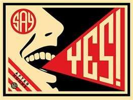
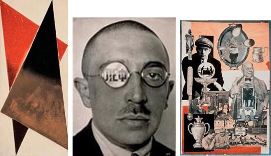
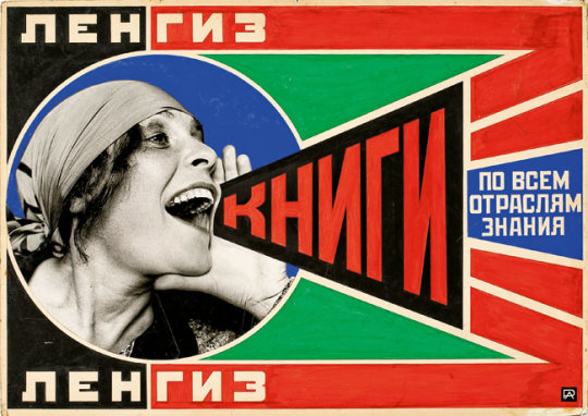
Alexander Rodchenko
Alexander Rodchenko is a Russian painter, photographer and also a graphic designer. HImself and Popova shaped Constructivism, which questioned the fundamental properties of art and asked what its place should be in a new society. The Constructivists challenged the idea of the work of art as a unique commodity, explored more collective ways of working, and looked at how they could contribute to everyday life through design, architecture, industrial production, theatre and film.
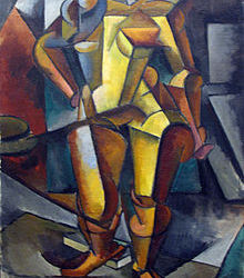
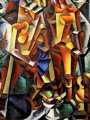
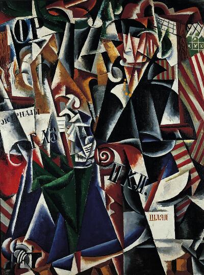
Lyubov popova (Russian , 1889-1924)
The traveler, 1915
Like many young women from prosperous Russian families at the turn of the twentieth century, Popova traveled widely in Europe; unlike her contemporaries, however, she used her travels to develop her talents as a painter, working constantly, studying the Old Masters, and enrolling in the Parisian Académie de la Palette, where her teachers included Jean Metzinger, an early practitioner of Cubism. This abstracted composition suggests the speed and sense of dislocation associated with modern travel and seems to include an oblique self-portrait in the central figure: a woman wearing a yellow necklace and high-collared cape, who reads a magazine or newspaper in her seat on a train, grasping a green umbrella in one gloved hand. Snatches of text (including the Russian words “magazines,” “danger zone,” and “natural gas”) suggest advertisements within the compartment and signposts outside its windows. With her use of found text, fragmented forms, and shapes rhythmically repeated to create a sense of acceleration, Popova here assimilated both French Cubism and Italian Futurism in a uniquely Russian hybrid known as Cubo-Futurism.
looking at the peice of Popova what came to mind was photomontage and Just looking at it i saw different pictures placed in this painting. She was a constructivist, Popova and her four fellow Constructivists declared that easel painting was to be abandoned and all creative work was to be for the people and the making of the new society. Although she was a painter she used her art as a movement for the people in class i was taught that constructivism was a movement for art. It was simply the russian version of modernism. Constructivism was formed in 1914, before the October Revolution in 1917 and the most important figure, which most associate to stand as its founder, was Vladimir Tatlin. Focused on the careful technical analysis of modern materials, and the refusal of the idea that art should be produced for the art’s sake but as a practice for social purposes, Constructivism borrowed the ideas of the above-mentioned Cubism, but also Futurism and its ideas rooted in the celebration of the modern man and the fast and furious machines. It also relied heavily on the criticism and the denial of the spirituality that Suprematism and its leading figure Malevich promoted.
7 notes
·
View notes