#csp godsend
Explore tagged Tumblr posts
Text

my babies,,,,, its over,,,, all over,,,,,
@hakeism thank u for everything <3
146 notes
·
View notes
Text
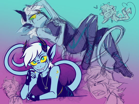
Warm up OC doodles cuz I was sad
342 notes
·
View notes
Text

This Dude Again™ lmaofjslkfj my bad i had such a brainrot these past weeks weh
3 notes
·
View notes
Text
It's not? Bad?

Now I just have to do the actual drawing part lmao
Hahahaha I'm doing a walk cycle now
I have never drawn a walk cycle
#3d models my beloved#the fact that csp has them built in is an actual godsend bc this would have taken a billion times longer without em#i am so.... tired. but also not somehow. what is wrong with me#if i didnt know better I'd worry that i was in a manic episode bc i did so much today#fr though for only having 7 frames its really quite smooth considering my inexperience#and its a 3/4 view too. that was probably the hardest part tbh
9 notes
·
View notes
Text
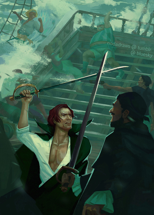
It's been a while, but here's my piece for @opshankszine from last year! You can still grab the zine and other goodies in the aftersales! ♡
couple progress shots under the cut:

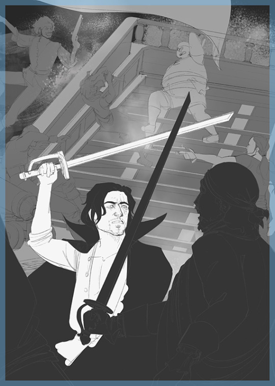
i had a very specific image of the composition and angle in mind and knew i'd be sitting there for hours if i had to the perspective by hand. luckily the 3d setup in csp is truly a godsend for stuff like this + used this ship model from sketchup for placement.
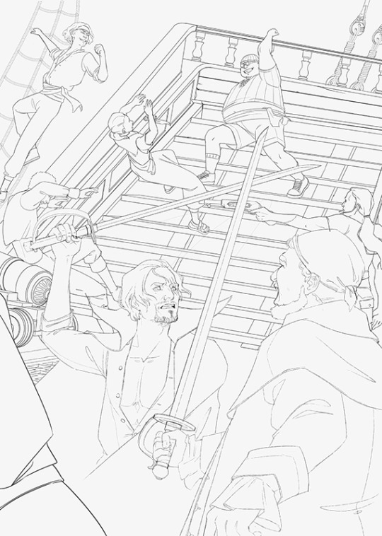
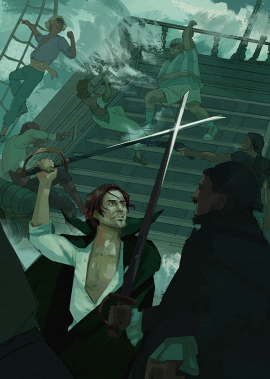
cleaned up the entire piece and only then realized i'd accidentally made every single red haired pirate left-handed -- did some frantic research and luckily only yasopp is definitely right-handed, but i really didn't want to redo large parts of the image to place him elsewhere so i had to compromise and just lose his gun.
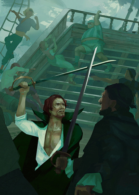
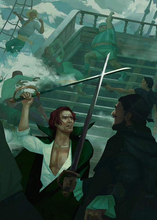

rendering rendering. kept tuning the values and colors until the end and i'm still not happy with them. this is actually what inspired me to do my 10 min film studies earlier this year to focus on more decisive value/color work earlier on into painting!!
#one piece#opshankszine#shanks#benn beckman#yasopp#lucky roux#fanart#artists on tumblr#looking at the 3d base i'm so annoyed that i completely lost the dynamics of shanks' pose#i'm also deeply unhappy with how all the skintones came out ngl#nothing like painting a bigger piece to find out all the areas you need to do more studies in!!
79 notes
·
View notes
Note
i wanted to say thank you for normalizing (for me) tracing refs and models for things, i'm from the deviantart era of "using references is cheating" which set me back YEARS lmao so to see you unabashedly using references so directly makes me feel so much better for when i do! i need to better realize that you still have to be a good artist to make a traced photo look good, and there's SO much you add to a drawing that isn't from the reference, so it's not like i'm lying or secretly a bad artist just cuz i use the csp 1.0 models for poses sometimes....... so thanks for sharing your process!!
of course!!! and 100% agree! that's what i have to remind myself whenever the imposter syndrome sets in: there's so much you gotta add to a thing beyond the traced pose, and the reason i can do it how i do is because i'm at a very comfortable stage of my artistic development. but man i've gotten so much better at freehanding so many poses and limbs and fabric details since i started tracing more frequently, it really does help your muscle memory and help build the skill!!
and. it's just, fun. when you want to turn your brain off, like that richard ii sketch i posted. sometimes i wanna draw just for the fun of it, for the tactile experience of putting down lines and making pretty shapes appear. tracing is a godsend for that. just be transparent about your process ✨
i have all kinds of opinions abt when and where tracing is helpful as u develop as an artist, but at the end of the day everyone's art journey is their own, and they should be allowed to use whatever tools are available to them. remember that artists and animators have been tracing as part of their professional workflow since the photograph has been invented.
#ask a rat#addon: i also used to be insufferable abt this#like NO ! TRACING!! IT'S!!!! ILLEGAL!!!!!!!!#but jfc man who cares#who#cares
84 notes
·
View notes
Note
hey so we've been meaning to ask you, which brushes do you use on CSP? the new years event thing they're holding gives out clippy and iirc you said your main brush costed some and we finally like. Have some to spend lmao
-Siam

hello Siam!! :D oooh yes login bonus time!! i have a singular main brush i use and swear by, which is "softBrush♦B8pencil♦DryInk" [10 Clippy] (Content ID: 1944219) aka "SmoooZZz2" <33 it's soft and wispy and a bit textured and it blends very prettily, i've been using it for a long time! (issues are that it's semi-tranparent, so using it for line art can be a bit of a pain lmao but since most of my art is just colored sketches i can get away with it)
a common thread you'll notice with my brushes is that 1) I LOVE SOFT BRUSHES!! and 2) I LOVE PEN PRESSURE!! so my brushes are soft and/or have a good taper to line widths.
some of my others: - "SOIPEN" [Free] (Content ID: 1778407) used to be my old main go-to, real solid brush, but still soft! good for proper lineart, which i havent done in ages hgjkg - "Yokan brushes (羊羹ブラシ)" [30 Clippy] (Content ID: 1944592) or as i renamed it "softie brush" (it used to just be the japanese characters) is what i use for blush and shading. it's really soft, but still has a harder edge unlike an airbrush, which i like! - "SU Cream Pencil" [Free] (Content ID: 1761353) is a classic, such good textures, really solid brush with a good taper!! :3 - i think Turnip Pen is a CSP default, it came free with your xbox /ref, i basically only use this when i need to color something solidly. (i also have a duplicate one with the no anti-aliasing setting. for homestuck purposes. :3) - Rough 6B Pencil is GONE FOREVER APPARENTLY?? i've looked up the content id and there is nothing hgkjg, so sad </3
other things i recommend: - "[UP] R Colour Gradient Set (Hair/Eyes)" [20 Clippy] (Content ID: 1945188) (and their other ones, if you just go check out the creator HamR, i have White and Pink but the Blonde/Purple/Green sets are new to me, i might get them lmao hgklj) are GODSENDS i LOVE messing with these for gradient maps (let me know if y'all need gradient map advice or anything hjglk), they make colors good :3 - "close and fill tool without gaps" [Free] (Content ID: 1759448) is just like. praise be ice cream fill tool, we all love ice cream fill tool!! please get this if you don't have it already, it's really helpful. you just make a layer beneath your line art, lasso your line art as messily as you want, and it'll fill it in for you, it's WILD man hglk - "BOKE brushes" [Free] (Content ID: 1610288) are really pretty for backgrounds if you fiddle with add (glow) and opacity!! - "A brush set that draws clouds" [Free] (Content ID: 1723992) is really good, i love using this for skies <3 this creator (27pt) has a lot of other good assets too! :D
i think that's about it!! clippy does expire eventually, but not for a while! you'll probably find some cool assets to spend it on before then :D in general i think a lot of the free assets are really good, but extra clippy is always nice to have!! i hope this helps, thank you for asking my beloveds!! :] <333 <222
#[guy who enjoys making lists/explaining things he knows how to do] yay! :]#sorry if y'all knew any of this/have these already hgkjg <33 <22#ive been using this program for [looks at the date. blinks.] ...a decade. so i have no idea what i need to explain and what i don't hjglkj#did you know you can change the icons at the top to whatever silly images you want? and save color palettes up there too?#did you know you can press ctrl and tap on a line to immediately jump to whatever layer that line is on?#did you know you can change the little blocks sliders (paint bucket's ''close gap'' for example) to sliders by right clicking the option?#did y- [CONSUMED BY THE FOG]#anyway sending my lov!! let me know if y'all need anything!! :D i hope y'all find a lot of good brushes and assets <33 <22#ency ref#volta transmissions#esprit: Euclydia
10 notes
·
View notes
Note
I'm very curious at how your art process is like. We've talked about specific stylistic things you do sometimes but I'm still curious what your art workflow is like and what tools/software you use. That "if i fumble shadowheart I'm gonna straight up kill myself" piece because I've been trying to reverse-engineer it in my head for days and I can't seem to figure it out. How do you usually draw, rin senpai?
there was a period of time where I only had access to mspaint, so I got used to drawing a lot with the pencil tool in that. when I later moved to CSP, one of the first things I did was set up a 1-dot pen that felt nice to use
when I'm feeling suitably mentally ill to the point of where I can't finish a polished piece, I just draw with that. I don't use very many of csp's features besides like.... layers, which are a godsend for silly doodles
I find that it helps a lot to draw very crude faces when working with cheap materials, not just because you can't achieve good things (you can!) but because crudeness + cheap materials lets you sell funny facial expressions much better
I highly recommend staring at fujimoto's expressions until you internalise something terrible
56 notes
·
View notes
Text
CSP Clothing Pattern recs!
This week I thought clothing patterns would be useful, because there are a lot of them on the asset store that have made my life easier.
1. Skirt stripes brush

Life saver for drawing tennis skirts I think. Found it recently and have been eager to try it.
2. Embroidery Pens

Good for simple stitching and detailing.
3. Sub tool assortment for plaid
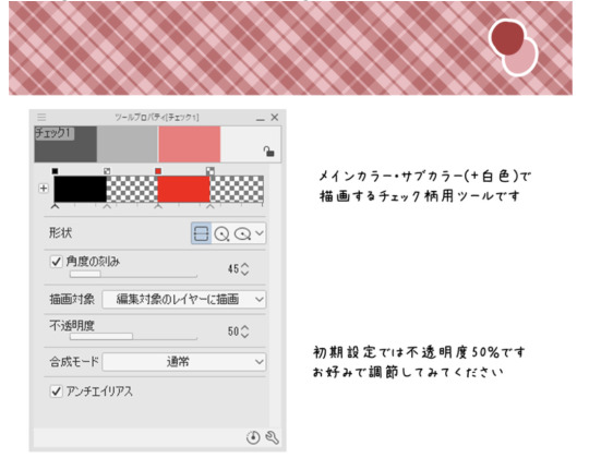
Uses the gradient tool to make plaid patterns. I think it's a neat concept but still have yet to use them.
4. Knit Edge Brush
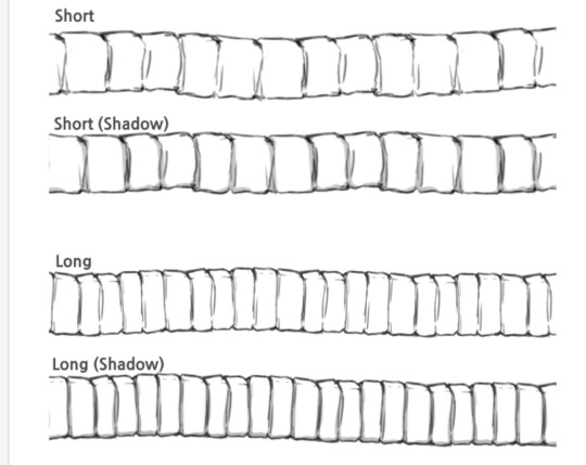
A godsend for sweater collars and sleeves.
5. Pico Lace
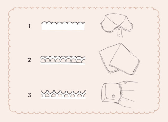
Simple frill for collars and stuff.
#weekly brush post#clip studio paint#csp assets#csp brushes#digital art brushes#clip studio paint brushes#honking
58 notes
·
View notes
Note
Hi! You're one of my favorite artists ever, and I would love to do some studies of your art! What are some of your favorite pieces that you've done, and how do you pick your colors? There's a lot more questions that I could ask, but figured you wouldn't appreciate an entire list of questions XD
Hello and thank you, I am honored! Feel free to send me all and any questions! I'll answer these two, starting by:
How do you pick your colors?
As I change art style with pretty much every illustration project of significance, this varies a lot. Here are, from most to least common, ways I pick my colors.
Eyeballing it. Unfortunately my most common... What I will do a lot digitally is lay down a color background, and flats of a few colors, then manually adjust each until they look good together by selecting by color and using adjustements. I then paint over it all.
Using a limited palette, eyeballed. Same as before, but this time I force myself to only use a few colors. It helps me, as constraints do.
Using a reference, eyeballed. This happens a lot when I mimick an art style. My medieval drawings for example, are often done by looking at images of actual medieval art to get an idea of what colors to use to look medieval.
Using an existing image, pipetted. Rarely, often as a challenge or if I'm super stuck, I'll just take a pic with colors I like and pipet from it. This website automates this if you want a good easy starting point!
These can be combined around. I'll post examples now, explaining how they use each.
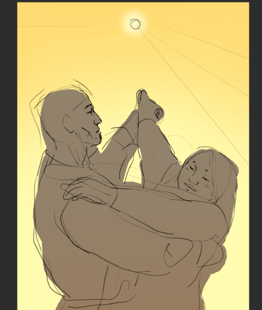
This is a sketch for a drawing I ended up doing way different. This is the first method - I used a flat layer for the characteres and three colors for the sky to test out atmosphere. This is how I plan out most full paintings, just trying to nail down a mood I have in my head. I fiddle around until I like it or, like in this case, fully give up and iterate further. Here, the composition was to be redone too as I did not like the body language. I was going for "bright hot sunny day under a weather that feels wrong".
For this comic, I combined a very limited palette and a photo ref to pipet from. I was looking for the stark cold/warm contrast of a mid-season bright night by a fireside. I took a google image photo of a campfire at night that was already edited. The photo itself looks unnatural but conveyed what I wanted. It's still on the file itself! From it, I pipetted a few colors I found "summed up" the palette and did all with them.

While my own habits make me prefer painting as you would in traditional methods, with directly picking the right colors, I will often digitally alter with overlays and layer blending modes some colors and gradients, etc, to alter a drawing to fix it's color palette. The following is a quite egregious example, because I first drew the character in flats before putting him in a full scene. Here is a before/after summed up.

The shadow is a layer, the bright yellow light zones also, and the orange "transitions" of light zones on the skin a third. There's also an overlay over the full character to blend him in. I do this by...making a full flat color of a layer, fucking around until a blending mode does what I want, and adjusting hue/brightness/saturation and opacity until it looks good.
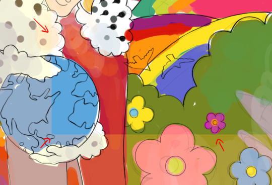
Another WIP where I was struggling with the overall palette. I was going for late 60s psychedelic. You can see in the top right the original color. I thought it looked too...new, so I added a yellow layer on top, and fiddled with it. Final choice was the following setting. I then put it with my sketch and color blockout in a folder and painted over it.
For this sort of adjustement, the "Color Balance" modifier in CSP, Photoshop, and others is also a godsend - but one I often use for fine tuning a finished piece.


This being said, there's some rough rules to coloring which are...born from studying color theory and doing studies. I am guilty of doing very little studies...so I'll just sum up the basics of the color theory rules I use.
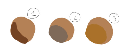
For "default" shading, I use a color that is darker, more saturated and with a slight hue diff. This is my "don't shade with black".
Using a shadow that's cooler will make the light look warm.
Vice versa.
There's a bunch of stuff to remember in how colors relate to each other and pipetting images who's atmosphere you think is interesting really is the best way to learn... It's learning how to black-blue/gold-yellow dress in your own art for the lack of a better word...But the basics will be:

Don't trust numerical values, but look at your colors in context. A same hue, brightness, saturation can look so much different. This is how Rakkan's beard looks whiteish here despite being a light very grey brown.

All this but...colour is such a wide topic, I can't really say a lot but can also type for hours... if you have precise questions about a piece in particular I can explain :') I hope this wasn't too vague and was instructive!
Speaking of particular pieces, answering your question last under the cut:
What are some of your favorite pieces that you've done?
In no particular order, illustration only.
Including this in another poast bc staff's new post editor limits the amounts of pics I can put in response to asks. Insert colorful language here...
Frankly twas hard to pick I am rarely fond of what I draw
41 notes
·
View notes
Text
the 3d model poser feature in csp is actually a godsend fr
#buying the software was worth it if only for that#will try coloring later but i might just go back to photoshop depending on how uncomfortable it feels lmao#it's where i have all my brushes and stuff. i have a whole system already.
4 notes
·
View notes
Note
Just wanna say, Rosie/Marie/Claire might be in their twenties but man they sure do act like teenagers half the time and are portrayed childishly. idk, might just be me, but I saw in some comments in the latest pages that some readers have literally 0 idea how old Rosie is, lol.
Also, I feel like Yamino's art quality has slipped a bit since she started using the CSP 3D models for pose blocking. I use these models frequently myself, and I've noticed an inherent stiffness to the character art made from them that feels uncanny to the eye (mine, at least).
Nothing against using the models! They're a godsend, really. They let you crank out character art at a consistent pace and they're so, so useful for posing and perspective - but when you put them next to art that was made without them... it's very noticeable if you don't put effort into making them blend into the scene.
I don't want Yamino to hurt herself, nor do I want her to take more breaks, even though this really adds to the rushed ending of the story. I guess I just miss the days of the comic where the pages were like setpieces, with bold and bright, bubblegum colors and lighting and posing, and even little spaces had details or fun Easter eggs to point at.
It's what inspired me to follow her work in the first place, what made me enjoy the early pages before and after the rewrite. She has such versatility! I've sincerely learned a lot from her work.
I understand what it's like when your passion for a project dies, despite you still loving it so much. I hope that whatever story she's drawing next has that same early SC passion in its artwork till the end.
When I first started reading I thought Claire was in her mid-teens which made me feel weird about the whole pregnancy thing, lol. Nobody has ever stated ages within the comic, which helps give the writers wiggle room in the timeline, but also opens the door for some... worrisome interpretations.
I appreciate all of these points about the art. I have nothing intelligent to say other than these last couple of pages have been rough, not just with the posing but the lighting and color choice as well.
—Mod Marie 🌸
3 notes
·
View notes
Text
im actually so glad I upgraded to csp 2.0 the align feature is a godsend
5 notes
·
View notes
Note
THE HANDS R SO COOL PLSS . STOP FLEXING (i jest. keep doing so ur a legend meow)
TYYYY ぱみお's finger brushs is a GODSEND for drawing hands in csp
3 notes
·
View notes
Text
CSPs head model thing is such a godsend T o T Instead of using my silly head and face as a reference, I can just use this little 3d model guy and its so nice. Now I don't have to take the worlds most awkward reference photos anymore LOL
1 note
·
View note