#could be more opaque but it looks p nice on dark grey
Explore tagged Tumblr posts
Text


Testing white ink on fabric.
#could be more opaque but it looks p nice on dark grey#linocut#block printing#fabric printing#Joanna Krótka#prints#my art
78 notes
·
View notes
Photo


YEAH BABY NOW THIS IS MORE LIKE IT
Class-5 Berserker Frame
Lore and Process below cut
Lore:
A highly specialized and expensive class of combat armor intended for delicate or complex strike applications where other options like missiles, drones, tanks or traditional infantry might be too clumsy or slow, or when collateral casualties are of high concern. Common applications are storming buildings and bunkers, or long-duration scouting missions. The Class-5 was designed with fully-robotic hands and feet, such that the operator’s own hands and feet don’t reach all the way to the ends of the limbs. This allows the suit’s hands to be a lot stronger and tougher, as well as able to be swapped out with other mission-specific attachments. The feet were driving cleats, able to extend outwards in a violent and sudden springing action, to aid jumping and running at speed. The Class-5 was precise and specific enough that they needed to be custom fit to the wearer, and they required advanced manufacturing techniques to maximize performance of the various components, so they cost a lot.
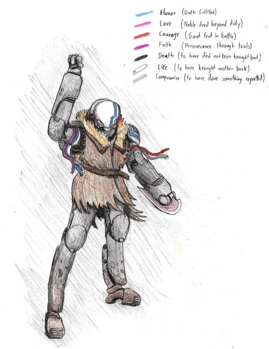
Stolen Class-5 units were favorites of the Time Knights. Since specific suits would only accommodate a very specific set of body measurements, it was frequent that each warrior could only find a single suit to match them, (or only a single warrior could be found to match a suit.) As such, the Knights often took strong ownership of their suits, and decorated and repainted them as they saw fit. A tradition arose of painting stripes/tying ribbons to the suits to symbolize the warrior’s past feats. The specific character drawn big in the third picture is supposed to be the girl from the Forest of Daggers, so she’s decorated to reflect the accomplishments in that story: a red and grey ribbon together means some dark and horid victory in battle, something that she felt guilty about. The purple, blue, and white ribbons together means she swore to bring somebody back from death, and succeeded after persevering through many trials. All time Knight suits (and ships) have two blue stripes permanently painted onto them somewhere, to represent the two oaths that they must necessarily have fulfilled: The oath to maintain the absolute secrecy of the cause, and the oath to stand by one another, and persevere until the war’s completion. Since they are eventually destined to win, it is a historical absolute that none of them had ever broken either of these oaths.
Process:
Picture 1: Idea for the basic silhouette of the design I was wanting to go for. Not thinking about mechanics at this step, just wanting to visualize and exaggerate a cool shape. I was really inspired that day by Evangelion, if you couldn’t tell by the words, which is why it looks all lean and gaunt. The extended limbs were put in to emphasize that look, and I liked how the the proportions came out. I also really liked the long helmet that blends into the back, since it calls to mind pillbugs and xenomorphs. I’m def keeping the long head. The visor is supposed to be either some kind of reinforced 1-way glass. Transparent from the inside, pale and opaque from without.
Second picture was drawn to clarify the mechanics and various internal/external details. Happy with how this came out, with the possible exception of the exposed flexribbing on the hips. The suit’s limbs will be actuated with electronic muscle cables directly beneath the outer layer, so I needed to make room (especially around the hips) for those too. It was apparent at this point in the design process that the suit makes the wearer’s butt look absolutely enormous, which is acceptable on grounds of hilarity.
Third picture is yeah boy. I should note that NONE OF THIS IS FINAL. I’m still experimenting with a lot of these designs, and this is still pretty early in the character-design process, no matter how much I like this one.
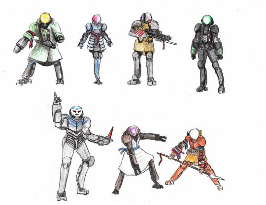
Fourth picture is a couple cool poses. The upper-middle pose shows how the driving cleats work. A jetpack modele could be attached to these suits, but I didn’t draw any of these with it. Left image showcases both the gravitic battery power source (birthday cake-sized cylinder on the upper back) and the big butt, still allowed on grounds of hilarity.
Fifth picture are a whole bunch of different character designs, as a proof-of-concept to show how swapping out weapons, paints, and clothes can result in an extremely wide variety of characters. Green one is a noir detective with a big iron on his hip, Blue one is waifu, Yellow one will kick your ass, Black one has cool braids and a nice color scheme, Grey one has a knife and a legacy to live up to, Brown one specializes in C L A M P, Orange one is hardcore.
Inspirations:
1. Bubblegum Crisis Hardsuits (I had various inspirations before, but seeing this anime really solidified what I want and what I didn’t want from this design, and gave me the idea to customize weapons and colors based on the wearers’ personalities.)

2. Evangelion Evas (There is very little cooler than the stance and the attitude these things radiate. Look at this duuuuuuuude. Inspired basic shape, as well as the idea of having an onboard AI helping with movement and coordination.)

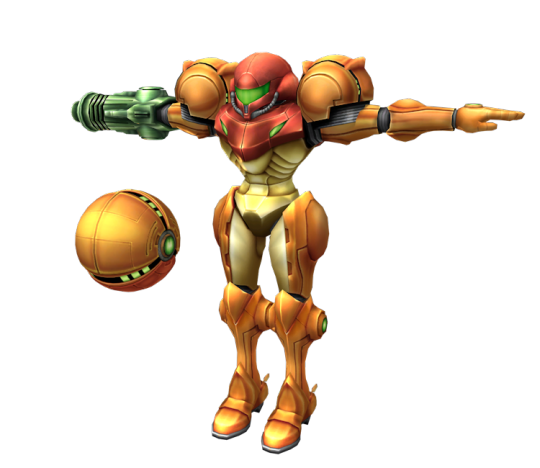
3. M E T R O I D (I don’t think ANY power armor I EVER draw will be fully free from Metroid inspiration. I’ve been in love with this design ever since the tender age of 11 1/2 when I scrolled through Smash Melee’s roster of pokemon and marios and found a COOL ROBOT GUY. Mwah. Iconic. Lovely.)

35 notes
·
View notes