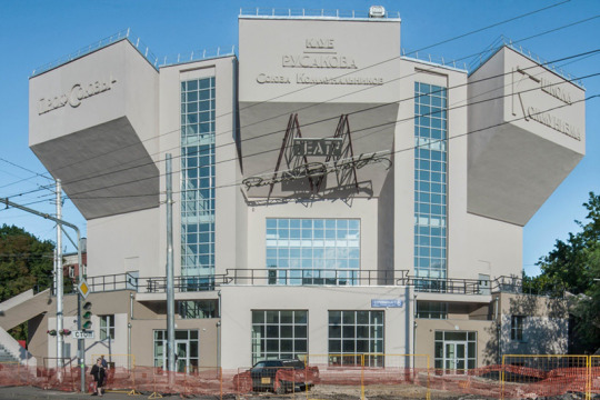
#constructivist architecture
Text

Pomnik Bartolomeo Colleoniego
Szczecin, Poland
#Poland#35mm#film photography#analogue#original photography#travel diary#photographers on tumblr#travel photography#eastern europe#statue#soviet architecture#soviet union#post soviet#khrushchyovka#Constructivist architecture#brutalism#neoclassical#neoclassicism
16 notes
·
View notes
Text

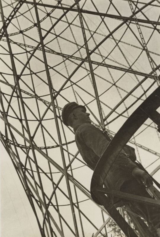
Andor Weininger, Constructive Sculpture "the 11 high," 1970-1971
#art#design#architecture#sculpture#model#Andor Weininger#Constructivists Sculpture#constructivism#"the 11 high#tower#construction#wood
206 notes
·
View notes
Text

Dominion architecture inspiration moodboard
#dominion worldbuilding#was inspired by a lot of the Empire architecture in Andor but also by the Brutalist and Constructivist movements#with a lil bit of cyberpunk because the Dominion can be a lil cyberpunk as a treat
5 notes
·
View notes
Photo

Just in is this constructivist-influenced work by the German-American artist Paul Kelpe, c. 1935. Born in Germany, he was keenly aware of the work of Kurt Schwitters, Kandinsky and the Russian constructivists. He immigrated first to Chicago and then settled in New York where his work in abstraction was welcomed. His work has an architectural element, with the forms simultaneously stacked and floating, along with the feel of engineering. His work can be found in the collections of the Art Institute of Chicago, Baltimore Museum, the Whitney and MOMA, among others. #paulkelpe #modernart #interiordesign, #artadvisory #artonpaper #kurtschwitters #architectural #constructivist #constructivism #abstractart #geometricart https://www.instagram.com/p/ClDP9edgcqc/?igshid=NGJjMDIxMWI=
#paulkelpe#modernart#interiordesign#artadvisory#artonpaper#kurtschwitters#architectural#constructivist#constructivism#abstractart#geometricart
5 notes
·
View notes
Text
Adolescence of Utena -- Architecture x Character Designs
Dunno if I read it from somewhere, but I realized that Utena's new uniform is styled somewhat like the architecture of Adolescence Ohtori, namely how her clothes are black and white (later with red accents) . Whereas Utena stands out in the world of RGU, she blends right into Adolescence Ohtori, almost as if she is a part of the architecture and vice versa.
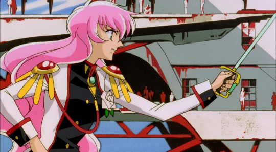
The movie is also called The *Adolescence* of Utena (or Girl's Revolution Utena: Adolescence Apocalypse), and in the show, we see adolescent Utena wear black and white at the funeral. I think that her wearing this scheme again in the movie is a sort of return to her adolescence. Not to say that she regressed back into the child she was before the show, but more so to represent the child that Utena still is even after maturing. An adolescent is defined as someone roughly between 10-19; Utena is still a teen who's growing in this age range.
That said, Adolescence Ohtori seems to be an architectural representation of Utena's inner child/self. Like a mindscape of sorts. At the end of the movie, both she and Anthy would leave the mindscape of their adolescence and enter into the unknown "outside world" of adulthood.


Red is associated with the Rose Bride, ie Anthy. Before meeting Anthy for the first time in the show, Utena's clothing was absent of red (her child funeral dress); however Utena's RGU uniform afterwards would have red accents.

Similarly, Utena's Adolescence "boy" clothing doesn't have red, but her "prince garb" after meeting Anthy does.
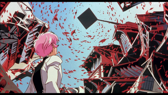
Speaking of, if we continue seeing Ohtori as Utena's mindscape, the deep red of the Adolescence rose garden is like the part of Utena's mind that Anthy occupies. The tower where the girls draw is also Anthy's domain, as it's draped in red.

Even other black-white architecture of Ohtori is accented with red--Anthy has always been present in Utena's thoughts, even if subconsciously.

Alternatively, red in Ohtori could represent Anthy's mindscape "overlapping" with Utena's. Anthy is still wrestling with leaving Akio after all, and after the events of RGU, it would make sense that she and Utena share "spaces"/experiences/solidarity.
Anthy's Rose Bride dress also more closely resembles Utena/Ohtori's aesthetic (white, red with black accents), and we only see her transform into that when she is with Utena. It seems to signify that Anthy has become more familiar/recognizable to Utena, as her Rose Bride dress visually brings her closer to Utena, more so than her generic mint-green uniform.
When Utena first meets Anthy in Adolescence, a light flurry of rose petals fall from the garden above, crossing from Anthy's domain into Utena's-- they are beginning to cross each other's paths again. During the dance in the garden, a much heavier shower of roses blanket the school architecture below, as if Utena and Anthy's connection has now become much stronger. From then on, Utena would try to create a genuine bond with Anthy (as we see during the drawing session)
Alternatively, it could also signify a progression towards Anthy taking the spotlight when she and Utena decide to leave the school for good:

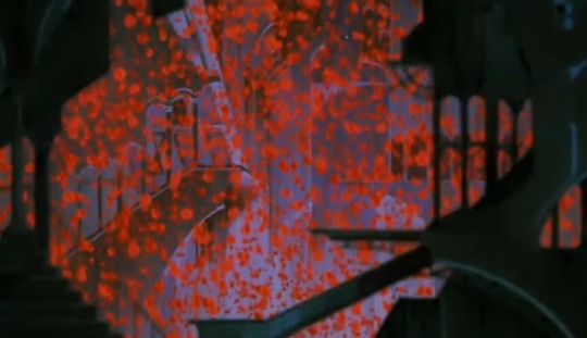
Near the end of Adolescence, we are back in Anthy's rose garden, we see the chairman's tower (associated with Anthy and Akio), and everything is washed in purples and reds-- Anthy's colors. Utena's black/white structures are now absent. From here on out, Anthy is going to drive (heh) the story forward.
I wanna talk about the architectural styles of Ohtori, but that'll be its own post once I do a bit more research. I wanna expand on some differences such as:
Adolescence- constructivist, Russian Revolution, industrial, "masculine"


Show- neoclassical/rococo? French Revolution, floral/decorative, "feminine" -- perhaps Anthy's mindscape in a way.


Anyway this was supposed to be a bullet point list of miscellaneous stray thoughts, but I guess that's impossible, so I'll just eventually write more individual utena thoughts posts lol
Please feel free to tell me what you think btw!
There's also another post by @nothing-suspicious-in-there about Utena's uniform that's a completely different take, please check it out!
#utena thoughts#uniform#architecture#ohtori#rgu#shojo kakumei utena#sku#adolescence of utena#anthy himemiya#utena tenjou#akio ohtori#analysis#design#character#rgu analysis#revolutionary girl utena
654 notes
·
View notes
Text

I booked a ticket to see the Narkomfin building!!!
Built in 1928-1930, it's one of the symbols of Soviet constructivist architecture. Architects who designed it (Moisei Ginzburg and Ignaty Milinis) called it a "housing machine": along with living quarters it had a communal building with a canteen, laundry, a nursery, a library and a gym.
The building was restored in 2020 by Alexei Ginzburg (grandson of the architect) and it's supposed to have been done in a way that preserved the original design. I can't wait to see it!
Thanks again to everyone for the donations!
79 notes
·
View notes
Text


Venice in the art of Alexandra Exter (1882-1949)
Carnival in Venice (oil on canvas) 1930s
Carnival Procession (oil on canvas)
Masked Figures by the Banks of a Venetian Canal (oil on canvas)
Venetian Masks (oil on panel)
Pulcinella (gouache on paper) late 1920s-30s
Venice (oil and sand on canvas) 1925
Venice, 1915
"Aleksandra Aleksandrovna Ekster, also known as Alexandra Exter, was a Russian and French painter and designer. As a young woman, her studio in Kiev attracted all the city's creative luminaries, and she became a figure of the Paris salons, mixing with Picasso, Braque and others. She is identified with the Russian/Ukrainian avant-garde, as a Cubo-futurist, Constructivist, and influencer of the Art Deco movement. She was the teacher of several School of Paris artists such as Abraham Mintchine, Isaac Frenkel Frenel and the film directors Grigori Kozintsev, Sergei Yutkevich among others." [x]
"Exter painted views of Florence, Genoa and Rome, but ‘most insistent and frequent were images of Venice. The city emerged in various forms: via the outlines of its buildings, in the ‘witchcraft of water’. In glimmering echoes of Renaissance painting, in costumes and masks and its carnivals’.
"Exter’s characteristic use of the bridge as a stage platform, seen most clearly in Carnival in Venice, is a legacy of her time as Tairov’s chief designer [Alexander Tairrov, director of Moscow's Kamerny Theatre]; the director believed in breaking up the flatness of the stage floor which the artist achieved for him by introducing arches, steps and mirrors. Even in her easel work, the emphasis is at all times on theatricality. Bridges are used as proscenium arches, the architecture creates a stage-like space in which to arrange her cast."
"For all her modernity, references to Venetian art of the past abound in these paintings. The masked figures are influenced by the Venetian artist Pietro Longhi, to whom Exter dedicated a series of works around this time. The incredible blues used in both Carnival Procession and Masked Figures by the Banks of a Venetian Canal are a direct reference to Titian, who was famed for his use of ultramarine, the pigment most associated with Venice’s history as the principal trading port with the East." [x]
"Exter had long since abandoned the Cubist syntax by 1925 but her sense of colour remained together with a strong conviction, shared with Léger, that a work of art should elicit a feeling of mathematical order. In its graceful interaction of fragmented planes and oscillation between emerging and receding elements, Venice (1925) echoes the more precise qualities that also appear in Léger's work at this time, both artists occupied with the continuous modulation of surfaces and the 'melody of construction' that Le Corbusier was still advocating in the 1930s. But while Exter subscribed to Léger's theory that 'a painting in its beauty must be equal to a beautiful industrial production', she never fully embraced the aesthetics of the machine and rejecting the common opposition between ancient and modern, her work often retains a classical edge - for example in these trefoil windows, arches and vaults. Human figures, which had been nearly absent from her Cubo-futurist paintings, also return in other works from this period."
"She was undoubtedly aware of the concept of 'defamiliarisation', a term first coined by the influential literary critic Viktor Shklovsky in 1917:
'The purpose of art is to impart the sensation of things as they are perceived and not as they are known. The technique of art is to make objects 'unfamiliar,' to make forms difficult to increase the difficulty and length of perception because the process of perception is an aesthetic end in itself and must be prolonged.'
An instance of this device is discernable in the present tight formation of the oars, seen from above. Like Braque and Picasso, Exter incorporates sand into certain areas of pigment to enhance the differentiation of surfaces, a technique also used to 'increase the length of perception'. The occasional lack of overlap between the boundaries of the textured surfaces and colour planes strengthens the paradoxical combination of tangible presence and elusive abstraction that makes Venice such a powerful work."
"Venetian subjects occur in Exter's work as early as 1915. A gigantic panneau of the city was one of the final works she produced in the Soviet Union and exhibited in the 1924 Venice Biennale." [x]
"The specific theme of the Commedia dell’Arte first appeared in Exter’s work in 1926 when the Danish film director Urban Gad approached her to design the sets and marionettes for a film which was to tell the story of Pulcinella and Colombina, transposing them from the Venice of Carlo Goldoni to contemporary New York.
Pulcinella most likely relates to the artist’s subsequent experimentations on the theme of the Commedia dell’Arte. Pulcinella, who came to be known as Punch in England, is one of the classical characters of the Neapolitan puppetry. Typically depicted wearing a pointed hat and a mask, Pulcinella is an opportunist who always sides with the winner in any situation and fears no consequences." [x]
8 notes
·
View notes
Text
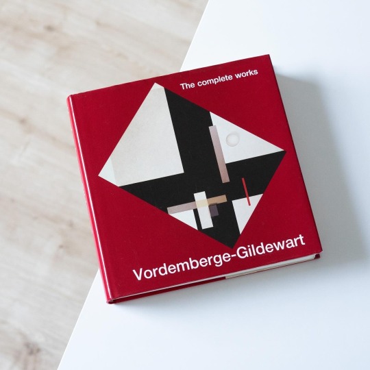
A key protagonist of constructivist art in Germany was Friedrich Vordemberge-Gildewart (1899-1962), a multitalented painter, sculptor and graphic artist and, interestingly, one of the few German members of the Dutch De Stijl group. Vordemberge, born in the town of Osnabrück in Lower-Saxony, in 1919 moved to Hannover, then and later the unofficial capital of abstract art in Germany, to study architecture, a study he was never to complete. He quickly got in contact with the likes of Hans Arp and Kurt Schwitters and in 1927 was one of the founding members of „die abstrakten hannover“, a circle of artists including Schwitters, Carl Buchheister and Rudolf Jahns. In the years following Vordemberge developed a very consequential abstract idiom revolving around basic geometric forms, a formal vocabulary he also occasionally translated into reliefs, typography and stage designs. Being avant-garde Vordemberge after 1933 fell through with the NS regime and was marked „degenerate artist“, a stigma that led to his emigration to Amsterdam in 1938. Nonetheless VG continued to be present in both solo and group exhibitions internationally. After the war Vordemberge and his wife received the Dutch citizenship and in 1952 he started teaching at HfG Ulm as head of the visual communication department.
A wonderful way to follow the artistic development and career of the artist is the old but gold volume “Vordemberge-Gildewart – The Complete Works”, edited by Dietrich Helms and published by Prestel in 1990: not only does it included all of the artist’s known works including photoworks and lithographs but it also ventures out into his architectural and commercial works that are addressed in two of the eight essays included in the catalogue. A complete exhibition roster and a thorough bibliography round out this still singular publication on what is one of German constructivism’s most significant artists.
#friedrich vordemberger-gildewart#catalogue raisonne#monograph#art book#vintage book#constructivism#modern art#de stijl#book
20 notes
·
View notes
Text
Ok, so I'm trying to picture the different architectural styles in every canonic Cybertronian city, and I think that Tarn would be predominantly brutalist(which is my favorite). But Structuralism and Metabolism also don't look bad... aaah
Now I'm trying to picture how Kaon would look like, maybe something like ancient Rome or Naples, but gloomy and more hostile and rusty. For some reason, I also imagine it covered in punk-looking or constructivist murals (idk if I'm making sense).
Vos: maybe eco-brutalist/solar-punk but with floating buildings. Mh - maybe Deconstructivism? Expressionism??? Idk I gotta choose at some point.
Iacon: art deco? Neoclassical but futuristic, something that screams, "We're rich and you're not," but also sophisticated
The other cities are still too vague in my mind for me to decide, but if someone wants to jump on this weird rumble-y architectural headcanon train of thoughts, be my guest!!!
#the fun thing is that there are a fuckton of cities and an entire planet to imagine#i love worldbuilding#please worldbuild with me!!!!!#also I love imagining how art and culture would change from city-tate to city-state#Kaon is punk and you can't change my mind#vos is like Cybertronian silicon valley to me#now the cityformers are even better to image but that's a rambling for another time#steel rambles#world building#architectureal headcanons#transformers#maccadam#possible things that are gonna be inportant in one of my fanfictions???#if I could I would write fictional encyclopedias instead of narrative... but the brain worms
18 notes
·
View notes
Text
An ‘Ism’ Overview - Constructivism vs. Op Art
In the world of art, two movements have emerged that have pushed the boundaries of perception and challenged traditional modes of representation: constructivism and op art. While these movements differ in their origins and approaches, they share a commitment to exploring the relationship between art and the viewer.
Constructivism, which emerged in the early 20th century in Russia, was a response to the social and political upheavals of the time. Constructivists believed that art should serve a social purpose, and they sought to create works that were functional and accessible to all. As such, constructivist artists often worked in mediums such as architecture, graphic design, and industrial design.
In contrast, op art, which emerged in the 1960s, was less concerned with social issues and more focused on exploring the perceptual effects of colour and form. Op art works often feature geometric shapes, bright colours, and optical illusions that challenge the viewer's perception of space and depth.
While the goals of these movements may differ, they share a common interest in the viewer's experience of the artwork. Constructivist artists sought to create works that were accessible to all, while op art artists aimed to create works that engaged the viewer's perceptual faculties.
One key difference between these movements is their approach to form. Constructivist artists favoured clean lines, geometric shapes, and a reduction of form to its most essential elements. Op art artists, on the other hand, often employed complex patterns, vibrant colours, and dynamic compositions that create a sense of movement and energy.
Another difference lies in the artists' approach to colour. Constructivist artists often employed a limited colour palette, favouring blacks, whites, and greys, with occasional splashes of bold primary colours. Op art artists, in contrast, embraced bright, intense colours and frequently employed colour contrasts to create optical illusions and vibrancy.
Despite these differences, both constructivism and op art share a commitment to exploring the relationship between art and the viewer. Both movements sought to create works that engage the viewer's perceptual faculties and encourage active participation and interpretation.
In the end, the comparison and contrast between constructivism and op art reveal the dynamic and ever-evolving nature of art movements. While these movements may differ in their goals and approaches, they are united in their commitment to pushing the boundaries of perception and challenging traditional modes of representation. Whether through geometric abstraction or optical illusion, these movements remind us that art is not just a passive object of contemplation, but an active force that shapes our experience of the world around us.
3 notes
·
View notes
Text

my tribute to: van doesburg constructivist font (#01)
info: Theo van Doesburg (1883–1931) was a Dutch artist, who practiced painting, writing, poetry and architecture. He is best known as the founder and leader of De Stijl.
3 notes
·
View notes
Text

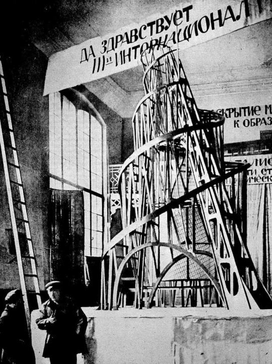

The brief period of constructivist architecture in the USSR before Stalin’s aesthetic conservatism gave it the boot ruled. Such great examples of hope communicated through space, a socialist utopianism which sought to liberate beyond the economic. The world had been irrevocably changed, why should the buildings not as well? The cubist shattering of lines and exposed joints speak to a remaking of the world after a liberatory apocalypse. If the everyday man is liberated, the everyday should feel as such. Novel spaces for novel sociality yet unrealized. Every day would be avant-garde. What if your bus stop felt liberating?
35 notes
·
View notes
Text


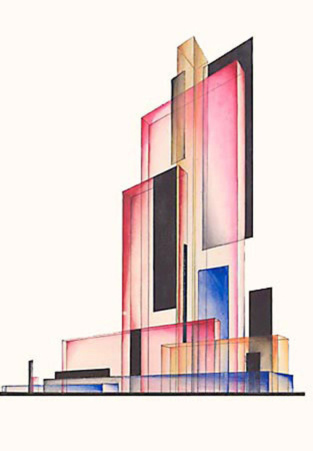
City of Tomorrow
Some Tumlbr banners made from Constructivist architecture concepts. Please enjoy.
#red futurism#aesthetic#proletkult#soviet union#constructivism#ussr#ussr art#marxism#marxism leninism#communism#cityscape#architecture#not my art
44 notes
·
View notes
Text
brutalist architecture and constructivist architecture should kiss
(with tongue)
10 notes
·
View notes
Text


in one of the classes this week Nelly talked about globality and locality, and how "local" can be untraceable. this made me think about the trend, that is non-surprisingly called, glocality that is often re-iterated by people in"creative industries", or rather, those who are forcing economy to have "creative industries". and, mostly, this reflection/note is based on my observation of what is happening in russia
glocality means opening up local for the global. it means searching something in the local, that might be sold to the "globe". perfect example of it can be found in Urals: they sell industriality and constructivist architecture, instead, let's say local traditional ceramics. it happens for a reason: no one cares about ceramics with ural patter of a small village.
so, when "creative industry" wants to be glocal and embrace "locality" it always ends up in thinking the globe. it is not embracing everything local, but only that local, which is intresting for those outside the local.
and here i am thinking about another problem: that of russian local brands being the same across country. i have been once in this Bolshoy store in ekaterinburg that most of the "best" russian brands (the best is here meaning often mentiond by telegram channels) and what me and melanika understood: everything looks the same. to be more concrete, most of the brand produce basic clothes. i wonder: why do they do it and aare not they bored with themselves? i suspect that this trend of glocality, makes them think that if they produce a basic t-shirt and sell it for $$ it is cool enough already, because the brand itself is "local"
2 notes
·
View notes
Note
What do you think about brutalist and constructivist architecture, or violets
i.. feel to sick to register that question
5 notes
·
View notes
Last Seen Blogs

dodadamdang18
Bucc

oel-ngati-kame
oelngatikame

katzen-blog
Katzen-Blog

jionxiu
Kyungsoo

bloggingday
Daily Blog