#compared bono to the moon and now I have like a million ideas about what I could draw next
Explore tagged Tumblr posts
Text

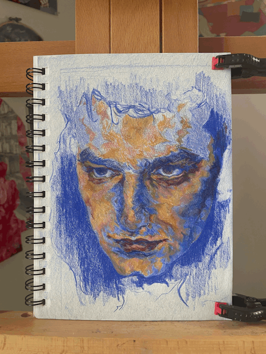
Portrait of Bono - colored pencil on 8.5 in. x 5.5 in. paper
I dedicate this post to my ultramarine blue colored pencil. Rest In Peace, you were this drawing's strongest soldier.
The Short Version
I expect this post to be lengthy, but to summarize:
There is music to be found in a face. I enjoy the way Bono's face harmonizes with itself, and I do not necessarily mean it in the sense of uniformity or the blend between a perfect interval. When I think of the harmonies in his face, I think of tension and contradiction, and an ambiguity that is pleasant to sit in and marvel at. It is kind of like hearing a full, tall chord that makes something in you buzz when struck, or seeing a mountain range jut into the sky, making the air ring from its boldness (I totally equate Bono's nose to a mountain, and those close to me know I love mountains). Sitting in this ambiguity, I felt like his features connected with one another in unexpected and exciting ways. To make another comparison, I feel the same way when I watch the moon rise at its fullest and map out a face in its craters.
Now, if you so desire to know the nitty-gritty of my experience with this drawing, read on.
The Long Version
If you were to look up the dictionary definition of trusting the process, me working on this portrait would be exhibit A. Deciding to proceed with a portrait done in full color really set the tone. The last piece I have done fully in color dates back to August 2022. So, the evolution of this drawing began with me staring skeptically at my colored pencils and oil pastels for a good half hour, until I felt brave enough to even breathe on them.
Right off the bat, I knew I wanted to generally structure the process around chiaroscuro, an effect and/or technique that focuses on strong contrast between light and dark values. In drawing and painting, the chiaroscuro technique involves beginning on a mid-tone surface. Darker (usually thinner) layers of the subject are added first, then the subject is built upon with increasingly lighter (usually thicker) layers. I felt like this focus on strong contrast would, in addition to shadows and highlights, also bring out the contrasting features in Bono's face, such as the harshness of his eyebrows versus the roundness/softness of his eyes. Whether the final product truly looks like a chiaroscuro piece is debatable, though I think following the technique's general guidelines helped me achieve the depth I was going for.
I did not have any mid-tone paper on me, so the first 40 minutes or so were spent covering the paper in a thin layer of colored pencil:

When working in color, I like to utilize complimentary color schemes. I am especially crazy about color schemes centered around blue and orange, and wanted to lean into that here. My rule of thumb was for the darker, shadowy layers, I would use blue tones, and for lighter layers, I would use orange tones. The blue layers were a place for me to loosely shape points of shadow and recession in Bono's face, and simply get the lines that make up his features down on paper. To be frank, it was at this point I began to wonder if committing to the bit and drawing Bono was a mistake.


Engaging with the portrait at this stage was akin to repeating the same word so many times it fails to sound like itself. I was so intensely fixated on the tiny aspects of him that get lost in a glance--is the contour of his bottom lip aligned with his chin? Did I get the asymmetry between his eyelids right? Should I draw his freckles now or later? It was jarring to step back and consider each of these details in tandem with one another. I asked myself, are these features even working in tandem with one another, is this even Bono? Bomaybe? In retrospect, I think what alarmed me was seeing this layer exist on its own. To bring the harmony analogy back, I had struck only a single note with this layer instead of multiple. It simply lacked the context for depth and movement that other layers would hopefully provide.
As for the lighter layers, I had mixed feelings about how to proceed medium-wise. Colored pencil is not a medium I frequently use, so I doubted my ability to get the thickness I wanted these layers to have with colored pencil alone. Initially, I considered using oil pastels for the lighter layers, but ultimately decided in this case, the textural disconnect between colored pencil and oil pastel might create some unwanted separation between the shadows and highlights. I ended up sticking with colored pencils, and I think this helped elevate the interplay between angular areas and softer areas of Bono's face.


Watching the layers slowly converge was quite satisfying. And, I finally got to draw his freckles!
Here is a close-up of the finished piece.

And the reference, shot by Anton Corbijn:

That's all for now. If anyone stuck around to the end of this post, thank you for taking the time to read it! I had a great time with this portrait, so definitely expect more U2 art.
#u2#u2 band#bono#the edge#adam clayton#larry mullen jr#art#compared bono to the moon and now I have like a million ideas about what I could draw next#thinking about that lyric from the fly that's like they say the sun is sometimes eclipsed by the moon
18 notes
·
View notes