#coloured chrome
Explore tagged Tumblr posts
Visit Tumblr Blog
Explore Tumblr blogs with no restrictions, modern design and the best experience.
Last Seen Tumblr Blogs


Fun Fact
Tumblr has been providing a Korean-language service since 2013.
Text


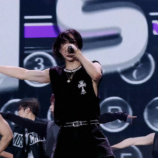
𝘧𝘢𝘷𝘦 𝘫𝘬 𝘭𝘰𝘰𝘬𝘴: (130/?)
#btsedit#btsgif#jungkookedit#dailybts#usersky#userpat#userines#userdimple#tuserochi#usersevn#raplineuser#uservans#annietrack#bladesrunner#rjshope#usermaggie#usermizuoka#*mine#*jkseries#jungkook#*scheduled#i actually love how this set turned out#we appreciate videos with consistent colour grading we really do#his sparkly blue/purple duo chrome mic 😍#also hi the blond hair being sideswept like that? when paired with the white suit? *swoons*
303 notes
·
View notes
Text
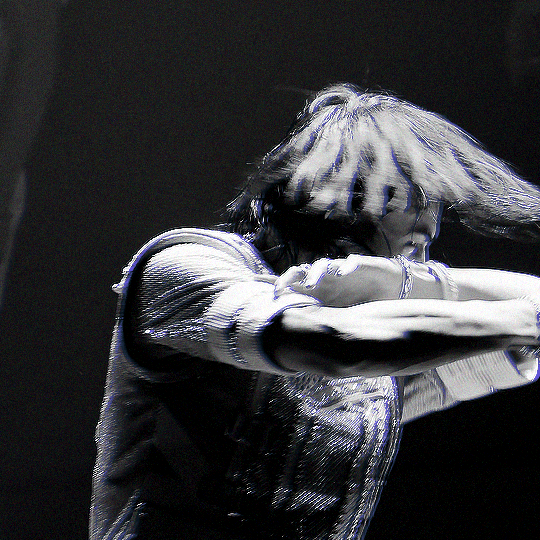
5 STAR DOME TOUR 2023 [UNVEIL 13] | HYUNJIN ☆
#flashing tw#createskz#bystay#boyidoledit#dancerachasource#stray kids#hyunjin#skz#hwang hyunjin#once again lets not talk about the colouring#lets talk about that first chrome hearts fit#PHEW 😩#they moved the seoul dates and now its the same weekend i fly back from japan#what if i just run away to seoul???#a girl can dream
1K notes
·
View notes
Text
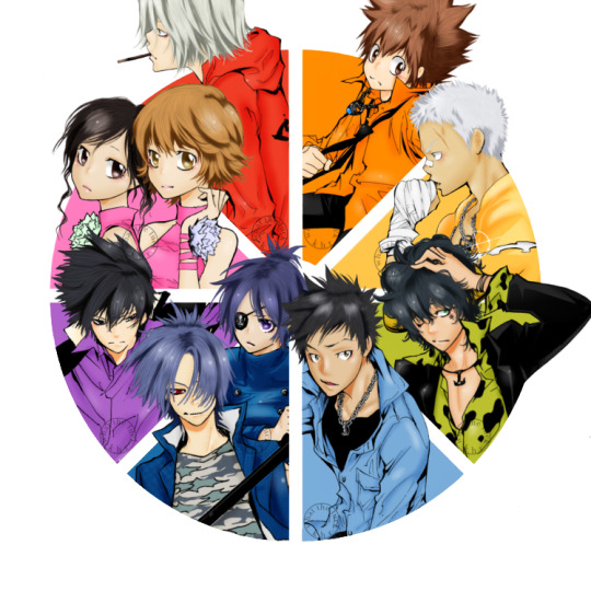
vongola colour wheel: 8/8
— support, miura haru, sasagawa kyoko
#sasagawa kyoko#miura haru#khr#katekyo hitman reborn#khredit#khrgraphics#my shit#gokudera hayato#sawada tsunayoshi#sasagawa ryohei#lambo bovino#yamamoto takeshi#rokudo mukuro#chrome dokuro#hibari kyoya#manga colouring#manga coloring#khr colour wheel#khr color wheel#colour wheel challenge#color wheel challenge#colour wheel meme#color wheel meme#COMPLETE!!!! ITS COMPLETE!!!!!!!#we started this in June and she’s complete babyyyyyy!!!!#I’m so happy I could finally finish this. finish something on here#and I think it turned out so good too!!!#the little flower things on the girls are those colours#to represent their possible flame colours which I’ll never change. lightning and mist#ANYWAYS THANK YOU ALL AND I HOPE YOU LIKE IT
493 notes
·
View notes
Text
ateez as supermarket cashiers:
seonghwa : if he is not judging how customers put their stuff on the conveyor belt then he is hanging out in the snacks aisles 'making sure' eating the snacks that it's always restocked. no one snitches on him because he is the only reason the store is not in place
hongjoong : is never at his station because he has to help everyone else. low-key scares customers because he is always stressed TM about everything going wrong to be fair once yeosang almost let someone take money from the cash register
yunho : tells people there is no change whenever he can't be bothered to split large amounts like a $ 100. his lunch hour is somehow four hours and in the other four hours of his shift, he plays on his gameboy. still won best employee three months in a row which seonghwa hasn't yet forgiven him for
yeosang : can't say no to people because he doesn't want to disappoint anyone. forced by wooyoung to wear the elf hat every time the holiday season rolls around. sometimes eats the expired desserts instead of throwing them out
san : isn't shy to share his opinions on which product is good or which one is bad. knows all the regulars and will let them know if there is a sale going on. sweetest boy 💕
mingi : chips all the ceramic mugs whenever he is scanning them but no one has the heart to complain about it to the manager hongjoong since mingi is almost in tears everytime. gets free gum from grandmothers and free cigs from the emos.
wooyoung : his main job is yapping and his side hustle is flirting with everyone. the only checking out he is doing is checking out his attractive coworkers.
jongho : polite, efficient, and offers everyone a smile. break's all the regulars' heart whenever he is on the graveyard shift he doesn't care, he needs the money 💵
#i didn't want to end the year without posting a single ateez content#i laughed too hard at their shenanigans and i owe them this at least jndndndn#the way their favourite colour is 'chrome silver' and 'cement' hooked me#and i said “gotta work gotta make that money make purse” so many times irl#thank you ateez for being iconic 😘#HOW WAS THE SHOW lives rent free in my mind#ateez#ateez reactions#ateez fluff#ateez scenarios#ateez drabbles#ateez imagines#seonghwa#hongjoong#yunho#yeosang#wooyoung#san#mingi#jongho#writings of tie-dye
72 notes
·
View notes
Text
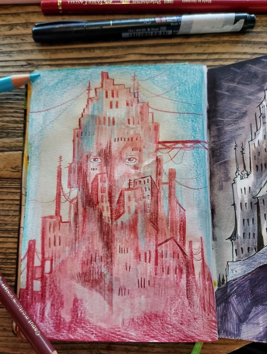
Something something becoming a city
#really should continue reading that nk jemisin book so i could make a better pun. i got like 2 chapters in before getting distracted by uni#reading. two years ago. oops. after i finish burning chrome? only got two short stories left in that i think#sketchbook#drawing#colour pencil#coffee#illustration#artists on tumblr#my art#uh. i had a point when i started drawing this. i think it might have been please commission me because being a care worker is exhausting an#i consider quitting ever shift i get that's not a night one#or buy originals#sold a lot of those earlier. not so much since january. idk why.
178 notes
·
View notes
Text


lewis hamilton wins the 2008 world championship

#lewis hamilton#and nothing for massa!#chrome car yellow helmet .chrome car yellow helmet ...#tw: flashing#2008#yeah ik the colouring is off in some of these be a love and just ignore that#my gifs
91 notes
·
View notes
Note
Hi!! I just wanted to say that the way you draw characters/use colors in your art is an absolute dream, I've never seen anything prettier. Do you have a specific way you pick/use colors, or any advice for coloring? You inspire my art so much, and I'd love to learn how to color like you someday :)

@braventheninth gonna reply to both of you here hope that's cool!
aaaah thank you so much I'm really honoured to hear you both like it and that it inspires you anon !! ;v; I don't actually know much about art theory-wise, aside from very basic colour theory that I always forget so most of my choices are pretty instinctual and based on my own preferences!
i can do my best to explain my thought process though! uuh it is. lots of text though just as a warning.
one thing I tend to do with almost everything is pick what kind of colour mood I'm going for! usually, since I love orange and also warm feelings, I'll aim for some kind of warm tone and when doing that I try to slide every colour I pick towards the warm end of the colour wheel. Blacks and whites are especially good for this! As a general thing I almost fully avoid picking any colours along those edges of the colour picker

instead I'll move all my colour choices a nudge into the square for the colours towards the tone I want (in this case warm) (the white is there be warm too I just forgor to type it).

and since I wanted warm colours for this drawing I desaturated the blue of Brain's pants so it would fit in better. I once heard someone say you should always pick one main colour and saturate fully and the further away from it on the colour wheel you got, the more desaturated your colours should be. I don't really do that bc I like my colours to stay bright but I do keep it in mind to mess around with sometimes.
I'm not always great at keeping this consistent, but I think it usually makes for pretty decent results... Other things I keep in mind are that when I pick the colour for my shadows I always make a little slide on the colour wheel towards the opposite tone of what I based my main colours on. oh and picking the right base colours ?? no clue tbh I always put every colour on it's own layer and then I spend a couple minutes adjusting them all seperately until I feel like they go well enough together. I usually avoid the bottom to right section of the square fully, bc I find they often get oversaturated and muddy, but that's just a personal preference I guess.
also since I enjoy the way coloured lineart works for my stuff I tend to mess around with layer settings for my lineart! usually the end results will look something like this:

where the clipped layer is clipped on to my colours folder. lineart is the only place where I just use plain black since I'm gonna change it with these layer settings later. it often still shows up as black for darker colours (and especially blues?) but it keeps a slightly coloured edge that I enjoy. if the blacks of the end result don't look good, messing around with the layer opacity usually changes stuff up. sometimes I'll also erase part of the lineart from one of the layers as a way to adjust.
I think what might be more relevant though, is the way I've been picking my colours for most of my recent posts though, which is. very differently. and also quite dependant on the fact I've been drawing on Tegaki! Tegaki has a limited colour palette that looks like this

only the 6 colour slots next to the bottom greyscale can be replaced by your own colours. As shown here I only bothered to add something to half of them; mainly the beige-ish colour I like to use for whites, a brown that I never use bc it's ugly with everything else here and a purple? that I only Think I added. both the brown and purple suffer from being too desaturated for the rest of the palette, which makes them stand out in a pretty bad way when used tbh.
I have. absolutely no idea what I'm doing with colours on this site though ngl. I think it just automatically pushes you to be a little more chaotic with the choices? a simple example is the green I picked for Link's tunic here doesn't really have any good, easy choice for shading imo. most of the "darker" green tones just feel more saturated, and it sticks out pretty bad as a shading colour for the more muted green I picked for the tunic. Removing those, the choice was either a mossy green or a blue.

and while the mossy green is still green, it feels far too dark a shading colour compared to what I picked as shading for the rest of the drawing. The blue has the added bonus of being closer to the purple I used for the black-ish parts.
I think my point is that it's really easy to push yourself to make some fun new choices when the tools you're using limit you a bit in a way? Looking at it now, I'm also seeing that the hands were lined with very different colours. I remember just thinking that I couldn't be bothered to find the exact same purple I used for the first hand so I just went with the first thing I landed on, that being a pink. But now I think it works pretty well since the one hand is lifted a bit more into the light and that goes well for a bright colour like pink. happy accidents and all that right ?
I am fully just yapping at this point 🧍 but the point still goes for most things drawn on this site.

like there was no reason to add the blues or reds or pinks to the heather here but I only had so many purple shades to work with. it might be less realistic but I don't think it would've come out as well if I had stuck to only the purple shades from my reference photo.
This ended up way way too long and I have no idea if any of it made sense or was helpful at all, but it was surprisingly fun to reflect on my own choices a bit more! especially since I often just do whatever I feel like I think it's helpful to sit back and consider what instinct actually tells me it's the right thing to do.
in an attempt to do something actually helpful uuh I recommend messing around with 2 specific things and switching around with them a bit; namely limited colour palettes (like 1 or 2 main tones imo) and then just going absolutely ham and just using whatever colour for everything (make them orange! put some blue and purple on the bark! leaves can be blue if they want to! (go more ham than I did tbh))

I think just messing around does so much for making some kind of sense of colours even without Knowing how they work. it's easy to say we should all study, but personally I'm pretty bad at it and it's more fun to just trial and error it... errors do happen a lot though omg do they happen, but that's helpful for figuring stuff out too!
#ask#when I called myself Yappinator 2000 on bsky this is exactly what I meant shfdiuhsdf#feeling a little sick and should've probably slept early instead of figuring this out but it was rly fun and relaxing actully!#considering how bad I've slept recently ending the day with lots of quiet pondering might be just what I need haha#I should probably get the triangle colour wheel so I can lessen all those colours I don't like to use but I'm too used to it being like thi#too tired to have imposter syndrome too tired to overthink whether I make sense. it's quite nice actually#I hope at least some of it will be helpful or fun :)#almost started overthinking anyway I am pulling myself back by the scruff and off to bed#sleep well everyone whenever you do <3#also. totally no secret tegaki agenda here totally 👀 it's totally not like I think everyone should at least try that site haha no waay#it's only full of cool and nice people just like here and you can draw silly comments to each other#and also runs better on chrome than firefox wink wink......... spleepy time..........
27 notes
·
View notes
Text
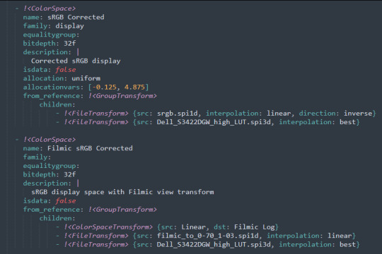
canmom's notes on fixing the colours
ok so if you've been following along on this blog for the last week or two i've been banging on about colour calibration. and i feel like it would be good to sum up what i've learned in a poast!
quick rundown on colour spaces
So. When you represent colour on a computer, you just have some numbers. Those numbers are passed to the monitor to tell it to turn some tiny lights up and down. The human visual system is capable of seeing a lot of colours, but your monitor can only display some of them. That's determined by its primaries, basically the exact colour* of its red, green and blue lights.
(*if you're wondering, the primaries are specified in terms of something called the CIELAB colour space, which is a model of all the different colours that humans can possibly see, devised by experiments in the early-mid 20th century where the subjects would turn lights at different frequencies up and down until they appeared visually the same. Through this, we mapped out how eyes respond to light, enabling basically everything that follows. Most human eyes tend to respond in pretty close to identical ways - of course, some people are colourblind, which adds an extra complication!)
Now, the problem we face is that every display is different. In particular, different displays have different primaries. The space in between the primaries is the gamut - the set of all colours that a display can represent. You can learn more about this concept on this excellent interactive page by Bartosz Ciechanowski.
The gamut is combined with other things like a white point and a gamma function to map numbers nonlinearly to amounts of light. All these bits of info in combination declare exactly what colour your computer should display for any given triplet of numbers. We call this a colour space.
There are various standard sets of primaries, the most famous being the ITU-R Rec.709 primaries used in sRGB, first defined in 1993, often just called the sRGB primaries - this is a fairly restricted colour space, intended to be an easy target for monitor manufacturers and to achieve some degree of colour consistency on the web (lol).
Since then, a much wider gamut called Rec.2020 has recently been defined for 'HDR' video. This is a very wide gamut, and no existing displays can actually show it in full. Besides that, there are various other colour spaces such as AdobeRGB and P3, which are used in art and design and video editing.
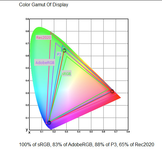
What you see above is something called a 'chromaticity diagram'. the coordinate system is CIE xyY with fixed Y. The curved upper edge to the shape is the line of monochromatic colours (colours created by a single frequency of light); everything other colour must be created by combining multiple frequencies of light. (Note that the colours inside the shape are not the actual colours of those points in CIE XY, they're mapped into sRGB.)
In this case, the red, green and blue dots are the primaries of my display. Since they are outside the green triangle marked sRGB, it qualifies as a 'wide gamut' display which can display more vivid colours.
Sidebar: you might ask why we didn't define the widest possible gamut we could think of at the start of all this. Well, besides consistency, the problem is that you only have so many bits per channel. For a given bit depth (e.g. 8 bits per channel per pixel), you have a finite number of possible colours you can display. Any colours in between get snapped to the nearest rung of the ladder. The upshot is that if you use a higher gamut, you need to increase the bit depth in order to avoid ugly colour banding, which means your images take up more space and take more time to process. But this is why HDR videos in Rec.2020 should always be using at least 10 bits per colour channel.
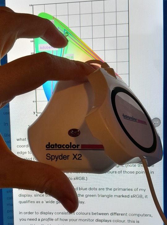
in order to display consistent colours between different computers, you need a profile of how your monitor displays colour. Yhis is something that has to be measured empirically, because even two monitors of the same model will be slightly different. You get this information by essentially taking a little gadget which has a lens and a sensitive, factory-calibrated colour meter, and holding it against your screen, then making the screen display various colours to measure what light actually comes out of it. This information is packed into a file called an ICC profile.
(Above is the one I got, the Spyder X2. I didn't put a lot of thought into this, and unfortunately it turns out that the Spyder X2 is not yet supported by programs like DisplayCal. The Spyder software did a pretty good job though.)
Wonderfully, if you have two different ICC profiles, and you want to display the same colour in each space, you can do some maths to map one into the other. So, to make sure that a picture created on one computer looks the same on another computer, you need two things: the colour space (ICC profile) of the image and the colour space (ICC profile) of the screen.

Now different operating systems handle colour differently, but basically for all three major operating systems there is somewhere you can set 'here is the icc profile for this screen'. You might think that's the whole battle: calibrate screen, get ICC profile, you're done! Welcome to the world of consistent colour.
Unfortunately we're not done.
the devil in the details
The problem is the way applications tell the operating system about colour is... spotty, inconsistent, unreliable. Applications can either present their colours in a standard space called sRGB, and let the OS handle the rest - or they can bypass that entirely and just send their numbers straight to the monitor without regard for what space it's in.
Then we have some applications that are 'colour managed', meaning you can tell the application about an ICC profile (or some other colour space representation), and it will handle converting colours into that space. This allows applications to deal with wider colour gamuts than sRGB/Rec.709, which is very restricted, without sacrificing consistency between different screens.
So to sum up, we have three types of program:
programs which only speak sRGB and let the OS correct the colours
programs which aren't colour aware and talk straight to the monitor without any correction (usually games)
programs which do colour correction themselves and talk straight to the monitor.
That last category is the fiddly one. It's a domain that typically includes art programs, video editors and web browsers. Some of them will read your ICC profile from the operating system, some have to be explicitly told which one to use.
Historically, most monitors besides the very high end were designed to support sRGB colours and not much more. However, recently it's become easier to get your hands on a wide gamut screen. This is theoretically great because it means we can use more vivid colours, but... as always the devil is in the details. What we want is that sRGB colours stay the same, but we have the option to reach for the wider gamut deliberately.
Conversely, when converting between colour spaces, you have to make a decision of what to do with colours that are 'out of gamut' - colours that one space can represent and another space can't. There's no 'correct' way to do this, but there are four standard approaches, which make different tradeoffs of what is preserved and what is sacrificed. So if you look at an image defined in a wide colour space such as Rec.2020, you need to use one of these to put it into your screen's colour space. This is handled automatically in colour managed applications, but it's good to understand what's going on!
(*You may notice a difference in games even if they're not colour managed. This is because one of the things the calibration does is update the 'gamma table' on your graphics card, which maps from numeric colour values to brightness. Since the human eye is more sensitive to differences between dark colours, this uses a nonlinear function - a power law whose exponent is called gamma. That nonlinear function also differs between screens, and your graphics card can be adjusted to compensate and make sure everyone stays on the standard gamma 2.2. Many games offer you a slider to adjust the gamma, as a stopgap measure to deal with the fact that your computer's screen probably isn't calibrated.)
For what follows, any time you need the ICC profile, Windows users should look in C:\Windows\System32\spool\drivers\color. MacOS and Linux users, see this page for places it might be. Some applications can automatically detect the OS's ICC profile, but if not, that's where you should look.
on the web
Theoretically, on the web, colours are supposed to be specified in sRGB if not specified otherwise. But when you put an image on the web, you can include an ICC profile along with it to say exactly what colours to use. Both Firefox and Chrome are colour-managed browsers, and able to read your ICC profile right from the operating system. So an image with a profile should be handled correctly in both (with certain caveats in Chrome).
However, Firefox by default for some reason doesn't do any correction on any colours that don't have a profile, instead passing them through without correction. This can be fixed by changing a setting in about:config: gfx.color_management.mode. If you set this to 1 instead of the default 2, Firefox will assume colours are in sRGB unless it's told otherwise, and correct them.
Here is a great test page to see if your browser is handling colour correctly.
Chrome has fewer options to configure. by default it's almost correctly colour-managed but not quite. So just set the ICC on your OS and you're as good as it's gonna get. The same applies to Electron apps, such as Discord.
To embed a colour profile in an image, hopefully your art program has the ability to do this when saving, but if not, you can use ImageMagick on the command line (see below). Some websites will strip metadata including ICC profile - Tumblr, fortunately, does not.
For the rest of this post I'm going to talk about how to set up colour management in certain programs I use regularly (Krita, Blender, mpv, and games).
in Krita
Krita makes it pretty easy: you go into the settings and give it the ICC profile of your monitor. You can create images in a huge variety of spaces and bit depths and gamma profiles. When copying and pasting between images inside Krita, it will convert it for you.
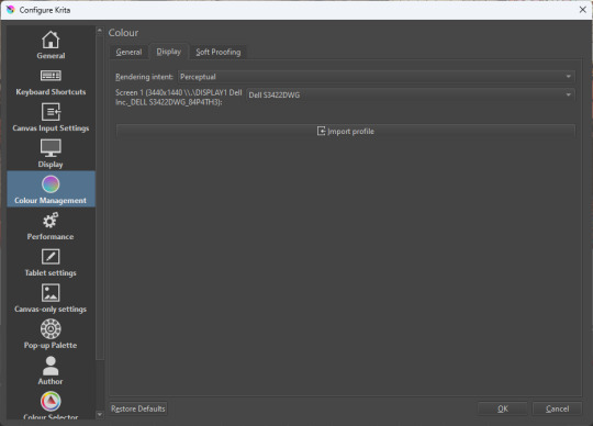
The tricky thing to consider is pasting into Krita from outside. By default, your copy-paste buffer does not have colour space metadata. Krita gives you the option to interpret it with your monitor's profile, or as sRGB. I believe the correct use is: if you're copying and pasting an image from the web, then sRGB is right; if you're pasting a screenshot, it has already been colour corrected, you should use 'as on monitor' so Krita will convert it back into the image's colour space.
in Blender
Blender does not use ICC profiles, but a more complicated system called OpenColorIO. Blender supports various models of mapping between colour spaces, including Filmic and ACES, to go from its internal scene-referred HDR floating-point working space (basically, a space that measures how much light there is in absolute terms) to other spaces such as sRGB. By default, Blender assumes it can output to sRGB, P3, etc. without any further correction.
So. What we need to do is add another layer after that which takes the sRGB data and corrects it for our screen. This requires something called a Lookup Table (LUT), which is basically just a 3D texture that maps colours to other colours. You can generate a LUT using a program called DisplayCal, which can also be used for display calibration - note that you don't use the main DisplayCal program for this, but instead a tool called 3DLUT Maker that's packaged along with it. see this Stack Overflow thread for details.
Then, you describe in the OpenColorIO file how to use that LUT, defining a colour space.

The procedure described in the thread recommends you set up colour calibration as an additional view transform targeting sRGB. This works, but strictly speaking it's not a correct use of the OpenColorIO model. We should also set up our calibrated screen as an additional display definition, and attach our new colour spaces to that display. Also, if you want to use the 'Filmic' View Transform with corrected colours (or indeed any other), you need to define that in the OpenColorIO file too. Basically, copy whatever transform you want, and insert an extra line with the 3D LUT.
Here's how it looks for me:
in games (using ReShade)
So I mentioned above that games do not generally speaking do any colour correction beyond the option to manually adjust a gamma slider. However, by using a post-processing injection framework such as ReShade, you can correct colours in games.
If you want to get the game looking as close to the original artistic intent as possible, you can use the LUT generator to generate a PNG lookup table, save it in the Reshade textures folder, then you load it into the LUT shader that comes packaged with Reshade. Make sure to set the width, height and number of tiles correctly or you'll get janked up results.
However... that might not be what you want. Especially with older games, there is often a heavy green filter or some other weird choice in the colour design. Or maybe you don't want to follow the 'original artistic intent' and would rather enjoy the full vividness your screen is capable of displaying. (I certainly like FFXIV a lot better with a colour grade applied to it using the full monitor gamut.)
A 3D Lookup Table can actually be used for more than simply calibrating colour to match a monitor - it is in general a very powerful tool for colour correction. A good workflow is to open a screenshot in an image editor along with a base lookup table, adjust the colours in certain ways, and save the edited lookup table as an image texture; you can then use it to apply colour correction throughout the game. This procedure is described here.
Whatever approach you take, when you save screenshots with Reshade, it will not include any colour information. If you want screenshots to look like they do in-game when displayed in a properly colour managed application, you need to attach your monitor's ICC profile to the image. You can do this with an ImageMagick command:
magick convert "{path to screenshot}" -strip -profile "{path to ICC profile}" "{output file name}.webp"
This also works with TIFF and JPEG; for some reason I couldn't get it to work with PNG (you generate a PNG but no colour profile is attached.)
It's possible to write a post-save command in ReShade which could be used to attach this colour space info. If I get round to doing that, I'll edit into this post.
video
In MPV, you can get a colour-corrected video player by setting an appropriate line in mpv.conf, assuming you're using vo=gpu or vo=gpu-next (recommended). icc-profile-auto=yes should automatically load the monitor ICC profile from the operating system, or you can specify a specific one with icc-profile={path to ICC profile}.
For watching online videos, it seems that neither Firefox nor Chrome applies colour correction, even though the rest of the browser is colour-managed. If you don't want to put up with this, you can open Youtube videos in MPV, which internally downloads them using Youtube-DL or yt-dlp. This is inconvenient! Still haven't found a way to make it colour-corrected in-browser.
For other players like VLC or MPC-HC, I'm not so familiar with the procedure, you'll need to research this on your own.
what about HDR?
HDR is a marketing term, and a set of standards for monitor features (the VESA DisplayHDR series), but it does also refer to a new set of protocols around displaying colour, known as Rec. 2100. This defines the use of a 'perceptual quantiser' function in lieu of the old gamma function. HDR screens are able to support extreme ranges of brightness using techniques like local dimming and typically have a wider colour gamut.
If your screen supports it, Windows has a HDR mode which (I believe) switches the output to use Rec.2100. The problem is deciding what to do with SDR content on your screen (which is to say most things) - you have very little control over anything besides brightness, and for some reason Windows screws up the gamma. Turning on HDR introduced truly severe colour banding all over the shop for me.
My colorimeter claims to be able to profile high brightness/hdr screens, but I haven't tested the effect of profiling in HDR mode yet. There is also a Windows HDR calibration tool, but this is only available on the Microsoft store, which makes it a real pain to set up if you've deleted that from your operating system in a fit of pique. (Ameliorated Edition is great until it isn't.)
Anyway, if I get around to profiling my monitor in HDR mode, I will report back. However, for accurate SDR colour, the general recommendation seems to be to simply turn it off. Only turn it on if you want to watch content specifically authored for HDR (some recent games, and HDR videos are available on some platforms like Youtube). It's a pain.
is this all really worth the effort?
Obviously I've really nerded out about all this, and I know the likely feeling you get looking at this wall of text is 'fuck this, I'll just put up with it'. But my monitor's gamma was pretty severely off, and when I was trying to make a video recently I had no idea that my screen was making the red way more saturated and deep than I would see on most monitors.
If you're a digital artist or photographer, I think it's pretty essential to get accurate colour. Of course the pros will spend thousands on a high end screen which may have built in colour correction, but even with a screen at the level I'm looking at (costing a few hundred quid), you can do a lot to improve how it looks 'out of the box'.
So that's the long and short of it. I hope this is useful to someone to have all of this in one place!
I don't know if we'll ever reach a stage where most monitors in use are calibrated, so on some level it's a bit of a fool's errand, but at least with calibration I have some more hope that what I put in is at least on average close to what comes out the other end.
94 notes
·
View notes
Text
opened tiktok to find an ateez video to gif and ended up seeing my moots' gifs stolen for an edit </3
#igm.talk#it's that person who stole my gifs before for their edits so like idk chrome saved the username so when i open tiktok on my laptop#it automatically goes to that user's page#and the first thing i see is anna's gifs stolen#her colouring is too iconic to not notice#but it's crazy that this person will not stop stealing gifs#atiny gifmakers please go block @/m-o-m-o-9-3 (this is their tumblr acc) so they stop stealing your stuff#other gifmakers... for txt / twice / monsta x / got7 / etc... do go check this acc#their blog is just a repost of all their tiktok edits so if u see ur gifs used in the videos there it's DEFINITELY on tiktok too#im being kind rn by soft mentioning this person but if they continue stealing from gifmakers i think we need to call them out collectively
7 notes
·
View notes
Text

i messed up the eyepatch (wrong eye) so i had to redo, got frustrated for making such a mistake, gaslit myself several times into thinking it wasn't her right eye as i was redoing and so rechecked the wiki every time, am still not sure about it, gave up, posted to tumblr to get rid of it
#khr#chrome dokuro#NO FR IM SO :SOB: i did the bg and then was like WAIT A MINUTE#i would colour it more but NO! fuck this rifhweliuhdweilfsdfbhwe#aight im done.#my art
13 notes
·
View notes
Text
hehe re: nails (new set!!)


#theyre short again :-((((((#sighhh#cheer season just started last night so had my acrylics axed#currently relearning how go type again#i was gonna do a full a chrome set with silver charms!!!#but i keeewp seeing these green camo + baby pink lace combos#not just in nails but clothes as well#omg like namedcollective’s new collection hehe#so im like u know what lemme switch it up a lil#VALENTINES NEXT SET#OMG BUT. then as we were sticking the gems on#i saw my nailgirl just got some chinese new yr charms…#and i just#I SHOULDVE DONE A CNY SET NOOOO#its fine honestly reds not my colour anyways sigh
5 notes
·
View notes
Text
local spider beats up black hole and temporarily wins!
#you know it's bad when I brush of the good ol' horrible pixel-ey 'art programme' I downloaded off of chrome#really it's so bad#like paint but worse because it's only in the corner of my screen#i have a very VERY limited amount of colours#and i draw it all with my finger and my mousepad#idk why i do this to myself#i know it doesn't look great but just take it for what it is#across the spiderverse#spider-man: across the spider-verse#across the spiderverse fanart#miles morales#miles morales fanart#calculator's posts
96 notes
·
View notes
Text
loadout pic for my steam profile
#l4d2#nick#sfm#mysfm#mods included#chrome and axe 4 life#always use the purple shirt nick#he looks way too good in that colour
48 notes
·
View notes
Text

vongola colour wheel: 6/8
— mist, rokudo mukuro, chrome dokuro
#rokudo mukuro#chrome dokuro#khr#katekyo hitman reborn#khredit#khrgraphics#my shit#gokudera hayato#sawada tsunayoshi#sasagawa ryohei#lambo bovino#yamamoto takeshi#manga colouring#manga coloring#khr colour wheel#khr color wheel#colour wheel challenge#color wheel challenge#colour wheel meme#color wheel meme#alrighty. cant add shorthands now bc Mukuro’s will make this not show in the tags lol#and I worked too hard for that to happen so!!!!#anyways positioning these two was. a lot harder than I anticipated#adding two to one slot was… hard. but I got it I’ll figure it out#the mist guardian role is BOTH OF THEM!!!! ITS BOTH#the number countdown btw is colour slots not how many characters are in this#anyways yeah you get both for indigo congrats!!!!#look at them with their indigo uniforms lol#finding a good full body Mukuro panel was……. hard#how I’m gonna position Kyoya…….. not sure. wish me luck lol
221 notes
·
View notes
Text
have such a love hate relationship with interior design. why is my bedroom not turning out the way i want it to grrrr
#i have the worst base ever to work with its like grey carpet off-white walls floor-to-ceiling fitted wardrobe with solid mirrored doors#very live laugh love#but i think i tried to fight it too hard 😭#should have worked with it and gone for minimalist art and retrofuturistic chrome furniture and odd splashes of accent colours and cool#pastel bed linens#instead have tried to inject a bit of warmth into it and it's just the most characterless Nothing room ever blergh
6 notes
·
View notes
Text


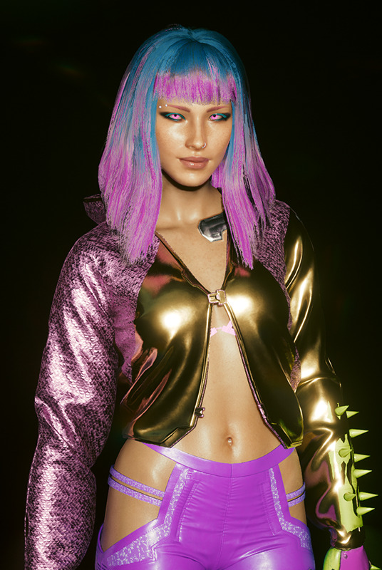


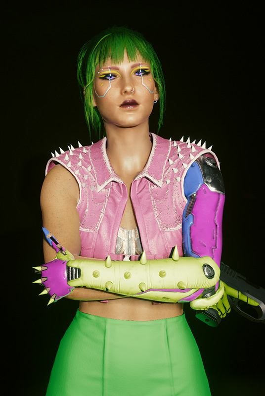

Van Ito through the Years.
2065: After her brother decided to work for Arasaka, Van took to the streets. Her stubborn attitude had dictated that she would rather be homeless than suckling the teat of the company that killed her parents. It wasn't long before she found family within a small gang that ran a couple streets in Watson called The Neon Foxes. They peddled drugs, hassled people, and occasionally robbed a bodega or two here and there. Like most small time gangs, they had dreams of making a name for themselves but in a place like Night City, that was always going to be a struggle. The gang was made up mostly of teenagers and young adults, their leader, Dodger, being the oldest of the bunch at twenty-five. They did find themselves in a handful of gangwars with other small gangs for their territory. It was during one of these fights Van got caught by a grenade and while she made it out with her life, her arm and hand weren't so lucky. Her chosen cyberware to replace what was lost would eventually become a staple part of her look.
2068: At eighteen, Van left the family she had made within The Neon Foxes. She was still young and disillusioned enough to have hopes and dreams and she desperately needed to be making eddies in order to achieve those dreams. Van began working as a dancer at the Cobra Club, a sleezy club found on Jig-Jig Street. While she had been on her own for many years, this was the first time she truly felt independent as she had her own studio apartment, a paying job, and was consistently booking shows with her band Vito and the Sparks. She still found herself pulled into doing jobs, her connections from The Neon Foxes reaching out and asking for help from time to time. This would also be the year she met the man she considered to be her closest choom, Jackie Welles. The two were put on a job together by a mutual contact and after things went south, Jackie pulled her bleeding ass out of trouble and the rest is history.
2072: While her music career was still the most important thing to Van, it didn't pay the bills. With someone like Jackie by her side, it was easy to slip into the solo lifestyle. They shared connections and jobs, doing what they could to help one another out whenever they had the chance. This time of her life was filled with scrapes, bruises, and bullet holes but nothing she couldn't handle. It was around this time that her band fell out, the other members putting other priorities over it. With the lack of success they experienced, it wasn't a surprise to Van, but she was still disappointed. Starting over was never easy but the struggle was alleviated by Jackie, Misty, and the few contacts she still had from her old gang, though they were reluctant to help her since she left them. She would drop the stage name and rebrand herself a bit
2077: Losing Jackie was a blow she hadn't been preparing for but it helped her when she found out she was a ticking time bomb not long for this world. If there was a heaven or a hell or some sort of afterlife, maybe he'd be there waiting. Van's impending death was a bitter sweet feeling as the aftermath of the job they had done set her up with some incredible connections. People like Lizzy Wizzy and Kerry Eurodyne basically falling into her lap. It was like she was finally getting where she wanted to be in life and by some cruel twist of fate, Night City would take one last thing from her. While that thought could have paralyzed her, Van decided to roll with it, taking advantage of favours owed to her in the off chance her and the rag-tag group of friends she had made on this journey could manage to find a way to prevent her death. That is where she is now, living her life day to day, taking complete advantage of every opportunity that comes her way, writing music, working stages all over Night City, and planning The Skin and Chrome tour with Lizzy Wizzy and the Metadwarves.
#cyberpunk 2077#oc: van#about: van#always a colourful bb#I don't think anyone has every seen her forehead#not even herself#it was very fun putting together the different looks and figuring out how her style might have progressed over the years#she definitely picked her chrome at 15 years old then was too poor to justify upgrading it until it just became a part of her look
66 notes
·
View notes