#colors of…
Explore tagged Tumblr posts
Visit Tumblr Blog
Explore Tumblr blogs with no restrictions, modern design and the best experience.
Last Seen Tumblr Blogs


Fun Fact
Tumblr.com rank in the US is 25.
Text
not to be a dirty commie or anything but i don't think any one person should have enough money to solve world hunger and then get to decide not to
#he speaks#i hate rich people#“but preston the rich people EARNED that money they worked so hard to exploit all those poor people” I'LL EAT YOU TOO#they're trying to decide what color their third yacht should be#meanwhile your average joe is busy trying to pick between dinner or rent#luigi mangione was right#luigi mangione and tetsuya yamagami legendary collab coming this spring
49K notes
·
View notes
Text

in all timelines in all possibilities only you can show me this
#artists on tumblr#Arcane#jayvik#Jayce Talis#Viktor#arcane spoilers#my art#I saw That Shot (you know the one) and my brain broke with how beautiful it was#and then I was like wait those colors... oh my god what if...#aaaand I've always wanted to draw the klimt kiss ref#looks like these two were the ones who got it in the end hah#but phew this tested me in so many ways with figuring things out
58K notes
·
View notes
Text
the us banning tiktok over fears of chinese influence prompting americans to flee to xiaohongshu (which translates to little red book - the same name as the famous red book of mao zedong quotations) and form instant connections with the chinese… you can't make this kind of irony up


#soooo funny genuinely#i looove xiaohongshu i see it as the lovechild of twitter pinterest insta and tiktok#of course there's some uh. 2000s blog-type content including thinspo. and colorism#but if you curate your feed properly you'll escape them#and then there's endless fun#and chinese netizens are SOOO mercilessly funny sometimes#donald trump#us politics#social media#us#rednote#tiktok ban#twitter#tiktok#xiaohongshu#fashion
39K notes
·
View notes
Text
Crystals study


i'm so tired
45K notes
·
View notes
Text
People said that Tumblr isn't a great place to post original art that isn't fanart, but I'm doing it anyway because I haven't got the motivation to draw anything else
Happy pride month lads! 🧡💛🤍💙
from an aroace potato :)
#drawing#anime#digital art#art#small artist#artists on tumblr#digital artist#colors#colour#aromantic#aromantism#asexual#aroace#pride month
88K notes
·
View notes
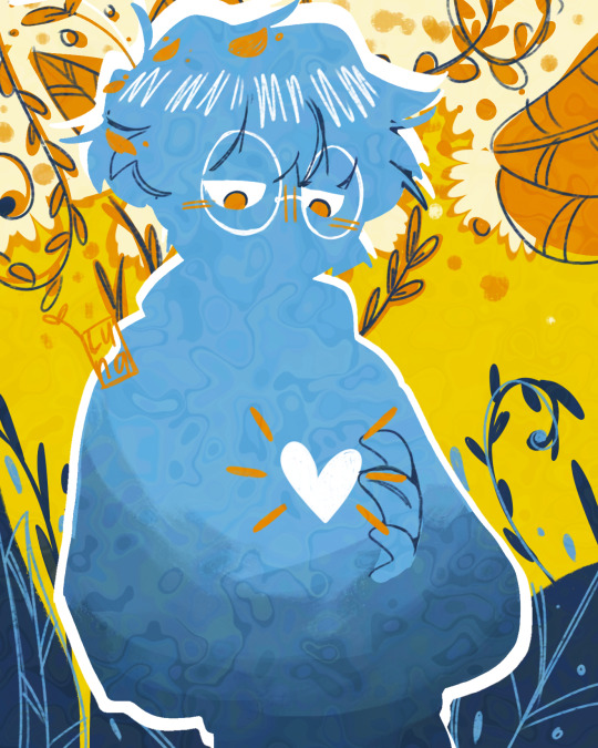
Text

Dragon room
#illustration#artists on tumblr#use ALL the color#description in alt text#inspired by the peacock room
32K notes
·
View notes
Text
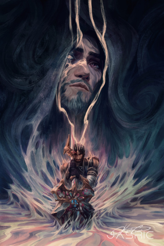
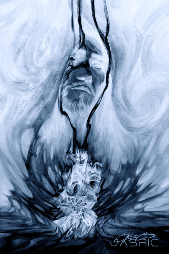

Another one… just endless inspiration It’s so heartbreaking
#arcane#jayce#viktor#league of legends#arcane fanart#jayvik#jasric#jasricart#idk why i just wanted to invert the colors
42K notes
·
View notes
Text

(college stuff) everyone give it up for the humble arapaima
#art#my art#doodle#drawing#digital art#illustration#fish#arapaima#man college really has done great things for my ability to color. gotta give it that
35K notes
·
View notes
Text


I hope she gets this pack from every single person she knows that has seen her Dandelion crayon collection.
[source]
[Dandelion Crayon Video](which is a delight if you haven't seen it, pure joy encapsulated in wax)
#crayons#good things#crayola#news#they're also bringing these colors back in colored pencils and markers#but the crayons made me so happy for Her
21K notes
·
View notes
Text
Hey, if you do crafts (especially things like crochet, knitting, embroidery, etc), make sure to look up how to identify when a listing is AI generated. You do NOT want to waste money on an incredible looking kit or pattern that is physically impossible to make, especially if you're on sites like etsy hoping to support an actual artist.
#as an embroiderer: big red flags are curved straight or satin stitches#stitches that you cannot identify or figure out at all#thread that fades into other colors#backgrounds that match the piece weirdly well (like a floral embroidery piece with a matching vase and flowers on the table)#and a lack of videos of the piece and photos from other angles
25K notes
·
View notes
Text


#nature#gif#naturecore#sky#photography#aesthetic#photografy#art aesthetic#art#landscape#beautiful#clouds#places#florest nature#moodboard#mountains#spring#scenery#night#art nature#cottagecore#field#meadow#pretty#explore#cloudscape#colorful#sunrise#sunset#lake
28K notes
·
View notes
Text
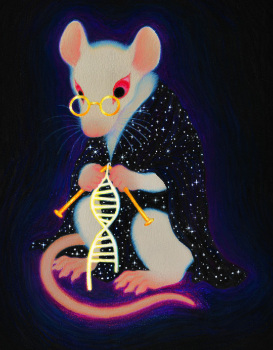
"Work with animals is a source of suffering to all of us. We treat them like babies who cannot speak."
#the quote is from Oleg Gazenko (talking about his regrets over Laikas death)#the drawing is based on the Monument to the laboratory mouse in siberia russia#art#illustration#colored pencil#marker
23K notes
·
View notes
Text
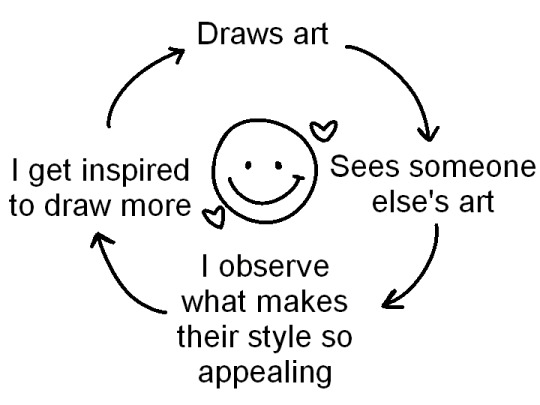
Peace and love
#pink posts#i saw a tweet that was like “i see other people's art” --> i get discouraged#i understand that seeing art that is prettier than yours can be discouraging but why not twist that a bit?#why does it look prettier to you? is it the colors#is it the textures they used? the brushes?#study them and try to put your spin on it#and maybe you'll find your art beautiful as well
95K notes
·
View notes
Text
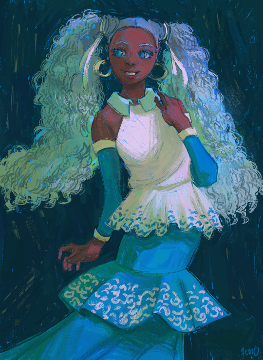
miku (nigeria)
#illustration#art#artists on tumblr#illustrators on tumblr#digital painting#digital art#painting#lighting study#color study#summer#miku#hatsune miku#dress#fashion
51K notes
·
View notes