#colorgamut
Explore tagged Tumblr posts
Photo

Explore the concept of gamut, its significance in technology and design, and how it influences color accuracy and visual experiences. read the full article: https://bit.ly/4gYRtcx #Gamut #ColorGamut #Technology #DisplayTechnology #ColorTheory #DigitalDesign #VisualExperience read more: what is a gamut
0 notes
Text
RGB vs CMYK: Which color space is right for you?

RGB vs CMYK: Which color space is right for you?
The color space that you use to print your work can have a significant impact on the final look and feel of the finished product. We can create designs that can be displayed anywhere, including mobile devices, desktops, metal signs, or gloss business cards. The difficulty with that is that the colors in our chosen palette might look more different in different display environments.
RGB vs CMYK
There are two main types of color space: RGB and CMYK. RGB is the most common type and is used by most digital devices such as televisions, computers, and smartphones. CMYK is a more specialized type that is mainly used for printing inks on paper. In general, RGB produces brighter colors while CMYK produces more accurate colors. However, there are some disadvantages to using RGB. For example, it can be difficult to create certain shades of color with RGB, and also some colors be difficult to print.

Photo by Kaboompics .com on Pexels.com
What is Color Gamut?
In photography, graphics, and other forms of design, the color gamut is a term to describe the range of colors expressed by a particular device or software. In most cases, this refers to the number of colors that display on a screen or printed out. Devices with a larger color gamut can reproduce more colors than those with a smaller gamut. This is often illustrated by showing how many different hues can be reproduced on different devices. The sRGB and Adobe RGB color spaces use in modern graphic design software. sRGB covers only 35.9% of the visible light to Adobe RGB, which reaches 52.1%. Ever since technologies started to improve, we can do better and better at these spaces giving us better gamuts.

Image By Lindsay Marsh Design The RGB will impact the consistency on different screens, phones, and desktop displays. Be sure to constantly test your design using several screens and sources so it is possible to correct some of the bigger inconsistencies. As technology advances, screen color representation will become increasingly uniform.
RGB (Additive Color System)
RGB is the most common additive color system, used in digital displays and televisions. It uses three primary colors: red, green, and blue. These three colors can be combined to create any other color in the spectrum by varying the intensities of each. RGB is a great option for displays because it can create a wide range of colors with just three primary colors. An RGB display is made up of three separate light tubes that emit light at three different wavelengths. HEX (USED FOR WEB DESIGN) Hex colors are used in web design to create a color palette. It's made up of 6 characters that represent the red, green, and blue levels of each color. By using hex colors in web design, you can ensure that all browsers display your website with the same colors. There are three sets of numbers in a hexadecimal code. The first set of digits represents the color red; the second, green; and the third, blue. While the combination equals the hexadecimal code, it produces a fully mixed color. The scale of 0 to F determines if it is darkest (0)or lightest (F) so the hexadecimal code 000000 would be black and FFFFFF would be pure white.

Image By Lindsay Marsh Design WEB-SAFE COLORS Web-safe colors are a set of 216 colors that display on the web without the risk of being changed by the browser. This allows for a more consistent look across different devices and platforms. Web-safe colors make it easier to change the colors of screenshots, making them more convenient to use in a variety of programs and devices.
CMYK (SUBTRACTIVE COLOR SYSTEM)
CMYK is a subtractive color system that combines cyan, magenta, yellow, and black to create a wide range of colors. The colors are created by layering different amounts of each color over each other on top of a white background. This system is used in traditional printing methods, such as newspapers and magazines. Four metal plates are created in the printing process for any design. The first plate will include only cyan areas that will print, the second plate yellow, the third plate magenta, and the last one will include black ink to help to saturate or darken the cyan areas. PANTONE Color In printing, Pantone Matching System (PMS) colors are special inks that have a specific formula. Each printer has its own set of Pantone inks, and when you send a file to be printed, you need to select the Pantone colors that will be used. Because the inks are specific formulas, the colors will print the same way each time - even if there is a different printer or paper used. Pantone has various color selections. Some incorporate metallic colors and potent swatches that can add an extra sparkle to your printed inks.
Different In Between RGB vs CMYK

Image By Lindsay Marsh Design CMYK is a subtractive color model in that when you add all of the colors together they form black, while in RGB or additive color model, we add all the colors together in order to produce a pure white. RGB is an additive color system, meaning we mix colors along with light. It starts with a darkened black pixel and takes up light and color. But in printing, light reflects colors differently from inks do. The white paper reflects the greatest light when it reflects light well and absorbs the greatest light when it poorly reflects it. CYMK only consists of inks and the reflective quality of light, it has a much more limited color range and this is a big problem in design.
Graphic Designer Tips
As designers, we must consistently make designs that look good in print and on the screen. Hence, we must use CMYK and RGB to showcase the same design in whatever setting. For example, my current logo has a bright and vibrant design that looks perfect on a computer. I process it for printing on paper and printer and undergo a disappointment as I see how the colors dull. This happens quite frequently and is a natural obstruction we deal with every day.

Image By Lindsay Marsh Design You can manually select the closest colors you can find in an effort to retain color vibrancy. You'll not get as close to a full RGB match as color decoder algorithms can normally get, but you can get a bit closer compared to each other.
Conclusion: RGB vs CMYK
There are many things to consider when choosing a color space for your project. RGB is great for digital projects and photos, while CMYK is better for print projects. Whichever you choose, be sure to test your colors in both spaces to make sure they look the way you want them to. And the Pantone Book will be an important tool for every designer, you should have one. They have "coated" Pantone color, which is glossy, semi-gloss, or matte finishes on paper. Also, "uncoated" Pantone color is less common and is more porous and absorbs more of the in on paper. It is my wish that this information piece has been helpful. Feel free to leave your comments below and share them are the most constructive method to share helpful info. Read the full article
0 notes
Photo

Legend. 2022. #31dayssonic #supersonic #chaos #perfectchaos #sonicadventure #procreateart #colorgamut #sonicthehedgehog #sonicfanart #illustration #sega #openyourheart #crush40 #kaiju #rain #blackartists (at Lancaster, California) https://www.instagram.com/p/CeRCOvDL9Sz/?igshid=NGJjMDIxMWI=
#31dayssonic#supersonic#chaos#perfectchaos#sonicadventure#procreateart#colorgamut#sonicthehedgehog#sonicfanart#illustration#sega#openyourheart#crush40#kaiju#rain#blackartists
1 note
·
View note
Text
Key specs of the Smartphone Screen
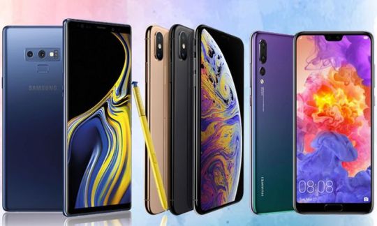
Of course, smartphones are among the most technological devices in the segment of modern consumer electronics. Over the past decade, the phone has turned into a universal handheld PC with fairly high-quality multimedia features, including a camera, projector, etc. Blackview MAX 1 Projector Mobile Phone with a projector function, Desktop Mode in Android Q 10 and foldable smartphones perfectly illustrate this trend. As a result, today smartphones are leading in popularity. Of course, companies adequately respond to huge demand, constantly improving technology and offering innovative models. As a result, the technical specifications of the new models are improving rapidly. Companies already offer multi-camera smartphones, including Sony with an unprecedented 8 cameras, models with 8-core chipset, including OnePlus 7 Pro with Qualcomm Snapdragon 855, ultrafast UFS storage, 64-MP cameras with Sony IMX686 image sensor, etc. Of course, the screen is one of the main components of the smartphone, and the pace of its improvement is consistent with the general trend. Companies continuously offer innovative displays with new technological solutions, including LTPS, IGZO, or Super and Dynamic AMOLED, etc. As a result, their specs are rapidly improving.
Resolution and PPI
As known, the resolution directly affects the image clarity and is one of the main characteristics of screen when choosing a smartphone.
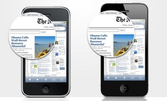
But smartphone manufacturers often also use PPI (pixel per inch). Physically, both of these parameters characterize the number of pixels on the screen. But the resolution indicates their total number on the screen, and PPI takes into account their number per unit area. In general, PPI is more informative since it takes into account screen size. For example, a 4.3-inch HD screen has a pixel density of 342 ppi. But it drops to 312 ppi for 4.7-inch screen. On the other hand, many consider 300-350 ppi optimal. According to many experts, at a standard distance, the eye ceases to perceive a further increase in pixel density. Nevertheless, many companies continue to increase it, including for marketing purposes. Today, only some budget models continue to use screens with 720p (HD) resolution (1280 x 720).
Most popular screens
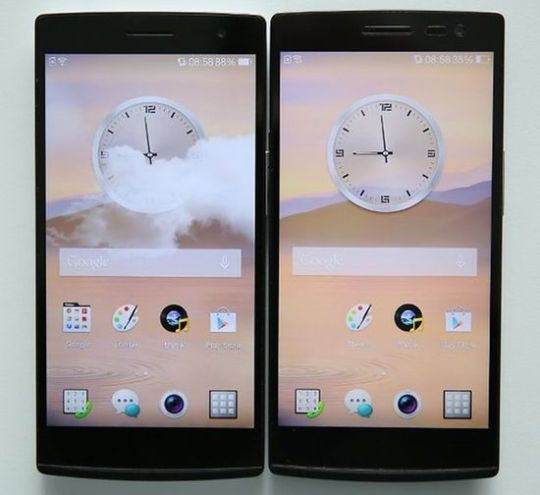
- 1080p (Full HD, FHD) - 1920 x 1080 - good resolution for a modern smartphone. It provides 440 ppi / 400 ppi for 5-inch / 5.5-inch screens, and drops to 367 ppi for a 6-inch screen. Unfortunately, for a 10-inch screen, the pixel density does not exceed 220 ppi. Today many popular models, including OnePlus 3, Sony Xperia X, Huawei P9 and iPhone 7 Plus use Full HD screens; - 2K (QHD, Quad HD) - 2560 x 1440 - excellent resolution for screens up to 8 inches (367 ppi). QHD (Quad HD) is four times the HD resolution. Accordingly, 5.5-inch QHD display has a pixel density of 538 ppi. For comparison, the pixel density of a 5.5-inch Full HD screen is 400 ppi only. Strictly speaking, 2.5K would be a more accurate name for it. The list of popular models with this resolution includes OPPO Find 7, HTC 10, Nexus 6P, Moto Z, Galaxy S7, LG V20. But the difference between OPPO Find 7 with QuadHD and OPPO Find 7a with Full HD weakly visualized for 5.5-inch screens.
- 4K Ultra HD (4K, Ultra HD) - 3840 x 2160 - expensive smartphones with a screen up to 12 inches. Sony Xperia Z5 Premium was the first to use an Ultra HD display on a 5.5-inch screen, providing a pixel density of 806 ppi.
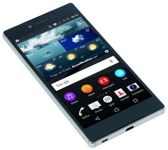
But many experts consider this resolution too excessive for such screens. Today, the Samsung Galaxy Note 10 Plus display also supports 4K Ultra HD. But companies are unlikely to continue to increase resolution due to the high power consumption of models with a large diagonal. Probably the trend of increasing resolution is nearing completion.
Color gamut and smartphone screen refresh rate
It affects color rendering, including color saturation and number of shades.

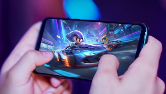
The displays of modern smartphones support the following standards: - sRGB - the most common format in smartphones, covering 33.3% of all visible spectrum; - DCI-P3 (Digital Cinema Initiatives) is used in digital cinemas and covers most of the spectrum. It exceeds sRGB by 26% and covers 41.8% of color space; - BT.2020 format is used by Sony in smartphones and TVs. It covers 57.3% and is 72% wider compared to sRGB; - Apple use Wide color Gamut in the iPhone. It covers 77.6% of the visible color spectrum. Screen refresh rate characterizes the refresh rate of the image on the screen. Typically, companies use 60 Hz. But some smartphones support 90 Hz. iPhone frequency reaches 120 Hz. Xiaomi Black Shark 2 already reached 240 Hz. In fact, this is a gaming smartphone. As known, high frequency provides smooth playback of highly dynamic scenes, for example, in games.
Conclusion
The screens of modern smartphones already provide excellent resolution, including 4K Ultra HD, wide color gamut and a huge screen refresh rate (up to 240 Hz). Energy consumption and sizes factors limit the further increase in smartphone screen resolution. On the other hand, companies continue to actively improve matrix production technologies, improving their characteristics and eliminating typical shortcomings. In addition, competition between OLED and LCD technologies is also driving innovation in this segment. Probably, further improvement of the screens will move due to this factor. This video demonstrates the great features of Xiaomi Black Shark 2 Pro in gaming mode. Read the full article
#colorgamut#dynamicAMOLED#IGZO#LTPS#MAX1ProjectorMobilePhone#OPPOFind7#pixeldensity#pixelperinch#ppi#QHD#QuadHD#smartphonescreen#smartphonescreenppi#smartphonescreenresolution#SonyXperiaZ5Premium#superAMOLED#UFSstorage#XiaomiBlackShark2
1 note
·
View note
Photo

Okay so, I think that's it. I'm going with this. I decided to limit my palette in order to get some harmony to the colors. It was very helpful. Although I originally limited it too much and had to expand it a tad. Planning is done, now it's time to start the actual painting. #historicalfantasy #bestseller #greytowertrilogy #roughdrawing #wip #wizards #spies #ww2 #wwii #alternatehistory #color #colorgamut #limitedpalette #colorsketch
#ww2#wwii#colorsketch#roughdrawing#color#bestseller#greytowertrilogy#wip#historicalfantasy#alternatehistory#colorgamut#limitedpalette#wizards#spies
1 note
·
View note
Photo

Worse than I thought, I was exporting in ProPhotoRGB. Look at the difference in colour representation! Essentially photos posted from my phone were missing 1/3 of their colours! #color #colorgamut #colorperfectionist #photographer #adobergb #prophotorgb #srgb #android #iphone
0 notes
Text
CMYK VS RGB ( from a printing press point of view )
Change your expectation to pleasing color...

RGB is Red Green Blue this is what your monitor and your TV produces. So, if your file looks great on your screen in RGB, why is your printed piece dull and does not have the pop that you saw on your screen? This is due the change in the color gamut. RGB is a much larger color gamut than CMYK so a lot of your blues and greens will be changed when the file is converted to CMYK.
For more information on how to change your document's colorspace, download our exclusive, FREE book: How-To: Your Reference Guide to Accurate Printing
I am by no means saying that printing is dull and all computer monitors and TV’s are in perfect calibration. What I am sayin is that we all need to change our expectation so the person sending the file knows what to expect when the file is completed and printed at Presto Print. (Shameless Plug). The expectation of a perfect file and a perfect print job is hard to swallow on both sides. When both sides have the expectation of pleasing color we both win the customer gets a print job that looks great and the printing company does not have re-runs all day and can help you with your next job instead of going out of business because of the expectation of perfection.
- Tony, Print Consultant
#RGB#CMYK#ColorGamut#PrestoPrint#SaltLakePrinting#SLC#HighQualityPrinting#printing#printmedia#print#design#digitalprinting#offsetprinting
2 notes
·
View notes
Text
TV settings

Many consumers pay attention to the differences in the playback quality of TVs in stores. This is especially noticeable during simultaneous work of several TVs on one channel. Unfortunately, modern TV manufacturers primarily are interested in increasing sales. Therefore, the optimal pre-settings are not a priority for some companies. Manufacturers often try to present in their TVs maximally "bright blue" and "red" colors, increasing the brightness of these colors. Marketers know that the buyers majority choose the brightest TVs or models with maximally deep color. However, the most TVs provide the similar playback quality when properly setting. This factor can be useful in choosing the optimal TV.
Main settings
The calibration provades the maximum correct image playback. This method uses a reference image at the TV input. The values of reference image parameters are compared with the image on the screen. Complex Delta E characterizes the deviation degree from standard color. For example, Delta E = 0 corresponds to the ideal setting. The reference colors are very deep, bright and saturated. A calorimeter provides a measure of the color temperature of the output signal. Specialist achieves of the images identity on the screen with reference colors during the calibration process. Only top models usually provide full calibration. Typically, Delta E value after calibration is 2-3. The human eyes do not perceive such distortion. However, this calibration is laborious, requires knowledge and equipment. The TVs are adjusted before the maximum possible identity to international standards. The TV must minimally to distort the original content that is always created on basis of standards or recommendations. Correct playback of the sky at sunset, skin color of actor and the image details provides realness. Abbreviations PAL, NTSC or HDTV are designation of these standards. They contain requirements and recommendations to the video signal parameters and the allowable values of various image parameters. Most of the standards are outdated after the HDTV emergence. Today OLED TVs provide maximum color gamut.
Main technical values
Values of main settings: - color temperature of 6500K (D65); 6500 K is the approximate color temperature of the midday sun. White objects under such light have a certain color. - gamma correction; Gamma coefficient determines the ratio between the numerical value of the pixel and its actual luminosity. Correctly set gamma correction provides proportional reproduction of halftones in the whole range. The recommended value is 2.22 (or 2.4 in the darkened room); - brightness; Brightness provides clarity and saturation of the image in external lighting. The recommended brightness of about 120 cd / sq.m. A list of settings that do not require the use of special hardware settings includes: - Picture Mode (Standard / Dynamic / cinema); - mode of color temperature (cool / normal / warm); - tripping of some settings; - contrast; - brightness; - sharpness; - color / saturation; - Motion-Compensated Frame Interpolation (MCFI). This video shows the image settings of the TV. Read the full article
0 notes
Photo

This is what I'm talking about in a more direct technical depiction I've always used adobe RGB (thin black line) , it has a deeper colour pallet with more vivid colour. However, as I was saying in the previous post, phones and some other Web platforms can't properly render the full colour pallet. To get proper saturation and tones on the phone / tablet I'll have to export in sRGB from now on (thick black line) #colour #color #gamut #colorgamut #srgb #adobergb #saturation #tone #contrast #iphone #android #colorPalette #photoshop #photographer #blog #detail #rendition #colorscience #ugonlearntoday #educate
#ugonlearntoday#photoshop#saturation#colorgamut#tone#colorpalette#educate#color#photographer#colour#detail#colorscience#blog#gamut#srgb#iphone#adobergb#rendition#android#contrast
0 notes