#can you tell i'm having fun with gradient maps now. can you tell
Explore tagged Tumblr posts
Text


three of them
#four of them if you count the background#phrygian#rosa art#can you tell i'm having fun with gradient maps now. can you tell#shoutout to zine mod avi going 'do you ever use gradient maps?' possibly lifechanging.#bc my answer was (in my head) well no but not for any good reason (the reason was i was too lazy to look it up)#palisade#friends at the table#also having fun drawing swoopy phrygian lines. always
117 notes
·
View notes
Text
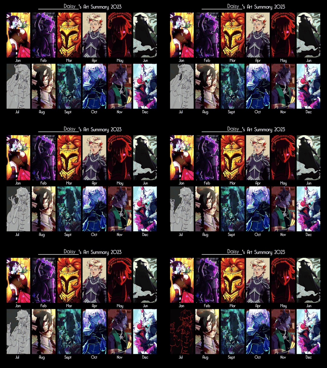
2023 Summary of Art!
This year was full of experimenting and trying new things, and I think it really paid off in the end. I'm getting more comfortable with pixels, I finally have a way of painting I can do reliably, and I feel like I refined my main cel-shaded style a lot! I also feel like I improved on fundamentals just a bit more, with more solidly constructed anatomy (which I want to get even better at in 2024), and shading that actually makes more sense.
I feel like I'm finally getting to a point where I like my art - and a huge part of that is my partner picking up the habit of asking me what I like about a piece whenever I showed him something I made this year. It was super hard when he started, but now I can find at least one, maybe two things that are my favorite. I used to feel really, really neutral to bad about most of my work. I just did it and it was done, and on to the next piece. I knew I was "good" at art, but never really in the way I wanted. Now I'm daring to set my own work as my desktop and phone wallpapers.
I also finished a yearly challenge for the first time ever! Not that I completed every day of it, but I tasked myself with drawing a "Daily Snake" each day - as in Metal Gear, not the creature. It was sort of like those year of Miku challenges, but with Snake that left me room to draw any version of him. It was a fun thing because at the end of the day it ended up being like a little diary of my art, I could tell how I was feeling, whether I had lots of time to draw, all that. I think there was one time when I drew Liquid, there was an ACAB Snake in there, and also a trans one for fun.
Going into 2024 I have three big overarching art goals I want to work towards.
I want to learn and improve my anatomy enough to be able to solidly construct a body in perspective without needing to grab reference. (Not that I'll stop using reference, this is meant to be a goal that forces me to learn even more anatomy to feel confident with it)
I want to push my colors to be a lot wilder and more interesting. Rather than just picking the correct "local" color and working with light, shadow, and gradient maps to tweak colors, I want to be able to make interesting color choices right off the bat.
I want to at least try to start figuring out 'the style' for ttrpg art. (That nice rendered painting style you see in core books!) I'd really LOVE to start working on those projects, but I know most of them shoot for a different art style than I have.
The general plan is to keep doing studies, with the first half of the year being anatomy, the second half being color, and the ttrpg style thing being spread out throughout.
Thank you to everyone who's supported me and hung out on Tumblr! It genuinely means a lot, as this has been my go-to site when I'm down, and the one where I feel most comfortable sharing my art because the platform itself isn't predatory. I hope 2024 brings everyone lots of comfort and joy this year 💕
22 notes
·
View notes
Note
Do you have any coloring tips? I'm trying to get better at coloring but it's hard :/ everything looks so out of place and I lose motivation fast
Of course!
By no means am I an expert on this (I still forget to choose a light source 90% of the time) but here's a few things that I do when I'm colouring something digitally. Remember these are all individual to the way I make art so they may not all be applicable to yours and are simply me explaining how I do colours, not a tutorial for all colouring styles.
Buckle up folks, this one's a long one (sorry in advance!!)
Here goes nothing.
Losing motivation is totally normal and okay, take a break if you need it, maybe send it to some friends for some hyping up (art servers full of other artists are great for this!). Colours ain't gonna look perfect first time you try to do them, I never put down a colour that I like first time, it takes some messing around and asking friends for me to get them down.
So don't feel pressured to get them perfect in the beginning, that rarely happens!
Here's a mini explanation of how I do my colours, hope it will help a little :)
1) GET THOSE BASE COLOURS IN!!
It doesn't matter if they're not exactly what you're going for rn, go with roughly the colour you want and start there! Personally, I do big blotches of colour just to get something down on the page as this helps me want to actually finish it. Then you clean up those edges so they're all in their correct spaces.
I've found that working on a neutral mid-tine grey background helps you see the colours best at the start so all of my 'paper' starts off grey when working digitally.
Here's the example I'm going to be using (this is from the ghost files fanart I'm working on)

2) ADJUST THOSE COLOURS!!
So, now you've got those colours down, you can adjust them to be roughly how you want them to look. If you're unsure on what colours look best together, you can either take some time out, find some YouTube channels and learn a little about colour theory... OR you could grab some colour pallettes from online and have a play around with gradient maps or simply placing the colours in yourself. There's no shame in using resources like those, that's literally what they're there for.
I didn't need to do this on this drawing as I was happy with the colour selection. This is because I chose the background colour and simply adjusted the hue and saturation slightly until I got the colours I wanted. This is my general technique for choosing colours as my work tends to be fairly similarly coloured (browns, oranges, reds, yellows with hints of purple)
3) ✨SHADING✨
Right, well done! You've got your base colours in.
...but oh god, what now?? They look so flat and lifeless, what shall you do?!
This, my friend, is where shading comes in. It's both a way of telling the viewers where the light and shadows are, can change the mood of the drawing, can change what we feel about a character or it can just look real pretty but shading and lighting does all sorts of fun things to a drawing.
If your style is more simple and doesn't require shading/has minimal shading: apply this tip to any shading you do have and don't forget the importance of rim lighting in simpler styles.
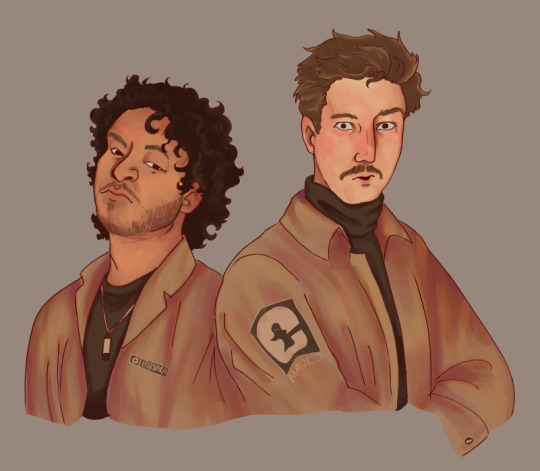
For shading both skin and clothes, I use the original colour, shift it down into a darker shade and on the colour wheel I shift it down too (eg. shading green with blue, red with purple) sometimes you can shift that even further to create similar shading to the one above, where I shaded orange/brown with pinks/purple's.
The principle is the same with highlights but like,,, opposite. Shift everything up, shade browns with yellows, blues with greens, etc.
SIDENOTE ON HOW I COLOUR SKIN:
Okay so, these next two paragraphs are based entirely from what I've learnt during studies and aren't rules, just simply how I do it.
For lighter skin tones, I tend to start from one of the lightest colours and shade darker, like you would if you were working with something like watercolours. This allows you to build up shadows in areas of darkness. Once you've done the shadows, you can then go in and add highlights and lighter sections where necessary.
For darker skin tones, I tend to start at one of the darkest values, as dark skin tends to reflect light differently to light skin. Then I add lighter shades in sections that the light would reflect. You can add shadows too, I tend to add them if the drawing still feels flat after doing the highlights.
3) OVERLAY + MULTIPLY LAYERS ARE YOUR BEST FRIEND
These things are literally lifesavers for me, I love an overlay layer.
I can't really explain what they actually do so I'm not even gonna try, just play around with them. But using a purple/blue multiply layer and erasing where the light hits, that makes the illusion of full shading without the same effort of painting in the shades.
Overlay layers are 100% a 'fuck around and find out' resource, I tend to use red and pink overlay layers as my colours tend to be more desaturated and this helps with brightening them up. However they can also be used to change the genre/mood of the drawing, like this:
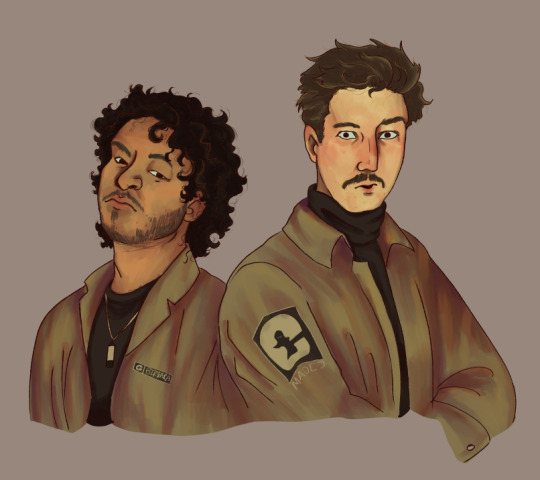
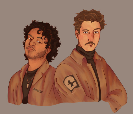
These two drawings are the exact same. There's no difference between them other than an overlay gradient map layer in green or sepia. (These gradient maps are built into clip studio paint, I'm not sure about other programs)
But the whole vibe is completely different. So yeah, fuck around with different colour schemes and overlay layers (the bi flag colours are a great choice for experimenting with overlays as the colours are naturally very harmonious so maybe start there.)
You can also try a noise later for a bit of texture, it's my go-to fix it for any drawing ngl
Uhhhhh, yeah. That was lengthier than I expected, hope it helps even in the slightest. As I said at the top, I am by no means an expert and am still figuring things out myself, so just fuck around and find out.
Bye now!
#artists on tumblr#art#artwork#digital artist#fanart#ghost files#art tutorial#colouring#art tips#deathian answers#digital painting#digital art#colour tutorial
21 notes
·
View notes
Text
mapmaking progress update (distant sobbing noises)
I've spent the past week or so roughing out a new map for the Hinterlands in my free time and it is just... not working lol. Why is this so hard??? It's not like I'm going into it blind - I've spent hours pouring over fantasy maps, considering advice for plausible geography building, trying a variety of configurations... I even know generally where every major location needs to be. I just can't for the life of me form an attachment to any of the land configurations I've tried!!
There are two main issues I'm facing: Firstly, I am way too concerned with making everything feel BIG. But what past Caspar has failed to consider is that if everything is drawn BIG, then there's zero size contrast, leading every location to appear... middling. Decisions on what should be smaller and what should be larger are very difficult to make, though, let me tell you. These recent sketches are messy but you can see how I have attempted to address this problem, even though I still can't decide which areas should be smaller. Unrelated, I also really gotta figure out how to make the giant crags surrounding Parthesa flow better with the rest of the land lol.
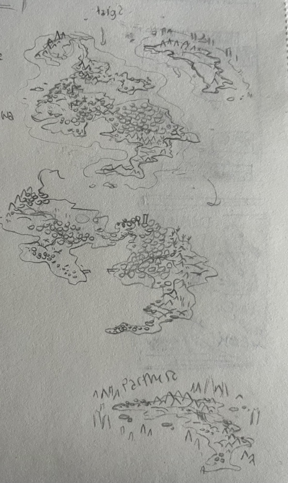

The second issue I'm working on (attempted fix above) has to do with biome placement. In my old maps, which are at the end of this post, I would dedicate entire, giant sections of the land to exactly one biome and almost never included the same biome twice on the map. I pretty much had dedicated zones for each type of thing - "the swamp area", "the mountain area", "the forest area", "the roofed forest area", etc. I want to get out of that habit for the sake of more interesting landscapes. I would much prefer to place many small, diverse wetlands than one single swamp that the characters must travel the entire continent to get to. Which yes, was the original idea.
As with most aspects of worldbuilding, I'm more concerned with what looks nice than 100% realism, and that's mostly because exploring the middle ground of plausibility is one of the most fun challenges of worldbuilding for me. The Hinterlands' climate is mostly dry, with a gradient that works its way from snowy cold (or it will, once I find a place to put Voklor) to dry cold taiga & grassland to temperate forest to warm desert - and that's it. In my mind this is because the land mass is all situated closer to the northern hemisphere of the planet, not smack dab in the middle. Does that make much sense, realistically? I don't know. But I want an excuse to be rid of tropical areas (I hate making them, sorry) and I don't think most people would give enough of a shit to think too hard about that explanation.
This is the last map I made of the Hinterlands (previously named Ha'vesta). It's defunct now because too much of it is based on outdated lore. However, I really enjoy the shape of it - when it comes to maps I really love on-the-nose fantasy geographies that are shaped like something cool - a dragon, for instance. I'm purposefully trying to avoid that trope right now because I think a naturalist aesthetic works better for the story, but I also think that's why it's been so difficult for me to grow an attachment to the new ideas I've been working on. Guess I'll just keep working at it. Hopefully the next time I post about a map it will be because it's DONE and I can introduce Nelka and have them explain it to everybody.

The only thing I'm perfectly happy about regarding my map progress is that I've finally graduated out of my "island continent" phase (;一_一). These old maps make me cringe, so hard, for so many different reasons.


2 notes
·
View notes
Note
Just as your name implies I swear I've seen you before… in my mutuals blogs… on my dashboard... Since when, my Swiss cheese brain cannot tell me…. Am Subscribed now.
And hey thought I'd talk to you about that real interesting headcanon of yours where there's a species of demon that can divide like mitochondria and the one where same-sex individuals can reproduce with each other as well… do you have any details on those species you would like to share? Would you like me to CREATE some lore for species like that? See I am currently collecting headcanons of people on the nnt fandom on the demons and their realm to make an idea-collaborative demon realm lore + map project, and I thought, maybe you'd like to see me try to bring a headcanon of yours in there too. I'm working not just with regions and landmarks but with creatures too and I've got plenty of space left for mysterious demon civilizations... So far we’ve got a bone mountain, gradient cursed forest, pomegranate lake, volcanic gardens, unnatural maze biome, physics-defying lake, and many more :D I’m so excited for the fandom to see the finished product honestly. If it sounds like something you’d have fun with feel free to dm me about that, or anything!
HII, YPU ARE MY FIRST ASK 🙀💗💗💗 HUUUGS
And yes as my name implies I do back flips on every blog hsjkd, so glad we develop a universal transcendental mental state of connection (mutuals)
AND OFFFFCCC, I will love to be part of this demon lore, I have seen you and some of mutuals do it and it's so cooool, demons deserve more, I will dm you later with a more detailing HC, huuuugs 🫂
(btw I live in the cursed forest 🤓☝️ love that one)
#i just did a backflip when i saw this#and i just wake up#arepita ask#nanatsu no taizai#nnt#the seven deadly sins#7ds
6 notes
·
View notes
Note
Hey, absolutely LOVE your art and I enjoy seeing your comics! Small question, how long does it take for you to make one page? And what is your process?
thank you!!!
THANK U!!!!!!!
it's a decidedly long-ish process and i'M KIND OF WONDERING HOW I MANAGED TO CHURN OUT TWO PER WEEK FOR A WHILE... (it was bad for my mental health i think is how). some artists can do like THREE OR EVEN FOUR PER WEEK!! but i am slow and so it takes me like 4-5 days to make one dfkjhgfdkjg
anyway first step is thumbnailing! that's when you make a tiny comic page and map out where you will have the panels, and what you want in them. also very good to figure out where your text bubbles will be at this stage.
NEXT!! transferring the thumbnail to a regular comic canvas! i like to thumbnail on paper with pencil because i eRASE STUFF A LOT (paneling is hard and i'm still learning), so i take a picture of it and then paste it onto the canvas >w>
NEXT!!! rough sketch phase. the picture quality tends to be jank as hell b/c i'm lazy & refuse to take more than one picture EVEN IF IT'S BLURRY, so i go over everything with a VERY QUICK SKETCH to lay out the same ideas. then I go in with a vector tool to make the panels!!
NEXT!!! Sometimes skipped depending on the page, is any 3D background work if I feel like i need it! which is usually always, because my perspective skills are uh. LACKING. (aND YES IT'LL TAKE LONGER TO LEARN PROPERLY IF I RELY ON 3D TOOLS BUT I DON'T CARE!! I JUST WANT TO TELL STORIES RIGHT NOW!)
this also involves MAKING the 3-d structure which i try to do if i know the scene i want to make is in a moderately complex looking area. it takes.......... so long............................ 3D modelling is hard....
NEXT!! Actual Sketch. This is me figuring out what the characters will look like Proper instead of throwing vague blobs on the page. i have to turn my brain on a higher setting for this part so it's usually a harder step for me. i also like to finish the background lineart by this stage.
NEXT!!! THE DREADED PEOPLE LINEART........ hardest stage. VERY BORING. lack the attention span for this to not be a horrific slog. HAVE TO HAVE SOME FORM OF ENTERTAINING NOISE ON OR ELSE CAN'T COMPLETE.
NEXT!! FLAT COLORS AND SHADOWS! self explanatory! i usually do the background first since it's cooler to watch characters come to life on an already completed BG.
NEXT!!!! Text stuff. Drawing out proper text bubbles, adding in text, changing the colors of the bubbles to match the characters.. this is also where i attempt to add SFX if there are any, and this is extremely difficult for me for whatever reason. STILL LEARNING LMAO.. i also blur stuff if i'm trying to show like... depth at this stage. like making one character blurry so you know they're closer to the "camera" so to speak
NEXT!!!!!!! AND FINALLY!!!! THE BEST PART!!!! Gradients. MAKES EVERYTHING BETTER. FUN TO APPLY. PULLS THE ENTIRE PAGE TOGETHER.
....................hm that's actually quite an involved & difficult process. i am only now realizing that
HM.
62 notes
·
View notes
Text
I was getting some questions about my process in procreate, so I just put this together. More under the cut!
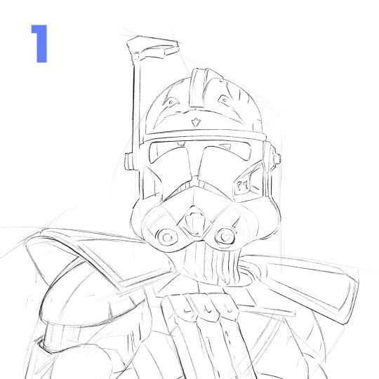
1. Start with a rough sketch! It just has to be clear enough, so that when I start painting, I know where things are supposed to go. I use references throughout the whole process, but especially now! If I get something wrong here, it'll be a pain to fix later after I start adding in values and color and all the fun details.
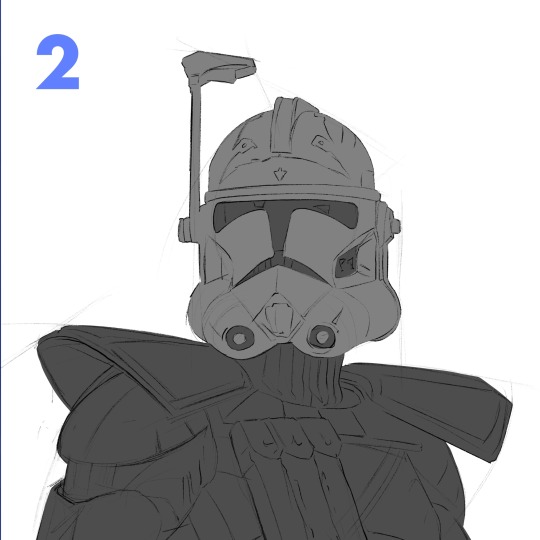
2. I make 2 layers, one for the body and one for the helmet, just painting in the basic shapes. Then, I make 2 clipping mask layers, one for each of those. I could have more, but for a painting like this, it's not really necessary.
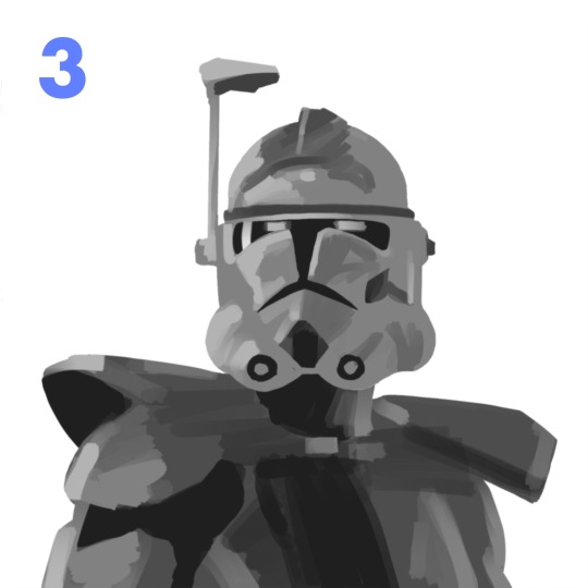
3. I start to lay in some values on the clipping mask layers with the flat brush. For this particular painting, I wasn't sure what colors I wanted yet, so I stuck to greyscale. Whenever you're making anything, whether it's with graphite or an apple pencil, the pressure you use is super important. Constantly pressing really hard gives you less control over your stroke. Another helpful thing to remember is painting big to small. At this point, I'm not thinking about the little scratches on his armor (at least I shouldn't be). Right now, I'm using a bigger size for my brush and later I can zoom in with a smaller one.
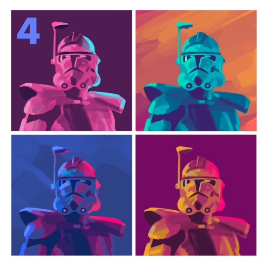
4. Then I made a copy of my work so far and duplicated it a couple times in a new canvas. I played around with the gradient map tool and color drop to try to quickly find something that stands out! Something I learned just recently is that you can adjust the reach a color drop has. Super helpful!
5. After finding a palette I liked, I go back to my first canvas and used the same method again to get those colors. This is a bit convoluted and only cause I don't like to work without having a clear direction in mind. If I know my colors right away, I'd probably skip the greyscale and color comps, and go straight to this step.
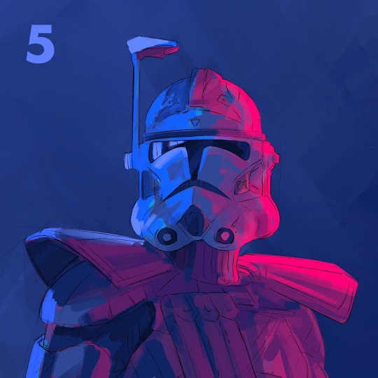
6. This is where the fun begins! Still looking at my references, I begin to render the form. I use a combination of the flat brush and smudge tool to build in the values. Once the basic values are there, I started to give the armor some texture. I used the dry brush and oil brush to add nicks and scratches. I also used some from the comics MaxPack set.
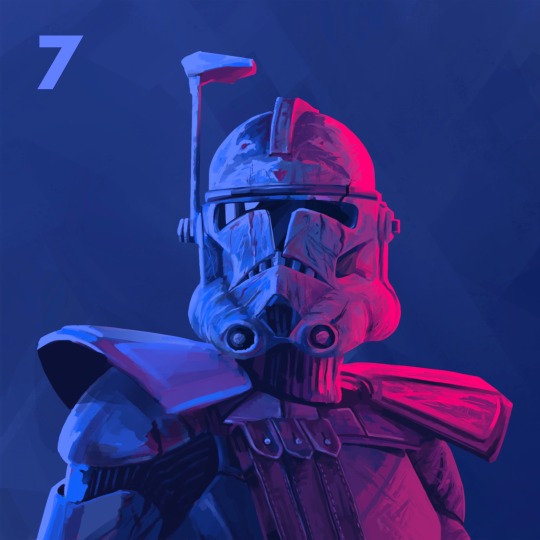
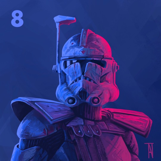
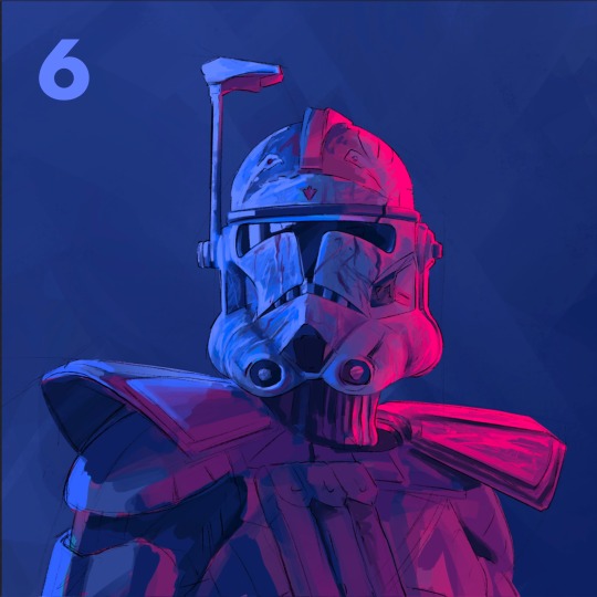
7. After finishing the helmet, I start to focus more on the body, using the same technique. I use the flat brush to define the large shadows on the pockets and bring it to a teeny size to add the stitches. I try to always keep the basic light logic principles in mind.
8. Last step is to take a break! I've been looking at this thing for too long, and if there's anything wrong I can't tell. I come back to look at it later and give itty bitty finishing touches. Maybe a highlight gets too bright, or an edge isn't as defined as I would like. Then I call it done!
Thanks for reading! I want to say I'm definitely still learning about painting digitally and I'm no professional! This isn't the best way to work, but it's my method. Hopefully this rambling mess was helpful to some of you!! If there's any questions I can do my best to answer :)
104 notes
·
View notes