#but yeah this time i opened a scar hermitcraft video and then was possessed with the desire to make this
Explore tagged Tumblr posts
Visit Tumblr Blog
Explore Tumblr blogs with no restrictions, modern design and the best experience.
Last Seen Tumblr Blogs


Fun Fact
When “GIF” was named word of the year in 2012, Oxford Dictionaries U.S.A. credited Tumblr for pushing the word.
Photo
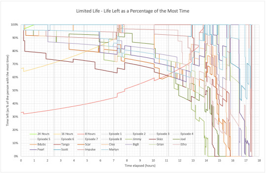
I’m back with another Limited Life graph! This time I woke up in a cold sweat the other night with a desperate desire to see what a graph based on percentages is like, and here it is! Here, I used the data from the og graphs (here) but divided each data point by the maximum time someone had at that exact moment, in order to work out what everyone’s life left was as a percentage of the maximum.
More details, including a close up of the right hand side and the full data tables, below!
The green, yellow, and red lines going diagonally upwards represent where the 24, 16, and 8 hour marks are, but still calculated as the same percentages. So you can see that all the lines above the yellow diagonal are green names, and below the yellow diagonal and above the red are yellow names, and below the red are red names. The small blip of the 24 hour green line just highlights that time Scott and Bdubs boogeykilled quickly enough to have over 24 hours briefly.
There’s a lot of Scott at the top (the blue 100% line), but I do like that he dropped below the top a few times, so you can see various non-Skizz TIES members up there, as well as Pearl briefly at the end. I also like the way the lines curve down as a result of the percentage thing, it’s cool.
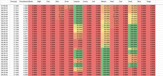
Below is a close up of Session 6-8, aka the tangle at the right hand side of the main graph:
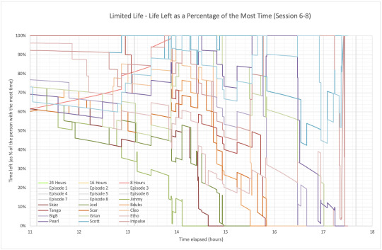
There’s honestly not much more for me to say, other than “behold: the tangle!”, but tbh I do like the mess of lines. I also like the way that, because as time goes on the person with the most time also loses time, so when Jimmy loses his final hours, it looks like a much smaller loss than Pearl and Etho later trading time with each other.
It’s also just cool to compare this with the original graph, where everything is squished in together, but here everything is spread out by design to take up the most space.
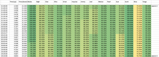
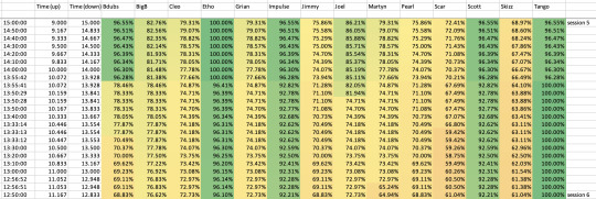
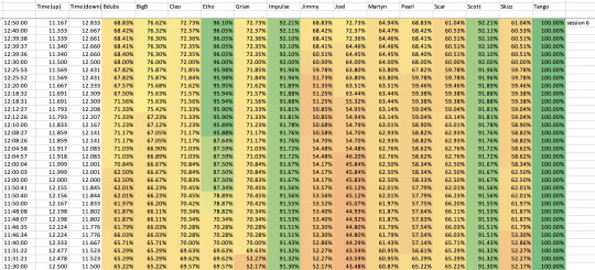
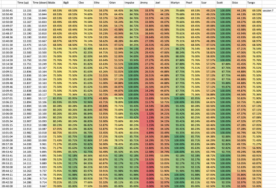
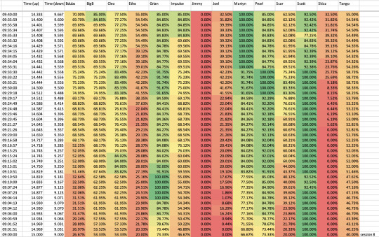
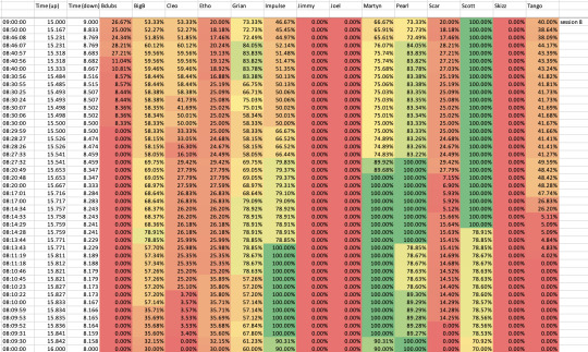
Next will be the screenshot of the data itself: this time the numbers aren’t coloured based on life colour, but instead at a simple scale of percentages. This helps highlight who is the person with the most time at a given moment, as well as the reds as they get close to death.
Session 1 data:
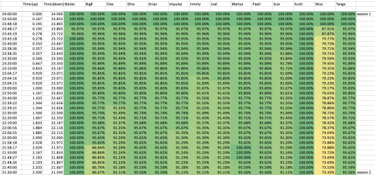
Session 2 data:
Session 3 data:
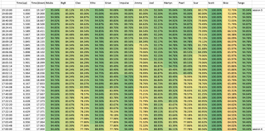
Session 4 data:
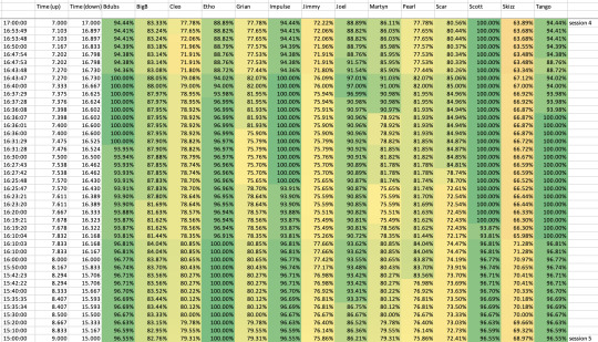
Session 5 data:
Session 6 data (first 1h20m):
Session 6 data (final 40min):
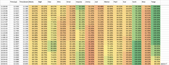
Session 7 data (first 1h10m):
Session 7 data (final 40min)
Session 8 data (first hour):
Session 8 data (second hour):
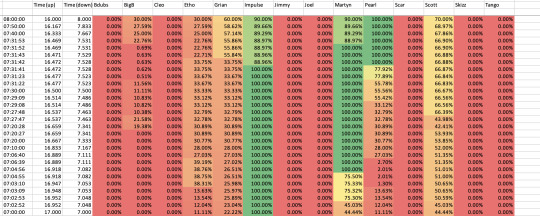
Session 8 data (final 30min):
Hope you enjoyed!
#limited life smp#traffic life smp#24lsmp#limlife#this time i actually started making this an hour ago and im ready to post now#i admit the last few graphs of the original series i did i made them and they were ready to go several days before i got around to posting#my spreadsheets#but yeah this time i opened a scar hermitcraft video and then was possessed with the desire to make this#and now its nearing midnight so i guess i still have a scar video to watch tomorrow lmao
6 notes
·
View notes