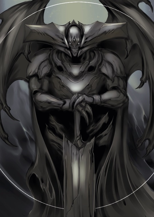
#but this was a way of studying the paint/texture stuff rather than character design etc
Explore tagged Tumblr posts
Visit Tumblr Blog
Explore Tumblr blogs with no restrictions, modern design and the best experience.
Last Seen Tumblr Blogs


Fun Fact
Tumblr has 16.74 million mobile monthly users in the US.
Text

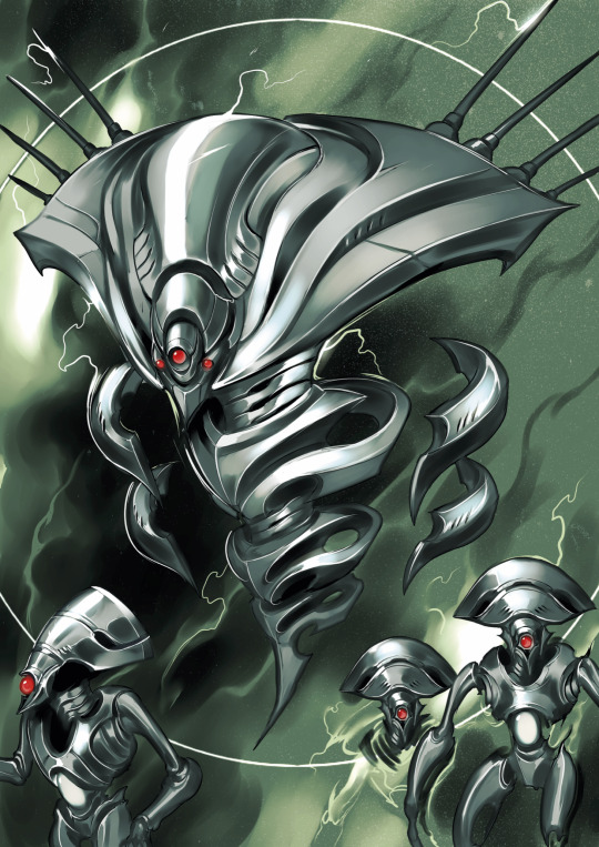
Arcane style study because of course I want to learn how to paint like this
Original image:

#heavily referenced in terms of (most) of the outlines#but this was a way of studying the paint/texture stuff rather than character design etc#ill work on that by drawing some ocs in the style. then painting them in the same way as this#so that in effect is another study abdjhdjd#<- ill struggle w/ that one but i really wanna paint more. i never do. its a long process but the art looks so pretty when its done#art#arcane#study#art study#style study#arcane league of legends#jinx#jinx arcane#jinx league of legends#artshit
24 notes
·
View notes
Note
Hey I can't find this in your FAQ so sorry if it's been asked before! Your traditional art is so stunning and vibrant, would you happen to have any brand recommendations for people trying to get into painting? Maybe specific gouche paint, brushes, papers etc. Thank you so much and have a nice day!
no one has ever asked me this before because this is like the first time ive started putting traditional art on my blog! LOL umm to be honest I’m very far from pro on this front, most of my knowledge comes from a handful of classes I didn’t pay a lot of attention to and lots of youtube videos but here’s my recommendations:
Paint

A lot of my paints are winsor newton designer’s gouache because this is what my teachers made me buy when I was a freshman at art school LOL. it’s definitely kind of pricey, I think it’s like $10.99 for a tube which I was NOT a fan of as a college student and is still not my favorite thing now. But they’re overall worth the price if you really want solid, high quality opaque paints. Though I’ve heard their student grade winton paints are decent as well?
I’ve heard less good things about brands like reeves and artist loft... but I think turner is alright? m.graham is supposedly great.
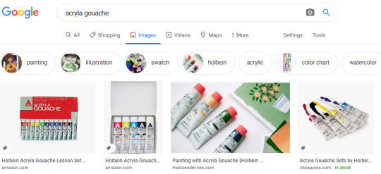
I also bought a set of holbein acryla gouache when it was discounted on amazon a while ago and have found it very solid. One thing you have to know about acryla gouache is that it uses a binder more like acrylic paint (hence the name acryla). Paints are made out of pigment + binder and most gouache is essentially watercolor but with extra pigment/chalk to make it opaque - the binder is water soluble so these paints can be reactivated with water. Acryla gouache is NOT water soluble when dry and it dries pretty fast so it’s overall less flexible. But other than that you can pretty much treat it like any other gouache and I find they keep a little better too, less likely to get gunky or stiff.
All paint brands have a handful of starter packs which are slightly discounted but if you want to build your own starting palette I’d say get a warm and cool tint of all the primaries, get a lot of white (working with gouache somehow involves a lot of mixing with white lol), and get a brown, maybe like burnt sienna or raw umber for underpaintings. No need to get a black, mixing darks builds character, looks better, and having one out of the tube can become a crutch. If you find a white watercolor paint tube that’s cheaper you can buy that instead of a gouache white. Again, they have pretty much the same make-up. And white paints are generally opaque enough that the composition between gouache/watercolor shouldn’t matter too much.
I’ve never used a block tray of gouache. Like those paints that come in little blocks in a tray? I know there's a bunch out there but I’ve never used them and I don’t know anyone else who does so I have no opinion on them.
Brushes
I’ve been kind of exploring this myself. I recently bought a cheap set of flat brushes off amazon LOL and I like them a lot?
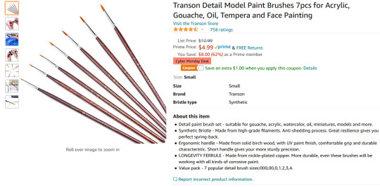
Theyre probably not The Best or anything but I found flat brushes suit gouache plein air painting really well because its suits the kind of color blocking shapes I want to make. Also these had the right handle length to fit in my painting bag. That’s like the main reason I chose them tbh.
Honestly a lot of my art supplies philosophy is “give it a whirl with whatever you have lying around and when it feels like you're missing something specific keep an eye out for when that stuff goes on sale”
Paper
GOTTA BE HONEST I’m using cheapo paper. Because I’m making these paintings half for study and half to give my parents something to hang in the living room.
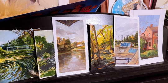
You can actually see some of them curling in on themselves here lol. If you’ve seen the sketchbook I’m holding in any of my pics of paintings it’s one of the canson mixed media books.

and its FINE... I wouldn’t necessarily recommend it lol.. I like that the texture is very fine but it doesn’t hold a lot of water and definitely distorts. Also I keep ripping off the surface with painters tape but that might just be on me. Oh buy artist tape. Just because its so satisfying to have clean edges.
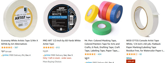
I’m using painters tape instead of artist tape because I found it in the basement but if youre buying supplies buy artist tape because it’ll be kinder to your paper.
SPEAKING OF PAPER.
I guess anything heavyweight for watercolor/mixed media will be fine? some people like a lot of texture but if you’re painting small you might want to avoid it and pick hot press over cold press. Honestly I feel like a lot of this is going to depend on what your specific needs are.. how big do you want the paper to be.. do you want a sketchbook or would you rather carry around loose paper... etc. Maybe go to an art store and touch all their paper. I feel like its easier to understand sizes and texture when you’re seeing it physically.
When I go on a trip, I normally bring a softcover heavyweight stillman & birn sketchbook because I tend to obliterate metal spiral books in my bag LOL. Also I don’t rip any pages out of my travel sketchbooks so I don’t need perforation or anything. Also they go on sale a lot in the art store I go to haha. I havent used gouache extensively in it but it takes inkwash/maker pretty well.

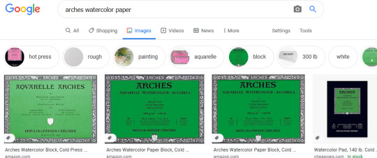
On the higher end, I personally haven’t used it that much but my friends who do traditional illustration professionally swear by arches watercolor paper. It comes in lots of different sizes.
Whatever you use, if you really want it to lie flat you’re gonna want to soak and stretch it on a board but I don’t bother with that because I am lazy.
Palette
You didn’t ask about palette but I’m taking the opportunity to be a shill because I personally use a sta-wet palette and I LOVE it.

One of the biggest frustrations about gouache for me was how quickly it dries after it leaves the tube. And even if you can reawaken it with water its not quite the same? and consistency is SO important when it comes to applying gouache so I don’t want to be over-watering my paint.. ugh. Anyways, I don’t have to worry about that with the sta-wet palette and really its been a game changer for me. sta-wet is a brand name but there are a bunch of other wet palettes not by masterson that I’m sure are just as good. I mean, it’s just a box with a sponge basically, that can’t be hard to replicate.
The only thing - and I personally have not had this issue but I have friends who have - is that if you leave it wet for too long it could grow mold? or a mouldy smell? Just wash your palette with soap and don’t leave it for weeks on end and it should be fine.
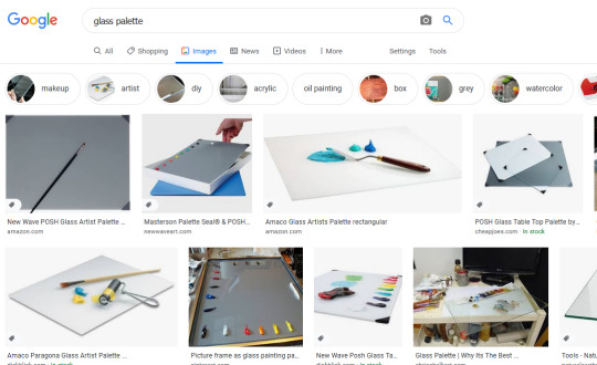
If you’re not feeling a palette that’s always moist, the best palette I used in school was a simple glass palette. you can buy one I guess but it’s so easy to DIY, I think the way we did it in school is getting a piece of glass and mdf from the hardware store cut the same size and then duct taped them together on the sides so it wouldn’t be sharp.
costs like nothing.
what else...get a palette knife if you like to mix paints? and like to save paints... mixing with the brush means you lose paint in your brush in the mixing process so a knife is a good way to maximize that process. I don’t use it much but sometime if I have to mix a lot of one color I’ll pull it out of my bag.
I don’t know anything about easels, I sit on the dirty ground like a gremlin when I paint.
Ok yeah that’s all the supplies tips I have. hope some of it was helpful! always try to save money with art supplies, I think. Especially if you’re just starting out - it’s less stressful to use cheap supplies too lol. Good luck! Happy painting!
89 notes
·
View notes
Text
“LET US SPEAK OF THE TERRIBLE BEAUTY OF BECOMING OURSELVES”
Illustrating Destiny’s Books of Sorrow with community artist Francine Bridge
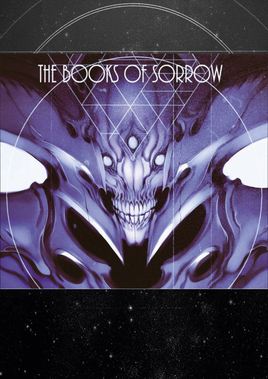
One of the most impressive Destiny fan-projects we’ve seen to date has been Francine Bridge’s incredible illustrated rendering of Destiny’s Books of Sorrow. Francine, otherwise known as Witnesstheabsurd, agreed to take some time to answer a few of our questions about her work, its impetus, and what the project means to her.
Written by Seth Dickinson, the Books of Sorrow tell the story of the Hive - and by extension Oryx and his siblings - and give deep, rich background to one of the game’s largest and most important conflicts. Lyric and evocative, the books offer insight into both the Hive themselves and the universe they inhabit, and remain Destiny’s most impressive and most in-depth piece of lore-building. For those who may have joined the community in Destiny 2, or never had the chance to read the original books, they can be read in their entirety here. Francine’s project shows the same impressive attention to detail, and most importantly, the same level of empathy as the works that inspired it. We’re ecstatic to be able to share this conversation with the Destiny community, and we hope you’ll take the time to admire the full project.
You can find Francine on Artstation, as well as on Twitter and Tumblr.
Written in Light: To get things started, tell us a bit about yourself. What you're studying, what field you work in, what you like to do for fun - give us a brief summary of who you are and what's important to you!
Francine Bridge: HI! I'm Francine, although I'm better known online as Witnesstheabsurd. I work as a freelance illustrator and concept artist in the UK - you might have seen some of my work in the game Hiveswap or at labels like Killstar. I do album covers, shirt designs, character/monster etc design work for games, comics, private clients. I'm currently in my 4th and final (I took an extra sandwich year to do a supplemental diploma in professional studies) year of my Illustration and Visual Media BA degree in London, after which I'm probably going to look for more permanent studio/contract work rather than the one-off freelance stuff I've been pursuing while I've been in school.
A couple of years ago, prior to starting the degree, I came out as a trans woman, which is probably an important detail, and it's informed a lot of my work. However, my driving impulse has always been monsters - my preoccupation with Destiny started entirely because a friend of mine showed me screencaps of Oryx after the The Taken King release and I was smitten. Pretty much all of the media I consume, the games I play, the art I create is in pursuit of ever greater or more unique creature and monster design, and they're very dear to my heart.
As far as what I do for fun - my day is 90% working at the tablet, but I find time to play some games and build "gunpla" model kits as well as paw through my artbook collection. Almost everything I do is informed by my profession, so I use my hobbies as a means to access and process more referential or inspirational visual material or ��techniques. I only recently started sincerely learning how to actually "paint," rather than just do some basic rendering under lineart, so that's been a major part of my work lately.
WiL: Was there anything in particular about Oryx that really drew you to him? Did Oryx come across as particularly great and/or unique to you, or is there something else that struck you with his character or design?
FB: Well, as I said, I'm transgender. In the ‘pitch’ my friend made to me about Oryx as a character, the most interesting aspect to me was that he's a transgender man (although I'm a trans woman, the experience has some shared parallels obviously).
In media, it's incredibly difficult to find trans characters not wholly defined by that aspect of their identity, or who aren't constantly wallowing in the Misery and Tragedy of being trans. I want trans characters who occupy all roles - villain, hero, supporting and main - and it's rare to find anyone who's more than a token or like, tragedy porn. Oryx super resonated with me because he was this figure who acquired power and immediately transitioned, asserting his identity in a way that couldn't be defied - Oryx's story is very much one about self-definition and the value of existence under your own terms, which are very important concepts to me.
When I decided to start work on illustrating the Books I actually reached out to Seth Dickinson, the author Bungie contracted to write them (and the Cabal Booklet/odd flavour text, by the way) to get some specific questions answered and he was kind enough to respond and was very cooperative and supportive. Among the things I asked about I wanted to know if Oryx was consciously written as transgender character or if it was just a coincidental "weird alien race" flourish. I was very happy to learn Seth had purposefully written Oryx that way, and that he was happy people took strength from it.
It's very novel to have, like, a "trans power fantasy"... a character who acquires absolute power over the self and instantly rewrites the contract between themselves and their body that so many of us spend our entire lives making adjustments to and renegotiating for some measure of peace. It was satisfying, refreshing.
Oryx is super cool to me on multiple visual levels obviously as well, being a mineral-encrusted deep space insect mummy warlord, but that element specifically sets him apart for me, and always will. It's cool to know that a trans character in Destiny can also be a hideous monster from beyond the stars.
WiL: Nice! I've wondered if Oryx was intentionally written to reflect a transgender person. I'm glad to hear a positive answer to that question, and I'm glad you found strength in it!
My next question is, why did you decide to take on this project? I mean, it's very clear that you love Oryx, so that factor is a given, but you mentioned in your original post that this was something you did for your degree. Care to elaborate on that?
FB: So, the structure of my illustration degree is such that while we’re given specific "briefs," such as topics or techniques, the final year gives us significantly more free rein. We're obligated to complete three "projects" and author a thesis over the course of the final year, but the subject matter, material, everything about those projects is our call. The outcomes are judged based solely on technical and professional development rather than adherence to a specific brief.
This left the field wide open for me to kill two birds with one stone and bring in a project I had intended to do anyhow, but hadn't had the time or space for; something that I was sincerely passionate about rather than an edict handed down by a tutor. Illustrating the Books of Sorrow was something i'd wanted to do ever since I first read them back in The Taken King, and I jumped at the chance. In addition, while i've produced and formatted artbooks before (My first published work, The Occult Supergiant Primer, can be found here ), I've been able to recoup the time invested away from client work in sales and funding. The Books are obviously material belonging to Bungie and I can't justify selling copies, digital or otherwise, of my illustrated version, so I had to find some other reason to make this investment of time and unpaid work worthwhile as well as enjoyable.
Being able to use the work produced to further my degree was the perfect "excuse.” That said, I've received so much attention from the Destiny community at large, including commissioned work from several new clients, that it would have easily been worth it regardless.
WiL: Your work definitely deserves the attention, you clearly have a strong sense of design! Would you be willing to tell us a little bit about the process you went through to make the Books of Sorrow? Do you have any early versions or storyboards that you'd like to share? Or did any of the illustrations go through any major changes from start to finish, and would you be willing/able to show us that process and talk a bit about why you made the changes you made?
FB: The greater part of the Books came together incredibly smoothly and naturally, with very little iteration required on specific pieces. The images had been stewing in my mind ever since I read the original verses a few years ago and they were more than ready to be rendered. What did require a lot of research, development and false starts were the designs for the sisters, Savathûn and Xivu Arath. Both of them have yet to appear ingame in any major capacity (although it's looking likely Savathûn is going to be a Year 2 DLC), so it was up to me to create designs for them that:
Satisfied the descriptions appended to them in the verses, as light as they were, and also matched the info Seth gave me
Satisfied my own personal expectations and interpretation
Conformed to the lore and the existing known morphology of the Hive in a way that would make them recognizable to a player with no prior familiarity with the Books
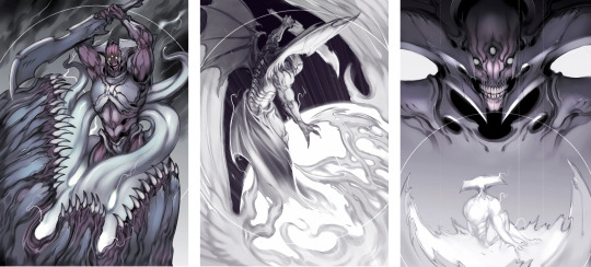
Balancing these principles lead to a lot of internal back and forth - Savathûn was easier because we had already seen her brood in D2 on Titan, so I knew to emphasize ornate crests, bonelike texture and a slightly less mineral, more biological look by comparison to Oryx's brood, the hive we exclusively encountered in D1. She was tough at first but ultimately fell into line with something satisfying for me, which actually drew a lot from the Xenomorph Queen in Aliens.
Xivu Arath was a little trickier because she had to be distinct from Oryx, who kind of already occupies the "big mineral/bone-encrusted bruiser" archetype visually, so I had to take her even further. I spent a lot of time wondering whether she would have any ornamentation like some of the bigger Knights (Alak-Hul comes to mind), given that she represents the "ultimate" Knight morph, but I eventually eschewed all decoration in favour of something reflecting her nature in the narrative: blunt, implacable, spartan. She dispenses with the ritual and hierarchical trappings the other siblings indulge in - notably she decides that all battlefields are her Court, rather than entertaining a court herself, and she tends to default to just brutally bludgeoning whatever stands in her way rather than making an appeal to the Deep or engaging in trickery. I was very satisfied with how she turned out, and the piece featuring her is easily one of my favourites.
WiL: I was going to ask which piece is your favorite! Do you have a Top 3 that you're most proud of?
Is there anything about the Books that you wish were different, or is there something you wish you had the opportunity to draw for this project but couldn't justify including it?
FB: I have a strong tendency to favour whichever the last piece I completed was, because by default I'm always proudest of my most recent work and very rapidly lose favour with pieces even like, a week old. That said, I think overall the strongest piece for me personally would be Oryx slaying Akka, alongside the final Wormfood painting and the Savathun piece, although honorable mentions go to Xivu Arath and Quria, Blade Transform.
I can't say there's anything about the Books specifically I wish was different. The part of me that's purely consuming it as a narrative wishes that they had found Taox, that there had been some confrontation there. I feel like there's a very strong "childhood vengeance" element to the Taox subplot, like when you're put down by an adult for drawing in class and you fantasize about coming back to the school years later as a wildly successful artist and making them admit they were wrong to have stopped you. A key part of that fantasy is recognizing it as a remnant of childhood, this impulse born out of a narrower perspective and inflated self-worth, and realizing you can move past that shit (Although if/when I do become a wildly successful artist there might be a few teachers I'll look up).
Ultimately, I think the arc of the books and what the story is trying to say about distortion of intent and self makes Taox disappearing a much more emotionally resonant and interesting turn. It would be neat if Taox turned up somewhere in-game, and became the focal point of a new Hive offensive. An entire species/culture with such a specific individual grudge is a fascinating concept.
With about a month and a half of time allotted for the project and 50 verses, there was a lot of stuff I had to cut despite how much it hurt - in a complete version I would have wanted a painting for every verse, but specifically I would have liked to draw Akka in full, the Dakaua War Angels, the Harmony/Gift Mast, the Qugu; basically I would have given form to the many species and cultures Seth conjures up with a few phrases and a loose description but still manages to make incredibly evocative.
WiL: Do you think you'll ever return to the project and draw those images, either as standalone pieces or as an update to the PDF you've already made?
FB: An update to the .pdf itself is unlikely. I tend to consider projects released to be complete, and usually by the time I revisit a subject I'm not obligated to work on it will have been a few years at the very least. I tend to have developed my technique and approach enough that new pieces inserted retroactively would look somewhat disjointed in terms of quality and style. The chance of releasing standalone paintings - especially of points of specific interest for me like say, Akka in his entirety, the Dakaua war angels, the Qugu, etc. - is significantly higher. Whether that happens sooner or later depends entirely on what my current workload looks like, and aside from the incredibly generous and supportive response to the project from the larger community the Books are very much a passion project and have to be weighed against, say, contract or school work going forwards.
WiL: That makes sense. What other projects do you have going on right now, if any?
FB: Just this morning I decided on the subject of my final degree project, which I'm also planning to run as my second artbook with an accompanying Kickstarter and print run - something I can actually sell as well as being material that excites me! It's entirely too early to disclose any specific details about it though.
Other than that, I continue to produce odd pieces of fanart in between a regular flow of client work both from private individuals and studios. I guess I can safely say I'll be doing more work on the second Homestuck game after contributing to the first, as well as doing some designs for a music video I was contracted for, and also finishing my thesis for the aforementioned degree.
The key thing, I think, is to keep moving - I get very anxious when I'm spinning my wheels between projects, and the temptation to linger on the threshold a while longer is incredibly strong, especially when there's always the fear your new work will fail to surpass what's come before. Reaching a personal peak like some of the paintings I did for the Books of Sorrow is a double-edged sword, and it can signify both a great accomplishment and a raising of the bar that can be daunting to follow. I'm confident that whatever you see from me next will manage it, though!
WiL: Believe me, after talking with you for a while, I'm confident your next project will meet your expectations. You are a very talented and very ambitious artist, and we can’t wait to see where your career takes you! It’s been a pleasure to talk to you, and we’re looking forward to your next Destiny passion project.
//
This interview has been edited for length and clarity
All images courtesy Francine Bridge
#destiny#destiny the game#bungie's destiny#destiny lore#destinylore#destiny fanlore#destiny fan lore#destiny community#destiny art#destiny fan art#destiny fanar#destiny the zine#written in light#unknownkadath#witnesstheabsurd#the hive#destiny hive#oryx#destiny oryx#xivu arath#savathun#the books of sorrow#the taken king#destiny 2#monster art#monster artists#sci fi monsters#sci fi art#sci fi artists#artist interview
546 notes
·
View notes
Text
AMA Transcript: Simple Melody
For our final AMA of Resbang 2017, @alliope, @bbbutterfingers & @daciafu stopped in to answer questions about their Resbang, Simple Melody! Here’s some of what went down:
Q: My first question for Allie is what inspired you to do this AU?
Allie: Well I've generally had the idea for an Over the Garden Wall AU for a while, not necessarily for SE, but as the first check-ins deadline was approaching I ended up rewatching bits of Over the Garden Wall and it just kinda clicked? Mainly I think it came from Crona's betrayal and Beatrice's betrayal and everything fell into place from there. I thought the eerie atmospheres would work well together! So I ended up scrapping my previous idea and wrote 3k plus a summary like three days before the first check-ins, rip.
Q: For butter/dacia, what went into how you decided which scene(s) to art?
butterfingers: HM well there was some chitchat when we started about what kind of work we wanted to do and I said that I loved the Boom comics covers, and then I shouted WHAT IF I MADE COMIC BOOK COVERS! and I think Dacia went WHAT IF I DID BACKGROUNDS and I guess we just approached it as if we were doing something comic-y haha!
Allie: You two were the power duo.
daciafu: I've always been in love with the style of the backgrounds of OTGW since that's where all those cozy and spooky feelings of fall and the Unknown really shine and I'm honestly HORRIBLE at designing backgrounds so I wanted to take the challenge and push myself to get better! Mimicking other people's styles really helps me break down how they make their choices and teaches me how to make things look Decent so I was super hyped to pick up the OTGW style! And then when Butters and I were trying to figure out What Do and she said she wanted to tackle covers, I decided to do background-heavy scenes. 😊
Q: What is generally your guys’ process (writing for Allie and arting for butters and dacia)?
Allie: Well, I wrote in little scenes, like I would get an idea for a scene and just go for it, the fic wasn't at all coherent until maybe a few days before posting. This actually posed a problem since linking scenes took longer than I thought it would. Because I had most of my scenes written, I thought I had more finished than I really did. By the end of Resbang, I had 56k written but only 20k remotely post-able. I'm a super obsessive planner though, so my whole fic was outlined in detail early on, which was nice cause I knew what I was doing lol
butterfingers: I loved going through Allie's notes, I was always excited to see how they'd connect the dots! My art process is as follows: scribble something, put it aside, look at it a lot throughout the day with the thought that maybe I can surprise myself into seeing something new, find something I hate, fix it, rinse and repeat. For this project I actually... have a friend who works with Boom Comics and she was able to hook me up with a nice little gallery of illustrations for the OTGW comic so I got to go through and put together my mood board for it 😊
daciafu: I read over the gloriousness that was Allie's draft and immediately picked out some neat scenes or wanted to reimagine the classic OTWG ones. I spent a lot of time studying first! Looking at the art books, and poring over the show’s scenes and kind of getting a feel for the color palettes, textures and compositions. Then I watched a tutorial on Youtube where someone just deadass uploaded their painting process on a piece of official art that made it into the show. So that was EXTREMELY helpful to watch the way they painted back-to-front and kind of blended the planes without like, losing depth?? The internet is so, so wonderful. And then I got to work! Started with a soft brush for lineart so it wouldn't be too prevalent, moved onto base colors, then shading, and then really trying to establish textures and make the atmosphere Just Right(tm).
butterfingers: Genius!! Oh damn that sounds like such great advice vis à vis backgrounds. /takes notes
Q: You sound like the dream art partner Allie, I weep for my artists and my last minute HERE IS 10K I JUST TYPED UP BC IM A MESS.
Allie: Ahh geez, these two were the dream partners honestly, like I'm so glad they could gather stuff from my notes, cause I've always got everything together in my head, but then it gets out there and it's a mess, these two deserve all the love.
butterfingers: There was one thing I regret that I didn't have the chance to draw and it was like a throwaway line somewhere in your notes about Maka presenting Soul with a praying mantis and him freaking out. I resonated with that so hard hahaha.
Q: What was the hardest scene for you to write?
Allie: The hardest scene to write that's actually posted was anything with Justin really, I don't get his character and it was tough to write him. There were a few scenes that were hard to write because I rushed them, but I wouldn't say they were genuinely difficult scenes, I just gotta rewrite 'em! But overall the ending scene I'm still struggling to write and there's a dream scene that occurs which has been difficult to write just for making it dream-like enough?
Q: And what was the hardest to art? :o
butterfingers: I had a hard time with Maka's expressions. I had many scribbles designing a Ragnarok lantern, too, but it was very fun!!
Allie: Your design for the Ragnarok lantern was so good, I still cry over it.
butterfingers: Ahaha thank you! He was very Calcifer inspired ;)
daciafu: I struggled quite a bit with the first one I painted, just because it was all so new to me. I had to base color 3 different times because the soft lineart bothered me if something extended too far, or there was white background peeking through. And then reimagining the texture in the leaves and the ground to try to separate the planes there but also wanting them to be cohesive was a bit of a headache. If I had to go back and do that one over again I think I'd be more prepared to deal with the foliage lmao.
butterfingers: Your textures were very excellent, that was a quality I struggled with as well!
daciafu: The first one I painted was the Golden Light scene where Maka and Soul are leaving the woods and entering the fields.
butterfingers: Trees r hard.
Allie: They all came out so incredible though, I'm in awe of how you were able to create those leaves.
daciafu: Omg ;;;;; At the same time trees are so organic and flowy and the chances of getting them wrong are pretty slim considering they can get janked as hell lol they're super fun to just zone out to. "I’ll just put a happy little leaf here, ooh and how’s about another one right next to it. They can be happy friends. Oh look, the squad showed up!!" Channeling my inner Bob Ross... but yeah you can just do whatever with them and they somehow come together.
Q: Daciafu how do u.....background, like you did so well and all I hear from art friends is various levels of pterodactyl screeching when the word background is mentioned.
daciafu: I heavily based the Leafing the Forest scene and the church scene after stills from the show so I don't get composition points there, but I built the pumpkin fields just based off of the environment’s design elements. I really wanted to push the depth of that scene but also give it that same never-ending quality to it, and I'm super happy with the results. Another note is that I omitted the characters entirely while building the backgrounds. Since I'm usually a pretty character-heavy artist, I wanted to tackle it like I was preparing the scene for an animator later. And then once they were done, I added in our sweet kids. Doing it that way first really helped to cement the characters in the space rather than my usual "character is done, how can I put them in an interesting physical space?" struggle lmao.
Q: Did you guys feel like your writing/arting changed at all or that you learned anything/picked up new skills/honed old ones etc. etc. during Resbang?
Allie: Gosh yeah, it changed a lot. In hindsight a bad idea, but this was the first fic I'd ever written with intention of posting and the longest piece I'd ever written. Before this I had written very little and my longest piece was maybe 10k. Throughout Resbang I've learned most of everything from the ground up, it's taught me a lot about my limits, how I work and writing in general. I've definitely improved a lot from the experience!
butterfingers: Let me tell you all about the airbrush tool that I discovered during Resbang. Amazing. Incredible.
daciafu: I learned how to paint backgrounds!!! Which is something I've always wanted to get better at. And I got super comfortable in Clip Studio (I'd just gotten it) as well as using texture brushes, so overall it was a very helpful and wonderful experience as a Resbang participant and as an arteest.
Q: Oh that reminds me butters, what program do you use?
butterfingers: Paint Tool SAI for the most part, and then Photoshop for color correction, borders, and, like, finesse things! :)
Q: Did you guys listen to any music that inspired you or helped you create?
Allie: Ah, yeah! I had a playlist actually! https://www.youtube.com/playlist?list=PLjTCaFkFU6rkD1edJwCZmHvJiUwlSUeGZ
If you want I can explain some bits of it? I use music a lot when writing aha. I like to associate certain songs with characters and character relationships, so most of the songs are connected to a particular part of the story. The Monroe Transfer, Wayfaring Stranger, and Mountains were all more general atmosphere stuff. Blame was very much related to Maka, which may not be apparent now, but yeah. Ragnarok I actually connected a lot with Willow Tree March. Soul was probably closest with A Lady. Crona had a lot of songs, but Neptune was most specific to them, as was probably Ghost Towns. Some character relationships I associated with certain songs, Crona-Ragnarok and Soul-Maka were both pretty connected to Always Gold, especially that dang last line "there were holes in you, the kind that I could not mend" oh man. Crona-Maka was definitely We Could Be Friends, Bloom, and Spell. Meet Me in The Woods I thought was a pretty good group song! Those are just some general bits of my thinking with the music aha.
daciafu: Definitely checked out Allie's dope playlist. For most of my working time, tho, I was either listening to TAZ: Commitment or MBMBaM oddly enough lol. I will forever think of Justin's uproarious laughter whenever I look at them lmao.
Q: Were any of the relationships difficult to characterize?
Allie: Mmm this may sound weird but early Maka-Crona was weird for me, cause they were kinda at that point where they want to (or at least Maka wants to) like each other, but they don’t like or trust each other at all and it's a weird spot for them. I'm used to writing them as at least interested by one another, if not enemies or already fond of one another, so this felt like a very odd place to start with them.
Q: Do you guys have future plans for writing/drawing? Aside from polishing and posting the rest of the fic!
Allie: I have,,, too many plans,, I need less plans,, someone please take them away from me, I can't be trusted with them,,,, I do want to do a sequel for this when I get it finished, playing on the detail about crows memory lasting five years so. Beyond that I have a SoMa fic to finish for the prompt challenge!! I'm working on a gift for Crescentcrona, which is a fantasy Kirona fic called Eat The Rich. I have polyam week fics that I'm cleaning up, I think my favorite so far is a Azusa/Naigus/Sid/Mifune one for Through The Seasons. And God I have so many CroMa fics I want to write, I gotta fill the AO3 tag. I think the biggest one right now is a wings-related soulmates au that I've been working on on the side since October I think?
daciafu: Yo there's one scene that I'm like sUPER hyped to do if Allie does the sequel because I already know exactly how I wanna draw it but I wasn't able to fit that in near the end, and it didn't end up in the first part. But there are a couple of other scenes Allie and I workshopped that would be super fun to do and I would love to draw them. Other than that, my drawing plans are pretty much working on commissions as they come in. Surprisingly my queue has been maxed out and I just got a full time job so of course now I'm like.... hm.... I'll get 'em done eventually!!
----
That’s the end of the AMAs for the 2017 season! Thanks again for reading along with us, and see you next year! :)
7 notes
·
View notes
Text
FEB
In February there has been an increase in productivity and focus compared with last month. Unfortunately, there still isn’t a lot to show yet though, as I’ve been chipping away at multiple things. These bits will hopefully help me in achieving my goal of being ready to stall this year and working towards prospective clients. I aim to get some of these things finished in March: M.H Poster revamped; RTBC revamped; Greeting cards finished; self-promo pack fully fleshed out; tote and t-shirt designs ready for screen-print.
Much of this month has been spent creating work for a competition I can’t mention yet. This has taken up a large chunk of time. It’s been fun doing it though – I’ll talk more about it when I can. Outside of producing work for that, I’ve been playing with using more handwriting in my work, working on greeting cards, continuing learning very basic animation on AE and making ceramic pieces.
I realised recently that I haven’t drawn people for quite a bit of time. Most illustrations that I see in adverts and magazines have people and scenarios in. At the moment there isn’t much evidence of this in my portfolio and most of the time people need to see it to know you can do it. So, with that in mind, I’ve switched up my lunchtime drawing routine, instead of drawing random things and thoughts, too, more observation and to draw a person a day. This will improve my observation and character skills and be a useful addition to my portfolio. In the past, I have tended to shy away from bodies and focus more on the heads or unclothed bodies (or draw monkeys instead). This time around, I’m going to try and look more at the subtleties. The body form will stay near enough the same, it’ll be the defining elements and clothes that will show the difference of people.
Lunchtime studies will help to build up a bank of people I can reference, once I have a few at my disposal I will then attempt at communicating phrases and business idioms (https://www.topcorrect.com/blog/50-common-business-idioms/) things like, ‘team-building’, ‘community’, ‘healthy living’ etc. these will then turn into images for my portfolio – hopefully then helping me to find editorial work as they will be examples of explaining a key point/theme, people and scenario. I will be adding this into my main tasks for 2020.
This month I’ve taken a lot of inspiration from music, using it as a tool for interpretation. I would like to repeat this process for my favourite songs and albums so that I can build up some artwork relating to that area and explore the song deeper.
I’ve started using Illustrator a lot more to vectorise the text pieces that I’ve been doing, this has also had a knock-on effect to the drawings I’ve produced recently as well especially the animated ones. They’ve become a bit cleaner and more scalable – but the little texture that was initially there has been taken away through doing this. I’m still trying to find a middle ground at the moment. I’ve started adding shadow so that they’re not as flat. I have started toying with the idea of getting procreate but it’s an expensive trial to see if I like it or not. In the next few months, I’m going to try bringing in some bits of texture through photoshop and have a play that way.
The time where I’m making the most physical stuff I have for a while, it’s strange that my drawing has become more digital. As well as trying texture-out digitally I’m hoping that there will start to be more of a cross over between drawings and objects – the ceramic pieces require painting the glaze on – after a while of doing this I should be more confident with a paintbrush and with that may come a bit more of a looseness to the overall look as you only get one shot with paint. I’d like to paint at least 1 big canvas that I’m happy with this year.
I’ve tried to actively consider the audience more in what I’ve been working on in 2020. Focusing mainly on products rather than a specific content/drawing for an audience. I don’t feel that I will fully understand who my audience is until I go out and talk with people at stalls etc. I’m keen to achieve this year and creating a variety of products will help to develop my practice and, possibly, widen my audience.
I’d say the most successful aspect of my work this month has been the refinement of handwritten text, both physically and digitally. I feel like the text is becoming more like how I would write normally. When writing notes I often write faster and link up characters – this wasn’t being translated into the earlier text pieces almost as if my hand would get stage fright and just make writing look a bit strange and forced probably due to the slower speed of which I was writing it. Through doing more text-based work I’ve become more confident and faster with producing it. I’ve enjoyed the process of refining it digitally and smoothing it all out. I’ve been refining the text for the MH posters as the current text is a bit funky. I’m going to be working on a set of greetings cards this month and having this refinement process in place will help a lot for the cover text on the card.
On the flip side to that, the least successful aspect to my work is that I feel I’ve got stuck into a ‘kawaii’ loop with faces that are on things (not people), it’s been going for a while and I’m trying to wriggle out of it. Removing the nose for felt is practical logistically but then pushes it down a different sort of style, sewing on a sideways nose doesn’t really make sense to me. It’s something that hopefully through drawing more things with faces will start to carve out a suitable, transferable face that can be used for ceramics, felt and drawing.

Overall, I think this month has helped to get the ball rolling. I hope to get most of the things that have been started this month finished in March so that by April I can start on more new stuff. I’ve started to adapt to longer/larger pieces of work but will continue to give myself short weekend projects so that I don’t start slacking or loose pace. I think a 2-month window of 1 month create and 1 month refine will help me to tie up any loose ends and not have work dragging behind me all year. I hope that in the next reflection I can show all the finished stuff that I’ve been working on this month.. and the competition entries too!
1 Felt toy, 1 Zine (need cover), 2 Cards, 1 person, 5 ceramics.
GOAL LIST 2020 (Revised)
Make 12 Felt toys
Draw 12 People/Idioms
Draw 12 Editorial responses
Draw 12 Mindsets
Make 12 Zines
Make 12 Reasons to be cheerful
Make 12 Cards
Read 12 comics
Take 10 Polaroids a month
Write 12 reflection pieces
Design and distribute self-promo pack
Stall at an art fair
0 notes
Photo

Europe’s Eclipsing Sensation
Ta-da! This is the infamous school project I was working on a while ago. Funnily enough, it took about three weeks to complete, and it took about three weeks after before I could post it, partially due to me wanting to wait until it was graded so it wouldn't look like I stole it from myself, and also because I just haven't had the time to give this description the attention I think it deserves. And so, here we are. So who and what exactly is this? The Master of Mystery before you, if you don't recognize him, is none other than Harry Houdini, the famed magician. And here I have recreated this photo of him completely out of text, and photoshop brushes made from individual letters and characters to speed up the process once I realized how slow-going typing out words and them using the warp tool to shape them was going to be. (Mostly because I've been having some lag issues with Photoshop I have no explanation for.) Now, loyal watchers of mine will likely notice this is pretty far outside the realm of things I normally make. Firstly, it's photo-realistic. Secondly, since when have I ever made images out of text like this? The reason this thing is so abnormal is that I was given certain projects to choose from and re-creating an image out of text, among those options, was the one that appealed to me the most. It was also the only project on the list that was digital, which I thought would really play into my strengths, give me a chance to use my drawing tablet (which was still pretty new to me back in August) and would be a good option to ease me into working in the classroom environment with a project close to what I'm used to doing. As they say, it's better to set yourself up for success, so that's what I tried to do. The funny thing is that while this project is pretty different from Painting, I actually ended up listening to a lot of advice the teacher was giving. For context: There are three levels of Painting and my Design class going on in the same classroom at the same time. Which sounds like a nightmare, but it's actually kind of nice. I'm not much of a painter, but I believe the advice I'm overhearing to be very solid, and the overall environment...Let me tell you guys, more than once already I've wanted to cry tears of joy because compared to the high school art classes I'm coming from, this is so much better and more helpful. It's made me realize just how toxic those previous classes really were; that it wasn't just me dragging my feet in the mud when I didn't like them or saw problems. This class is so much healthier a learning habitat for an artist! Anyway. When I inquired about the project, the teacher told me to pick someone iconic, and then proceeded to tell me that people like Miley Cyrus and Lady Gaga are not what she considers iconic. I will agree to disagree on that, at least as far as Lady Gaga is concerned. This was mildly disappointing because I knew my choices were going to be limited, and I did not want to pick someone I had no interest in spending a lot of time studying. Already I was traveling outside of my comfort zone in a few ways, and I know it shows when I'm not passionate about or remotely interested in a project. Other "icons" I tried before landing on Houdini include; Pharaoh Tutankhamen's funeral mask, Willy Wonka, Johnny Depp as the Mad Hatter, Elphaba from Wicked, and Edgar Allen Poe. Because things that I consider iconic and also actually like are not two categories that overlap terribly. And I wanted to do something a little unexpected or unconventional. Something I could have fun with. I forget how exactly I thought to try Houdini, though I think I was thinking of things I had an interest in and magic (both as in shows and as in fictional) came up, and Harry Houdini is arguably one of if not the most famous magicians of all time. And while I won't bore you with all the details here, if you look him up he turns out to be a pretty interesting character in general. So as far as constructing this thing went, I started by using the original photo to create a general outline, then had it and my working canvas set up side-by-side in Photoshop pretty much the entire time I was working, so I was never without the visual aid. Then I started with a rough layer of words to get a general idea of where different shades of gray would go and to get a rather unsteady feel of how the whole process was going to work. (Fun fact: The words I used were words I thought you could association with either Houdini himself or magicians in general, including Spectacle, Magic, Illusion, Escape Artist, Facade, etc.) It didn't take long for me to realize that going about it that way, while an interesting idea, was going to require more time and patience than I really had to give. So I pulled an old Photoshop trick out of my sleeve. I typed out certain letters and characters like (), T, o, i, H, and then made brushes out of those letters so that I could still have the textured look of the, uh, text, while getting a feel closer to normal brushes that I'm more used to using, and it sped up the process dramatically. After I figured that out, it was pretty much a back and forth of adding layers of black, then adding layers of white until the area looked how I wanted it to look. I focused on smaller sections at a time, and out of the different sections, the face is probably the one I spent the most time and effort on. There are layers, upon layers, upon layers that were built up all over this thing, but the face got three primary major alterations in the hopes of making it look like the original, because the first time around it was very, very off. And speaking of things that were very, very off...Hands in art, in general, are not my strong suit and are generally agreed upon as one of the more difficult parts of basic anatomy, at least from what I've seen. However, in my defense, the hands in the original photo are...strange...And even after a lot of contemplation, I'm still not quite sure why, beyond the simple answer of it being an awkward position because of the handcuffs. The experienced students in the art class and the teacher had the same general consensus. So, if you were wondering, here is your explanation as to why the hands look so queer. Take it or leave it. There are some minor differences between what I've done here and the original image, namely the texture (which is a product of how this was made, so I don't count it and actually really like the visual interest it adds) and a few small differences in shading. Most of that was done at the teacher's suggestion because anyone who knows me knows that when it comes to a recreation of this nature, I am usually a stickler for accuracy first and foremost. But I can't say it's a bad thing here. It works, and it adds more than it outright changes to the look of the original. Overall, though it is still very outside my normal scope of artwork, I am satisfied with how it turned out. And hey, I got a 99 on it, so at the very least I can be happy I got a good grade for it. I do wish it hadn't taken me so long to get around to posting it, but given that Inktober has come and gone and I'm struggling with this year's NaNoWriMo big-time, it is kind of a good thing I have a few things in reserve to post while fresh content is a little sparse. Oh, and a fun little tidbit about where the title for this came from: Turns out there's a poster for one of Houdini's shows that features the same pose as my reference photo, and that's the headline at the top. But I was stuck between that and what appears to be the most common phrase in his advertising, "the Master of Mystery." What made my decision for me is the interesting part. There's this book I read in grade school called "Hocus Pocus," which is told by a sort-of real-life magician who worked on some of the Harry Potter movies, Paul Kieve. In the story, Paul meets a lot of famous magicians from the past (they literally pop out of the posters he has!) because they want to help him be a better magician. It's really fun and you can actually learn a few tricks along the way. I ended up with my own personal copy (I originally read the school library's copy sometime after I ran through all the Goosebumps books they had) and there's a little folder stuck inside the back cover, which I remembered having not only a few cards for some fun visual tricks but also a few postcard prints of the magician posters. On a whim, I decided to check and see if there was a Houdini in there. And wouldn't you know it! The poster with this pose was one of them! And thus, my decision was made for me. (I'm tempted to bring the card to class tomorrow to show the teacher, but she's usually pretty busy as it is, so...) It sure is funny how life works out sometimes. Next up: Likely another colored pencil review I've been meaning to post, I need to update my Meet the Artist picture, and I have a couple of text-oriented ideas I need to figure out what to do with. And also probably a commission I finished the concepts for today. (And maybe maybe maybe some NaNo stuff? I have an idea to get back on track...but we'll see.) ____ Artwork (c) me, MysticSparkleWings I do not own the original reference image. ____ Where to find me & my artwork: My Website | Commission Info + Prices | Ko-Fi | dA Print Shop | RedBubble | Twitter | Tumblr | Instagram
0 notes
Text
PDP - Back to basics - Patrick haneberger - FMX Talk ( Animal Logic and Neuland) - Talk on Concept art
Notes Collected:
Animal logic - lego movie sequel - they are hiring in Vancouver and Sydney
Childhood is driving his career
Concept art for movies, - the art of star wars started him f f
Art centre college of design
Got to do an internship in Pixar texturing and modelling
1- letting his childhood drive his career.
Started with toys rising up - transmediaism - have a character, watch it, play with it, read it. That is what transmedia is,
Commodore 64 was the start of graphics
Immersive words, escapism.
Hypervalley is a side project he is working on.
Patrick's history of concept sty
1920s dan sayre grosbeck - destined for Hollywood
1927 - fritz Lang - metropolis
1938 - buick y job - car
1950s - Mary blair- utopia - highly referenced
1970s - syd mead inc
1980s - roger dean - games and album art
1990s- Craig mullins - guy that laid the masses out to digital art
2000s - Scott Robertson - starting to get education in concept art - design studio
2010s - social media has opened the world to art and concept art and influence
Focusing concept art on fundamentals of drawing and not technology
Depth: it's the key to creating immersion.


Another example
Shapes:

Shapes can change the composition
Tones: tones are the mood

Guide the eye
Narrative - use tools to emphasis story
The duel The conversation.


It will be good to see these sorts of images in your portfolio for an inspiring concept artist
Focus on the idea before the execution:
Experience - thought - experience - thought - experience etc etc
How he develops ideas
All the thoughts and experiences are all pulled together to create an idea.
The idea:
People like to kill ideas - the hardest part is to stay true to it
Idea - the swamp of despair !!!!

Be open to new ideas and collaborate but hold onto the idea!
Stress is bad for ideas but great for getting stuff done. Separate these three things to do better work
Idea + image = concept art
How does he develop ideas when burnt out:
Exercise to bring your brain to life - science yo. Pump fresh blood to brain - it acts as a reset switch
Travel - he encourages artists to get a holiday and travel. Go places you have never been before. It leaves a powerful imprint on your t
Brain and talk to strangers!
Document:

He writes down things that happen to him. It lets him record experiences.better than taking a photo
Brain inventory - senses input
10 - output hands
Socialise: brainstorm, with others. Creative flow! Happy hour is great!
Coffee (or absinth ;) )
The Age of Enlightenment
Production design and concept art
Script - story -
Story - design and build - shot production used to be a long time line but now it all happens at once
Story
Design
Shot production
10 tips:
Re study foundation - drawing is everything
Study history
Go see the world
Read
Collaborate
Document
Take risks
Be nice to people they make your life
Draw what makes you happy not what's cool
Make your work a calling, something that makes you happy
Put in the hours, practice and get the muscle memory
Carry a sketchbook with you
More tips!
Cover your basics for a big studio
His favorite places to travel: the alps, Bavaria (south Germany), India, places full of nature
Story board - speed and rough designs
Visual effects takes the time
Portfolio has the range - ideas then present but rendering is one of the skills you need to have so have finished ideas and Sketches
wants 10 ideas in an hour rather than 1 idea in 10 hours he then drops final to one of his artists to paint up
Most of his concept artists came in from different directions. If you want to work for a studio get into the studio but if art is your life then stick to it. You will be a better artist that way.
Collaboration is getting used to working in an idea that isn't yours or someone taking your idea and take it further
Leave ego at the door
Talk to peers for ideas even if it hurts. It's the only way you can grow!!!
What can I take away from this talk?
The 10 tips for concept art really are an eye opener and I will try to follow those as much as possible, but the main aspect I am taking away for following in a concept art path is the post it note art. He said they’d like 10 ideas in an hour rather than one in 10 hours. The talk was very honest and down to earth and a real change to see. I spoke to Peter in the recruitment hall afterwards and he took a look at my art station. He said I needed more on there, more environment that tell a story, character art that show emotions rather than a T-pose. He did say he could tell we were from games from this.
I need to put the hours in and really strengthen my portfolio for next year. I need to leave my ego at the door and be more confident. Talking to peter was terrifying but I am glad I did it.
I was able to get a really good feel for how the movie/animation industry works with concept art and 3D too.
0 notes