#but there's a tiny difference between times and serif and I don't like it.
Explore tagged Tumblr posts
Visit Tumblr Blog
Explore Tumblr blogs with no restrictions, modern design and the best experience.
Last Seen Tumblr Blogs


Fun Fact
70% of Tumblr users say the Dashboard is their favorite place to spend time online.
Text
I went to go make my hard day Jenny's problem but I just loaded into google docs and times new roman disappeared. I'm wigged. That's the only font I use. Like don't ask me why but Arial makes me anxious. WTF.
#Okay like there's a font called times and all my previous times new roman docs are now in serif font#but there's a tiny difference between times and serif and I don't like it.#cause now I don't know if I was writing in serif or this times font??#I want my times new roman back#It's the princi#it's the principle of the thing#jess#jess complains about stuff
6 notes
·
View notes
Note
GOD chapter 59 was SO GOOD n i have a lot to say so sending an ask instead of leaving it on the post.
i /love/ when you make things hyper detailed, because your shading techniques are so much fun to sit n stare at and soak in for a while. that being said, the coloring of the wine spilling is what does it for me this time. it still would have been really cool in bw, but not as cool as seeing all the shades of red over the dark blue bg. you did the glass really well too!! I don't think there's a noticeable difference between the wine color inside and outside the glass which is fine bc it's clear, so it RLY makes me appreciate the lighting you have around the glass rim to show the edge in contrast. that tiny little detail makes the image for me. stellar work. i love it
also i do wanna throw in appreciation for the handwritten serif. super well done at first glance it did look like you'd jus typed it out. idk what texture you have on the brush you use for words but it's rly nice to look at up close.
i think the color kinda tipped me off but i waffled bc i couldn't remember if either of his parents spoke in serif font and was a bit daunted to dig thru 50+ chapters to confirm who it was if it didn't turn out to be them. i'm glad i looked at your tags tho haha saved me the trouble. what a way to end the act too!! i read this one on my phone and was scrolling thru the images at full size and after four or so i kept expecting it to cut off. it was a very pleasant surprise to have it keep going, worth the wait to have a longer chapter :)
maybe it jus wasn't meant to be a la sabo getting the letter from sally. it might have to be stelly after all tho there are things that come before then. what a bad time to have one or both of his parents speak to him for the first time that night. oof can't wait for the next act lets goooo
Oh wowww what a beautifully long review!
Thanks so much im glad you like how it turned out, i’m really happy with it, too! Ive never drawn fluids like this before, but i really needed this page to have that extra kick because it was such a short one.
Because i couldnt figure out how to make this moment look slow mo with multiple different panels on one page, I really wanted to make a piece that is like,, frozen in time instead.
A page like this, you can keep on it as long as you’d like. You can make it as slow mo as you want it to be.

The serif lettering is that of outlook’s!
I dont know if you can see the difference between this and my usual handwriting, but it’s supposed to look taller. Higher up. Neater. Cleaner. (Still my handwriting though so like so actually neat or clean, but you know like,,, in comparison to the norm.)
His dad only talks in one scene, and his mother has never said anything yet, so i dont blame you if you couldnt find it. In my. Large repertoire of chapters ive accumulated.
I definitely felt the same about the pages when drawing them. But probably the opposite feeling lol. Mine was more like “ugh i forgot theres so many. How many more of these do I have to get through??? How did i do this the first act ending with 11 pages???”
Im so glad you guys are on the edge of your seats with the letter :)
Thanks for the ask!
103 notes
·
View notes
Text

This guide will help make the quotes or words in your gifs consistent, harmonious, and most of all — pretty!
How will you know which fonts work well together and which ones don't?
↓ FIND OUT HOW TO PAIR FONTS UNDER THE CUT ↓
If any of you might notice, I know I've discussed the difference between fonts and typefaces in this post, but for this one, I'll just use the term 'font' even if I probably meant typeface so nobody come for me please 😂
Kinds of Fonts
Before we dive in and start downloading fonts, let's first discuss the kinds of fonts, starting with these two:
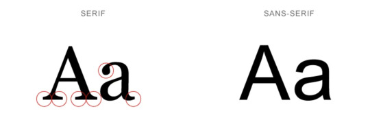
Serifs have serifs.
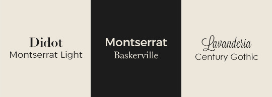
A serif is a small line attached to the end of a bigger line in a letter or symbol. Think Times New Roman, Baskerville, and Didot.
Sans Serifs have no serifs.
‘Sans’ is old French for 'without’. So, sans serif means without serifs. Think Arial, Century Gothic and Comic Sans.
NOTE: There are a variety of styles under serif and sans serifs, but this guide (hopefully) won't dive in too deep. This is just a tiny guide that will help you make prettier gifs. ✨
Script
Script fonts are the ones that are cursive or in longhand. They often look handwritten with a brush.
TIP: Script is best used for headers (big text). Avoid using them as body text (small text) or in long sentences and paragraphs because it won't be very readable.
〰️
Each of the following tips will help add contrast, create consistency and establish harmony in your font pairings.
[1] Limit the # of styles
Don't use too many fonts. Fonts are like introverts. They work best with just a friend or 2 😂
This would also depend on the style, which will be explained in the next tip.
[2] Opposites attract
Don't pair fonts with similar styles like this:
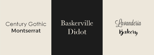
❌ Century Gothic + Montserrat are both Sans Serifs.
❌ Baskerville + Didot are Serifs.
❌ Lavanderia + Bakery are Script fonts.
Even if both fonts look good individually, it just wouldn't work.
It's like if two of the most beautiful people in the world became a couple. They both look good, but their beauty is overpowering each other. There has to be a balance, you know?
Do pair different styles instead:
[3] Avoid conflict
This tip is similar to [2].
Don't:
❌ pair similar font styles
❌ pair an attention-grabbing font with another attention-grabbing font
❌ pair distinctive fonts together such as these:
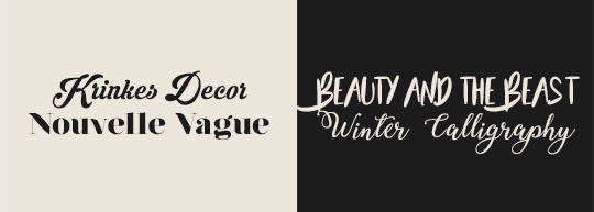
Notice how they would both keep fighting for the spotlight, destroying the harmony of your texts.
Do pair a distinctive font with a neutral font, like this:
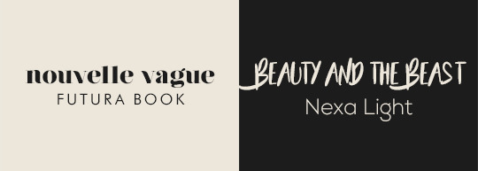
[4] Sans Serif + anything but Sans Serif
Here's a fun tip: When you're too lazy to think about what to pair your serif / decorative / script font with, just pair it with a clean sans serif font. It's what I did in the Do examples in [2] and [3] if you haven't noticed 😂
[5] Pair a font with itself
Opposites attract, and it works with just one font family as well! Play with a single font family's weight and styles.
Do pair a thick sans serif font with its lighter relative (as seen below: Montserrat Bold + Montserrat Light).
Do pair a regular serif font with its italic sibling (as seen below: Baskerville Italic + Baskerville Bold).

TIP: Play with the tracking (letter spacing) and capitalization (lower or uppercase) too. See Montserrat Bold and Baskerville Bold above.
I prefer to increase the tracking whenever the text is bold and/or in all caps to make it easier to read.
[6] Don't mix moods
Fonts have moods. They have traits (i.e. loud, friendly, trendy, timeless). They can be used to convey feelings (i.e. happy, sad).
For example, avoid pairings such as this:

There is nothing about the two fonts above that unite them. They have different vibes — nothing in common.
Though mixing personalities work in friend groups, it doesn't work very much with fonts.
〰️
With all that said, I know some of the tips might contradict each other, and some probably won't always work. It all depends on the font. Just see what looks good to you, and if you're unsure, then come back to this post :)
Please like/reblog if this has helped you and feel free to hit me up for any questions and concerns! ♥︎
〰️
REFERENCES:
reuxdesignco
visme
undullify
FREE FONT SOURCES:
Google Fonts
Open Foundry
awwwards.
Font Squirrel
dafont
#here you go anon!#club post#club tutorial#nongif#font pairing#typography#completeresources#allresources#itsphotoshop#yeahps
2K notes
·
View notes