#but ngl I love the design of my personal self insert she’s really cute
Explore tagged Tumblr posts
Text
Straight up just made a self insert instead of a reader character like I meant to, fuck-
I’m thinking I’m just gonna make a version of my self insert that’s meant to be more of a reader y/n based character with the same general idea, and make them and my self insert buddies or smth I don’t know-
#im too self indulgent when it comes to these things lmao#but ngl I love the design of my personal self insert she’s really cute#feels a lot like what I’d be like#oh they’re a stock associate btw#restocking gift shops#filling ticket machines#refilling the daycare supplies 👀#also cross trained in p&s for general fixes like arcade machines and stage lights#fnaf#fnaf sb#loona drabble#fnaf self insert#self insert#y/n
9 notes
·
View notes
Text
Rating Genshin Impact Character Designs (Pt. 1)
Hey y’all! I’ve been thinking of doing this for a really long time and I decided to finally stop being lazy and do it. So this is going to be a review of all the playable characters in Genshin Impact from a design perspective. I don’t really have any prerequisites to make this list worth anything (unless you count one year of a fashion/sewing class in high school lol) but hey idk, seems fun?
Gonna be super long (10 characters) so putting everything under the cut.
Disclaimer: I don’t actually hate any of these designs, nor do I consider my opinions “fixing” them, this is just for fun.
Character: Lumine
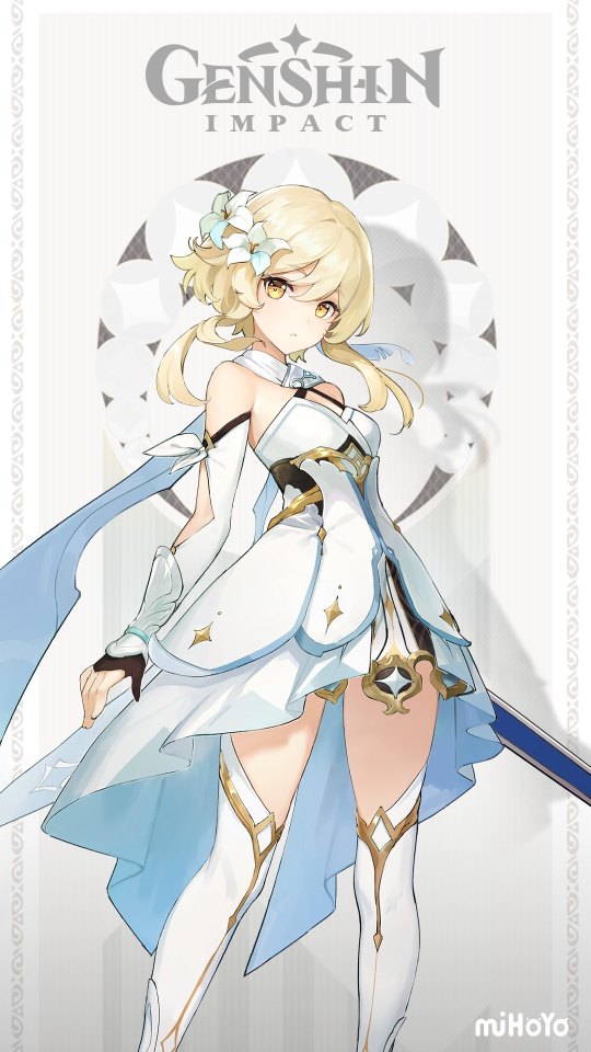
I have a lot of conflicting feelings about this design. The hair and basic build are fine, very generic but that’s unsurprising for any character that is working at least partially as a pseudo self-insert. The color scheme is also very bland - and is one of the reasons I originally thought that Aether was automatically Geo traveler and Lumine was Anemo traveler. I think that adding more colors would’ve been a good thing, but also would’ve required a revamp of the dress itself, so maybe not the most practical thing, even if I think the dress is a bit too busy. The biggest changes I would make would be to get rid of the fancy part of her stockings as well as the extra flow/ruffled back of the skirt, which is just a bit too much considering the top layer of the skirt is already quite detailed (in a very nice way) and that could’ve just been extended. I also have to admit that though the scarf is very impractical and showy, but it reminds me of a costume from a series I like so I actually like it a lot, although you could definitely term it unnecessary.
Rating: 7/10
Character: Aether
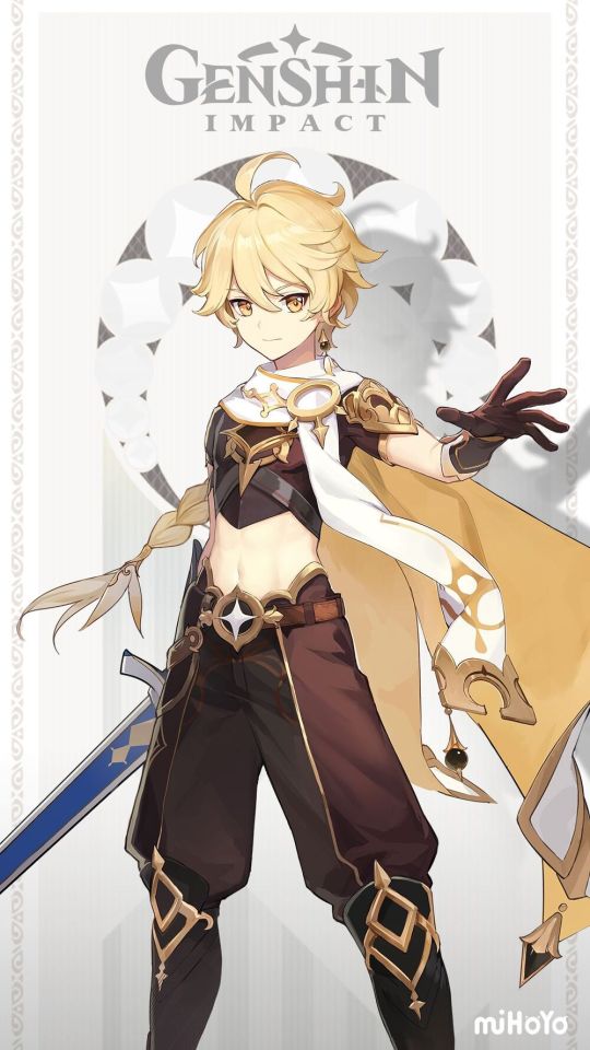
Okay ngl this character design kinda slaps. Firstly, I love that Aether has long hair, it’s a good contrast to Lumine’s cut (and contrast should be super important with characters that are siblings/parallels of one another) and idk long braids are kinda cool. I love that the outfit has distinctive colors, which give the character personality and keeps him from being washed out. The design is much more streamlined than Lumine’s, and although I’m not a huge fan of midrifts (a theme in this post I’m sorry) there’s not actually much I’d change in this design. Except maybe make the cape a scarf to better match with Lumine. This is definitely the superior design in terms of the siblings in my opinion and I think the lack of intricacy fits the image of “traveler” better. It’s not my favorite and there isn’t anything that really stands out in the design, but it’s really solid and I like it.
Rating: 9/10
Character: Albedo
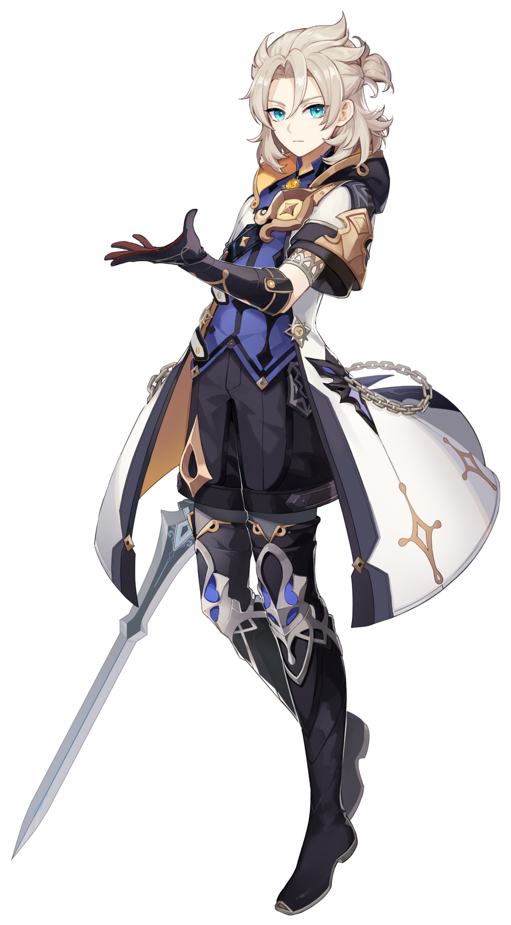
This design has a lot of potential, but I think in the end it’s just a bit too busy (which will be a theme in this game haha). I like the hair - in general I’m glad Genshin isn’t scared to try a bunch of different lengths and styles on guys because if not everything would become painfully boring. I also like the clothes for the most part. The boots are especially sleek, and I like that despite being a Geo character they gave Albedo a bluer, darker color scheme. I think it fits with his mysterious sort of quietly menacing vibe (this man is Frankensteining something I know it). But it really starts to get a bit too much with the coat. I think he needed a coat, again it fits the character, he’s in the middle of a frozen tundra and he’s also a magic scientist man, he needs some sort of coat. But I think the chain and the strap across the front is a bit too much. If I were the designers I would’ve continued with a sleeker theme, make the sleeves longer, the gloves shorter, if you wanted some ornamentation maybe a pack of vials on his belt. Overall very good design, greater color scheme, too busy. Also can we appreciate his banner art? It’s so good I love it.
Rating: 8/10
Character: Amber
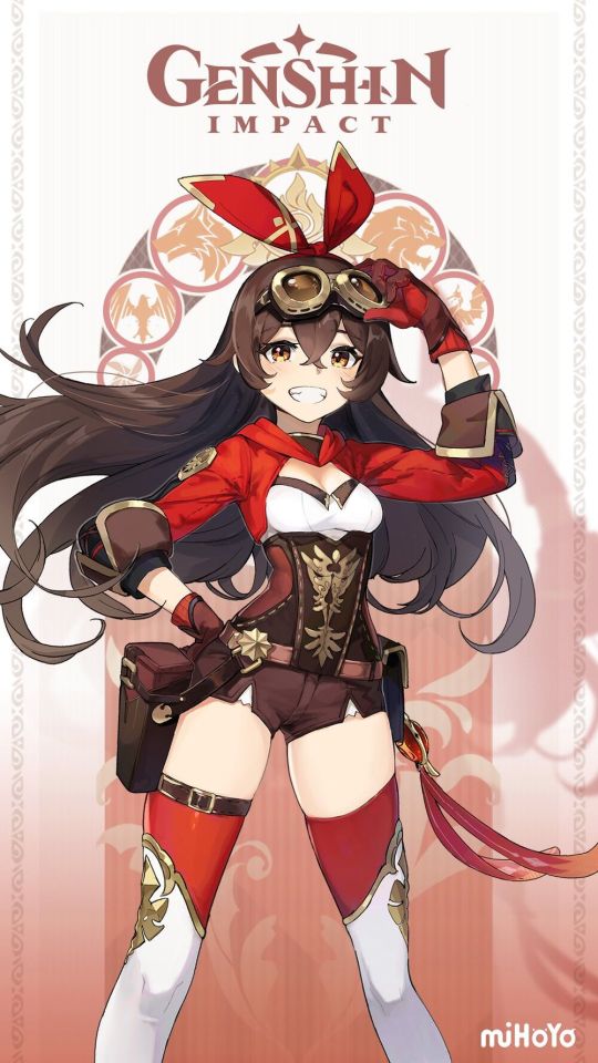
Okay first I’m gonna say her card art is super cute. Love the pose, love the style. All gut. Now let me say that this outfit had potential but then it sorta... fell flat. I like the color scheme for the most part, except the white cause idk white is boring and in the game it looks kinda latexy, but I understand wanting three colors and black might be too close to brown. That being said, I hate stockings. Stockings are just the worst, they’re impractical, hard to put on, uncomfortable, should only be worn with dresses. No knight of Favonius needs stockings. Might I suggest pants or shorts? Or like cool pseudo armor plates like with Lumine. Also though I do like the jacket and the leather stomacher design, I think a bomber jacket might suit the character better, because idk they’re cool and they make me think of Amelia Earheart, although that’s such a culturally distinct thing I can’t blame them for not thinking that way. Again the jacket is still very cool, love the stomacher, and love the cuffs.. The belt is lovely and like I said love the embossed designs, but ultimately this design is too impractical, and too bland to get away with being impratical for me. So... yeah.
Rating: 5/10
Character: Barbara
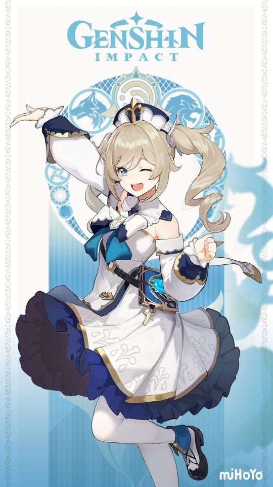
Barbara! Our fav crazy nun. First I’m gonna thank her for having an attack of pure magic then I’m gonna say I hate the color white apparently because I also didn’t like it here. I’m pretty sure she’s supposed to be a novice (could be wrong), so I’d flip the colors, have the accents be white and the main color navy. But idk that’s just me. Overall I quite like her design. It’s a pretty good balance between simple and detailed. I don’t even hate the stockings. I’d say the least good part is the top, the bow and the weird collar is just... ehh? but I don’t think getting rid of the collar would help though. I’d say ditch the bow, make the dress connect to the collar, keep the off the shoulders cold sleeves. I really like the ruffled part of the top skirt. Idk it’s the best part of the design. The hat makes her look like a nurse not a nun though. maybe make the hair ties for the ponytails little veils, might fit better. Overall mostly nitpicks, it’s a strong design.
Rating: 8/10
Character: Beidou
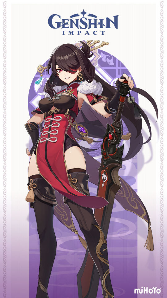
Firstly I’d like to apologize to the Beidou I pulled before never using her (forgive me ily); next I’d like to admit I don’t love her design. I haven’t really harped on the lack of armor on these characters - because I’m not sure how I’d integrate armor into all them without making them bland af, no one wants people running around in full plate armor how tf you supposed to climb in that - but I still wouldn’t’ve put her in a leotard and boots only when she’s a canonical fighter, without even the armor accents on most of the other character. I know that traditional qipao would probably be terrible to fight in, so I’m not going to complain about them slitting it - I actually quite like it I think it’s cool and sleek and fits her vibe - but I will complain about them putting her in a leotard underneath. As someone who dances I can assure you no one in their right mind would want to fight in a leotard, which yes I know isn’t the point and I can’t blame them for not thinking that way. Anyways, I think leggings/stockings and tall boots are quite cool so that’s prolly what I’d do, streamlines the whole design too, gives it a sense of connectivity (idk I’m weird and I don’t look at this character often so yeah). I like the top of her design, although I’d prolly replace the fur on the cap with a large collar, sort of pirate-y or Navy-like. Also let me just say I love the hair and eye patch. Fits her reckless sort of character to hate her hair whipping around, and the eyepatch really sells the concept of her having fought for years. The hand guards didn’t need to be flared, but I don’t mind them being there. Especially since handling a Claymore would definitely rip up your hands if you didn’t have protection. Also the boots though impractical are very cool so... yeah.
Rating: 6/10
Character: Bennett
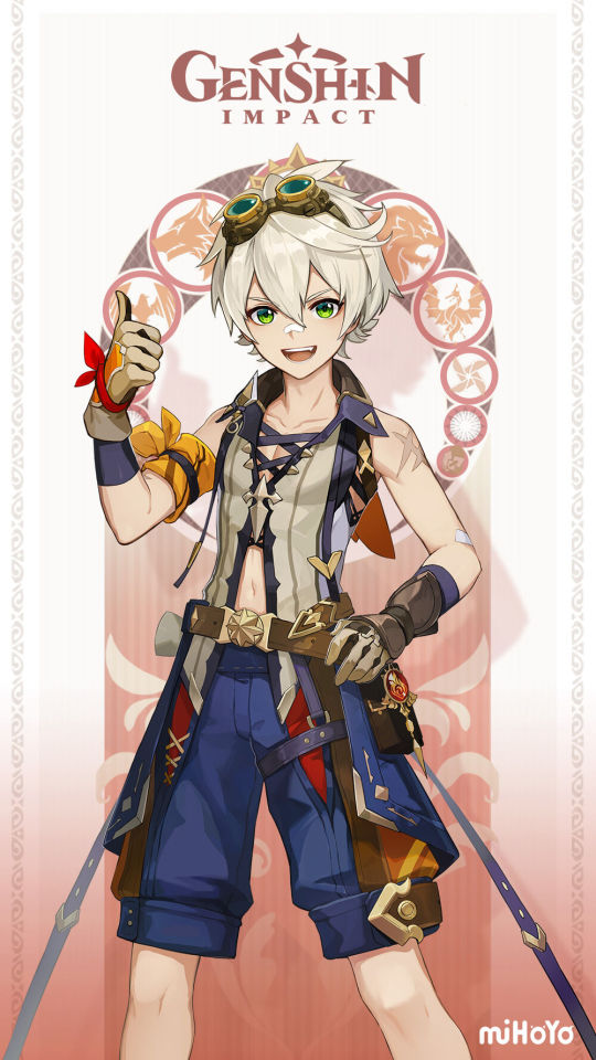
One of my main team and prolly the closest thing I currently have to a DPS I have conflicting opinions on Bennett’s design. I think it’s a pretty good design all things considered. His belt and all his packs would be busy if you didn’t know Bennett’s character, but considering he’s a wanna be adventurer, I think it works pretty well. Although I don’t know why his extra belt straps are so long... or even exist?? Idk kinda weird. His top is... ehh? I don’t really like it, I think partially because I don’t think Bennett would wear a midrift shirt like this (midrifts where there shouldn’t be midrifts or, as I like to call it, being MagiReco-d) and partially cause the color, though understandable in such a busy design, is kinda bland. I think that’s why the collar works instead of being too busy, we needed some color. If I had to changed the design I’d get rid of the midrift and get rid of those weird extra belt things. Also that one random dagger star thing on one side of his blue collar is just so weird and random and like why does it exist? But overall I like the design, and it doesn’t bug me when I’m playing with him. I think it’s a good example of how busyness can accurately portray a character. Well done.
Rating: 8/10
Character: Chongyun
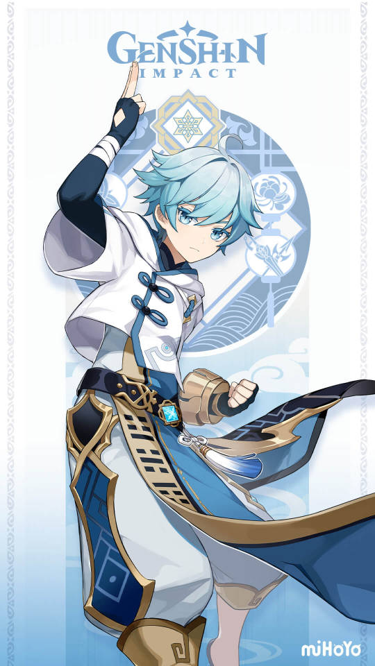
Another character who I own but have never played, though my friend has him on their main team and they look super cool. I’m not gonna lie I love this character’s design. Firstly the color palette is so good, the white feels like it works to offset all the blue hues - which I love that even the darkest parts of his design are blue not black - so it doesn’t feel bland or irritating, especially with the gold giving it a sense of luxury. I also like the choice to have a tunic that extends to the pants, I think having only white pants would be too bland - again white it a meh color for designs - so it really gives it some necessary details and color. I also like the jacket, again it gives the design a sense of detail while being simple enough not to feel like too much. Also I have no idea what the outfit would look like without the jacket and I have a feeling that answer would be Not Good, so... yeah. Some nitpicks; the left arm band thingie golden cuff is kinda too much and seems impractical and irritating. And... that’s it. I know the slippers are impractical, but I think they work, he is an exorcist not an adventurer after all. Overall, probably second favorite design in the game. Great job
Rating: 10/10
Character: Diluc
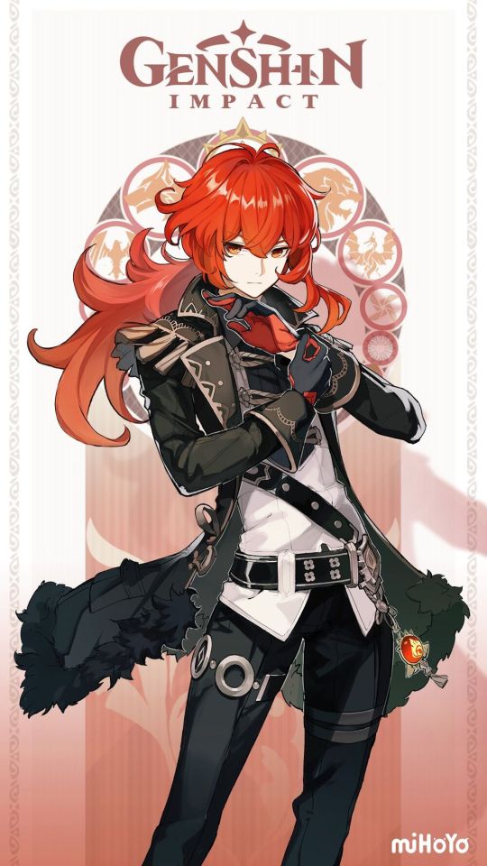
Give Diluc a high ponytail, I’m begging you. Lol anyways personal preference aside (which is impossible this entire post is personal preference) I like this design. I think the color works and the whole outfit is a good reflection of Diluc’s character, closed off, luxurious while also a bit ragged and uncontrollable. Yeah. I like it. I do think the thing chain accessory is kinda random, and I don’t think there’s anything about the design that knocks me off my feet, but I do really love the design overall. Also the gloves, good gloves. Suggestions? High ponytailed Diluc. Nothing else. Also though he’s not in this post I like that this outfit is very streamlined and simple compared to Kaeya, it’s a good portrayal of their differing views and opinions through fashion. Because unlike with the traveller siblings I think these brothers have a dynamic where contrast is better than parallel.
Rating: 9/10
Character: Diona
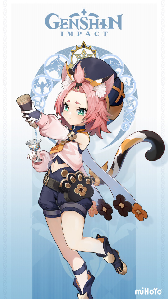
Okay so though I’ve never interacted with this character I skimmed the wiki and I love her backstory it’s hilarious. Also since I never interact with her I don’t have many opinions about her design except why does she only have one sock on? Honestly relatable moments. I think the extra ponytail is kinda weird and excessive considering the hat and I’d prolly make the hair orange to match the ears but overall very cute design. What do bartenders look like? Idk. Oh and also there are a bit too many colors roaming around, but I get it. Overall fairly generic but kinda cute. I still think midrifts are bad.
Rating: 7/10
And that’s it! I hope this didn’t come off as “lol these designs are gross and I’m superior and we should fix them” because no. No one should take any of these suggestions seriously. Except maybe the ponytail one lol. Anyways I hope at least one person likes this cause this took forever and I kinda burned out after a while. Next post if I make it will be interesting cause it includes my least favorite design. May you all have lovely playing and if you love a design I don’t honestly more power to you. Bye!!
5 notes
·
View notes