#but like. when it's just the straight lines. the 'you Must Use the desaturated version' feels. misguided
Explore tagged Tumblr posts
Visit Tumblr Blog
Explore Tumblr blogs with no restrictions, modern design and the best experience.
Last Seen Tumblr Blogs


Fun Fact
The total number of visits Tumblr.com received during January 2021 is 327 million.
Text
today's controversial take is that i honestly hate the disability pride flag. every time i see it i get mad
#lifeblogs#like in the name of making it accessible they just made it ugly which is honestly not the message i personally want to send#and also the stripes all standing for different categories of disability is like. questionable at the best of times#but the fact that there are separate stripes for 'neurodivergency' and 'mental illness' but only one for physical disability#is. i think. a lot.#also i've definitely talked to people who get headaches from the new one and not the old one so it's like.#well. perhaps acting like accessibility is universal. is ALSO A PROBLEM#like. the zigzag is an epilepsy risk either way to be clear.#but like. when it's just the straight lines. the 'you Must Use the desaturated version' feels. misguided#like you cannot make a flag that's accessible to every single person. you cannot make anything that's accessible to every single person#WHATEVER.#i am also not really convinced we need a flag but you know
14 notes
·
View notes
Note
Would you mind sharing how you bring SATIM comics to life for us? ^_^
Ha, ha, I've been waiting for question like that. Okay... *stretches the clasped hands, you can hear the crash of knuckles* Here we go.
--------------------------
First of all, at the very beginning I would like to point out that each comic I make has a completely different method of creation. I draw a comic strip othey way (like SATIM), than comic page (like Kuro and Ninja or Before Henry). The former are characterized by great chaos, while the latter do not often differ from the final versions.
But let's focus now only on the comic strip for SATIM.
It all starts with an idea. I usually come up with ideas when I'm away from home and beyond the ability to save an idea, so many of them, unfortunately, are lost forever (sometimes I compe up with them again). However, if the idea is not forgotten and I return home, depending on whether I have time to draw or not - I either start sketching it right away in the form of comic frames or just writing the idea on a piece of paper. Apart from single exceptions (e.g. Radio strip), I do not write a script for a comic but I draw it straight away. The sketch is my scenario XD
For this reason, sketches can be very chaotic - sometimes the frames are completely out of sequence. I rarely sketch backgrounds at this stage (I rarely sketch them at all XD) - they are created only in the final stage of making the lineart. Let's see it on the example of Bacon Soup, part 1.

Sketches are often very simplified, I do not play with details (e.g. stripes on Sammy's harness). In addition, I draw comic strips without dividing them into individual parts at first - so on one A4 page there can be frames from two different parts of a given strip (like here).
I also use what I call recycling, i.e. reusing a frame - when I know that the frames will not differ too much, I very often draw only those differences...

The second point in creating the strip is rewriting the texts from it. Since I draw in English, often without access to a dictionary, my sketches are often very linguistically incorrect. At this stage, therefore, I initially correct dialogues, vocabulary, grammar - and then send the rewritten text to one of my English proofreaders. Each strip goes through two people - they are usually Titatotrix and Ozio, but sometimes when either of them has no time, I turn to my husband. Discussions about dialogues are very often carried out here, sometimes it leads to minor changes in the structure (e.g. adding a frame or removing it) or dialogues.
Above you can see corrected text of strip.

After linguistic proofreading, it's finally time for the lineart. This is probably the most important stage, though not the most time-consuming. I correct the sketches I made previously, usually starting with the speech bubbles and adding backgrounds to them. For this purpose, I use my UniPin fineliners, which have been proven for years and do not smear when using an eraser. Each part of the frame has its own fineliner - for example, speech bubbles are made with 2-thick fineliners, the foreground is 1-thick, but further plans and sometimes the background is 0.5 mm thick.
When the lineart is ready, there are two steps that I honestly hate - wiping the pencil lines with an eraser and scanning. Scanning a single page can take up to an hour, 'cause if it turns out that the lines that should be perfectly horizontal aren't that in relation to the edge of the sheet, the fun of arranging the sheet on the scanner begins. I honestly hate it.
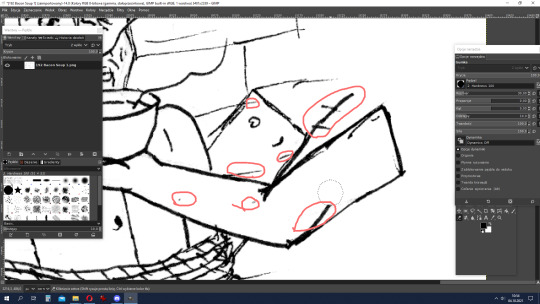
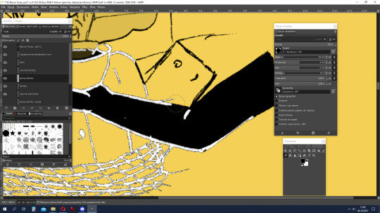
After scanning, we have the stage of cleaning the lineart in the computer. I'm only human, you know, I make mistakes and errors. But since I process the strips on my computer, I can afford it. The graphics program I'm using is GIMP. I start by reducing the brightness and increasing the contrast and of course the desaturation. Then I erase all the unnecessary lines, correct mistakes (all red loops on screen above), and sometimes add in pieces that I have forgotten (e.g., I always forgotten about the patch on Sammy's trousers).

Next comes what often takes the most time - that is, arranging and placing frames. It sounds simple, but it is not. Frames must look aesthetically pleasing, the comic book must have internal symmetry - or just express controlled chaos. Setting the width of the frames, arranging them, creating recycled frames, adding backgrounds (if they were drawn separately), sometimes moving the speech bubbles... it can take up to several hours!
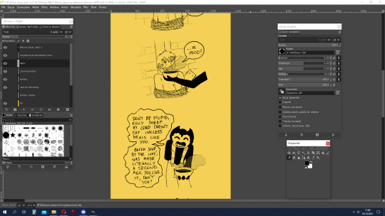
The next stage is my favourite - colouring. In the case of SATIM, where I really only color black and sometimes the shining elements light yellow or darker ones in dark yellow, this is also the shortest step in making the strip.
Usually, at the end, I leave myself to make bright contours on a black background. Working on them mainly involves manipulating the eraser tool, and then change colour to the background's. After this stage, sometimes there is play with details - light effects, Bendy's spots, etc.
When the strip is ready, there is only one thing to do - importing to a graphic file and zooming out (I work on a high resolution, which is inconvenient to read). Et voila!
--------------------------
I hope you'll enjoy this "secret of SATIM's strips making". I've wanted to do something like this for a long time, but I didn't feel like doing it myself, so thank you for asking, @sobercupcake ^ ^
6 notes
·
View notes
Text
Shadow Tactics – Finding the Perfect Art Style
From colorful to rather dark and realistic: finding the right art style for Shadow Tactics took time, but it was worth every second.
Since the company’s founding in 2012 we developed two big games for PC and consoles as well as several mobile apps, with these two games being »The Last Tinker« and our recent release »Shadow Tactics: Blades of the Shogun«. In this article we want to take you behind the scenes of our quest to find a fitting art style for both The Last Tinker and Shadow Tactics. First off, we will introduce both titles and their art styles to you. After that we’ll dive right into the development process before we talk about problems and challenges we encountered along the journey – and of course about how we solved these issues.
The Art Style of The Last Tinker & Shadow Tactics
The Last Tinker is a third person jump ‘n’ run in a colorful world, inspired by games like »Banjoo Kazooie« and »Jak & Dexter«. As Koru, you must defeat the Bleakness that threatens Colortown by using the power of colors. The game’s style is defined by round and smooth shapes, bright colors and a warm light setting. Everything is made from paper, color and glue which combined results in papier-mâché. As a contrast, we added some cardboard elements to create edges and make the world look more interesting. No straight lines, no 90 degrees, rather playful than super accurately drawn patterns – everything looks like it’s made and painted by children. The game’s characters are cartoony and funny, showing their attributes in their looks.
Shadow Tactics is set in Japan’s Edo period and it’s quite the opposite of The Last Tinker. It’s a hardcore realtime stealth game in which you control five different characters with individual skillsets. Basically, it‘s »Commandos« with Ninjas. You kill or sneak around enemies to accomplish your missions. Theme and story of this game are darker and grittier, that‘s why we decided to create a more realistic style and combine it with non-realistic elements like outlines imitating ink, that typical Japanese paintings are famous for. We included many details and each map has its own interesting light setup to catch the mood of a level. In comparison to The Last Tinker, we used more desaturated colors. All characters are human but they all have their own unique silhouette, so you can instantly identify and recognize them. However, they have longer legs than normal humans – a design decision we made because the perspective made them look smaller and somehow compressed.
Finding the Style for The Last Tinker
The Last Tinker started as a project while we were still at university and we had three to four weeks to complete it. It had to be in 3D which was a problem for us at that time. When we started developing the style, our artists had nearly no experience in 3D modeling – our strength clearly lied in creating 2D graphics. So we thought about how we could use our skills in creating 2D graphics for a 3D game. We didn’t have the time and experience to make high detailed models so we thought about what we could create with the help of simple shapes and if we could create details with the help of textures. That‘s why we started with a 2D image that we projected on a plane and roughly cut out the shape of the image. Then we extruded the face and voila – we had a 3D model. Now we just needed the right material to realize this style, ending up with cardboard. [6]
6
So we decided to create a world made entirely out of cardboard but we weren’t really satisfied with the early outcome. It looked sort of boring. Plus, we felt like cheaters because our 3D models were so simple. Still, we needed 3D models with plain shapes that could quickly be created and animated. Then we had the perfect idea: Papier-mâché! It’s perfect for beginners in 3D modeling. Plus, at university we were five artists. After starting the real production, we were two artists, then four. By only having to handle one or two materials we were able to create a world fully made of papier-mâché. Material handling was crucial, as creating different good looking materials that look good and real costs a lot of time.
Everybody loved the idea and since we had proper 2D skills, we decided to use textures to add detailed hand-painted patterns.
Now we had a base to work with. To get to know the material better we came together with artists and game designers in tinkering sessions [1], testing different shapes and patterns. We had two or three of these meetings and in the end we really knew the material and its potential. The figures we made were nice references. Some were really good, some were pretty ugly. Oh, and we still have them in our office. One of them sits right next to me and watches me … creep … [2]
Anyway, after having decided on a direction, we wanted to get a clearer vision for our design, which we eventually found in the works of Hundertwasser and Niki de Saint Phalle. Both focus on round and smooth shapes which colorful textures. Plus, we looked for papier-mâché figures made by kids because we wanted the world to look like kids built it. Those references gave us a good feeling for how the world and characters should look like.
First Steps in the Right Direction
After graduation, we occasionally experimented with the prototype, got a lot of feedback and wondered how we could improve it. When it became official that we could make The Last Tinker a complete game, we developed a story and reworked the gameplay which both influenced the style of the game. The first thing we noticed was that everything looked too clean and not very lifelike.
So we added some color splashes and dirt to make everything look a bit more used. Along with the story came Colortown’s different districts, which served the gameplay well. Prior to that, the world was so colorful and chaotic that players often got lost. Introducing the districts and with them some coloring rules helped solving this issue. As already mentioned, we initially used only two materials. After starting the development, however, we considered adding more materials like water and paper hills [3] to make the world more interesting. We struggled a long time with the water because it never really fit into the world.
Then we had the idea to add patterns that you can see on nearly every asset: spirals. They appear as ripples in the water and as splashes in waterfalls. Honestly, I love spirals and I loved drawing them. After some time though, I was so fed up with them that now, every time I see a spiral, I’m about to scream!
Of course, not all of Tinkerworld is friendly and colorful. The Bleakness wants to erase everything in it. The player sets out on an adventure to defeat the Bleakness and the monsters it created – so much for our vision of the first prototype. Style-wise, they needed to fit into the world, so we gave them round and simple shapes. Still, we wanted them to look like something totally strange and foreign to the world. So we decided to make them out of some kind of goo, however, they seemed like being made out of porcelaine. Again – with the story we added in the later production, in which whole colortwon is covered by bleakness – we needed to find a design for this new material. We had an overall feeling and look for the creatures but we still struggled with the Bleakness that wasn‘t lifelike.
We had so many concepts [4] and it took us very long to get the Bleakness’ style right – also because of some technical problems. We ended up with a mix between a less shiny form of goo, and something that you can‘t touch, something that isn‘t really quite there. We also added some patterns on every bleak object to give them a little bit of a mystical appearance. [5]
Finding the Style for Shadow Tactics
The basic idea for Shadow Tactics formed during our time at university. Our Creative Director had always been a huge fan of “Commandos”, so he thought “Why not revive this genre?” So, what’s cool and fits a stealth game? Exactly: ninjas! So we pitched a Commandos-like game with ninjas, with the very first draft being a mobile version. And as we all know, it‘s always common to reuse skills you acquired in prior projects to do something completely different … not. Shadow Tactics was supposed to become a mobile game [7] , so we had a rather cute and cartoony style in mind, which we were already used to. Or in other words: we were – artistically speaking – kind of stuck and pretty much too influenced by our work on The Last Tinker, but we knew that this wasn’t the style we wanted to go for. We wanted to reach these old fans of Commandos which were used to a much more realistic style with tons of details and crispy textures.
8
We analyzed the spiritual predecessor [8] and tried to understand what made Commandos … well, Commandos. We wanted to keep its core elements within in our own style to keep the old fans of the game happy – for us artists, however, finding the right style became a real struggle. We had our concept artist overpaint some Commandos screenshots [9] [10] to get a better feeling for a more realistic style while trying to add our touch to it. We never wanted to create some super realistic style, because that just wouldn’t have been us. Plus, for only four artists it was nearly impossible to make a realistically looking game, so we mixed realistic elements with non-realistic elements. We started to concept and model some buildings because somehow the concepts we had created so far didn‘t get us any further. In the beginning, we reduced the complexity of the models and again used textures to obtain detail, which based on photographs that our artists painted over to give them a painted look. We experimented with different non-realistic elements like outlines and canvas patterns [11]. The outlines worked best ingame and fit the Asian style the most, while the canvas patterns created too much noise and simply didn‘t look good. After finishing the first playable prototype [12] [13] , we already knew that we also wanted to include numerous interesting light-settings for catching different moods.
Shadow Tactics’ pre-alpha
For our vertical slice we created polished assets to get a feeling for the style and the quality we wanted to reach, so a lot of time went into one level [14]. Between putting up the prototype and this pre-alpha version we had time to get used to the perspective that brought its own challenges with it. We changed the color palette and various little details, because the prototype seemed a bit to cheerful and idyllic. Shadow Tactics’ story included wars and tragedies, so we developed a better fitting style, using more desaturated colors, but still keeping it very painty, though with reduced details and thick outlines.
From there on out we received some feedback from friends from other games companies, many of them asking „Oh, is it a mobile game?“ Just what you want to hear when you’re developing a big PC and console game … it really bothered us. We realized that our current version was too far away from the original Commandos style, lacking detail, crispiness and realism. We used no normal or specular maps which therefore had no depth and small surface details – everything was kind of plane. This particular level admittedly wasn‘t the best choice for a vertical slice, because it was one of our most colorful ones – not the best basis for finding the right art style for a game that’s getting darker and darker in the long run.
From Pre-Alpha to Alpha
When we created our alpha version [15], we added some normal as well as some specular maps for metallic assets, also adding further details to textures like on stones and thatches. We changed the way that nature looked, from a very painty to a more realistic style, with small leaves instead of big spots. We also removed the outlines from all foliage. Additionally we used the new lighting system from Unity 5. However, we first wanted to get the overall setup right, so we lost the interesting lighting at that stage. And still, it wasn’t what we were aiming for …
From Pre-Alpha to Pre-Beta
In our pre-beta version [16] we decreased the overall number of outlines and made them thinner. We even considered deleting them completely but lost that thought because they created a nice depth and contrast between asset and terrain. We also added dirt to the textures to give everything a gritty and used look. And our shaders learned color variations which you can see on the stones. At that time we didn‘t have a good setup, that‘s why it looks a bit out of place. Besides making the scenes more realistic, however, it kind of masked the fact that we used the same assets over and over again. We tweaked a lot of small things in this phase of development and improved our terrain by adding normal and height maps. These height maps did a better job in blending textures, so the transition between two materials like grass and dirt looked rather crispy than blurry. Eventually, we gave every level a nice light-setup and used color mapping to create more variety between the levels thus creating the proper mood. Ambient particles like in The Last Tinker made the world more lifelike. Well, so much for finding and creating the right art style for Shadow Tactics.
Problems and Solutions
On our quest to find the right art style for both The Last Tinker and Shadow Tactics we certainly had to overcome quite a number of challenges. So, let’s take a look at what these problems were and how we managed to solve them.
The Last Tinker
As mentioned earlier, the first version of The Last Tinker was too colorful and chaotic. Players got lost on a regular basis and didn’t know where to go. Since we used every color to paint the assets and usually had a bright light-setup, we couldn’t use color or light to guide the player through the world. As we developed the story we divided Colortown into different districts. That helped us bringing some order into this colorful world. Bye reducing the number of colors per district and, at the same time, adding specific shapes and patterns as well as some coloring rules, we were able to help players navigate better. Plus, every district is inhabited by different races [17][18][19]. The whole game uses the same house assets. So by giving each districts its own attributes and uniquely designed assets, we could create enough variety and saved a lot of time by not modeling different house types.
Another way to facilitate navigation was adding unique landmarks like a big windmill [20] or unique fountains or maybe special buildings like taverns, that draw the players’ attention and thereby help them remember certain places. Unfortunately, we never managed to completely solve this issue so eventually we gave our companion Tap a guiding feature. Whenever you call him, he shows you the way before you get lost again. Anyway, we just yellow to mainly mark relevant gameplay assets climbable walls, pillars you can jump on or specific landmarks. So, whenever you see something yellow, that’s where you want to go!
20
The Challenges of Creating Shadow Tactics
21 – time was scarce … so was a good night’s sleep.
Shadow Tactics confronted us with a whole set of different problems, the biggest being the style itself. On the one hand we weren’t sure on which platform we’d release the game. On the other hand our artists were still too influenced by our previous projects that were all cute and cartoony. »Realism« was another big thing. Not only did we want to make a more realistic looking game, we also wanted it to be historically correct. For that we had to do a lot of research and research takes up a lot of your time! Time – unsurprisingly – was a big problem, but well … when isn’t time a problem game development [21] ? As mentioned in the beginning we switched between styles a couple of times, until we were told it looked like a mobile game and we started to increase the quality, added normal and spec maps, better lighting and more details overall, which resulted in a ton of additional work. And with us still being only four artists, time was crucial. Also, we lacked experience in many ways, e.g. when it came creating high-detailed terrains and proper lighting setup, so we had to get to know a lot of new tools which – again – cost us a lot of time we didn‘t have. Oh, did I mention the time problem? Well, luckily we have a lot of comfortable couches in our office.
When we had finally developed the first style-prototypes and started with the creation of assets, we encountered a new problem.
The Perspective
23
In the beginning we had really large curved roofs that took up a lot of screen space which made it difficult for our level designers to place enemies the way they wanted. It also made it difficult to navigate the player characters because you couldn‘t see what was behind the buildings. It was possible to rotate the camera but with all these roofs the player wouldn’t have been doing much else, which would have eventually killed the fun. Also, the big roofs looked kind of out of place, so we iterated them a couple of times until they fit. We minimized the roof sizes and flattened [23] them so they wouldn‘t hide the enemies on the ground.
The Architecture
24
(56.) Another problem was the Asian architecture. We wanted our characters to be able to climb roofs to generate that sneaky ninja feeling. But Asian roofs are rather bent and curved and these shapes collided with our animations. The feet of the characters didn‘t adapt to the ground beneath them, so it always seemed like they were floating. Also, you could never tell where you were supposed to go because the shapes were too undefined – you never quite knew where you could climb up and where you couldn’t.
So we designed three types of roofs [24]: – flat and completely walkable rooftops – rooftops with obstacles protecting you from your enemies’ eyes – inaccessible rooftops – Sadly, we lost a little bit of the Asian feel and typical design but in this case proper gameplay was more important.
Readability
The third challenge was readability. Being able to instantly recognize enemies and usable objects is a must. In the beginning we struggled with this topic because we didn’t have enough contrast between the different assets. For example, every wood asset mostly had the same color. There was no real eye candy drawing the player’s attention. Enemies kind of disappeared within the environment because they were designed in the same color scheme like everything else. To solve this issue, we created some landmarks, made the shadows darker to create depth and added different color shades to give the assets more contrast [22].
22
Then we developed a slightly different, more saturated and brighter color scheme for enemies. We also provided them with fake lighting so the environmental lighting wouldn‘t affect them as much as the assets surrounding them. The fake light was a gradient that made enemies look brighter from above while usually, they would look brighter on the bottom, to separate them from the ground. In this case, however, they are wearing dark trousers, so it wouldn‘t have had any visual effect. Thanks to the lighting, they wouldn‘t completely merge with the environment and were therefore a lot easier to spot.
Summary
Every game needs its own process of creating a style. You will encounter different problems and will have to find individual solutions for all of them, no matter if your following project is similar to the first. Problems might occur because many reasons, a new setting maybe. I think, what‘s always important when creating a style, is that you use the skills your artists have. Don’t try to create something you can‘t identify with or that doesn‘t fit your skills just because it would be so much cooler. When you don‘t create something that you can absolutely relate to, you will get stuck and be very unhappy with the result. That said, it doesn’t mean you shouldn’t leave your comfort zone. We definitely left ours in order to make Shadow Tactics.
After The Last Tinker and some other cute looking games we wanted to develop something different and in the early beginnings we struggled a lot – the style simply wasn’t like anything we were used to. After some long discussions, reworks and iterations, however, it turned out quite well. The Last Tinker and Shadow Tactics are two completely different games with completely individual styles. Sure, we could have gone for a super realistic style, but it wouldn’t have made us happy. And if that had been the case, maybe we wouldn’t have put that much heart and effort into it to make it look great.
About the Author:
Bianca Dörr
is Art Director and Texture Artist at Mimimi Productions.
In her position as Art Director, Bianca is with Mimimi Productions since 2012. She’s not only in charge of leading and coordinating the art team, but also works on game asset textures and develops the art styles for every major project. On top she is responsible for the quality of all graphics and artworks. @Katzenviechle
The post Shadow Tactics – Finding the Perfect Art Style appeared first on Making Games.
Shadow Tactics – Finding the Perfect Art Style published first on https://thetruthspypage.tumblr.com/
0 notes