#but its meant to be a homage/solidarity drawing
Explore tagged Tumblr posts
Text

from the river to the sea
#adventure time#finn mertens#finn the human#jake the dog#palestine#watermelon#free palestine#i dont wanna tag too much stuff for palestine cause imagine youre looking for useful info and you just get boy and dog eating snacks#but its meant to be a homage/solidarity drawing#finn would be pro palestine he is a hero#he wouldnt stand for genocide#also i uhhh didnt use colour refs for finn and jake i just bullshitted#i usually colourpick but i didnt this time#ALSO I FORGOT HIS BACKPACK BUT idk pretend he just doesnt feel like wearing it
40 notes
·
View notes
Text
VOC’s Review of the art of Magic The Gathering Core 2021
I an no art expert. Never studied art professionally. But I do consider myself a Vorthros (someone who appreciates the art, story, and flavor of Magic The Gathering). So I have been wanting to this for a while so let’s try it. If this is liked then maybe I will do it again for Zendikar Raising. I’m not going through every card in the set. Just a handful that really stood out to me and I just want to talk about.
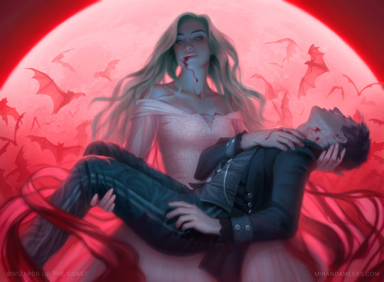
Indulging Patrician by Miranda Meeks
Normally I like to save the best for last but this one is so obviously the best art in the set that I need to lead with it. When I first saw this card revealed my jaw dropped. It is purely captivating! It embodies what vampire artwork wants to be. From the powerful dominant vampire woman in the center, to her poor powerless victim, to the beautiful blood moon behind her, to the swarm of ominous bats, all highlighted with blood. Of course the traditional gender role reversal feels so perfect and not forced here. It is a beautiful artwork and you should want to play Magic just to look at this card.
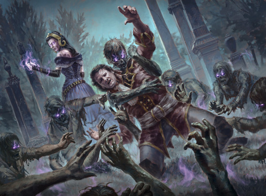
Liliana's Scorn by Josh Hass
We are not moving away from the gothic horror yet though. This is sadly a card that most players will never see as it isn’t in the Core 2021 booster packs but is in the Liliana planeswalker deck. Making this art very easy to overlook but quite impressive when examined. You really feel the struggle of the victim as he fights a losing battle against a horde of zombies. Being in the center you might think he is the protagonist that we cheer on to escape but Liliana even in the backgrounds steals the scene and you know she wins this fight. This is just a great group piece where each individual zombie displays a surprisingly amount of depth which truly makes this piece feel even more hopeless for the poor victim and even more empowering for Liliana.
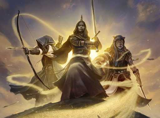
Basri's Solidarity by Paul Scott Canavan
Basri Ket is a new planeswalker in the set but instead of looking at him directly let’s check out his magic instead. This is a piece that perfectly embodies cooperation and teamwork, Each figure looks quite a bit different, has a different background, and a different specialization. Yet they are all subtlety bonded together through the sand that basri controls. The way it wraps around and protects them all it a cool and powerful effect.
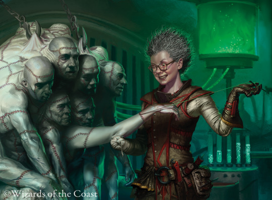
Obsessive Stitcher by Joe Slucher
And we are back to dark and creepy. But I can’t ignore in crazy details in this artwork. On Innistrad, the doctor Frankenstein-like scientists that create ‘zombies’ though alchemy and science rather than straight-up necromancy are called “Stichers”. And this one piece explains all that without any words (except for the 1000 words a picture is worth). The corpses all have different faces showing that this is not simply a construct made from a generic stock but instead were actual living human beings at one point. The ominous green vat behind her is hooked up to them pumping them full of something that can’t be good. Plus we also have ominous test tubes in the background to really hammer in the point of “evil mad scientist”.But then her actual clothes has lots of handy tools to show a devoted craftsman. As she literally stitches thread through not only her diabolic experiment but also her passionate artwork. And finally I did not even notice until seeing the enlarged art but she is missing her right hand! I assume this counts as positive disabled representation right?
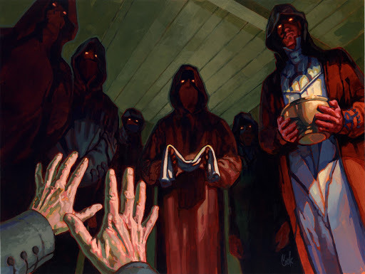
Village Rites by Bud Cook
I promise this is the last dark and creepy card (maybe) on the list but I have to give this one a shout-out. It is a throwback and homage to the card Village Cannibals from Innistrad. Even the same artist. Definitely one of my all-time favorite MTG arts so I am very happy to see a remake of that art! It is nice when Magic throws in the little nostalgia winks randomly.
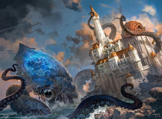
Tolarian Kraken by Svetlin Velinov
Magic will often use what they call “Scale Birds” to show how big something is. These are tiny birds near a creature to show how much bigger the creature is than the birds and give a size comparison. Sometimes birds are too small and they use something like “”Scale Deer” or other mammals. Well then those are still too small we now have a “Scale Castle”! What is more terrifying than a Kraken this big! As if that isn’t bad enough it’s brain is actually visible and has like lightning coming from it or something. This feels like a very epic piece where you can feel the motion and terror from it.

Daybreak Charger by Forrest Imel
The next several arts are going to be under the category of “Things MTG does all the time but needs to make it new each time.” I feel it is most appropriate to start with this unicorn. You see unicorns take occupy a very unique position in both general fantasy genre and pop culture itself. Unicorns are very recognizable so they are very much a great fantasy trope to include. But they also have a reputation of being aimed at “young girls” and in the process made to seem very soft and non-threatening. MTG is a game about combat! You don’t want to summon a gentle non-threatening creature to fight for you but it wants to have unicorn cards. Meaning it wants “badass unicorns!”. Well they absolutely succeed here! But the beautiful thing is they need to over-correct. It wasn’t necessary to paint it all black and cover it in blood. We don’t need to put it on a heavy metal album cover to show its fierce side. Instead bright light is used in a way that makes it seem comforting but also powerful and not to be messed with. This is a unicorn that you are relieved to be on your side and terrified of seeing on your opponent’s side. That takes serious talent to bring it all together!
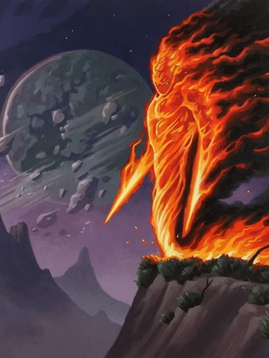
Chandra's Incinerator by Craig J Spearing
First I apologize that this art is a little cropped from the original. What is another thing that shows up all the time in fantasy art? FIRE! It gets hard to draw fire so often and make it feel different. This is a fire elemental so that is a bit different but still something we have seen a lot. The card Fire Elemental was in the very first Magic set. That card has had 4 different artworks and 3 other cards have some for of Fire Elemental in their name (Deepfire Elemental, Firefiend Elemental, and Wildfire Elemental). This one is clearly meant to be a nostalgic nod to the original art and it works so well! The fire is so detailed and intimidating but the creature is very expressive. It is very refreshing to see yet another Fire Elemental in such a new fashion and perspective.
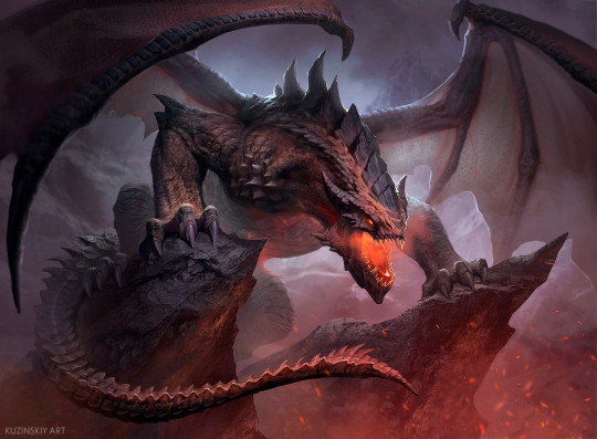
Terror of the Peaks by Andrey Kuzinskiy
How many times have we seen a dragon in MTG? Over 200 times!! This set alone has 3 dragons! We have seen zombie dragons, skeleton dragons, dragons who breath lightning, dragons that breath frost, dragons covered in metal, and all kinds of other dragons. But sometimes you just need to go back to basics. But basics do not need to be boring. As we see here this is an awesome basic dragon that embodies everything you think of when you think of dragons yet still blows you away with how awesome it is! This is quality dragon art
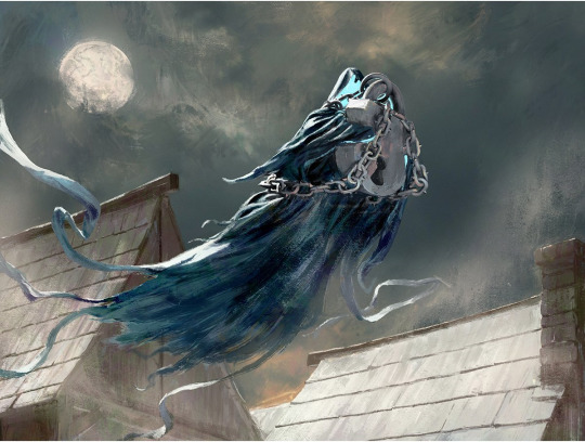
Shacklegeist by Igor Kieryluk
Ghosts and spirits are again a common trope that gets redone a lot. I really like how this piece can just take a mundane object with some symbolism behind it and just make an entirely new creature from it. This is basically a giant lock with ominous chains attached being held by a specter and it all works so well together! This art style being more watercolors is a nice final touch to give this piece a spooky feeling but also a really cool feeling too.

Rousing Read by Campbell White
I am going to end this with a bit of a weird piece but I didn’t want to leave it out. This is apparently a follow-up to the card Hard Cover from the core set before. This guy has magical wings made from the pages of a book! Like I don’t have anything else to add. That is cool enough by itself.
Special Mentions
Alchemist's Gift, Chandra Heart Of Fire, Garruk’s Uprising, Peer Into The Abyss, and Sanguine Indulgence. All cards with awesome art but I don’t want this post to go on forever (and some of them I couldn’t find good clean versions of just the art). Please tell me what art from Core 2021 I missed that you really liked!
1 note
·
View note
Text
Blog #5: Volver Analysis

Sole, Paula, and Raimunda
The 2006 drama, Volver, takes place near Madrid, Spain and captures the lives of Raimunda, her daughter Paula, and her sister Sole, as they deal with the recent passing of their Aunt Paula. Shortly before their Aunt Paula’s death, she confesses to the women that their late mother, Irene, (who had died in a fire years before with their father) had been taking care of her. The women dismiss this as a symptom of her dementia until their Aunt’s neighbor, Agustina, also claims to have heard Irene speaking which the sisters try to disregard. Sole then begins seeing Irene herself but tries to keep it a secret from Raimunda who is busy dealing with her vile husband’s murder.
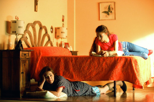
Despite never having heard of this movie previously, I really enjoyed it. It was visually stunning in many scenes, offered interesting angles and perspectives, and had a very compelling plot. Honestly, I enjoyed the close relationship that Raimunda shared with her daughter, Paula, as it reminds me a lot of the relationship I have with my mother. The closeness and familiarity of the characters, in general, felt very safe and comforting; I almost feel as though I am part of the community when watching it.
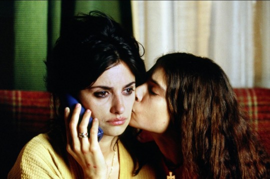
The film’s budget was estimated to be around €7,450,000 while its total worldwide gross was about $85,585,000 (Volver). The director, Pedro Almodóvar, is famed for his movies whose topics have surrounded death, the complexities of sexual desire, violence, and sexual abuse. He has also won awards for his past works including an Academy Award for “Best Foreign-Language Film”, “Best Director” from the Cannes Film Festival, and “Best Original Screenplay” at the Oscars (Britannica). It is said that the prominent female characters and quirky small town in the film are meant to mimic the women and rural area Almodóvar was raised in during the 1950s and 60s (Holland, 2014). Almodóvar grew up during the dictatorship of Francisco Franco who’s reign over Spain involved the placement of civil codes that struck patriarchal tones and gave women limited rights. It was not until 1975 (close to Francisco Franco’s death) that restrictions were lifted and women could be recognized as the “head” of a family, procure assets, and receive passports without showing proof of marriage among other things (Miguel, Martínez, González, Vadell, Pérez, Diz, 2014). As the country has since grown to reflect an attitude that leans more closely towards gender equality, there is still an imbalance between men and women which is clearly evident in the media. This imbalance pertains to much of Spanish media in which men are represented more often than women and women are typically much younger (Miguel, et al, 2014). Almodóvar’s response to this involved creating a mostly female cast with characters of different ages to produce a film that is mainly female-centered. In this way, Volver both celebrates women and effectively blasts the notion that men need to be chiefly present in all Spanish media.
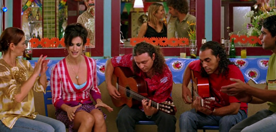
Raimunda Singing “Volver”
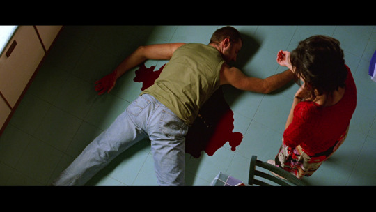
The film was released in 2006 and is about two hours in length. It was shot using a 35 mm Panavision Panaflex Millennium camera in Madrid, Spain (Volver). Almodóvar’s expressive use of color and interesting perspectives are used to dramatize scenes, draw viewers attention to certain aspects within a frame, or create a particular mood. This can be observed in the scene where Raimunda sings a song that her supposedly deceased mother taught her as a child during a party she is catering. The scene is powerful and full of emotion as Raimunda sings the song with passion and a noticeable sadness. Viewers can observe that this is a crucial scene based on the perspective of the shot that shows Raimunda in the center of the musicians and partygoers, as well as the vibrant colors that bring attention to her. Another part that utilizes perspective and color is the scene when Raimunda discovers her murdered husband. The camera is perched above her and she is seen standing over his bloodied body. With this angle, viewers have a similar view to the one that she has in that they can survey the entire situation from her viewpoint. Furthermore, Almodóvar’s use of color is important to note as the red pool of blood around the body expresses severity and presses for the viewers attention but Raimunda still manages to stand out thanks to her glaringly red sweater.
From an ethical perspective, the film should entertain the viewer in a way that does not disrespect or harm anyone in any way. The movie does not seem to perpetuate any commonly known stereotypes of the Latino culture. Some common stereotypes and generalizations include that Latinos are associated with crime, poverty, illegal immigration, and gangs which are ideas that are typically maintained through the media (Lester, 2013). Almodóvar clearly does not try to perpetuate any of these harsh and false Latino stereotypes through Volver. Instead, the film is a celebration of the Latino culture and people as he recreated a reality that closely resembles his childhood. However, Almodóvar does employ the Utilitarianism ethical principle to show the character’s real way of life while also maintaining their dignity. For instance, the main characters are not extremely well off, in that, there are a few scenes where Raimunda has to ask her neighbors to lend her food to cook with until she can pay them back for it. There is also a scene where Raimunda frets about her husband being laid off from his job. These subtle hints allude to the fact that Raimunda’s family has to work hard to make a living and are probably not wealthy. Almodóvar implemented Utilitarianism through his creative choice to build a family that has to work hard to stay afloat but also does not see money as a giant problem. Essentially, he chose to depict Raimunda’s family in a way that showed the character’s successes while also giving viewers a serious glimpse of their hardships (Lester, 2013).
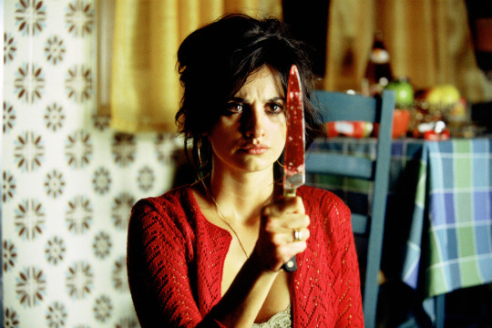

In terms of semiotics, color is again an important aspect to pay attention to in the film. Not only is it implemented to create a particulate mood and draw the viewer’s attention to things, but it is also used to send messages. For instance, in the scene where Raimunda discovers her husband’s bloody body, she makes the risky decision to clean up the crime so her daughter does not go to jail. Raimunda cleans the murder by removing the knife from her husband’s stomach and wiping up his blood with paper towels and a mop. The extensive amount of blood in this scene is important as it is used to show the horrifying extent of the crime and to further deepen the severity of Raimunda's actions. Above all, the visual cue of color is used to counteract the film’s darker themes of murder, regret, sorrow, and death. The name of the movie, Volver, also carries a significant meaning as its literal translation means “to return”. This can be applied to any one of the scenarios played out within the film including, the women’s mother coming back into their lives after she was believed to be dead, their Aunt’s neighbor, Agustina’s, sad realization that her mother would never come back home, the eerie wind that reappears and brings with it uncertainty, and of course, Raimunda’s return to her mother in the end. In this way, “Volver” can have many meanings associated with it including one that reminds viewers that things will eventually return.
Irene and Raimunda
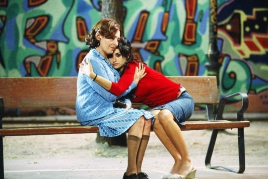
The film combines melodrama and realism to create a movie that would appeal not just to Latinos, but people all over the world. Volver depicts strong tones of family, solidarity, and warmth that pays homage to Latinos and their culturally rich heritage and customs. Death is a particularly important notion to the film that is played out in the beginning when the camera pans across a graveyard to show women who are busy cleaning gravestones. It is understood from this scene that tombstones are meant to be looked after by members of the departed’s family. Agustina even prepares for death by looking after her own gravestone which is a conventional practice in the town. Traditions and family values are carried on throughout the film taking precedence over all other aspects. Neighbors look after each other, lovers reunite, and families stay together. These instances are examples of the close familial bonds and relationships that Latino’s cherish and that Pedro Almodóvar cherished while growing up. Therefore, Volver is a reflection of this message that brings him back to his Spanish roots and connects the world with them too.
References:
Google Images
Gutiérrez San Miguel, B., Ibáñez Martínez, M. L., Carcedo González, R., Bujosa Vadell, L. M., del Pozo Pérez, M., & Martín Diz, F. (2014). Gender roles and the Spanish media, a three-decade-long comparative study. Revista Latina de Comunicación Social, 69, 213–228.
Holland, J. (2014, October 15). Volver. Retrieved from https://variety.com/2006/film/awards/volver-2-1200517470/
Lester, P. M. (2013). Visual communication: images with messages. Belmont, CA: Wadsworth.
The Editors of Encyclopaedia Britannica. (2019, September 21). Pedro Almodóvar. Retrieved from https://www.britannica.com/biography/Pedro-Almodovar
Volver. (2006, March 17). Retrieved from https://www.imdb.com/title/tt0441909/
1 note
·
View note