#but it’s also similar to watercolor in the way that you can reactivate the color using water on the painted surface
Explore tagged Tumblr posts
Note
do you use gouache when you paint? i'm not very familiar with painting or paints but i want to learn and i really like the colours and general feeling of all your paintings and i think that i might like to learn to use that material as well
I have used gouache in paintings, but not the ones I’ve posted this summer. The lake creature and the canvas w a hole was painted w acrylic, the rest in aquarelle/watercolor! Out of the two of them acrylic is the most forgiving for me lol, since it dries fast and you can paint over any mistakes. Watercolor is either really relaxing or hell on earth, as it dries slowly and you can never paint lighter colors on darker colors, so you need to know which spots that you want brighter and use as little paint as possible in those spots, and the colors spread out when the paper is wet, which can create really cool effects!
#ty anon I hope your painting journey goes well :)#you can hop into dms if there’s anything you’re wondering about regarding paint#gouache is pretty similar to acrylic in the way that the colors are pretty opaque#but it’s also similar to watercolor in the way that you can reactivate the color using water on the painted surface#the thing that makes gouache unique to me is that the paper gets an almost leathery finish when it dries#quick warning tho that acrylic dries a few shades darker than when you first apply#I’m pretty sure that’s the case w gouache as well#uhhh anyways hope this was helpful???
7 notes
·
View notes
Note
,, i dont,, know jackshit about naruto,, but,,,,,,, your watercolor pieces are so good??? like???????? SO GOOD?????
Here's the obligatory ask (since I started trying to use watercolors): are you aware of any tips for that particular medium? Like, are the brushes and watercolor quality really important or is that just my imagination? Also, how 2 mix colors and not die-
LMAO thanks!! I’m glad you think so!
I do have a lot of tips for watercolor, but I’ll start with the material questions. I would say that the quality of the tools can be fairly important, but like, it’s not make or break.
Supplies Information:
Disclaimer: None of this is necessary! You can make great art with any material available to you. All materials have different strengths and weaknesses, but you can create things that bring joy with the most rudimentary of supplies.
I tend mostly to use liquid watercolors because I find them easier to control and manage (and I just...like working out of little bottles of liquid with eyedroppers. It’s my ink bias), but they have significant drawbacks. Archival speaking? light will bleed all the color out of what I have created eventually! They aren’t built to last. That doesn’t worry me much because I tend to stack all my drawings up and shove them in a drawer when I’m done, but it’s something to keep in mind. I find them easy to mix and manage in the pallet, and easy to reactivate if they dry out
The brands I use are Dr. PH Martin’s Concentrated/Radiant Watercolor, and Ecoline Watercolor. Between the two, I would recommend Ecoline because they are cheaper, have more consistent texture, and have more in the bottle. Honestly, if the art store near me wasn’t on a huge sale, I never woulda gotten the PH Martins, they’re expensive as hell and just incredibly teeny glass bottles.
BUT, if you want to use watercolor that comes in tubes (which will last longer, give you more options for artistic expression—because the texture ranges from paste to watery, you have all that range to experiment with—and which most watercolor artists prefer in general) there’s a lot more options. The highest quality for the cheapest price I’ve found are the Turner’s watercolor tubes? I don’t always love the texture when I’m wetting the paint because I am picky, but the color is incredibly vibrant, and the prices are incredibly affordable compared to like, schminke or cotman haha. I used these in school and had a great time with them.
Brushes I know a lot less about, like almost nothing honestly, I wish I could give you some concrete advice on brushes but what it really comes down to for me is like, if you like the way it feels in your hand, if you like the way it makes a mark, it’s good. all it exists to do is facilitate You making a mark on the paper with some artistic medium, as long as you are satisfied with it, that’s good.
If you want brush recommendations though, I’ve been told that Princeton’s watercolor brushes (i have a couple from the Heritage and Velvetouch series) are good synthetic brushes for...moderate prices. Brushes are expensive. Usually people recommend you have a #2 and #4 Round, and a smaller detail brush, but again, really, like all things art it all comes down to your preferences, and your needs.
Actual Painting Tips:
Take care of yourself! Treat yourself kindly, forgive yourself for making mistakes. I’m dead serious. It’s impossible to avoid making mistakes, and in watercolor the mistakes are really hard to fix, and usually impossible without the use of gouache or something else opaque, so at some point it’s going to become an exercise in forgiving yourself for making those mistakes, like drawing in pen with no under-sketch. On a good day, I find this therapeutic. On a bad day, it’s maddening. It’s okay not to make art on a bad day. When it comes to something you do because you enjoy it, and want to continue enjoying it, it’s important not to force yourself to do anything you don’t want to, and to take breaks when you feel yourself getting frustrated.
Paint from Lightest color value to Darkest. If you’re going to paint a character with a bit of a rim-light from some golden sunlight, paint that light light yellow first, top to bottom, and then work your way to the darker colors.
If you’re painting on a tilted surface (I’m guilty of keeping my sketchpad or paper block on my knees) paint from top to bottom. The weight of the water will pull the paint down, so you want to work with gravity, not against it!
Limit yourself. Let yourself only work with one color for a day or so, then only two colors, then only three. When you put yourself in a corner where you don’t have a lot of options, you’ll often find you surprise yourself with what you come up with. Usually, I pick three colors, put them down on my pallet, and leave them there for a week or so, mostly just painting from those colors. It helps me develop a familiarity with how those colors work together, and how they work when I mix them.
Mixing Colors:
another thing I should say about the Dr.PH Martin’s watercolors is that they don’t always mix well. I tried to get a skin tone for Kakashi once out of pink, green, and a little bit of brown, and in the mixture you could see all of the colors that went into it, and it gave a very strange look. I liked it as a color, but it definitely looked weird.
The paint that you use will have properties specific to itself, and you will get more familiar with those properties as you work it. It may mix smoothly on the pallet, it may not, and both of those can be good if you’re willing to work with them.
Because of watercolor’s properties, there’s three main ways to mix it:
One: Mixing in the palette. What it says on the tin—you mix the paint, you put it on the paper. I do this one the most, it just takes a lot of familiarity with your paints to get used to the balances that create the colors you want, just lots and lots of playing around.
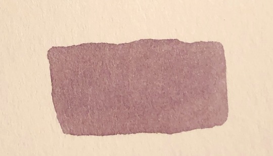
Two: Mixing dry. This isn’t really “mixing” per se, but it does the same job, Watercolor is a transparent medium, and one that reactivates when wet, so if you put one color over another, it’s about the same as mixing.
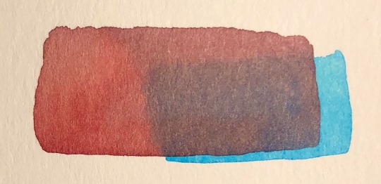
Three: Semi-wet mixing. The combination of the two! You can get some weird effects out of this. I use it sparingly, but I love to use it when I do.
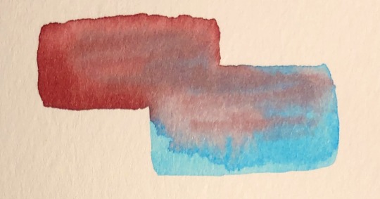
The most useful physical tool for me (just me personally) in mixing is a pallet i have, and while it’s fairly cheap and should last like, idk forever, there are other ways to get a similar effect without it, as long as you give yourself space to mix.
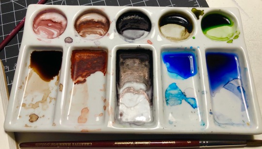
it looks like this, it’s a porcelain pallet (so the cleanup is incredibly easy, unlike my plastic one, which unfortunately wants to hold my color a little) and i use it almost daily. The circular wells are for where you put the bulk of the color you will be using, and the rectangular wells are for mixing either with water, to get more translucent colors, or with other colors. The limited wells but excess of mixing space puts pressure on me not to use too many colors, but to mix them constantly. (but also has enough divided space that I don’t feel anxious about everything getting muddied. i am very particular.)
It’s heavy though, and while its therefore good for sitting on my desk and not getting knocked off by my cat or me, it’s not easily portable, especially as it’s uncovered if that's something that is important to you. Blick’s probably has them, as does...I imagine any other art retailer? They’re fairly popular. Usually around 6-8$ but again, none of these tools are necessary, they are just what suit me personally. I hope this helps! If I have the energy for it, at some point I’ll post some basic watercolor exercises to help with control and technical skill. You can get very good with any medium just by raw continuous practice, but my teacher last year had us do a lot of exercises that not only gave me a much greater comfort and confidence with watercolor, but that were also just...incredibly meditative to do.
#it wouldnt be basil mokutone if i didnt turn literally every advice post into an excuse to tell people to treat themselves kindly#something something you are your greatest tool and just as you shouldnt leave your brushes in the water you also shouldnt overwork yourself#i got a lot of my supplies very cheap cause the art store near me was closing so lots of it was extremely discounted so i'm very lucky haha#changeside#watercolor#advice#i genuinely hope this helps folks hahaha i dont wanna come off as like idk presumptuous or preachy#long post /
49 notes
·
View notes
Note
What are your favorite watercolors? What do you recommend for starting out?
PWC for my favourite. But I'll go over the sets I have though so you can choose for yourself.
PWC extra fine
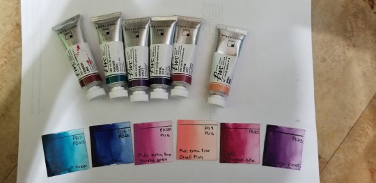
We'll start with my favorite one. I only have 6 tubes but plan to replace many of my others with these.
They come in 15ml tubes that cost 10-15 dollars each. They have a 100 colour line with a number of single pigments and minimal pigments convenience mixes. Almost all of there colors are bold and very pigmented. They're creamy, dry nicely, go into pans beautifully and reactivate easily. These are great but not very well priced with budget in mind if you just want to play. You get a lot of paint though making it nicer if you plan to use long term.
A Academy
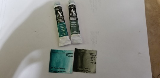
A decent mid tear paint. These are 7.5ml tubes at 7 dollars each. There are 60 colours in their line. They have really nice color options but I find them more granular than some of the others. The colors are decently vibrant. They pan well too. I haven't used them much yet but enjoy them so far.
Pebeo
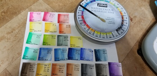
Alright, I don't like these. I'll use them but not as a first choice. They're not fun to work with, have weak pigments and way too many pigments in colours that don't need it. The range is nice which makes me sad that there's only a couple colors that I enjoy. At 45 dollars for the set... I'd skip it honestly. Only nice thing is you can find a list of pigments used...
W+N cotman
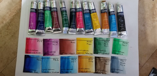
Great little paints for being student quality. A blanket price of 5-6 dollars per 8 ml tube, it's affordable for those starting out. Some are a little more chalky than I personally like but it's not a deal breaker. I recommend if you don't want to jump into professional quality but need a few more colors to try these.
Pentel
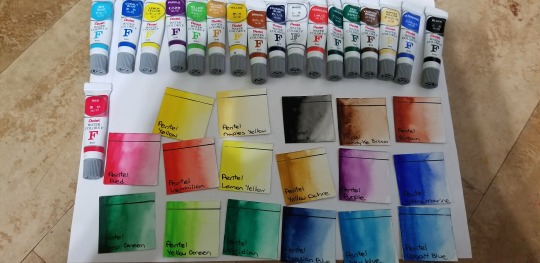
Probably my recommendation for if you want a set and are just starting out. A set costing 25 dollars or so for 5ml tubes. They pan nicely, have a good range of colors and aren't hard to work with. My only real complaint is the lack of red. I'd prefer a crimson over the vermillion or a switch out of one of the cool blues. But still a goid set. No pigment information.
Reeve's
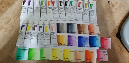
These have become a love and hate for me. Cost is even with pentel and you get much larger tubes... But it's not as nice of paint. Very grainy and streaky if you don't know how to handle it. It also pans poorly, cracking and becoming chalky. The colors are great and I use the peach so often it's not even funny. It's a good alternative but far better out of the tube and after you learn how to mix.
Looking at simular colours
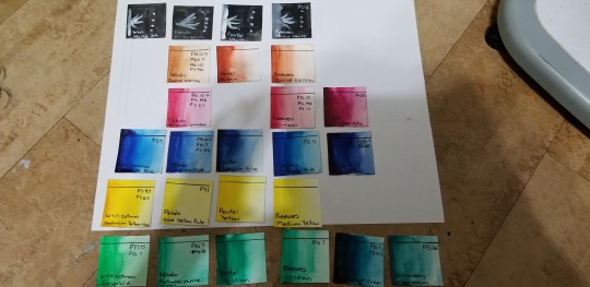
I try and avoid perfect matches. But seeing side by side is a good way of seeing quality. Like this you can see how pigmented some of these are.
At the end of it though pick a brand that works with what you like to paint. Look online for people's pallets that paint similar things. You like illustrations, gauch or smooth water colour is nice. You do landscapes and nature, a lighter more granulating pigments. Animals, a lot of neutrals with varings textures.
8 notes
·
View notes
Text
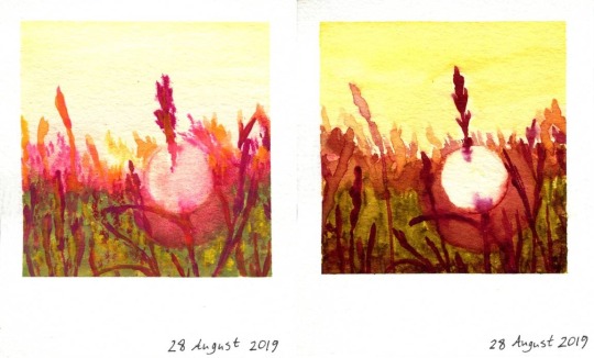
$50 vs $4 Watercolors
This my Sparklers is the product of two of my favorite things; eagle-eyed art shopping and the lust for artistic experimentation. A little while ago I was scavaging the clearance section at my local Michaels, and I stumbled upon some 5 ml. Winsor & Newton Professional watercolor tubes for a little over $1 each. Upon double-checking the stickers and noticing the cheapest one was originally priced at $9.99 (the most expensive was originally priced $14.99!), I knew they were coming home with me! (And for the record I got all four unique colors they had; if there had been more I certainly would've grabbed them too!) Once I had them home and swatched out, I, of course, wanted to put them to the test to see as I'm sure many of my fellow tight-pocketed artists do, are these tiny tubes really any better than the cheaper mid-range stuff? So I color matched as closely as I could with the watercolors I had, and naturally, since it was the biggest set, the Arteza set of 60 watercolors ended up being my best bet. Technically, at least right now, you can't buy the Arteza tubes individually, so I did the math and even leaned on the high end to place them at about $1 per tube. But even if I'd paid the $40 price Amazon puts on the set, that would still have been cheaper than these four tubes, and it certainly would've been cheaper than a larger set (12, 24, etc.) of most any "professional" quality paints. Unfortunately, I could only match by color similarity, as I did check and none of the pigments match between the Arteza paints and the four Winsor & Newton ones I had. The closest "match" was that the pigment for the yellow in the Arteza set that I picked out is often used as a substitute for the pigment in the yellow Winsor & Newton paint. So I acknowledge you can't really judge the comparison based on color alone here, but then again I figured even if I could match pigments the colors may still turn out differently based on formula or manufacturing process. Still, I tried to create both paintings as similarly as possible, but we'll talk more about that in a second. Now, before I go on I want you to really take a look at the two Polaroids and decide for yourself which side you think was made with the more expensive paints. Really consider what it is about each one that makes you think it's one or the other. Got your choice? Good! Moment of truth; the painting on the left was made with the Arteza watercolors; the one on the right with Winsor & Newton! It was odd though; maybe I'm just used to the cheaper stuff, but I felt like I had an easier time painting the Arteza one than the W&N one. To be fair, the yellowish-green color from W&N (Green Gold, if anyone cares) did lean more on the yellow side than the match I picked from Arteza, which didn't help. (I really could have benefitted from some sort of cool color in that palette.) The W&N paints were definitely more transparent, and yet it took more to water down the color when/if I needed to, which I have mixed feelings about. But again, maybe I'm just used to cheaper stuff and so I'm not used to the traditional properties of more expensive paint. Something I noticed about the W&N paints that I found interesting though, was that they did seem to dry more slowly than the Arteza paints. Drying time with watercolors usually depends on the paper; 100% cotton in particular usually dries more slowly and absorbs the paint more evenly. The thing is that I used the same cellulose paper for both of these; Canson XL watercolor paper. And So my conclusion is that, for whatever reason, the W&N formula just dries more slowly. This makes sense if you consider the drying "issues" I mentioned when I did my Review/First Impression piece on the Arteza paints. To summarize: when the Arteza paints dry on a palette, they dry pretty extremely so. This makes me wonder if you were to mix some glycerin and/or honey into them if they would also dry more slowly on the paper. Whatever the case, I did notice the W&N paints also seemed to layer nicely with thicker concentrations of paint, but the layers underneath wanted to reactivate almost too easily with more watery layers on top, and you can probably spot some instances of that. This was, however, very useful when I decided I wanted to add another layer of yellow to the sky to darken it up. No harsh water lines! The sun/glare spot on both I made by placing an old circular sticker where I wanted it, so I can't comment on the lifting abilities of either brand of paints, but because of how the grass/plants lead into the spot, as well as some other areas, I will say that both kinds blend pretty nicely and similarly. The W&N paints just have the added benefit of drying more slowly, which allows for more blending time. Ultimately, I have to say both paints have their pros and cons, at least as far as I can tell. But my question going into this was more so if I felt like the professional quality paints were really worth all the extra money (when you don't find them for very good clearance prices). And I'll be honest, my answer is no. Now, granted, professional-quality paints--not just watercolor--due tend to be more lightfast/long-lasting, and if you're not like me and not used to using the cheaper stuff that end of the day just behaves differently no matter how you slice it, there's nothing wrong with using the more expensive stuff if you can afford to and that's what you like. There are benefits there. It's just for me, at this point in my artist career, I'm just as happy with more amateur level supplies that, in my experience, work just as well for what I like to do with them. Of course, every case is different. Arteza has more or less made a name for themselves at this point for being less expensive but still decent quality. Not all other options will work out as nicely by comparison. And just as well, even among different professional quality brands, you may have a preference based on your own personal taste. That's just the way things are. So in conclusion: The Winsor and Newton watercolors are definitely nice, but I'm not convinced these four tiny tubes would've been worth $50+ if I'd had to pay full retail price for them. For that kind of money, I'm just as happy with 60 colors from Arteza and a little leftover for something else. What about you, dear reader? Based on the artwork, do you think the paints used on the right are worth over $50? Next up, I plan on revisiting another supply that I recently expanded my collection of also thanks to some shelf-clearing clearance prices at Michaels, and I'm also working on a couple of particularly special/exciting projects that I'm eager to share, so stay tuned for all that. Oh, and of course we are officially in Inktober-Prep Season, so there may be some things coming up later this month in regards to that. I have to say, I'm practically chomping at the bit for Inktober this year based on my plans so far. ____ Artwork © me, MysticSparkleWings ____ Where to find me & my artwork: My Website | Commission Info + Prices | Ko-Fi | dA Print Shop | RedBubble | Twitter | Tumblr | Instagram
1 note
·
View note
Text
The Best Watercolor Supplies for Beginners
Are you a watercolor beginner and are looking for supplies that will help you with your art journey? You’re in the right place because this post is going to be all about watercolor supplies for beginners – the things to consider and the many categories that may seem overwhelming for newbies.
I’ve always been fascinated with watercolors but was too intimidated to actually start working with them because the pieces of information I saw when it comes to choosing your first supplies as a beginner were overwhelming. When I got my first watercolor paint set, I was beaming with joy because the plethora of colors in front of me was so pleasing to the eyes. I slowly built my supplies from there with trial and error and a bit of help from the internet.
I want to help those who are starting their watercolor journey so you won’t end up as clueless as me, so I made this guide.
As someone practical, I am all for affordable yet quality products that will give you great results. So without further ado, here are the best watercolor supplies for beginners.
(Some links are affiliate links which means we earn a small commission if you purchase at no additional cost to you.)
Tips for Choosing Art Supplies
Before going to the main point of this article, I have two tips to give you when purchasing art supplies.
1. Buy the best supplies within your budget
As a beginner in watercolor painting, you don’t have to spend a lot of money on supplies to aid you in your journey. At the starting point, stick to your budget and look for the best supplies that you can afford. There are cheap alternatives and these ones, though they have a difference from the premium supplies, are workable and great to have as a beginner.
2. Quality over quantity
You don’t need 48 watercolor paints or 25 kinds of brushes. Start small and choose quality over quantity. Sometimes, investing in one good brush is better than buying the generic cheap brush sets that don’t really last or don’t have the best performance.
You will learn along the way what works for you and what doesn’t.
Watercolor Supplies for Beginners
Despite the many options available on the market, there are brands of art supplies that have quality products and made for beginners to build up your skills without making your wallet cry.
We’ve compiled the lot of them and made some recommendations on great products so you will have ideas and choices should you decide to get them for yourself.
Watercolor Paints
The first thing you need to have is, of course, watercolor paints. Sample sets might be the best place to start in this category.
There are a lot of high-quality brands that carry a variety of colors at very reasonable prices, and you will surely pick one to your liking.
Watercolor paints come in two forms – in tubes and pans. Tube paints are great but they are easily used up, so I personally recommend pan paints for those who are still exploring watercolor painting.
Read: The Best Watercolor Set for Beginners
Pan Paints
Watercolor paints in pans are most commonly used by beginners because of their convenience. Pan paints are highly portable, easy to clean up, mostly have a built-in mixing palette, and they typically last longer.
Look for reputable brands that offer quality products because quality watercolor makes all the difference as it gives you great pigments, color payoff, and workability.
Here are the things you need to know when you get pan paints:
they need to be activated with water before you can start mixing colors
they’re great for small to medium-sized paintings
they are great for traveling
they last longer than tube paints
Recommendations
Winsor & Newton Cotman Watercolours Sketchers’ Pocket Box
Sakura Koi Watercolor Sets
Sennelier La Petite Aquarelle
Tube Paints
Watercolor in tubes is in liquid form and is thick. They can be squeezed out on a mixing palette and thinned with water to have varying transparency. And just like watercolors in pans, dried tube paints can be re-activated with water.
The great thing with tube paints is they give intense pigments and are naturally more concentrated than pan paints. The disadvantage of tube paints though is that you can easily squeeze out too much product and end up using more.
Things you need to know when you about tube paints:
Colors are easy to mix together
they are great for large scale paintings
you have to get a mixing palette because tube paint sets often don’t come with it
you need to tightly close the tubes to keep the paints from drying.
Recommendations
Daniel Smith Extra Fine Essentials Introductory Watercolor
Van Gogh Watercolor Paint Set
Reeves Student Watercolor Set
Gouache (Opaque Watercolor)
While many consider gouache a different form of paint, it technically is an opaque form of watercolor. What’s special about it is it gives results that are similar to opaque paints like oils and acrylics. Some artists focus on making artworks using only gouache paint, but you can use this paint in conjunction with watercolors to intensify highlights and depths.
Recommendations
Winsor & Newton Designers’ Gouache Primary Color 6-Tube Paint Set
MIYA Gouache Paint Set
Arteza Gouache Paint
Watercolor Brushes
There are a ton of watercolor brushes on the market and the varieties can be overwhelming. What should you, as a beginner, get?
Watercolor brushes vary in handles, bristles, and prices, and recommending this art supply is difficult because it really comes down to personal preference. What I prefer may not work for you or vice versa.
It’s kind of like a trial and error when it comes to finding the perfect brush for you, but don’t worry, we have a few recommendations that will give you somewhere to start.
One thing to keep in mind is that there are a lot of brush sizes available and usually, the recommended brush for beginners is a round brush in a size 8 or 10. Using this size will allow you to paint almost anything you want.
As for the brush handles, they come in different lengths and materials. Long handles are great when you are working on an easel and are usually designed for acrylic paints. As for watercolors, shorter handles are commonly used as you’ll be working mostly on paper.
There are also various bristles available and most artists generally prefer the softer ones. Brushes made out of sable and goat hair are soft and are popular options, but there are also soft nylon brushes that many artists prefer because of their excellent spring and control.
Recommendations:
Pentel Aquash Water Brush Pens
Winsor & Newton Series 7 Kolinsky Brushes
Kuretake Water Brush – Medium
Princeton Aqua Elite, Series 4850
Watercolor Paper
Choosing the paper you’ll be working on is important in your watercolor painting journey. The paper made for watercolor is absorbent and it allows you to work on the paint for multiple applications without warping too much.
There are three main things you need to look out for when choosing your watercolor paper: weight/thickness, absorbency, and texture. Watercolor papers are categorized into three – rough, cold press, and hot press.
Cold Press
This type is the most popular and it’s referred to as “cold press” because the paper is manufactured by rolling them on cold cylinders which produces an irregular dimple pattern on the paper.
This type of watercolor paper has medium absorbency and medium texture. And it’s often the best type of paper for beginners.
Hot Press
This type of watercolor paper is a bit smoother because it is rolled on hot cylinders. The brush strokes are more visible in this paper.
Hotpress watercolor papers don’t absorb water and paint as quickly as the others so it allows you to work and move your paint on the surface for longer. This paper is great for artists who want to emphasize the details of their work.
Rough
Rough papers are not rolled in cylinders, instead, they are hard-pressed or not pressed at all. This results in a heavily textured paper and this type is the most absorbent out of the three.
Watercolor papers are available in different weights, the most common of which are 180 gsm (light-weight), 300 gsm (medium-weight), and 640 gsm (heavy-weight).
Light-weight papers buckle and warp very easily, unable to take in too much water.
Medium-weight papers can take a few washes, lifting, and other watercolor painting techniques, although there can be a tiny buckling so it needs to be taped down to minimize the warping.
While heavy-weight papers do not require you to tape it down as it allows multiple washes and wet-on-wet technique. Although this paper has the highest thickness, it doesn’t necessarily mean it’s better and it’s usually more expensive than the other two options.
Read: The Best Watercolor Paper for Beginners
Recommendations:
Canson Watercolor Pad
Strathmore Mixed Media Pad
Strathmore Watercolor Art Journal
Stillman & Birn Beta Series Softcover Sketchbook
MozArt Premium Cold Pressed Acid-Free Watercolor Paper
Mixing Palette
When you are using tube paints, having a good mixing palette is essential. You can use disposable ones like palette paper but those are not really practical because they are a bit wasteful. The watercolors left on the palette can be reactivated for future use and investing in a good palette will do you more good.
There are a variety of palettes available. There are plastic, acrylic, and ceramic palettes among others. I recommend using plastic palettes as they are the most affordable. If you are using a watercolor set that comes with a palette, then you are good to go.
Recommendations:
Ceramic Artist Paint Palette
Plastic Palette
Shappy Foldable Watercolor Palette
Masking Tape
When working with smaller paintings, you’d want to have your paper stay put and unmoving. You can use masking tape to adhere your watercolor paper to your work surface.
Spray Bottle
Have a handy spray bottle on your side when working on watercolors. You’ll need this to activate and moisten your watercolor paints in a pan so that you can easily pick them up with your brush.
Pencil and eraser
Some artists paint directly on blank paper while others sketch out a draft first. If you are one of the latter like me, you’ll need to have a trusty pencil and eraser.
A 2H or HB pencil will be useful to make your lines light enough so they won’t be visible through the paint. Although what pencil you’ll use will ultimately depend on your preference and the amount of force and pressure you exert on it.
Two Plastic or glass containers
As mentioned in our Watercolor for Beginners article, it’s recommended to use 2 jars of water. One jar is for rinsing your brush and the other one is for painting and mixing up your colors. It’s a simple hack so you won’t have to keep changing your water.
Paper towel or absorbent cloth
Of course, don’t forget your rag or paper towel when working on watercolors. This will come in handy when you need to wipe off excess water or paint. This will keep your workspace clean and mess-free.
Start Your Creative Journey!
Now that you know the basic watercolor supplies for beginners, you are ready to take on your art journey! It’s exciting to shop for art supplies, but it’s more exciting when you actually use those supplies to start creating your artwork!
Don’t worry about purchasing the affordable options first, you can always upgrade when you have already mastered your skills and are ready to move on to the next level.
I hope this list helped you. Don’t forget our motto, art is not perfect, so it’s okay to mess up a little bit. Learn from your mistakes and always strive to improve on your next try!
0 notes
Text
Pello Irazu: Panorama
• Dates: March 10–June 25, 2017 • Curator: Lucía Agirre
Pello Irazu is a key figure in the renewal of contemporary Basque and Spanish sculpture. Over the course of three decades, he has forged a solid career by fusing the broadest possible spectrum of sculpture with photography, drawing, and mural painting.
Regardless of the discipline he uses, Irazu's work exhaustively explores the problems that arise in the multiple relations between our bodies, objects, images, and spaces.
The installation design hinges on a conceptual and physical device invented by the artist, which incorporates some of the most significant milestones and masterpieces of his career.
The Guggenheim Museum Bilbao is pleased to present Pello Irazu: Panorama , which examines the thirty-year track record of one of the foremost renovators of contemporary Basque and Spanish sculpture. As the title suggests, more than the backward glance which any retrospective entails, this show is a multi-directional vision where time wrinkles and folds in space, offering a kind of panoramic landscape.
The exhibition, featuring over one hundred works, hinges on a conceptual and physical device invented by the artist himself that incorporates some of the most significant milestones and masterpieces of his career. The aim is to create a kind of simultaneous perspective where past and future are reunited and refreshed in a continuous present. In the Museum, the walls of Gallery 105 help create an enveloping atmosphere that draws viewers to experience the work, making them part of it and inviting them to reflect on the language of sculpture.
A key figure on the contemporary art scene, Pello Irazu has forged a consistent body of work since the 1980s, alternating between broad-spectrum sculpture—from small-format three-dimensional creations to massive installations and hybrid objects—and photographs, drawings and mural paintings. In every medium he uses, Irazu's oeuvre exhaustively explores the problems that arise in the multiple relations between our bodies, objects, images, and spaces.
The backbone of this retrospective is a large corridor that cuts diagonally through the center of the space and divides it into different areas which are organized in a circular fashion. This layout proposes a complex spatial experience, where visitors will be free to choose between several more or less linear routes at any point along the way. The central corridor contains a chronological survey of Irazu's most important works on paper as well as a mural painted for the occasion that illustrates the evolution of his drawings, collages, and paintings, while the peripheral areas house his sculptures and photographs.
This artist's oeuvre runs the entire gamut of sizes—from diminutive sketches to large-format works—, and media—from pencil and watercolor to wallpaper, adhesive tape, and all sorts of prints—. The exhibition also allows visitors to discover different forms of artistic expression: figurative, geometric, documentary, gestural, etc.
TOUR THROUGH THE EXHIBITION 1984–89 Early years The tour begins with photographic records of Irazu's first ephemeral experiences in the mid-1980s that would lead to the creation of his first steel piece, whose physical forcefulness is permanently questioned by the partial use of paint. These years witnessed the rise of what contemporary critics began calling "New Basque Sculpture", in which artists like Pello Irazu, Txomin Badiola, Angel Bados, María Luisa Fernández, and Juan Luis Moraza rejected local sculptural tradition and began to reconsider the work of Jorge Oteiza from more contemporary perspectives like Minimalism, Post-Minimalism and Conceptual Art.
In this early stage, Irazu established some of the parameters that would remain constant throughout his career, such as limiting the size of a work according to his own physical possibilities so that the piece would act as a condenser of a performative act, or dealing with his growing proximity to Minimalism and Oteiza, always from a heterodox position. During these years, Pello Irazu produced works of an intense material density, like Gante (1988), which create a spatial discontinuity wherever they are inserted. Little by little, color began infiltrating his work in thick coats of oil paint, as we see in The Land that Sleeps (La tierra que duerme , 1986), or more industrial spray paints. In the artist's words, "In both cases and with nuances, a contradiction is created between the optical (the eye) and the haptic or tactile, with their different spatialities."
Around this time, Irazu began working with media like drawing but maintained the characteristics of the sculptural genre. His drawings and paintings, developed alongside works in other media, were not conceived as sketches or designs for sculptures he intended to make but as independent creations. In 1989 Irazu produced his first mural painting, Corridor (Corredor ), at Galería Joan Prats in Barcelona, transferring ideas developed in drawing to situations closer to real space. With his pictorial, sculptural, or photographic wall interventions, the arrangement of his sculptures in space, and the fragmentation of that space, Irazu gradually altered the viewer's perception in the course of the itinerary.
1990–98 New Objects — The Domestic After a brief time in London, in 1989 Irazu moved to New York and entered a phase which, for the artist, was marked by the idea of externality, "for the important thing is not just the distance placed between you and what you leave behind, but the fact that you become something external to yourself". This decade is represented by works made of lighter, more readily available industrial materials like plywood or plastic, with expressive treatments and constant allusions to the domestic space. He created pieces that play with architectural references which disappear as mere constructions yet retain symbols of those references, such as brick or dialogue with household objects.
In this period of his career, he deconstructed objects to reassemble them in a disjointed fashion, creating a sense of defamiliarization with regard to the meaning of everyday objects and materials. In works like Unknown (1994) and After Pris (1997), Irazu revealed the tension between public and private. That tension is multiplied in photographs like White St. (1992) and Switch (1997), images of private creative processes destined for a public relation with other works by the artist, treating spaces and walls like trompe l'oeils or open windows onto an action performed in a private setting. "The domestic and familiar is rendered uncanny by a process of defamiliarization." He also managed to convey this unsettling sensation in works like The Good Teacher (On the table being itself a piece of wood) (1993) and The Bride (You will be whatever you want) (1993), where the artist intervened in the pedestals, the flamboyantly patterned fabrics that dress up the works, or the titles themselves.
In his drawings and paintings from this decade, Irazu applied basic colors to found pieces of printed paper or wallpaper which served as a continuous or reactive point of departure for his work. During this phase, he added new layers to his drawings using materials like adhesive tape, as in The Wound 5 (1998), allowing him not only to design an alternative pattern but also to link diverse materials.
1999–Present In the year 2000, back in Bilbao, Irazu embarked on a new phase in which his works questioned the signs that surround us, using forms that were suggestive to spectators yet far removed from their habitual points of reference to create mixed feelings of familiarity, ambiguity, and strangeness. Irazu appropriated the space, combining mural painting with three-dimensional materials and sliding along the blurred boundaries of conventional artistic categories. We see this in Acrobat (2000), where the mural painting fractures the wall which the sculpture seals. Another important piece is Life Forms 304 , in the Guggenheim Museum Bilbao Collection, a work originally created for Gallery 304 and now adapted to this new setting. The pentagram-like mural painting that surrounds the viewer modifies our perception of the space and its architecture as well as our relationship with the constructed object. The work resembles an unstable, impassable shelter in which color is combined with different ordinary materials like adhesive tape and plywood. We get the impression that we are seeing a deconstruction prior to reconstruction, the reused detritus of previously inhabited architectures or spaces. Drawing on this and other similar works from the period, Irazu produced sculptures like Fold 04 (Pliegue 04 , 2005), which he calls "drawings in three dimensions", based on the idea of "taking a drawing, cutting it, creasing it, folding it and placing it in space, but in a real way".
In works on paper like Johntrash (Juanbasura , 2003), the forms are quite simple, and through the layering of different transparent volumes and materials we can make out everyday objects such as bags or familiar faces from art history.
The final areas house Irazu's most recent works, which challenge the idea of representation in sculpture through reproductive processes such as plaster, aluminum, bronze, and steel casting or photography. In works like Noli me tangere (Mistrust) [Noli me tangere (La desconfianza) , 2009], whose title alludes to the biblical episode, frequently depicted in art history, where Jesus Christ appears to Mary Magdalene after the resurrection, Irazu created pieces of cast aluminum that visually resemble other materials like cardboard and assembles them with screws, making it difficult to tell the real and represented materials apart. In the artist's words, "The way they are articulated has more to do with the idea of accumulation than with the notion of assemblage." In Annunciation (Anunciación , 2014)—another major theme in art history, the depiction of which played a central role in the development of pictorial perspective—serial photographs reproduce the artist's immediate surroundings (the studio and production processes), which are gradually modified by paint rather like a trompe l'oeil , thus exploring the relationship between representation, materiality, and ornament.
In a nod to the idea of "eternal recurrence" and the circularity of all artwork, the exhibition ends where it began, with photographs and metal sculptures reminiscent of those with which the show opened.
DIDAKTIKA If you want to learn more about the exhibition and the artist's work, we invite you to take a brief tour led by museum educators in our Express Tours. You can also discover the behind-the-scenes setup process and other curious facts through the Shared Reflections program, unique tours led by museum professionals and sponsored by Fundación Vizcaína Aguirre.
Curatorial vision: March 22. With Lucía Agirre, Curator Key concepts: March 29. With Marta Arzak, Education Deputy Director
Additionally, you will find more information about the artist and his working process on the exhibition minisite, specifically in the educational section Did You Know...?
BIOGRAPHY 1963 Born on 26 October in Andoain, Gipuzkoa (Basque Country) 1981 Enrolls at the Faculty of Fine Arts of the University of the Basque Country/Euskal Herriko Unibertsitatea, where he graduates with a minor in sculpture in 1986. 1982 Receives a visual arts grant from the Spanish Ministry of Culture. 1983 Wins Third Prize in Sculpture at the 1983 Gure Artea competition. Exhibits at the Sala de Cultura, an exhibition hall managed by the Caja de Ahorros Municipal in Bilbao. 1984 Takes First Prize in Sculpture at the 6th Visual Arts Biennial of Vitoria-Gasteiz. 1985 Wins an artistic production grant from the Provincial Council of Gipuzkoa. Takes Third Prize in Sculpture at the 1985 Gure Artea competition. Exhibits at Galería Windsor Kulturgintza, Bilbao. 1986 First solo show outside the Basque Country at Galería Fúcares, Almagro. His work is included in the Muestra de arte joven at the Madrid Circle of Fine Arts. 1987 Wins First Prize in the sculpture category at Bizkaiko Artea. Participates in the exhibition Dynamiques et interrogations at the Musée d'Art Moderne de la Ville de Paris. Also appears in Una obra para el espacio at Canal de Isabel II in Madrid. 1988 Two one-man shows at Fundació Joan Miró, Barcelona, and Galería Soledad Lorenzo, Madrid. Participates in the 4th International Drawing Triennale at the Kunsthalle Nurnberg in Nuremberg, Germany, where he wins an award. That same year he wins the ICARO prize for most outstanding young Spanish artist. Three Spanish Sculptors exhibition at the Donald Young Gallery, Chicago. 1989 Exhibits at Galería Joan Prats, Barcelona. Lives in London and exhibits with Txomin Badiola at Riverside Studios, London. Chosen to participate in the 9th Salon of the XVI at the exhibition hall of La Fundació Caixa de Pensiones, Barcelona. 1990 Chosen to participate in the Aperto section of the 44th Venice Biennale. Thanks to a Fulbright scholarship from the Joint Spanish-American Committee, he moves to New York and remains there for the next eight years. His work is included in Spanische Eisenskulptur , a show that tours to museums in the German cities of Mannheim, Bochum, and Berlin. 1991 First solo show in New York at the John Weber Gallery. 1992 The Museo de Artes Visuales Alejandro Otero, Caracas, holds an exhibition of his work. Exhibits at Galería Soledad Lorenzo, Madrid. Participates in the exhibition Pasajes in the Spanish Pavilion at Expo'92 Seville, and in Tropismes at Tecla Sala, L'Hospitalet, Barcelona. 1993 New exhibition at the John Weber Gallery, New York. Participates in the exhibition Future Perfect , curated by Dan Cameron, at the Heiligenkreuzerhof, Vienna. 1994 Exhibits at the Palacete del Embarcadero, Santander, at Galería Joan Prats, Barcelona, at the Costas Grimaldis Gallery, Baltimore, and, under the title Real World , at Galería Soledad Lorenzo, Madrid. 1995 His show Habitat opens at the John Weber Gallery. Exhibitions at Galería Fernando Latorre, Zaragoza, and Galería Manuel Ojeda, Las Palmas. Leads an art workshop at the Madrid Circle of Fine Arts. 1996 His work is included in the show Abstract-Real at the MUMOK, Museum Moderner Kunst Stiftung Ludwig Wien, Vienna. 1997 New exhibition at Galería Soledad Lorenzo, Madrid. Also exhibits at Galería Lekune, Pamplona, and Espacio Caja de Burgos hosts an exhibition of his work.
1998 Returns from New York and settles in Bilbao. His work appears in the shows El punto ciego. Spanische Kunst der 90er at the Kunstraum Innsbruck, Austria, and Dibujos germinales at the Museo Nacional Centro de Arte Reina Sofía, Madrid. Leads a workshop at the Arteleku contemporary art center in Donostia-San Sebastián. Produces the sculpture that is selected to be the image of the Academy of Television Arts and Sciences Awards. 1999 Exhibits at the art gallery of the Málaga Architects' Association and in the show Daylight at Galería Soledad Lorenzo, Madrid. 2001 Presents the exhibition Life Forms 1ME9D at Galería Moisés Pérez de Albéniz, Pamplona. Participates in the show Gaur, hemen, orain at the Museo de Bellas Artes, Bilbao. His work is featured in Deux millénaires d'histoire de l'Espagne. An 1000-An 2000. Musées Royaux d’Art et d’Histoire, Brussels. 2002 New exhibition of drawings, Mimendi 308 , at Galería Soledad Lorenzo, Madrid. Participates in the exhibition Conceptes de l'espai at Fundació Joan Miró, Barcelona. 2003 Artium Centro-Museo Vasco de Arte Contemporáneo, Vitoria-Gasteiz, hosts an exhibition of his recent work under the title Fragmentos y durmientes . 2004 Exhibition at Galería Soledad Lorenzo, Madrid, entitled Pliegues . His work is included in the show Dispersions , held at the Bass Museum of Art, Miami. 2006 Holds the exhibitions Let It Bleed at Galería Moisés Pérez de Albéniz, Pamplona, and Todas las cosas—Pasión elemental—frutos extraños at Galería Carreras Múgica, Bilbao. His work is included in the show Enlaces+Dos at the Museo Patio Herreriano de Arte Contemporáneo Español, Valladolid. 2007 His work is featured in the exhibition Incógnitas. Cartografías del arte contemporáneo en Euskadi , curated by Juan Luis Moraza, at the Guggenheim Museum Bilbao. Participates in the 48th Oktobarski Salon in Belgrade. 2008 His exhibition Home opens at the Yancey Richardson Gallery, New York, and Galería Soledad Lorenzo presents the show Pello Irazu: Universo de suturas .
His work appears in the exhibition Micro-narratives: tentation des petites réalités at the Musée d'art moderne de Saint-Étienne Métropole, Saint-Étienne, France. 2009 His work is exhibited in the show PhotoDimensional at the Museum of Contemporary Photography, Chicago. Opens the exhibition Hondatu gabe bizi /Vivir sin destruir at Koldo Mitxelena Kulturunea, Donostia-San Sebastián. 2010 Galería Carreras Múgica, Bilbao, hosts a one-man show featuring the artist. Participates in El retorno de lo imaginario. Realismos entre XIX y XXI at the Museo Nacional Centro de Arte Reina Sofía, Madrid. 2011 Galería Moisés Pérez de Albéniz, Pamplona, opens the exhibition (1x1) x1 . Gallery Kit in St. Louis, Missouri, hosts a show entitled Pello Irazu: Isolation Room . His work is included in the group exhibition Olor Color. Química, Arte y Pedagogía at Arts Santa Mònica, Barcelona, and the show Sin realidad no hay utopia at the Centro Andaluz de Arte Contemporáneo, Seville. 2012 Exhibits at the CAB – Centro de Arte Caja de Burgos under the title Una oportunidad cada día . The installation Life Forms 304 , a site-specific work created for the Guggenheim Museum Bilbao, is exhibited at the institution as part of the show Arquitectura habitada . 2013 Exhibits at Galería Moisés Pérez de Albéniz, Madrid. Participates in the exhibition Mínima resistencia. Entre el tardomodernismo y la globalización: prácticas artísticas durante las décadas de los 80 y 90 at the Museo Nacional Centro de Arte Reina Sofía, Madrid. 2014 Presents his latest work at the Yancey Richardson Gallery, New York, in a show entitled Studio . His solo exhibition SiluetasMasasSombras PerfilesBultosEspectros LeyendasDesechosEspantos opens at Galería Carreras Múgica, Bilbao. Participates in the show Haber hecho un lugar donde los artistas tengan derecho a equivocarse. Historias del Espai 10 y el Espai 13 de la Fundació Joan Miró at Fundació Joan Miró. 2015 Sala Alcalá 31, a gallery run by the Regional Government of Madrid, presents El muro incierto , featuring various installations made by the artist over more than two decades. His work appears in the group show Suturak // Cerca a lo próximo , held at the Museo San Telmo in Donostia-San Sebastián in collaboration with Artium Centro-Museo Vasco de Arte Contemporáneo. His creations appear in the group exhibitions Made in Spain. Periplo por el arte español de hoy, at the CAC – Centro de Arte Contemporáneo, Málaga, and ExpoColección. El arte de los ochenta at the Museo Patio Herreriano de Arte Contemporáneo Español, Valladolid. 2016 The exhibition Itzalak opens at the Centro Cultural Contemporáneo Pelaires, Palma de Mallorca. Participates in alt-architecture at CaixaForum, Barcelona. 2017 Participates in the show (Ex)posiciones críticas. Discursos críticos en el arte español 1975–1995, organized by the CGAC in Santiago de Compostela.
0 notes
Photo
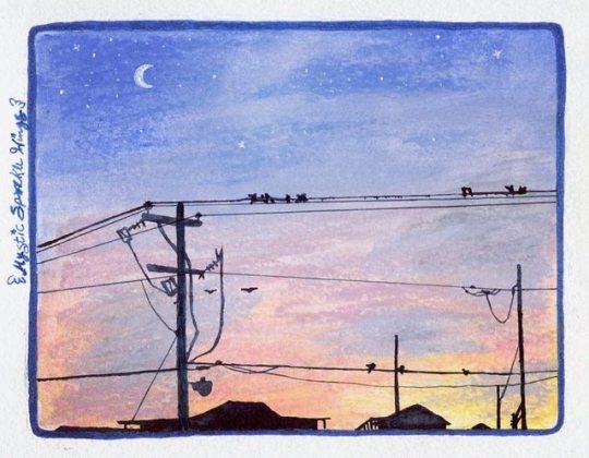
Beach Nights (Gelatos Test)
Here we have another, slightly stranger, art supply that's been on my wishlist to try for a while: the Faber Castell Gelatos! Which, for those that don't know, are one of many options available on the market for water-soluble/watercolor crayons/pigment sticks/etc. I grabbed up every unique color my local Michael's had when I went in one day and they were on clearance for $0.97 each. They retail for usually around $3 a pop if you buy them individually like this, and so I jumped on the opportunity. I ended up with a total of 35 colors to pick from. They do come in sets--some smaller ones of 4, a few that have 15 colors each, and there are a couple of bigger gift sets with around 30 each, as well as other specialty sets that come with a few gelatos and some other things for specific projects. As of yet, I can't comment on the arrangement of any of these sets, but I do like these well enough that I would like to end up with the full range of 80 colors eventually, so I've already worked out a few sets I'd need to purchase going forward to make that process as inexpensive and quick as possible. So perhaps I'll update this to comment on that at a later date, we'll see. Even so, I felt like I ended up with a pretty good range to pick from, just missing a couple of colors here and there that I didn't get simply because they weren't there at the time. I even ended up with a handful of metallic colors, which are pretty interesting, though I didn't use any of them here and when scanning artwork, metallic colors consistently fall flat anyway. Though I was pleasantly surprised that in swatching the metallics they don't lose hardly any of their metallic sheens after being hit with water. (As metallics in water-soluble colored pencils tend to become not-metallic anymore when that happens.) At first, I wasn't sure what to draw to test these things out. They come in little lipstick/chapstick/lip balm/whatever tubes, where you twist the bottom to get more product to come out, but are mostly flat on the end and so they're a little too big and super creamy to get super precise lines, unless you were to take a wet brush to them to pick up the color or be so bold as to cut chunks off to make them into a finer point/crisper edge, and even then I'm not sure how long said finer edge would last with how soft they are. My first thought was a galaxy, but that seemed a little too easy/obvious, and I had a feeling my gel pens would give me a fit over the top of these, based on how they don't like a lot of wax and they aggressively don't like watercolors. Eventually, I decided to try replicating one of the pictures I'd taken when we went on vacation to the beach recently since that would be broad enough and not require such fine detail other than the silhouetted buildings, which I had no intention of trying to do with the gelatos from the very start. Although I had made this artwork at a much larger size, that may have been a somewhat viable option. But I like relatively small art pieces. (Though this doesn't look exactly like my reference partly because of the unpredictability of art and partly because my eyes got confused while I was figuring out so of the powerline details, as well as I added the visible moon and stars and birds for some more visual interest). The one other thing about the gelatos I'm not crazy about is that some colors, mostly the pastels and some brights, melt almost seamlessly when hit with water, while others, mostly certain darker colors, either take more work and water to melt nicely or in some cases just won't fully dissolve the lines/texture marks. At least not on the cold-press watercolor paper I was using; I suspect some colors may have faired a little bit better on smoother hot-press paper, but I've yet to test that out. This has its advantages and disadvantages. It can work and give you some interesting textures, as you can see peeking through in a couple of places here. But if you want a super smooth, seamless look then you'll have to be careful and pick which colors you use accordingly. I tried a couple of different methods of applying the gelatos, mostly just to see what would happen. The most obvious thing to do is to apply the dry gelato to dry paper and then come back in with a brush to melt them down. But I also tried wetting the paper and applying the gelato straight to the wet surface, which was interesting and in most cases seemed to prevent harsher lines and textures being left behind, probably because the colors were already "floating" on top of the page without settling into the fibers. And because of that, I ended up inadvertently trying a wet gelato on dry paper. That was okay, but not much different from the other methods I'd already tried. I also tried mixing two gelato colors--Boysenberry and Fig--on a plastic palette by scribbling a bit of each right on the palette and then adding a couple of drops of water, and then I applied my new custom color to the drawing with a brush. This was interesting, and likewise, I think those that prefer more traditional watercolor techniques would probably like this method best. But I also like this method as it gives you a way to make a few more colors if, like me, you just don't have what you want/need and don't want to risk trying to blend/mix the gelatos straight on the paper. (Which I did try and is very much an option, as is blending two colors by using just water on the paper). And just as a side note that the edges of my scene here may not be perfectly blended or applied consistently because I lightly drew a rounded rectangle as "this is the size and roughly the area where I want the color to go" since I knew the gelatos were too imprecise to try and get right up the edges, and I was using a slightly larger piece of paper than usual. And I didn't use any tape to isolate the area, which in hindsight was probably a better idea, but oh well. Same thing with the funky outline; I defined the area with a glitter marker and tried to cover any gelato that was too far outside the guideline I'd given myself, but there were a few spots I had to cover up a bit with a white gel pen. Speaking of which... I was very right about my pens not liking whatever this gelato stuff is. The white gel pen did okay, but it wasn't as vibrant as I'd hoped and it did get clogged pretty easily, but I had a struggle with black pens similar to my Wire Sunset piece. Except for this time, after trying three pens I saw the light at the end of the tunnel instead of continuing to struggle with more. After a bit of thought, I ended up going with my black "Shark's Eye" Jane Davenport Mermaid Marker, since those use a dye-based ink that behaves similarly to watercolor, but not identically. That way I knew the color would go on top of the gelatos but as long as I was careful and only used so much, wouldn't reactivate any of the colors underneath and leave me panicking with a big mess. And in the end, even if some lines are bit wobbly/imprecise and I had a few smudge accidents, I think the mermaid marker ended up being for the better because the buildings weren't pitch-black in my reference, but I was really not into the idea of trying to draw enough detail to convey that, and yet because the mermaid marker ink is similar to watercolor, the pigmentation was just inconsistent enough that I think it implies that by accident. In a good way. Overall, I'm pretty happy with how the piece turned out and this certainly convinced me I want to try collecting all the gelatos so I can use them for backgrounds more often, despite some of the difficulties I had with them. They're a unique tool that takes some getting used to. And this does make me want to try some other brands of water-soluble crayons, but I'm not sure if I'll follow through with that just because I feel like these are really good enough on their own for me unless I find some unique colors in other sets I'd just really like to have that I can't get in the gelatos. Time will tell, I suppose. ____ Artwork © me, MysticSparkleWings ____ Where to find me & my artwork: My Website | Commission Info + Prices | Ko-Fi | dA Print Shop | RedBubble | Twitter | Tumblr | Instagram
1 note
·
View note