#but i had no idea how to add it to the design smoothly and cleanly so i just scrapped it
Explore tagged Tumblr posts
Visit Tumblr Blog
Explore Tumblr blogs with no restrictions, modern design and the best experience.
Last Seen Tumblr Blogs


Fun Fact
Tumblr was the first site to host the blog for President Barack Obama in 2011.
Text
explodes them ALL... what time is it??? DESIGN TIME

i got too lazy to color anybody else fully aside from the mtt you can explode me now too
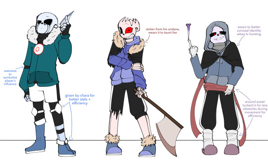
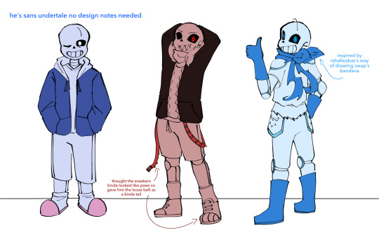
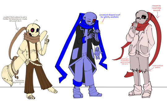
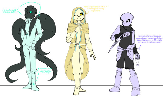
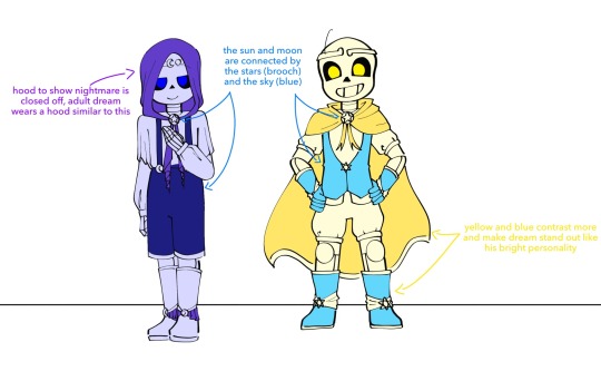
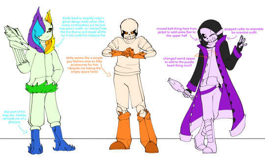
#tricule art#triglycercule draws the bottom six seriously for the first time!!! yes thats right ive never drawn color sans before this AND 😒😒😒#my favorites out of all of these..... obviously mtt but then maybe error and geno and outer#everyone else is nice too (except for color i STRUGGLED coming up with a unique design for him without knowing much about him)#spreading the killer is the tallest out of the mtt agenda every day 🙏 BECAUSE HE IS ok let me live in peace he is to me. he is to me........#reaper is beautiful can i just like womanify him and then take him for myself......no??? aww ok..........#every step delta takes sounds like a walking factory with those boots. CLACK CLACK CLACK CLAGCK#as always i am mandated to say my young dreamtale twins designs are inspired by ouji fashion because i love lolita fashion#just so the masses know i will likely never draw any of these designs ever again soooo#i solely draw the mtt and thats it 😭😭😭 all these designs are going to waste 🧡🙏#all the scarf people have different ways their scarves fall based off their designs and i really like that x3#got the 3 different meanings of overalls too: playful (ink) regal (young nm) and practical (farm)#originally i wanted to add the bravery soul's tough glove and manly bandana to delta too#but i had no idea how to add it to the design smoothly and cleanly so i just scrapped it#triglycercule eye shapes are carrying half of these designs bruh like.....outer's alien peanut shaped eyes my beloved!!!#i drew farm's eyes and immediately i was hit with a rush of southern kindness and i think thats funny as hell#anywyas its like 1am i gotta go eep now....time to tag these i suppose. should i even do all and only do mtt lmao#killer sans#dust sans#horror sans#murder time trio#utmv#sans au#yeah i'm not doing allat just mtt and general tags it is 😇😇😇#bad sanses#star sanses#squishes young dream and young nightmare in my hands politely#meanwhile i throw the mtt against each other to where its unrecognizable whether theyre fighting or hugging 🙂🙂🙂
169 notes
·
View notes
Text
12:15pm
She entered the studio with her eyes lowered and with her fingers playing with the hem of her blazer out of sheer nervousness—probably because she was about to meet the group for the first time.
She had been reading up on them last night, so this should go over well. They were monster rookies, winning 8 awards just after their debut and recently, their fanbase was growing both locally and internationally—Stay, as they were called, showed fierce loyalty and immense market influence. These were the two things that stood out as she followed the trends of their album releases, music chart rankings and overall audience reactions. It was interesting noting the talents and skills of each member; from the dance line’s ability to choreograph and freestyle with ease, to the vocal line’s distinct vocal colours and singing techniques, and of course, to the producer line’s proficiency in composing and their natural inclination to freestyle and performance rapping.
Again, she had already mastered all the details of this group—from their stats to their background, there was no reason for her to not get the final approval. She was the top intern of her batch, was a graduate from a premier university, and she naturally gravitated towards music and production.
This is it. All she needed to do was impress them and get their nod of approval.
After knocking on the door, she clears her throat before announcing herself. But just as she was about to speak, a muffled voice says, “Come in.” Startled, she hesitantly pushes the door and finds herself figuratively yet thoroughly thrown off balance.
She was faced by only one member.
He pushes his chair backwards and stands, closing the gap between the two of them in five quick strides. He doesn’t tower over her, but she felt herself shrinking in his presence. There was a shadow of a smile there, and the rest of his expression smoothly adjusted from a placid look to form crescent-shaped eyes and a sudden dimple.
He reaches his hand out and says, “Hello, it’s a pleasure to finally meet you.”
She was slightly bemused, blinking in rapid succession, as she was wont to do in situations like this. Interestingly, if there was anyone who was supposed to be saying those lines, it was supposed to be her. As far as she was concerned, she wasn’t anyone he should be “pleased” to meet. If anything, this job interview should be an additional workload to him at the very least. In an attempt to start on the right footing, she responds, “The pleasure is mine, honestly.”
For a while there is a lull, but he directs her to the seat across him soon enough, and finally, she sighs in relief with knowing that the official interview was about to start and the easy parts would come soon enough. Besides, this was all for formality’s sake anyway, the Human Resources head informed her that she was already accepted as part of the team handling their group, and that even the CEO approved of her performance as an intern.
All that was left was laying the groundwork between her and the group. Well, that is, between her and their leader.
Still perplexed with why he was the only one there, she attempts to think less of it—the group probably had a schedule or he was in charge of making executive decisions like this—and proceeded to answering question after question. From topics such as how she would contribute to the styling and artistic direction of each comeback, to any ideas she might have to increase the fanbase and market reach, it seemed like he wouldn’t run out of things to ask.
So of course she was taken aback again when, after hours of easing herself into a momentum of staying in a formal disposition for the interview, he suddenly asks, “So, why Stray Kids?”
He’s looking straight at her with his textbook smile, but she couldn’t bring herself to look at him because the way he was casually twirling a pen in his left hand was distracting—and the fact that he didn’t even flinch when her entire expression dropped to the floor in utter panic sent her into an even worse internal dilemma.
She wasn’t able to prepare for this. She was just assigned to the group because they had a vacant position—if she was being honest with herself, she was aiming for more of the administrative work for the company overall, and not actually getting designated to a talent. Should she say that? Should she be honest, will that be more endearing, more appealing?
Or should she say the typical answers—even though they aren’t true at all? That it is because she admires their work ethic and music? That it is because she believes that she could really help with their market reach, impact in the music industry and legacy as the company’s rookie group?
Or should she just—
“I don’t know why. But I don’t see a reason why not.”
The words were out before she could process them, and this time her head snaps up to face him, pupils contracting at the realization of what that kind of statement meant—for the security of her newfound job, and for his first impression.
“I’m sorry, I didn’t— mean to answer so informally, I honestly—“ stammering, she steals glances from all parts of the room except where he was sitting. This is a nightmare, she curses, while simultaneously thinking of a way to do damage control.
Engrossed in her thoughts, she catches the last part of his question. “…If you don’t mind?”
“Sorry, what were you…” she trails off, unsure of what his complete question was. At her fully transparent facial expression and rigid posture, he smirks—genuinely this time—and gives an apology before repeating his question.
“I’m sorry. You must be confused.” he starts, but he doesn’t give room for her to respond. “I asked if I could call you by your name, that is, if you don’t mind.”
At this point, she had thrown all her spiels, answers, and statistics out the window together with all rational thought. And so, as if her body moved on its own accord, she just nods.
“Great!” he exclaims, closing the file folder and standing up, looking to make his way to the door. “Welcome to the team.”
“Wait,” she blurts out, standing up as well. “Sorry, yeah—I mean, yes, I am confused.” she hazards, not looking at him. Rather, she returns to the same disposition she had before entering the room. “I believe I answered all your questions except for one. And that would be enough to merit my dismissal, I’m sure. Because even the most basic, and most important question which pertains to one’s motivation and loyalty, was something I could not answer.” she’s rambling, she knows this.
But she continues.
“So I just don’t know how… rather, why I am still accepted?” her voice was soft this time, no note of the level-headed and formal character she had so-cleanly put up a while ago.
As she was speaking and asking this question, he had made his way to her; and now they were face to face, with him standing relaxedly, file folder tucked in the crook of his arm.
“You see potential in us. You aren’t sold on us yet, but you studied about us, and you performed well under the company—you’re open-minded about learning even if you were just assigned here.” he lists off, voice level and eyes piercing through her. “There is motivation.”
She stands completely still, his echo of her words earlier dawning. “And loyalty?” she murmurs, curious despite herself.
He smiles. “You gave me your name.”
“What does that mean?” her voice goes a notch quieter, barely above a whisper. Yet even though they were feet apart, she feels as if they’re so close their foreheads could touch. “Should I not have—“
“I don’t think calling you as ‘intern’ is right.” he tilts his head to the side. “You might not think so, since work dynamics need to be maintained and all, but still, you gave me your name.” he pockets his hands now, giving a one-shouldered shrug.
At the unspoken question between them, he adds, smiling, “I’d like to think that means you’ll stay.”
26 notes
·
View notes
Text
Cutie Reviews: YumeTwins April 19
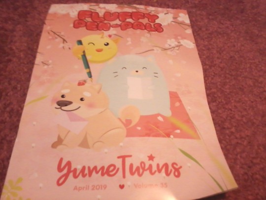
“The cherry blossoms are blooming, the weather is getting warmer, and our furry little friends are out to play! This time of year motivates us to get outside and enjoy the magical season that is spring! We absolutely love having picnics in the park during cherry blossom season and watching all the cute pets run around. Beautiful scenes like this inspire us to get creative and sketch, paint, and write so we can share it with our friends and loved ones. That is why for this month’s theme being Fluffy Pen-Pals, we’ve filled this box with kawaii animal friends and spring goodies that will allow you to get creative and inspired! We hope you enjoy these kawaii goodies as much as we enjoyed putting this box together for you!“
Yume Prize
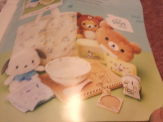
This month, inspired by the fluffy theme we have goods featuring Rilakkuma and Pochakko.
Photo Contest
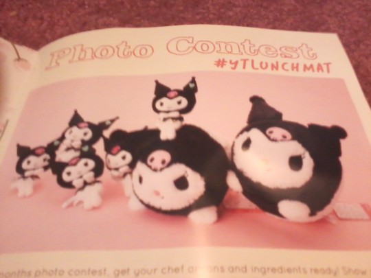
Meanwhile, cuddly Kuromi is the focus of the photo contest.
Pets Lunch Mat
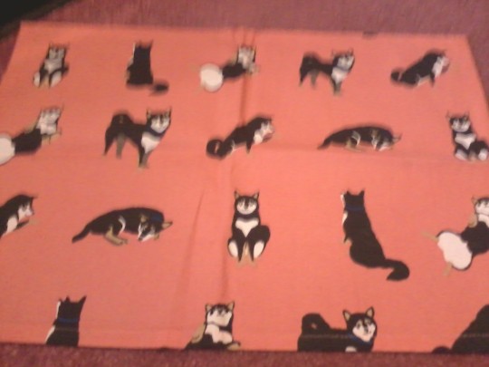
Purrfect for a picnic during spring, or just on the go or at the table, we get this adorable cloth mat covered in various dog and cat prints and colors. You might recognize these designs, as I’ve gotten a few past items featuring very similar shiba.
Rating: ♥ ♥ ♥ ♥ ♥
No, there isn’t much to it. But it’s pretty cute isn’t it? It adds a fun touch to meals and would probably be a suitable item for messy or young eaters, or suitable for those moments when you’re not at a table. You could probably use it for crafts too, and I assume it’s easy to wash. . .
Shiba and Neko Strawberry Plush
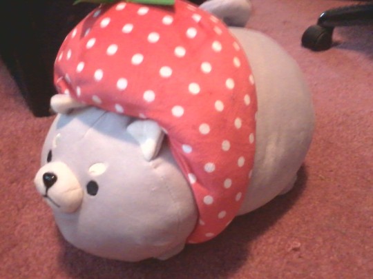
To go with the puppies and kitties in the previous item, we also get an adorable fluffy companion. Each plush is 25cm and there are three different colors of both the cat and dog. I got the light grey shiba, but I would have loved to have gotten the pink kitty~ It also has a pink button (by that I mean... the thing Pompompurrin has), which I think is kind of cute.
Their strawberry hat is also removable! According to the booklet, you can also wear it, which I think is a fun little idea.
Rating: ♥ ♥ ♥ ♥
The plush is very mochi marshmallow squishy like, but it doesn’t have as much stuffing. It’s very soft and stretchy, but I feel like it could have used a little bit more stuffing, because to me the paws look kind of weird and shriveled up. The strawberry hat is the same, and again I like how you can remove it, so you could put it on other things, or just take it off to change your animals look. However, the stem pieces are made of felt and as such one of the leaf on mine is bent and I can’t fix it.
Cube Toothbrush Stand

Now for something a bit different, we have an adorable little cube used for holding a toothbrush. These come in a large variety of Sanrio characters, and Doraemon, Snoopy, and Kirby characters!
Rating: ♥ ♥ ♥ ♥ ♥
I kind of went over this in the previous review from DokiDoki Crate, but I don’t really have much use for a toothbrush stand due to the ones I use. But I do have various “teeth tools“ I could use it for instead, or holding ear cleaners... or or or as I discovered, it’s perfect for holding a pen!
It makes a great pen holder and I’ve been having fun using it for that, it almost gives it a fancy look, like those pens you find in offices or banks attached to the ball chain.
I can guarantee that’s probably what I’ll be using it for~
Plushie Magnet
(sorry for bad lighting, I took the picture but somehow it didn’t save so I had to re-take it.)
Our next item once again features the various cast of Rilakkuma and Sumikko Gurashi, but this time in the form of a semi-cuddly magnet :D This adorable magnet is very fluffy and plush-like, and on the back is a small rounded magnet (which can be shifted around as I discovered). It’s cute pastel tones make it an adorable spring accessory (although mine kind of gives me winter vibes you know~) for hanging up papers, photo’s, or just decoration.
Rating: ♥ ♥ ♥ ♥
I don’t really have much to say about it, but I really like it. It’s so cute and adorable. My only annoyance is that I’m not sure I’ll actually get to use it, because I was informed it’ll probably collect dust and hair, and in having it un-packaged I noticed that this was indeed true. Kind of annoying. But I still want to use it, so I’ll probably end up finding a place for it after we move...
Pokemon Pen & Kawaii Notepad
Now some actual stationery, our first item is an adorable Pokemon-themed Pen. There was 4 available in 2 different styles, a basic pen featuring Pikachu and various foods, available in brown or black- or there is a thinner, sorta fancier looking pen in either pink or white featuring Eeevee.
I feel like there’s no real point in giving the pen an in-depth review. It’s a typical pen, but it has no trouble writing, dotting, or anything. The ink lasts a long time without dropping or becoming faint, I think it’s a pretty good quality pen and would recommend it.
-------
Our final item is an adorable, pastel colorful notepad based on the recent trend of drink science and the unique containers people are coming up with to put them in for an instagram worthy pic. There was 9 variants (one of which was Yeastken, so I’m glad I didn’t get it twice...) and I think out of all of all the options, this is the one I’d have wanted. I’m very happy I got it!
There are 2 different styles of paper in this pad, one facing vertical while the other is horizontal. The pages feature designs from the front, which have a clear cover over it to help keep it clean.
Again, I feel like there’s no real actual point in rating this. Notepads are notepads, it’s pretty much like the Yeastken one I just got (they’re by the same brand). Paper is fine, it is written on very smooth and cleanly. I think this is very very very very very cute~! I love how shiny the spine seam piece across the top is.
♡ Cutie Ranking ♡
Content - 4.5 out of 5. I feel really content with this box. I’m not sure I’m in love with it or anything, but the quality of each item was great, and everything had variety and is practical, which as you know is very important. I sort of felt like there wasn’t much of an evenness in terms of the size of items though, but it’s probably for obvious reasons.
Theme: 3.5 out of 5. I felt conflicted over this one, because it was very similar to the previous box in that it features cuddly animals. I mean don’t get me wrong I adore animals and kawaii goods, obviously, and because of how the box carried itself the items had a different feel about them. However, I kind of wish the box actually played up the fluffy part of the theme more (the Photo Prize and Yume Prize did excellent in improving that but not everyone gets it...), and given the description I feel like they should have given the box more of a spring vibe. I can see the pen-pal part, but only a little...
Total Rank: 7 out of 10. I liked the content and I would recommend this one. But I did have a little concern that due to how small a majority of items were, I’m not sure this box would cost as much as we pay. But I don’t really have any way of finding that stuff out, so I could be wrong due to being name brand and all.
♡ Cutie Scale ♡
1. Cube Toothbrush Stand - I might not have gotten my first choice but I do like Rilakkuma, so I’m not complaining either. I’m obviously going to use this as a pen stand more than its intended purpose, but I also like how fun it is in general. If I could I’d buy the rest of the collection just to decorate with :P
2. Strawberry Inu/Neko Plushie - Even though I am a cat person, I can’t resist how sweet this doggy looks~ He’s so squishy soft, he’ll make a great bed time companion; I’m kinda looking forward to dressing him up a little too~
3. Notepad - I have several of these so I can’t say it was a necessary item either in my case, but I love how cute it is! I love stroking the textured spine seam thingy on top, and admiring the adorable drawings all over it and in it~
4. Pokemon Pen - It’s so sweet looking, the pastel colors and drawings are adorable. I kind of wish I got the sleeker pen with metal accents but I’m very impressed by how smoothly this one writes. I really like it so I’ll probably keep it nearby.
5. Lunch Mat - Not a necessary item, but I do like it. It’s pretty neat to use, and I’ll probably end up folding it up and bringing it with me, so if I end up eating in the car or somewhere else, I’d have it just in case.
6. Plush Magnet - As cute as it is, I’m not sure if I’ll end up using it. I’d hate to have to clean it all the time due to pet hair or dust snagging it.
2 notes
·
View notes
Text
Creating Frames Process
As a huge portion of my final piece is in the style of a graphic novel, meaning the narrative is communicated through a series of images which follow a character and their movements, reactions, actions etc in a linear fashion. reader views the frames from left to right and views one panel at a time.

An example page taken from Robert Kirkmans Outcast comic series.
For the individual frames and overall pages of my book i followed a rather simplistic process which contained of multiple easy steps; i used both digital and traditional processes and tried to demonstrate my skills in each of these methods.
My comic pages had to communicate the narrative i created and follow the character - they need to show his emotions and reactions to the events of the story. As well as this, the frames need to show the surroundings and environment the story takes place as well as the horrific monster who acts as the protagonist. Another key element of my final piece is the pop up pages, the inclusion of pop ups meant i had to include space for these pieces when creating and designing the comic style frames.
1) Story boarding/Thumbnail Sketches:

The first logical step of creating any type of narrative product, be it a film, book or graphic novel is to create a rough draft of the outcome; as i created a comic book i created a series of small, roughly 2.5cm by 2.5cm thumbnail sketches. I sketched out the idea i had for the visuals of each frame roughly and quickly - details and cleanliness of the drawings wasn’t a big issue, as long as the more important features such as the characters and a basic idea of the background/surroundings were there. I purposefully kept the drawings minimal so i could quickly create them, giving me more time to spend on the actual finished frames.
I roughly story boarded the whole narrative, leaving me with around 28 - 30 small and quick sketches for all of my frames, giving me a visual idea of how the story would play out and how the narrative would actually look in a visual form. I also left spaces for the pop up’s - creating this storyboard helped me visualize how the pop up scenes were going to fit in, and if they would smoothly flow into the narrative.

Story boarding can be considered an art form in its own right: i’ve mentioned my interest in story boarding before on my spring board and through out my project. I find it interesting to see how the creator of the media carefully planned out each shot and action, especially in films as it shows you the Director knew exactly what to do for every tiny piece of the film. Its fascinating to see the process and how the end product came to be. Alternatively, sometimes storyboards show content which was cut or changed in the final product, providing us with an idea of what the media could have been, had the content not been altered. To illustrate my point, here’s a story board from the original Star Wars, which shows an almost creepy and strange ‘Wookie’ design (The Character hadn’t been given the name Chewbacca at this point) as well as a strangely futuristic suited Han Solo, sitting in the cockpit of what i assume is the millennium falcon.

2) Drawing Frame Designs:
The second step of this process was to begin drawing the actual designs of each individual frame. I used the original thumbnail sketches as my guides to basically redraw each frame, except this time i redrew them much larger and included more detail. I spent more time on the drawings, adding detail to the character and their face, as well as the backgrounds. As well as this, i also added environmental features such as shadows an shading to each frame, However, i later found out that this element was rather pointless as the digital image trace effect didn’t pick up the finer details of shading, so i stoped implementing them by hand.
Following the plans and ideas i created before hand, which were based of my research and influences, i used a quite simple and minimal style. I chose to keep the characters and backgrounds rather bare, plain and simplistic, in an attempt to almost create the idea that the book was intended for children in the viewer, in order to make the horror that much more impact full when it appears. As well as this, a big visual aspect of my frames is block colours - i only used a colour scheme of 4 shades, so the lack of detail made it easier for these blocks to be implemented, and they looked better visually.

I drew out each frame in pencil carefully, however, i kept to the visceral, messy and gestural strokes within the designs to add style and create a more intense and dramatic sense through the visuals.
3) Digital Developments:
Once i had drawn out each of the frames by hand the next step of the process was to scan them into the computer using a scanner, allowing me to edit them digitally. Firstly i opened the frames into photoshop, where i slightly cleaned them up and removed any errors in the drawings, however, i made sure to keep the gestural visuals in the designs. I used the basic Eraser and Paint Brush tools to alter the small mistakes. It was fine, during this process, to leave in the background and paper elements, as these would be digitally removed in the next step.

Once i had cleaned up the images a bit i then copied them into the software Adobe Illustrator. In Illustrator i utilized the Image Trace option, which is basically a technique which digitally traces around the images lines. The method creates a bold, black outline of the image and removes any blocks of colour or tone, which in turn removes the paper background, leaving me with clean, digitally traced versions of my original illustrations.

By using this technique i can quickly and easily give each of my frames a crisp, clean and professional aesthetic. Through this simple method i can make my frames look so much better, and i can also alter the messiness of the frames by adjusting the Image trace threshold, a method i talked about in a different post.
I used this method on all of my frames, giving me a quite professional aesthetic while still keeping to the original style of my illustrations. This step was fairly simple and done quite quickly, except from some slight experimentation with the Image Trace Threshold level and other properties.
For the second digital development i took the now digitally traced image back into Photoshop. In photoshop i could now begin colouring in each section of the drawing using the simple Paint Bucket tool. I used a basic 4-colour - colour scheme (i have explained this further in a separate post) to colour in each section of the drawing. The minimal colour scheme meant i needed to be selective and careful with the colours i used, however i followed a few continuous rules, for example, the walls would always be grey or white, while the most impactful and important features of the drawing would be the bright red shade, in order to bring attention to it. Once again this process was very easy and simple, however, it gave me visually interesting and aesthetically pleasing designs.

4) Arrangement:
The final step of the frames creation process was to arrange each individual frame onto the pages. During thumbnail sketching i knew what order the frames had to be in, in order to present a linear narrative, however, i still had to come up with the arrangement of the frames of the page, this included how many frames would be on one page, how big or small the individual frames would be and how they would be placed together. Before starting i had some basic rules which i could follow:
Firstly, i had the idea that the more important and impactful frames would be large on the pages, therefor being more prominent and gaining more attention due to their importance. As well as this, i didn’t want to keep the pages too crowded or too bare, so in turn i came up with the idea that the more impactful sequences such as the action areas would have a higher amount of frames which would be closer together in arrangement, which means the user would read a higher amount of frames in a quicker time, making the reading experience seem more rushed and more impactful, correlating with the events of the narrative.

Alternatively, for the more slow and mundane parts of the story there would be less frames, making the experience seem slower and less erratic, which once again correlates to the events.

These techniques are examples of how i have considered the audience in my designs, as well as how i have used a Gestalt Theory style technique to purposely manufacture the way in which the user reads the book, which in turn links back to my theme of creating an interesting user experience.
Here is an image of some of the printed pages in my first main prototype book:

0 notes