#but I can't do that when I can literally count the goddamn pixels
Explore tagged Tumblr posts
Visit Tumblr Blog
Explore Tumblr blogs with no restrictions, modern design and the best experience.
Last Seen Tumblr Blogs


Fun Fact
Celebrities use Tumblr as well.
Text
PLEASE I can't fucking SEE ANYTHING in this goddamned show WHY is it so FUCKING DARK
#I just want to take good screenies of my silly characters#but I can't do that when I can literally count the goddamn pixels#because it's so fucking dark the compression can barely handle it#I cannot watch this show in the day#it doesn't matter my screen brightness I just cannot see SHIT#specifically talking about s6 here since I am rewatching it rn but I am so completely and utterly sure it applies to other seasons#teen wolf
67 notes
·
View notes
Note
OK but when you're free of all the other obligations and able to do it can we get the Ines skin writeup anyway because I liked the Eine Variation one and why do they keep giving Caprinae ops skin like this do they just hate goats at hypergryph or what
Okay so I got this ask a month and a half ago and am just now getting to responding to it. In that time, I got a job as a professional VFX artist so my opinion means double what it did before. So that's fun! Respect me and bow to me, peasants.
I wrote a massively long writeup here and then my page refreshed and I lost all of it twice. Let's speedrun this shit, alright? (She says, immediately writing a 5 page unhinged rant.)
This skin sucks because of the exact opposite reason Eine Variation does, it's just too fucking detailed for its own good.
...Also what the fuck is that in the background is that a goddamned alien spaceship has anyone else noticed this?? This is a bloodline of combat skin this is canon does ines just fight aliens at some point what the FUCK?
Anwyay VFX in the readmore.
Deploy animation. I hate you. I hate this. I hate it.
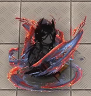
It's rare I get to see an entire skin's mistakes in microcosm like this! That's fun!
This is so detailed that it actually ceases to have any real shape or identity. This doesn't look like shadow, because skins can just. Change character lore to make something look cool yes I'm still mad. Is it stars? That would explain the weird yellow dots, and there are stars in the art. Fire? No, it's not actually fire, there'd be fire here. Burning fabric? It only looks like that if I squint and zoom in, but I can't... think of anything else.
The colors are so awful. The way that there is a hard line between the dark lavender and the scarlet which then fades into orange is. A choice. I would not have made. At all. In any way. Ever. At any point. Also the random dots of yellow are very funny because they are so clearly just random pixels of yellow. Some of them even aren't in the orange, so they're just like, highlights that have decided to break out of the highlighted areas. Did they.. want this to look like her burning dress? In which case, why are they.. blue? Her dress is black with orange embers, I don't GET IT.
Also small thing but it has a drop shadow, but like. She's literally in all black until she fully appears. And the swirling ribbons are dark-colored. There's no worry about them not standing out against a light background. Is that just supposed to look like she's surrounded by shadow if that's the case then why isn't the rest of this shadow AGH.
This looks weirdly... JPEG compressed??? Like, you can kiiinda see it in the big version, but if I shrink this down to phone resolution...
GOOD LORD SHE'S BEEN DEEP-FRIED.
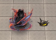
S1 is good. I like it. It's simple, elegant. Good use of colors, and I think the impact looks great, good use of red and orange to create visual interest. Not gonna bother to screenshot it, it's not that interesting NEXT
S2!
Stop it. Stop it. Put a few colors away. I am counting 8 distinct colors in this one swing alone, and then two more for Ines herself. Stop it. That is too many colors. Add less colors.
I don't even see what the colors are there FOR. Are they selling the tip of the swing? That's not right, because the red highlights start at the tip, then swirl inwards until the red is in the inner part.
I do actually think this one is a lot better at actual resolution.
It's still too detailed, and that detail ends up being crunched and not really... serving any purpose in the grand scheme of the effect, but I do think it is... better. It makes it more clearly light on the outside, dark on the inside.
Also I hate the ends of this swing. I hate it. Why is one a perfect circle that's been stretched out and the other end a rectangle that's fading out. Why is that how you did this. This effect looks like two different swings that have been stapled together like goddamned Catdog.
BUT WHEN IT FADES IT HAS AN INKBRUSH LOOK SO WHAT IS THIS EFFECT.
Why not lean into the burning dress look? Have it be a black trail that like, burns away when it fades? That would be STUNNING, anything but. Whatever is happening here. Mrgrgr okay fine it can't get worse right
DEAR READER. I PRESENT. S3. THE CULMINATION OF EVERY SINGLE PROBLEM.
So this IS a stars theme after all. This IS stars? Just wanna make sure we're all on the same fucking page here.
Dear reader. I hate this. So fucking much. This may be, and I do truly mean this, the worst piece of VFX I have ever seen in any game. This doesn't read as a piece of VFX in an anime game, it reads like the background of a YA fantasy novel's cover.
The nebula doesn't move. It's static. It is clearly just a jpeg. It's not even doing the Chowder screen-space orientation thing. It's just. There. Inescapable.
The comet itself just. Ends. It doesn't fade out or taper. It just. Stops. There's barely any anti-aliasing here. It's just a hard line between the comet and the background.
Ines herself is surrounded by identical dark lavender and orange energy, so there's no visible difference between the effect and herself. Sure. It's not going to be onscreen long anyway. Who cares.
The center of the comet is bright white as if it's the highlight of the effect, but it's... it's off-center?? so it's ultimately... Highlighting something. is it highlighting the sword? Is it supposed to be a haze that shows you the sword? But it doesn't look like it because it took me 15 minutes while writing this to realize that the sword was there at all because it's the same orange color as all the other highlights and so it gets eaten. If your highlight color stops drawing my eye, then you've fucked up because that is literally what a highlight color is supposed to do. Where am I supposed to look at this thing, where is the focus, the shape?
It's even funnier that the blade leaves a little cartoony goofy team rocket blink when it leaves, before immediately turning into whatever public domain NASA star image they're using for the comet. A real glimpse into what it would look like if Spiderverse sucked ass. (I do like the blink itself tho, a small little blue haze to add color and contrast against light backgrounds, smart touch.)

Explosion sucks. Suddenly they decide the palette is something entirely different. Where did the yellow come from. Yellow isn't even on the art. I guess when your palette is that big, you can change them up how you want. I would actually like this effect if it was slightly less detailed and in a skin that had actually used this pallette. It reminds me a bit of Specter the Laurentina. But with this level of detail and these colors... This somehow looks more like a YA book cover. A Sword of Goats and Stars. Fuck me I hate it.
I almost like this buff uptime indicator, It's just that the red from the swords fades into the orange on her dress and makes the whole thing muddy. Also she has an actual roiling flame behind her LMAO GET DUNKED ON HOEDERER THAT'S RIGHT I WILL DUNK ON HIM EVERY TIME EVEN THIS PIECE OF TRASH HAS ONE UP ON THE HOE LMAOOOOO
(In fact I actually... think this might be a recurring texture? It looks familiar, but I can't pin down from where. This is a bad screenshot for showing it but I'm not bothering to get a new one. This is my mental breakdown and I get to choose the visual aids.)
Anyway, maybe I'm being mean. After all I'm criticizing an effect for being too detailed when I am actively zooming in and looking at the details. So let's shrink down to the resolution of my phone just to see how it would-
Ah.
Final Ouroboros VFX ranking: A jpeg compressed photo of a wizard airbrushed on a van / 18 Originium Prime. Actually wait no that sounds too cool. Uh. The wizard is also racefaking. Now it's no longer cool. Nailed it.
#arknights#arknights vfx breakdown#emphasis on breakdown again#I don't have as personal a vendetta against this one as I do Eine Variation#but I do think this one is genuinely bad#Shame. Ines would have crushed it with an actual skin
47 notes
·
View notes
Text
This is some kind of crime against logic, common sense and facts.
Saying something like this about a fan theory when the actual source material itself has more plot holes than swiss cheese is wild to me.
You seem to forget that MK is a fighting game, the lore itself doesn't even add up in some places. Just look at the dialogues and how many of them contradict themselves. You can't possibly argue that anything about MK lore is logical, but sure, go off.
We will just clarify that in the entire previous post, as we noted, we did not touch on your personality or dignity. We discussed your judgment within the framework of one of your posts, not your personal qualities or you as a person. But you still saw the offensive subtext in your address, and we just wash our hands of it. Being offended by something that doesn't exist is your right, who are we to take it away.
Let me just say, I love the gaslighting in this, especially in the last phrase.
The whole subsequent text to the end of the block seems completely insane.
The lie here is to claim that Kuai did not want his brother to be reborn.
You know, there's a difference between being wrong about something and blatantly lying. You have every right to tell me I'm wrong. I even admitted that I'm wrong, yet you accuse me of "ignoring evidence" and "lying". Like, it's a goddamn video game, why would I go out of my way to make up oh so evil lies about a pixel character? With all due respect, it's getting ridiculous.
You say that there is no evidence that Bi Han received the title after his father's death, but the official website of the Mythology of Sub-Zero (it still exists!) talking about it right now. This is something that could be verified by simply going to the wiki fandom and looking at the sources. Actually, here's a screenshot for you, if you don't believe us.
Fair enough. I was wrong and I'll gladly admit it. However, I'm an adult with a job, I have more important things on my mind than memorizing every small detail from video games I played decades ago. Still doesn't mean I "lied" as you claim. What would I gain from that anyway? As I said before, people can do their own research. I'd gain nothing from lying or "distorting the truth" as you'd like to put it.
You've brought in a lot of dialogues to prove your point, but it feels like you either aren't very familiar with the plot yourself (most of your statements are refuted by the plot itself), or you did it intentionally, counting on people who have only played MK1 and don't know the details of other games.
A bold statement considering you yourself are not very familiar with the lore if you called Noob a revenant when he's actually a wraith, but of course, you will say my criticism makes no sense because it is, in fact, you who can't accept it when you're wrong.
In any case, considering all that has been said, we understand that you will simply ignore even the strongest irrefutable evidence, because it contradicts your vision. I'm sorry, but all your rhetoric on this issue speaks directly about this. Friend, you're wrong.
I can admit this is a valid point of criticism from your side. Nothing to disagree with here.
It seems to me you're the one lying here. I literally admitted your criticism was valid, yet you ignore that completely and make claims about me that are untrue.
Furthermore, you continue to call me something I told you I'm uncomfortable with, completely ignoring my personal boundaries. But then again, I do assume I'm getting away mildly with the condescending pet names and being called a liar.

Given that you call people slurs when something they say or do isn't to your liking says so much about you. I won't argue with someone who insults and disrespects people with a different opinion than their own.
This is what you sound like when you claim I'm intentionally "lying" to people to make some poor video game character look bad:

Congratulations on proving me wrong though, I hope it helps you sleep better tonight!
The thirst to write some crap prevailed over laziness, hooray! Or it was spring that breathed a thirst for life into us, it doesn't matter. The important thing is that some time ago we came across a very controversial post from @evilbihan. The post.
We agreed with other posts by this author regarding MK1, but here we still want to object on a number of points. It is inconvenient to write all your notes in the comments, but there is something to say, which is exactly why we are writing this.
!Attention!: This is not an attack on the author, not a belittling of his dignity, not some kind of hatred and dislike. We want to note the controversial points in his statement and that's it. And if we've sorted it out, then let's go.
For convenience, we will split the post into the same blocks. We do not disagree with the whole post, but we will note these blocks too.
One more important warning: here we will only talk about the MK9-11. MK1 sucks cock like the latest harbor whore.
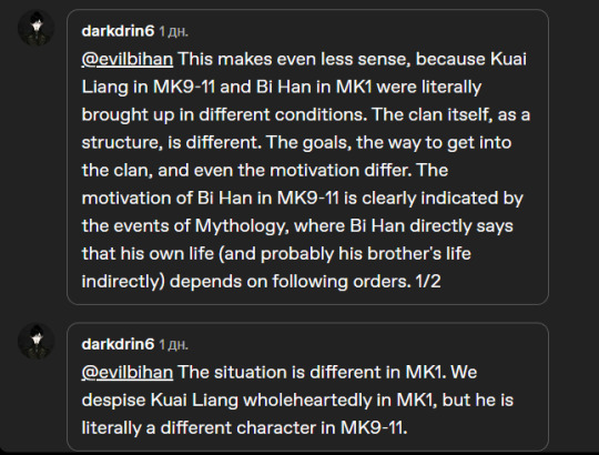
"Kuai Liang has always stood on the shoulders of others" and "Tundra as a character does not exist."
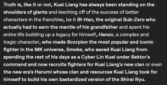
(Screenshot, so as not to be unfounded)
Considering that we are talking about the version of Kuai Liang from MK9-11 from here on, we will only touch on this version. But let's mention that the statement "Kuai stands on the shoulders of others" became legitimate only with the release of MK1, when he was given the role of Scorpion. More precisely, not even a role, but just a name that no longer stands for anything.
In other versions, adopting the name Sub-Zero made sense. And it was a plot event that was important to the character. It's like saying that Hanzo has never been able to protect his family and that makes him a bad character. No, this is the event that shapes the character. This is an important plot point for the personality and for the further path of life, a defining event, if you want to call it that.
In addition, it is confusing to mention that the character is supposedly less active because someone else saved him. In MK, characters often save each other. Yes, in the context of the post it makes sense, but in the context of the story itself, this is a completely logical development. No one broke out of the Cyber Initiative's control on their own, so it makes sense that Kuai was saved by someone. The very fact of the rescue says little about the character. Only that he was dear enough to someone to convince others to help. Besides, let's remember that he was immediately sent to spy, so it wasn't just kindness that played a role here.
"Tundra has never been relevant in Mortal Kombat until he took the mantle of Sub-Zero."
Well… yeah? Because that was the point of it. We had never seen Kuai before he became Sub-Zero, assuming the title after his late brother. This is literally his plot function, the point of entry into the plot. An event that also defined him as a character. This is analogous to the death of the Hanzo family for Hanzo himself (an important plot event) and his enslavement to Kuan Chi.
This statement is equivalent to saying that Hanzo, as a character, did not exist before being reborn into a ghost, and Johnny did not exist as a character before entering the tournament. It's just that the original source didn't bother to tell at least something more about Kuai (they just apparently didn't come up with this). As players, we simply don't have the "before" materials, because the creators didn't create them. In the plane of the foreseeable plot, the Tundra did not exist, but here we are trying to evaluate the characters as living people, and living people do not appear out of thin air. In the plane of lore, Kuai had years of life before becoming a Sub-Zero, but we just don't know anything about them, so this is a very controversial statement. Because it is based on some undescribed events about which we have little idea.
"The best proof of that is the fact that Raiden never even considered him for his team of Earthrealm's champions."
Raiden did not consider anyone from Lin Kuei as champions at all (he took Tomas to the team in MK9 because he was in the right place at the right time). And the reason for this is not that Kuai is an empty character, but that Lin Kuei are murderers, secretive and cruel, who indirectly collaborated with Quan Chi (their Grandmaster for sure, he took a contract from a sorcerer in Mythology). At the same time, Raiden does not express distrust of Kuai. So to say that Raiden ignored him because Kuai is not capable enough or not diligent enough is wrong. Because Raiden definitely didn't do it. In addition, it is with the adoption of the title of Sub-Zero that Kuai essentially comes to Raiden's attention.
Here, with all due respect, the stretching of the owl on the globe begins. From here on out.
Speaking of earning the mantle, a little clarification. "Scorpion" is just Hanzo Hasashi's call sign, which means nothing without Hanzo himself. This is not some kind of mantle/title in lore MK and never has been. You may have other information, but we've never heard of it. At the same time, as "Sub-Zero" it is not just a title, but a ancestral title that is obviously passed down in one family. Bi Han inherited it after his father's death, when he was very young. It is logical that after Bi Han, his offspring or his brother would have received the title. Because to be a Sub-Zero, you have to be a cryomancer, and cryomancers are now represented by one bloodline (not counting Frost). This is supported by the fact that cryomancers are descended from people from Edenia (which was confirmed not only in MK11). Their abilities are innate (genetic) in nature and cannot be transferred to someone else. Perhaps earlier, when there were more cryomancers, the title really had to be earned, but there are no more cryomancers (the reasons for their disappearance are probably degeneration, natural extinction of abilities, as well as violent deaths, since cryomancers belonged to Lin Kuei and moreover, they founded Lin Kuei).
In addition, this title gives nothing but a target on his back (metaphorically, of course), because even as a venerable warrior bearing such a title, Bi Han directly said that he could be killed for violating orders or failing. Outside the clan, the title of Sub-Zero is more of a minus than a plus. And within the clan, it is also a rather difficult burden. So Kuai didn't win anything by getting this title. Moreover, he got it legally, so the word "stole" does not fit here at all.
It is also worth adding here that Kuai really wanted to avenge his brother, since Bi Han's death turned out to be a heavy loss for him. From Kuai MK9's biography, we know that they are the only ones who were stolen at an early age (all other members of the clan, based on their biographies, were recruited in various ways at a more mature age), so it is logical to assume that surrounded by adults, Bi Han and Kuai were very strongly connected with each other. If you think we're wrong, then let's just remember Kuai's behavior in MK9. Smoke warns him that adopting the name Sub-Zero will attract unwanted attention, but Kuai says it's a way to honor Bi Han's memory (he doesn't even consider it a common title, which should have belonged to him anyway). He is definitely not without empathy, but in an attempt to catch up with his brother's killer, he leaves Sonya with a wounded Jax in her arms. He openly demands that Shao Kahn arrange a fight with Scorpion for him, although he must understand perfectly well that Shao Kahn is a powerful ruler, and the colosseum is located in the very heart of his empire. And it is very dangerous to make demands on the emperor of the Outside World in such conditions. And he doesn't care about that. His goal is revenge for his brother. If Kuai's motivation is false, then to whom and what does he want to prove? Who does he want to fool with this? Why would he pretend? Logically, he is blinded by grief, too young and reckless, and it seems to him that killing Scorpion will at least calm his grief and pain a little. It can be said that he really loved Bi Han (as much as it was possible in the conditions of their growing up, of course), because people take revenge for those they love.

Kuai Liang's biography in MK9. What is in the original, what is in our localization says the same thing - abducted, unlike other members of the clan. (we don't want to waste time installing MK9 right now to take one screenshot, so a photo from the screen may well be suitable).
Summarizing this block and responding to the last paragraph, which talks about people who considered Kuai MK9-11 to be kind and forgiving, we can only say that the fans really greatly distort Kuai's character, excessively whitewashing and softening his character. But Kuai is really not that kind of person - his personality has both positive and negative traits. He was not forgiving. The only time he showed strange mercy was when he let Frost, who knew the location of Lin Kuei Temple, leave. The scriptwriters could fix this by saying that Frost escaped on her own, and was not expelled.
But on the other hand, the statement that MK1 made Kuai a completely different character is also true. And then we will try to explain why.
Next @evilbihan provides an analysis of the dialogues of Kuai and other characters in MKX and MK11. And before we start talking about this, the most important clarification is that not all dialogues are canon. Usually people understand this, but we'll explain why just in case. Not all of them occur in canonical events (almost all of them occur in non-canonical events, to be honest). It can be assumed that the characters met off-screen before or after the events of the game. But, for example, in the MKX, the Revenant variations open up unique dialogues for a number of characters. Jax the Revenant has a unique intro with Takeda and Cassie, although he was healed before Cage was born (and probably Takeda too). Not to mention guest characters, characters who died in or before the plot, or mirror matches. That is, the characters could not meet, these dialogues could not happen, which means that there is a precedent for non-canonical dialogue. This in turn means that the canonicity of all dialogues is not absolute and it is completely wrong to believe them. The dialogues, which are strange and simply contradict the logic of the plot and just logic, can not be considered canonical completely. Nevertheless, this scheme mainly works for MKX and MK11, but MK1 claims to be more canonical intro. However, we will not yet claim that everything intro in MK1 is canon, because there are precedents for non-canonical events (the multiplicity of the canon is a separate topic, and we hate MK1 for its laziness and mediocrity).

About Scarlett: Kuai calls her a "perversion" because Scarlett is an artificial creation of Shao Kahn. Even if a different version of Scarlett is presented to us in MK11, for Kuai Liang she is still the same person that Shao created from blood. In MK9, she is a golem, in the MKX comic, she tells Mileena the phrase "I am the same "daughter" of Shao Kahn as you, half-breed", confirming her artificial birth. This is also confirmed by her ability to absorb blood through her skin (D'vorah says that she is aware of her abilities, so this cannot be attributed to learning blood magic from Reiko). In MK11, she says that Shao found her an orphan, but was it really? Or does she remember what Shao wanted her to remember? No one but her confirms this version. Scarlett in MK11 is obsessed with blood and longs to marry her "father", as she says in a dialogue with Sindel. She even has an equipment called "Shao Kahn's Seed". So Kuai is right in his judgment: She's a perversion.
About Jacqui's improvements: Kuai has undergone a violent transformation into a cyborg. This in itself is a cruel blow to the psyche (just read how people in reality react to trauma or a traumatic change in their body or appearance), not to mention that his mind and free will were suppressed. Kuai bluntly says that because of the CyberInitiative, he does not trust technology. He is a technophobe for quite logical reasons. At the same time, he does not call Jackie weak and does not belittle his talent, he only pays attention to the fact that she uses improvements, but there are no negative connotations in his statement.
Kuai does evaluate opponents, but from a purely practical point of view. He does not give a value judgment as a rule, but simply notes a fact or interprets a fact.

First, D'vorah is literally threatening Kuai. She is the first to say that this is their first and last meeting, making it clear that she is going to kill Kuai. What should he say to that? Be happy? This phrase has nothing to do with Kuai's words in MK1 about lower species, there is literally nothing in common here. Secondly, it is partly xenophobia. And you may be unhappy with this fact, but in the MK setting, xenophobia is justified, because there people are forced to deal with creatures that are mentally and biologically different from human beings and literally pose a danger. MK has never been smart enough to suggest a method of resolving differences between the races of humans and, for example, Tarkatans, let alone everyone else. Thirdly, the two above phrases are in no way similar to Bi Han's words about tarkatans. What kind of "elitist" worldview are you talking about if Bi Han literally expresses an adequate point of view regarding Tarkatans? They are dangerous. They are sick, they turn into bloodthirsty creatures who cannot control themselves. They're still eating other living things. There is no effective medicine yet, only something that relieves the symptoms. And it is available only to Mileena, who in the plot just showed that tarkata affects not only physically, but also mentally. Yes, these are living beings, and Bi Han's point of view is radical, but tarkata is like a mixture of schizophrenia and anthrax (or plague, if you like). It's not "elitist" thinking, it's damn common sense. And this cannot be tied in any way to Kuai MK1's words about "lower species" or to a response to a direct threat.
Tarkata is one of the cancerous tumors of this plot (ironically), and there are many problems and understatements associated with it. But we will talk about this in more detail in some other post. And now let's be brief.
NRS tried to show an allusion to AIDS, but in the end they created a really difficult topic that would not be discussed properly in the plot. It's easier to pretend that Tarkatans are just sick people who can integrate into society. But they can't. Bi Han expresses a radical point of view, but it is not without meaning. Yes, it would be more merciful to provide them with comfortable isolation and allow them to depart from the other world humanely (they die from tarkata, as we know from the plot). The creation of some kind of closed hospices would be an option, but Edenia does not have it. It turns out to be interesting. Bi Han, with his rather sane approach, is considered a cruel bastard because of this phrase, but the merciful Sindel, who simply exiled sick subjects to the wilderness, where they had to die of disease and starvation, who took care of creating a cure only when her daughter became infected, is kind in this plot.
No, it literally proves nothing, because it's not even some kind of specific formulation in a specific situation. And they literally talk about different things. Here, friend, you keep stretching the owl around the globe.
The use of the same words in different situations (and approximately the same ones too) does not mean similarity of views. Because, you know, dictionaries tend to be limited.
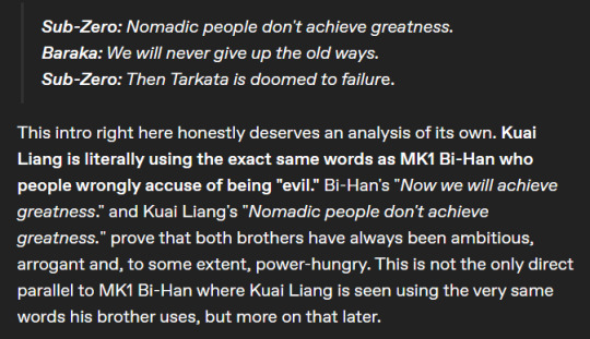
(By the way, here Kuai literally shows that he is not very good at the history of his native world, because in the history of the Earthrealm there were at least Mongols - a nomadic people who built a fairly large state. That's a strange remark. MK11 dialogues seem like a neural network was writing, to be honest.)
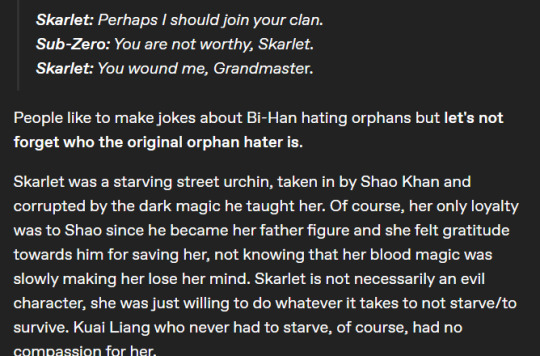
As we said above, no one but Scarlett herself confirms this version. For Kuai, she is still considered a golem, as in MK9 and the MKX comic. Besides, Scarlett is his enemy. They are literally on opposite sides of the barricades. Scarlett faithfully serves the one who longs to enslave the Earthrealm, and who has already made attempts before, which led to the fall of Lin Kuei, to the cybernization of Kuai, to the invasion of the Earthrealm and many victims. Scarlett is an enemy of the Earthrealm, and Kuai does not care about her marital status. Why should he care at all? Moreover, why should he be polite or sympathetic to a crazy lady who is asking to join his clan, even though he didn't even invite her? It is not quite correct to compare it with MK1 and Tomas. But Bi Han does not reproach him for being an orphan, he only says that Tomas is not Lin Kuei by blood. That's all. He's actually right, Tomas is adopted.
Just what is the logic of this claim anyway? Scarlett and Kuai interact only within the framework of an open confrontation, they have no other points of contact. Scarlett is one hundred percent the enemy for the Earthrealm and for Kuai. And Kuai protects his world, he's like a soldier on duty. He shouldn't be interested in the life of some random blood witch and sympathize with her. It's like blaming all the characters for not wanting to understand Shao Kahn or anyone else. And don't pretend that Scarlett is better. She literally tortured Jade in the plot and did it with pleasure, she is not some unfortunate hero worthy of sympathy.
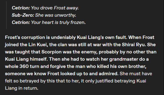
Correction: Frost joined the clan when Shirai Ryu was considered to have been re-exterminated by the hands of Havik (who possessed Fox). Frost joined the clan when the clan was just trying to start existing again. Frankly speaking, it is completely unclear where she got so much respect for the traditions of the clan, which she did not know before, and for Bi Han, whom she had never met. We are not going to say for sure, but it is much more likely that Frost was influenced by someone from the old Lin Kuei staff (because they could have survived and escaped from the CyberInitiative). Because Kuai has definitely been making the decision to reconcile with Shirai Ryu for a while. And yes, Frost hasn't really established herself as a decent character. Throughout its history, it has desired power and strength that it could not handle. Besides, if we turn to dialogues here, then in one of them Kuai asks if he was a bad mentor, to which Frost says that he was a hindrance. That is, she had plans to take Kuai's place during her studies, BEFORE alliance with Shirai Ryu (because after her escapade, she was expelled). The only complaint against Kuai Liang here is that he did not kill Frost. He let go of a man who is clearly unkind and who knows about the secret location of the Lin Kuei Temple. This could be solved with one correction from the screenwriters - the phrase that Frost ran away on her own.
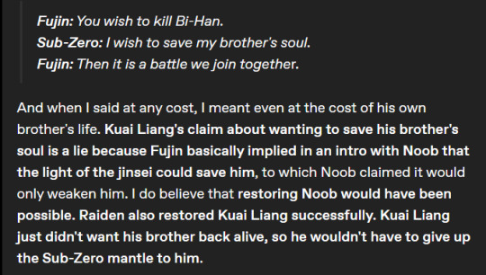
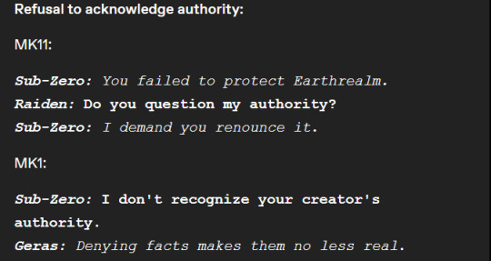
Maybe (just maybe!) our localization is a little different, but Fujin is not saying that Kuai wants to kill his brother. He's asking about it.
Oh, yes. He also asks a question in the original.
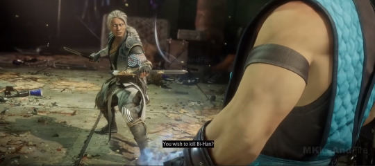
The lie here is to claim that Kuai did not want his brother to be reborn. Bi Han is reborn like the rest of the revenants and probably cannot be healed without Quan Chi's presence (by the way, later in the post you refer to the need for Quan Chi's presence and the fact that his death essentially put an end to the return of enslaved champions). Kuai was lucky that Raiden's magic worked at a specific moment in a specific way. How lucky both Hanzo and Jax are. It was further stated that Quan Chi must be alive to save the Revenants. And Bi Han is a revenant.
Besides, Kuai has no reason to hold on to the title of Sub-Zero, because it gives nothing but danger. He is not useful, he is not honorable (five generations of Sub-Zero before him were murderers and made enemies). He does this because there is no one to transfer the title to. He wears it like as bloody chevrons, as a sign of his service to the Earthrealm.
We will not argue about the rest of the dialogues that relate to Bi Han (with Cetrion or others), or with Bi Han himself. The game acts very strangely and seems to be trying with all its might to put Kuai and Bi Han against each other as enemies. We have already written about this here and do not want to repeat it.
Since the block with rhetoric and analysis of dialogues is over, we will summarize. Kuai Liang in MKX and MK11 is a man who has been through a lot. He was kidnapped in early childhood, deprived of his family and normal growing up (we still remember about his biography MK9, which says that ONLY he and Bi Han were stolen, the rest joined voluntarily in adulthood), his brother was killed, his clan was turned into soulless iron, he himself was turned into soulless iron, he was murdered Sindel (by the way, who was resurrected by order of Shao Kahn and sent by him to massacre the champions; that is, Shao is indirectly responsible for Kuai's death, which means that his henchwoman Scarlett has even less chance of gaining any sympathy from Kuai Liang, even if she were an orphan three times). Kuai was enslaved first by the CyberInitiative, then by Quan Chi. Against his will, he participated in the invasion of the Earthrealm, and the memory of the horrors that he had committed consumed him with guilt. In the comic (which is still canon in many ways), Kuai literally talks about wanting to die. After that, he entered the service of Raiden and began to look for a Kamidogu for him, which is why he was cursed and again fell under someone else's control. Which again led to casualties. What did he say to Bo Rai Cho? "I have to do hara-kiri." The topic that Kuai is broken by these events and wants to die has been raised twice. He decided to revive the clan with the light hand of Raiden (it was Raiden who sent applicants to join Lin Kuei). In the new clan, Kuai finally finds solace, but in the end his own student, whom either out of mercy or stupidity he did not kill, breaks into the temple and kidnaps his people. Kuai has gone through a lot of traumatic events, just turning into a revenant is worth it. It took Jax years and years to suppress his PTSD, and he didn't fully recover. Kuai wants to protect his home, his homeworld. He makes claims to Ryden for not coping with his role as a defender. This is not very fair in the big picture, but Kuai saw with his own eyes the two invasions and the arrival of Shinnok. Will you say that Kuai does not want to defend the Earthrealm? Well, for some reason, it was he who led his clan to defend the Sky Temple and faced the legions of Kotal. It was Lin Kuei who took the hit and gave Cassie and her team time. Not the glorious Shirai Ryu, who just got into a fight with the special forces, messed up with their grandmaster and just disappeared without participating in the defense of the Earthly Kingdom.
There is no point in comparing Kuai MK9-11 and Kuai MK1, because the life of the second one is literally sugar. He did not survive a fraction of what Kuai Liang experienced in the previous chronology. Comparing them is like comparing a veteran and a loud cadet. Kuai in MK11 has every right to be grumpy, demanding of others and himself, suspicious of enemies and even allies. The events of his life encourage such thinking. From the height of his experience - both life and combat - he can be somewhat arrogant and proud of his skill. Because Kuai MK9-11 has a moral right to do so. Kuai-Scorpion does not have this right, he is just a loud brat who jerks off at his father and traditions (if we were Bi Han, we would evict him from the temple and issue a restraining order) Like a fucking fanatic. He doesn't have the same qualities, experience. Nothing. Even biology failed, depriving him of cryomancy. In fact, the personality of Kuai in MK1 is formed in a completely different way than that of Kuai in MK9-11. Because both the events of life (the social factor) and the biological basis are different. This is literally not the Kuai Liang we knew. This is another person who happens to have the same name.
Also completely overlooked is the fact that Kuai, in his dialogues, not only criticizes everyone and everything, but shows respect to other characters (with whom he is not in confrontation). So he suggests that Jade join Lin Kuei (probably because they have lost a significant part of their personnel and need new personnel). He recognizes Sonya's fighting spirit. He literally thanks Raiden for saving his life (although he remembers that Raiden has a dark and light state). He pays tribute to Liu Kang when he speaks about Kuai's own discipline.
Most of his statements are neutral or caustic (depending on the dialogue), Kuai shows hostility to those characters who are in confrontation with his side (the Outworlders or the Black Dragon), but nothing more.
And since we've dealt with this, we'll move on.
Kuai Liang's motives for revenge and forgiveness are actually as clear as possible when you remember that more than 20 years have passed. Why do you overlook this fact? 25 years have passed between the events of MK9 and MKX (the main plot) (Jax mentions this). Shinnok's invasion ended 25 years ago. And the reconciliation of the two clans took place five years before the events of MKX (this is stated in the plot). Kuai initially rushed to take revenge because he was blinded by grief, his pain was fresh. But then the events of MK9 happened, and now he is a former revenant, crushed by life, with the realization that he did terrible things. With a years, the thirst for revenge subsides, but the moral obligation suffocates. After all, your dear man died, how can you just let go of his death? Here we will allow ourselves to say that the motives of revenge are close to us because of personal experience. That's why we know what we're talking about. To come to terms with loss is, among other things, to let go of the thirst for revenge, to get rid of a destructive moral obligation. Kuai has had at least 20 years to think about it. Scorpion's death will not bring his brother back to him, will not soothe his pain. He believed that Bi Han was lost forever. He must continue to live, which means that he needed to put an end to a long-standing and senseless feud, especially considering that the real culprit is Quan Chi. It is he who must be punished.
To claim that Kuai was indirectly involved in the deaths of other Revenants is a clear misconception. Because, first of all, Kuai needed to give himself the moral right to end the senseless clan feud. Secondly, to protect your clan from a new conflict with Shirai Ryu. And third, damn it, this conversation (in which Hanzo found out the truth) took place five years before Quan Chi was captured. Five years! It's a long time. The fact that Hanzo has not thought with his own head in these five years is only Hanzo's problem. Should Kuai have foreseen this years in advance? He has enough headaches of his own, and at that moment he didn't know Hanzo well enough to anticipate his actions. Hanzo Hasashi is the only one to blame for what happened. It was he who decided to attack the special forces, not listen to anyone and cut off the sorcerer's head. No one pushed him to do this except himself, although literally everyone around told him to wait. Hanzo has shown himself to be a stubborn ass who doesn't know how to listen.

The scene of the conversation and the conclusion of peace between Lin Kuei and Shirai Ryu (chapter 9 "Scorpion").

Quan Chi has not been seen since the invasion was stopped. Sonya and Jax talk about it here (Chapter 8 "Jackson Briggs")
The same thing is in the Sony chapter (chapter 5 "Sonya Blade")
The claims that Kuai reorganized the clan just to elevate himself are simply taken out of thin air. Because although Kuai Liang is deservedly proud of his skills, there is not a single objective sign that would indicate that your statements about him are true. Where did this statement about him being narcissistic come from? Selfish? Kuai literally has no other life, he has put all his remaining years to protect the Earthrealm and hunt the scum within it (as he tells Kano). What is the selfishness here? What does he get besides constant pressure?
Perhaps there is reason to believe that Kuai wanted to put an end to Lin Kuei's dark legacy, but then again-who wouldn't? He talks a lot about honor, because he saw with his own eyes how dishonor and betrayal (the actions of the last Grand Master of the clan) led to the downfall of not only Lin Kuei, but also to larger tragic consequences. This is not selfishness, not a desire to "giving themselves a pet on the back." This is common sense and awareness of mistakes and their consequences.
Where did you get this from? The intros above do not suggest this in any way. Friend, it seems that you believed in what you came up with about the character. Kuai Liang strives for iron discipline, because he is well aware of how much damage has been done to him by the events of his life. And if he lets himself get weak, he'll just break down. And if he breaks down, who will stand at the head of Lin Kuei? Who will join the ranks of the defenders of the Earthrealm? As a responsible soldier, Kuai cannot hang a weapon on the wall because he is tired. And we have already cited above what confirms our thought (his sad experience, his desire to avoid repetition, the moral test that Kuai went through, etc.).
In addition, Kuai's envy of his brother (which is in no way confirmed by the game itself and other media) can only be said that many people would envy Bi Han, since he was really talented. It is said about him that he mastered in his youth what other cryomancers before him mastered only in old age. But again, this does not indicate Kuai's envy of his brother. There is not a single confirmation of this statement.

The whole subsequent text to the end of the block seems completely insane. To claim that Kuai was the only one who constantly survived, not because the writers wanted it, but because… for some other reason. The only reason is the desire of the screenwriters. Or perhaps an outright misunderstanding of what to do with the characters of Hanzo and Kuai (and many others). Where should they be placed? They look more like a link in MK11 and MKX than full-fledged characters. Okay, Hanzo has more plot weight because he's the creator's favorite. But everything else is just a weak plot, not the character's fault or intention. There is literally no place to analyze him as a living person, because Kuai appears only functionally in the plot. Well, maybe the studio hates him because so much shit has fallen on this particular character. He was enslaved three times, his family and friends are almost completely dead. It is wrong to say that he did nothing to bring Smoke back, because, as we remember, Quan Chi is needed to revive the revenant, there is no proven scheme, Quan Chi himself has been hiding for twenty-five years, and collectively the chances of revival are negligible. Personal aspirations are on one side of the scale, on the other is a job that will provide the homeworld with another faction of defenders. Kuai, who has gone through the horrors of two invasions, obviously will not choose personal aspirations. In addition, Smoke does not appear in the final chapters of MKX (only in flashbacks from the time of Shinnok's invasion), and it is unknown where he is. With Quan Chi's death, he can be considered completely lost (the rest of the Revenants are considered lost for the same reason, and there is no problem with that). And the fact that Bi Han survived in Soulnado was not known at all before the events of MK11. He was believed to be dead. Who should Kuai be trying to bring back? Ghostly shadows of long-gone loved ones? Prefer the dead to the living?
We can agree that Kuai's behavior in the intro and his ending are collectively confusing because they somehow contradict each other. But here you can find a dubious, but time-bound explanation. Considering that in all intros the Kronika is mentioned as still alive and active, it can be concluded that these fights and dialogues, respectively, take place in parallel with the plot of MK11. Which lasts… How much? A couple of days? In this light, it can be assumed that all of Kuai's strange reactions in the dialogues are either a defensive reaction, or simply the result of AI work (seriously, sometimes one part of these dialogues is not connected to another).
Oh, right, rhetoric again.
These dialogues are not connected in any way at all. There are only two identical words here that don't apply in the same context. This is not a common lexicon in this case and not the same specific reaction to the situation. These are literally different dialogues. And here you are really engaged in unfair interpretation.
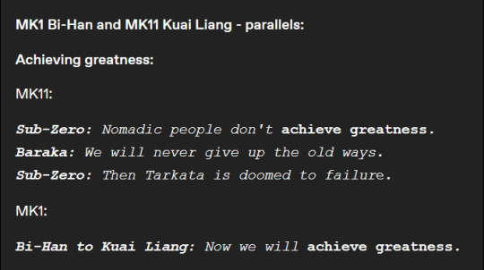
We have already written about this above and we will not repeat it.
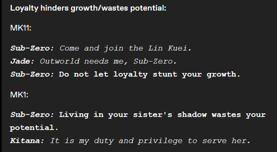
A fair comparison, however, the different circumstances that lead to this phrase. Bi Han in MK1 encourages Kitana to be more independent. Kuai in MK11 wants to get a valuable fighter into the ranks of his clan to protect his world. They use similar words, but in different situations and for different purposes.
Here we can agree on the similarity by about half (due to the difference in circumstances, and therefore the messages themselves).
We repeat that Kuai Liang in MK9-11 literally caught two invasions and the return of Shinnok. The latter happened because Raiden's Shinnok amulet, which he was supposed to protect, was stolen. That is, Raiden actually failed at his job. Yes, in the end, all three events ended well, but Kuai, as a man who laid down his life to protect his world and serve its interests, has reason to be angry at Raiden for his mistakes.
In MK1, Bi Han denies Liu Kang's authority for reasons that are still unclear. Bi Han wants more, but what does this have to do with Liu Kang? We, as players, know what Liu's mistakes are, but Bi Han doesn't know that. At the same time, we do not know why Bi Han is so fiercely against Liu's authority (he literally tells Kenshi, "give him time and you will understand," hinting that his dislike has some deeper reasons, but we do not know about them yet). It is also incorrect to compare these dialogues. We think there is no need to explain the reasons. Their context is strikingly different.
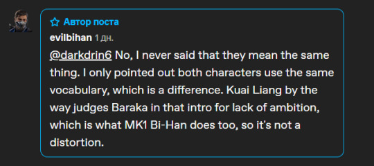
How is Kuai Liang considered the "good brother" when they both use the same vocabulary and share the same views?
The fact that they use similar words, but in different contexts, can only mean that they speak the same language, and not that their views are somehow close to each other.
Making such a statement is like saying that if a conditional user uses the words "cosmopolitan", "economy", "corridor" and "carte blanche" in his speech, then this makes his views close to one notorious Austrian artist who used the same words in his speech in 1939.
This is absurd and meaningless.
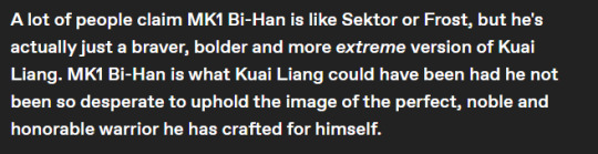
Yes, people say that because Bi Han literally demonstrates the character traits and biographies of Frost and Sector. He's not the best version of Kuai, he's not even a pale version of himself. He is a lazily written man who, in modern works, must be evil simply because. Bi Han in the old chronology was really interesting for his tragedy. He never wanted to be a part of the clan, he had no choice in this matter, in the original MK1 (literally in the very first game) in his ending, he leaves the clan because he doesn't need it all. His life was taken away cruelly and unfairly, he was just a man in thrall to circumstances, he was not shy about being sharp-tongued. After all, Bi Han from the past chronology, with his tragedy both during his lifetime and after his death, is many times more interesting than the piece of evil cardboard that Bi Han was turned into in MK1.
We will not stop at the fact that the decision to make Kuai a Scorpion is disgusting. We will not argue with this, because it is pointless to argue with the truth. Is he the best Sub-Zero? At least he was interesting, one of the few who really developed and changed as a character. As a result, his entire progression, motivation, and personality foundations were rewritten. Kuai Liang, whom we respected, although in some places we condemned, simply ceased to be. We hope that the NRS will choke on their money and never touch this story again.
And now to the comments that were posted. They are too small, so we want to answer in more detail here.


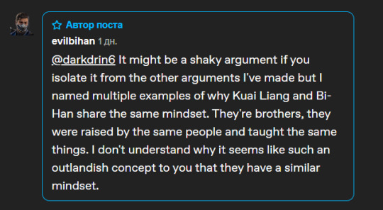
We literally took apart your entire post from beginning to end, not touching only what concerned Kuai MK1, because we want he burns in hell. And we still say that you are trying to substitute concepts. Their vocabulary is in no way similar (for the reasons we mentioned above). And as we have already noted, Kuai Liang MK9-11 grew up in different conditions than Bi Han MK1.
Lin Kuei himself is obviously different in different versions. If in MK1 we understand that this is closer to the traditional clan, which is connected by blood (both parents were in the clan, there is an opportunity to form a family, Bi Han refers to Lin Kuei's blood), then the early versions of Lin Kuei are more like the cult of assassins, who are united by the desire for influence - political, material and td. What kind of parenting with the idea of superiority are you talking about in the framework of MK9-11, if we have already found out that Kuai and Bi Han were abducted as children, and all the other members of the clan joined him. The biography of the Sector in MK9 literally says that there was no doubt that the Sector, being the son of a Grandmaster, would join the clan. Cyrex joined the clan as an adult, and previously he was from among the Tswana and trained among the warriors of his people. Tomas is from Prague and was also recruited at a fairly conscious age, because he attracted attention with his abilities. His exact age has not been named, but it is said that he does not remember his childhood, which means that he was hardly a child at the time of recruitment. Based on this, Bi Han and Kuai Liang are the only children who were raised in the clan. This means that there was no general idealogical system for education (we don't know much about Lin Kuei at all, but the Grandmaster decided to make everyone cyborgs for absolute submission, so we can assume that there were precedents for disobedience). The clan system in MK1, although it requires following orders, does not threaten death. But in MK9-11 (for which Mythology is still canonical), the mistake is inexcusable. Bi Han bluntly says that his failure or disobedience would mean his death at the hands of his own clan. Lin Kuei's in old chronology is a violent militarized cult, not a family. Yes, it is possible that one bloodline is present there, but it is needed only because of the special abilities (cryomancy) that give the clan an advantage.
See the difference? This already denies the possibility for Kuai MK9-11 and Bi Han MK1 to grow in the same conditions. Hell, even Bi Han MK9-11 and Bi Han MK1 are different people because of their different upbringing and different life experiences. We think that it makes no sense to explain that a personality is formed on the basis of a biological basis (psychophysiological features) and social impact, life experience. With a difference in life experience, different personalities are formed. It is for this reason that we consider the ending of the Scorpion invasion to be simply insulting and sad. The very concept of multiple timelines essentially contradicts the concept of personality. But this is such a truism that it makes no sense to explain it. In MK1, people have the same names and partially similar biography elements. And this already means, in fact, that Mileena, Kitana, Raiden, Lao, Bi Han and all the others are not the same ones we saw in previous games. These are literally other people.
59 notes
·
View notes