#brusho
Explore tagged Tumblr posts
Text
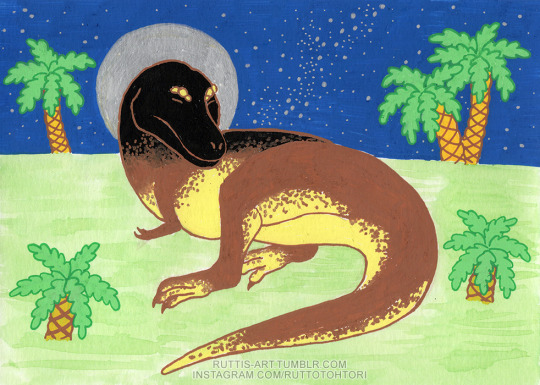
Daspletosaurus
Posca paint markers, Brusho powder paint
200 notes
·
View notes
Text
Crossings
New abstract painting!
11″ x 14″ Mixed media painting from my sketchbook. Prints available. Instagram Facebook Pinterest Tumblr YouTube Link

View On WordPress
#2023#abstract art#abstract painting#acrylic#Brusho#California Artist#Fine Art America#gouache#Mixed Media#Pixels Shop#San Diego Artist#Sketchbook#Tiffany Arp Daleo#Watercolor#wordless
13 notes
·
View notes
Text


FABRIC EXPERIMENTATION
For my fabric experimentation, i used different methods to dye the fabric, i used black and white fabric.
For my black fabric, i experimented using bleach, i used buttons, paintbrushes, bubble wrap and rubber bands to add the bleach onto the fabric. I also experimented using wet and dry bleach and seeing the effect each would have on the fabric depending on the time left in the bleach.
For my white fabric, i experimented using coffee, tea and brusho. For the brusho, i used rubber bands to make tie dye effects to the fabric. For my tea and coffee, i experimented how dyed each would be based on the time left in each liquid.
3 notes
·
View notes
Text


This week was brusho - I’d never used this before and it’s really pretty! But good god is it messy. Based on photos I had on my phone
2 notes
·
View notes
Text

"Ready to add a burst of color to my art with the Brusho Crystal Colours 6 & Spritzer set! 🎨✨ These vibrant pigments and the spritzer make for dynamic and unique effects. Can't wait to see the magic unfold on paper!
Shop:- https://www.kingsframingandartgallery.com/brusho-crystal-colours-6-spritzer-set
0 notes
Text
01/03/23 - Animation Background
For my animation, I wanted to use a Brusho background in which I was sprinkle Brusho onto a wet piece of paper. I learnt this was the best method from my experimentation with different techniques.
It took me a few tries to get it right, however I was finally satisfied with the end result. I sped up the footage, and the way the colours flowed into each other was mesmerising to watch.
Test 1 - my phone ran out of storage halfway through so stopped filming.
Test 2 - Was not a good camera angle and lighting was off.
Test 3 - didn’t hold it for long enough at the end - was only a 4 second video.
Test 4 - Not enough concentration of Brushos.
Test 5 - Had a massive line of unwettened page running through the green inks which I was unable to crop out.
Test 6 - Final animation background. I love the way the inks spread out in the water and blend together. The dried piece is beautiful as well, and I would like to experiment with photographing it for the background of my poster.


1 note
·
View note
Note
hi! in the video where you're dripping acrylic onto the wet canvass, what materials are those? Is it just acrylic with a lot of water, or is there another material involved? it looks fun to do!
It was fun at first!! Haha
The material I mentioned in the video, the little pots of dry powder (Colour craft Brusho brand) was added to the primed wood surface, with water added so it pooled a bit, then I dropped yellow high flow acrylic paint onto it. The powders are not recommended for this use, actually, because of the issues with the pigments creeping up through the gesso and acrylic medium! Some pigments do that lol I just learned this the hard way.
The Brusho pigments seem fun on their own or in tandem with watercolor/gouache applications, though.
8 notes
·
View notes
Text

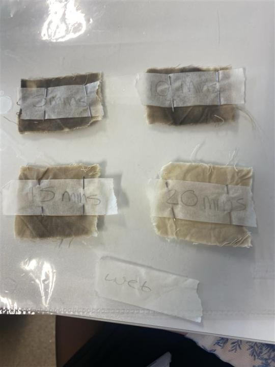
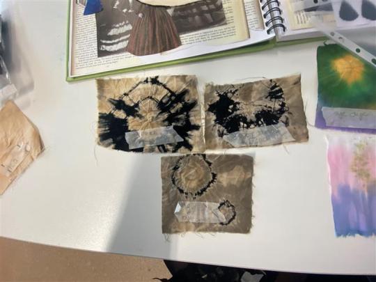
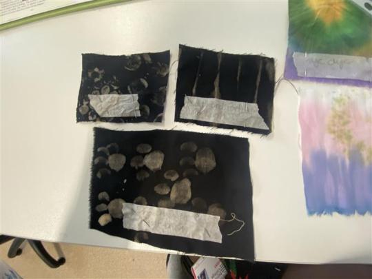


this was my experimentation with different fabric techniques.
bleach timed
the first and second image was my bleach theory. to start it off I set off a timer for 20 minutes and every 5 minutes I took one of each sample out. after 5 minutes you can see that a clear difference was made between the wet and the dry samples. the dry samples took out about more of the colour we can see this from the corner as the corner of the dry wasn't fully submerged which shows a difference
after another 5 mins I took out the next two making sure to wash the samples thoroughly and then left them to dry. looking at the samples they both have similarities however the dry sample tool out a little more than the wet samples
after another 5 minutes I took the other samples out rinsed them and let them dry once they had fully dried you can see that the dry samples have almost no colour after the 15 minutes while the wet samples are still darker
after the full 20minutes the over all colour change was drastic from the full black dye etc and you can see that the dry samples performed a lot better than the wet samples
bleach dye
the top two were created by using rubber bands, I tend rubber bands ensuring they were tight. I then dipped them both in bleach then took them out and played them to develop for a few minutes and then rinsed them then removed the rubber bands which left this overall really cool and beautiful pattern which could be cool if in future I add brush colour etc.
the bottom image was created by using buttons, I tied buttons using rubber bands then I dipped them in bleach took it out and left it to develop then rinsed. overall I liked how this turned out it reminded me of the an eclipse which is cool and it would be fun to experiment with different shapes and sizes in the future.
the top left in the 3rd image was created by bubble wrap I used a bigger and smaller size bubble wrap, I applied bleach with a brush and stamped it onto the fabric I also did this with the smaller bubble wrap and left it to dry.
the top right one I created by folding the fabric and used the paint brush to apply bleach then left it to dry
the bottom one was created by using a paint brush and bleach I took a midsized brush and used bleach to paint on these paw print like designs. overall I didn't like how these turned out and could have done better.
tea and coffee
these samples were made by tea and coffee I left each on in there for a few minutes then left them to dry over the space of a couple of days the tea had dyed a lot better than the coffee and the coffee only tinted the fabric.
brusho ink
the first brusho ink sample was created by the same technique of tye dye however this used all of my chosen colours i dipped the top in yellow then with a paint brush painted the green, blue then followed by the purple dye. overall i don't like how bold it is it doesn't give a tye dye effect like the other samples do.
the next sample across was created by brusho ink and bubble wrap i painted purple brusho ink onto to a smaller bubble wrap and pressed it onto the fabric i repeated this with the blue however i did this with a larger. i do like the way this turned out and could be an interesting technique going forward.
the next sample was created by using rubber bands. i tied two rubber bands one near the top and one in the middle. i dipped the top of the fabric in green them the middle in purple and then yellow. overall i am happy with how this turned out and with my colour palette it could come in handy when creating something different.
this next sample was created by dip dye, i started off by folding the fabric to make it easier to dip then i dipped it into the purple brusho dye and let it soak for 3-5 seconds then dipped it into the blue brusho dye letting it soak for another 3-5 seconds, overall i liked how this turned out however it didnt fully dry so another sample leaked onto it.
this next sample was created by using buttons and brusho dye i started by using rubber bands to tye around the buttons making ensuring they were tight and secure, then i dipped it into the purple brusho dye, so it wasnt bland i dip dyed blue at the ends to add extra colour, overall i liked how this turned out it had a cool effect in my opinion and loads of these could look better
this last sample was created by using brusho dye i used white cotton and placed rubber bands in the centre ensuring it was tight, i then dipped it into purple dye and created this. overall i was happy with how it turned out, though it wasnt fully dry when i placed it with the other samples and therefore left odd colours which i wasnt a fan of.
little women. (2019). [Film]. United States: Columbia Pictures.
#gowns#fashion photography#fashion design#fashion illustration#fashion marketing#experimentation#brusho ink#bleach
3 notes
·
View notes
Text

These are more pieces that had to be dyed with the interfacing of the skirt. I followed the same process as before.
0 notes
Text
Here I wanted to add a bit more detail and resemblance to my skirt adding a splodgy effect with brushos to dye on the denim creating more of a colourful effect.
0 notes
Text

Giraffatitan
Posca paint markers, Brusho powder paint
186 notes
·
View notes
Text
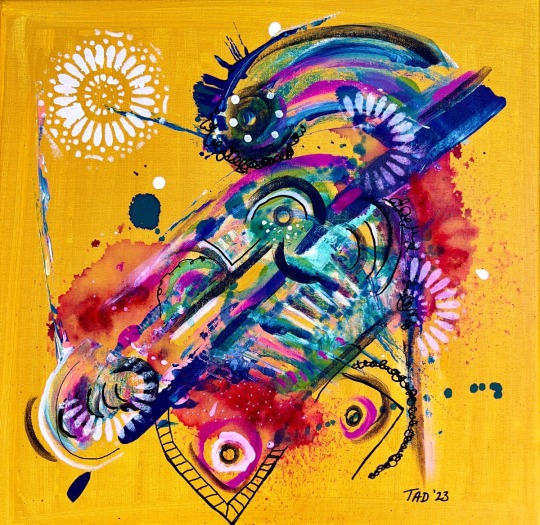
Jezebel
New painting on canvas!!!
16″ x 16″ Mixed media painting on canvas After making a few art sales last month, I finally broke down and purchased a few new canvasses! Mostly due to a lack of space, I have been painting on paper and sketchbooks for the last few years, so it felt really good to stretch out on a bigger playing field! I named this piece Jezabel because I was thinking about one of my old cats, that was her…
View On WordPress
#abstract art#acrylic#Asemic Writing#Brusho#creativity#imagination#Ink#Intuitive art#Mandala#Mixed Media#San Diego Artist#Tiffany Arp Daleo#Women Artist#Yellow Oxide
28 notes
·
View notes
Text
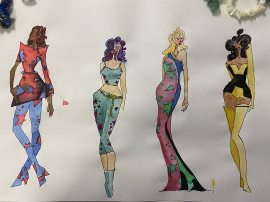
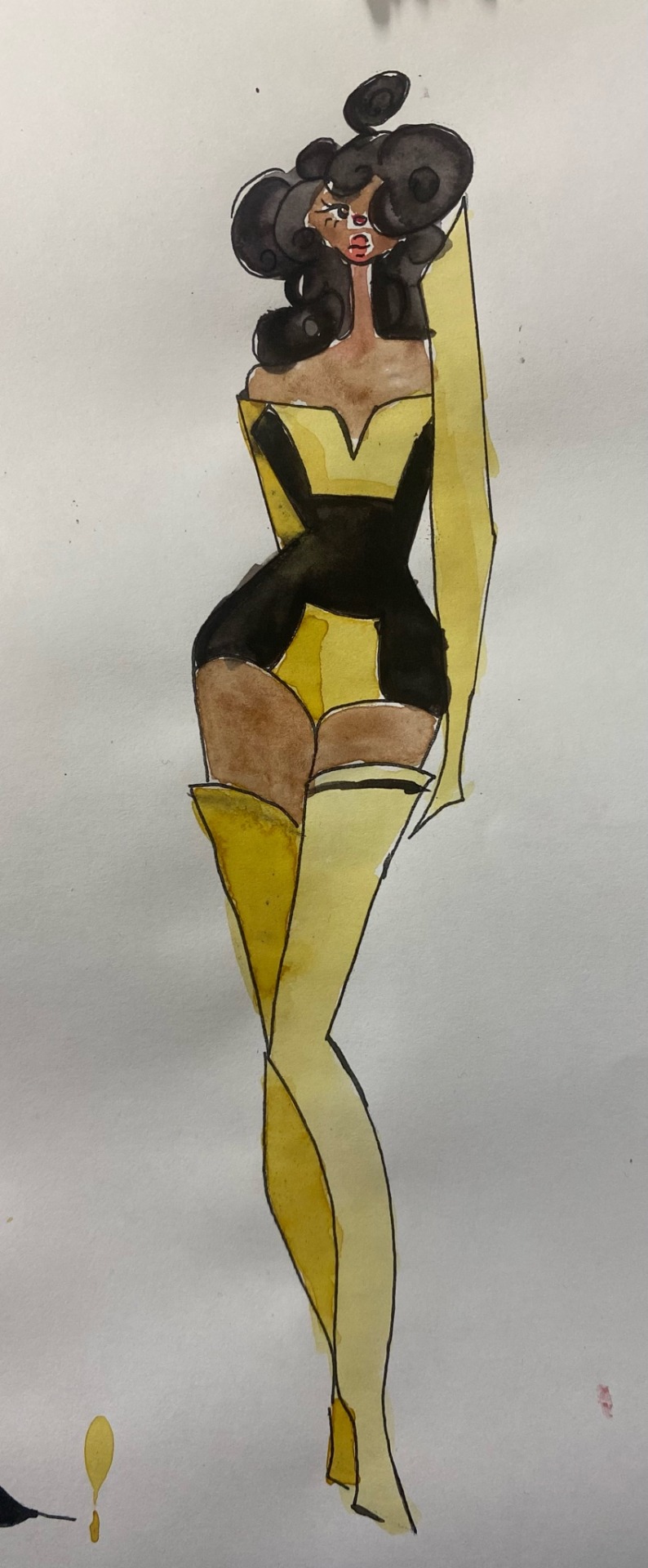

Within fashion we began our media experimentation upon our copy’s of our 12 piece collection. Within this page section I focused on my use of brusho inks and water colour. I ensured to utilise a wide range of skin tones and hair types/colours as my clients haven’t got a specific skin tone I wanted to make sure that my collection would be diverse. Within these designed I intentionally allowed the inks to bleed and work against one another to represent the flowing and spirited aura around these looks as they would be used in recreation activities where my client would be having the most fun and feeling the most like themselves.
Within the first piece I wanted to create an inverse look inspired by black light with the broth and bold uses of red and blue. The patterning is also inspired by carpets created within the decade that would have been utilised in recreational spaces for children ( places that often had bright colouring and modified lights. Within the second look I was inspired by the acid wash trend of the decade with a teal leaning denim adorned with purple accent patches to provide interest and customisation to the look. The third look was inspired by tie dye and the advances it has made through the decades with talented artists creating intricate designs through intense skill of rubber bands and twine to create a personalised fabric. The final look is inspired by the ever iconic bumblebee from the transformers franchise utilising a black and yellow colour scheme with sharp robotic like design to resemble machinery and the transformation one may got through. This is significa to both my clientele and brand identity as they would preach equally, ethical sourcing and cruelty free and by association with this iconic symbol known for being in the correct side it also implements those ideals onto my company.
2 notes
·
View notes
Text


Some recent things. The crow was the last thing I painted. I have been sketching up a storm lately. It has kind of become a Couch Thing. Some people will sit and crochet. I will sketch birds and flowers and landscapes and whatnot. It relaxes my brain a bit.
Of course, I then take forever to add paint. But anyway. With the coming of colder months, I hopefully will have more time for arting and actually writing. I tend to hibernate and nest and work on shit when it’s gross and cold outside.
So I painted a crow who was a lot of fun to paint. Building up the layers from light to dark really made me see how many colors are contained within the color black itself.
Second is a rough abstract pencil sketch of L’Arc de Triomphe. This is my favorite style in which to draw and paint - abstract and airy city scenes. I plan on painting it, eventually.
The painting of the Chanel bottle was done in watercolor and Brusho (favorite shit ever, it’s basically watercolor in powdered form), and I then digitized it for shits and giggles. I still have no idea what I’m doing in my ancient version of Photoshop, but I played around a bit and kind of dug the psychedelic Chanel No. 5 thing.
4 notes
·
View notes
