#bestofvape
Explore tagged Tumblr posts
Visit Tumblr Blog
Explore Tumblr blogs with no restrictions, modern design and the best experience.
Last Seen Tumblr Blogs


Fun Fact
BuzzFeed published a report claiming that Tumblr was utilized as a distribution channel for Russian agents to influence American voting habits during the 2016 presidential election in Feb 2018.
Text
10 Best Vape Juice Package Designs

by Toro Imports
We love packaging design here at Toro Imports — as a smoke and vape wholesaler, we know how important design can be to make products appealing to potential consumers. Ugly packaging means slow-moving product, and a great design conveys a strong message. When a company introduces products with great design, it conveys the message that the company has good communication, a quality product, strong branding, a good understanding of its customers, and that it cares about the presentation of their product.
Vape juice bottles are items that customers tend to collect, after all. Who wants to add an ugly bottle to their collection? So, without further ado, here are 10 of our favorite vape juice brands with great packaging:
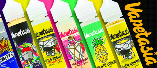
10. Vapetasia
Vapetasia is a brand with a fun aesthetic. The vaper demographic tends to be young, edgy, alternative adults who grew up with the Internet, Adult Swim cartoons, and skater brands like Savage, Thrasher, and Stussy. Vapetasia does a terrific job of encapsulating everything that this demographic finds nostalgic and fun without directly exploiting that nostalgia.
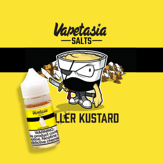
The mascot for the Killer Kustard line of vape juices by Vapetasia reminds us of the heroes of Aqua Teen Hunger Force, as a character that is personified food with a thick black outline and expressive features.
The Vapetasia logo itself is also fun, having two variations — the cloud which has icons from all of its juice brands:
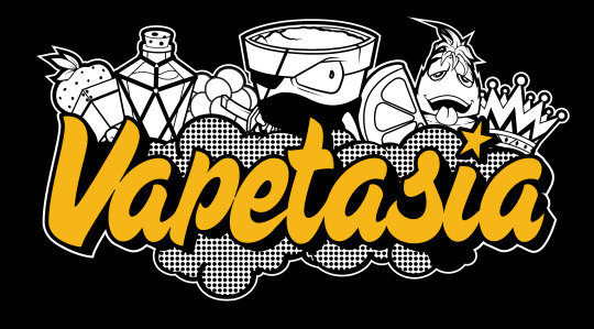
and the simple, iconic Vapetasia name. I have found that people wear Vapetasia branded swag freely, simply because even outside of its context as an e-juice brand, it is a groovy look.
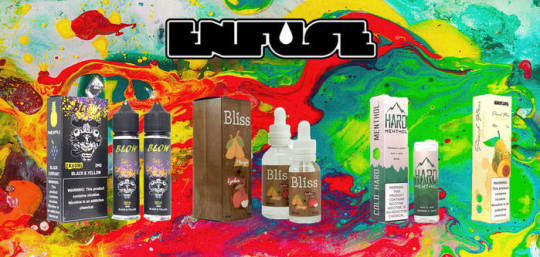
9. Enfuse - Pulp
We admit a personal bias here, because Enfuse is a brand local to Toro Imports HQ here in Houston, Texas. However, there’s a lot to be said for its logo and packaging design for their line of Pulp e-Juices.
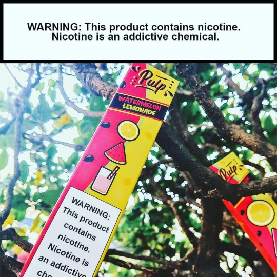
While the Enfuse logo is simple and conveys what the brand is, the packaging for Pulp reminds us of packaging for food and beverages. The Pulp packaging is classic, readable, and beautifully conveys the flavor with its mostly bi-chromatic color scheme that makes the box itself into a watermelon and lemon hybrid.
The packaging is bright, appealing, and while not as cartoonish and playful as Vapetasia, still has its own crisp, minimal illustrations that make the bottles fun to collect as well as delicious to vape

8. Naked100
Naked100 is one of those brands that you can count on consistently flying off the shelves. Each bottle has a very minimal aesthetic that strives not to give the consumer more visual information than they require — the brand name, the e-juice line, nicotine strength, flavor, etc.
No additional design elements are ever added to the packaging, which makes the brand unassuming, yet very stylish.
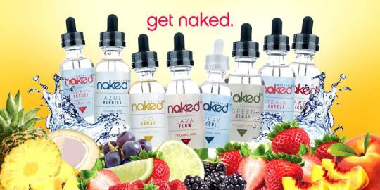
Naked100’s sans-serif font and minimal aesthetic remind us of Apple or Google, strong brands that also strive not to over-design their products. The brand is also careful not to under-design their packaging, either: all of their juices come in an eco-friendly glass bottle with very pale, subtle colors on the labels.
Aside from their innovative flavors, Naked’s sophisticated and thoughtful packaging makes it stand out from the competition as one of the best juices out there.
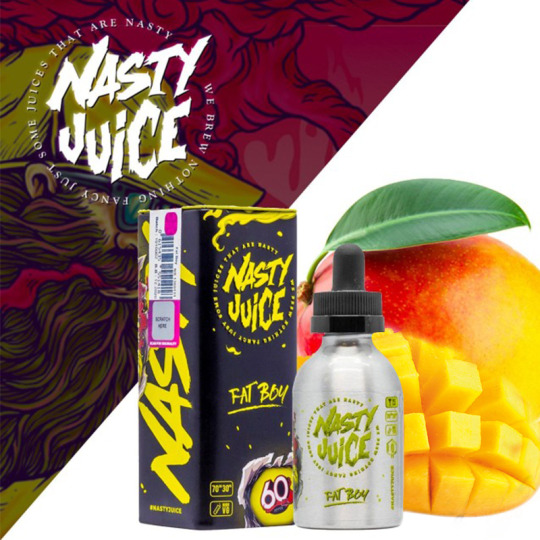
7. Nasty Juice
On the opposite side of the design spectrum from Naked100 is Nasty Juice. According to their company bio, Nasty Juice is a company founded on the idea of being an “obnoxious e-juice brand” with an “empowered sense of X-rated […] playfully daring spirit”. Standing out from other vape juice brands on this list, Nasty Juice vocally prides itself on its “exquisite advertising and top notch packaging”, which it easily accomplishes.
Nasty Juice, like Vapetasia, understands its alternative, millennial consumer base, diving into design language of skater brands and hip-hop aesthetic. Nasty Juice, much like RAW Rolling Papers, even produces its own skateboard decks and apparel with their signature fun illustrations. We love Nasty Juice not only because they are hugely popular, but because their thoughtful packaging and branding earns the popularity.

Just look at this guy. Nasty as can be.
While each of their line of Nasty Juices have unique packaging, every single bottle is easily identifiably Nasty™.

6. Nasty Juice x Kilo Collab
We just had to bring it back to Nasty Juice, because this collaboration between Nasty Juice and Kilo is absolutely stellar.
Nasty Juice tends towards its high-contrast, pop culture skater illustrations, while Kilo has a high detail, classical, almost baroque style of packaging. When you combine the two, you get this line of amazing illustrations and packages that remind us of Alphonse Mucha and vintage tobacco ads.
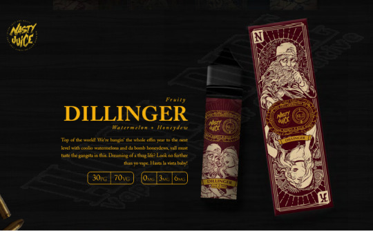
The packaging for the Nasty Juice x Kilo collaboration, to us, shows enormous respect and love for their consumers, knowing that the swag and bottles would be a lot of fun for fans of the individual brands to own. Kilo has a great aesthetic in its own right, but when combined with the powerhouse that is Nasty Juice, they come together to make a gorgeously detailed piece of artwork on every bottle.

5. Alternativ by Marina Vape Co.
Marina Vape Co. is a company that understands the other side of its consumer base that Nasty Juice and Vapetasia don’t quite reach — the sophisticated, yet edgy adults who are also likely big fans of the design of Naked100 bottles. While not quite as minimal as Naked100, the Alternativ juice line by Marina Vape Co. has a strong, informed design language of its own. Each juice is named after Greek letters, while using typography and design elements that are very much from the advanced digital age.
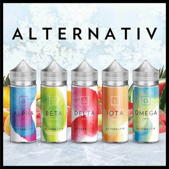
Alternativ e-Juices Alpha through Omega do a beautiful job of showcasing the transcendence of nicotine consumption from traditional smoking to high-tech vaping techniques, while also alluring the consumer with its fruity color schemes.
Like Naked100, the Alternativ vape juice packaging is not over designed, and only has some design elements that aren’t directly giving you information. We love the classy, stylish look of this juice line
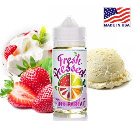
4. Fresh Pressed by California Grown E-Liquids
Going back to fun and illustrative, yet a little more modern, Fresh Pressed juices by California Grown E-Liquids reminds us of Enfuse Vapory’s Pulp juices. The logo condenses its flavors into one succinct space, and the entire aesthetic makes the juice line feel very “fresh”, as it claims to be.
The finish on Fresh Pressed bottles is glossy with contrasting metallic and glossy shine, and the illustrations are minimal, yet very appealing.
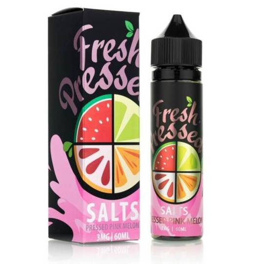
We are particularly big fans of the high-contrast packaging used for the Fresh Pressed line of Salts. Using its flowery, decorative logo splashed against a matte black background, this packaging is downright sexy.

3. Levels
While the packaging design for Levels is not very illustrative like other brands on this list, it is indeed thoughtful and intriguing. Utilizing design language of the 80’s such as Neon signage color schemes and fonts, Levels understands that its bottles need to earn their place in a customer’s vape juice collection.
This juice brand is for fans of the Terminator, the San Junipero episode of Black Mirror, and the more seasoned of their target demographic who actually lived through the 80’s.
What impresses us about the packaging for this juice brand is how it conveys a feeling, a time, and a place while giving us very little visual information besides lines and color, with no real change in color values or shading.
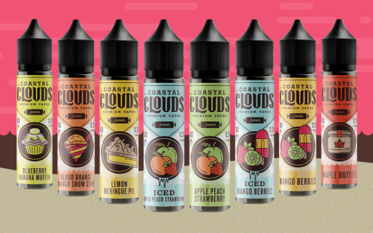
2. Coastal Clouds
Coastal Clouds is a hugely popular brand that positively flies off the shelves — in part, we believe, due to their amazing packaging and illustrations.
Like Marina Vape Co., Coastal Clouds utilizes a maritime design aesthetic, making consumers feel like they are inhaling fresh fruit right by the seaside. Coastal Clouds manages to work in the digital age information and inherent newness of vapor products in their vintage packaging feel seamlessly.
The old-school shape of the label and logo are vectorized, as are the illustrations of the flavors each bottle contains. The color schemes are muted, not overbearing, yet still ‘pop’.
Each design element on the bottle is perfectly balanced with the other elements. While some brands like Nasty Juice can tend to ‘crowd’ the information on their packaging against their vivid, detailed illustrations, all of the information on Coastal Clouds packaging is perfectly legible and beautifully described.
Also, they’re delicious.
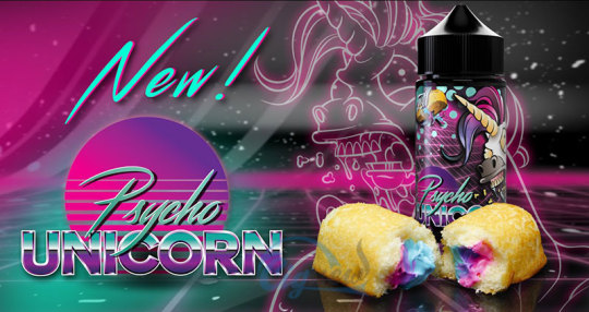
1. Psycho Unicorn by Puff Labs
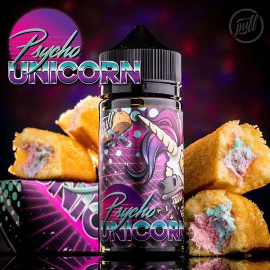
Psycho Unicorn earns first place on our list for design for making us stop and stare every time we pass their bottles in our store. We are suckers for vaporwave aesthetic here at Toro Imports, as is most of their demographic — making Psycho Unicorn by Puff Labs a clever play in packaging design.
One of the latest and greatest crazes in fashion and art nowadays is Glitch and Vaporwave. Psycho Unicorn perfectly merges design language from the 80’s and 90’s, a nostalgia factor for both sides of the vaping demographic spectrum. The illustrations for Psycho Unicorn are as appealing as they are hilarious, which shows that although they understand the importance of great packaging design, they don’t take themselves so seriously that they can’t inject humor in their product.
Psycho Unicorn is stylish, fun, and shows a deep understanding of their consumer base, which makes it our #1 favorite packaging design for vape juices.
#vape#vapelife#vaporwave#vapefam#vapefeed#vapeforlife#ejuice#vapejuices#design#bestof#bestoftheday#faves#aesthetic#branding#brands#listicle#breakdown#top10#bestofvape#vaporizer#smoke#smoking#cloudchaser#vapequeen
1 note
·
View note
Photo
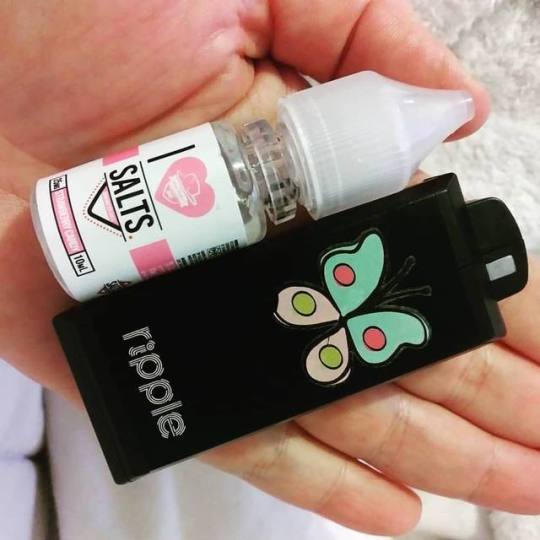
Tiny #Handcheck @vapemadhatter #ILoveSalts #Strawberrycandy In my @wellon_official #Ripplekit. That I did a lil decorative customization on! . . . #teambabyclouds #tooter #stealthvape #vapor #mtl #nicsalts #vaperpix #vapepix #vapepics #bestofvape #vapefam #Repost @gina_sassi_thedarkartsvaper4 with @insta.save.repost • • •
#repost#stealthvape#vapor#vapepix#vaperpix#vapepics#bestofvape#nicsalts#vapefam#ilovesalts#tooter#ripplekit#strawberrycandy#handcheck#mtl#teambabyclouds
0 notes