#belnder art
Explore tagged Tumblr posts
Text


This was very accidentally my second belnder porject. It started life as just, an attempt to creat a referance for a character of mine's (her name's Forge) weird horns and it, uh, got out of hand. Im very happy I was able to get it so far tho. Origional character art below

#d&d oc#oc art#my ocs#tiefling#dungeons and dragons#dnd#tiefling oc#dnd tiefling#oc#blender#blender3d#3d model#belnder art
9 notes
·
View notes
Text

Gigawatt
20 notes
·
View notes
Photo

they are rigged!
21 notes
·
View notes
Text
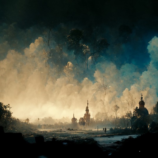
This scene was inspired from the film 1917, I tried to give the painting a terror and destruction aspect.
#warart 1917 conceptart belnder blendercommunity digitalart beautifuldestinations fantasyart aestheticart war environmentdesign#aesthetic#architecture#anime and manga#war#concept art#environment#nature#environment art#environment design#blender#blender3d#photoshop#artists on tumblr#ghibli art#oilpainting#war art#1917 movie
225 notes
·
View notes
Photo


🌹 Hello Everyone! 🌹
Time for a little design update, I hope you like it🌹 ... My new love is Render Blender, the pictures were taken in Blender. Follow me on instagram too! 🌹 How you can find me? its really easy, just write this.: @aylinnefay thank you for your support! 🌹
#aylinnefay#aylinnefayart#ts4 blender#the sims 4 blender#ts4 art#the sims 4art#the sims 4 blender 3d#ts4 belnder 3d#gorgeus sim#dinner date#duble date#I am create an istagram#Follow me♥#Thank you all♥#@aylinnefay
18 notes
·
View notes
Photo

Handsy
#daily#everyday#render#belnder#3d#cgi#cgi art#art#artists on tumblr#graphic design#abstract#abstract art#modern#3d art#minimal#minimalist#Minimalistic#digital#digital art#computer#computer art#b3d#color#colour#colorful
6 notes
·
View notes
Photo


SNES Controller
instagram | twitter | dribbble | behance
#lowpoly#simple cg#simpleCG#snes#nintendo#console#gaming#Illustration#gif#animation#controller#art#3d#belnder#low poly
301 notes
·
View notes
Photo

2 notes
·
View notes
Text

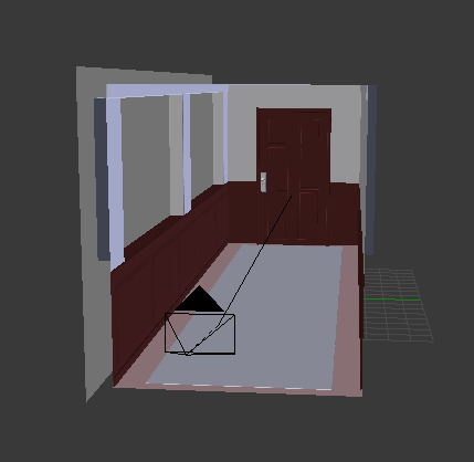

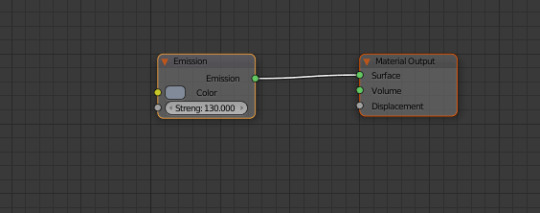
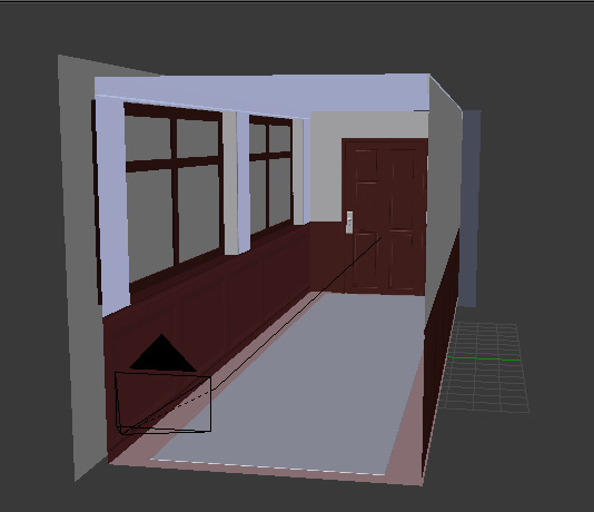
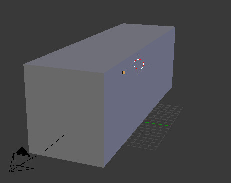
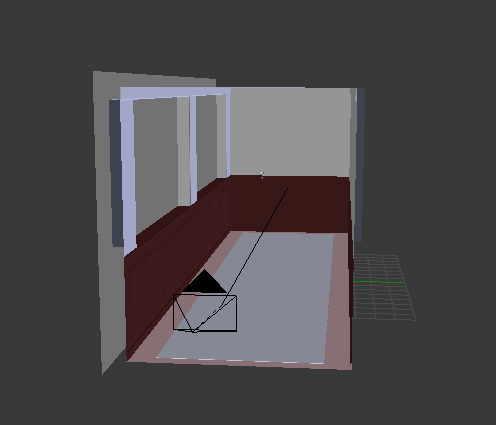
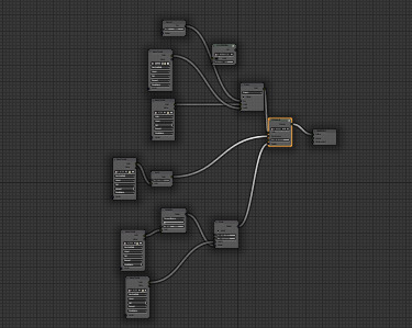
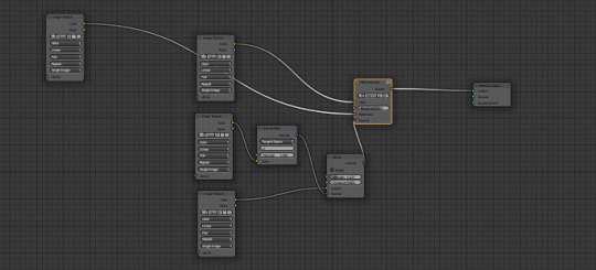
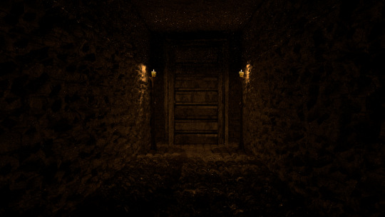
Despite the very clear problem that has presented itself in the way of lighting, the images above show the process I used to make a couple of corridors that will feature in trailer I've made as a part of my Final Major Project. Unfortunately, tumblr doesn't allow enough screenshots to show the whole process of the creation, so I'll try to describe the whole process as much as I can.
A quick disclaimer before I continue, I'm only showing the process of making one of the corridors as I used essentially the same techniques to make the other.
I first started with the default cube that belnder gives you and I scaled it up and elongated it is so it was much larger and in the shape of a rectangle. I hollowed out the rectangle to create the basic shape of the corridor's interior. To create the wall panels and windows, I used a large number of loop cuts to essentially cut the shapes into the walls; after using the loop cuts, the panels and windows had their own faces, which allowed me to extruded them, I extruded the windows inwards to make sure the glass was thin along with creating a windowsill and I extruded the wall panels outwards. To create the rug, I extruded the floor and scaled it down before extending it once again along the Z axis. I then added another cube to the scene which I scaled up to be the shape of a door, I then again used loop cuts to extrude different parts of the rectangular shape to add detail and actually make it look like a door. To finish off the modelling, I beveled all of the edges in the hallway, I did this because straight, perfect 90 degree edges dont really exist in the real world and having them in the seven was rather distracting.
Thankfully, the modelling of the hallway was far easier than I expected, the real challenge for me was texturing; during this part of the project, I decided to proper image textures instead of creating my own materials with nodes. There is a wide selection of different textures on the internet and I've found a few sites that are designed for people who create CG art, so their textures also come along with things like normal and bump maps, as well as roughness and distortion images. For things like architecture models, you need image textures and creating your own takes a lot of time and I unfortunately didn't have the time to do it, so I made sure to use royalty free textures.
Having the texture is only half the work though, you can't simply slap one on a model and expect it too look good, so I created a node system for the textures to make them look as realistic as possible.
The wooden panels on the lower half of the wall as well as the wooden floors use a rather simple set up. It centers around a node that combines all of the image texture inputs. I first added the basic colour texture which I plugged into the colour segment of the Dielectric node, I then added the normal and bump maps into the node group; these two textures affect the appearance of the objects surface; in the case of the floor, it makes it appear that there are bumps on the surface and creates the illusion of depth, specifically around the edges of the planks as well as the ridges on the wood. I connected the bump map into the bump node and the normal map into a normal map node, which I then connected to the bump node's normal, these two connected nodes then connected to the Dieletric node's normal. The combination of these nodes made the material look more real and 3D, but it looked too perfect and clean, so in order to make it look more worn and like it wasnt completely untouched, I added a roughness texture which I connected to the Dieletric's roughness value; this means the roughness changes to that texture, darker sections of that texture will be less glossy the lighter areas. Finally, I added a similar in a similar texture as to the last one and combined it with the colour node, this added a dust like layer to the texture. This process was used for anything with wood in the scene, like the door, panels and floor as well as the stone walls in the second corridor.
To create the actual shape of the bricks in the stone corridor, I used a displace modifier along with a displace texture, this displaced the mesh wherever the texture is darker than pure white.
The glass in the windows is essentially the same as I used for the bottle and drinking glass that I posted about before.
The last texturing I did was creating the pale green paint, it was rather easy. It is made up of two RGB nodes which control colour, along with a gloss node and a diffuse node that are mixed, the RGB nodes control the colour of the gloss and diffuse. I lastly added a noise texture which I plugged into the displacement as scaled it up to the point where the bumps it created were so small that they just seemed like bumps on paint on the wall
2 notes
·
View notes
