#beige and white striped throw pillows
Explore tagged Tumblr posts
Visit Tumblr Blog
Explore Tumblr blogs with no restrictions, modern design and the best experience.
Last Seen Tumblr Blogs


Fun Fact
12.7% of mobile users access Tumblr.
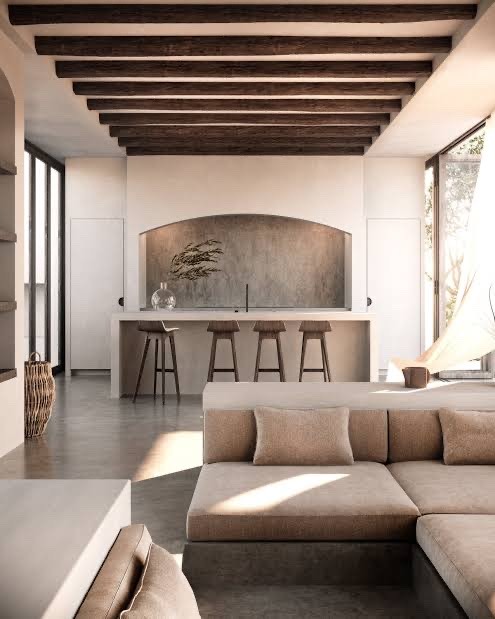
Photo

New York Loft-Style Family room: mid-sized country loft family room idea with light wood floors, white walls, and no fireplace
#light hardwood flooring#light hardwood floors#white vaulted ceiling#white panel walls#beige and white striped throw pillows#white base molding#square glass side table
0 notes
Text
Interiors: Basics of Styles
The 9 Styles of Interiors are maximalist, brutalist, coastal, minimalist, rustic, art deco, Hollywood Regency, midcentury modern and modern organic and they all have unique characteristics. Let’s dive in.
Maximalism
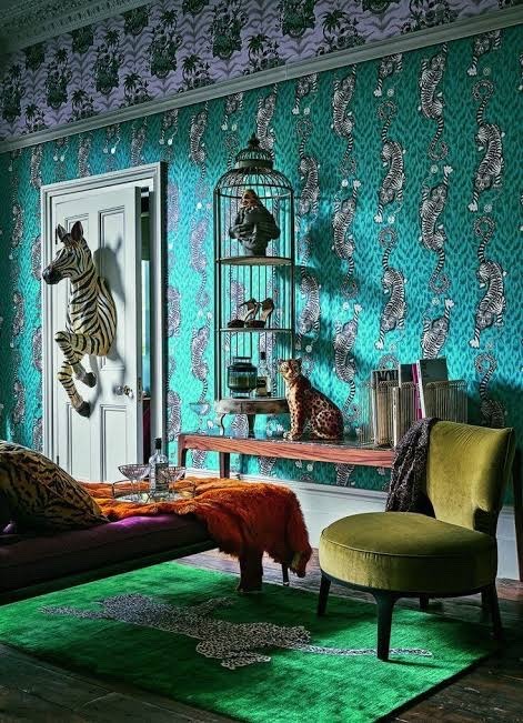
* Bold colors.
* Bright wallpaper.
* Mixed patterns with contrasting motifs, like animal print, geometric shapes, or florals.
* Ornate accents, like chandeliers.
* Layered fabrics.
* Statement pieces.
Notable people: Kelly Wearstler, Martin Brudnizki, Dorothy Draper and the Greenbriar Resort
Brutalist
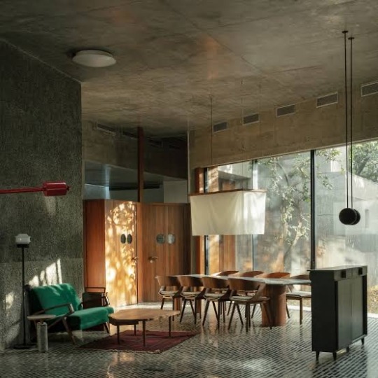
* Raw Materials. At its core, Brutalist interior design honors raw materials—showcasing the honesty of construction
* Geometric Shapes
* Textured Surfaces
* Unadorned Minimalism
* Focus on Function
Notable people: Le Corbusier, Marcel Breuer, Moshe Safdie
Coastal
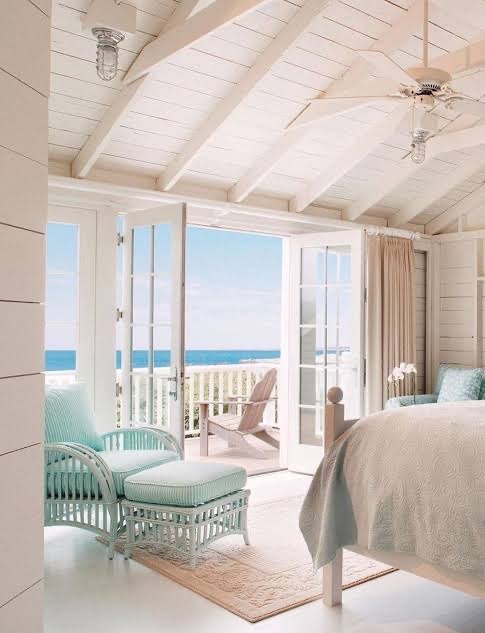
* Natural Light
* Crisp whites
* Layered blue tones
* Jute textures
* Stripes
* Linen upholstery
Notable people: William Pahlmann, Amy Aidinis Hirsch, Brett Sugerman and Giselle Loor Sugerman
Minimalist
* Simple lines.
* Monochromatic or neutral color palettes.
* Limited furniture.
* Limited decorative objects.
* Storage solutions that keep the space uncluttered.
* Open floor plans.
* Natural light
Notable people: Donald Judd, Ludwig Mies van der Rohe, David Chipperfield
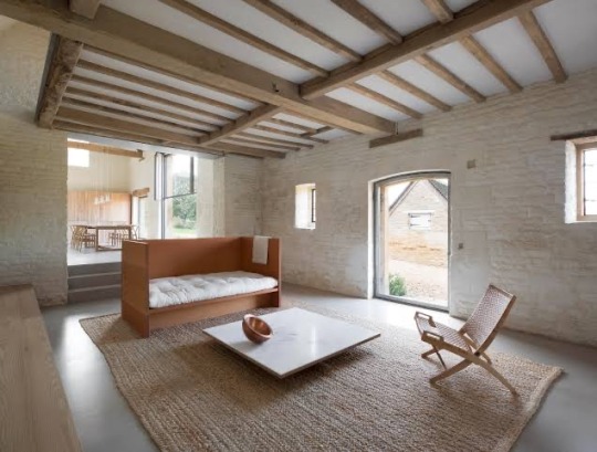
Rustic
* Main Colors: Wood grains or browns, beiges, or warmer shades
* of white.
* Accent Colors: Muted colors - tans, reds, blues, greens, yellows,
* and grays.
* Shapes: Rugged, imperfect lines and silhouettes.
* Fixture Finishes: Iron, pewter, copper, or brass.
* Aesthetic: Imperfect but warm and inviting. Decor/Art Style: Animal hides and fur, antlers, throws, pillows,
* and rugs with simple motifs or patterns.
Notable people: Alexander Waterworth, Grey Walker, Katherine Pooley, Bill Hovard, Jean Stoffer
Art deco
* Streamlined, symmetrical forms.
* Geometric designs as ornamentation; it's common to see shapes such as: Trapezoids
* Rich material and textile palettes
* Ornamental light fixtures such as chandeliers or sconces.
Notable people: Jacques Ruhlmann and Maurice Dufrène, Eliel Saarinen
Hollywood Regency
* richly layered textures
* high contrast patterns
* metallic finishes
* vibrant colors
Notable people: Dorothy Draper, George Vernon Russell, Douglas Honnold, John Woolf, and Paul R. Williams.
Midcentury Modern
* clean lines
* muted tones
* a combination of natural and manmade materials
* graphic shapes
* vibrant colours
* integrating indoor and outdoor motifs
Notable people: Arne Jacobsen, Charles and Ray Eames, Eero Saarinen
Modern Organic
* The modern organic interior design style mixes minimalism, midcentury modern, and boho flair
* Clean minimalism and sleek lines meet nature-inspired shapes, organic textures, and rustic elements
* By adding natural textures and shapes, the modern organic decor is warm, inviting, soulful, and elegant.
#c suite#powerful woman#strong women#ceo aesthetic#personal growth#that girl#productivity#q/a#getting your life together#balance#cultural education#rich bitch guide#interiors
316 notes
·
View notes
Text


flag id: six flags with 9 stripes, with the second and eighth being smaller than the others, the first and ninth smaller than those, and the fifth the smallest.
the top left flag's stripes are black, blue-black, very dark faded blue, dark dull blue, black, dark dull purple, very dark dull indigo, indigo-black, and black. the top right flag's stripes are dull blue, dull light blue, light silver, very light silver, grey, very light grey, light grey, silver, and dark grey.
the middle left flag's stripes are silver, light silver, very light silver, silver-white, light brownish-grey, cream, light sandy brown, tan, and dull light brown. the middle right flag's stripes are light grey, very light grey, grey-white, off-white, white, light cream, cream, dull cream, and light yellowish-grey.
the bottom left flag's stripes are brown, soft brown, dull light brown, pale green, brown-grey, pale blue, light blue-grey, silver, and dark silver. the bottom right flag's stripes are light brown, light orange, very light golden yellow, cream, beige, orangish-white, light tan, tan, and dull light brown. end id.
banner id: a 1600x200 teal banner with the words ‘please read my dni before interacting. those on my / dni may still use my terms, so do not recoin them.’ in large white text in the center. the text takes up two lines, split at the slash. end id.
noircolauric | greycolauric ashencolauric | ivorycolauric chiffoncolauric | beigecolauric
noircolauric: a colorgender related to the color noir, drops of ink, eyeliner, crows, spiders, charcoal, painted nails, and the night
greycolauric: a colorgender related to the color grey, window panes, fog, old sweaters, clouds, cobwebs, ash, and owl feathers
ashencolauric: a colorgender related to the color ashen, old newspapers, smoke, quiet cities, pale cheeks, pebbles, chalk, and the clouded moon
ivorycolauric: a colorgender related to the color ivory, lace, marble, china dishes, doves, paper, bones, and vanilla shakes
chiffoncolauric: a colorgender related to the color chiffon, stone walls, sweaters, moths, dusty lace, animal tracks, incense, and throw pillows
beigecolauric: a colorgender related to the color beige, lattes, dry fields, footprints, easels, cat fur, pottery, and fresh-baked cookies
[pt: noircolauric: a colorgender related to the color noir, drops of ink, eyeliner, crows, spiders, charcoal, painted nails, and the night
greycolauric: a colorgender related to the color grey, window panes, fog, old sweaters, clouds, cobwebs, ash, and owl feathers
ashencolauric: a colorgender related to the color ashen, old newspapers, smoke, quiet cities, pale cheeks, pebbles, chalk, and the clouded moon
ivorycolauric: a colorgender related to the color ivory, lace, marble, china dishes, doves, paper, bones, and vanilla shakes
chiffoncolauric: a colorgender related to the color chiffon, stone walls, sweaters, moths, dusty lace, animal tracks, incense, and throw pillows
beigecolauric: a colorgender related to the color beige, lattes, dry fields, footprints, easels, cat fur, pottery, and fresh-baked cookies. end pt]
seventh set of colorgenders based on the results of this 'what color is your aura?' uquiz for anon!
these are in the colorgender flag format with the aura color from the uquiz as the center stripe and colors inspired by the listed things as the rest of the stripes. the terms are the aura color, 'col' from 'color, 'aur' from 'aura', + 'ic'!
tags: @radiomogai, @colorgendered | dni link
#noircolauric#greycolauric#ashencolauric#ivorycolauric#chiffoncolauric#beigecolauric#colauric#colorgender#aesthetigender#my flags#my terms#new flag#new term#mogai flag#mogai term#mogai#long post
32 notes
·
View notes
Text
Enhance Your Space With Stunning Nautical Decor – Timeless Ocean-Inspired Elegance
The charm of the sea has captivated people for centuries, and bringing that oceanic beauty into your home is easier than ever with Handcrafted Nautical Decor. Whether you want to create a serene beachside retreat or a bold maritime aesthetic, nautical decor offers timeless elegance and coastal charm. From classic nautical wall decor to unique nautical decorations, there are endless ways to infuse your space with the spirit of the sea.

Why Choose Nautical Decor?
Nautical decor is more than just a design style; it’s a way to bring the relaxing and adventurous spirit of the ocean into your home. With a mix of deep blues, crisp whites, natural wood tones, and maritime symbols, this aesthetic creates a calming atmosphere that reminds you of sandy shores and gentle waves.
At Handcrafted Nautical Decor, we offer a wide selection of nautical decorations that perfectly capture the beauty of the sea. Whether you’re decorating a beach house, a coastal-themed room or simply love maritime elements, our collection provides high-quality, handcrafted pieces that bring your vision to life.
Popular Nautical Decorations for Your Home
Ship Wheels & Anchors Add an authentic touch to your space with classic ship wheels and anchors. These timeless nautical decorations bring a maritime feel and serve as stunning focal points.
Nautical Wall Decor Elevate your interiors with unique nautical wall decor, such as vintage maritime maps, framed portholes, and sea-themed paintings. These pieces add personality and depth to any room.

Lighthouses & Buoys Lighthouses symbolize guidance and safety, making them a great addition to your decor. Decorative buoys add a playful and authentic coastal vibe.
Model Ships & Sailboats Nothing says “maritime elegance” quite like a handcrafted model ship. These detailed pieces make excellent centerpieces for any nautical-themed space.
Rope Accents & Driftwood Designs Natural materials like rope and driftwood are essential elements in nautical decor. Incorporate rope-framed mirrors, driftwood tables, or woven baskets to complete the look.
How to Incorporate Nautical Decor in Different Spaces
Living Room
Create a cozy and stylish living room with nautical wall decor like framed sea-inspired artwork, ship wheels, and rope-wrapped lanterns. Complement the look with blue and white striped throw pillows and rustic wooden coffee tables.
Bedroom
Turn your bedroom into a peaceful seaside retreat with soft, ocean-inspired colors and elegant nautical decorations. Opt for bedding in shades of navy, white, and beige, and add accents like porthole mirrors and lighthouse-themed lamps.
Bathroom
A nautical decor-themed bathroom is both refreshing and stylish. Incorporate seashell accessories, wooden oars as wall art, and towels in marine hues. A porthole mirror can be the perfect finishing touch.
Outdoor Spaces
Enhance your patio or deck with maritime-themed furniture, rope-wrapped planters, and lanterns. Hanging a ship’s bell or anchor outside adds an authentic nautical feel that welcomes guests with coastal charm.
Shop the Best Nautical Decor at Handcrafted Nautical Decor
At Handcrafted Nautical Decor, we specialize in offering beautifully designed, high-quality nautical decorations that bring the magic of the sea into your home. Whether you’re looking for elegant nautical wall decor or unique maritime treasures, our collection has something for every ocean lover.
Follow Us & Stay Inspired!
Stay up to date with our latest nautical decor collections and decorating ideas by connecting with us on social media and joining our community of coastal design enthusiasts.
0 notes
Text
Nautical Home Decor Ideas for a Space

Nautical home decor brings the tranquility of the sea into your living space, creating a relaxing and inviting atmosphere. Nautical home decor whether you live by the coast or want to incorporate seaside charm into your home, this decorating style offers a perfect blend of elegance and comfort.

Key Elements of Nautical Decor
Coastal Color Palette – Shades of blue, white, beige, and soft grays mimic the ocean and sandy shores. Natural Materials – Incorporate driftwood, rattan, linen, and rope accents for an organic touch. Nautical Symbols – Anchor motifs, ship wheels, and seashell decorations instantly enhance the seaside aesthetic. Stripes and Patterns – Classic navy-and-white stripes are a timeless feature in nautical decor. Weathered Finishes – Distressed wood furniture and rustic elements evoke a charming, beach-worn look.

How to Style Your Home with Nautical Decor
Living Room: Add striped throw pillows, wooden coffee tables, and coastal artwork. Bedroom: Use white linens with navy accents and incorporate rope light fixtures. Bathroom: Decorate with seashell soap dishes, maritime mirrors, and soft blue hues. When using the blue color palette, combining it with neutral colors such as white, sand beige, or light gray is an effective way to emphasize the sea theme. In addition, wooden textures or seashell color details can add warmth and naturalness to the sea theme.

As a result, sea-themed home decoration with a blue color palette can make your home a calm, spacious, and peaceful place. You can bring the sea atmosphere to your home by using different shades of blue in each room. You can create a living space full of marine motifs in your living room and a peaceful sleeping environment in your bedroom. You can also live the sea theme with details in areas such as the bathroom and kitchen.

In addition, you can emphasize the sea theme even more by combining the blue color palette with neutral colors such as white, sand beige, or light gray. Wooden textures or seashell color details can add warmth and naturalness to your home while making you feel the sea breeze.

Remember that home decoration is personal and should reflect your own style. You can transform your home into an original and peaceful living space by using the sea theme with a blue color palette. Read the full article
0 notes
Text
Coastal Bedding Sets: The Perfect Blend of Comfort and Seaside Style

Introduction
Transforming your bedroom into a serene coastal retreat is easier than ever with coastal bedding sets. These bedding ensembles capture the essence of the ocean, bringing a refreshing and tranquil atmosphere into your space. Whether you live by the beach or just want to bring a bit of seaside charm to your home, the right coastal bedding can make all the difference. This article explores the styles, benefits, and factors to consider when choosing the perfect coastal bedding set.
What Are Coastal Bedding Sets?
Coastal bedding sets are specifically designed to reflect the beauty of the ocean and beachside living. They often feature soft, airy colors like blues, whites, and sandy neutrals, along with marine-inspired patterns such as seashells, coral, waves, and nautical stripes. These sets typically include sheets, comforters, pillowcases, and decorative shams, all tailored to bring a breezy, coastal vibe to any bedroom.
The Appeal of Coastal Bedding Sets
1. Brings a Relaxing Atmosphere
Coastal bedding creates a soothing environment that mimics the calming nature of the sea, making your bedroom a perfect place to unwind.
2. Timeless and Versatile Style
The oceanic-inspired theme is evergreen, making it suitable for all seasons and home décor styles, from rustic beach cottages to modern coastal apartments.
3. Variety of Designs and Colors
Whether you prefer a bold nautical theme or a subtle, breezy aesthetic, there are coastal bedding sets to match every preference.
4. Complements Different Interior Themes
Coastal bedding blends well with a variety of interior décor styles, including minimalist, farmhouse, and bohemian themes.
Popular Styles of Coastal Bedding Sets
1. Nautical-Themed Bedding
Nautical bedding sets incorporate elements like anchors, sailboats, and stripes in navy blue and white, perfect for a classic maritime look.
2. Tropical Beach Bedding
Featuring palm leaves, exotic florals, and vibrant hues, tropical beach bedding adds a lively and tropical touch to any bedroom.
3. Sea Life and Ocean-Inspired Bedding
Designs with seashells, starfish, dolphins, and coral prints create a beautiful underwater-inspired retreat.
4. Minimalist Coastal Bedding
For a more subtle and sophisticated take, minimalist coastal bedding uses soft tones, light textures, and simple patterns inspired by sandy beaches and ocean waves.
How to Choose the Best Coastal Bedding Set
1. Material and Fabric Quality
Cotton: Breathable, soft, and ideal for all seasons.
Linen: Lightweight and perfect for a casual coastal aesthetic.
Microfiber: Affordable, wrinkle-resistant, and easy to maintain.
Bamboo: Eco-friendly and offers moisture-wicking properties for added comfort.
2. Color Palette
Opt for colors that evoke a beachside atmosphere, such as:
Light blues and aquas to resemble ocean waves.
Sandy beige and off-whites for a neutral, breezy feel.
Soft pastels for a relaxing and cozy beach-inspired look.
3. Pattern and Design
Choose from a variety of patterns that reflect the coastal theme, including:
Geometric Stripes: Classic nautical appeal.
Floral and Palm Leaves: For a tropical touch.
Seashells and Starfish: Ideal for a marine-inspired décor.
4. Set Inclusions
A complete coastal bedding set typically includes:
Fitted sheet and flat sheet
Duvet cover or comforter
King Adjustable Bed Sheets
Throw pillows (optional for extra styling)
Tips for Styling a Bedroom with Coastal Bedding
1. Incorporate Natural Elements
Enhance the coastal vibe with rattan furniture, driftwood accents, or seagrass rugs.
2. Use Sheer Curtains for an Airy Feel
Light, flowing curtains allow natural light to filter in, mimicking the openness of the beach.
3. Add Complementary Décor
Seashell or glass vases.
Ocean-inspired artwork.
Rope or woven baskets for a nautical touch.
4. Layer Textures for a Cozy Look
Mix different fabrics such as linen, cotton, and knitted throws to create a warm and inviting coastal space.
Where to Buy the Best Coastal Bedding Sets
1. Online Retailers
Popular online stores like Amazon, Wayfair, and Bed Bath & Beyond offer a wide variety of coastal bedding sets with different styles and price points.
2. Specialty Home Décor Stores
Brands specializing in coastal and beach-themed home décor often carry high-quality, unique bedding collections.
3. Local Boutiques and Artisan Shops
For exclusive, handmade, or custom coastal bedding, check out local boutiques and small businesses.
Caring for Your Coastal Bedding Set
1. Washing Instructions
Follow the manufacturer’s label for specific washing guidelines.
Use mild detergents to maintain fabric quality.
Wash in cold water to prevent fading.
2. Drying and Storage
Air dry when possible to retain softness.
Store extra bedding in breathable fabric bags to prevent dust accumulation.
3. Ironing and Maintenance
If needed, iron on a low setting for wrinkle-free sheets.
Rotate bedding seasonally to maintain freshness and longevity.
Conclusion
Coastal bedding sets offer an effortless way to bring the beauty and serenity of the ocean into your home. Whether you prefer a bold nautical theme or a subtle beach-inspired design, there’s a perfect bedding set for every coastal décor enthusiast. By choosing high-quality fabrics, coordinating colors, and adding complementary décor, you can create a relaxing and stylish bedroom oasis.
With the right coastal bedding set, your bedroom can become a personal seaside sanctuary where comfort meets coastal elegance.
#bedding#premium bedding#coastal bedding#coastal bedsheets#King Adjustable Bed Sheets#Adjustable bed sheets#adjustable bedding
0 notes
Text
Home Decor Trends for SS 2026-27
Innovative overview research of The Home Decor Trends for Spring Summer 2026-27 and ideas incorporating the given color palette and textiles prints:
M O O D B O A R D T H E M E

By Madhusudan
Trends for Spring Summer 2026-27
1. Sustainable Living: Eco-friendly materials, repurposed items, and energy-efficient solutions.
2. Wellness-Centric Spaces: Calming colors, natural textures, and air-purifying elements.
3. Maximalism: Bold patterns, vibrant colors, and statement pieces.
4. Global Inspiration: Incorporating traditional craftsmanship and motifs from around the world.
5. Smart Homes: Integration of technology for convenience, security, and energy efficiency.
Color Palette Ideas


Soft Peach and Pastel Hues:
1. Blush Accents: Add soft peach tones to throw pillows, blankets, or vases.
2. Pastel Walls: Paint walls with soothing pastel shades, like pale pink or baby blue.
3. Whimsical Patterns: Incorporate pastel-colored florals or geometric patterns on textiles.

Minty Fresh Tones

1. Minty Green Accents: Add fresh mint tones to vases, planters, or decorative accessories.
2. Calming Walls: Paint walls with a soothing mint green shade.
3. Nature-Inspired Patterns: Incorporate minty green and white botanical prints on textiles.


Vibrant Coral and Turquoise

1. Coral Red Accents: Add vibrant coral tones to throw pillows, blankets, or vases.
2. Turquoise Statement Pieces: Incorporate turquoise-colored vases, decorative boxes, or wall art.
3. Global-Inspired Patterns: Incorporate vibrant coral and turquoise geometric patterns or tribal motifs on textiles.
Neutral Shades

1. Beige and Ivory Base: Use neutral shades as a base for walls, furniture, and textiles.
2. Powder Blue Accents: Add soft powder blue tones to throw pillows, blankets, or vases.
3. Natural Textures: Incorporate natural textures like linen, cotton, or wool in neutral shades.
Textiles, Prints, and Curtains Ideas

1. Striped Dining Chair Covers: Use striped fabrics in soft peach, minty green, and neutral shades.
2. Floral Patterns: Incorporate whimsical floral patterns in pastel shades on textiles, like curtains or throw pillows.
3. Geometric Prints: Use vibrant coral and turquoise geometric prints on textiles, like blankets or wall hangings.
4. Natural Fiber Textiles: Incorporate natural fiber textiles, like linen or cotton, in neutral shades for a calming atmosphere.
5. Layered Window Treatments: Use layered window treatments, like sheer curtains and opaque drapes, in neutral shades to add depth and texture.
Trend research by
Madhusudan Lal
1 note
·
View note
Text
Summer Home Decor Ideas for a Bright and Airy Feel
Summer is a time for transformation—not just outdoors but also within the walls of our homes. With longer days and warmer weather, the season calls for a fresh, vibrant, and breezy ambiance that reflects the beauty of the outdoors. This blog will explore a myriad of ideas to help you achieve a bright and airy feel in your summer home decor. Whether you’re redecorating a single room or revamping your entire home, these tips will inspire and guide you.
1. Embrace Light and Neutral Colors
Summer is all about bringing the sunshine indoors, and the easiest way to do this is by choosing light and neutral colors for your walls, furniture, and decor elements. Shades like white, beige, soft gray, and pastel tones can create an open and spacious feel.
Examples:
Paint your walls in a crisp white or soft cream shade.
Use pastel-colored throw pillows and curtains to add subtle vibrancy.
Opt for a beige or light gray sofa paired with a white coffee table.
2. Let the Natural Light In
Maximizing natural light is key to creating a bright and airy space. Here are some ways to do it:
Sheer Curtains: Replace heavy drapes with sheer or lightweight curtains that let sunlight filter through.
Mirrors: Place mirrors strategically to reflect light and make your space feel larger. For example, a large mirror opposite a window can double the sunlight in the room.
Clean Windows: Ensure your windows are spotless to allow maximum light penetration.
3. Incorporate Natural Elements
Bringing the outdoors in is a hallmark of summer decor. Adding natural elements like wood, rattan, and greenery can create a fresh and organic feel.
Ideas:
Use rattan furniture or wicker baskets for storage.
Add potted plants or fresh flowers to your living spaces. A monstera plant or a vase of sunflowers can make a significant impact.
Choose jute or sisal rugs for a natural, textured look.
4. Switch to Lightweight Fabrics
Heavy fabrics like velvet or wool can make a space feel wintery. For summer, opt for lightweight and breathable materials.
Suggestions:
Swap out heavy drapes for cotton or linen curtains.
Use light, breathable bedding such as cotton or bamboo sheets.
Add slipcovers to sofas and chairs in lighter fabrics and colors.
5. Add Pops of Color
While neutral tones create a calming base, pops of color can add personality and vibrancy.
Examples:
Use bright, patterned throw pillows or a colorful area rug.
Add bold artwork to your walls, such as a vibrant abstract painting.
Incorporate colorful vases, candles, or decorative bowls.
6. Declutter for a Minimalist Look
A clutter-free space feels more open and airy. Summer is the perfect time to embrace minimalism.
Tips:
Donate or store items you don’t use frequently.
Use hidden storage solutions like ottomans with compartments.
Keep countertops and surfaces clean and uncluttered.
7. Outdoor-Inspired Decor
Bring summer vibes indoors with decor that evokes the feeling of being at the beach or in a tropical paradise.
Ideas:
Use coastal-themed decor like seashells, driftwood, or nautical stripes.
Add tropical prints in your cushions or wall art.
Use a color palette inspired by the ocean, such as blues, greens, and sandy neutrals.
8. Upgrade Your Outdoor Spaces
Don’t forget about your outdoor areas. Create an inviting space for relaxing or entertaining.
Suggestions:
Add outdoor seating with weather-resistant cushions.
String up fairy lights or lanterns for evening ambiance.
Use outdoor rugs and throw blankets to make the space cozy.
9. Invest in Multifunctional Furniture
For smaller spaces, multifunctional furniture can help maintain a bright and uncluttered look.
Examples:
A daybed that doubles as a sofa.
Nesting tables that can be tucked away when not in use.
Ottomans with built-in storage.
10. Use Aromatherapy to Set the Mood
Scents play a significant role in creating a summer vibe. Opt for fresh and citrusy aromas.
Recommendations:
Use essential oils like lemon, lavender, or eucalyptus.
Light candles with summer-inspired scents such as coconut or sea breeze.
Add a bowl of potpourri with dried flowers and citrus peels.
11. Incorporate Artwork and Wall Decor
Art can be a great way to add a personal touch and seasonal flair.
Ideas:
Hang landscape or botanical prints.
Create a gallery wall with summer-themed photos or artwork.
Use removable wall decals for a temporary seasonal update.
12. Optimize Ventilation
A bright and airy feel isn’t just visual; it’s also about comfort. Ensure proper airflow in your home.
Tips:
Use ceiling fans or portable fans to keep air circulating.
Place screens on windows to allow fresh air in without letting bugs inside.
Keep doors open between rooms to promote airflow.
13. Experiment with Lighting
Lighting plays a crucial role in setting the tone of your space.
Suggestions:
Use warm, soft lighting for a cozy evening feel.
Add string lights or LED candles for a magical touch.
Install dimmers to adjust the lighting based on the time of day.
14. Personal Touches
Make your space uniquely yours by adding personal elements.
Ideas:
Display family photos in light-colored frames.
Showcase travel souvenirs that remind you of summer vacations.
Add handmade crafts or DIY decor items.
15. Focus on Entryways
Your home’s entryway sets the tone for visitors.
Tips:
Add a colorful doormat with a summer motif.
Place a small bench with storage for shoes and bags.
Use fresh flowers or a potted plant to greet guests.
Conclusion
Transforming your home into a bright and airy summer haven doesn’t have to be overwhelming. By incorporating light colors, natural elements, and functional decor, you can create a space that feels both stylish and inviting. Remember, small changes can make a big impact.
For more insights on interior design, visit kasapros.com.
Sources for Further Reading:
Wikipedia on Interior Design
Houzz: Summer Decorating Ideas
Better Homes & Gardens
With these tips and resources, you’re well on your way to achieving a summer-ready home that radiates light and joy. Happy decorating!
0 notes
Text
7 Interior Design Trends That Always Stay in Style
In the ever-changing world of interior design, certain trends come and go, but some have stood the test of time. These timeless styles continue to inspire and resonate with homeowners and designers alike, regardless of the decade or design evolution. Here are seven designs trends compiled by our interior designers in Kochi to help you stay in style:
1. Neutral Color Palettes
Neutral tones like whites, beiges, grays, and earthy hues have long been a foundation of classic interior design. They create a calm and inviting atmosphere, provide versatility, and allow for layering with bolder accents. Whether it's a minimalist modern home or a traditional space, neutrals remain a timeless choice. The beauty of neutral tones lies in their adaptability—you can effortlessly switch up the look by adding colorful pillows, artwork, or rugs, giving the room a refreshed feel without major renovations.
2. Natural Materials
Incorporating natural materials such as wood, stone, and leather never goes out of fashion. These elements bring warmth, texture, and a connection to the outdoors. Hardwood floors, marble countertops, and rattan furniture are just a few examples of how natural materials can seamlessly blend with various design styles. Additionally, sustainable and eco-friendly materials have become more accessible, allowing homeowners to combine timeless aesthetics with environmental consciousness.
3. Classic Patterns
Certain patterns, like stripes, checks, and herringbone, have an enduring appeal. These designs add visual interest without overwhelming a space. A striped rug, a herringbone wood floor, or plaid throw pillows can elevate the room while maintaining a timeless aesthetic. Incorporating classic patterns is an excellent way to strike a balance between subtlety and sophistication. You can layer these patterns with solid colors or mix them for a more eclectic look that still feels cohesive.
4. Functional and Quality Furniture
Investing in well-crafted furniture pieces is a trend that never loses its charm. Quality materials and timeless designs ensure longevity. Iconic pieces like a Chesterfield sofa, Eames lounge chair, or a sleek mid-century modern credenza transcend trends and remain desirable for decades. When selecting furniture, focus on craftsmanship, comfort, and durability. These pieces not only stand the test of time but also become cherished heirlooms that add character and history to your home.
5. Statement Lighting
Lighting does more than illuminate a room; it sets the mood and enhances the overall aesthetic. Timeless statement fixtures like chandeliers, pendant lights, and wall sconces have been staples in interior design. Choosing elegant, high-quality lighting ensures a lasting impression. For example, a crystal chandelier can add a touch of grandeur to a dining room, while a sleek metal pendant light can bring modern elegance to a kitchen. Layered lighting—combining ambient, task, and accent lighting—is a key strategy to achieve a well-lit and stylish space.
6. Built-In Storage
Maximizing space with built-in storage solutions is both practical and stylish. Custom cabinetry, bookshelves, and window seats with hidden compartments add functionality while maintaining a clean and cohesive look. These solutions are adaptable to any design style and enhance the usability of a space. Built-ins not only help declutter but also create opportunities to display decorative items like books, vases, or art pieces, turning storage into a design feature.
7. Greenery and Indoor Plants
Bringing the outdoors in has always been a popular design choice. Indoor plants add life, color, and a refreshing vibe to any interior. From towering fiddle leaf figs to low-maintenance succulents, greenery complements every style and enhances air quality, making it a timeless design element. In addition to traditional potted plants, consider vertical gardens, hanging planters, or terrariums to incorporate greenery creatively. These elements not only boost the visual appeal of your space but also promote well-being by creating a calming environment.
Bonus Tips for Timeless Design
While the above trends form the core of enduring interior design, here are a few additional tips to ensure your space remains stylish for years:
Embrace Minimalism: A clutter-free space with carefully chosen furniture and decor pieces often feels timeless.
Focus on Balance: Strive for symmetry and proportion in your design to create a harmonious look.
Choose Versatile Decor: Opt for items that can transition across different design styles or themes.
Stay True to Your Style: Ultimately, a space that reflects your personality will always feel authentic and timeless.
Conclusion
Trends may evolve, but these seven interior design staples continue to shine due to their versatility, functionality, and aesthetic appeal. By incorporating these timeless elements into your home with the help of a reliable team of interior designers in India, you can create a space that remains stylish and relevant for years to come. Whether you're starting from scratch or refreshing an existing design, these enduring trends provide the perfect foundation for a beautiful, timeless home.
#interiordesign#homedecor#homeinterior#dlifeinteriors#interior designers#interiors#dlifehomeinteriors#home & lifestyle#home interior#bringhappinessinside
0 notes
Text
Top 10 Home Decor Tips to Instantly Elevate Your Space

Creating a welcoming and stylish home doesn’t have to be a daunting task. With the right approach, your space can reflect your personality while maintaining a cohesive and polished look. Below are the top 10 home decor tips to help you transform your living space into a haven of comfort and elegance.
1. Start with a Neutral Base
A neutral color palette provides the perfect foundation for any room. Shades like white, beige, gray, and taupe not only make a space appear larger but also allow for greater flexibility when adding accents and textures. Neutral walls and large furniture pieces create a timeless backdrop that can be easily updated with changing trends.
Pro Tip:
Use varying shades of the same neutral color to add depth and dimension to your space. For example, pair light gray walls with darker gray curtains or rugs.
2. Layer Textures for Visual Interest
A well-decorated room isn’t just about colors; textures play a crucial role in adding depth. Combine soft fabrics like velvet or chenille with more rugged materials like wood, metal, or stone. Mixing textures creates a rich and dynamic atmosphere that’s both visually and physically appealing.
Examples of Texture Pairings:
A chunky knit throw on a sleek leather sofa
Woven jute rugs under a polished wooden coffee table
Metal light fixtures contrasted with linen lampshades
3. Incorporate Statement Lighting
Lighting is more than functional; it’s a key decor element. Statement lighting, such as a chandelier, oversized floor lamp, or sculptural pendant, can instantly elevate a room. Layer your lighting by combining ambient, task, and accent lighting for a well-balanced and inviting environment.
Tips for Selecting Lighting:
Match the fixture’s style to the room’s overall aesthetic.
Use dimmer switches to control the ambiance.
Incorporate LED lights for energy efficiency.
4. Add Greenery and Natural Elements
Plants and natural decor pieces breathe life into any space. Houseplants, succulents, or even faux greenery can add a refreshing touch of color while purifying the air. Incorporating natural materials like wood, rattan, and stone also brings an organic warmth to your interiors.
Low-Maintenance Plant Suggestions:
Snake Plant
Pothos
ZZ Plant
5. Focus on Wall Decor
Bare walls can make a room feel incomplete. Add personality and charm by hanging artwork, mirrors, or even a gallery wall. Large-scale art makes a bold statement, while smaller pieces grouped together create a cohesive focal point.
Creative Wall Ideas:
Use removable wallpaper for a temporary yet striking effect.
Install floating shelves for a practical display option.
Arrange mirrors to reflect light and make the room appear larger.
6. Play with Patterns
Patterns can bring energy and vibrancy to a space when used thoughtfully. Whether through rugs, pillows, curtains, or wallpaper, patterns can anchor a room or serve as accents. Stick to one or two patterns per room to avoid overwhelming the space.
Popular Pattern Choices:
Geometric shapes for a modern look
Floral prints for a touch of femininity
Stripes for a timeless and versatile option
7. Invest in Multi-Functional Furniture
For smaller spaces, multi-functional furniture is a game changer. Look for pieces like ottomans with storage, sofa beds, or extendable dining tables to maximize both style and utility. This approach not only saves space but also creates a cleaner, more organized look.
Examples:
A bench with built-in storage for entryways
A coffee table that doubles as a desk
Foldable chairs that can be stored when not in use
8. Personalize with Accessories
Accessories are where you can truly showcase your personality. Think throw pillows, vases, books, and trinkets that align with your style. Don’t shy away from items that hold sentimental value—these pieces make your space uniquely yours.
Tips for Styling Accessories:
Group items in odd numbers for visual appeal.
Use a mix of heights and textures.
Rotate accessories seasonally to keep things fresh.
9. Define Spaces with Rugs
Rugs are a powerful tool for grounding a room and defining areas within open floor plans. Choose a rug that complements the room’s color scheme and is proportional to your furniture layout. Layering rugs can also add texture and dimension.
Size Guide:
Living Room: Rugs should fit under the front legs of all seating furniture.
Bedroom: Place rugs under the bed, extending on either side.
Dining Room: Ensure the rug is large enough to accommodate chairs, even when pulled out.
10. Embrace Minimalism
Less is often more when it comes to home decor. A clutter-free space not only looks sophisticated but also feels more relaxing. Focus on quality over quantity by choosing a few standout pieces rather than overcrowding the room.
Minimalist Checklist:
Declutter regularly to maintain order.
Opt for sleek, clean-lined furniture.
Keep decor elements functional and meaningful.
Conclusion
By incorporating these 10 tips into your home, you can achieve a space that is not only aesthetically pleasing but also functional and inviting. From layering textures to choosing statement lighting, each detail plays a crucial role in elevating your home’s overall appeal. With thoughtful planning and a touch of creativity, your dream space is just a few steps away.
0 notes
Text
How to Mix and Match Styles in Your Living Room
Designing a living room with the help of Living Room Interior Designer In Vashi that reflects your personality and taste often involves combining different styles. Mixing and matching can create a space that feels both unique and cohesive. However, achieving this balance requires careful thought and an understanding of how different design elements can work together. Here’s how to successfully mix and match styles in your living room while ensuring the space feels harmonious.

Find a Common Thread: To make multiple styles work together, start by identifying a common element that ties everything together. This could be a color palette, material, or a specific theme. For example, you could unify various styles by using a neutral color scheme like beige, gray, or white. This will allow for contrast without overwhelming the space. Similarly, using a shared material, such as wood or metal, throughout the room can create cohesion, even when other design elements vary.
Balance Proportions: When mixing styles, balance is key. Pair large vintage pieces with smaller modern items to avoid overwhelming the space. Ensure a mix of bold and subtle elements to maintain harmony and prevent clutter.
Mix Textures and Patterns: A fun way to blend styles is by incorporating various textures and patterns. For example, if you’re combining modern and traditional pieces, pair a sleek, minimalistic sofa with textured throw pillows in floral or damask prints. Mixing patterns such as stripes, chevrons, or geometric designs with more classic textures like velvet or leather can give your living room an eclectic vibe. The key is to balance bold patterns with more neutral ones to avoid a chaotic look.
Embrace Contrast: Contrast is key when mixing styles. Combining industrial elements like exposed brick with traditional furniture or pairing contemporary art with antique pieces creates a visually stimulating environment, allowing each element to stand out and add depth to the space.
Personalize with Accessories: To complete the look, use accessories to bring the various styles together. Rugs, lamps, and artwork are great tools for adding personality while ensuring the space feels coordinated. For example, a modern rug can work beautifully with both contemporary and vintage furniture, while unique artwork can blend well with eclectic or boho décor. Accessories help tie everything together without overwhelming the space.
They are also known as Kitchen Interior Designer In Navi Mumbai, and always assure that everything is done according to the pre-defined interior designing guidelines.
About SE Interior
At Shree Excellency, we specialize in optimizing space through expert planning, enhancing layout, functionality, and visual appeal. Our skilled designers assist in selecting the perfect furniture, accessories, and decor to elevate your space. Committed to creating inspiring environments, we provide customized interior design services, guiding you seamlessly from concept to installation.Source: https://penzu.com/p/8bbb685656917869
0 notes
Text
The Art of Layering: How to Combine Textures, Colors, and Patterns in Interior Design
Layering is a powerful technique in interior design that can add depth, warmth, and personality to any room. When done right, combining textures, colors, and patterns creates a visually dynamic and inviting space. The key to mastering the art of layering is to balance different elements in a way that feels cohesive, not chaotic. Here’s how to combine textures, colors, and patterns in a way that enhances your home’s style and comfort.
1. Start with a Neutral Base
When layering textures, colors, and patterns, it’s helpful to begin with a neutral base. Neutral colors like whites, grays, or beige act as a calming backdrop, allowing the more vibrant elements to shine. You can then introduce accent colors and bold patterns without overwhelming the space. This creates a sense of harmony and balance.
Check this page: best interior design company in bangladesh
Tip: Use neutral walls, furniture, and flooring as a canvas, and build up layers with bolder hues and textures in accessories like pillows, rugs, and art.
2. Mix Textures for Depth
Textures are essential for creating a rich and inviting atmosphere. Mixing soft, tactile elements like velvet, wool, and cotton with harder textures like wood, metal, or glass creates visual contrast and adds interest. You can play with layers of textiles—throw blankets, cushions, and rugs—to create a cozy, layered effect.
Tip: Combine soft textures (velvet cushions, a plush rug) with harder surfaces (wooden furniture, metal light fixtures) to create balance and warmth.
3. Layer Patterns with Intention
Combining patterns can be tricky, but when done thoughtfully, it adds dimension and intrigue to your space. The key is to mix different scales and types of patterns—think of pairing a bold geometric print with a delicate floral or a striped design with a solid. Make sure the colors in each pattern complement one another, and keep the overall palette cohesive.
Tip: When mixing patterns, vary the scale. For example, pair a large-scale pattern (like a floral rug) with a smaller pattern (such as striped pillows) to avoid visual clutter.
4. Use Color to Tie Everything Together
Color is one of the most important elements in creating a cohesive layered look. Choose a color palette that ties together all the textures and patterns you’re working with. This doesn’t mean everything has to match perfectly, but you should stick to a harmonious mix of shades. Adding accents in complementary or analogous colors can help bring the space together.
Checkout this page: interior design company in bangladesh
Tip: Start with two or three main colors and then introduce accent shades through accessories or decor. This will help maintain balance without making the space feel too busy.
5. Create Layers in Different Zones
In open-concept homes or large rooms, layering can also be used to define different zones. By using a variety of textures, colors, and patterns, you can create distinct areas within a space while maintaining a cohesive look. For example, you might create a cozy reading nook with a soft armchair, a throw blanket, and patterned cushions while keeping the rest of the room more minimalist.
Tip: Use rugs or furniture placement to help visually divide a room. For instance, layering a patterned rug in a living area can create a defined space for lounging or conversation.
6. Don't Overdo It: Keep It Balanced
While layering adds personality, it’s important to avoid overwhelming the space. Too many textures, patterns, or colors can create visual noise. The key to effective layering is to balance bold pieces with more neutral or simple designs. Incorporate empty space or minimalistic decor elements to give your room room to breathe.
Tip: If you're unsure, start with a few layers and assess the room before adding more. Less can often be more when it comes to layering.
Conclusion
The art of layering is about creating a space that feels lived-in, dynamic, and full of personality. By mixing textures, colors, and patterns with intention and balance, you can craft a room that looks effortlessly stylish. Start with a neutral base, introduce complementary patterns and textures, and don’t be afraid to play with color. With these techniques, you’ll master the art of layering and create a space that feels both visually rich and inviting.
Related Post: interior design company in dhaka
#design#interior#interiors#interior design#interior decorating#home decor#home interior#decor#decoration#plants#nature#conservatory#hippie#aesthetic#decor aesthetic#interiorstyling#interior design aesthetic#design aesthetic#home#home aesthetic#interior aesthetic#nature aesthetic#plant aesthetic#home decoartion#home decor aesthetic#space#veranda#porch#porches#sunrooms
0 notes
Text
Pattern Play: How to Mix Prints and Textures for a Vibrant Yet Balanced Interior
Mixing prints and textures in interior design is an exciting way to infuse personality, warmth, and visual interest into your space. It allows you to create a dynamic environment that feels layered, rich, and unique. However, it can be a tricky balancing act. Too many clashing patterns or competing textures can create chaos, while too few can leave the space feeling flat. The key to mixing prints and textures successfully lies in understanding how to combine them thoughtfully to achieve harmony without sacrificing energy or style.
In this blog, we'll explore practical tips and strategies for mixing prints and textures to create a vibrant yet balanced interior that feels both cohesive and exciting.
Check this page: best interior design company in bangladesh
1. Start with a Neutral Base
When mixing prints and textures, it’s essential to start with a neutral foundation. Neutral tones like beige, gray, white, or light wood act as a blank canvas and help ground the room, allowing the more vibrant patterns to shine without overwhelming the space.
Neutral Walls and Furniture: Opt for neutral-colored walls, floors, and larger furniture pieces, such as a sofa or dining table. This creates a calm backdrop and allows the patterns in your accessories (like pillows, rugs, and curtains) to take center stage.
Use Neutral Textures for Balance: You can mix textures in your larger furniture pieces, such as a soft velvet sofa or a linen armchair. This provides a tactile contrast but doesn’t compete with the more complex prints in the room.
Why It Works: A neutral base allows you to play with a variety of patterns and textures without feeling cluttered. It also provides a consistent and harmonious backdrop that ties everything together.
Pro Tip: Don’t be afraid of a pop of color! While your base should be neutral, a well-placed accent color can elevate the entire design and add a cohesive flow throughout the room.
2. Limit Your Patterns to Three or Four
While it’s tempting to go overboard with prints, sticking to three or four complementary patterns ensures that the space doesn’t feel chaotic. This approach allows each print to shine while maintaining a sense of order and structure in the design.
Mix Different Types of Prints: You can mix a variety of print styles, such as stripes, florals, and geometrics, but keep the color palette cohesive. For example, pair a bold floral print with a geometric pattern and a stripe in similar hues to keep things visually interesting but still balanced.
Vary the Scale: Mixing prints of varying sizes is a great way to create harmony while maintaining excitement. Pair a large-scale pattern (like a floral or geometric rug) with smaller prints (like a subtle striped pillow or a small-checkered throw) to avoid overwhelming the space.
Why It Works: Limiting the number of patterns ensures that the space feels intentional rather than overwhelming. Using a mix of scale and style adds depth without making it feel cluttered.
Pro Tip: Use prints that share at least one color to maintain cohesion. This will make the different patterns feel like they belong together, even if they have different styles.
3. Play with Texture for Added Depth
Textures are just as important as prints when creating a balanced interior. A room filled with mixed textures can evoke a feeling of warmth, comfort, and luxury. Think of texture as a way to add dimension to your patterns without adding visual noise.
Layer Fabrics: Combine different fabric textures like velvet, linen, wool, and leather to give depth and interest. A velvet sofa paired with a woven wool throw and linen cushions can feel incredibly rich without overwhelming the eye.
Incorporate Natural Elements: Add textures like wood, stone, or metal to complement the fabrics in your room. A leather chair can pair beautifully with a wool throw, while a woven rattan pendant light can add an organic, earthy touch to the space.
Why It Works: Textures add tactile appeal and a sense of luxury, creating a layered, comfortable environment. By incorporating a variety of textures, you can make your room feel dynamic, even if your prints are relatively subtle.
Pro Tip: When layering textures, balance soft and hard materials. For example, pair a soft velvet cushion with a sleek leather chair, or add a woven basket next to a smooth, polished wood table.
Checkout this page: interior design company in bangladesh
4. Use Color to Tie Everything Together
Color is one of the most powerful tools in interior design, especially when it comes to mixing patterns and textures. A unified color scheme helps bring cohesion to a space and ensures that your patterns work together rather than compete for attention.
Choose a Cohesive Palette: Pick a dominant color that runs through all your prints and textures. For example, if you’re mixing a bold floral pattern with a geometric design, choose one color (like navy, green, or mustard) to link them together. This creates harmony, even if the prints are from different families.
Accent with Contrasting Colors: Once you’ve chosen your primary color scheme, you can add a few contrasting accent colors to add depth. Just be sure not to go overboard—adding one or two contrasting colors in small doses (like in artwork, throw pillows, or decor) can add pop without feeling disjointed.
Why It Works: A consistent color palette brings unity to your designs. It allows different patterns and textures to work together naturally without clashing.
Pro Tip: When mixing patterns, try sticking to two or three primary colors and build the rest of your scheme around those. This prevents the space from feeling too busy or mismatched.
5. Anchor with a Statement Piece
A statement piece can help anchor the room and provide a focal point around which the rest of the design revolves. This could be a bold patterned rug, a large piece of artwork, or a standout piece of furniture. Use this element to tie together the colors, patterns, and textures in the room.
Rugs as Anchors: A patterned rug can ground a room and pull together different design elements. For example, a geometric rug with multiple colors can tie in accent pillows, throws, and wall art, while setting the tone for the rest of the space.
Artwork as a Focal Point: A large, colorful piece of art can act as a visual anchor in a room, bringing together various textures and patterns. The colors or shapes in the artwork can inform the palette for the rest of the room, helping your design feel cohesive.
Why It Works: A statement piece gives the room structure and prevents it from feeling chaotic. It acts as a visual anchor that the rest of the room can revolve around, making the mix of patterns and textures feel intentional.
Pro Tip: When choosing your statement piece, ensure it aligns with the color palette you’ve selected. It should serve as a complementary element rather than a clash of competing designs.
6. Incorporate Negative Space
Just as important as mixing patterns and textures is leaving space for your design to breathe. Negative space—or the areas that are left "empty" or uncluttered—prevents your space from feeling too busy or overwhelming.
Allow for Breathing Room: In a room filled with rich textures and bold prints, allow for some "empty" areas where there are fewer patterns, such as bare walls or large swaths of neutral-colored furniture.
Balance Bold and Subtle: If you have a bold print, like a large floral throw pillow, balance it with more subtle pieces. A simple linen chair or a muted rug will allow the stronger elements to stand out without overwhelming the room.
Why It Works: Negative space is essential for creating a sense of calm amidst the energy of mixed patterns. It helps keep the design grounded and prevents the room from feeling cluttered.
Pro Tip: Don’t be afraid to let your space breathe. Sometimes less is more, and leaving open spaces between patterns will allow the eye to rest and appreciate the design in a balanced way.
Conclusion: Playful Yet Purposeful Design
Mixing prints and textures is an art form that, when done correctly, can transform a space from ordinary to extraordinary. By starting with a neutral base, limiting your patterns, playing with texture, and using color to tie everything together, you can create a vibrant yet balanced interior that feels cohesive, inviting, and full of personality.
Remember, the beauty of mixing prints and textures is in the balance. Allow each piece to shine while keeping the space grounded with a thoughtful, cohesive approach. With these tips, you’ll be able to create a dynamic and engaging space that’s uniquely yours.
Related Post: interior design company in dhaka
#design#interior#interiors#interior design#interior decorating#home decor#home interior#decor#decoration#plants#nature#conservatory#hippie#aesthetic#decor aesthetic#interiorstyling#interior design aesthetic#design aesthetic#home#home aesthetic#interior aesthetic#nature aesthetic#plant aesthetic#home decoartion#home decor aesthetic#space#veranda#porch#porches#sunrooms
0 notes
Text
Mixing It Up: How to Blend Bold Patterns and Styles Without Overwhelming Your Space
In interior design, mixing patterns and styles can be one of the most exciting ways to create a dynamic, personalized space. However, it can also be intimidating. How do you combine bold patterns, colors, and styles without creating visual chaos? The key is to approach the process with intention and balance. When done correctly, mixing patterns and styles can add depth, interest, and energy to a room.
Here are some essential tips for blending bold patterns and styles while maintaining a cohesive, harmonious space.
1. Start with a Neutral Base
The easiest way to mix bold patterns without overwhelming the space is to start with a neutral base. By keeping the walls, floors, and large furniture pieces in neutral tones, you create a calm foundation. This helps prevent the room from feeling too busy and gives your bold patterns room to shine.
Colors to Choose: Shades of white, gray, beige, or soft pastels are perfect for large elements in the room, like walls, sofas, and rugs. These neutrals allow patterned accents to stand out without competing for attention.
Why It Works: A neutral base provides visual relief and makes the room feel spacious. It also gives you more flexibility when introducing bolder patterns and colors.
Pro Tip: If you want to add a touch of drama to your neutral base, consider using a deep accent color (like navy, charcoal, or forest green) for your walls or larger furniture pieces.
Check this page: best interior design company in bangladesh
2. Mix Patterns with a Common Thread
The key to blending patterns successfully is to find a common thread that ties them together. This could be a shared color, theme, or texture. When you mix patterns—whether geometric, floral, or abstract—choose one or two colors that repeat across different patterns. This will help unify the various designs and create a cohesive look.
Example: If you have a striped sofa, you can mix it with floral or geometric cushions that incorporate one of the sofa’s stripe colors. This creates harmony without overwhelming the room with clashing colors.
Theme: You can also create cohesion through a shared theme or style. For example, mix vintage florals with modern stripes or geometric patterns as long as they have a similar vibe—both could be classic patterns but with different aesthetics.
Pro Tip: Use one pattern as the "anchor"—the largest or most dominant pattern in the room—and pull colors from this pattern into smaller, secondary patterns to create balance.
3. Vary the Scale of Your Patterns
When mixing bold patterns, the scale of each design plays a crucial role in ensuring that the room doesn’t feel crowded. Pair large, bold patterns with smaller-scale patterns to create visual contrast. This approach keeps the room interesting while ensuring that no single pattern overwhelms the space.
Example: If you have a large, graphic floral print on your curtains, balance it with smaller patterns, like a geometric rug or subtle checkered throw pillows. The difference in scale makes the room feel more intentional and less chaotic.
Why It Works: Mixing patterns with varying sizes allows the eye to travel across the space, giving it more depth and dimension. It also helps create visual interest without making the space feel too “busy.”
Pro Tip: When mixing patterns of different scales, ensure that the larger patterns are placed in the background or on larger pieces (like curtains or a rug), while the smaller patterns are used on smaller accessories (like throw pillows or a chair).
4. Play with Texture
While mixing patterns is a great way to add interest, combining different textures can take the look to another level. Textures can help to soften bold patterns and add layers of tactile richness to a room. By mixing fabrics with different textures—velvets, linens, leathers, and woven materials—you add complexity and warmth without relying solely on patterns.
Example: Pair a bold geometric print on a velvet sofa with a woven or linen fabric on the pillows or a textured throw blanket. The softness of the linen or woven fabric will contrast with the plushness of velvet, making the bold patterns feel more balanced.
Why It Works: Mixing textures creates visual and tactile contrast, enhancing the overall aesthetic of the room. It also prevents the space from feeling too one-dimensional or flat.
Pro Tip: Incorporate both shiny and matte finishes in your design. A shiny fabric, like silk or satin, can contrast beautifully with matte materials, such as linen or cotton, helping to ground bold patterns in a more sophisticated way.
Checkout this page: interior design company in bangladesh
5. Use One Focal Point for Bold Patterns
To avoid overwhelming a room, choose one key piece or area where you’ll go bold with patterns and keep the rest of the room more subdued. This focal point could be an accent wall, a piece of furniture, or a statement rug. By limiting the boldness to one area, you give your room focus and allow the patterns to work in harmony.
Example: If you have a patterned wallpaper on one wall, you can keep the rest of the room simple with neutral furnishings and smaller, less bold patterns, like solid-colored throw pillows or rugs. This way, the wallpaper becomes the focal point without competing with other elements.
Why It Works: A single focal point gives the room direction and prevents the space from feeling chaotic. It allows the bold patterns to stand out, but without overpowering the entire room.
Pro Tip: If you use a bold pattern on an accent wall or piece of furniture, balance it with subtle details in the rest of the room. Solid-colored textiles or simple decor can act as a visual “breather” between bold patterns.
6. Limit the Color Palette
When mixing multiple patterns, it’s crucial to limit your color palette. Restricting your colors to two or three main hues (plus neutrals) will prevent the room from looking cluttered. This doesn’t mean your room has to be dull—it simply ensures that the patterns work together in a harmonious way.
Example: If your room features a bold floral pattern on the sofa, pull in two or three key colors from the floral design and repeat them in the room. Use one of these colors for your accent pillows, another for your rug, and a third for smaller details, like art or accessories.
Why It Works: A limited color palette creates cohesion, making sure the various patterns blend together smoothly. When you spread a few key colors throughout the room, everything feels connected.
Pro Tip: If you're nervous about committing to a limited palette, start by selecting your main accent color and build around it. For instance, if your primary color is a deep blue, use lighter shades of blue, along with neutral tones, to maintain balance.
7. Add a Neutral Pattern for Balance
When combining bold patterns, it’s often helpful to introduce a neutral pattern to help tie everything together. A simple, classic pattern like stripes, polka dots, or a subtle geometric print can act as a visual bridge between bolder designs.
Example: If you’re mixing floral prints with geometric patterns, consider adding a small striped rug or simple checkered pillows to introduce a sense of calm. This neutral pattern can pull the entire look together while still allowing the bold designs to stand out.
Why It Works: A neutral pattern works like a “visual pause,” giving your eye a place to rest while still contributing to the overall design.
Pro Tip: When adding a neutral pattern, choose something with subtle lines or smaller shapes. Avoid overly busy or contrasting patterns that could clash with the bolder designs.
Conclusion: Bold Doesn’t Have to Be Overwhelming
Mixing bold patterns and styles is all about finding balance. With a thoughtful approach, you can create a space that feels dynamic and unique without overwhelming the eye. Start with a neutral base, vary the scale of your patterns, and play with texture to bring everything together. Keep your color palette in check, focus on one focal point for boldness, and don’t be afraid to use a neutral pattern to tie everything in.
By following these simple tips, you can confidently blend bold patterns and styles to create a space that feels harmonious, stylish, and undeniably you. So go ahead—mix it up and let your personality shine through your design!
Related Post: interior design company in dhaka
#design#interior#interiors#interior design#interior decorating#home decor#home interior#decor#decoration#plants#nature#conservatory#hippie#aesthetic#decor aesthetic#interiorstyling#interior design aesthetic#design aesthetic#home#home aesthetic#interior aesthetic#nature aesthetic#plant aesthetic#home decoartion#home decor aesthetic#space#veranda#porch#porches#sunrooms
0 notes
Text
The New Classic: How to Make Timeless Design Feel Fresh and Modern
Timeless design is the art of creating spaces that feel enduring, elegant, and always in style. But how do you make classic design feel fresh and relevant in today’s world? The key is to blend traditional elements with modern touches, creating a balance that feels both sophisticated and contemporary. Here’s how to give classic design a modern twist while maintaining its enduring appeal.
1. Mix Traditional and Contemporary Furniture
One of the best ways to create a modern take on classic design is by mixing traditional furniture pieces with more contemporary ones. For example, pair a vintage-inspired sofa with a sleek, minimalist coffee table or mix an antique wood cabinet with modern, streamlined chairs. This fusion of old and new adds visual interest and keeps the space feeling dynamic without losing the timeless charm of traditional design.
Check this page: best interior design company in bangladesh
2. Embrace Clean Lines and Minimalism
While classic design often involves ornate detailing, a more modern approach focuses on simplicity. To keep a timeless design feeling fresh, look for furniture with clean lines and a less-is-more attitude. Think of a classic Chesterfield sofa, but in a more subdued, streamlined shape, or a traditional wingback chair with modern upholstery. Clean lines allow the design to feel fresh, without losing its sophistication.
3. Use a Neutral Palette with Pops of Color
A neutral color palette—think whites, beiges, grays, and blacks—is at the heart of timeless design. But to make it feel modern, add pops of bold color through art, accessories, or furniture. A rich emerald green or navy blue throw pillow, or a statement piece of artwork, can bring energy to a neutral room without overpowering its classic elegance. This small infusion of color gives the space a modern feel without sacrificing its timeless foundation.
4. Incorporate Modern Materials
Classic design often relies on traditional materials like wood, leather, and brass. To make it feel more modern, integrate materials that are both fresh and timeless. Think marble countertops, polished concrete floors, or glass and metal lighting fixtures. The mix of old-world materials with newer, sleeker finishes adds a contemporary edge to a traditional space, while maintaining a sense of elegance.
Checkout this page: interior design company in bangladesh
5. Reinterpret Patterns and Textures
Classic design often incorporates patterns like stripes, damasks, and florals. To give these elements a modern twist, reinterpret them with updated materials or a more minimalist approach. For example, instead of heavy floral curtains, opt for a subtle floral print on a throw pillow or rug. Likewise, geometric patterns or abstract art in place of traditional damask can create visual interest while keeping the space feeling fresh and contemporary.
6. Focus on Statement Lighting
Lighting is one of the most powerful tools for updating a classic space. A traditional chandelier can be modernized by choosing one with a sleek, contemporary design. Likewise, instead of traditional lamps, try sculptural or statement light fixtures made from materials like metal or glass. Mixing old and new lighting styles—like pairing a classic brass floor lamp with a modern pendant light—adds instant modernity to any room.
7. Add Subtle Tech Upgrades
Classic design doesn’t have to be at odds with modern technology. To keep your space feeling current, add subtle tech upgrades that blend seamlessly into the design. A built-in sound system, smart thermostats, or a hidden TV in an antique cabinet allow you to enjoy the benefits of modern technology without compromising the timeless feel of the space. These invisible upgrades ensure your home is both stylish and functional.
Conclusion
The beauty of classic design is its ability to stand the test of time. But by blending traditional elements with fresh, modern touches, you can create a space that feels as relevant today as it will in the years to come. Whether it’s through furniture, lighting, or materials, mixing old and new helps to keep timeless design feeling fresh, while honoring the elegance and sophistication that makes it so enduring.
Related Post: interior design company in dhaka
#design#interior#interiors#interior design#interior decorating#home decor#home interior#decor#decoration#plants#nature#conservatory#hippie#aesthetic#decor aesthetic#interiorstyling#interior design aesthetic#design aesthetic#home#home aesthetic#interior aesthetic#nature aesthetic#plant aesthetic#home decoartion#home decor aesthetic#space#veranda#porch#porches#sunrooms
0 notes
Text
Sofa Throw Blanket: The Perfect Accent for Comfort and Style

When it comes to home decor, few items offer the charm and versatility of a sofa throw blanket. Whether draped over the back of your couch or folded neatly on the armrest, a
this simple yet elegant decor piece.
1. The Functionality of Sofa Throw Blankets
Sofa throw blankets serve more than just an aesthetic purpose. They are the perfect companions for cozy evenings, keeping you warm and comfortable. Whether you’re watching your favorite show, reading a book, or enjoying a cup of coffee, a soft throw blanket adds an extra layer of comfort.
Additionally, throw blankets are great for protecting your sofa from everyday wear and tear. Spills, pet hair, or general usage can take a toll on your couch’s upholstery, but with a throw blanket, you can protect your furniture while adding a stylish touch.
2. Choosing the Right Material
The material of your sofa throw blanket is crucial for both comfort and aesthetics. Here are some popular choices:
Cotton: Lightweight and breathable, cotton throw blankets are perfect for warmer climates or for adding a casual look to your living space. They are easy to clean and often come in various patterns and colors.
Wool: Wool is ideal for colder months due to its insulating properties. A wool throw blanket offers warmth and coziness, making it perfect for snuggling up during winter. It also adds a touch of luxury to your sofa.
Fleece: For those who love a super soft feel, fleece is a fantastic option. It’s lightweight yet incredibly warm, making it suitable for all seasons. Fleece throws are also highly durable and come in a variety of colors and patterns.
Linen: If you're aiming for a rustic or earthy aesthetic, linen throw blankets offer a natural, textured look. They are also breathable and ideal for layering.
Knitted Throws: Knitted throw blankets bring an artisanal, handcrafted vibe to your living room. They often have unique textures and patterns, adding visual interest to your sofa setup.
3. Colors and Patterns: Enhancing Your Decor
When selecting a sofa throw blanket, it's essential to consider how it complements the rest of your room’s decor. Here are some styling tips:
Neutral Tones: If your living room has bold or vibrant furniture, a neutral throw blanket in beige, gray, or white will balance the look without overwhelming the space.
Bright Colors: A pop of color can bring life to an otherwise muted room. Opt for a vibrant throw in hues like mustard yellow, teal, or coral to create a striking contrast.
Patterns and Textures: Patterns like stripes, geometric designs, or floral prints can add a playful or artistic element to your sofa. Meanwhile, textured throws with pom-poms, tassels, or chunky knits offer a cozy, tactile feel.
4. Styling Your Sofa Throw Blanket
How you display your throw blanket can impact the overall feel of your room. Here are a few ideas to get you started:
Draped Over the Sofa: For a casual, lived-in look, simply drape the throw blanket over the back of your sofa. This creates an inviting atmosphere and makes it easy to grab the blanket when needed.
Folded Neatly: For a more polished and organized look, fold the blanket neatly and place it on the armrest or back of the sofa. This works especially well with patterned or textured throws.
Layered Look: If you have multiple throws or pillows, layering them on your sofa can add depth and visual interest. Choose complementary colors and textures for a cohesive yet dynamic design.
5. The Benefits of a Sustainable Sofa Throw Blanket
With growing awareness of eco-friendly living, many homeowners are opting for sustainable throw blankets made from natural fibers and ethical production methods. A handloom cotton or wool throw blanket is an excellent choice for those who want to reduce their environmental impact while supporting local artisans.
Sustainable throw blankets not only help the planet but also offer a unique, handcrafted quality that machine-made alternatives can’t replicate. These throws are often made with care and attention to detail, ensuring that each piece is one-of-a-kind.
6. Versatility: More Than Just for Sofas
While sofa throw blankets are designed for couches, their versatility extends far beyond the living room. You can use them as bed throws, picnic blankets, or even wraps for outdoor gatherings. This multi-functionality makes throw blankets a valuable addition to any household.
7. Maintenance and Care
To keep your throw blanket in pristine condition, proper care is essential. Most cotton and fleece throws are machine washable, making them easy to clean. Wool or more delicate fabrics may require hand washing or dry cleaning, so always check the care label. Regularly washing and airing out your throw blanket will help maintain its softness and longevity.
Conclusion: Elevate Your Living Space with a Sofa Throw Blanket
A sofa throw blanket is a simple yet powerful accessory that can elevate your living space. Whether you're aiming for a cozy vibe, adding a pop of color, or protecting your furniture, the right throw blanket can enhance both the comfort and aesthetics of your home. With a range of materials, styles, and uses, it’s a must-have item for any modern household.
For the finest selection of handcrafted sofa throw blankets, including eco-friendly options, explore the beautiful range offered by Dmaasa.in. Whether you prefer timeless block prints or luxurious wool designs, you're sure to find a piece that complements your home and lifestyle.
This article offers a comprehensive look into the charm and practicality of sofa throw blankets, all while maintaining originality and ensuring a plagiarism-free result.
0 notes