#behindthescalpel
Explore tagged Tumblr posts
Visit Tumblr Blog
Explore Tumblr blogs with no restrictions, modern design and the best experience.
Last Seen Tumblr Blogs


Fun Fact
Mobile US users spent an average of 115.8 minutes on Tumblr app monthly.
Text
Behind the Scalpel #2 - Dar’s journey with cover design

Hey there, traveler!
Today I’d like to share a personal story concerning both the woes of being a writer, my mentality on self-publishing, and our current project. This is the story of how I created the cover for our WIP.
To tackle a few things heads up, I’m not a complete amateur when it comes to graphic design, however, I am only scraping the surface. I’ve never received any education in graphic design but it became a kind of guilty pleasure for me as soon as I found the magic of MS Paint, so I’ve got some years of self-education, reading up on the topic and long hours of just d*cking around with graphic software behind my back.
Given that, I’d only recommend doing the cover yourself if you know what you are doing or you don’t have any other options – me personally falling in the latter category. We are trying to self publish with little to no funds, to begin with, and thus have to make some tough decisions. One of them is the fact that we can’t afford to hire a professional cover designer, so I either do it myself or not at all. Since giving up is not an option, I decided to do it or die trying. Here’s how I did it.
Basically, I created the first version of the cover before we finished the first draft (not the first English draft, the first draft in our native tongue.) All I knew that it’s shaping up to be a desert fantasy, so I need something with that feeling. So as every newbie would, I hit up google, typed „desert fantasy art” and clicked images. I found a nice looking art, added a black border, slapped a title onto it and this is what arose from that witches’ brew of a design:

So, there are a couple of problems with this. First, it is boring. You look at it, admire the art for a splinter of a second, and go on about your business. Second, which keeps coming back, is the genre. This one looks like a Jane Austen romance when it should scream epic adventure and magic and stuff. The third problem was the method I acquired the art because Google Images is rarely a place to browse for royalty-free stuff you’d use on a book cover. But I was content with this for a while, shoved it into a folder on my laptop, and kept writing the book.
Months pass by and we both started to lose enthusiasm and needed something to fire us up once more. I remembered the rush of excitement when I designed the first cover, so I got on my trusted laptop to do it all over again – this time trying to follow the law and use royalty-free images. But learning from the first cover, I wanted to do something exciting, something someone would click on out of curiosity, so I started browsing digital artworks on Pinterest. This is actually good advice for anyone looking for inspiration – but inspiration only. Don’t go wildly right click-saving things from there, or you run into the royalty thing again.
What I found were fractals. If you’re not familiar with the term, fractal arts are procedurally generated, mostly geometrical images which look trippy as fuck and if an artist gives their personal touch, they can look spectacular. To give a great example, I searched for royalty-free (see? I’m smart :3 ) fractal images and found this:
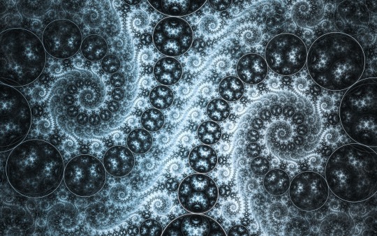
As you can see it is really eye-catching and I haven’t seen this style used as cover before, so I thought I can make something different. I got to work, added shaded borders, and a more fancy title and created cover v2.0.

Way to go! But there were still problems with this. We realized that one of our strong suits as writers is painting a vibrant world that’s easy to imagine yourself into. By using a lot of different senses in the descriptions one could almost feel the heat of the desert, the cooling sea breeze from the port, or the smell of roasting shashlik – but this cover didn’t give off this vibe. It felt cold, brittle (hence the silver) so it still needed a few changes. That was pretty easy to fix, I just tampered with the color temperature and voile! Cover design v2.1 was born:
Now, this was hinting at the right vibe, it looked almost like a quicksand swallowing the title which was all nice and good, but this was about the time we run into a bit of advice we then saw everywhere – research the market. Now, dear readers, what the fuck does that mean? It took me a while to figure out, but what people mean by that is to go on Amazon or Barnes&Noble or wherever you satiate your bibliophile thirst and look at other successful book covers in your genre. So I did, browsed Amazon best-selling fantasy books for hours, and noticed a few trends. First, most fantasy books didn’t use a fancy font, those were mostly for romance novels. The second is, pretty much every fantasy (by that I mean the myriad of Brandon Sanderson, George R.R. Martin and Anthony Ryan books) used some kind of image in the middle instead of just the title. Armed with this knowledge I jumped back on GIMP and got to work once again.
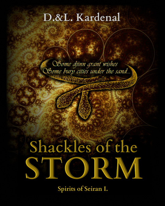
Now it was looking more like the big names, an epic but simplistic font, a thing in the middle (in our case a two-headed viper bracelet, a piece of important jewelry from the book) and even a quote. Now was the time for me to send it to my taste-testers: my younger sisters, both book nerds in their own genre.
And they told me they liked the previous font better. They found the snake and the quote a nice touch, but the font was too bland. Because at this point I had no idea who to trust with advice, I rushed to correct it and come up with a new, better version combining those two elements. So after a bit of designing again, cover v2.3 got birthed into this shining world.

Looking fancy, eh? This was the time I learned how to create a golden text effect without photoshop (yeah, I forgot to mention, photoshop would eat up, chew, and spit out the 4 GB ram in my 6 years old laptop, so I use GIMP instead). This was almost perfection… almost. We were content with this for a few weeks, right before we ran into several niche fantasy covers we quite liked that were more on the simplistic side, with a dark background, a fancy title and a beautiful border frame. We thought if it caught our eyes, it would catch other people’s attention too, so the designing bug bit me again and I opened GIMP for the umpteenth time.
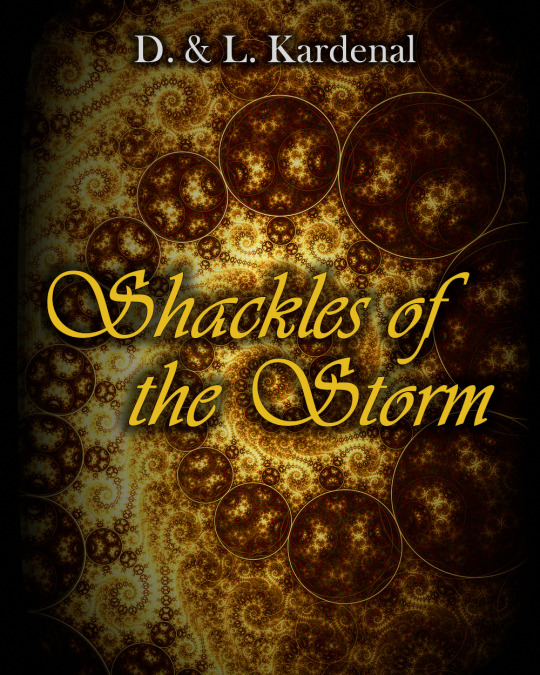
The idea was simple: create a black background with the fractal as a border, an artistic title and maybe some extra touches. This was the point we regressed back into the black and silver style because black and gold was too mainstream. It was more difficult to get right, but eventually I came up with this:

This time I was sure I hit perfection. It reminded me somewhat to Game of Thrones, it had two viper heads and a simplistic style. Around this time we found our first somewhat useful beta-readers, so I was brave enough to show them. The answer was in line with our reoccurring theme of being unable to paint a clear genre image: they thought it looked like a contemporary girl novel with some spooky snakes for a bizarre cavalcade effect. I’m gonna admit it, it felt like shit but being an author is about constant growth and learning from bitching beta-readers, so I decided to do some more research. I found a couple of useful resources, to be precise, a blogpost from Neha Yazmin (link here: https://nehayazmin.blogspot.com/2020/05/Book-cover-design-tips.html ) and a youtube video by Just Angus (https://www.youtube.com/watch?v=9SgJV8wGkcI). They’re both useful and entertaining, so go give them a look. We realized looking beautiful to us means nothing if people pick up the book and think about the wrong genre, thus they will be disappointed by the book by default. We had to make it look like an adventurous fantasy set in a magical desert, so I had to change my entire mindset.
I was browsing Pinterest one evening and found the magical looking Arabic calligraphy, precisely Take the Leap by Everitte Barbee. With a rush of enthusiasm, I grabbed the image and ran away with it, not thinking about some important things, and created this.

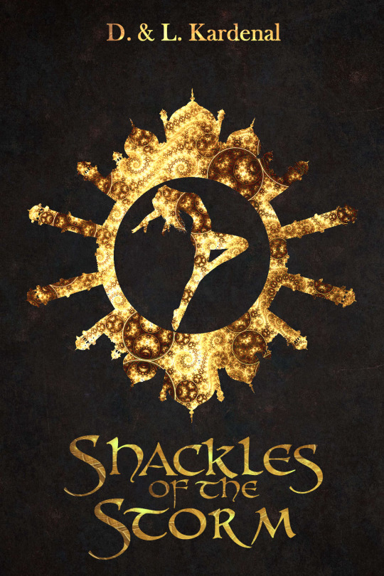
Now things were shaping up to be almost pitch-perfect. The font was fancy but fantasy-esque, the style was eye-catching but minimalistic, it screamed middle-eastern and it was unique. But remember the important things I shrugged off? One of them was the royalty-thing again. Turns out this image (or to be precise the ink and paper version of it) was already used in another book cover. Also, Arabic calligraphy uses words from the Quran. Now, I’m not a very religious person and I know next to nothing about Islamic religion. As much as I adore ancient Arabic aesthetics, I think it’s common courtesy to leave things you don’t understand a word of alone and not use them obliviously in commerce. But I believe I hit something on the head with this silhouette filled with fractal art, so I searched for some free stock images until I found what I was looking for. So, at the end of this surprisingly long wall of text about almost a year of redesigns and trial-and-error style approaches, I’ll leave you with our final cover (for now at least). I hope you found it entertaining and somewhat useful, if you have any questions or even critique, please, let me know in any way you prefer. Bah, it was nice to get this off my chest. Stay sharp, travelers!
Dar
The current version of our cover:
#behindthescalpel#amwriting#amdesigning#book#bookcover#book cover#fantasy#writing#writers#writerblr#writeblr#WIP#current wip#bookworm#amreading
0 notes