#beerpackagingdesign
Explore tagged Tumblr posts
Photo

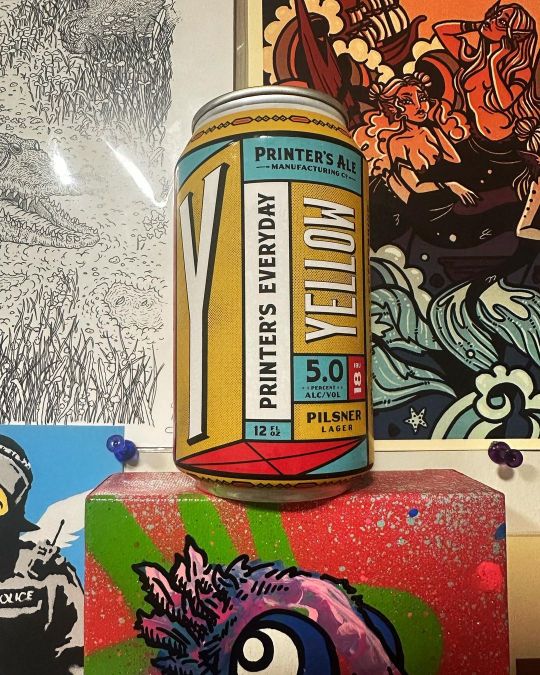
💛Yellow💛 Fine, tasty Pilsner by @printersbeer 😍 Light, refreshing & delicious! I’m definitely going to be checking out their brewery SOON! Cheers, y’all! 🍻 . . . #beer #beers #gabeer #pilsner #craftbeer #craftbeers #printersale #georgiabeer #goodbeer #beerporn #beerstagram #beertography #beerpackagingdesign #beerintheusa #beerlover #beerbeerbeer #beergeek #beerlove #craftbeerlover #craftbeerlove #craftbeercommunity #craftbeerstagram #craftbeerdrinker #craftbeeraddict #craftbeernation #craftbeerreview #craftbeerfan #cmyk #goodshit (at Atlanta, Georgia) https://www.instagram.com/p/Co_UCcfOuSO/?igshid=NGJjMDIxMWI=
#beer#beers#gabeer#pilsner#craftbeer#craftbeers#printersale#georgiabeer#goodbeer#beerporn#beerstagram#beertography#beerpackagingdesign#beerintheusa#beerlover#beerbeerbeer#beergeek#beerlove#craftbeerlover#craftbeerlove#craftbeercommunity#craftbeerstagram#craftbeerdrinker#craftbeeraddict#craftbeernation#craftbeerreview#craftbeerfan#cmyk#goodshit
1 note
·
View note
Text
It’s beer Friday!
Craft beer has been rising in the last few years. A trip to the pub is a bit more exciting as it means you can try out a ‘new’ craft beer instead of going for the same fizzy lagers. This means interesting flavours and snazzy packaging.
The App ‘Untapped’ is a social media space which encourages you to review and share the beers and pubs that you have tried with your friends. For me its good because there is always soo much choice, so it highlights what types of ales you like and you can find ones that are similar. As an aside Its great to collate and photograph the packaging!
I think what’s interesting about craft beers and why they have become so appealing is their authenticity, history and the story behind them. They have more perosnality. They are quite similar to wine in the sense that the emphasis is on where it was made (provenance) and what ingredients/balance of flavours went into it.
So the rise in craft beer consumers creates a battle on the shelf meaning creative branding plays a big role. It’s a chance for each micro breweries to show off their personality.
Traditional handcrafted beer is an art in itself and thus deserves to have great packaging. And a good label should be eye-catching and unique, and communicate the character and attitude of the brewery and the complexity of the beer. But essentially the quality of the beer must go hand in hand with the quality of the design.
I have rounded up a few of my favourite beer and ale packaging designs…

Camden.. (ale and lager)
Striking, bold and colourful - a definite way to get noticed. I particularly like the typography that looks almost stamped out of the label.

One of my favourite label designs- purely because of its fun simplicity. and I do enjoy a bit of a pun.


R&B
The design language is inspired by R&B’s resolutely hand crafted product – as such, every element on the packaging is rendered by hand, including the bar code. Bold silhouette key illustrations take their cues from the beers’ quirky naming conventions, and strong colours aid standout and shelf blocking. Reminds me of album covers and urban graffiti - reflecting the culture that these ales will circulate within.

Brewdog
A very distinctive and bold packaging design. they get across their punchy personality straight away.

Warsteiner Artist Collection
These designs are definitely eye-catching. They are unique on their own yet work well as a selection. The designs are clearly very intricate and exquisite just as they are bold and colourful. They remind me of my mums coca cola limited edition bottle collections!

Colloquial word play works well for this brewery product packaging. I think a nice added feature is the text in the black box that gives a helpful (yet silly) hint of when to best enjoy the beer. This is a little touch that adds to the personality of the brand.

I chose this one for its simplicity and ‘handmade’ feel. I like the use of the tag - this could be an interesting way to have a description of the ale and story behind it without over crowding the bottle.
1 note
·
View note