#bc i wanted a gradient for the hair since thats what im coloring next
Explore tagged Tumblr posts
Text
yesterday was webcomics day. i am bea and i make "A Ghost Story" - part 4: the art
this part i feel like gets done semi-easy once the rest of the shit is dealt with. yesterday, my knuckles continued to swell and feel like rotten wood so i had to cut it short. this shit happens more frequently than i would prefer. today i need to run to the store and also pick myself up a lil treat (an eighth). for right now tho i have some cbd rich stuff that should help. maybe. while the index finger still hurts, only the middle knuckle is swollen anymore. let's see.
i started with panels 2 and 3 bc they seemed the least immediately labor intensive. ill be copy/pasting the line/flats for panel 3 to edit from there. t...there's going to be a lot of copy/paste this page. its not usually like that. but i usually only copy/paste the lines and flats. i will re-shade things so that they look different
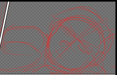
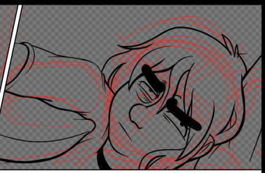
unlike the sketch, the lineart has more "weight" to it. wait thats not how the pillow would deform. hold on.
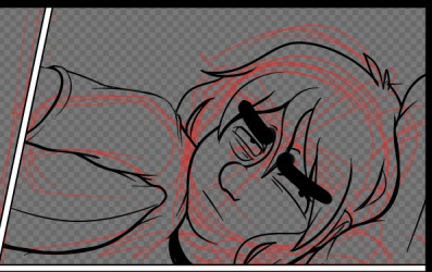
ok that's better. did people even notice that before i changed it. probably not. but it matters to me!!!!! these little things add up and add weight to your world!!!! ive been trying new things with line as as of [looks at watch] last week. so it looks bad right now. like someones vague idea of what good lineart is supposed to look like. practice makes perfect tho....or breeds familiarity or something.
some parts of this look weird. dont worry. we will cover up that shit with speech bubbles. thank you comics for your ways of obfuscating bad art.
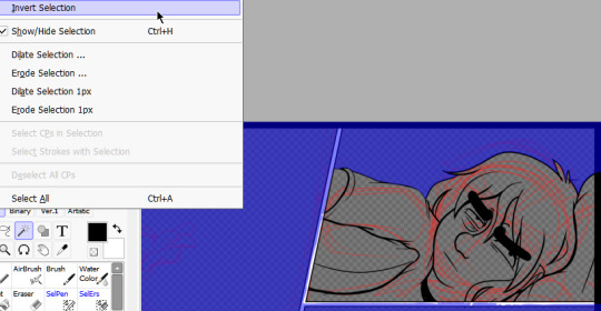
flats are easy. select everything that isnt your line art, invert the selection, and dump a base layer. then color that base layer with a mask
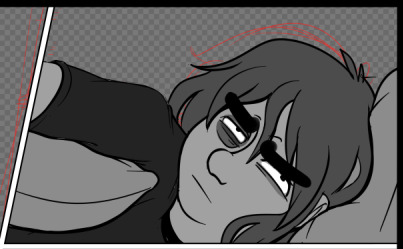
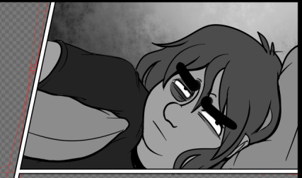
this page will, blessedly, not have any complex backgrounds. i already established the scene previously and can skate on doing my textured backgrounds. the background gradients in the direction the light in the room is being cast, usually.
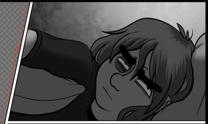
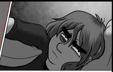
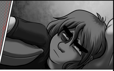
first, a multiply layer at 50%. since she's facing away from the light source, she'll be mostly in shadow. then a white overlay layer at 50%; this is to make the first shadow layer pop and keep from getting too muddy. then a second multiply layer at 50% for the next layer of shadows.
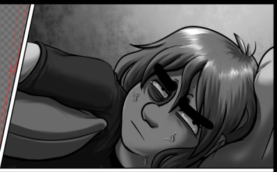
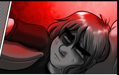
added some sweat beads to make her look more haggard and some shine to her hair, since she's so close to the light. i've started bothering doing this bc it unfortunately looks good. finally i add one more multiply layer at 40% over her eyes to make her look more over this entire thing. and then added the red glow in another overlay layer (100%) where it would land if being cast from above.
completely servicable and theres room for like. a speech bubble later. usually i do text first, but in this case its so secondary to the actions being performed, i want to prioritize one over the other.
looking at it, im not going to be able to copy/paste this after all. she's going to settle in more and her body will rotate too much in the process. i can use this as a base to trace over, though, which will get me started.
but pain is occurring so im going to eat breakfast. what a bitch!
24 notes
·
View notes
Photo


more doodle warmups w sunsou kids
ari ( @im-poke-ayy ) and lia ( @ozzingtonavenue )
#drawing is difficult#pksp fankids#pokespe#olympusshipping#i wasnt gonna color either of these but hadeel posted aris palette the other day n i was like hnnnnnnnn i gotta#i jus combined sun and sous colors to get lias rgrg3rg#ozzy im sry if i butchered them#i took a middle color from their hair and combined it w a bluer and a browner hue#bc i wanted a gradient for the hair since thats what im coloring next#n then i took the original blue/brown of sunsou n overlayed it to get the shading#i stared at the combos so long but eventually chose the brn shading#n then the mid-to-brown gradient even tho i RLY LIKED the blue-to-mid one#which is why i still have the csp file actually egwegwg#the eyes i jus did midtones again and i liked olive better than the blue#god looking at it now is so odd but when i was sketching her i couldnt stop thinking abt#blue-blue w suns hair and sous eyes and rghergh3gg she prolly has brn hair but i liked this too#anyway THEYRE BOTH SO CUTE AAAA#if anyone else has spe fankids pls.. send me a ref n ill get to them#i jus realized this wont post to the tag bc some of the tags are too long but oh well
14 notes
·
View notes