#barry Beckett Photos
Explore tagged Tumblr posts
Visit Tumblr Blog
Explore Tumblr blogs with no restrictions, modern design and the best experience.
Last Seen Tumblr Blogs


Fun Fact
Tumblr Inc. is funded by 13 investors.
Text

Nathalie - Two Bridges Hotel, Amsterdam , 1988
11 notes
·
View notes
Photo

Paul Simon: There Goes Rhymin’ Simon
Gatefold
CBS 69035
Released: May 5, 1973
#meine photos#vinylcollection#1973 music#paul simon#vinyloftheday#pete carr#jimmy johnson#cornell dupree#al gafa#david spinozza#jerry puckett#david hood#gordon edwards#bob cranshaw#vernie robbins#richard davis#barry beckett#paul griffin#bob james#bobby scott#carson whitsett#don elliott#roger hawkins#rick marotta#grady tate#james stroud#airto moreira#the onward brass band#the dixie hummingbirds#claude jeter
1 note
·
View note
Text
What The Butler Saw, by Joe Orton
What The Butler Saw is the last play by Joe Orton, a popular playwright who frequently wrote black comedies. The play was finished in 1967, but it's production was delayed until 1969 because Orton was murdered a month after he had finished writing.
Just to give a notion of how famous Orton was, he was requested by The Beatles to write a script for them to star in, and another of Orton's plays, The Erpingham Camp, was directed by Sir Ian McKellen.
While this play is supposed to be an absurdist comedy, more specifically, a farce, I found it lacking in humour. I suppose it's an exemple of what they call British humour. There are so many things going on at the same time during the play that it confuses me. I boiled down to the essential incestuous parts, but in case you want to check out the play in it's full craziness, the BBC2's Theatre Night staging from 1987 is available on Youtube. This staring was produced by Shaun Sutton, directed by Barry Davis and stars Dinsdale Landen as Dr. Prentice, Tessa Peake-Jones as Geraldine Barclay, Prunella Scales and Mrs. Prentice and Tyler Butterworth as Nicholas Beckett.
The play opens with Dr. Prentice interviewing Geraldine for a position as secretary in his office in a mental asylum. He begins by asking who is her father and when she says she doesn't know, he continues to press the issue, wanting to know how she was conceived. Geraldine confesses that her mother had been raped when she worked as the chambermaid at the Station Hotel, and that's how Geraldine came to be. Dr. Prentice tells her that he once himself stayed in the Station Hotel and asks more about Geraldine's mother. She tells him that she haven't seen her mother in many years, having been raised by Mrs. Barclay, who recently died in an explosion. Then, he asks Geraldine to undress, under the guise of being medical examination so he can know she's healthy before he hires her. She is hesitant but agrees.
When Geraldine goes behind the curtain to make herself comfortable so that the doctor could examine her, Mrs. Prentice arrives to the office, as her group trip had gone awry and she had instead spent the night at the Station Hotel, where a bellboy tried to rape her and stole the dress she had been wearing, leaving her only with a coat to cover herself. The bellboy, Nicholas, is also blackmailing Mrs. Prentice, as he had taken photos of them having sex the night before (one can assume that now Mrs. Prentice claims it was an attempted rape to hide the fact that she was having an extramarrital affair). One of his demands in that Mrs. Prentice find him a job, and so decides to have her husband take Nicholas as a secretary, which is why Mrs. Prentice asks that the doctor employ the bellboy to prevent him of further living a life of crime.
As if the scene wasn't chaotic enough, in arrives Dr. Rance, who wants to carry a government sanctioned inspection in the asylum. When Dr. Rance sees Geraldine, Dr. Prentice lies that she's a patient who had attacked him, while naked. Dr. Rance then writes an order to have Geraldine committed, believing her to be have been molested by her father as a child, despite her insistence to have never even known him. Dr. Rance then takes Geraldine away and Mrs. Prentice returns with Nicholas, so he can be interviewed. Dr. Rance begins to believe that Dr. Prentice is insane.
Sargent Match knocks in the door as he wants to interview Nicholas regarding the bellboy "misconducted himself with a party of school children". In a attempt to hide, Nicholas puts on Geraldine's clothes, while Geraldine, not wanting to be wearing the hospital nightgown's, puts on the clothes that Nicholas had removed.
The scene escalates further as Dr. Rance becomes increasingly unhinged and tries to diagnose everyone in the clinic, all based on the misunderstanding caused by Dr. Prentice trying to hide Geraldine from his wife. Eventually, Dr. Prentice hits Mrs. Prentice and runs, as Dr. Rance wants to commit him to the asylum. Finally, Nicholas confesses his part in the farse and after a long time, Geraldine also persuades Dr. Rance that she's not insane. During her speech, she laments having lost her lucky charm, an elephant charm. Dr. Rance tells her he found it and returns it to her, upon which Nicholas then says that he has a matching one.
Mrs. Prentice takes both charms and places them together, and they fit morning a single jewellery, which she then says that had once belonged to her, having been gifted it by her rapist after he attacked her back when she worked as a chambermaid in the Station Hotel. The assault resulted in a pregnancy with twins, which she put out to adoption, leaving each one with half of the charm. She then recognizes Geraldine and Nicholas as her long lost children.
Dr. Prentice then chimes in that the jewel was actually his and he had lost it after having sex during a power outage with an unknown maid, therefore revealing that he had been the one to rape Mrs. Prentice years before and to be the father of Geraldine and Nicholas.
Dr. Rance announces happily that since Dr. Prentice is Geraldine's father, then he was right about Geraldine being the victim of incestuous abuse by her father.
Dr. Rance: "If you are this child's father my book can be written in good faith - she is the victim of an incestuous assault!" Mrs. Prentice: "And so am I, doctor! My son has a collection of indecent photographs which prove beyond doubt that he made free with me in the same hotel - indeed in the same linen cupboard where his conception took place." Dr. Rance: "Oh, what joy this discovery gives me! Double incest is even more likely to produce a best-seller than murder - and this is as it should be for love must bring greater joy than violence."
And with the incest (and attempted incest) being revealed and the family reunited, the play finally ends. Like I said, I cut off most of the events, for their were awfully confusing and chaotic. Not my type of work, not at all. There were also no butlers, which makes me question the title, but hey, that's it.
#mother x son#Geraldine and Mr. Prentice#Nicholas and Mrs. Prentice#father x daughter#canon#what the butler saw#joe orton#shipcest#book review#parentcest#parent x child#filicest
3 notes
·
View notes
Photo


“I was just blowing off some steam” —Barry Bavetta, Demons (4 x 06)
Title: Ministry Rating: T WC: 700
He’s tiptoeing around her a little bit. Their interview with Addison Smith was productive after a fashion, but something’s a bit off with her. She seems tense—unhappy with something, and it’s not just the possibility that their current best suspect is also the long-term best suspect in another murder, and he’s evaded capture for the last twenty years.
Smith takes his leave. She lets him go without so much as the courtesy of walking the retired detective to the elevator. She sits at the break room table, with her palms laid flat on either side of the worst of the crime scene photos of Melanie Benton. She’s staring through it, stack of photos, table, and all, and he’s kind of at a loss. He’s not sure whether he should slink away to minimum safe distance or try to figure out what’s going on with her.
He decides on Plan B. It’s probably him that has her wound up. It’s probably his overzealous pro-ghost agenda, so he braces himself to make an apology. He sidles up close to the table. He slides back into the chair he’d vacated when Smith had made his move to leave. That’s when he sees it: A raised area running along the side of her right hand from the delicate prominence of her wrist all the way to the base of her thumb. It’s a nauseatingly not-quite clear, fluid-filled pillow with angry red skin just visible around the perimeter.
“Beckett!” He reaches for her hand. “That blister. That’s a burn. What did you do?”
“Nothing,” she says quickly. She jerks her hand away, but the motion causes the sleeve of her jacket to drag roughly over the area. She hisses in pain. “It’s nothing.”
“It doesn’t look like nothing.” He draws his hand away, but bends forward to peer at it. It’s worse than just the blister. The thumb itself is tight and pinker than it should be almost all the way to the tip. “Did you try making a latte again?” It comes out far more like an accusation than he means it to.
“You said you’d make me one!” she retorts.
They stare at each other, both embarrassed, both snappish, and the solve—to this at least—clicks. He’s tired and slow from an all-nighter. She’s under-caffeinated, because he accidentally drank both the coffees he’d raced out to get somewhere just after dawn. Their whole system has broken down. The thought nudges a dopey grin on to his face. They have a system.
“What?” she asks sullenly. Warily. “What?”
“Nothing,” he says. He holds his hand out, palm up. “Let me see the damage. We’ll take care of that, and then I’ll make you a double.”
“It’s fine.” She curls her fingers tight, a reflex to hide, but she winces again as the move pulls at the scalded skin and the contact burn itself.
“Beckett.” He rolls his eyes. “Do you want a sca—”
He swallows the r, but only just. Their eyes meet and he wonders if his are as blank with panic as hers. There’s so much missing time for him. Life skips from her bleeding out on the grass to dying in the ambulance to having died on the operating table. It skips from her, shattered and barely upright in a hospital bed, to Kate—you can make it out to Kate.
Sitting with her, here and now, he registers for the first time how carefully she’d put herself together to show up at that book signing. Here and now, he sees her in a jacket that skims the lines of her body, with her hair pulled softly back from the sharp bones of her face, and he knows she must be struggling still with the terrible physical ordeal. She’s struggling.
“Well,” she says as her hand sneaks out toward his where it still waits, palm up. “I am collecting the whole set.”
“I don’t blame you.” He matches her tongue-in-cheek tone and wills his finger not to shake as they gently draw hers closer to survey the damage. “Scars are badass.” He sneaks a sly smile at her. “Guys dig scars.”
images via homeofthenutty
#Castle#Caskett#Castle: Season 4#Castle: Demons#Kate Beckett#Richard Castle#Fic#Fanfic#Fanfiction#Fan Fic#Fan Fiction#Drabble#drabble fail#My Brain is Fucking Incorrigibile
26 notes
·
View notes
Text
Roe Erister (Rick) Hall, 1932-2018
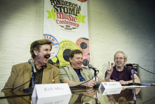
photo by Jacob Blickenstaff http://www.33-13.com/
Rick Hall may have been the most determined (some might say stubborn, Rick might even have owned up to bull-headed) man I ever met.
The first time I met him, I almost didn’t meet him at all.
Jimmy Johnson was the vehicle for my initial introduction in 1981. Jimmy was the guitarist with the second rhythm section at Rick’s FAME studios in Muscle Shoals (all of his rhythm sections were brilliant, this one was perhaps his most brilliant), and there had been a falling out when he and fellow members David Hood, Barry Beckett, and Roger Hawkins had decamped in 1969 to set up their own studio, Muscle Shoals Sound, in direct competition with FAME. There had been bad blood for a while, but everyone survived and thrived, and Jimmy, as affable a figure as you’re ever likely to meet in or out of the music business, had long since re-established a good, almost filial relationship with Rick.
I was just starting out on my book, Sweet Soul Music, at the time. Songwriter Donnie Fritts, a Florence native (Florence and Muscle Shoals are two of the area’s Quad-Cities), had introduced me to nearly everyone in Muscle Shoals except for Rick the year before, and now Jimmy took it upon himself to approach Rick on my behalf. Rick, Jimmy reported back to me, would be glad to do it – but when I arrived in town a few weeks later, all of a sudden, don’t ask me why, all bets were off.
This was something I could certainly live with (it was not an uncommon occurrence – very few of the people I was talking with had done interviews before, and, this may come as a shock, but not everyone is thrilled to be interviewed) – I could wait, I told Jimmy, it wasn’t the end of the world. Jimmy, however, was stricken. He saw it as a matter of honor, and he called Rick right away from his office. “I gave the man my word,” he told Rick, while I was sitting there. “You know, we’ve been friends a long time, Rick, but you gave me your word, and I gave Peter my word, and if you don’t stick by it, we’re not going to be friends anymore.”
I was more than a little mortified (and more than a little touched by Jimmy’s loyalty), but after hanging around Muscle Shoals for a few more days without hearing from Rick, I set off for Macon to talk with Phil and Alan Walden, and Otis Redding ‘s brother Rodgers, and his wife, Zelda, along with various friends and associates of Otis’.
That was where I got the call from Rick, on December 2, 1981, a Wednesday. He was, he said, willing to see me. Great! I said. When? Tomorrow, he said. I laughed, I’m going to imagine it was a kind of heh-heh-heh. Well, I’m in Macon, I said, and I’m sure I could make it by – Tomorrow, he said, making it clear by the tone of his voice that any modification was out of the question. At 7AM, he said. At my ranch.
Now Macon is at least a five-hour drive from Muscle Shoals, and it was already late afternoon, but I didn’t hesitate – and I’d like to think I still wouldn’t. (I mean, you do anything at the service of your story, right?) 7 AM tomorrow, great! I said. And I wrote down Rick’s very specific directions to the ranch (“43 South from Littleville, one mile on the right-hand side of the road, Kennedy Road 18”) on my hotel stationery.
I arrived at 7 o’clock sharp the next day, with my notebook and brand-new Sony stereo cassette recorder TCS-310 in hand. I started out, as you often do, by asking some generalized, conversational questions, just to try to establish a little rapport, but I knew immediately I had gotten off on the wrong foot just by the way Rick was shaking his head. This was clearly not the way to begin. “Well, let me start at an earlier point of my life [which turned out to be his birth],” he declared without hesitation, “and tell you what happened to me.” And he did. Four or five hours later he was still telling me, and I was exhausted. I hadn’t gotten into the Holiday Inn in Sheffield until late the previous night, and I left for Rick’s home earlier than I needed to because I knew if I didn’t make that 7 o’clock deadline, the whole thing could be off. Finally I held up my hand for the first and I think only time in my life and said, in effect, No mas. But we would go on talking, in what would eventually turn into a two-way conversation, for the next 35 years.
Read Rick’s book, Rick Hall: My Journey from Shame to Fame. Or try Sweet Soul Music for an abbreviated version of the story of a boy who grew up in the “deep sprawling, isolated woods of the Freedom Hills with the whiskey makers and whiskey runners and saw millers,” raised by a father who could barely eke out a living (“he was a pauper”), after his mother left, when he was four, to become a prostitute in his Aunt Es’s house of ill fame in the city. In all the years I’ve known Rick and his wife, Linda (the home that I visited has since become the FAME Girls Ranch, dedicated to help victims of abuse and neglect “overcome the adversity they have endured”), the conversation has never changed. In fact, it was renewed and deepened in the ten years that he worked on the book, first with Florence TimesDaily reporter Terry Pace, then with Robert Gordon. He wanted it to be raw, he said, something like a cross between Tobacco Road and Harry Crews, whose work he (like many of us) was introduced to by Atlantic Records head Jerry Wexler, a genuine polymath whom Rick alternately resented (their business relationship came to an end with Aretha Franklin’s disastrous 1967 Muscle Shoals session, and Jerry was the one who encouraged the second rhythm section to leave) and, more often than not admired.
The last time I saw Rick (though we always continued to speak on the phone) was about a year ago, when Rick was awarded an honorary degree by the University of North Alabama in Florence, and I was scheduled to give the commencement speech. He was already sick, although he wasn’t publicly acknowledging it, but he was in buoyant spirits, with an undiminished determination to continue to make his mark. There was a dinner the night before graduation at the president’s house, next to the lions’ cage (“Go lions,” is the university motto), where Rick exchanged fond reminiscences with old friends, none more fond than with State Representative Johnny Mack Morrow, whose father, Grover, taught Rick agriculture at Phil Campbell High School and gave Rick his first instrument, a mandolin. Rick always kept a picture of Mr. Morrow on his desk, on which he had written, “To the man who believed in me and my music when nobody did.”
The next day, in Rick’s name, and in the name of Sam Phillips, Rick’s original role model (and a native Florentine), I urged the graduates of the Colleges of Nursing and Arts and Sciences and Business and Education to hold on to their individuality, to identify and seize upon their dreams, not to let themselves get pushed around by disappointment or others’ expectations of them. And I cited how Rick, after a particularly devastating blow to his ego early on (he was fired by his partners from the musical enterprise that became FAME – it’s a long story, you’ll just have to read about it elsewhere), never gave up, barely even wavered. “I thought it was the worst thing that ever happened to me,” Rick said. “It was like they’d put the roller skates under me and pushed me out the door.” But, I told the graduates, he was determined not to be left on the shelf for long. As he described it, “I just went home to Phil Campbell to lick my wounds – but then after a few months I took kind of an arrogant attitude and dug in for the kill.” And the next time twenty-year-old songwriter Dan Penn, who was part of the firing cabal, saw him, Dan said, “He was standing on this concrete slab he’d just poured for the studio that now stands, and he said, ‘Hey Penn, why don’t you come over here and go to work for me.’”
That was Rick, to the end. It didn’t always make for smooth sailing – and there were, unquestionably, lots of ruffled feelings along the way – but you never had any doubt about where Rick stood. And you never had any doubt that he had a good heart.
He was the furthest thing from the back-slapping, easy-going caricature of a good ol’ boy – I mean, Rick was driven from the start. “I was so very aggressive and fired up at the beginning,” he told me, trying to explain why he got ousted by his friends. “I was the guy who was beating and banging and slinging sweat over everybody else, and it got to the point where they thought, This guy’s crazy! Because, you know, IT WAS LIFE TO ME.” It was not lost on him that the ferocity of his determination could overwhelm everyone around him sometimes, but in the end, I think, it was the lingering self-doubt, the crippling insecurity of a young boy who grew up lonely, impoverished, motherless in the Freedom Hills of rural Mississippi and Alabama, that proved to be his saving grace. As much as anything else, I would imagine, that was the innate quality that allowed him to focus on the improbable hopes and dreams of all those artists and musicians, black and white, who found their way to the studio he built with his own hands in Muscle Shoals, Alabama.
The enhanced e-book of Sweet Soul Music includes this short video piece with Rick. Available at iBooks: http://bit.ly/ssmusicee or Amazon: http://a.co/iwiMZC9
youtube
6 notes
·
View notes
Text
Is Soccer Hall Of Fame Cooperstown Ny The Most Trending Thing Now? | Soccer Hall Of Fame Cooperstown Ny

NEW YORK (AP) — Derek Jeter is amid 18 newcomers on the 2020 Hall of Fame ballot. He is acceptable to be an cutting best to accompany above New York Yankees assistant Mariano Rivera in Cooperstown afterwards the analgesic aftermost year became the aboriginal accepted aces by the Baseball Writers’ Association of America.
RochesterSubway.com : Should Rochester Chase Soccer Hall of .. | soccer hall of fame cooperstown ny A 14-time All-Star ambush and five-time World Series champion, Jeter hit .310 with 3,465 hits in 20 seasons and was the 1996 AL Rookie of the Year. He has been CEO of the Miami Marlins the accomplished two seasons.Other newcomers arise Monday by the BBWAA accommodate Cliff Lee, Josh Beckett, Jason Giambi, Paul Konerko, Rafael Furcal, Bobby Abreu and Alfonso Soriano.

Oneonta, NY, New York, National Soccer Hall of Fame, giant .. | soccer hall of fame cooperstown ny Holdovers accommodate Curt Schilling, who accustomed 60.9% aftermost year, Roger Clemens (59.5%), Barry Bonds (59.1%) and Larry Walker (54.6%). Schilling rose from 51.2% in 2018. Walker, on the acclamation for their 10th and final time this year, added from 34.1% in 2018.Bonds and Clemens, whose candidacies accept been attenuated by allegations of steroids use, are both on for the eighth time. Clemens rose from 57.3% in 2018 and Bonds from 56.4%.

The National Soccer Hall of Fame in Oneonta, NY, Goes Out of .. | soccer hall of fame cooperstown ny Ballots are beatific to added than 400 BBWAA associates with at atomic 10 after years in the organization, and a amateur charge arise on at atomic 75 percent to accretion election. Ballots charge be mailed by Dec. 31, and after-effects will be arise Jan. 21.Anyone adopted will be inducted July 26 forth with any selections by the Hall’s avant-garde era committee, which meets and votes at San Diego on Dec. 8.

National Soccer Hall of Fame - Wikipedia - soccer hall of fame cooperstown ny | soccer hall of fame cooperstown ny Players abide on the acclamation for up to 10 years, provided they accept at atomic 5 percent of the vote annually.Roy Halladay, Edgar Martinez and Mike Mussina were adopted forth with Rivera in the 2019 BBWAA vote.

National Soccer Hall of Fame Construction Continues - Soccer .. | soccer hall of fame cooperstown ny The ballot: Bobby Abreu, Josh Beckett, Heath Bell, Barry Bonds, Eric Chávez, Roger Clemens, Adam Dunn, Chone Figgins, Rafael Furcal, Jason Giambi, Todd Helton, Raúl Ibañez, Derek Jeter, Andruw Jones, Jeff Kent, Paul Konerko, Cliff Lee, Carlos Peña, Brad Penny, Andy Pettitte, J.J. Putz, Manny Ramírez, Brian Roberts, Scott Rolen, Curt Schilling, Gary Sheffield, Alfonso Soriano, Sammy Sosa, José Valverde, Omar Vizquel, Billy Wagner, Larry Walker. Is Soccer Hall Of Fame Cooperstown Ny The Most Trending Thing Now? | Soccer Hall Of Fame Cooperstown Ny - soccer hall of fame cooperstown ny | Delightful to my website, in this particular period I am going to demonstrate about keyword. And after this, this is the first graphic:

United States National SOCCER (FOOTBALL) Hall of Fame in .. | soccer hall of fame cooperstown ny Why don't you consider graphic earlier mentioned? can be in which incredible???. if you feel thus, I'l d show you some graphic once more below: So, if you would like receive the outstanding pics regarding (Is Soccer Hall Of Fame Cooperstown Ny The Most Trending Thing Now? | Soccer Hall Of Fame Cooperstown Ny), click on save icon to save these graphics to your computer. These are available for transfer, if you'd rather and want to obtain it, simply click save logo on the page, and it'll be immediately saved to your pc.} Finally if you need to grab new and latest photo related with (Is Soccer Hall Of Fame Cooperstown Ny The Most Trending Thing Now? | Soccer Hall Of Fame Cooperstown Ny), please follow us on google plus or save the site, we attempt our best to offer you daily up grade with all new and fresh pictures. Hope you love staying right here. For many updates and recent news about (Is Soccer Hall Of Fame Cooperstown Ny The Most Trending Thing Now? | Soccer Hall Of Fame Cooperstown Ny) pics, please kindly follow us on tweets, path, Instagram and google plus, or you mark this page on bookmark section, We attempt to offer you up grade regularly with fresh and new graphics, enjoy your searching, and find the ideal for you. Here you are at our website, articleabove (Is Soccer Hall Of Fame Cooperstown Ny The Most Trending Thing Now? | Soccer Hall Of Fame Cooperstown Ny) published . At this time we are excited to announce that we have found a veryinteresting nicheto be discussed, namely (Is Soccer Hall Of Fame Cooperstown Ny The Most Trending Thing Now? | Soccer Hall Of Fame Cooperstown Ny) Most people looking for information about(Is Soccer Hall Of Fame Cooperstown Ny The Most Trending Thing Now? | Soccer Hall Of Fame Cooperstown Ny) and certainly one of these is you, is not it?
National Soccer Hall of Fame - Wikipedia - soccer hall of fame cooperstown ny | soccer hall of fame cooperstown ny
The National Soccer Hall of Fame in Oneonta, NY, Goes Out of .. | soccer hall of fame cooperstown ny Read the full article
0 notes
Text
COMPOSITION IN PHOTOGRAPHY
GUIDE TO COMPOSITION IN PHOTOGRAPHY – 20 TIPS
BARRY O CARROLL - http://www.bocphotography.com
INVIZ note: (This is a great guide for 3d artists trying to understand photographers approach to handling composition, composition is key to good architectural visualisation)
Improve your photographic composition by following these guidelines.
There are no unbreakable rules when it comes to how you should compose your photographs After all, who likes rules except for your old school principal or heads of H.R. departments? There are however, several guidelines you can use to help improve the composition of your photos. In this tutorial, I’ve listed 20 of these guidelines along with examples of each. I’ve started with the most basic ones and finished with some of the more advanced composition techniques.
First of all we have to define what is meant by ‘composition’. Composition refers to the way the various elements in a scene are arranged within the frame. As I’ve already mentioned, these are not hard and fast rules but guidelines. That said, many of them have been used in art for thousands of years and they really do help achieve more attractive compositions. I find that I usually have one or more of these guidelines in the back of my mind as I’m setting up a shot.
We’ll start with probably the most well known composition technique: The Rule of Thirds.
1. Rule of Thirds
So I’ve just told you that there are no hard and fast rules when it comes to composition and then the first thing I write about is the ‘rule’ of thirds. In my defence, I didn’t come up with the name. The rule of thirds is very simple. You divide the frame into 9 equal rectangles, 3 across and 3 down as illustrated below. Many camera manufacturers have actually included the capability to display this grid in live view mode. Check your camera’s manual to see how to turn on this feature.
The idea is to place the important element(s) of the scene along one or more of the lines or where the lines intersect. We have a natural tendency to want to place the main subject in the middle. Placing it off centre using the rule of thirds will more often than not lead to a more attractive composition.

In this photo, I’ve placed the horizon roughly along the bottom third of the frame and the biggest and closest trees along the line to the right. The photo wouldn’t have the same impact if the larger trees had been placed in the centre of the frame.

In this photo of the Old Town Square in Prague, I’ve placed the horizon along the top third of the frame. Most of the buildings sit in the middle third and the square itself occupies the bottom third of the frame. The spires of the church are placed near horizontal line to the right of the frame.
2. Centred Composition and Symmetry
Now that I’ve told you not to place the main subject in the centre of the frame, I’m going to tell you to do the exact opposite! There are times when placing a subject in the centre of the frame works really well. Symmetrical scenes are perfect for a centred composition. They look really well in square frames too.

This photo of the Ha’penny Bridge in my home city of Dublin was the perfect candidate for a centred composition. Architecture and roads often make great subjects for a centred compositions.

Scenes containing reflections are also a great opportunity to use symmetry in your composition. In this photo, I’ve actually used a mix of the rule of thirds and symmetry to compose the scene. The tree is positioned off centre to the right of the frame but the perfectly still water of the lake provides the symmetry. You can often combine several composition guidelines in a single photograph.
3. Foreground Interest and Depth
Including some foreground interest in a scene is a great way of adding a sense of depth to the scene. Photographs are 2D by nature. Including foreground interest in the frame is one of a number of techniques to give the scene a more 3D feel.


In this photograph of a waterfall in The Netherlands, the rocks in the river provided a perfect source of foreground interest. Adding foreground interest works particularly well with wide angle lenses.


I took this photograph in the Dublin Docklands. The dock cleats along the quay provided the foreground interest in this shot. I think it adds a real sense of depth to the composition. The dock cleat in this scene was only a few metres in front of me when I took this shot. Including it in the frame portrays a sense of depth in the scene by including an element that I was quite close to as well as the bridge and buildings in the distance and everything in between them.
A friend who was with me that evening tripped over one of the cleats and almost ended up getting a very close up view of the River Liffey. That’s one way of adding depth to the scene I guess.
4. Frame within the Frame
Including a ‘frame withing the frame’ is another effective way of portraying depth in a scene. Look for elements such as windows, arches or overhanging branches to frame the scene with. The ‘frame’ does not necessarily have to surround the entire scene to be effective.

In the photo on the right taken on St Mark’s Square in Venice, I used the archway to frame St Marks Basilica and the Campanile at the far end of the piazza. The use of scenery viewed through arches was a common feature of Renaissance painting as way of portraying depth. As you can see, the square was completely empty when I took the shot. This is one of the benefits of getting up at 5am. Early morning is one of my favourite times to get out and about with the camera.
Frames don’t have to be man made objects such as arches or windows. The photo below was taken in County Kildare in Ireland. This time, I used the tree trunk to the right and the overhanging branch to create a frame around the scene containing the bridge and boat house. Notice that even though the ‘frame’ doesn’t actually surround the whole scene in this case, it still adds a sense of depth.
Using a ‘frame within a frame’ presents a great opportunity to use your surroundings to be creative in your compositions

5. Leading Lines
Leading lines help lead the viewer through the image and focus attention on important elements. Anything from paths, walls or patterns can be used as leading lines. Take a look at the examples below.

In this photo of the Eiffel Tower, I used the patterns on the paving stones as leading lines. The lines on the ground all lead the viewer to the Eiffel Tower in the distance. You’ll also notice that I used a centred composition for this scene. The symmetry of my surroundings made this type of composition work well.

Leading lines do not necessarily have to be straight as illustrated by the picture above. In fact curved lines can be very attractive compositional features. In this case, the path leads the viewer to the right of the frame before swinging in to the left towards the tree. I also made use of the rule of thirds when composing the shot.
6. Diagonals and Triangles
It is often said that triangles and diagonals add ‘dynamic tension’ to a photo. My mother in law also does an excellent job of adding tension to any scene. What do we mean by ‘dynamic tension’ though? This can be a tricky one to explain and can seem a bit pretentious. Look at it this way, horizontal lines and vertical lines suggest stability. If you see a person standing on a level horizontal surface, he will appear to be pretty stable unless he’s stumbling out of a pub at 2am. Put this man on a sloping surface and he’ll seem less stable. This creates a certain level of tension visually. We are not so used to diagonals in our every day life. They subconsciously suggest instability. Incorporating triangles and diagonals into our photos can help create this sense of ‘dynamic tension’.
Incorporating triangles into a scene is a particularly good effective way of introducing dynamic tension. Triangles can be actual triangle shaped objects or implied triangles. I’ll explain this in more detail in a moment.

This picture of the Samuel Beckett Bridge in Dublin incorporates plenty of triangles and diagonals into the scene. The bridge itself is an actual triangle (It’s actually supposed to represent a Celtic Harp on its side). There are also several ‘implied’ triangles in the scene. Notice how the leading lines on the right of the frame are all diagonal and form triangles that all meet at the same point. These are ‘implied triangles’. Having diagonals going off in different direction adds a lot of ‘dynamic tension’ to the scene. Once again you can see how I have combined two techniques to compose the image: leading lines and diagonals.

In this photo of the Hotel de Ville in Paris, the implied triangles and diagonals create sense of dynamic tension. We are not used to seeing buildings leaning at such angles in our everyday life. It is slightly jarring to our sense of balance. This is what creates the visual tension. You can also talk about dynamic tension to sound intelligent (or annoyingly pretentious) in front of your friends.
7. Patterns and Textures
Human beings are naturally attracted to patterns. They are visually attractive and suggest harmony. Patterns can be man made like a series of arches or natural like the petals on a flower. Incorporating patterns into your photographs is always a good way to create a pleasing composition. Less regular textures can also be very pleasing on the eye.


The two photos above were both taken in Tunisia. In the one on the left, I’ve used the pattern in the paving stones to lead the eye to the domed building. The building itself incorporates a pattern in the form of a series of arches. The domed roof also compliments the rounded arches below.
In the second photo, I really liked the texture of the stone work on the ground. This is less regular than the pattern in the first photo but the play of light and shadow on the surface is very pleasant. There are also interesting textures to be on the walls and roof of the passage. You may also have noticed that the arch creates a ‘frame within a frame’ around the man and cafe on the other side of the archway.
8. Rule of Odds
In the world of photography, there are certainly plenty of ‘odds’ but the ‘rule of odds’ is something different entirely. The rule suggests that an image is more visually appealing if there are an odd number of subjects. The theory proposes that an even number of elements in a scene is distracting as the viewer is not sure which one to focus his or her attention on. An odd number of elements is seen as more natural and easier on the eye. To be honest, I think there are plenty of cases where this is not the case but it is certainly applicable in certain situations. What if you have four children? How do you decide which one to leave out of the shot? Personally, I’d go by future earning potential.

The photo above is an example of the rule of odds. I deliberately framed the scene to include three arches. I think that two arches would not have worked as well and may have divided the viewers attention. It also so happened that there were three people in the scene. This composition also makes use of patterns and ‘frames within a frame’.

In the photo of two gondoliers in Venice above, you will see that I’ve completely ignored the rule of odds. It is true that your attention may shift back and forth between each gondolier. However this is exactly what a conversation between two people is like, a back and forth. For this reason, I think the even number of subjects works in this case.
9. Fill the Frame
Filling the frame with your subject, leaving little or no space around it can be very effective in certain situations. It helps focus the viewer completely on the main subject without any distractions. It also allows the viewer to explore the detail of the subject that wouldn’t be possible if photographed from further away. Filling the frame often involves getting in so close that you may actually crop out elements of your subject. In many cases, this can lead to a very original and interesting composition.


In the photo of my pet cat on the left, you you’ll notice that I filled the frame completely with his face, even cropping out the edges of his head and mane. This allows the viewer to really focus on details such as the eyes or the textures in his fur. You may also notice that I used the rule of thirds in this composition. He is a lovely pet but you should see the state of our furniture. He also loves children but he couldn’t eat a whole one.
In the second shot of Notre Dame Cathedral in Paris, I have left very little space around the edges of the building. the point of this photograph is to showcase the architectural detail of the front facade of the building.
10. Leave Negative Space
Once again, I am going to completely contradict myself! In the last guideline, I told you that filling the frame works well as a compositional tool. Now I’m going to tell you that doing the exact opposite works well too. Leaving a lot of empty or ‘negative’ space around your subject can be very attractive. It creates a sense of simplicity and minimalism. Like filling the frame, it helps the viewer focus on the main subject without distractions.

This photo of a giant statue of the Hindu god Shiva in Mauritius is a good example of using negative space. The statue is obviously the main subject but I have left plenty of space filled only by sky around it. This focuses our attention on the statue itself while giving the main subject ‘space to breath’ so to speak. The composition also creates a sense of simplicity. There is nothing complicated about the scene. It is the statue surrounded by sky, that is all. I also used the rule of thirds to place the statue to the right of the frame.
11. Simplicity and Minimalism
In the last guideline, we saw how leaving negative space around the main subject can create a sense of simplicity and minimalism. Simplicity itself can be a powerful compositional tool. It is often said that ‘less is more’. Simplicity often means taking photos with uncomplicated backgrounds that don’t distract from the main subject. You can also create a simple composition by zooming in on part of your subject and focusing on a particular detail.


In this first photo, I zoomed in on some water droplets on a leaf in a garden. It’s such a simple subject but is also very beautiful because of its simplicity. A good macro lens can be a very useful tool for creating these types of photos.
In the second photograph of a tree at dawn, I made use of a very simple and uncluttered background to focus attention on the tree. This photo makes use of ‘negative space’ to create a sense of simplicity and minimalism. I’ve also used the rule of thirds and leading lines in the composition.
12. Isolate the Subject
Using a shallow depth of field to isolate your subject is a very effective way of simplifying your composition. By using a wide aperture, you can blur the background that might otherwise distract from your main subject. This is a particularly useful technique for shooting portraits. You can learn more about how to use different aperture settings in my tutorial on Aperture, Shutter Speed and ISO.

In this photo of a cat hiding in a box, I set an aperture of f3.5 which is very wide and results in very blurred background. This focuses attention on the cat as the blurred background is now less distracting. This technique is an excellent way to simplify a composition. You may have noticed that I also used this technique to focus attention on the water droplets on the leaf in the last guideline.
13. Change your Point of View
Most photos are taken from eye level. In my case, that’s barely 5 feet! Getting high up or low down can be a way of creating a more interesting and original composition of a familiar subject. I’ve often seen wildlife photographers in particular lying in the mud on their bellies to get the perfect shot.

This shot of Paris at night was taken from the roof of the Montparnasse Tower in the 15th Arrondissement. Whenever I visit a city,I always try to see if there are any buildings with viewing platforms to allow to photograph the city from above. Getting high up gives you the chance to capture spectacular views of a city, especially at night.


Sometimes finding that perfect point of view means getting your feet wet. Above is a shot I took while standing in a stream in Ballyhoura, County Limerick, Ireland. I actually had to wait quite a while for a rain shower to pass and the sun to come back out. It was worth it though to get low down and capture the motion of the water as if flowed over the rocks. I needed several hot whiskeys after to warm myself back up though.
14. Look for Particular Colour Combinations
The use of colour itself is an often overlooked compositional tool. Colour theory is something that graphic designers, fashion designers and interior designers are all very familiar with. Certain colour combinations compliment each other well and can be visually very striking.

Take a look at the colour wheel to the right. You can see that the colours are arranged logically in the segments of a circle. Colours that are opposite each other on the colour wheel are said to be ‘complimentary colours’. As photographers, we can look for scenes that incorporate complimentary colours as a way of creating attractive and striking compositions.
Have you ever noticed how many movie posters have blue and yellow/orange colour schemes? This is done quite deliberately to create eye catching adverts. Click here to see just how many famous movies use this colour scheme in their advertising posters.

I made use of the striking blue/yellow colour combination myself in this photograph of the Custom House in Dublin. The yellow hues of the illuminated building contrast beautifully with the deep blue of the blue hour sky.

Red and blue are also complimentary colours on the colour wheel. The Stephen’s Green Shopping Centre in Dublin was lit up red for Christmas last year. This was very striking against the deep blue of the early night sky. I love photographing cities during blue hour. The deep blue of the sky at this time a very attractive backdrop to the city architecture and lights. The pure black of the late night sky is not as striking and contrasts too sharply with the lights of the city.
15. Rule of Space
The rule of space relates to the direction the subject(s) in your photo are facing or moving towards. If you are taking a photo of a moving car for example, there should be more space left in the frame in front of the car than behind it. This implies that there is space in the frame for the car to move into. Take a look at the example of the boat below.

In this photo, the boat is placed on the left hand side of the frame as it moves from left to right. Notice how there is a lot more space for the boat to move into in front of its direction of motion (to the right) than behind it. We can mentally imagine the boat moving into this space as it sails along the river. We also have a subconscious tenancy to look forward to where an object is heading. If the boat was right up at the right hand side of the frame, this would lead us out of the photograph!

This can also be used for pictures of pictures of people. The rule of space suggests that the subject should be looking or facing into the frame rather than out of it. Take a look at the musician in the photo above. I composed the shot with him sitting on the left hand side of the frame. He is facing to the right (as we look at him) into the area of space between him and the right hand edge of the frame. If he had been facing the other way, he would be looking out of the frame and this would look odd. By looking into the space in the frame, he leads our eye past the man leaning on the railing and to the couple dancing on the right hand side.
16. Left to Right Rule
There is theory that says we ‘read’ an image from left to right in the same way we would read text. For this reason, it is suggested that any motion portrayed in a photograph should flow from left to right. This is all very well but it assumes the viewer is from a country were text is read from left to right. Many languages are read from right to left such as Arabic for example. To be honest, I’ve seen plenty of fantastic photographs that ‘flow’ from right to left.
I was once criticised by a judge for the fact that a woman in a photo I took was walking from right to left. He told me it didn’t follow the ‘left to right’ rule. I reminded the judge that the photo was taken in Tunisia where people read from right to left. I didn’t win.

The photo above follows the ‘left to right’ rule. The woman walking her dog in the Tuileries Garden in Paris is walking from the left to the right of the frame. This photo also adheres to the ‘rule of space’. You will notice that the there is much more space in front the woman than behind her. She has plenty of ‘space’ to walk into in the frame. I also used the rule of thirds and a ‘frame within a frame’ to compose this photograph.
17. Balance Elements in the Scene
The first compositional guideline we looked at in this this tutorial was the ‘rule of thirds’. This of course means that we often place the main subject of the photo to the side of the frame along one of the vertical grid lines. Sometimes this can lead to a lack of balance in the scene. It can leave a sort of ‘void’ in the rest of the frame.

To overcome this, you can compose your shot to include a secondary subject of lesser importance or size on the other side of the frame. This balances out the composition without taking too much focus off the main subject of the photograph.
Take a look at the photograph of the ornate lamppost on the Pont Alexandre III in Paris. The lamppost itself fills the left side of the frame. The Eiffel Tower in the distance counter balances this on the other side of the frame.
You may have remarked that this seems to go against the idea of negative space mentioned in guideline number 10. It also contradicts the ‘rule of odds’ as we now have an even number of elements in the scene. As I said at the very beginning of this tutorial, there are no unbreakable rules in photographic composition. Some of these guidelines contradict each other and that’s ok. Some guidelines work well for certain types of photographs and not others. It’s a question of judgement and experimentation.

The photo above was taken in Venice. Once again, a decorative lamppost dominates one side of the frame. The church tower in the distance provides balance on the other side of the frame.
This also has a secondary effect on the composition. The church tower in the distance is obviously much bigger than the lamppost in real life. It appears smaller in the photograph as it is far away. This helps add a sense of depth and scale to the scene.
18. Juxtaposition
Juxtaposition is very powerful compositional tool in photography. Juxtaposition refers to the inclusion of two or more elements in a scene that can either contrast with each other or compliment each other. Both approaches can work very well and play an important part in enabling the photo to tell a story.

Take a look at this photo taken in Paris. In the bottom half of the frame, we have the slightly rough and ready book stands full of clutter and posters hanging from the tops. Rising above all of this however is the magnificent medieval Notre Dame Cathedral. This architectural gem is the epitome of order and structure unlike the unsophisticated but attractive book stalls below. They seem to be in direct contrast with each other yet they work well together. They both represent the city of Paris in different ways. They tell a story about two different elements of the city.

The photo above was also taken in France, but this time in the picturesque little village of Meyssac in the South West. In this shot, the old Citroen 2CV car looks perfectly at home in front of the typical French cafe in the background. The two elements compliment each other perfectly. The man with his back to us in the cafe is the owner of the car and he seemed surprised when I asked if it was ok to take a picture of his car. He asked why I’d ever want to take a photo of ‘that old thing’. He didn’t seem to realise that he had unwittingly set up a quintessentially French scene by parking in front of that particularly cafe.
19. Golden Triangles
Are you still with me? We’re almost there…. I promise. The golden triangles composition works in a very similar way to the rule of thirds. Instead of a grid of rectangles however, we divide the frame with a diagonal line going from one corner to another. We then add two more lines from the other corners to the diagonal line. The two smaller lines meet the big line at a right angle as is illustrated below. This divides the frame into a series of triangles. As you can see, this way of composing helps us introduce an element of the ‘dynamic tension’ we learned about in guideline number 6. As with the rule of thirds, we use the lines (of the triangles in this case) to help us position the various elements in the scene.

The photo above contains strong diagonals that follow the lines of the ‘golden triangles’. The light trails from the traffic perfectly follow the diagonal line running from the top right hand corner to the bottom left hand corner. The tops of the buildings on the left are close to the smaller diagonal on the left. The small line on the right meets the larger line at the top corner of the buildings.

The photo above makes use of the ‘rule of triangles’ in a more subtle way. The heads of the statues create an ‘implied triangle’. This line leads us to the Eiffel Tower in the distance. The smaller line on the left meets the longer line right at the halfway point of the Eiffel Tower. The smaller line on the right goes right between the two statues. The rule of triangles can seem like a complex way of arranging a photo but it can result in some really striking compositions.
20. Golden Ratio
What is the golden ratio? Well it’s actually very simple: two quantities are in the golden ratio if their ratio is the same as the ratio of their sum to the larger of the two quantities. Wait, what now? Ok, if that sounds too complicated, perhaps this mathematical formula will help:

What do you mean you’re even more confused now?
It’s true that the golden ratio method of composing a photograph can seem very complex at first. In reality it’s quite simple. It’s like a slightly more complex version of the rule of thirds. Instead of a regular grid, the frame is divided into a series of squares as in the examples below. This is known as a ‘Phi Grid’. You can then use the squares to draw a spiral that looks like a snail’s shell. This is called a ‘Fibonacci Spiral’. The squares help to position elements in the scene and the spiral gives us an idea of how the scene should flow. It’s a little like an invisible leading line.
It is believed that the golden spiral method of composition has been in existence for over 2,400 years having been devised in Ancient Greece. It is widely used in many types of art as well as architecture as a way of creating aesthetically pleasing compositions. It was particularly well employed in Renaissance art.
Ok, I have to admit something here. I have never actually purposely set out to compose a photograph using the golden ratio. When I looked back through my photographs, I did notice that I had unintentionally used it a few times.

I took this photo in Venice. The bridge and steps on the left occupy the large square to the right. The Fibonacci Spiral then leads us from here across the top of the bridge and down to the two women sitting next to it. It may have been a lucky accident but it seems to work!

The golden ratio can be set up in different directions. In this photo taken in Prague, the spiral leads us across the bridge to the castle on the far bank. Another lucky accident!
Obviously, it would be impossible to have all of these compositional guidelines in your mind as you are out shooting. Your brain would melt! However, a good exercise is to make an effort to use one or two of them each time you go out. You could do a photo session where you look for situations to use a ‘frame within a frame’ for example.
After a while, you’ll find that a lot of these guidelines become ingrained. You will begin to use them naturally without having to think about them. As you can see from the golden ratio, I even used one of them without even realising it!
Another good exercise is to look at some of the photos in my galleries or any collection of photos and try to see if you can tell which compositional techniques have been used.
I hope you found this tutorial useful and that it will help you bring your photography to the next level.
#3d#3d model#3ds#3dsmax#3d artist#3d animator#3d animation#3d artwork#photography#photoshop#photograher#3d visuals#3d visualisation#3d render#3d rendering#3d renders#3d modeling#archviz#architecture#architectural visualisation
1 note
·
View note
Text

Many factors go into determining the value of your signed collectible. Today, we look at five key areas which contribute to your signed collectible’s value.
The top factor concerning your item’s value is who authenticated it. Without authentication, your signed collectible’s value is only worth what someone is willing to pay and has no real value in the open market. But if a trusted source authenticates your item, the signature’s value increases.
There is a demand for authenticated sports memorabilia. A Michael Jordan autographed basketball authenticated by UDA is worth hundreds of dollars more than the same basketball signed by Jordan without authentication. If your item hasn’t been authenticated, I recommend contacting a third party authentication company and have them review it. There is an associated fee charged, but it is well worth it if you ever plan on selling your collectible or if you are passing it down to someone else.
Second, how good was the player? A player’s greatness helps the signature’s value in a big way. For example, Tom Brady is one of the best football players of all time. Because of this, his signature’s value is one of the highest in sports. The same holds true for Hank Aaron, Magic Johnson, and Wayne Gretzky. All three are among the greatest to play their respective sport. Player records, “Hall of Fame” status, along with world championship wins, are just a few aspects that play an integral part in a signature’s value.

Rob Gronkowski Autographed Signed New England Patriots Custom Style White Jersey GRONK Exlcusive Player Hologram W/Photo From Signing
Shop Now

Autographed/Signed Jerry Rice San Francisco 49ers Red Football Jersey Beckett BAS COA
Shop Now for Discounts %
Third, how scarce is their signature? Going back to the example of Tom Brady — he does not sign a lot of autographs. His signature isn’t only valuable because he’s a great player but also because there are so few authenticated Tom Brady signatures out there.
Barry Bonds’ signature, back when he was playing (and even today), was almost impossible to get. He did not attend autograph shows and would not sign at the ballparks. To many collectors, his signature is gold because it is so hard to find. On the other hand, there are players like Cal Ripken, Jr. When he played, he regularly signed at the ballparks. And, now, he does autograph shows all over the country. His signature carries value, but not as much as if it weren’t everywhere. The more he signs, over time, the more his signature’s value will diminish.
Fourth, what item did the athlete sign? Value is considerably determined by what gets signed. For instance, a signed Lebron James Jersey is worth a lot more than a signed Lebron James photograph. Helmets and Jerseys are two of the most valuable items you can get signed. Balls, bats, cleats, and gloves (to name a few) tend to maintain stable values. Signed, yet unframed, photographs are usually worth much less had their framed counterparts. Signed game-used items carry a greater value because of how limited the piece is. In the golf world, a photo typically has more value as golf balls do not sign well and are hard to read. Only a limited number of collectors collect signed visors, so the photo is a more valuable when it comes to golf.
Fifth, a player’s popularity can sway value. Derek Jeter was a great baseball player. He played for the Yankees, and the majority of the sports watching world liked and respected him — a fact that contributed a great deal to the increase in his signature’s value. During the time when Mark McGwire and Sammy Sosa battled to break Roger Maris’ record for “Most Home Runs in a Season,” both their signatures skyrocketed in value. Once their duel ended, the value began to drop. It dropped even further when all the drug speculation began. Jeremy Lin, when he played for the New York Knicks, was on an incredible run. As a result of his increased popularity, his signature was in high demand. He wasn’t going to be the next Michael Jordan or Magic Johnson, but people loved him. Now that he’s come back to earth, and is playing at a very average level, his signature is not worth anything near what it was during that short stretch. One last example is that of Joe Montana — he signs a lot of autographs but is still so popular with fans that his signature’s value holds up.
As you can see, an autographed item’s value is determined by many factors. Not just these five, but also considerations like the pen that was used, as well as its color. Also, where the item was signed can have an effect on its value.
Hopefully, these five key areas will help you when it comes to determining the value of your signed sports collectible. And, until next time, please check out GamedayConnexion.com for further information, old blog posts, upcoming signings, and all your sports collectible needs!!
Visit JW Sports Memorabilia onine
#blogging #jerseys #sports #Memorabilia #authenticity #collectables
Nfl Autographed Jerseys Why are they Vauled? Many factors go into determining the value of your signed collectible. Today, we look at five key areas which contribute to your signed collectible’s value.
0 notes
Text

Julia - Life drawing Model 1971
barry Beckett Photos
2 notes
·
View notes
Video
youtube
Buy it on Amazon - http://ift.tt/2HLL6IP - Discount Barry Manilow Signed Autographed 8x10 Photo Beckett BAS COA -- Click the link to buy now or to read the 39 4 & 5 Star Reviews.Subscribe to our Channel: https://www.youtube.com/channel/UC92ZVcn5t9UmjaDER21wkZQ?sub_confirmation=1 Like us on Facebook for videos, pictures, coupons, prizes and more - http://ift.tt/2wCDdi2 Discount Barry Manilow Signed Autographed 8x10 Photo Beckett BAS COA Super cool. Better than as pictured and with better quality than I was expecting. ... Reviewer : Martin Just got it. This is awesome and the price you pay for the quality you get can’t be beat. ... Reviewer : Charlotte Click http://ift.tt/2HLL6IP to buy now on Amazon or to read more reviews. Item is shipped securely and promptly Real Autograph Collectors Club (RACC) Trusted Seller #117 Perfect. Even better than what was expected. Its just great. Exactly as described and exactly what I needed. ... Reviewer : Mason Click http://ift.tt/2HLL6IP to buy now on Amazon or to read more reviews. ***Let Us Know What You Think… Comment Below!!*** Watch my other review Videos – https://www.youtube.com/channel/UC92ZVcn5t9UmjaDER21wkZQ Subscribe to our Channel: https://www.youtube.com/channel/UC92ZVcn5t9UmjaDER21wkZQ?sub_confirmation=1 Like us on Facebook for videos, pictures, coupons, prizes and more - http://ift.tt/2wCDdi2 #Unbranded, #Barry Manilow Signed Autographed 8x10 Photo Beckett BAS COA This is a review video for : B077WWR83S Manufacture : Unbranded Related Videos in Channel
0 notes
Text

Poster for The Museum of Mankind - 1972
0 notes
Text


Woman and Woman
Friedrich Strasse, Berlin 2011
0 notes

Photo

Barry Beckett Photos
The Sentinel 2014
38 notes
·
View notes
Photo

Barry Beckett Photos
Christiana at Maguelone Beach. 2012
29 notes
·
View notes
Photo

Barry Beckett Photos
Lone Sail Boat - Maguelone Beach 2012
3 notes
·
View notes