#ball point pen and pencil on canson drawing paper :3
Explore tagged Tumblr posts
Text
prepare your eyes for the shittiest sketch you’ve ever seen
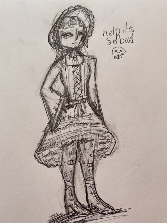
I’m scared to erase the pencil lmao
38 notes
·
View notes
Text
How I Make “Not That Magic”

1. I put a sheet of tracing paper over a lined sheet and do the lettering with Pigma Micron markers 05 and 08. Then I scan it into my PC.
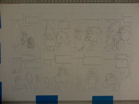
2. With a dollar-store 4H pencil, I draw the borders for two strips on a page of Canson bristol. I cut out the lettering from the tracing paper and trace around those pieces where the lettering will go. Then I rough in the art for each panel.
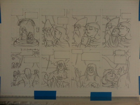
3. Pencils are finished with a General's Cedar Pointe #2 pencil.
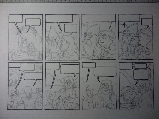
4. Borders and word balloons are done with a Hunt 513EF nib and Dr Ph Martin's Black Star Matte ink.
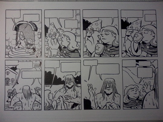
5. The art is inked with a Zebra G-Pen nib, Pigma Microns 01 05 and 08, and a cheap #2 watercolour brush; then pencils are erased. Some corrections are done with Dr Ph Martin's Pen White and a Uni-Ball Sigma white gel pen.
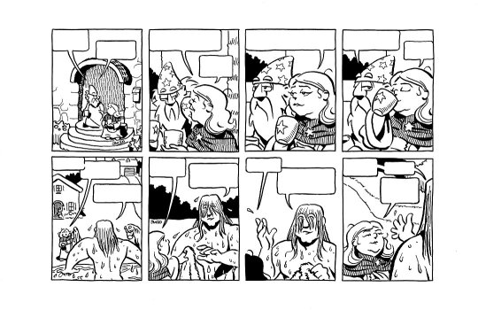
6. I scan the page and do some touch-ups in my clunky old graphics program (Paint Shop Pro 7).
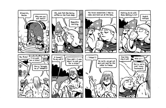
7. Still in PSP7, I copypasta the lettering from the lettering scan into the page scan, then fill in grays, sometimes convert some black lines to gray ones, and do final touch-ups.
#art#drawing#cartooning#pencil#inking#not that magic#Vernor Magus#Russ the Barbarian#comics#comic strips
20 notes
·
View notes
Photo
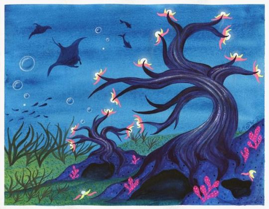
Nightlights in the Deep
At last, I can finally show you guys what's been with the tree fever in my last couple of posts (Terrarium Nova and WIP Wednesday: Oops all Trees)
So the art supply company Arteza madea post on their Instagram a few days ago where they announced a contest to make art featuring trees and post it on Instagram with all the appropriate tags, open until September 26th (with prizes of course) and I thought it would be fun, especially since one of their suggestions was to design a tree.
And I also decided to add a little extra challenge to myself to stick primarily to the Arteza supplies that I have, since it's their contest. That meant I had their watercolors, colored pencils, and woodless watercolor pencils to pick from and play with. Although I did end up using quite a bit of gel pen (Sakura gelly rolls and a little of my white Uni-ball Signo) to get the bright pops of color I just couldn't get with the other supplies. The gel pens felt fairer to supplement with since I usually accent pretty much all my work with gel pen in some form or another.
Naturally, after I gave myself a few minutes to ponder how to stand out among a crowd of trees but also fit right in, my imagination ran wild with my own fictional tree species.
I pretty immediately landed on the idea of an underwater/deep-sea/bottom-of-the-ocean tree and also something with bioluminescence (things that naturally glow in the dark) and from there I starting searching for various tree and water-themed things on Pinterest to flesh out my ideas. From that, I very quickly arrived at the idea of a winding, twisting trunk like you might find on a bonsai tree. And while originally I really liked the idea of having wispy drooping petals and/or leaves like Wisteria or willow trees, after a few tests that didn't turn out as nicely as I wanted (as seen on the WIP Wednesday mentioned above) I decided maybe it would be best to go without this time around.
So the final concept I've ended up with for my trees here goes roughly as follows, although I'm no botanist or marine biologist so there's a good chance a lot of this doesn't check out scientifically:
The Nightlight tree, named for its bioluminescent fruits--called "moon fruits" for their whiteish glow, pale bluish color, and spherical shape--is a species of aquatic tree that is found growing anchored to rock formations and cave systems in the greatest depths of the ocean. As these trees exist in oceanic depths with minimal or no sunlight, they perform chemosynthesis rather than photosynthesis to make their own food until they reach maturity and can produce their own artificial light as a food supplement. Nightlight trees root systems can reinforce and stabilize the rock formations they anchor to in order to grow, which provides a more sound home and environment for the species of fish that will eat the "moon fruits," attracted by their bright glow, produced by the tree and aid in the tree's reproduction. Because of this, nightlight trees may grow in clustered groups or may grow so closely together that multiple trees twist and wind around each other, which can put strain on the trees' root systems and may cause development problems and may cause the younger of the trees to die. The bark of mature nightlight trees may also have a faint glow where the tree is thickest, as the bark is stretched more thinly around the nutrient carry "veins" found within the trunk of the tree, where the chemical process that causes the tree's fruit to glow begins. Nightlight trees attract and feed a variety of deep sea creatures and other bottom-dwelling vegetation, many of which feature bright flourescent colors or bioluminescent traits and may camoflodge with the moon fruits or the few brightly colored flower-like leaves that the moon fruits emerge from four times a year, peak season typically being in the spring. This provides these other species with a largely safe place to settle and reproduce while the tree is at its most forthgiving. Moon Fruits once detached from the tree will retain their glowing properties for approximately 7-10 days. Fruits that in that time find themselves on or around suitable growing conditions may then begin to take root and grow. Fruits that are not in suitable growing conditions within the time frame will then begin to decay and detoriate. Certain deviations or subspecies of nightlight trees may also be found in the depths of brackish or freshwater, but the most common sigular variety is the "White Light" variety found in oceanic saltwater.
Excuse me if that's a little all-over-the-place for a faux "knowledgable source about trees" article, but I think I managed to get the bulk of my ideas for how these trees work in there.
For a while, I also had the idea that if one of the trees ever did grow tall enough to reach the water with plenty of sunlight and/or poke out of the water that the exposed parts of the tree would die and/or become sicker with more sunlight exposure, so you'd have this really tall tree that's dead at the top but as you follow it down becomes progressively healthier until you reach the bottom and find this beautiful natural undersea garden with all these neon plants and animals it's supporting in its ecosystem. And while I do still like that idea, I don't think it's terribly realistic and I definitely couldn't fit all that would entail into this one artwork.
That said, I think you can probably see my reasoning for a lot of the artistic decisions I made here, so hopefully, I won't have to stop every five seconds to explain how the tree works while I go through what my artistic process was.
After some sketching to think through my ideas of the tree structure and possible fruit/foliage things and the practice/failed attempt pieces, I decided my best bet for the pseudo-vision I had in my head would be to make lines from the sketches I'd done as a base (as in my practice pieces where I attempted to free-hand everything things really got away from me pretty easily), and so I lifted the lines for the two trees, the caves, and some of the ground/sand from my sketches and transferred them to a piece of Canson XL watercolor paper, since I knew I wanted to work primarily with the Arteza watercolors and maybe (at the time but this ended up not being the case) the woodless watercolor pencils too.
And if I may, I'd like to take a moment here to say that while on some levels I do understand why some more versed in watercolor than I absolutely loathe the Canson XL watercolor paper, to me, it much like the premise of cheaper watercolors is not strictly terrible--it's a matter of what you're used to and what you learn to work with. If you can learn to work with what you've got, and that's what you get used to, then to a point it the quality almost doesn't matter. This paper does work differently from the more expensive/nicer watercolor papers I've tried, but it's so much more accessible that I have more of it, so I use it more, and by now I've learned a lot about how to work with it to get the results I want, so I'm less likely to encounter some of the problems other people seem to have with it. It all just depends on you, your taste, and how you work.
But enough of my paper mini-rant. Back to the artwork:
I knew from my practice pieces that part of the mistakes I kept making was not laying down layers further in the background first so that I wouldn't have to attempt to paint around/right up to them later, as well as layering up more would help me better achieve the darker, moodier undersea look I was aiming for. So after taking a picture of my lines and very quickly and sloppily doing a color mockup in one of the few drawing apps that still work with a Gen 4 iPad to figure out which paint colors to squirt onto a palette, I went in with an all-over layer of a darker blue for the background first, and I layered that up 2 or 3 more times to get it to a darker intensity.
It's still a little bit brighter than I was originally hoping for, but it still came out pretty nicely. Though I couldn't tell you how much of the ocean-ish texture is just textural properties of the particular paint color and how much of it was how I laid down the paint between all the strokes I did to even out the coverage and the additional layers.
After that was dry, I made a faux-pas (in that I would have to paint around them a little later) and moved on the stars of the show; the trees themselves.
The trees were probably the slowest and most methodical part of this piece. I very carefully went in and would do lines and then blend them out slightly when possible, trying to use the transparent nature of watercolors to my advantage. This was a slower process, especially as I would work my way up the trees and get to smaller branches (especially with the smaller tree) and had to switch to a smaller brush just to make sure I was staying within my lines. But I and my dark, moody purple did eventually get through it, and even with only the trees the background painted, I was really pleased with how they turned out.
Then I moved on to my little rock-cave things and the ground. The caves started out as a lighter ultramarine color, but it looked kinda weird so I did even up going back and adding a couple of additional layers and shading to try and add more depth, as well as I tried to stick with a dark blue only for the insides of the caves, but they ended up really seeming to need the addition of some black. The end result is a little too close in value between the trees, the caves, and the caves' insides, but there wasn't really a better way to remedy that beyond starting over, and after everything I'd been through to get to this point, I did not want to do that. So it stays as is.
The ground was actually relatively simple. Since I already had a blue background and I had decided a greenish color would be the best route to go, I just layered some yellow paint in the areas I wanted to look more like sand/ground and did the same kind of semi-blending as I did on the cave rocks and trees. And it worked just as well when I added the sand/ground moving towards the back that I hadn't pre-drawn in.
Now, I was trying to hold off doing the little moon fruits (which at this point were just bioluminescent orbs to me, I did all the naming after I finished the piece so I would know exactly what I was trying to name) until I had all the painting done, since the plan was to do them with the colored pencils, and I just kinda wanted to be able to say I was done and put all the painting stuff away before I moved on to that. That's how I usually work with my mixed media projects; I prefer to have a plan and get the majority of one medium or section done before moving on to something else. (Usually to have more desk space available but it also helps me keep things organized.)
And it was at this point that I realized my plans didn't look very under-water-ish. It kinda just looked like a moody dry-land landscape painting. Which is fine, but that's not what I wanted/was going for.
To remedy this, I started by adding some seaweed/kelp like plants to the ground. Which still looked largely just like funny grass or weeds.
It was at this point that I deviated from the actual artwork and moved back to my watercolor sketchbook to do some toying around. The main thing I did was practice trying to make coral or coral-like plants since I figured that might help with the whole ocean thing. And on the page where I ended up doing a lot of the practicing, I actually ended up taking a little extra time, later on, to make into kind of a bonus art piece, which I'll be posting by itself at some point in the future.
But I also practiced making bubbles and some other details we'll get to in a moment.
I tried doing the coral a few different ways but ultimately went with the way I see coral in my mind when I think of the word; this rounded cartoony kinda thing, even though that's not what real coral usually looks like. (I looked up pictures during the process out of curiosity) I don't know where this very specific imagery got implanted into my brain other than maybe Spongebob, but that still doesn't seem quite right, so I don't know.
And I have to say that the Neon Pink Arteza watercolor continues to be a favorite of mine, while we're here. It held up over the dark colors and compared to the gel pens infinitely better than I thought it would. Arteza, if you see this by chance, this is my plea--please make more neon watercolors if you can make them as good as this pink one!
*Ahem* Anyway...
After all that, I did step back from the watercolor and come in with the colored pencils. I didn't think I was almost done, but at the moment I didn't have much else in mind for the watercolors and figured it would be best to move to the pencils and then I could come back to the watercolors if I felt like I needed to.
I'm not sure if the Arteza colored pencils just don't like watercolor paper or something, but I had kind of a hard time applying the pencils and getting them to pop the way I wanted to, particularly in areas that had thinner paint coverage. This was the most notable in the bare ocean areas where I was trying to do the moon fruits, as the pencils worked a little better when I hit those darker patches of blue, and they liked working over the truck bark a lot better. To be fair, I know some of this is because most colored pencils have a hard time going over darker colors, as even my Prismacolor and Polychromos can have a hard time over my toned gray paper sometimes, but it still seemed like these were falling more flatly on that front than I had anticipated.
Either way, by this point it was late and I was exhausted, so I finished up what I wanted to do with the pencils--finally coloring the moon fruits, adding some additional texture to the sand, caves/rocks, coral, and trees--and decided to leave it until morning.
As I was cleaning up for the night, I was looking at that bonus art piece/practice page I talked about earlier, and I noticed a spot where the paint had done a kind of texture thing again (this time definitely more from how I applied it and less from the paint itself) and the shape, combined with me thinking of things I could do to continue to play up the "ocean" imagery and make my seascape look more lived in, made me think of sting or manta rays. More specifically that one would look really good in that spot, and about the time I completed that thought was when it dawned on me the key component I had been missing the whole time:
It's an ocean life scene. Where's the life part?? Do you know what lives in the ocean? FISH!
And I still couldn't tell why that just hadn't occurred to me until then.
So I went to bed knowing exactly what I was going to be looking up and practicing the next day to add to and hopefully complete my tree painting.
The next day, after many minutes spent prowling Pinterest for marine life silhouettes and having added a few rays to my practice piece, (and some nonspecific fish to the other couple of failed attempts since the practice-piece-turned-art was getting a bit crowded) I was off and added a manta ray, a small school of fish, and two other fishes just hanging out. Then I couldn't help myself and added a smaller ray in the leftover space that was just kind of begging for a little something more behind the other ray.
And I could have very well stopped there, but it was bothering me in the fresh daylight just how much the colored pencils had seemingly sunk back into the artwork. My bubbles I added the night before were so hard to notice! And the moon fruits...they just weren't popping at all the way I wanted them to.
I tried not to; I really did. I wanted to stick to just using the Arteza supplies that I had and maybe some white gel pen. But I had to do something to get the color to pop more, and the alternative was to pull out the white and neons from my Prismacolor pencils and between the two options, pulling out my Sakura Gelly Roll Moonlight pens, as I said earlier, felt less like I was deviating from the challenge. And for all I know, the Prismacolor pencils might not have popped as much as I wanted either, even if they popped more than the Arteza pencils. So gel pens it was!
I used my white Uni-ball Signo for the actual moon fruits themselves, and the gelly rolls for their little leaf-petals and some extra dots/texture on the coral. I also used the white gelly roll to add some additional "glow" to the tree bark and to revive the poor bubbles that had gotten so lost before. And then I went back later at different points to add the two moon fruits that fell, partly to fill in space and partly because it just made more sense to my brain to have at least some that weren't still on the trees.
Also, I'm not sure how well it reads, but I did go back and try to add more of a proper "glow" effect to the moon fruits with the white colored pencil, but I feel like I lost a lot of the minimal pigment I was getting by the time I used a blending stump to soften the edges.
It's funny to me; this was one of those pieces where I spent so much time with it and meticulously going over the details that at first I actually wasn't sure it was finished. It's one of those where I had to step back and let it settle in that I had seen my vision through to the end before I could properly "accept" it.
And you know, for as many challenges as I had with trying to invent my own tree species and the problem-solving I had to do throughout the process, I am really proud and happy with how the final piece turned out.
It's different; it's out of my comfort zone because I don't do landscape type things, and it challenged my creativity in a different way. And I feel like I was able to achieve what I set out to do with the piece.
And thanks to my hesitance to dive right into the final piece without testing, I also got a bonus art piece out of it, so yay two birds with one stone?
This may have started out as just another contest entry, but in the end, I'm really glad for the mini art journey this piece took me on, and even if I don't win anything in the giveaway (which realistically I probably won't), I'm happy just to have made the artwork. And that's kinda the most important thing, right?
Now, I have some commission work to do, but I also have a certain supply that's been sitting on my desk all week just begging to be used, and some other pieces in the works, so stayed tuned for that and that bonus art piece I keep talking about that came out of this piece.
____
Artwork © me, MysticSparkleWings
____
Where to find me & my artwork:
My Website | Commission Info + Prices | Ko-Fi | dA Print Shop | RedBubble | Twitter | Tumblr | Instagram
2 notes
·
View notes