#austin abrams layout
Explore tagged Tumblr posts
Text
ᅟᅟ ⠀✉ credits on twitter ( @BONSAILAYOUTS ) if you use !!
⠀✉ like and reblog if you save this layouts.
( the credits to my account are mandatory, every header has a watermark. )
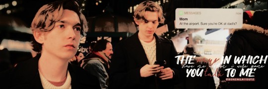

#layout#dashylily#icons#iconheader#iconsheader#dashlayout#austin abrams#christmas#christmas layout#christmas icon#dash y lily layout#serie netflix#layout twitter#twitterrp#austin abrams layout#austin abrams icons#austin abrams header#dash y lily#dash and lily#dashlilyicons#dash and lily icons
0 notes
Text
Life Is Strange fancast(new)
Already did a LIS fancast before, but since some of them were too old, I think it's time to do a new one
my other LIS fancasts
LIS BTS fancast
LIS 2 fancast
LIS TC Fancast
Cailee Spaeny as Max Caulfield

Sophie Thatcher as Chloe Price

Sydney Sweeney as Rachel Amber

Elle Fanning as Kate Marsh

Anthony Turpel as Warren Graham

Reneé Rap as Victoria Chase

Austin Abrams as Nathan Prescott

Aaron Eckhart as William Price
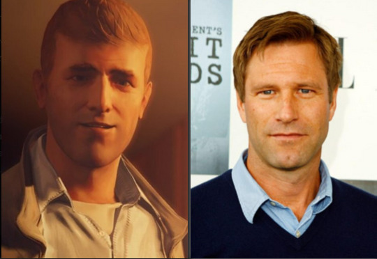
Robin Wright as Joyce Price
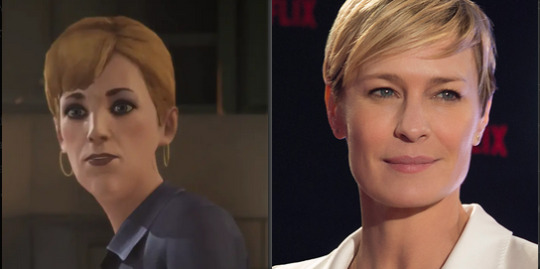
Ving Rhames as Principal Raymond Wells

Yvette Nicole Brown as Michelle Grant
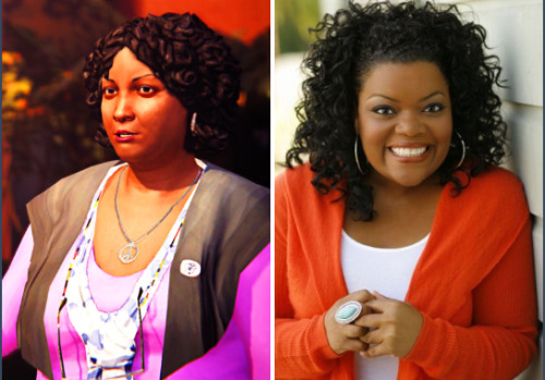
Douglas M. Griffin as Samuel Taylor

David Harbour as David Madsen

Norman Reedus as Frank Bowers

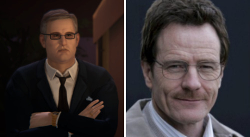
Bryan Cranston as Sean Prescott
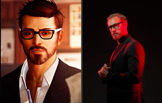
Dewon Sawa as Mark Jefferson
Barbie Ferreira as Alyssa Anderson

Brianne Tju as Brooke Scott

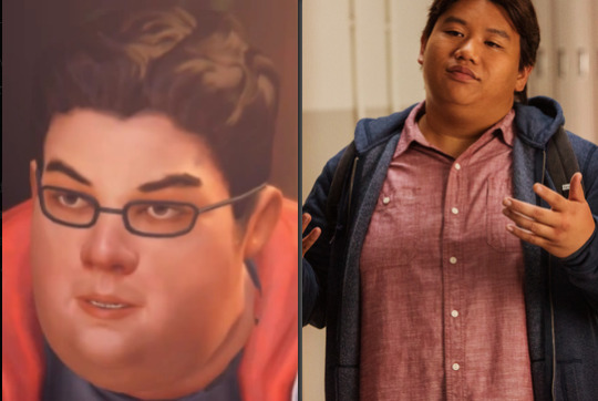
Jacob Batalon as Daniel DeCosta
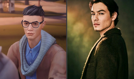
Ryan Potter as Evan Harris
Jenna Ortega as Stella Hill
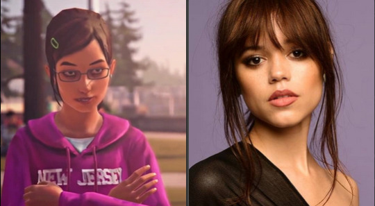
Jolie Vanier as Dana Ward
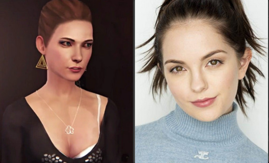
Kelli Berglund as Juliet Watson
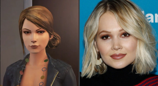
Ross Lynch as Luke Parker

Charlie Rowe as Justin Williams

Noah Centineo as Trevor Yard

Stefanie Scott as Taylor Christensen

Tiffany Espensen as Courtney Wagner

Mason Gooding as Hayden Jones

Justin Prentice as Zachary Riggs

Because of tumblr's new layout with the 30 picture limit, I cannot add more pictures, so here's the rest.
Dylan Minnette as Logan Robertson
Angourie Rice as Samantha Myers
Mischa Collins as Skip Matthews
Mark Hamill as Travis Keaton
#Life Is Strange#Fancasts#Max Caulfield#Chloe Price#Rachel Amber#Pricefield#Amberprice#Amberpricefield#Kate Marsh#Victoria Chase#Nathan Prescott#Warren Graham#Mark Jefferson#David Madsen#Joyce Price#Steph Gingrich#Mikey North#Drew North#Sean Prescott#James Amber#Rose Amber#Sera Gearhardt#Damon Merrick#Alyssa Anderson#Brooke Scott#Daniel DeCosta#Evan Harris#Stella Hill#Dana Ward#Juliet Watson
53 notes
·
View notes
Text
creator tag game
Rules: answer the questions and then tag 10+ other creators to answer the questions!
first creation and most recent creation of 2020: first and most recent
one of your favorite creations from 2020: this is probably my favorite gifset ive made this year just bc he’s............. so pretty and the coloring looks good and it’s just!! brilliant
a creation you’re really proud of: this one, which is one of my most recent sets... it just looks good to me? and it was something new i tried this year (and yes its the one from the next question) and it turned out nice and i just? really enjoyed it??
a new style you tried this year and a gifset that uses it: i started using actual typography in edits in like. the last couple of days lmao which i did here and here, i always thought sets w typography were so cool and i. wanna learn to do it more
your favorite coloring: this the boys set looks really good imo and i’m super proud of the coloring (blood tw) also this dash and lily set has really nice coloring and also i really like this the modern age: my week with cameron collier set very much it looks pretty
a creation that took you forever: this blue set and this red set both took a really long time (and was also a new style i tried this year) and im v proud of them
your creation from 2020 that received the most notes: this dash and lily nick jonas cameo one and once again i must say thank you nick jonas
a creation you think deserved more notes: this jack and dean set just bc like... they predicted covid y'all
a creation with a favorite scene/quote: this xander harris set!!! the zeppo is one of my absolute favorite buffy episodes and this scene just.... hits real hard for me
a new fandom you joined and a creation you made for it: dash and lily!! but also i kinda got heavy on the austin abrams fandom lmao i’ve made a lot of things for both (including an entire austin abrams source blog which IS linked throughout this post) but as far as dash and lily goes im really happy with this lily wardrobe gifset bc its like. idk it looks good to me and im proud of it and its also almost my most popular set of the year
a creation you made that breaks your heart: this escape the night s4 death scene absolutely kills me because tana did Not deserve to go out like that, also this dash and lily set kills me every time
a ‘simple’ creation that you really love: this gifset is literally just a few gifs of an outfit but i adore it very much, this set is also just a one second clip put into two very simple gifs with barely any coloring but i adore it v much
a creation that was inspired by another one (add both your creation and the one that inspired it!): okay i literally just posted this set but....... i love it ok and it was inspired by this set by @lorelaigilmo
a favorite creation created by someone else: okay i have. a lot of gifsets i ADORE from this year but immediately coming to mind are this set by @anakin-skywalker which has such pretty coloring and such an awesome layout, this set by @zoeyxjoan and tbh i havent seen the show its from but the coloring and typography and everything about this set is so GOOD, this set by @meliorn is so pretty i havent seen this show but the rainbow coloring has me weak, this set by @stupidape is so pretty i havent seen lotr but its such a pretty set the colors and typography and everything i love it, this set by @msjessicaday is so pretty i could scream the rainbow colors are so nice and the layout is so cute i love it, this set by @eddiediaz has me going insane its so pretty and so well done and i could scream, and this set by @robintunney is super cool and i love the cutouts!!
some of your favorite content creators from the year: there are so many but people ive really loved especially in the past few months are @nomoregoldfish, @jakeperalta, @danslevy and @cerealbishh
for good measure, another a couple more creations of yours that you love: this ani achola set bc she’s very pretty and a Good character and also i just like how the set turned out, also this ani achola set again bc she’s pretty, this charlie st george set bc its adorable, this chalex set where charlie’s being protective af, this the boys set bc the development... i could sob, this dash and lily set is hilarious, this one is also hilarious and dash said gay rights
i was tagged by @danslevy but i’m too nervous to tag people skdfjhsd but if u wanna do it pls do and say i tagged you!!
9 notes
·
View notes
Text
11 Impressive Corporate Graphic Design Projects
Every year in the HOW In-House Design Awards, we’re thrilled not only to see corporate graphic design, but to see it done well—and that’s why we like to share it as often as we can. From identity design to marketing collateral, the projects you’ll see below were all recognized in past In-House Design Awards. Check them out, and enter your own team’s work by this year’s deadline, June 5, for a chance to be among those who see their work in print this winter.
11 Award-Winning Corporate Graphic Design Projects
1. Salesforce University Design System
COMPANY/ORGANIZATION Salesforce, San Francisco; www.salesforce.com CREATIVE TEAM Ryan Lundy, Carl Loeb, Jessica Bognar, Eujin Hong, Jason Luster, John Zissimos, Molly Sullivan, Tricia Austin, Sophie Westbrook, Casey Ramsey DETAILS The team evolved Salesforce University to meet the visual sophistication of the rest of the Salesforce brand while still conveying education.
2. MetLife Federal Dental Campaign
COMPANY/ORGANIZATION MetLife, Washington, DC; www.metlife.com CREATIVE TEAM Allison Chess, Geneva Grace Kellam, Michael Mulcahey, James Goncalves, Maria Danar, Jill Hynes, Sandy Diaz DETAILS The “Choose More for Your Smile” campaign featured MetLife’s spokespeople, the PEANUTS© gang, as a way to highlight the plan benefits and underscore MetLife’s brand presence amongst other dental carriers.
3. Refer-A-Friend Commercial
COMPANY/ORGANIZATION DISH, OneTen Creative, Englewood, CO; www.dish.com CREATIVE TEAM Jessie Eck, Brian Bennett, Cory Voyzey, Nancy Perales, Michael Kinner and Olivia Koszuta DETAILS DISH wanted to deploy an all-graphics, DRTV spot to jumpstart the Refer-a-Friend program. The tone had to be soft and conversational—but drive response.
4. Hallmark Channel’s Spring Fling On-Air Promotional Graphics
COMPANY/ORGANIZATION Crown Media Family Networks, Studio City, CA; http://ir.crownmedia.net/ CREATIVE TEAM Kathleen Bloome, Amie Serio, Jennifer Lee-Temple DETAILS Each piece of this package was designed, modeled, textured and partially animated within Cinema 4D, eventually being brought into After Effects to fine tune and bring all the elements together into larger-scale animations.
5. CNN on LINE Messenger
COMPANY/ORGANIZATION CNN Digital, Atlanta; www.cnn.com CREATIVE TEAM Aimee Schier, Michael Hogenmiller, Alberto Mier, Daniela Dewendt, Samantha Barry, Ashley Codianni, Masuma Ahuja DETAILS This was a collaboration between the design team and the editorial social team to create a visual language for CNN on LINE official account.
6. AT&T AdWorks
COMPANY/ORGANIZATION DIRECTV, New York City; www.directvcreativeservices.com CREATIVE TEAM Roger Hyde, John Vetter, Amanda Assadi, Richard Griffin, Roman Sciascia, Mark Robinson, Sanchez Stanfield, Richard Griffin, Mike Polovsky, Billy Lewis, Lauren Abrams, Scott McDermott DETAILS To highlight the benefit of AT&T AdWorks, an addressable advertising tool, the team captured funny moments with vivid characters mismatched with products they would never buy, reminding buyers to “stop showing the right product to the wrong customer.”
7. Coleman Rebrand
COMPANY/ORGANIZATION The Coleman Company Inc., Littleton, CO CREATIVE TEAM Kelly Anderson, Joshua Newitt, Mattie Carnes DETAILS The team’s objective was to rebrand Coleman in a way that brings it into the 21st century and makes it more appealing to new consumers while keeping it identifiable to older generations.
8. The Muséo Line Marketing Materials
COMPANY/ORGANIZATION ASSA ABLOY Door Security Solutions, New Haven, CT; www.assaabloydss.com CREATIVE TEAM Faye Pite, Chery Targonsky, Melissa Matos, Emily Paecht, Kristen Bylan, Leslie Saunders DETAILS The team refreshed the Muséo Line brand, with the intention of evoking timeless artistry in all marketing materials.
9. Ideas That Fly Volume 21
COMPANY/ORGANIZATION Herff Jones, Yearbook Marketing, Charlotte, NC; www.yearbookdiscoveries.com CREATIVE TEAM Ann Akers, Heidi Lilly, Lynn Strause, Kristen Creed, Greg Rutkowski and Rashaad Bilal DETAILS Ideas That Fly showcases the best covers, themes, layouts, coverage and photography from hundreds of yearbooks printed by Herff Jones and serves as a source of inspiration for staff.
10. From the Ground Up Book
COMPANY/ORGANIZATION Gogo, Chicago; www.gogoair.com CREATIVE TEAM Rachel Allen, Tim Casart, Brian Doherty, Cinzia Mercuri, Jonathan Nielsen, Alice Nita, Stephen Rollick DETAILS The team was challenged to interview 40 thought leaders from key organizations and publish a book with the highlights to show how the internet of things will transform aviation.
11. Fossil Generation Symposium
COMPANY/ORGANIZATION Burns & McDonnell, Kansas City; www.burnsmcd.com CREATIVE TEAM Brandon Guffey, Ann Scheer, Aaron Fiddelke, Joe Bathke DETAILS The goal of communications and event materials for Burns & McDonnell’s annual Fossil Generation Symposium is to entertain and inform. The Transformers® movie series inspired the 2015 event.
Winners of the HOW In-House Design Awards benefit in some pretty fantastic ways.
Beyond the significant recognition of your team’s hard work, when you win you find your work featured in print and also online, where it’s sometimes featured multiple times throughout the year and beyond (the article above is a good example of this), gaining you valuable exposure.
This also means that when you win, today’s top talent sees your team’s award-winning work, and you have a valuable new tool for recruiting. Not to mention, you’ll find networking opportunities galore at HOW Design Live 2018 with the free Big Ticket registration that goes to the Best of Show winner. And the HOW team always looks forward to presenting the Best of Show winners their trophy on the main stage.
If you’re still unsure whether your team should enter, hear from one of our past winners:
“Winning has been a great way to get recognition from within the organization. It’s furthered our ability to attend design conferences and training, and has also strengthened our voice as a design team.”
—Kevin Johnson, art director, Cleveland Cavaliers
Click here to submit your team’s work by June 5, 2017!
The post 11 Impressive Corporate Graphic Design Projects appeared first on HOW Design.
11 Impressive Corporate Graphic Design Projects syndicated post
0 notes