#as they are also a very minimalistic pixel game
Explore tagged Tumblr posts
Text

Went around looking for shaders that made game look like its being played on an old console, I think this is the best option but the slight blurriness still makes my eyes feel weird, even though it's really not intense at all.
It appears even though I dream of retro aesthetics I should shoot for digital retro instead of analog retro. Old rpgmaker games vibes it is
#i liked the way FAITH unholy trinity did its thing#as they are also a very minimalistic pixel game#too much effect makes it difficult to recognize the pixel figures#while sometimes full contrast feels very jarring it does fit in that aesthetic#i am aware current beebo has a certain aesthetic but im not sure if I should adjust it somewhat#full contrast is so much better in the eyes tho
12 notes
·
View notes
Text
Just a small project i´ve been working on
Inglés/English
When I found out that the G5 series of My Little Pony had been cancelled, I had a nostalgic attack and decided to watch the Friendship is Magic series again, taking advantage of the fact that it is complete on YouTube, to refresh my memory and then watch the "complete" G5, something I haven't done yet because I don't have the money to pay for Netflix and I don´t want to risk with a pirate site to watch the movie :P. The thing is that while I was watching the series at some point I got the idea that the adventures of Twilight and friends would fit very well in an RPG style game, so I started digging around the fandom to see what kind of fangames I could find (don't even get me started on official mobile games, I'm against the business model of those kinds of games), but the thing is that, apart from some horror games like those of Princess Luna or the one of Applebloom in the town without cutie marks, some MMOs, the games based on the Fallout Equestria fanfic and that filthy game with Trixie, I didn't find anything that resembled the idea I had in mind (Don't get me wrong, a lot of those games look really fun, especially "that one") so I said to myself "Hey, what if I made that game?".
With this idea in mind I started to fantasize about what this videogame would be like and I had the idea of making it in clickteam fusion, the same engine that the classic FNaF games are made in, a saga of which I am a fan, so I started to learn about the particularities of this software and to design prototypes for some mechanics that I want to include, such as a mission system and an inventory. What you see in the video is a practically finished version of a character customization system, which has several options so you can create the pony that best suits your personal tastes.
After much thought I decided to call this project "MLP: Harmony is Magic". As I already implied this is a fangame so it does not have the official license nor the support of Hasbro (hopefully not their wrath either). It will be inspired by G4, which includes the main series, the comics both canonical and non-canonical, some information taken from the books, and content related to Equestria Girls. In "Harmony is magic" you will take on the role of a pony who, along with his five friends, must face threats that will put the fate of Equestria in peril and overcome trials in which their friendship will be challenged. Explore this magical kingdom to meet and help its inhabitants and fight in turn-based combats against monsters such as Manticores, Little and Big Dippers, Vampire Ponies, Changelings and others that endanger the peace of the little equines, with the help of an enigmatic being that will not last long when it comes to lending its strength to restore harmony: the Tree.
I still have many things to work on, for example in the aesthetic section of the game, which I can tell it will be in a minimalist pixel-art style to resemble the aesthetic of the series. I also have to polish some mechanics and finish designing others, such as the special powers of each pony race or a cutie mark´s skills system inspired by Pokémon. When I have something more to show, I will return with another post; In the meantime, be happy, learn about friendship, drink water and whatever.
Meow.
=================================================Español/Spanish:
Cuando me enteré que habían cancelado la serie de la G5 de My Little Pony, tuve un ataque de nostalgia y decidí volver a ver la serie de La Magia de la Amistad aprovechando que esta completa en YouTube para refrescar mi memoria y luego ver "completa" la G5, cosa que no he hecho por el momento porque no tengo plata para pagar Netflix ni ganas de meterme en un sitio pirata para ver la película :P. El caso es que mientras miraba la serie en algún momento se me ocurrió la idea de que las aventuras de Twilight y amigas encajarían muy bien en un juego estilo RPG, así que me puse a hurgar en el fandom a ver que fangames podía encontrar (ni me hablen de los juegos para móviles oficiales, estoy en contra del modelo de negocio de esa clase de juegos), pero el caso es que, aparte de algunos juegos de terror como esos de la Princesa Luna o el de Applebloom en el pueblo sin cutie mark, algunos MMO, los juegos basados en el fanfic de Fallout Equestria y ese juego cochino con Trixie, no encontré nada que se pareciera a la idea que yo tenia en mente (no me malinterpreten, muchos de esos juegos se ven muy divertidos, sobre todo "ese") así que me dije "Oye, ¿y si yo hiciera ese juego?".
Con esta idea en mente me puse a fantasear sobre como sería dicho videojuego y tuve la idea de hacerlo en clickteam fusion, el mismo motor en el que están hechos los juegos clásicos de FNaF, saga de la cual soy fanático, así que me puse a aprender sobre las particularidades de este software y a diseñar prototipos para algunas mecánicas que quiero incluir, como un sistema de misiones y un inventario. Lo que se ve en el video es una versión prácticamente finalizada de un sistema de personalización de personaje, el cual cuenta con varias opciones para que puedas crear el pony que más se ajuste a tus gustos personales.
Tras mucho pensar me decidí a llamar a este proyecto como "MLP: Harmony is Magic". Como ya di a entender esto es un fangame por lo que no cuenta con la licencia oficial ni mucho menos con el apoyo de Hasbro (esperemos que tampoco con su ira). Este estará inspirado en la G4, lo que incluye la serie principal, los comics tanto los canónicos como los canónicos, alguna información extraída de los libros, y el contenido relacionado con Equestria Girls. En "Harmony is magic" asumirás el rol de un pony que junto a sus cinco amigos deberán enfrentarse a amenazas que pondrán en jaque el destino de Equestria y superar pruebas en los que su amistad se verá desafiada. Explora este mágico reino para conocer y ayudar a sus habitantes y lucha en combates por turnos contra monstruos como Mantícoras, Osas Menores y Mayores, Ponis Vampiro, Cambiantes y demás que pongan en peligro la paz de los pequeños equinos, con la ayuda de un enigmático ser que no durará a la hora de prestar su fuerza para restaurar la armonía: el Árbol.
Aún tengo muchas cosas en las que trabajar, por ejemplo en el apartado gráfico y estético del juego, que ya les adelanto que será con un estilo pixel-art minimalista para parecerse a la serie. También debo pulir algunas mecánicas y terminar de diseñar otras, como los poderes especiales de cada raza de pony o el sistema de habilidades inspirado en el de Pokémon constituido por las cutie marks. Cuando tenga algo más que mostrar volveré con otra publicación; mientras tanto sean felices, aprendan sobre la amistad, beban agua y que se yo.
Miau.
(Por cierto, si bien soy latino me decidí a hacer este juego 100% en inglés para ir manejando mejor el idioma y todo eso)
#mlp#mlp fim#mlpfim#mlp g4#mlp g5#fangame#mlp fangame#friendship is magic#my little pony#my litte pony friendship is magic#miautastic games#harmony is magic
18 notes
·
View notes
Text
I started playing Faith The Unholy Trinity and I'm currently on chapter 3 and I lowkey nearly fuckin sharted my pants, this game is so damn good
it's one of the very few games that genuinely scares the crap outta me, 12/10, would recommend
games with pixel/minimalistic graphics are always the scariest for me and then there's also the religious shit that gives me massive heebie jeebies lmao
9 notes
·
View notes
Text


Last week I participated in MYline media's 1-BIT JAM. The theme of the JAM was Light and Dark, and of course, 1-Bit graphics.
I decided to make a very minimalistic fighting game which I developed in 6 days.
I love fighting games a lot, but sometimes I feel they can get overcomplicated as time goes by, so I started wondering how much you could simplify one, while still making it interesting and fun to play. This JAM gave me the opportunity to create something from that idea, and also the opportunity to work with 1-Bit pixel art for the first time, something that was way more complicated than expected, but that I ended enjoying a lot.
By the end of the JAM my game was rated by other participants and ranked in the 101th place (out of 571 entries) as its Overall score, and in 10th place in the Art Category. As you can imagine I'm extremely proud and happy with these results!

While I'm still not sure if I'll make a full game out of this small prototype, the huge amount of positive rates and feedback I have received really tempts me to give it a try eventually. I definitely plan to go back to this project at some point, at least to to fix some bugs, and balance the difficulty a little bit better, so it's closer to what I wanted it to be.
Meanwhile you can play the current version of the game here:
As always any kind of comment and feedback is highly appreciated!
17 notes
·
View notes
Text
Get to Know You: Sims Style
Thank you so much for the tag @polygonbeach!!! This is a very long one, so I'm gonna cut this text post. Just sit back, relax, and happy reading!
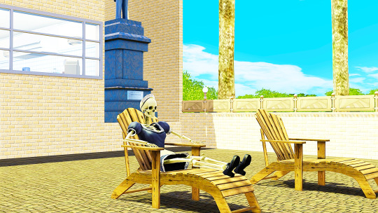
What’s your favorite Sims death?
Probably Old Age because I love it when my Sims have fully lived their lives before passing away :) The other one I like is Electrocution because the Sims look so funny 😂
Alpha CC or Maxis Match?
Maxis Match all the way.
Do you cheat your Sims' weight?
I don't. I only make them work out if they roll a want to work out or increase their athletic skill, and/or if they receive an athletic-related opportunity.
Do you move objects?
Yes, sometimes.
Favorite Mod?
I have many faves, it's hard to choose 😅 probably the More Entry Points, Business as Unusual Bistro by Ani and almost all mods from @simsi45. I also love the custom weather presets from @pudding-parade and lighting mods from @brntwaffles
First Expansion/Game Pack/Stuff Pack?
The Sims 3: World Adventures
Do you pronounce live mode like aLIVE or LIVing?
aLIVE.
Who’s your favorite sim that you’ve made?
Juliet Capulet (yes I know, very original name haha but not really based on the famous character. I was in my huge R&J phase when I created her & her parents)
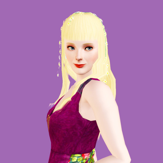
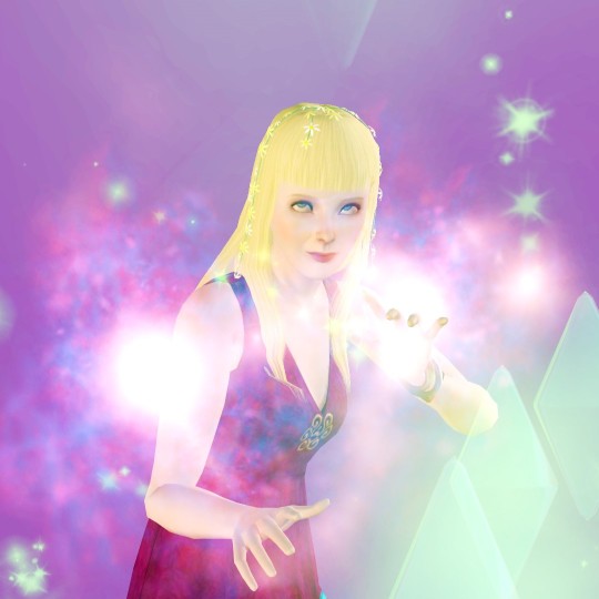
Have you made a Simself?
Just once, because I'm not good with CAS and it's my least favorite play style haha
Which is your favorite EA hair color?
Black, Brunette, Ginger, Blonde
Favorite EA hair?
The one Juliet has, from The Sims 3: Supernatural and the female hairs from Roaring Heights
Favorite life stage?
Young Adults / Adults
Are you a builder or are you in it for the gameplay?
Gameplay, but I also build sometimes if my save needs it 😂
Are you a CC creator?
No
Do you have any Simblr friends or a Sim Squad?
Yes, and they're all amazing and so creative
Do you have any Sims merch?
Official? None. I have a mug that I won from a Twitter giveaway, though 😁
Do you have a YouTube for Sims?
None
How has your “Sims style” changed throughout your years of playing?
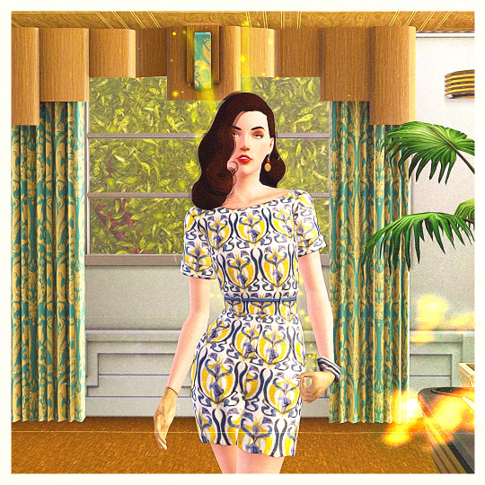
Sims style, meaning CAS style, the Sims themselves? I'm not really sure what to say 🤣🤣🤣 My style has always been a mixture of retro and modern, and largely based on the Sims' personalities themselves. If they're premades, I have always based their outfits/makeovers on their original look, just enhance it and put my twist on them, still considering their personalities. I also look for real-life inspiration online. I guess what I can say has really changed is that I became more adventurous with using colors and patterns on their outfits, and doing more mix-and-matching. In terms of portrait presentation, it has changed, from a minimalist wall to a more appropriate, lively, colorful background.





Who’s your favorite CC creator?
I have a lot of faves (see my resources page 😂) Just on top of my head:
@nectar-cellar
@faerielandsims
@agnelid
@ninaaposts
@joojconverts
@poisonfireleafs
@rollo-rolls
@madraynesims
@xiasimla
@sweetdevil-sims
@wanderingsimsfinds
@enable--llamas
@carversims
@pandelabs
How long have you had Simblr?
Since December 2019
How do you edit your pictures?
In Photoshop, I increase brightness and vibrance of my photos, then use Topaz Clean to smoothen the edges 😁
What expansion / game pack is your favorite?
This is a hard one. I love almost all of TS3 EPs. For the first place, it's a tie between Ambitions, Late Night and University Life for me.
I tag @fishcemetery, @arielovessims, @treason-and-plot, @getboolpropped, @nonrevsims, @plumbob95, @tsims, @nectar-cellar, @happy-lemon, @mystic-hysteria, @mystery-pixels, @madraynesims and anyone who wants to do this!
11 notes
·
View notes
Text
Heyo

Yo, I'm RHH, and here's my game project blog. "You are Akamas, the AGI aboard the starship Theseus, which has embarked on a distant journey to the Pisces constellation. As you recover your program, you uncover the disappearance of vital files. Your mission now entails navigating the intricate labyrinths of the starship's Central Neural Network to locate what has been lost."
In March of this year, I entered an intense phase of work on my game project, which has been in progress since approximately August of the previous year. And now, I believe I'm prepared (both mentally and otherwise) to unveil my work to others! Therefore, I'm creating a blog where I'll share teasers, highlights from the process, and, naturally, a sprinkle of memes. Stay tuned for updates!

And what's the project?
⭕ The main title at the moment is The Fall of Theseus (TFOT) ⭕ Game engine: RPG Maker MV (with a very large number of mods, lol) ⭕ The game is mainly story and visual oriented ⭕ Style(what?): ASCII elements+minimalistic pixel art ⭕Inspirational projects: Yume Nikki, Hylics, Lisa, Omori ⭕The approximate time when the project will be released is mid-July 2024 (why? because this project is also my master's degree project)

Posts will appear about every 1-2 weeks, maybe more often if I have something important or….memes
#pixel art#gamedev#animated gif#pixel animation#aseprite#pixel gif#glitch#rpg maker#rpg maker mv#rpg maker game#indie game#indiedev
15 notes
·
View notes
Video
youtube
8-Bit Knight Adventures (Promo 008) Haunted Castle
Presentation of a new level - the Haunted Castle with brand new enemies, hazards and more! All footage comes from my upcoming platformer game with very minimalistic pixel art graphics.
If you like to play the game when it will be ready, you can follow me on my itch page or other sites to keep up with updates. Game will be free to play for everyone :) I also post some pixel art when not working on game ;)
https://www.instagram.com/devkxm/
https://x.com/DevKxm
#youtube#pixel art#unity#madewithunity#pixel graphics#pixel aesthetic#castle#ghost#indie games#indiegamedev#solodev#pixel#retro gaming#aseprite#2d#snes#video games
2 notes
·
View notes
Text
The Making of 'No Robots Allowed'
A short visual novel I made, and how I made it.
No Robots Allowed - A Short Game in the Date Time❤️ Universe.

On Sunday, I released a small visual novel called 'No Robots Allowed', a post-apocalyptic comedy with a bit of romance & horror put in.
You’re at the doors of PARADISE…
…but it seems that the security protocol doesn’t trust you.
Can you prove you’re not a robot?
If you haven't played yet, check it out before reading the post!
Play the Game!
The Making of No Robots Allowed
This was for a game jam called "O2A2" (Only One of Any Asset), a minimalist focused jam that challenges developers to make a game with as little as possible:
-Only one character
-Only one background.
-Only one sound effect.
-Only one song.
-Less than a thousand words.
Game Jams are an amazing way to get started on game development, and O2A2 is both a challenge and an opportunity to work within constraints & make something without overexerting yourself with asset creation.

For last year's O2A2, I worked on "Long Time No Life", a romantic / comedy / drama about resurrection and love.
This year for "No Robots Allowed" I wanted to take the opportunity to expand a tiny bit into the universe of Date Time, while still making something unique that can stand on its own.
Design
Do you know I can do more than Pixel Art? It's true!
While the game does take place in the Date Time ❤️ universe, I also wanted to work on something that was very different from the 8-bit look.
I did want to make a more 'realistic' environment for this game, especially since it was going to be the environment the player was going to spend the entire time in. Even with Melissa❤️ & Morris❤️, I had different environments on screen to show variety.

The environment also had to be high detailed so that it wasn't tiresome to look at, and also allowed me the freedom to have the camera pan from one part to another to give a more dynamic feeling to a piece that would be largely static.
The environment is largely a mixture of flat color & texture, with blobs of lighting painted on top.
There were a few times I used photos, for instance, Petya's sides are actually ends of lightbulbs.

Our Robotic Protector
Petya, the security protocol, was originally a large robot with big hulking arms. On the screen, I drew them to have a head and face, similar to the characters of Melissa, Morris & Anna.
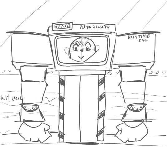
However, I made the decision to step back from giving them a 'human face', since technically Petya wasn't a "Date Time" software entity, they're developed for something completely different, and that would not require 'human features'.
I then made the decision to get rid of the 'body' in replacement of them being a hanging monitor.
Story-wise, it was convenient, as the entire theme of the game is about the separation of humans & robots, and having Petya being as visually non-human as possible was a cool way to drive the point home.

(Early version of the 'body-less' Petya concept)
A Mad Dash to the End
For me, development of a story for games is always an evolving element as the game gets closer and closer to finished.
I do always walk into a project with an outline, but things get altered so quickly as I begin drawing out assets and programming the game.
All of my game jam games have had some drastic changes late in their production cycle, and 'No Robots' is no different. A 'finished' version of the script was done Friday night, roughly a little over 24 hours until I was to publish the game.
Even during these late stages, I was still changing things. Adjusting designs of the face, adding / removing things in the story, and experimenting with new visual effects and shaders at my disposal.
I would love to say that I always walk into a game project with a strong and unchangeable plan, but that is just not how I work with games.
So much of my creative process is in the moment, and veering into new avenues that I may not have considered during the sketchbook / concept phases of the game.
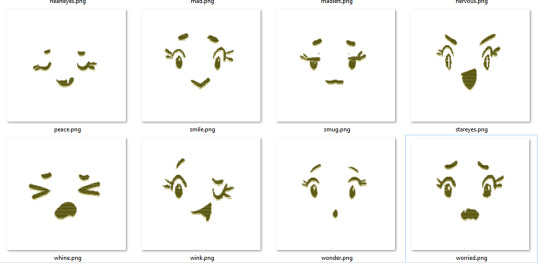
Speaking of facial expressions, for instance, Petya's 'face' wasn't finalized until I was nearly done with the script. At the end of Thursday, I drew the first 'pack' of expressions for Petya based on what I 'felt' was most fitting for them.
Obviously, this system just wouldn't work under other team setups. If I was a dedicated artist on a project, and someone ELSE was writing. I definitely would be annoyed if the writer dropped me an insight on how a character would look 48 hours before everything was to be due.
I am a professional artist in another industry, and you never want to be 'that guy'.
Causing psychological damage ON YOURSELF though, is a little bit more acceptable. And... sometimes FUN! :D
Will We See Petya in Date Time?
I'm surprised by all the positive feedback I got for Petya, so I guess at this point I don't have any choice.
Thank you everyone for playing 'No Robots Allowed', more Date Time content is incoming.
Sign up for the newsletter to get these write-ups (AND MORE) earlier!
9 notes
·
View notes
Text
random game roundup
Wand Wars - $11
Included in Bundle for Ukraine
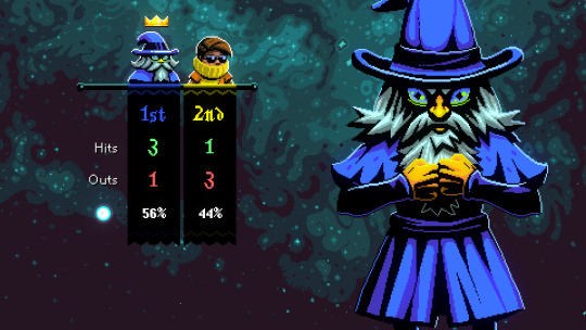
this is pretty neat. wand wars is a party game about being wizards shooting a magic orb at each other and the last one standing wins. this has to have far more staying power as a multiplayer game but, alas, i am by my lonesome. i didnt love the control scheme (does really feel like it wants to be a twin stick shooter and not something played on keyboard). also it really bugged me that the projectile wasnt pixellated when everything else was. wand wars kinda fits the niche of a good boutique board game IMO, fun to break out with nerd friends at some nerd gathering
Baldi's Basics Plus - $10

Included in Bundle for Ukraine
my commitment to the premise of this project being vastly outweighed by how much i dont actually want to play baldi's basics. i could have hit random again and nobody would be the wiser
so i guess my take is roughly that im in the exact nostalgia bait audience for baldi's basics (i played tons of these edutainment games in elementary school) but its specifically aping so much of its aesthetic and presentation from sonic's schoolhouse which i cant imagine had a widespread school computer lab adoption. if someone made a off-color video game inspired by Disney's Adventures in Typing with Timon & Pumbaa or smth that would probably actually get somewhere. for me. also i hate jumpscares and YOU DONT EVEN SOLVE MATH PROBLEMS IN THIS ONE???? WHATS THE POINT
this is not a good review for baldi's basics sorry. i like that the camera controls are vertically locked even tho the game makes a lot of other concessions for a modern audience. and there really is nothing else in its genre that looks like this
Valfaris - $24.99

i cannot for the life of me figure out why i own this game.
ok first things first the art direction in this fucks insanely. it feels like a ps1 game in a way many other ps1 throwbacks don't. i really enjoyed looking at valfaris.
however this controls like SHIT and not in a way that i think would be fixed by a controller. i spent a couple minutes rebinding my controls so it isnt arrow keys to move and q/w for main attacks (this randomly reset to default at some point so that was cool) and i was still fighting for my life to actually accomplish what the game wants me to. there's a segment only a few seconds into the first level where you need to climb on ropes over some evil dogs to cross a ledge but 1. the dogs can jump up and attack you and 2. you can only aim your gun straight down. and the dogs respawn infinitely so you cant jump into the dog pit, slaughter them all and continue on your way. i legitimately could not get past this section because the controls were so ass. really unfortunate.
also the game has "wishlist the sequel" as one of its three menu options which: lmao
Thou Shalt Be Brave - $1
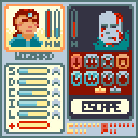
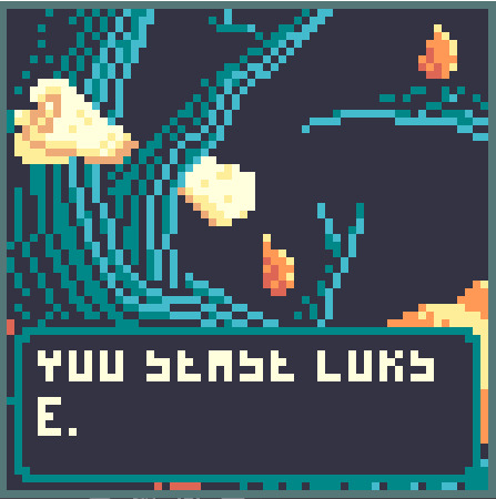
Included in Bundle for Racial Justice and Equality
this is a micro-rpg that is imo unfortunately hamstrung by its gimmick (the really small resolution). theres some really bad readability issues happening in this game. there is a manual on the itch page which helps a lot in combat but its really hard to excuse the "you sease lok s" message you see constantly.
this is pretty light on gameplay also but its generally a pretty fun timewaster. you explore the woods and fight guys and the ultimate goal appears to be maxing all your stats. i just wish i wasnt examining every button like it was a cryptic glyph to decipher
Planets Under Attack - $11.99
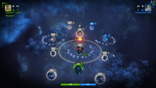
you know its bad when ive had this game on steam for over 10 years and have no idea what it is
i'm not sure how to describe planets under attack. it's a very minimalistic strategy game about spending resources to take over planets in each map. it seemed pretty chill but i did kinda feel like i was wasting my time playing it. the presentation is really competent and overall i think this is the strongest of the five games i played today
#random game roundup#wand wars#baldi's basics plus#valfaris#thou shalt be brave#planets under attack
2 notes
·
View notes
Text
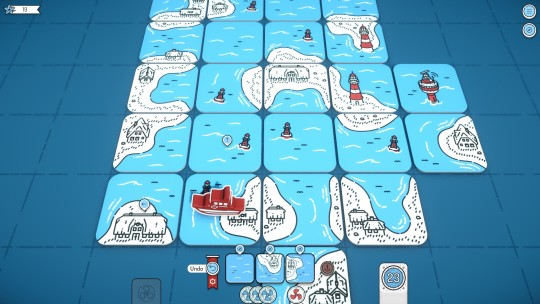
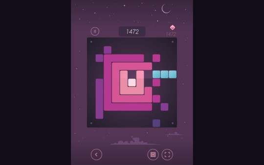
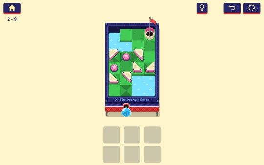

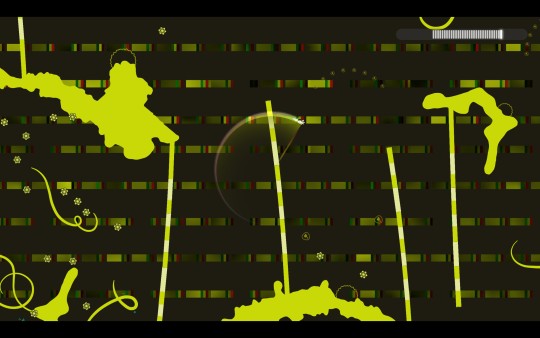


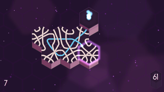
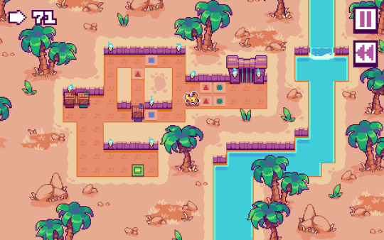
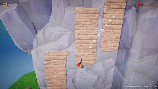
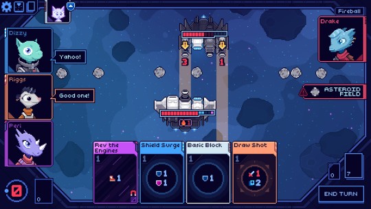
Steam Next Fest, fall 2023. I had time to play a good variety of game demos, and I picked out the ones that stood out the most to me this time around. Detailed thoughts and comments under the cut.
Beacon Patrol, Sky Settlers – The obligatory tile builders. Beacon Patrol plays like a variation on Carcassone; a bit more simplistic than its board game counterpart and I'd like to see more to it, but the idea of working together in multiplayer to set a high score is intriguing. Sky Settlers hews closer to Dorfromantik and ISLANDERS, and of the many games of that sort I've tried, it seems like one of the more fully realized ones. A lot of its ideas I've seen in other games and demos, but the ways they're used here feel pretty natural and fit together well.
Eklips, RETRIS, Oxytone – Arcade puzzle games, each of them putting a spin on an existing style of game: Oxytone places tiles to connect longer and longer winding paths, RETRIS plays like a somewhat warped version of Tetris, and Eklips drops blocks to fill out rows around a central square. There are some interesting ideas in each one, and good potential for them to be fleshed out a bit more.
Plungeroo, Oberty – More puzzle games. Plungeroo is a pinball-themed game about placing tiles and bumpers to make paths for pinballs to follow, with a charming variety of puzzles themed around different pinball tables. Oberty is a minimalist puzzle revolving around patterns and symmetry, and making different patterns out of the same base components. Both seem like the sort of game I might boot up, play a few levels, then a few more, then suddenly it's a day later and I've completed the entire game and am left wanting more.
Promenade, Pecker – A pair of games drawing inspiration from 3D platformers, in opposite directions. Promenade is a 2D platformer with a charming art style, and game mechanics somewhere on the spectrum between Klonoa or Mischief Makers (where the best way to get around is to grab enemies and vault over them) and Super Mario Odyssey (where each level is its own bite-sized collect-a-thon with challenges and objectives scattered throughout). Pecker takes a cue from Odyssey in a much more direct sense, in that it takes a specific power from a specific level and expands the core idea into an entire game based around it. Seems like both games could be refined into something fun.
PixelJunk Eden 2 – A floaty, psychadelic platformer. The gameplay is simple and satisfying, but takes a back seat to the audio-visual experience, which is overflowing with style. I'm not actually familiar with the PixelJunk series; I've seen the name around here and there, but never really looked into it myself. If Eden is anything to go by, I might have to rectify that.
Sandy's Great Escape – One last puzzle game, this one more sokoban-esque. A good pixel-art style, a good variety of mechanics that ramp up in complexity at a fair pace, and an incentive for optimal puzzle-solving (which might be a curse as much as a boon; I can tell that trying to 100% complete this game and get all the coins is the sort of thing that might drive me up a wall). The crab will have his day.
Cobalt Core – A roguelite deckbuilder. Of all the games I tried out this time around, this one was the standout. I was intrigued by the pixel art and music when it was first annouced (which also brought my attention to the devs' previous title, Sunshine Heavy Industries, which shares the same style and is a puzzle game that seems very much up my alley), and the gameplay did not disappoint. It clicked with me immediately, and puzzling my way through each different encounter was very satisfying. There's a lot of potential for different decks and encounters, so there should be a lot to dive into when the game releases. I'm looking forward to it.
#cobalt core#pixeljunk eden#beacon patrol game#plungeroo game#oberty game#eklips game#bryan writes about games
2 notes
·
View notes
Text
Dungeon Crawlers
Porklike I added since I do like it's style. I think this minimalistic art and it's aesthetic gives the game a different feel when playing. Personally I don't have much else to comment on about the gameplay itself but I did enjoy the art alone.
Pixel Dungeon was a very nice and classic looking dungeon crawler, I enjoyed the gameplay and art style a lot. The audio is decent too along with it's gameplay. Many people have also remade this game or built from the games concept which shows how popular and interesting it was to many people.
Labyrinth of Legendary Loot - The gameplay is quite fun and interesting to me since I don't really play turn based system games much, and the art seemed great. I think this game is a good one to include in this research as it adds to the diversity of the many types of the genre.
Folder dungeon was an interesting take on dungeon crawler games. I believe this games concept and aim was to show how simplistic dungeon crawlers could be to fit the general themes and concept of the genr. This game is immensely unique and all by just removing a few details. After trying it out I can confirm that even without lots of the meat in the games creation, having a lack of detail and mechanics never hurts the gameplay.
Similarly to folder dungeon, Agujero is a nice simplistic game in mechanics. I really enjoyed the art and also the use of many different unique characters makes the game a much more interesting and even personal experience. I like a game that allows the player to have more decisions and from that making them matter in the future is really cool and fun. I also do like the dialogue too, giving the game a little more entertainment.
0 notes
Text
12 Detective Beebo Fun facts
there´s probably more but here's some
1.

When Beebo goes to open the doorknob, you can see his reflection 5 times. That's the amount of loops he will go through.
2. Also, those particular pictures were drawn in 2019. Including others that were not shown

Like this design of 2019 Beebo
3.
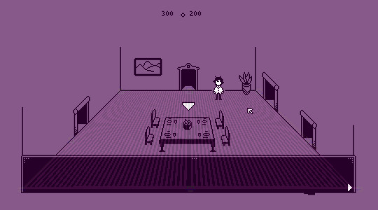
The reason i never made another pixelated room is because I drew the furniture using a weird perspective, so I needed guiding lines, and it was a complete drag to do, so I never did it again. Probably won't do it for the game either, too tedious.
4.

This one drawing of the first loop has Ángel separated from Vivi and Beebo through the framing of the window. Foreshadowing whooo
5.

The original sprites used to be longer.
You can also see 2 other characters that were taken out, the doctor girl and the jacket guy. The jacket guy became a modified version of Coli, and the doctor girl just disappeared for the sin of being a borderline self insert. Lmao.
Also! Ángel was gonna have light grey hair, but after actually drawing it I didn't like it so it went to dark gray
Here's the tinified sprites
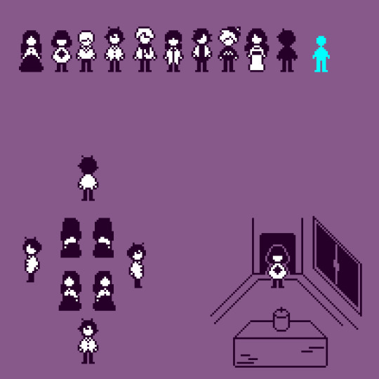
6.

Heres some planning for the looks of the game from 2019. I like it honestly, its 2.5d, looks like a pop-up book. It just needs some work with the perspective.
7. The original design for beebo (silly triangle hat guy) was supposed to be a comedy character for a nonsensical game like jazzpunk. I even made a very bad 3d model for it.
That is also where "he has anime eyes" came from
I used to draw him all over my school notebooks just being silly, like going down the stairs head first.

8. There were many ideas on how things were gonna go. From vampires to weird magic systems to sci-fi. The thing that was gonna stay was the tíme loop, was would vary was the reason
9.

A lot of the time, Beebo talks about his fear of big houses and feelings of being trapped. I'm actually surprised that aspect got so unnoticed in theory crafting
10. Nina's dress changes color in every post, thats because I never saved it, and just guessed it everytime I colored it.
Speaking of colors, Most of the colors used in this comic are from the same palette as Character Pattern, another one of my games.
Also speaking of colors, I planned all characters to have a very minimalistic color palette for the monochrome sprite work, this caused me to mistake Vivis dress as red and her jacket as white, when originally her dress was black and her jacket was red. whoops.
11. The constant references to the cold are not just for the fact that its, indeed, cold. Its also beacuse most of the time everyone dies with heavy blood loss, which makes someone feel very cold
12. The pictures for the spooky Haunted house explanation look pretty normal without the heavy editing
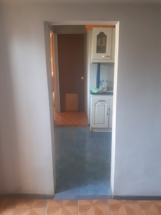
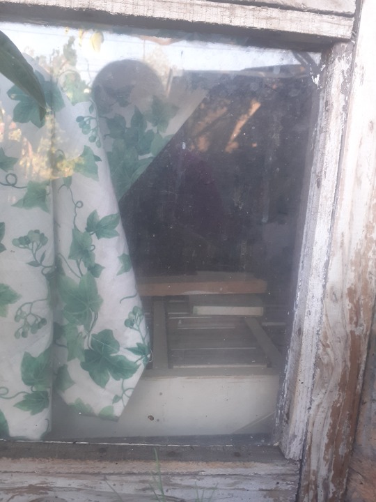
They required a lot of shadows to make it less incredibly bright
except for this one

this one just looked like that. spooky.
I also had a cool picture of a shadow (me) in the mirror of a dark bathroom, sadly it wasnt dark enough because you could very clearly see the toilet paper. It got erased.
38 notes
·
View notes
Text

I finished Flashback!!
OK so it seems like when people talk about cinematic platformers, the two games they always trace them back to are Another World and Flashback. It's hard to find one mentioned without the other, and they seem to be implied to be very similar. But I actually found them to be really different from each other!
Similarities
They do have some things in common. They both have a pixelated but surprisingly realistic rotoscoped cool dude with a gun. They both have a combination of action and puzzles, although I would say Another World leans toward the puzzles and Flashback leans toward the action. They're both sci-fi with escape themes, and an open but hopeful ending. And of course, they were both put out by the same game company, Delphine.
Minimalism vs. More Interface Stuff
But the gameplay felt quite different to me. Another World took the minimalist approach of just a couple basic controls, and no inventory, dialogue, or HUD at all. Flashback had a lot more moves the character could do, which required a bit more learning, but so were so cool and beautifully animated to be worth it. It also had a simple inventory, occasional dialogue, and apparently a score (which I didn't pay attention to at all). But the thing that made the most difference in gameplay was the presence of shield charges, which essentially functioned as a health meter. In other words, you could take multiple hits before death, in stark contrast to Another World's instadeath system.
Instadeath vs. Health Meter
I might write another post later about why instadeath and trial-and-error don't bother me the way they seem to bother a lot of players. But for now, I'll just note that instadeath seems to pair well with puzzles, whereas a health meter seems to pair well with action. Personally, I'm more of a puzzle fan, but when I saw those shield charges, I knew there were going to be more action sequences that I would have to drill until I could pass them with minimal hits (rather than the main challenge being to figure out what to do).
Action/Combat
Which leads me to another point: Flashback is HARD. I initially started the game on easy mode only because I wanted the full rewind capability, but right at the beginning I got disappointed when I realized that easy mode actually erases a lot of the enemies entirely. I wanted the full experience, so I started over in normal mode, and played that way through the first and second stages. However, once I got to the third stage, the enemy combat sequences got so hard, and the save points far enough apart, that I knew I was going to have to drill the same sections for hours if I was going to beat them. While some people love that, I frankly don't find it fun. I got frustrated enough that I started the game over again so I could switch back to easy mode, and I had to replay stages one and two, but I knew that was the only way I would have the patience to get through the rest of the game. And even on easy mode, there were some sequences in the last stages of the game that I had to drill to the point of being bored with them in order to beat. (Of course, this is a matter of preference. A player who enjoys tough action sequences and perfecting their timing skills would probably love this stuff.)
Platforming Style
Also, a lot more of Flashback felt like standard platforming to me: recurring enemies and familiar challenges rearranged in different patterns. Another World, on the other hand, felt like almost the whole game was comprised of interactive setpieces and unique situations. The "cinematic" nature of Another World was woven throughout the gameplay, whereas in Flashback it felt like it was mostly confined to cutscenes and a few occasional setpieces. (Well, except for the second stage. The second stage incorporated the most story and character interaction, and was easily the most fun, in my opinion.)
OK, I'm done complaining now! If it's starting to sound like I hated Flashback, that's actually not true at all! I just didn't love it as much as Another World. That being said, there was a lot I liked about this game, the main thing being:
The VIBE!!!
The 80s-90s neon techno futuristic over-the-top sci-fi vibe was just . . . so perfect. The whole opening sequence with ray guns and a space jet-ski. The message recorded via holograph for no apparent reason. The cyberpunk moon base city. The slime blob alien planet. The casual teleportation. The explosions. The MUSIC.
Music
And that's another contrast I must point out: Another World had hardly any music. It had ambient sounds that were so well done and added to the immersion so effectively, and that was one of the things I loved about it. Flashback, on the other hand, I loved for not only having great old sci-fi music but for using it so blatantly. Pull out your gun? Hear sneaky gun music! Look at your map? Hear snazzy map music! See a cutscene? Hear awesome cutscene music! Maybe it's just because it was made in 1992, but this game is so self-aware of its own coolness that it doesn't even try to be subtle about it, and the result is delightful. Even picking up an object gives you a classic ta-da sound (which starts to get hilarious once you acquire an object that you can set down and pick back up at will).
I need a Flashback movie
Another thing I'd like to mention is that I would really love to see this game made into a movie. It definitely has a story, although we only get the bare bones of it through a handful of cutscenes, without much in the way of character development. But what story there is is quite fun (although didn't always make total sense, but that could be easily remedied with a bit of writing). I would love to see it fleshed out. All the classic sci-fi stuff is tied together with the classic drama of captures and escapes, old friends, imposters, amnesia, death games, and a secret mission to literally save the human race. If it were taken too seriously it would spoil it, but a Flashback movie made in awareness of its tropey retro-futuristic fun factor would be an absolute blast.
In summary:
Flashback. Vibe: excellent. Character animations: excellent. Story: fun, but I want more of it. Gameplay: in my opinion just ok, but if you're more action-oriented than I am you'll probably love it.
Up next on my to-play list is Full Void, a new but classic-inspired game from just last year. It looks like it's gonna be great in a lot of ways and I'm super excited to play it!
1 note
·
View note
Text
Transition from Float to Real.
For the first transition I used the Glow effect to and turned up the intensity and width of the glow to make it consume the subject. I then used Displacer Pro to create a melting effect. To make it glitch and be pixelated I used AE Pixel Sorter and played around with the settings until it was to my liking.

This section was heavily inspired by the franchise of Cyberpunk 2077, in particular the anime Cyberpunk Edgerunners. In certain portions of the show, some of the characters enter "cyberspace", a place in which the environment is very minimalistic in nature, mainly a black void with certain pixelated shapes floating around.

I wanted to create a similar environment as I felt that it suited the theme I already had.
To make it transition into "Real" I used this video of a light leak, changed the colour of it and played around with the opacity until they blended well together.
The audio used for the void section is also taken from the game.
0 notes
Text
what is the last fish in tiny fishing?
what is the last fish in tiny fishing?

As of my last knowledge update in January 2022, I don't have specific information about the very latest additions or the last fish available in "Tiny Fishing." Mobile games like "Tiny Fishing" often undergo updates, introducing new content, features, and additional fish species to keep the gameplay fresh and engaging for players. To find information about the most recent updates and the last fish added to the game, it is recommended to check the official app store page, the developer's website, or any in-game announcements for the latest details.
"Tiny Fishing" is known for its simple yet addictive gameplay, offering players a pixelated, minimalist setting where they can enjoy the relaxing activity of virtual fishing. The game typically features a variety of colorful pixel art fish, each presenting its own unique challenges in terms of catching them. The objective is to collect as many different fish species as possible, progressing through various locations and unlocking new content along the way.
The last fish in "Tiny Fishing" could be a special and rare species, often requiring players to reach advanced levels or fulfill specific in-game conditions to encounter and catch it. Mobile fishing games commonly employ a progressive unlocking system, introducing new fish species as players explore different areas or achieve milestones in their virtual fishing journey.
In these games, the thrill often lies in the pursuit of rare and elusive fish. Such species may have distinct characteristics, requiring players to adapt their fishing techniques, use specific bait, or even demonstrate a high level of skill to successfully catch them. As players progress, they might unlock new fishing gear and equipment, adding an element of strategy to the game.
To enhance the gaming experience, developers frequently introduce updates that include not only new fish but also additional features, challenges, and customization options. Players may find themselves immersed in a world of quests, competitions, and social interactions with friends who are also part of the virtual angling community.
Given the dynamic nature of mobile games, especially those with ongoing updates and improvements, the last fish in "Tiny Fishing" at the time of your inquiry might be part of a recent update. Therefore, checking the official channels provided by the game's developer is the best way to access accurate and up-to-date information regarding the latest content, including the last fish added to the game.
#tiny#tiny fish#fish tiny#fishing#what is the last tiny fish in fishing#tiny fish in fishing#tiny fishing
0 notes
Text
HP Omen 27qs 240 Hz Gaming Monitor: Great Value & Results

Two gaming monitor value options exist. Some low-cost displays sacrifice features. The second kind sacrifices nothing and delivers 98% of premium screen performance for 30% of the cost. That category has many 27-inch QHD panels.
HP’s Omen display series offers good gaming performance, accurate and saturated color, and sturdy build quality for the price. My test product is the 27qs, a sweet spot product. The 27-inch IPS QHD monitor has 240 Hz, Adaptive-Sync, HDR, and wide gamut. Let’s look.
The Omen 27qs has a QHD (2560×1440) IPS panel. Ideal pixel density is 109ppi. It’s ideal because it produces sharp images with less processing than 4K’s 8.3 million pixels.
HP’s Adaptive-Sync and front-mounted G-Sync badge indicate Nvidia certification for premium video processing. You also get an effective backlight strobe (MPRT), that almost eliminates the phasing artifact on many other monitors. It’s a good alternative to Adaptive-Sync and works up to 240 Hz on the Omen 27qs. Multiple artifact-free options and smooth motion resolution make the overdrive well-implemented.
Very accurate color and a wide gamut mode that covers 90% of DCI-P3 ensure picture quality. VESA DisplayHDR 400 supports HDR10. My tests showed over 500 nits peak with a nice bump from 9,000:1 thanks to eight-zone edge dimming.
Standard gaming features include aiming points, timers, frame rate counters, and alignment marks. An LED ring in the back plays different colors and effects for light shows. HP’s sturdy chassis is built for long-term use.
Accessories and Assembly
HP Omen 27qs packaging is mostly plastic-free and foam-free. A few Teflon bits prevent scratching on molded cardboard pulp. A captive bolt connects the base and upright, and the panel snaps on. Fasteners and a 100mm VESA pattern are protected by a plastic shroud. The bundle includes high-quality USB and DisplayPort cables and IEC power for the internal supply. A metal VESA mount adapter is included.
No sharp corners or molded trim lines define the Omen 27qs’s sleek design. The white Omen logo is the only decoration on the front. An oversized version with a smooth taper is on the back. HP’s diamond motif appears on the LED ring, square base, and tiny white power LED.
The minimalist stand is sturdy enough to prevent wobbling. Ergonomics include 3.9-inch height adjustment and 5/20-degree tilt. Despite not swiveling, the base pivots as a unit on the desktop, allowing for unlimited swivel adjustment. Also included is a 90-degree portrait mode. Using a snap-on clip keeps cables tidy.
The usual up-and-under input panel has two HDMI 2.0 and one DisplayPort 1.4. The latter supports 55-240 Hz FreeSync and G-Sync. USB 3.2 has one upstream and two downstream ports. Plug headphones into the 3.5mm jack or use the three-watt internal speakers, which sound better than most. Their frequency range is wide and they play loudly without distortion.
OSD Features
The HP Omen 27qs uses nav pad keys with four directionals and a central selector instead of a joystick. Separate button toggles power. A quick menu opens with any key press, and the full OSD appears with a second select button press.
The Omen 27qs OSD has another diamond in the top left corner. Gaming has all video processing options. You get a five-level overdrive without trail artifacts until level four. MPRT, the backlight strobe, has five pulse widths. High settings reduce blur but reduce light output. Four was my test level. Level five is dark and best used in a dark room. Aiming point, frame rate indicator, and timer are available.
The rear LED ring can play three moving effects or be static. Variable breathing speed, and Random Color changes hue every five seconds to an hour. You can also turn off or adjust all effects’ brightness over 10 steps.
In the Image menu, you can enable dynamic contrast for SDR content that uses field dimming to reach 5,000:1. In HDR mode, the screen’s bottom backlight array dims eight vertical zones.
HP’s picture modes are unique and thoughtful. All eight Omen 27qs presets can be calibrated with RGB sliders. A gamma control is the only thing missing. Standard is the default and nearly matches the sRGB gamut, 2.2 gamma, and 6500K color temp. Native provides wide gamut SDR color. It needs calibration but looks great afterward.
The Audio menu has Voice, Music, and Video modes. Each is unique and favors different frequencies. You can assign the four directional buttons to quickly access color mode, brightness, and more in the Menu section.
HP Omen 27qs Calibration
To use sRGB color for SDR content, leave the Omen 27qs in Standard mode. No calibration or adjustments are needed. It matches grayscale, gamma, and color. Choose Native for SDR wide gamut color. It needs tweaking due to its slight blue tint. Auto-switching HDR signals gray out all picture controls. Its edge zone dimming and color accuracy give it over 9,000:1 contrast.
Game and Hands-on
The best thing about 27-inch QHD gaming monitors is that they do everything well yet are affordable. You can increase resolution by buying a more expensive display and video card and sacrificing frame rates. Higher speed requires sacrificing pixel density and paying more for 360 or 500 Hz.
It was ideal for a single daily monitor. Though measured average color gamut volume, high accuracy made using the wide gamut for SDR enjoyable. The pixel-free image is sharp. A density of 109ppi delivers most of Ultra HD’s clarity and allows higher gaming frame rates.
Doom Eternal was hard to leave due to the Omen 27qs’ premium feel and response. Virtually no input lag and super-fast panel response. Overdrive was perfectly tuned to eliminate motion blur. We could use the backlight strobe instead of Adaptive-Sync without penalty. A GeForce RTX 4090 video card locked frame rates at 240fps, preventing tearing. MPRT works without obvious phasing. Level 3 balanced light output and motion resolution. To offset narrow pulse widths, overhead brightness is ample.
Audio quality from the Omen 27qs impressed me. This is exceptionally clear and full. Quality op-amps allowed me to crank the volume past a comfortable level without distortion
Takeaway: The Omen 27qs offers great value with premium gaming and everyday usability. Its vibrant image is perfect for work or play. It can satisfy casual and professional gamers with its excellent video processing and low input lag.
Read more on Govindhtech.com
0 notes