#arts3372
Explore tagged Tumblr posts
Visit Tumblr Blog
Explore Tumblr blogs with no restrictions, modern design and the best experience.
Last Seen Tumblr Blogs


Fun Fact
The “We are the 99%” Tumblr blog became the slogan for the Occupy Wall Street movement.
Text
Artist Statement
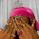
At the beginning of the semester, I had an idea to have my final portfolio to have a fashion magazine feel with bright colors and funky outfit choices. Sadly, the coronavirus made it difficult for me to shoot. Luckily my friend and I have both been social distancing and she was down to shoot some photos in her cute apartment. My friend Paige helped with creating a cute color palette focusing on the colors green, pink, and blue mostly. I was inspired by her living room with very interesting features and with green painted flooring and a bookshelf full of different vases she thrifted.
The overall theme I wanted to portray was a day in the life of quarantine with a fashion magazine look. So I composed this series to start with her waking up and trying to find something cute and dance in the living room, read magazines and go on a picnic. I saw this trend where photographers put cling wrap over the lens and dab vaseline on the edges like a vignette border. Although some came out too blurry we came up with a couple of good ones with a dreamy hazy look. After shooting for a while, I wanted the colors to have a grainy and vintage feel to them to keep the images consistent with each other. I think natural lighting is the best lighting for the style I was going for so we used the windows in the rooms to help with soft lighting. For the outdoor photos, we had used the shade from the tree to prevent harsh shadows on her face. The images I have taken for this project has helped me learn the importance of color in photography and the techniques I used I learned throughout the semester.
1 note
·
View note
Photo


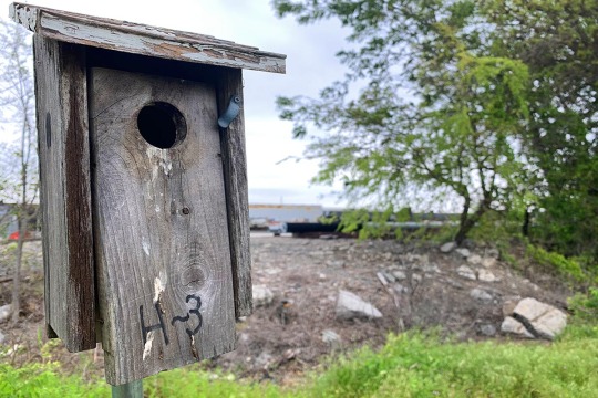
This collection is titled “Containment and Control”. Being stuck in my house the past few months has made me think a lot about the spaces we live in. Specifically, I’ve been thinking a lot about how much control we each have over our environment, and the limitations of that control. It seems obvious in light of the current pandemic that humans are affected by their environment just as much as other animals, and that even with our modern technology there are some aspects we cannot control. So, for my collection, I decided to focus on the ways in which we shape our home environments and the ways that our environment affects us.
Following this theme, most of my pieces focus on shelving or containers. Conceptually, we can understand furniture to be a way for homeowners to express their desires onto their environment. Of all furniture, shelves and containers allow for greater expression still; they give us structure, they allow us to organize seemingly disconnected objects and bring them together to create a greater meaning. Of course, humans cannot control everything in their environment, and to draw attention to that I used a few shots of nature viewed through windows. Symbolically, these photographs represent a desire for unrestricted movement and a tacit acceptance that for now these outdoor spaces are partially locked away.
My process to create these images was mostly an observational one. I spent a lot of time trying to get the framing right for different containers and shelves around my house. I staged a few of the objects in some of my photos, but largely the photos are in a documentary style with minimal changes to the environment. The greatest challenge with these was trying to get the lighting to play nice. It was difficult to get enough light to take pictures inside my house, and all of the indoor photos I took required me to use my tripod as I had to have a slow shutter speed to get the exposure right.
0 notes
Photo


Human Geography: The Body as Home
The human body is a point of infinite fascination to me. As my body changes day-to-day, year-to-year, so too does my personhood. This vessel which travels with me through life is never the same and has weather unkindness and tenderness from myself and others. I rest heavy in her, an oak with roots that run from head to toe, speaking joy and sorrow and everything in between.
Of late, I’ve been feeling quite at home in my body. The days spent alone and isolated run by, each blending into the other. In the uncertainty of pandemic life, my body rests heavy when I rests, and it delights in movement when I move. Grounding and centering myself in my body has been a centering and calming practice through the tumult of pandemic life.
I wanted to honor and exalt this body I inhabit through a series of photographs in which I use light and composition to abstract my body to the point of seeming like alien geography. I didn’t want to lose the focus entirely and so chose to include signals that cue familiarity within the photographs. These small details help forge a connection between recognition, abstraction, containment, and freedom.
Using different color light bulbs and two lamps, I played with various combinations of red, blue, orange, and green. Twisting and contorting, sometimes using a shutter on a short lead, sometimes holding the camera myself, I relied heavily on a shallow depth of field and a shutter speed just a little too fast for the lighting to achieve moody dark shots. While this process was certainly entertaining, it wasn’t without its frustrations. Arriving at a good balance of light and dark was challenging, as was getting the focus and composition just right in order to convey familiarity in a strange way.
0 notes
Photo


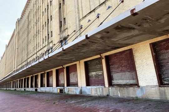


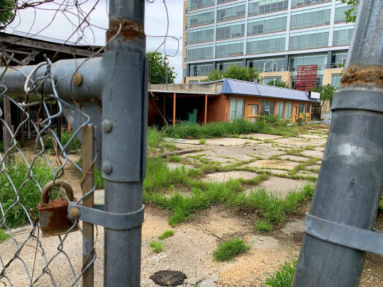


Rise and fall, death, and rebirth these truths are the critical characteristics of life. For each one of us, how we approach this unmistakable state is often reflected deeply in the pathos of our lives. If one is afraid of death, one might be meek and shy, and if one is fearless, then they might be confident and proud. Whatever type of person you are, you will be remembered by how you live your life. It is often the fate of great people to be recognized by what they built, and if fact, what is left behind is often the only thing that remains of the people that made them. The pyramids if Giza, the Easter Island heads, and of course, Stonehenge. These works are world-famous and for a good reason, but it is my opinion that significant meaning and purpose also lay lie in our modern decaying world. In our cities, dead streets paint the stories of our culture, and abandoned buildings are the monuments to more prosperous times.
My photographs capture the texture of these echoes of life from underneath the decay of my modern city. Photographed exclusively within the City of Fort Worth, Texas, my photos document the urban decay through the lens of color because nothing is truly ever gone. From an abandoned parking lot to a decaying marketplace, the power of digital editing has allowed me to bring back the colors of these buildings and areas. That being said, not all had color, to begin with, showing that in some places such as railways, perhaps there was never life, to start with. For many inner-city shots, the brickwork of the buildings draws on feelings of warm dirty colors and the strength or repeating patterns. Complementing the colors, both line and perspective are used to draw the viewer into the photograph, be it a broking chain link fence or a distinct pattern of hand-laid brick. To best capture that state of every subject, natural light was purposely explicitly used on cloudy days to contrast the idea of rot with the warm feelings of life.
I believe that the past has every lesson needed to build a brighter, healthier future. To achieve this, examining the decay of the yesteryear is a necessity. So venture out and explore the forgotten worlds around you, and maybe you’ll discover histories and stories you never knew were possible.
-Tyler C
0 notes
Text
Art Event Response
The first museum I took a tour of was the Griffin. They had a lot of interesting shots from a variety of styles. There were botanical close-ups, documentary style photographs of people and architecture, photo collages of different buildings, and more. One photo in particular that I liked was a surrealist photograph of a rollercoaster on top of the ocean. I like how the roller coaster cuts up the negative space of the photo. I also like how the black of the track mirrors the black of the rocky coast next to it. Similarly, the color of the sky is similar to that of the ocean, and it gives the whole piece a sense of symmetry that’s broken by the rollercoaster.

The Second museum I took a tour of was Fotofest and their exhibit The Pleasure of Unintended Consequences. The exhibit featured the work of 3 artists, Pablo Gimenez Zapiola, Anderson Wangle and Martin Amorous. The exhibit was about happy accidents in the creative process that serve as inspirations for a body of work. This piece by Pablo Gimenez Zapiola is part of his “Night Tree” series. These are photos taken at night by shining a flashlight up into the trees. I really like this piece because I love how the trees sort of fade into the background, it makes them look like they’re growing from the edges of the photograph. I love how the flashlight hitting the trees creates this implied circle in the center of the piece. I love the shapes the trees carve out in the negative space of this piece, I think the shapes they make are really interesting. I also love how this is just different from anything I’ve seen before. The novelty of it enhances its appeal, though by saying that I don’t mean to take away from the compositions themselves which are quite good.

The final museum I took a tour of was the Brooklyn Museum. I had trouble finding photographs at the brooklyn museum, but I found some rather high quality ones in their exhibit entitled Two Dutch Houses: Meet the Schenks. The exhibit is about the reproduction of 2 houses that have existed in Brooklyn for centuries, and it contains some brilliant photographs of their interiors and exteriors. My personal favorite of which being this one. I really like the color scheme in this photo. The pastel blue and the white work well together to create a soft feeling. The blue is accented by the orange-brown wood, which complements it nicely. We also have dark brown in the form of the chair, door handle, and grandfather clock. I really like the symmetry of this photograph, and I like how the door is placed in the dead center. It creates a division of space that I find rather pleasant. I love how the pastel blue and white are found throughout the piece, I think it does a great job of making the piece visually cohesive.

Between the three museums I visited, I think Fotofest was my favorite. I liked all the artists’ work there and, in my opinion, it was the easiest one to navigate and get the full experience. I felt like the work in the Griffin was good, but the google street view made it difficult to navigate the space and view the photos. I liked the Brooklyn museum and the architectural photos I found, but it took some time to find any photographs at all on their site, so for my purposes it wasn’t ideal. I also just think that the work from Fotofest was my favorite work between the three.
0 notes