#apdo703
Explore tagged Tumblr posts
Photo
1. First and Last Name:
Eric Gurevich
2. Nickname:
Eric
3. Location:
Bucks County, PA
4. Major or area of study:
Pharmaceutical Sciences
5. 2 interesting facts about you:
My parents immigrated from Ukraine and I can speak Russian near fluently. I was born here however, so my English is far better.
Even though my major revolves around science, I tend to love the arts and liberal arts. I’ve played piano for around a decade and I enjoy composing jazzy electronic music in my spare time.
6. Why are you taking this class?:
I had some scheduling problems and ended up with a lack of credits for the semester, so with the add/drop end-date looming on the horizon, I found this course that suited my interests in visual arts and decided that it was perfect!
7. What do you think is the purpose of self-portraits?:
Self-portraits are a sort of reflection into one’s existence in the most socially apparent and external manner. How you see yourself versus how others see you is a fundamental question that we must all address and a self-portrait bridges that gap. A self-portrait can say something deep about one’s personality or it can just be an appreciation for one’s aesthetics. Often times it’s a mix of both and is an extremely personal way to create visual art.
8. What creative choices led to your self-portrait?:
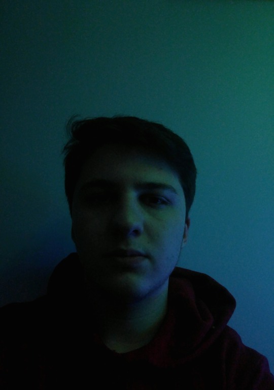
For my self-portrait, I wanted to do something minimalistic and aesthetic, with a fairly empty background and a focus on the interplay between light and shadow. Luckily, I had some cool lights that changed colors, so I turned off the room lights and illuminated myself only with these blue lights that gave out a nice, moody glow. Thus, by playing with the exposure and brightness/contrast, one half of my face is illuminated in the blue glow and the other is darker which I think is a neat effect, not necessarily for any deep, underlying meaning, but more so for the atmosphere.
0 notes
Photo




1. Assignment 5
2. Eric Gurevich
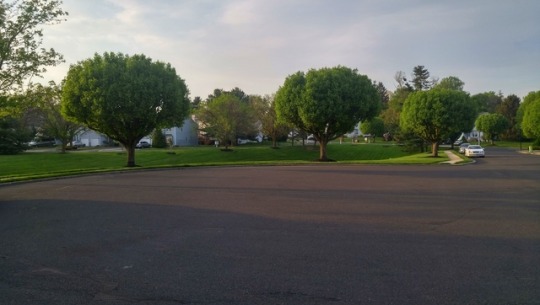
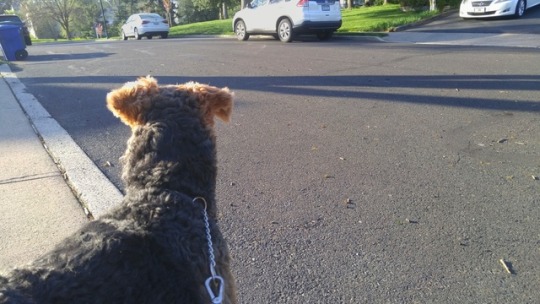
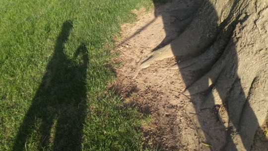
3. For my story, I wanted to do something very simple that was an important part of my life, and that of course would be my daily dog walks. The story starts out with the first part of every walk, getting my dog’s attention with his leash. Then, establishing the setting with some nature shots and a point of view from the dog. Part of the story is a shadow of myself with my dog which depicts an emotional relationship. Then, the dog’s exploration of nature is depicted, finally ending with us going home, which is a bittersweet ending.
4. The time of day during these photographs was around sunset which allowed for some very beautiful outdoor colors. I tried to mix close up (including a few macro) shots with wide angle shots in order to get a mix of details and overall setting. Several of the pictures use the rule of thirds to structure them. In the first picture of the leash, I use a depth of field effect to create an interesting aesthetic. A few images were edited to emphasize the colors and white balance.
5. The challenging part was creating an interesting sequence of images that flowed coherently out of my day to day life. Nonetheless, I found that you could highlight a mundane part of your life in an interesting way.
6. Movies and animation are similar to photographic narratives in the sequence of scenes, but the fact that movies are seamless means that a lot more detail is put into each scene and there tends to be more connecting information between each scene rather than a somewhat disjointed narrative in some photographic sequences. A photographic narrative is a lot like a storyboard, but movies expand on their storyboards to fill in more information like panning, zooming, etc. Furthermore, a movie can display a scene where the camera focuses on one subject for a length of time, as long as the subject does something interesting, but with a photographic narrative, focusing on one subject for too long tends to get repetitive quickly.
7. The argument seems to center around the fact that a single image cannot be used to tell a story because there is simply not enough context to determine what is going on without background information. I would agree with this. Photographs depict an ephemeral image that can only be analyzed as an instantaneous point in time. However, a series of photographs can certainly tell a story given they follow a fundamental framework that includes background context and some sequence of events. In this way, several singular moments are strung together to tell a story in a way that emphasizes distinct moments.
2 notes
·
View notes
Photo


1. 4
2. Alexa Ciero
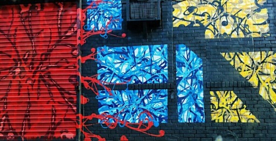
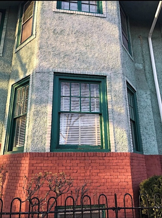
3. For this assignment I wanted to make sure my final images did not have any distractions in front of or behind my subjects. I didn’t want there to be anything else in the photograph to take away from the color relationship I was capturing. My two strategies to fulfill these goals were to make sure I was close enough to my subject when necessary and to make sure I had a clean background. In order to get the vibrant colors I wanted, I ensured I took the photos when the sun was out or when I had artificial lighting on.
4. My favorite color relationship was more than three colors. We are surrounded by this color relationship in everyday life, so I enjoyed getting to pick and choose which images described my current mood. For example, since I am anticipating spring weather I chose to incorporate a colorful Easter egg decoration.
5. The most challenging color relationship for me was monochromatic. My goal was to find subjects to photograph that were one color yet still vibrant and detailed. I found myself arranging the subjects because I could not find great examples in everyday life.
6. After reading Chris Ziegler’s argument I would have to disagree with him. I don’t think that filters on Instagram “damage” images. I think filters can help enhance an image and sometimes give it more of an emotion appeal. Ziegler says filters rob your image of its realness, which he thinks is negative. However, I think because of the “realness being robbed” filters can give your image a whole new meaning. This can be positive because it can help you tell the story you want to convey through your filtered image.
7. After reading Dieter Bohn’s argument, I agree with him that Smartphone users are not trying to create “accurate” images. Smartphone users do not care about accuracy because they are worried about “likes” and “follows”. Today, it seems to be more important to the general public to upload a photo that is visually appealing to their specific audience rather than if it is entirely “accurate” or not. However, I do not think that is always negative. I also agree with Bohn that “no image is ever accurate” anyway. Second, I disagree that the images should not be taken as “historical” record. This is because the image still represents a specific point in time and it can also showcase the type of editing skills photography used in that given time period.
8. I was surprised by this study’s results because I do not think filters can detect a person’s current mental state. Filters or manipulation of an image’s color can alter the mood of an image to the audience, but I do not think it reflects the mood of the person who posted it. For example, if the image is more vibrant and saturated it can portray a brighter and happier vibe to the person viewing it. On the other hand, if the image is dark and dull it may portray a more serious or gloomy vibe. However, I don’t think the filters can reveal what the photographer’s mental state is. Instead, the filters may reveal what the photographer thinks is visually appealing or an emotion they are feeling in that specific moment. For example, I do not have depression yet my favorite type of photography is black and white. My preference is based on what I find appealing and has nothing to do with my mood. I could be happy or sad and still be intrigued by black and white images. Therefore, I do not think this study is accurate.
3 notes
·
View notes
Photo


1. Assignment 4
2. Eric Gurevich
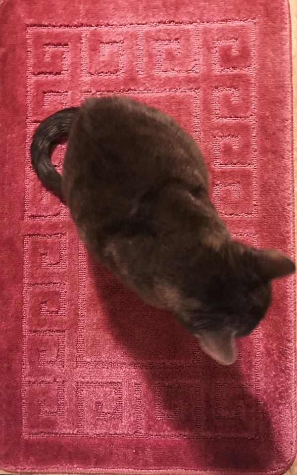
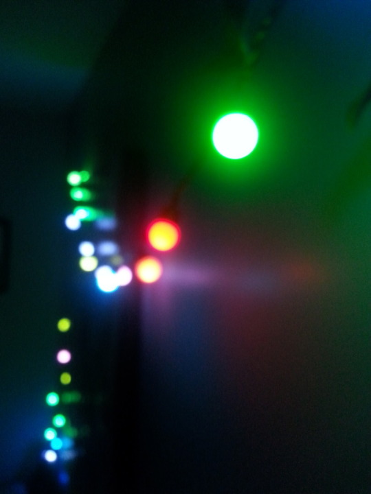
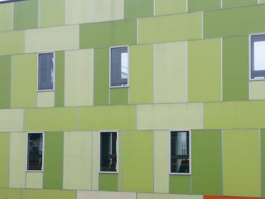
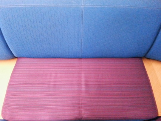
3. Color can completely change the context and atmosphere of a photograph so for this assignment, it was important for me to pay attention to what colors appeared in my images and if they were the ones I intended, whether they reflected reality or not. This also affected whether I would prefer to change them a bit through an editing application to better fit my intentions. For most of the images, I bumped up the saturation a touch and brightness/contrast, just to get the color across better. Some images, like the monochromatic building, were cropped to focus in on one or two colors. The first image was taken at a close distance with a really neat bokeh effect that highlighted the polychromatic lights.The image with the bottles has two different colored bottles that let the natural light through to create a neat filter effect of the kitchen. The bottles also warped the image like a lens. The image of my dog highlights how he matches the couch and curtains, creating an overall monochromatic effect. Finally, the image of the seat was taken at Temple and demonstrates primary colors really well, with the beautiful shades of off-blue and off-red with a centered composition.
4. I really liked finding dichromatic images because the subject was usually very simple but with interesting cropping and color editing, I could get a colorful and compositionally pleasing final image. I think dichromatic color relationships tend to work really well to highlight a particular aesthetic quality of a subject.
5. Finding monochromatic subjects that were actually interesting to look at was somewhat challenging as the majority of monochromatic scenes I saw were shades of gray and white.
6. The author certainly has a point that filters produce a sort of faux-artistic image that may look more interesting than the source material but without any real thought or intention behind it, thereby compromising the original source material. I tend to agree with this somewhat, as I feel manipulating an image to be specifically more aesthetically pleasing requires thought and effort and cannot just be edited with a preset filter. If you’re not an artist, why try to make your photography less realistic? On the other hand, if done tastefully and in the correct context, even a preset Instagram filter can look really nice, so really it is up to the photographer to choose the right time and place to use a certain filter or leave their photograph as it is.
7. I think I agree for the most part that images are not intended to be a source of history in the current Instagram, everyone-has-a-cellphone era. The reality is that billions of photographs are taken each year and to sort through each of them for every one of your friends and relatives, attempting to study important moments of their life, is an impossible task. Modern photography is better savored in the moment, perhaps even once and never looked at again. The problem is that there are already so many beautiful images that attempting to create an original one to be interesting enough to last in peoples’ memories is difficult. Therefore, Instagram photography is more of a social exercise than a historical one.
8. The question is, whether the photographer works to create a photograph with colors that reflect reality or reflect their desires or mood. Perhaps, even just by choosing a scene with particular lighting or colors, this decision reflects the photographer’s mental state. In fact, I read somewhere that depressed people see colors as less bright in real life. I would agree that colors are the most important tool to the atmosphere of an image, and what the photographer wants to convey. Maybe the color temperature and saturation can indicate the photographer’s mood but perhaps the photographer just likes certain colors and aesthetic choices.
2 notes
·
View notes
Photo

1. Assignment 3
2. Eric Gurevich
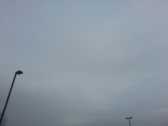
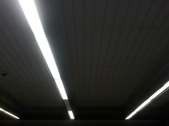
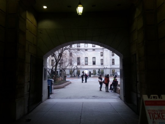
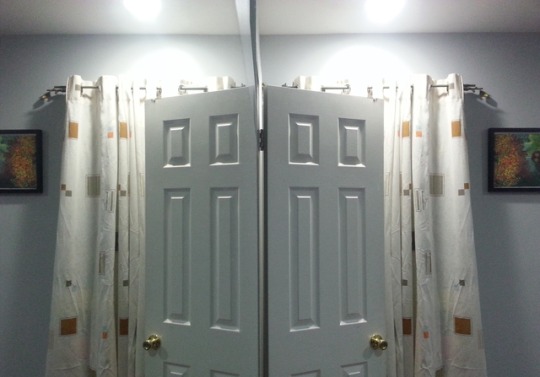
3. Beyond the typical choices of subject, color, etc., I specifically focused on composition. How photographs draw the eye to certain points and the relation between elements in a picture, whether the foreground or background. The picture of the plant represents the rule of thirds with the plant occupying a third of the image and nature in the background. This picture has a shallow depth of field to bring attention to this composition. It is also somewhat grainy which although not initially intentional, turned out to be pretty. The picture of the light-posts demonstrates the rule of tenths where the effect is a very moody, dramatic picture due to all the empty space in the sky. The picture of ceiling lights has not one, but three dynamic diagonals! And they all intersect at different angles, which working with the contrast of the lighting, creates a neat effect. The picture of an archway in City Hall has a nice frame between the walkway and the garden outside. It gives a sort of context to the picture as a whole. Finally, the image of the door is an example of a centered composition, with the composition accomplished via a mirror. I think this is a pretty cool effect that I came upon by chance.
4. My favorite template was probably the rule of thirds because it is how I think most of my photographs are arranged as it just has a natural attention-grabbing effect. Photographs with a centered subject appear awkward to me, but off center subjects tend to make the image more interesting and natural.
5. I would say the rule of tenths was fairly challenging because it required an empty space with a specific subject occupying a small fraction of it, which tends not to happen in life in an interesting context. As well, the center composition was difficult because centered objects are usually surrounded by distracting off center content.
6. If I had to answer “yes” or “no”, I would say that yes, photographs are art, but obviously there are several stipulations and differences between photography and art that make photography distinct. Berger’s argument focuses on how art is property and has a predetermined composition that reflects the artists’ desires. On the other hand, photography is mass produced and relatively disposable, resulting only from the photographer’s decision to photograph or specifically not photograph a subject at a certain point in time. From my point of view, art focuses on the relationship between aesthetics and emotion, and thus a beautiful or evocative photograph can certainly be classified as art, regardless of what the photographer or audience thinks it should be. I would disagree with Berger because he focuses on the intent behind art rather than the inherent “artness” of a photograph or painting or sculpture. I will concede however that photography will result in a different response from a viewer than a painting, due to the way that a painting is physically manipulated by the author through his tools and generative process.
7. Berger claims that photographs differ from art in that art is created with a purpose already in mind by the painter or sculptor, with a specific composition already predetermined. On the other hand, photography is merely a recording of what already exists, and thus, to attempt to mold a photograph into some form of composition is a completely different process. Berger judges a photograph based on how well it delivers the message, but I judge a photograph not only on the message but on the frame through which the message is seen, colors, shapes, and composition. Thus, I would have to disagree again and say that composition is extremely important to a photograph and is what often separates an okay photograph from one that is truly memorable.
8. The thing about good photographs is that they capture fleeting moments, so unless one has a lot of free time and is okay with getting looks from strangers, a photograph will probably be captured relatively quickly, in the moment. When I take photographs, whether with a phone or a camera, it is usually the result of something catching my eye without prior intentions. I of course consider arrangement and composition, but it is “on-the-fly”, without too much effort. Fortunately, I know that if I can capture a decent base image, I can crop and rotate it later to be as good as it could be. I do not think composition is something that can be ignored at the time of the photograph, but I do not think it is terribly important if everything else is already good as it can always be fixed later. This assignment has definitely introduced a deeper understanding of composition into my photography skills. While I always subconsciously thought about it, after this assignment, it will probably be something I pay more attention to.
2 notes
·
View notes
Photo

Assignment # 3
Kirsten Overton
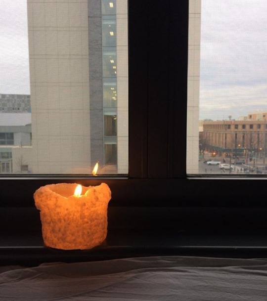
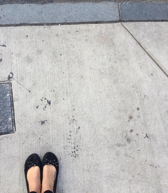
I really wanted to look for a photo that no one has taken before. The lighting on most of my photos was perfect so I had to capture that moment. Each photo I wanted to be different and capture a different aspect of my life: my room, my job, my city, things like that. And I think I displayed them in the best way possible.
I really enjoyed the frame compostition. I think it really showed how much one can do with photography by framing an image In an unexpected way.
I think middle placement was the hardest for me to capture. I feel like life doesn’t happen in a perfect angle so it was hard for me to set up a middle placement shot a lot of the time.
I think I disagree with John Berger. I think to be able to photograph a certain moment at a certain time is an art. It takes patience and creative thought to produce such an Image.
I think I agree with him. Composition should not enter into art. It should be something that someone feels not pushes.
Absolutely not, I did not think twice about the images I created on my smart phone. This assignment has changed the way I view my images and how I create art. I would have never thought about framing an image or how I could apply rule of thirds to make it even better. it has taught me to be a better photographer using my smartphone.
1 note
·
View note
Photo
1. Assignment #2
2. Alexa Ciero
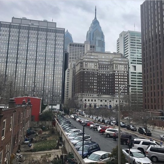
3. Lighting can establish the mood of an image by setting a tone. A brighter lighting might make the audience feel happier while a dark lighting might make someone feel a little more emotional and down.
4. I think lighting can reveal the truth in an image if it is bright enough to show the flaws of the object or setting. Lighting can conceal the truth in an image if it is darker and able to hide the flaws.
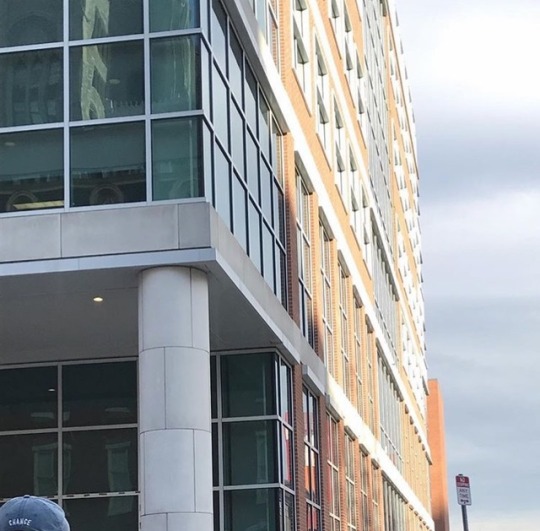
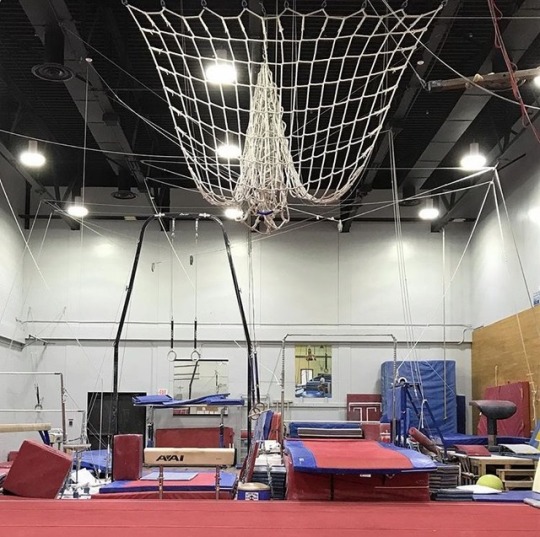
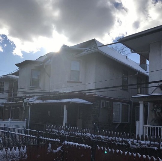
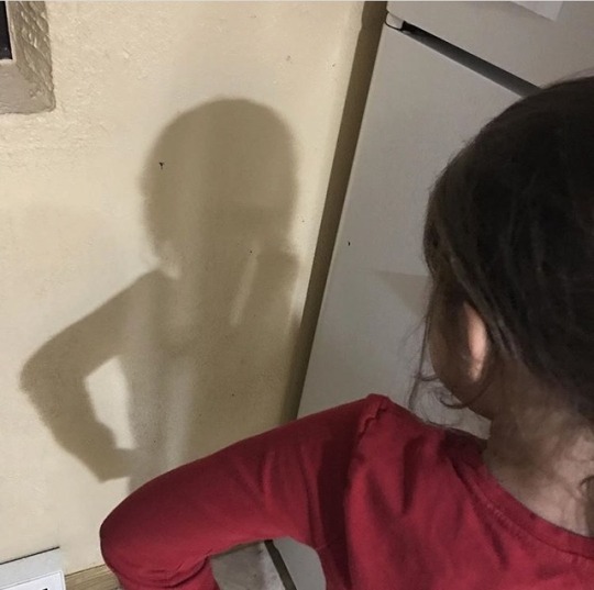
5. I chose my final images because they all meant something to me personally. My natural lighting picture was a view from my work, which I thought was an appealing picture of my home in Philadelphia. The side lighting image was taken on campus at Temple. The artificial lighting picture was taken in the school’s gymnastic room, which is something I love to do. My back light picture was taken from my home. Lastly, my shadow picture is an image of my little sister and her shadow. My creative choice was to include people and places that mean something special to me.
6. My favorite type of lighting to capture was natural lighting. This is because there were so many options for settings and the weather did not matter.
7. The most challenging type of lighting for me to capture was back light. This was because the days I tried to shoot were gloomy rather then sunny. I also had to shoot most of these images specifically near sunset or sunrise, which can be difficult with school and work hours.
8. Yes, I agree because a photographer can be bias without realizing it. We can make decisions to photograph certain aspects in our life, or to not showcase them at all.
9. No, I do not agree that all experiences are made equal through photographs. We can show that not all experiences are equal through photographs just by simply photographing our every day lives. Everyone has a different neighborhood, school, car etc.
5 notes
·
View notes
Photo



Assignment 2
Enxhi Hysenj
As we all know photography is all about lighting. Just by looking at an image, lighting determines when it’s taken, daylight, night time or is it an indoor photo by artificial lighting. By doing this homework and taking images due to different types of lighting, I learned a lot because the most common ones I knew were artificial and natural lighting. This homework taught me also how to take side lighting pictures, in which I never did before. Also made me think critically on how to place the object so I would get a great back lighting image or how they were exposed to light.
For natural lighting, I took the picture in one of our snow days. I really enjoyed the view and thought this would a nice picture for natural lighting. The sky color and the snow were the same because of the reflection that snow has. I find the reflection of the sun in the lake very relaxing and peaceful. Sceneries like this I would never prefer to use filters or edit, because the colors itself are resembled nicely.
About artificial lighting, I found it very easy to take this kind of image because I’m always used to taking images with artificial lighting. I took this image at the auto show for 2017. You could only take artificial lighting images there because the way the cars were arranged. There were lights everywhere this way it was easy to take images to the new cars.
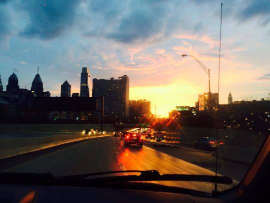
I found Back Lighting a little difficult, because you had to take the image at a certain angle. The image I took was at sunset. You can see the buildings clearly and the light reflecting in the back. I like how the light reflect in the building. Also, in this image I love the mixture of colors because almost every color is shown.
I learned a lot regarding side lighting, For this image, I took my cousin to model for me. I had to find the perfect angle, meaning that I had to move the standing lamp a few times to get the image I wanted. It wasn’t as easy and it was something new for me. As you can see the light reflect on the right side of her face by showing in detail features of her face.
For shadows and contrast lighting, I chose again a snow day. As we know light and contrast create shadows. The perfect way to demonstrate it, you can see the shadows of the tree falls in different surfaces in the white snow
I do believe lighting reveals truth in a image. I believe this is because the way light is reflected either to the person or object. Also it can establish mood, because a photo full of lights can show happiness, and on the other side a contrast photo with shadows can show a darker side.
I do not agree with Sontag that through taking photographs all experiences could made equal because it requires professional photography skills on how to place objects in different angles, or how to take great images with lighting reflecting.
6 notes
·
View notes
Photo
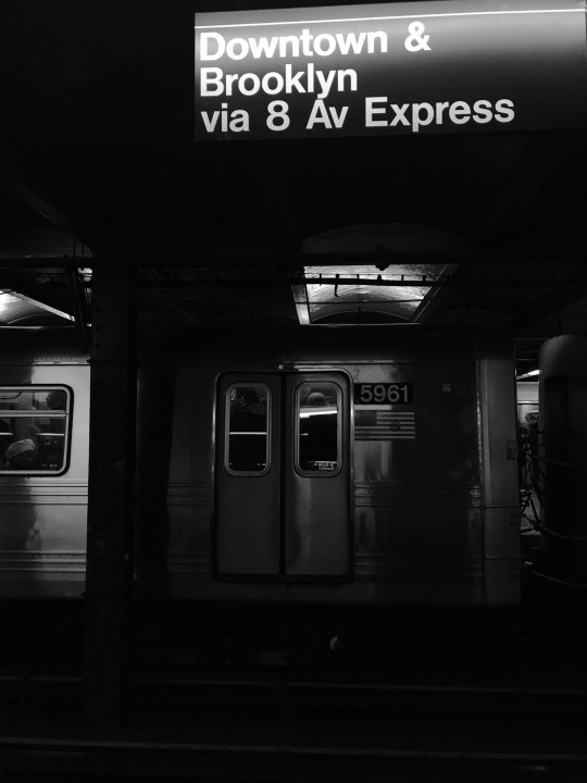
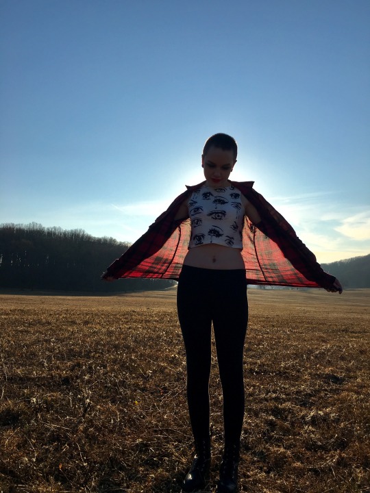
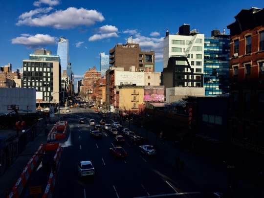
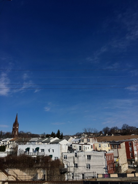
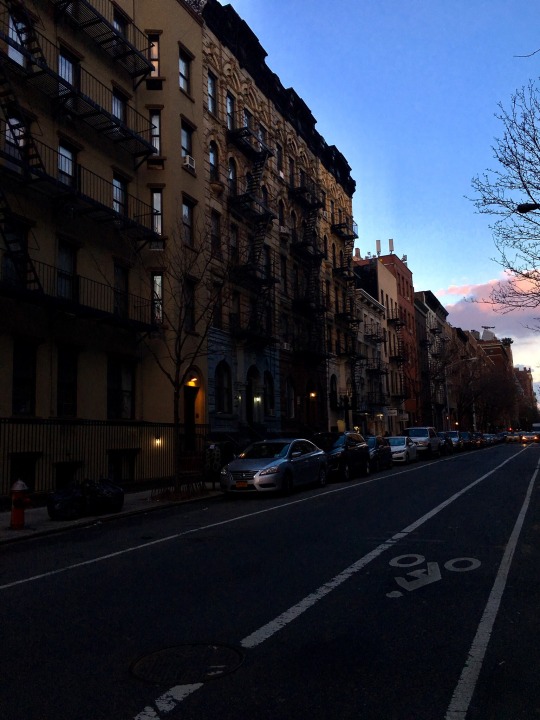
Assignment 2
Jamie Wiedmann
Lighting is everything in an image, it establishes location, are you outside or inside, it establishes time of day, is it midday or nighttime, is the sun rising or setting, it can establish time of year, the weather. Lighting transforms the mood and tone of an image and the emotional response it evokes, just as the lighting of an establishment can transform it, for example, from a brunch place to a dim, candlelight dinner. Outdoors, dim lighting can turn a beautiful nature scene into one full of darkness and shadows. Lighting determines the entire mood of the image as the colors we see themselves can also change. Lower light situations do not illuminate every detail of an image, and it can contort colors into appearing darker than they are, while bright lights and colors are loud and busy. Light can also tell your eyes where to look in an image, much like a spotlight on a stage follows the person the audience should be looking at.
Because of this, light is tricky to work with, especially when you, the photographer, do not have control over it. Light can conceal details of an image by shining, or being focused elsewhere. Often times lights cue where the viewer should be looking, tricking them into not paying attention to the rest of an image, or the viewer simply may not be able to make out any details that are in the dark. Sometimes this can come in handy for a photographer who wants to manipulate lighting and exposure, if there is noise or insignificant details that draw away from the main focus, darkness can be used to hide the imperfections and draw the viewer to the focus of the image. I believe the analogy that light can reveal the truth does apply to photography, but I don’t think, in the case of photography, that it has to have a negative connotation, light is the most powerful tool a photographer can use, but that doesn’t always mean more is better, too much light can make everything appear washed out, also concealing details.
Natural lighting has always been my favorite, simply because it is natural. I feel like natural lighting grounds the image, preserves an element of truth. Even if the lighting is not perfect, it reflects the current situation. Natural lighting is also ever changing, it is hard to find the same exact effect twice, it is very organic. I would prefer editing the brightness, highlights, and exposure using software than adding a flash and unnatural light to an image.
For me, side light was the most difficult because it was hard to find the balance of light coming from the side and causing enough of a shadow, but then knowing the difference between an image with shadows and an image with side lighting because they are often the same thing.
I agree with the concept that there is a position of power when taking photographs. If the photographs have a sort of consciousness themselves, in turn they can each have their own view on the world, just as all people see things differently. Photographs can be manipulated in size, shape, color, and focus. Objects in the photo can be retouched or altogether removed; the photographer can manipulate objects in the field as well, changing a person’s position or an objects location. The photographer has the ability to make the viewer see something the way he or she sees it, so I do think Sontag’s statement is true.
My interpretation of Sontag’s proposal that photographs democratize experiences is that through photography we can catalogue the world. Every thing, place, person can exist as a photo, as a physical copy or an image online. Capturing the light and transposing it into a 2D, flat image, making it easily accessible, compact, and visible. However just because photographing objects or people ‘catalogues’ them in a similar way does not mean that all experiences themselves are equal, only the images of them are equal.
Artificial- I was in New York a couple days this week and I figured what better place to find artificial lighting! I originally simply picked the subway station because it’s underground and is entirely artificial light and because I had seen some creative photos of underground subway stations. I tried a number of different angles and object for this picture but when the train pulled in I thought that would be an interesting background since it spanned the entire width of the frame, changing the landscape entirely. It also gives a sense of motion without being blurry, and the metal causes the light to be reflected in so many different ways.It was hard to avoid getting a streak of white light at the top of the sign but in the end it added a soft glow to the letters. I put the image in black and white because it provided a starker contrast between light and dark, made the light parts look much brighter and unified them, instead of having slightly different colored light areas. It also made the dark part darker and reduced a lot of background noise.
Back light- My inspiration for this picture actually came from the mother of one of my high school classmates who is a really talented photographer, she would take pictures of people during sunset and the light would turn their figures into a silhouette and they were always so beautiful. I got my sister to model for me and tried to create my own version of her photographs. As it turned out, perhaps because of the time of day, it was still a little early, there was enough light in the sky from the other direction that you can still see her features such as the color of her clothes and her facial features, I like that her figure is darkened but you can still make some of these things out. I told her to hold her shirt out, I had no idea how it would turn out, but I like that the light shines through the fabric of her shirt, and gives the outline of her body a glow, it’s like two different effects of light in one. I left it in color because of the pretty background colors and the bright contrast between them and her red shirt.
Shadow- I took this photo because the sun was at the perfect height in the sky where it made it look like the shadow was splitting the scene in half. The busy, colorful skyline is still lit while the quieter, darker road is in the shadow. I definitely wanted to keep this image in color because there are so many different, bright colors on the buildings and in this cause I think that enhances the lighting even more than if the image were in black and white, whereas it is often the other way around.
Natural- I always loved the skyline of Manayunk so I went to the trail Monday morning when the light was still soft and tried to get some good natural light images. I like the solid colors of the building walls and how the early morning light makes them appear brighter and cleaner in a way. I chose to have the buildings at the bottom of the image so they would frame the rest of it while simultaneously displaying the sky as as clear and expansive, also to show the gradient of color, from darker blue to lighter blue. I kept this image in color because of the beautiful blue color of the sky and the glow, white color of the buildings was exactly what I was looking for when going for natural light.
Side- I took this picture because from where I was standing the light was shining from the side, and there was a noticeable shift from day to night all in one scene. Again here I used the light to divide the image in half, the left and lower parts looks like nighttime while the right and upper parts still have daylight present. The streetlights of houses are on and the headlight on the cars, but the tops of the buildings have a soft glow that fades as it goes own, casting small shadows, and the sky is still a bright blue. The sun is coming from such an angle that you can’t see the physical area where it is setting, but you see both day and night in one image, without the area in between. I left this one in color as well because of just how light the sky was and the soft, warm, glow of the streetlights, the darkness of the buildings provided a sharp enough contrast to see the light coming from the side.
2 notes
·
View notes
Photo

1. First and Last Name:
Eric Gurevich
2. Nickname:
Eric
3. Location:
Bucks County, PA
4. Major or area of study:
Pharmaceutical Sciences
5. 2 interesting facts about you:
My parents immigrated from Ukraine and I can speak Russian near fluently. I was born here however, so my English is far better.
Even though my major revolves around science, I tend to love the arts and liberal arts. I’ve played piano for around a decade and I enjoy composing jazzy electronic music in my spare time.
6. Why are you taking this class?:
I had some scheduling problems and ended up with a lack of credits for the semester, so with the add/drop end-date looming on the horizon, I found this course that suited my interests in visual arts and decided that it was perfect!
7. What do you think is the purpose of self-portraits?:
Self-portraits are a sort of reflection into one’s existence in the most socially apparent and external manner. How you see yourself versus how others see you is a fundamental question that we must all address and a self-portrait bridges that gap. A self-portrait can say something deep about one’s personality or it can just be an appreciation for one’s aesthetics. Often times it’s a mix of both and is an extremely personal way to create visual art.
8. What creative choices led to your self-portrait?:
For my self-portrait, I wanted to do something minimalistic and aesthetic, with a fairly empty background and a focus on the interplay between light and shadow. Luckily, I had some cool lights that changed colors, so I turned off the room lights and illuminated myself only with these blue lights that gave out a nice, moody glow. Thus, by playing with the exposure and brightness/contrast, one half of my face is illuminated in the blue glow and the other is darker which I think is a neat effect, not necessarily for any deep, underlying meaning, but more so for the atmosphere.
0 notes


