#anyway this is done by doing linework and then colouring on top of it because the lines go all weird and organic
Explore tagged Tumblr posts
Note
I couldn't help but notice you color your line art sometimes. Do you have any tips on colored line art?
hiii there! thank you for asking!!
just a heads up that i'm notoriously bad at "teaching", and i'm assuming an amount of general knowledge of art programs + layer modes!
i actually don't often "colour" my lineart, at least not in the way a lot of other folks do! i'm used to working as streamlined as possible and developed quick-fire workarounds for most steps during my time in webcomics!
i also have multiple lineart styles! a more textured one with thin lines which i typically use for more polished pieces, and a soft-brush sketch style (inspired by my pal @moonverc3x's lovely lines) that i generally use for less detailed works, though i sometimes get carried away 😅💦
my textured lines don't lend themselves well to those nice and thoughtful coloured lines most folks do. but here's a quick breakdown of my techniques using the soft-brush style!
lines and flats 1) make lineart + flat colour it. my lines are never at 100% opacity, so already some of the colour shows through them anyway! 2) set the lines to multiply mode. because my lines are typically in a colour and not black, this usually works well enough for me, as you can see in the second image! i frequently just call it done here!


hand coloured lines a) if i do want to take the time to colour the lines individually- often things like metals, especially warm golds, require this added detail to really help them pop- i'd just lock the layer opacity and pick a colour that suited and apply where needed. this is fairly standard! b) a second version of the same technique, with higher contrast/more saturation to suit my tastes and a little extra finessing (especially around the eyes). this is very much a "to taste and time/energy" thing! sometimes at this stage i'll add high contrast slaps of colour such as bright purple or blue



my overlay-lines technique a) the second technique that i use is actually very fast and usually gives an okay-enough look. it's what i use for high-speed professional webcomic work (with my textured lines) to give the illusion of individually coloured lines for basically zero effort. so starting with the base lines set to multiply, as seen in (2), then, b) duplicate both the lines and the colours (with shading, if you have it). clip the colours to the duplicated lineart layer, ostensibly "colouring" the copied lines the exact same colour as the colours. set this duplicated layer to overlay, and adjust opacity as needed


you can kinda see that the overlay lines method is not as specific in colour as the hand-picked ones above, and it will suffer from overlap based on where your flats come to underneath the lines. but i find it helps especially when you have high contrast light colours in the work (ie starstruck's face mask) as the lighter colours brighten up the linework in those places significantly.
for highly polished works i would come back and still pick out areas to finesse individually. there's ultimately no quick substitute for spending more time on your work!
there's about a thousand and one other combinations of these effects you can do, such as using the duplicated lines on multiply instead, or further painting over the top, etc etc. but duplicating the colour layer and clipping it to the lineart is one of the techniques i developed that sped up my work process most significantly over the years!
#starflungs process tag#my art#starstruck dee#asks#i don't typically talk about my method because it's pretty sloppy and i really am just not good at teaching!#been told it repeatedly over the years so you get what you get sorry! 😅💦#fwiw i'm working in paint tool sai. most programs should have these kinds of features and layer modes.#if yours doesn't i'm sorry but i don't know how to help!#starstruck is also a somewhat biased example for this sort of thing due to the fact she's quite monochromatic in colour#if you put pink lineart on her she looks good because she's basically just pink all over. when you have high contrast designs-#it's harder to make these quick techniques work and you have to spend a bit more time fiddling around at the end to fix edges.#anyhow! hope this helps some folks!! lmk if it helps you out!
21 notes
·
View notes
Text

I'm bad at explaining broad processes, so this is going to be very... stream of consciousness. that being said, I'll try to explain a little bit of it!
also for disclosure's sake, this alt was actually earlier in the process than the final monochrome version, and I tend to destructively edit as I go without remembering to save different project files, so what I'm gonna explain here bounces around a bit
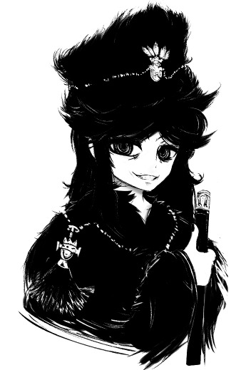
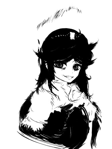
okay so, unfortunately, going through my layers raises more questions than answers without context lmao
when I'm doing inkwork-heavy pieces like this one, I usually work entirely in black and white, smearing the shapes together with a bleed-heavy pen and a slightly less bleedy brush
in general, I'm a firm believer in not fighting the texture of the brush you're using. if you need to a lot to get wispy shapes from your brush, you need to use a wispier brush
if it seems weird that I use a bleed-heavy pen but not a bleed-heavy brush, I think that's weird, too! the best way I can explain it is that I've always found it frustrating when my paints bled in unexpected ways, but associated an overbleeding pen with one that wasn't running out of ink
... not entirely rational, I'll concede.
but anyway, why black and white? why not use a slightly tinted dark tone, like shows up a lot in my finished pieces?
there's a lot of reasons I can make up for why I do that, but the most straightforward and (unfortunately) revealing one is that I do it because, if I'm drawing entirely in black and white, I never have to layer-hunt to erase
... I just make a new layer on top and paint white over the old one

this is also why I like using mspaint when I'm not really up for doing anything particularly advanced. layers are great and I love them dearly, but sometimes it feels like they're more annoying than helpful
so in general, my method for actually blocking things out can be roughly described as "start drawing it and don't stop until it's done, and if you don't like it, your wip is now a reference layer and it's time to use it to redraw the entire piece"
not... entirely good as advice
in fact, I'd strongly advise you don't internalise that. looks pretty cool, though, sometimes. maybe explaining myself here is a bad idea, because it's going to give other people my deeply unwell habits.
anyway.
when framing a piece, I'm usually just fucking with things by eye until they look about interesting enough to me. in general, I'm a big proponent of leaving tools around that can be generally described by "things you can fuck around with"
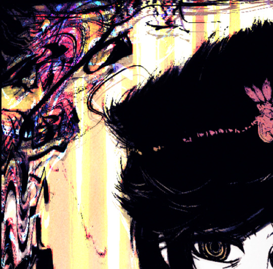
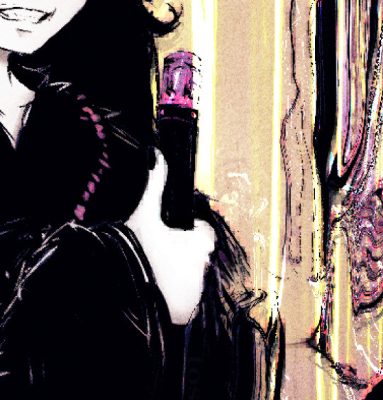
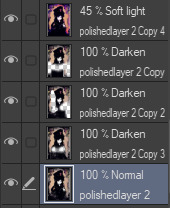
effects like this are achieved mostly by duplicating the image, filtering the duplicated layer, possibly gradient mapping it to get some colours, and then using that as a mask of some kind. this often entails deleting chunks of the new layer when things start overlapping in unpleasant ways
if you're willing to keep a folder of textures around, you can actually use posterisation + gradient mapping + blending modes to work your textures into some really weird setups
if I'm planning on using a really colourful background or frame for whatever reason, I find that one way to create a pseudo-depth effect is to duplicate the linework, mosaic it, layer the mosaic below your actual lines, and then erase all of the chunky pixels inside of the subject proper
in the process of making the final version of a piece I post, it's really not uncommon for me to have up to nine versions of the linework layered on top of each other, set to darkening different portions of the art
as for framing proper... sometimes it's literally just throwing things on the edge of the image until it looks balanced to my eye, then ctrl+a, then shrink selection [X] pixels until I get a border that looks nice
hope there was at least something of value in that! admittedly, it seems like it was mostly just a reveal of how messy my desk is
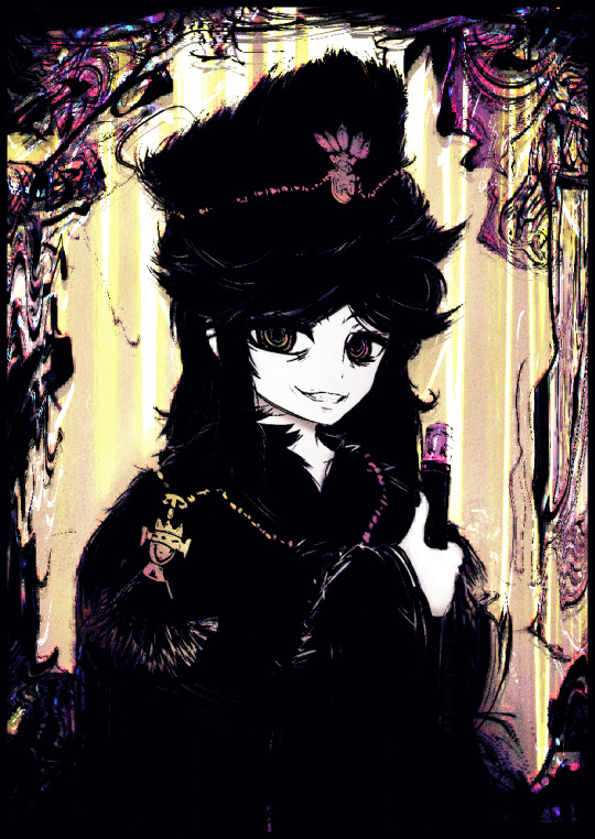
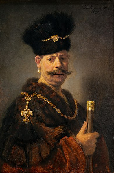
referenced from A Polish Nobleman (1637)
286 notes
·
View notes
Photo

never enough art of their kiss
#the old guard#kaysanova#tog#art tag#i dont understand digital art quality and at this point i will never learn. thank u. this is 540 by 540 px shouldnt that be fine ???#why does it look so grainy and blown up.........#anyway this is done by doing linework and then colouring on top of it because the lines go all weird and organic#and i enjoy that <3#OK i changed the pic to a png im not 100% sure on how tumblr works but. hopefully ppl see this one instead of the jpg jghfdksl
149 notes
·
View notes
Note
You’re one of the only Hetalia art blogs still active that I absolutely love! Do you know any more of them?
Actually!!! I spent the past week sitting on this question, but im finally able to compile (most of) i have a bad memory and theres just so many, you see) the hetalia artists ive admired. ill write up a little blurb on each so you can know what to expect
warning, this is super long
I’m going to list my fav Prussia focused artists first:
@theknoflook is SO SO SO good at capturing the worn/rough-round-the-edges Prussia and they’re 100% the BEST at drawing the aged feel of him. They draw a lot of characters with human imperfections, it’s just such a RAW emotion I feel from each drawing.
@maplevogel I’ve admired since I was like,,, 13. You have no idea how much I want to be able to draw like them. Their watercolour illustrations are KICKASS!! They have such a sense of mystical-ness to each piece, everything is so unreal in what they draw it gives me such a sense of calm-ness. Constantly they’re using watercolour to it’s full extent, im EXTREMELY floored and always have been.
@mieudiary is another person ive admired since i was a absolute baby. Their art teeters on anime-realism and their use of lighting, shading and blending is SOOOO GOOD. They’re able to make their characters so real yet overly gorgeous lol. They’ve got the best damn detail in form/muscles (flesh) ive ever seen.
@kisamesfacioplegia is LITERALLY DRAWING RENAISSANCE PAINTINGS OKAY. Their art is always refined and carries the same aura as those huge paintings you find in museums, with extremely good storytelling and illustrations. Best historical prussia and germany on this site imo.
@carnagekiid (i dont know if they do aph anymore but their recent work is JUST AS GOOD) has the cutest modern interpretation of gil and is my fav. i personally am not a fan of like,,, the “ideal” canon prussia, and the way they draw emotion/use of colours (for all their work) with prussia has that like,,, UMMF of character, yknow what i mean??? they focus on ruspru i think but idk lol
Okay those are just the best prussia’s ive seen, heres some more general hetalia artists that focus on other characters
@payadraws is quite possibly my FAVOURITE HETALIA ARTIST???? IF NOT AT LEAST IN THE TOP 3 BC THEIR STUFF IS SO GOOD AND STYLIZED PERFECTLY. their linework is stunning, and colouring has that tone over all of it that harmonizes the whole piece. The way their utilize their style in everything is PERFECt, idk how to use words for it, just take a look. Their austria/switzerland is deadass on-the-money.
@tomato-bird Literally how does one even manage to do this. theyre professional and it fucking SHOWS. Each composition, each stroke of their pen, it shows dude. Their art has like,,, the emotions, the feeling, is really well executed and they have so much attention to detail it blows my fucking mind. like ,,, this gives of hard renaissance level mastery vibes
@paperdrawsshit is SO GOOD at using that like,,,, the form/silhouette of characters. like,, the shapes they use, the flow of each pose, the hands, ALL OF IT SCREAMS PERFECTION. Each drawing has such flow and structure at the same time, and each character has such a pretty fashion sense. Excellent use of lighting and i strive to be as good as them in drawing people
@jackce THIS ARTIST HAS LIKE.,, SUCH A CLEAN CUT ART STYLE ITS GORGEOUS. Each drawing has the smoothest lines and the characters have distinct features. Their prussia, italy and germany styles stand out so much because of the way they draw the noses, jaw, features etc. Like they look like screenshots out of a professional 2d animated feature. Seriously.
@starstray (not sure if they draw hetalia anymore but i need to tell yall about them anyway) has such gorgeous like,,, composition. like if you dug through a collection of paintings from the renaissance you’ll find a few of theirs scattered in their. The use of like,,, linework paired with the way they colour is so perfectly executed. its so balanced im shaking
@amazing-prussia has the cutest, quirkiest style with what they draw. the hair/clothes are so stylized and fluid and i love them so much!! Each drawing looks so quick and perfected, every time I see one of their pruaus doodles i fucking DIE.
@glass-soda has such gorgeous illustrative style. It’s so unique and the way they colour and draw people have this wonderful POP to it. The colours are so balanced and bright, its so SO!!!!!! LOVELY. LIKE,, IDK HOW TO KEEP FROM RAMBLING ABOUT HOW MUCH I LOVE THEM JUST LOOK.
@ask-risorgimento-italy (ack, dont know their main sorry) Their illustrations are so well done, you can see the thought and practice in each character!! and i love the “realistic” feel to it. I say that about characters who dont have like,,, idk “anime hair”?? but not only the hair, the clothes, the form, the ENVIRONMENT. THIS ARTIST KICKS ASS WITH THEIR ENVIRONMENT BUILDING. LOTS OF DEPTH. ABSOLUTE LEGEND.
@hetapolis !!!!! THEIR ART IS SO CLEAN AND SKETCHY AND BEAUTIFUL. OKAY. Shading/colouring is GORGEOUS. and the way they draw each character to be distinct and have unique features ITS SUPER PROFESH AND LOOKS AMAZIGN!! I admire their style so much yall got no idea
@thedisappointedidealist12 has REALLY GOOD LINEWORK/STORYTELLING. LIKE WOW. Every time i see something theyve drawn im shaking bc the pacing and execution is AMAZING. Everything about the way their art looks is super balanced and you can see the exact emotion each character is expressing.
@captainjellyroll OKAY. THIS PERSON. LEMME TELL U BOUT THIS. FIRST OF ALL. THIS IS ONE OF MY FAV ANIMATORS. THEYVE BEEN MY IDOL SINCE I WAS 11. Their work has so much energy, colour, and you can see the thought in each composition. I love them so much,,, each drawing has its own burst of energy!!! i want to be able to be like them when im older and live with like 5 cats.
@tea-artblog (they dont draw hetalia much anymore but their recent art is 100% worth looking at) OKAY. YALL. This is one of the people who’s art i looked at constantly when i first joined!! Their art is so like,,,, balanced and has just enough contrast and the colours???? EVERYTHING WORKS SO WELL. The eyes/expressions are SUPER CUTE.
@sully-s ANOTHER ARTIST WHOS STYLE IS ONE OF MY FAVS. It’s super fluid and the colours are perfect!! Each character has their own uniqueness I cant express my love of how perfect their lighting/colouring is. Their illustrations are straight out of a movie art book, its so GORGEOUS. and the environment REALLY has depth!!
@ask-victorian-austrian (dont know their main ack sorry!!), THE LINEWORK IS SO DETAILED AND CLEAN. I love the way they draw clothes/fashion, its all so detailed and gorgeous and you can feel the weight of the cloth and the lace and everything okay???? Seriously I love all their blogs, they have a bunch, and you should check out all of them!
@amoxesyoew HAS SUCH CUTE DRAWINGS!! The style in their characters’ hair is so flowy and the way they draw faces and eyes have this adorable quality to it!! the pureness of the emotions they draw are really prominent and i constantly just DIE because of it! I love love LOVE the gercan they draw too
@arschbiene THE WAY THEY DRAW FACES??? SPOT ON. The colours are SO spot on and i love the POP they give. The shading?/? SPECTACULAR. And each doodle is super cute and like,,,, when people say each drawing has a story behind it?? I FEEL THAT WITH THEIR ART OKAY. HIGHKEY.
@ekinoksin ???? HELLO??? THIS RENAISSANCE VAN GOGH MICHAELANGELO MASTERMIND OF AN ARTIST IS LIKE THE SAME AGE AS ME>????? I just foudn that out. BUT the way their art has so much depth!!!! THE BACKGROUNDS??? THE ENVIRONMENT?? ITs ALL EXTREMELY WELL DONE. And they have this texture to their art that makes it look just like historical paintings its so good!!! Im SHOOK.
@alfredtalia WORM. THeir characters all have structure and expression and everything about it has such like!!! UMFF. The way they draw certain things,, theres minor details!! and you may not notice them!! but they ADD SO MUCH!! Everything feels like it has attention to it, and it is so well balanced!!
@avlerie (again, not sure if they still draw hetalia but their art is really pretty) the way they add texture/detail to their art is SPECTACULAR. The hair???? the bodies??? It seems so structured and well drawn!! THE EYES THO. THE WAY THEY DRAW EYES ARE SO BEAUTIFUL I CANT GET ENOUGH
@elhuesoardiente DUDE IDK HOW THEY COLOUR/DO THEIR SHADING. BUT ITS SO UNIQUE AND GIVES THEIR ART THIS EXTRA LAYER OF DEPTH. The art is so gorgeous with the way they do their lighting, and everything about it has balance and harmony im just shook
@ask-2p-uk no idea how someone can even pull off art like they do. the lines/colours ARE REALLY WELL INCORPORATED to EACH DRAWING. The way they draw expressions?? is so unique??? like i love the hair too, it has this flowy-ness to it!! EVERYTHING about their style is so colourful and pretty and unique i just ghhghghg dont know how to explain it, just LOOK AT IT.
@lucerna-lunam the way their shading is,,, the “mystical”-ness of their art??? ABSOLUTELY INCREDIBLE. IDK How they manage to draw stuff with such like,,,, sparkle to it. But their lighting is really well done, the EYES are so gorgeous! even the way each drawing is textured!! It comes together so perfectly!!
@suckmyicelandick THE WAY THEIR HAIR IS DRAWN??? SUPER SHINY AND GORGEOUS. I love the way their draw their characters, the hands/face/hair is so stylized the second you see their art you just KNOW its drawn by them. The eyes are super detailed and its so pretty im just sobbing i love their style
@aph-lithuania OKAY one of the first hetalia artists ive ever seen when i was new. THEIR ART IS SUPER PRETTY. The colours are really smooth and THE WAY???THEY DRAW BODIES?? THE FIGURES ARE SO WELL PROPORTIONED????!!! Everything about it is so cute!!!
@ask-mr-luxembourg BRUH??? HELLO?? COLOURING, LINEWORK, PROPORTIONS, EVERYTHING IS 10/10. Seriously they way they draw hair has such texture, and the way the bodies are drawn are so good. everything about them!! and the eyes?? DEADASS KILLED ME. Their art has seriously so much detail and i just DIE every time
@ellmovy HOW DOES ONE EVEN MANAGE TO DRAW CHARACTERS AS WELL AS THEM?? Each character has distinct features and like,,, the hair is always stylized and it looks SO GOOD????!!! The amount of detail they put into drawing small things like eyebrows and freckles add so much to the overall piece like WOW
@haeko9page THIS ARTIST. HAS THE CUTEST ART EVER. Their comic strips are seriously so adorable and has really good pacing! Each time they draw comic strips, the frames are so varied and it comes together SUPER WELL. Idk how to explain this, but like,,, the “camera angles” and the way they draw expressions/character interactions go together like peanut butter and jelly!
@kyotemeru-arts (they dont draw hetalia much but i love their art so much) dude the flow?? of the poses their characters have?? the flow of the characters themselves?? SUPER WELL DONE LIKE WOW. Also the way they shade and highlight things ?? like using more than one colour?? THAT REALLY MAKES THEIR ART POP. I LOVE THE WAY THEY CAN PERFECTLY DRAW FLUIDITY IN THEIR ART.
@frukmerunning GOLLY GEE DO I HAVE SOMETHING TO SAY BOUT THEM. Just the way they draw faces, eyes and like,,,, bodies in general,, ITS ALL SO PERFECTLY BALANCED. The way they manage to make sketches look incredibly refined and capture the movement in each drawing???? LIKE IVE ADMIRED THEIR ART FOR SUCH A LONG TIME ITS BEEN 300 YEARS
@miss-ostrich-art BRUH how does one manage to draw ???? like them??? the way their characters’ forms and muscles can be seen but like not overly detailed??? they have the PERFECT amount of detail in each drawing, and the expressions!! the way they draw noses and facial structure and *italian hand gesture* PERFECT.
@maryluis THEIR EXPRESSIONS ARE SUPER DYNAMIC!!! AND THE POSES HAVE SUCH FLOW. Also did i mention the amount of detail they put into minor things?? like WOW. Seriously i think out of this list i like the way they draw expressions the best. Also this might be a weird thing to focus on, but the way theyre able to draw the interior/background/angles of things are INCREDIBLE.
@cioccolatodorima YOOOOOOO THIS IS LIKE THE FIRST ARTIST I SAW WHEN GETTING INTO THE FANDOM. ONE OF THEM AT LEAST. Their non-hetalia work is actually my fav and i want to do just what they do when im older! I love their illustrations, and their way of drawing characters/character design (ginjinka of mr.kitkat are my favs). The way their lighting looks, is SO pretty and the linework is ABSOLUTELY STUNNING. their art blog (not just hetalia) is @rainbow-taishi
@ask-badlydrawnseborga lemme tell yall about a thing. i love how funny their art is, and like,,,,, i know its “badly drawn seborga” but the way the hair flows and the proportions,, everything about it is SO nffhhklahjdj polished. LIKE IDK HOW TO EXPLAIN IT BC THEYRE SUCH A MEMELORD BUT I GENUINELY HAVE SO MUCH LOVE FOR THEIR SKILLL
@sabrow3 NOT ONLY IS THEIR ILLUSTRATIONS SUPER CUTE, IT HAS GREAT PROPORTIONS AND DEPTH. I love their attention to detail in clothing and historical things, and like,, the line work is AMAZING. Seriously, I want to be able to draw as well as them, its incredible how the amount of work and effort is shown in each drawing.
@buruzaitama !! The way they draw characters has like,,, this level of realism and the way they do their lighting just pushes that to the next level. I don’t know how people can pull off drawing realism yet still make it so unique that i can instantly tell that a piece is drawn by them, but this artist IS SO GOOD AT THAT. LIKE WOW
@inkodoodles Okay their “1 hour drawing challenges”? IM FLOORED ANYONE CAN DRAW THAT IN ONE HOUR. The have such detail and flow and movement in each drawing! And the lighting they have is so soft and calming, it lends itself to each piece REALLY WELL. Whatever emotion each drawing is supposed to give is conveyed to a tee
@heyheyartman BRO the style??? is so fucking UNIQUE AND ICONIC?? And the way they manage to pace comics and storytell is sO GOOD. Like,,, the way they can use shapes for each of their characters is so refined and stylized i love it. Their use of colour seriously KICKS ASS and im floored every time i see their work.
@merasgar their art is so detailed!! and the backgrounds/environments are so soft and gorgeous to look at! I have like,,,, no idea how you can pull off such beautiful hair and eyes in each drawing!! They draw a lot of rochu and like,, the features look so PERFECT for the characters ghhghghg
@yosb ALRIGHT LISTEN UP THIS ARTIST SERIOUSLY HAS ONE OF MY FAV STYLES. It’s so refined and you can see the distinct features of each character. The style isnt realism but the characters FEEL REAL. They have such a perfect way of paying attention to details and putting in proportions/facial features to each character im so amazed and love their work so much
and of course i want to include @paachubelle though theyre working on their own project ( @the-otwya-project ) now, they’re one of my like,,,, friends that i made on this blog through hetalia ask blogs and i figured id like to include them on this list. Idk how people can draw in pencil with such detail and everything but they do it EXPERTLY. The line work is always so clean and the shading is always so well done!!
of course, im very clumsy and forgetful so i know i forgot some names but i cant remember things!! Either way, these are some of my all time favourite iconic hetalia (and non-hetalia) artists!! I want to be able to draw as well as them one day!
148 notes
·
View notes
Text
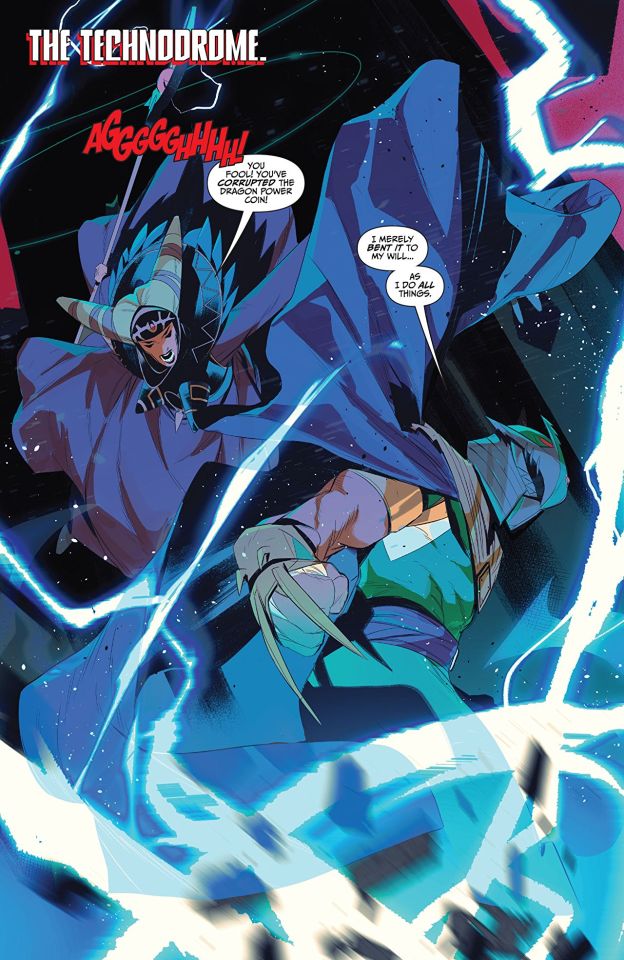
Mighty Morphin Power Rangers Teenage Mutant Ninja Turtles #3
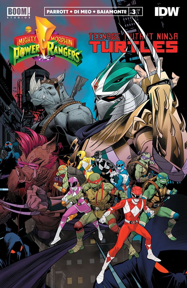
Mighty Morphin Power Rangers/Teenage Mutant Ninja Turtles #3 Boom! Studios/IDW Publishing 2019 Written by Ryan Parrott Illustrated by Simone di Meo & Alessio Zonno Coloured by Walter Baiamonte & Igor Monti Lettered by Ed Dukeshire Rita Repulsa faces off against Shredder for control of the weapon that will change the Power Rangers forever! No matter who wins, the world will never be the same! As the two villains battle, the Mighty Morphin Power Rangers must find a way to storm the Foot Clan base to save Tommy, as the Teenage Mutant Ninja Turtles step up to help their new allies in an unexpected way. Who knew that ll it took was a team up of epic proportions to make me a fan of both franchises? This is beyond what I could have hoped for and now I want to see this on a regular basis. Has that ever been done before? Two companies sharing a series that comes out on a regular basis well there is a first time for everything and so in some immortal words, make it so number one. Oh we open up this issue pretty much where we left off as Rita was going to find her coin and get it back. Here we see something that I hadn't known about Rita and I have to say it's a huge revelation for me. Maybe it is just for this story but I wouldn't have thought that about her though I will say I can easily see why Shredder is in love with the power of the coin. Though with how the coins work how is he able to fuse to his DNA? Anyway this is the power of storytelling right there, learning and thinking about what we see and taking to a level that isn't even on the page itself. Ryan has this ability to really surprise you by how he writes the characters and how quickly the reader becomes engaged and invested in the story. I love how the story moves through the pages. The story & plot development that we experience through how we see the sequence of events unfolding and how the reader learns information are laid before us exceptionally well. The character development we see is amazing and the more we see the characters the more we understand about them and the more my thoughts on them seem to change. The pacing is sublime and I love how we go from segment to segment as nothing feels forced, glossed over of thrown in just because. The way we see the twists and turns unfold and how it all works to create the ebb & flow that we see shows some top notch writing and brings a level of excitement and tension to the story. The interiors here are pretty darn fabulous. Simone has a very unique style and he utilises that to the fullest in how we see the linework and it's varying weights utilised throughout to brings us some gorgeous attention to detail. Would I like to see more backgrounds being utilised, yes yes I would, but what we do see works in the composition of the panels to bring depth perception, scale and an overall sense of size and scope to the book. The utilisation of the page layouts and how we see the angles and perspective in the panels show this superb eye for storytelling. The colour work is beautifully rendered as well. I adore the way light sources are utilised to create some unique hues and tones with competing colours making something new and fresh looking. The utilisation of the colour and and how we the hues and tones create the shading, highlights and shadows is some top notch work. With the ending what it is I am more excited than ever to see the next issue! So far though I do like that we have a battle and then an alliance, as such until that is no longer needed. I don't think either one expected the other to be that powerful and as a stalemate approached well you get the idea. Who knew that this would such an epic story in the making and that we'd desire to see this continue long after this arc is over.
#comic books#comics reviews#BOOM! Studios#IDW Publishing#Ryan Parrott#simone di meo#walter baiamonte#ed dukeshire
3 notes
·
View notes
Text
Ok process!
(And btw I may have fucked up a new pen by deciding to re-draw the lines over the pastel, after experimenting and seeing that that didnt work well, bc I got lost in the moment. The ink is exactly flowing nicely now. If you have any tips to save the pen please say!)
I bought some new materials the other day (a3 art diary, brown a4 diary, white pencils, black marker pen for outlining), and Ive never actually had any of those materials before except the pen, so I wanted to start messing around with it. And Im hoping Big Paper will help my brain in deciding thats worth getting the (acrylic, mostly) paints out. (I have about 0.1 watercolour skills so thats a whole project to learn).
So first I just fucked around with the above and pencil and and oil pastels to just see how it looks together and on brown paper. (Midtone paper?)(the adhd brackets are strong today).
To be perfectly honest my first days attempt at Harrow looks like this:

[Image description: a Harrow face in pencil on brown paper. Her nose line and bottom lip have been coloured in white pencil. Her top lip and around her eyes are done in black pastel, which are comically large compared to the face size. It looks like someone with a big black mustache in a superhero eye mask. Little bits of pastel have escaped the eye outline and lodged themselves in the details of the eyes themselves. Its pretty silly.]
I remind myself that I do in fact have the entire page to work on, and I end up with attempt 2:

[Image description: A pencil sketch of Harrow's face and neck. Its got the hair, the anger, the bone earrings; but none of the face paint or blood. Also the ears are relatively detailed which Im also proud of. The ears are quite prominent, for some reason this is important to me. Her ears are expressive.]
Next up, linework in my new pen (?RIP? HELP!).

[Image description: Same as above, now outlined in pen. The eyes now have an obvious reflection circle on the pupil. Her head hair, eyebrows and curly sideburns have been done in the outline pen.]
Some lines are a little wobblier than ideal, but Im really learning to let go of "perfection" in my art. So what some lines are a little wobbly, the art is still doing all the things Im trying to get it to do. My hand will strengthen and make swoopier lines, or it won't. Doesnt make this bad art. Just a little wobbly art, and thats fine. (Maybe a slightly thicker pen would look more like in my minds eye?)
I considered giving her a tiny bit of upper lip hair, but I decided that 1. It wouldnt work well visually with the face paint lines and 2. I dont think she got far enough into puberty. Tbh Id be kinda surprised if she menstruates with any kind of regularity.
Next picture I took because I knew it would look cool and yay new materials.

[Image description: same as above; Harrows eyes, teeth, and bone earrings have been coloured in white pencil, which looks both bright and comfortable against the brown paper. Its kind of like highlights? Its gently pretty. Also her pupil is coloured in black pen and the...iris? The coloured bit? Has been filled in grey pencil.]
Not much else to say, the white looks super cool.
I dont remember exactly which is next, I hope this is a fantabulous introduction for it anyway.

Almost there!
[Image description: Same as above, now with Harrows black face paint done in oil pastel. The design is symmetrical side to side. Big circle-diamond shapes around the eyes, lines coming down both sides of her forehead. The sides of her nose are also covered, sort of swirly T-shapes on either cheek, a line under the curve of her nose, straight vertical lines on her upper lip, two slanty lines on her chin, and these little dots on the diagonal between nose and eye. The top of her neck has sort of swirly tentacle shapes going downward.]
I think in hindsight, doing black pastel over top of white would have been easier than dodging the black to put down the white and also try avoid too much grey smudging. Although given that she's worked up, I think some smudging actually adds to the realism. There, I totally had that planned the entire time because Im super thoughtful and totally didnt mess up my NEW PEN.
I was going to take a picture after the face-paint, but I got distracted thinking about an earlier idea to make her bloody also. Because thats just how Harrow is. I was trying to think what would go nicely on top of pastel, since by now I had realised that Id maybe fucked up my pen, and also I specifically wanted the paint to be pastel, because its described as chalky, so I didnt want to also do the blood in pastel. What about paint? Thats so messy that requires a palette- wait I only need a tiny bit! Huzzah!
So I just. Found a small paintbrush and dipped it directly into the tube. And it worked wonderfully! Could I have been more subtle with the paint, sure, and I did rein myself in from adding more, but I dont think its too much. I think its exactly the right amount for an artwork by me who leans more maximalist than minimalist when it comes to details. I will probably need to restrain myself from the painting the background yet another shade of black.
Oh and I decided that grey didnt look right, so I went over her irises in brown texta (marker) which now look totally black which makes her look creepier! Totally as intended!
Here's the final product again to complete the sequence:

Aand I can't copy paste the image description back down on mobile. Its the same picture though. Im sorry about that.
Have a Harrow!
Im gonna talk about the process under because Im really proud of it. But firstly heres the final version (for now? A background is itching at me but also blank space is allowed and in fact important):

[Image description: A photo of a mixed media artwork of Harrowhark Nonagesimus of The Locked Tomb, just her neck and head. She is pulling an angry face with big diagonal eyebrows, a scrunchy nose and a snarly mouth with teeth. She is wearing face paint to look like a skull, rendered in oil pastel so that it looks chalky. The paint covers her entire face, ears, and top of her neck. The paint is primarily white, with big black shapes around the eyes, most of the nose, and the upper lip. There is also some other black decorative paint in lines and circles. Harrow has short very curly black hair and sideburns, which are drawn in pen. Everything is outlined in black pen. The background is brown paper. Her ears are littered with bone earrings, mostly studs. From her orifices, including sweat glands on her forehead, she is exuding bright red painted blood, which also drips down her face. ]
19 notes
·
View notes
Photo
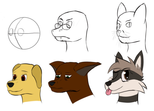
Day 21 - Actually visible muzzles!
Okay so as I said last time I figured out that sweet spot for the 3/4 muzzle and decided to go nuts with it, and this time draw thick enough that it’ll be bloody picked up when I save the file.
So, for a bunch of consistency, I took a base, drew some guidelines on it (top left) then copied it a bunch of times so I could try a bunch of faces with the same angle/pose. And then, for the most part, I just drew at random to see what came out.
I have no idea where the snake came from, but it came out nigh perfect. There was a lot of fiddling to get it looking properly three-dimensional (the nostrils were originally closer together, and it’s amazing how much difference adding just the upper ridge of the left nostril made to the image.)
I think it still needs some work - honestly the lack of ears is probably the most striking thing, leaves the side of the head looking very blank, so if I could get some pattern or colouration difference down there it’d make a difference, but that’s for a later day.
My housemate wandered past, took one look at the snake, and declared that she was adopting him and already had a backstory for him. Good times. =D
Second came the cat, and yeah this one didn’t turn out so well. I think I tried to balance too much human with cat, and ended up with a sort of half-half that doesn’t really work as either. I’m probably going to try to redo this later, at least to try to figure out exactly what went wrong.
Next, a slightly stoned-looking dog. Couldn’t get the far ear to work right - I probably could if I just looked up a reference, but I wanted to do these ones without because I was being a stubborn bastard. It could honestly use a bit of fluff around the edges, I think - if only to take the attention off my poor linework.
The depressed deer was originally going to be a fox again, but it ended up like this. The housemate picked it as a deer instantly as well, and I’m not entirely sure exactly where the difference lies, but it worked. Trying to get a little more variety with my eyes and expressions, and while this wasn’t perfect, it got the idea across. The ears you see here are the result of about ten retries, and again a reference probably would’ve done the trick, but eh.
And finally, the only pic I actually did use a reference for here is a quick sketch of @metriccaboose‘s character Cubic, because drawing my friends’ fursonas was always a part of the idea of getting into this whole drawing thing =D I’ll admit that one was finished in a rush to show him before I went to bed, and if I had a bit more time there’s more than a couple things I’d fix about it - most specifically the far cheek fluff and the ear not looking quite so two-dimensional - but not bad.
Right now, I think the biggest things I need to work on are getting a stronger idea of head shape and eye positioning. I think given the angle I was working on, the left eye should have been a little further to the viewer’s right (putting it about central on the guide circle) and the eyes maybe a bit larger full stop - there’s simply too much space to the right of the eyes.
But most importantly I need to work on those lines. The sketchy, dirty, uneven lines just make the pictures look wrecked, and this is after I’ve cleaned up much of the worst of it.
Anyway. That’s me done for today. Not sure what the next one will be yet - I might try moving down into shoulders for bust pics, or just try to do a piece on getting those details a bit less crappy.
2 notes
·
View notes
Text
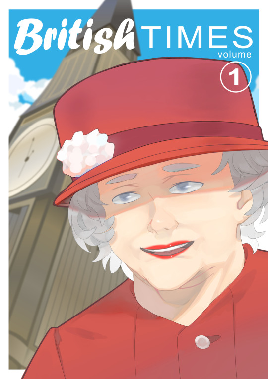
YCA Asset Creation: Queen Elizabeth Illustration + Cover Design
20.03.19
Today I started working on my illustration of Queen Elizabeth for this project. I wanted to have her on the front cover of a graphic novel that I would be designing. The background would have Big Ben, which you can see in the previous post below.
Rough Linework
So, to start with, I sketched out a rough drawing of the Queen in a drawing program called Clip Studio Paint. Out of Paint Tool Sai, Photoshop and this, I find this to be my favourite program to draw and paint in. For this rough sketch, I used a thin watercolour brush like I usually do. I used various different reference images from Google. I decided to draw her like how she looks most of the time. I think that the hat and the curly hair are kind of her defining parts. The hair was really challenging to get right—I’m not very good at drawing curly hair/hair in general. The hat looks pretty good too I think. I tried to get it to look like her as best I could, as far as this particular style will let me, and I think I kind of pulled it off, but I still need to improve on my faces in general.
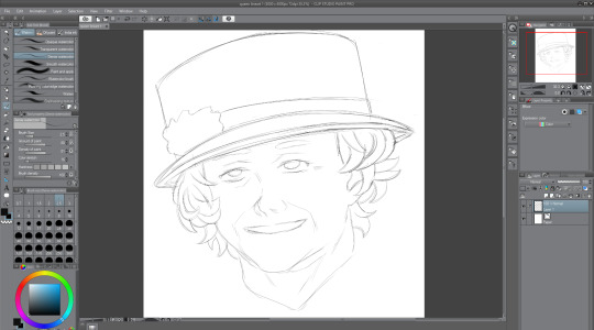
Polished Linework
After finishing the rough sketch of the Queen, I thought it time to go over the lines. To do this, I created a new layer, and then lowered the opacity of the sketch layer, so that I could go just make out what I was drawing over. I don’t really like how the lines turned out once I compare it to the original sketch work, because it kind of lost the sketchy and rough charm, but I thought that I could probably make up for that when it comes to painting it. In this screenshot, you can see her outfit now—it is her usual outfit that she appears in public wearing. I went with this one because it was simple, and I would prefer to keep the focus on her face if possible. Overall, I’m not a big fan of how it looks right now, but I’m confident that I can improve this soon.
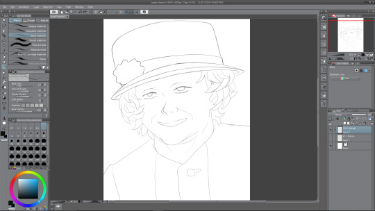
Colouring
The next thing to do after finishing the linework was to colour in the Queen’s main parts, so I’d decided that I wanted her outfit to be coloured red, since I was adhering to the colour palette of the Union Jack; red, white, and blue (the blue will be the sky, white for clouds). I chose a regular not-too-saturated but not-too- desaturated red shade for her clothing and her hat. For the moment, I want to have the rose thing on her hat red, but maybe it will look good if I am to make it white instead. I chose a middle shade of grey for the hair, because I would need highlights for it as well as, obviously, darker tones. A regular white skin tone and plain white for the eyes and mouth for now. The mouth is white at the moment as I plan to show teeth, but later on I change this.
So, to colour this in, what I do is I create two layers—one where I will colour whatever I want, so the hat and torso for example. And how I colour is I use a pen to draw around the outside using the red, and then I just fill in the rest because it is much more easy and efficient than colouring in the hat, and then doing the outlines. Anyway, after I’ve coloured the parts, I use the second layer above the coloured one, and apply a clipping mask of sorts. This enables me to paint on this layer, only on the colour that I’ve filled in, an extremely useful feature.
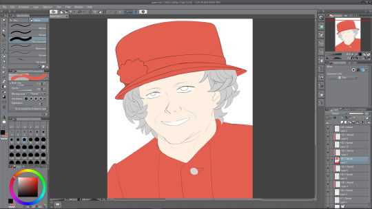
Painting Face I
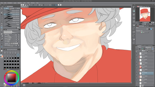
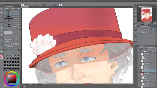
Now it was time to paint the face that I’d coloured in with the skin tone. I added the necessary shades first, like with her face lines, which I’ve exaggerated in her favour, the shade under her nose and shadows being cast by her hair, look to the left and right of her face. Also, you may have noticed that I completely forgot to draw the eyebrows from the second screenshot onward, so i corrected that below. I painted in the inside of the ear using dark shades also. It was fun to paint underneath the head, where a shadow is being cast. The shadow being cast from her hat makes her look almost evil and scheming right now, I think it may be because the eyes aren’t painted yet. There must be a relatively harsh lighting right now with how dark I’ve made the shadows—probably midday sunlight or something. There are all sorts of shades among the shadows, underneath the hat are a mix of greys, oranges and also a bit of red and pink nearer the top, where the colours from the hat bounce off. The shadow below the head has multiple shades too, mainly the same as the shadow from the hat, except from reds. There is a slight pinkish shade on the left side of the of the shade, bouncing off of the clothing, and an orange shade just under the chin.
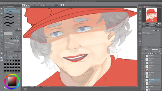
Painting Face II
Next I decided to work on the face some more to try and finish it. I started with the eyes. The eyes were under the hat’s shade, therefore, I needed to paint them accordingly. This meant that the main white in the eye would be a darker shade; grey. I painted her eyes a greyish blue, like her real eyes, and kept the shading quite minimal. After I finished the iris, I went over the outside using the blur tool to give it a soft look. Then I went back to the brush tool and did one white stroke on each of the eyes, and airbrushed a slight white over the middles of them. I think that it really adds to the painting and makes her eyes look less dead, which is something that often unintentionally happens when I’m drawing eyes. After finishing the eyes up, I moved to the mouth. After a bit of experimenting, I realised that making her grin was a bad idea, mainly because I just couldn’t get it to look right, but also because, once I drew her with her mouth open, presumably in joy, it looked a lot better.
I also tidied up the face shading, using the blend tool to blend parts that looked like they were too harsh and intruding. Next I continued on with the mouth area, and painted her red lips. Right now they don’t look very good, like they’re too thin or something, I fix this somewhat later on. I painted a small white dot on her lips to look like a highlight, which I think really goes far. Finally, I worked on the hair—easily my least favorite part of the illustration. For starters, even the sketches don’t look good to me, so adding depth to the hair via color wasn’t sounding too thrilling. But alas, I continued on, and painted them in a way that is acceptable, not great but I’m okay with it, so I continued with the shade from the hat, and painted a dark shadow coming from one edge of the hat to the other. It kind of dips, down and then up at the edges, which corresponds to how close the hair is to the sides of the hat. There aren’t many different shades among the hair, but I did decide to make it get lighter as it went down, no particular reason really, I just thought it would look nice and kind of a little less boring.
Painting Outfit I
Next I worked on her outfit, which wasn’t too difficult to come up with something I was pleased with. I looked at references of her wearing this kind of stiff outfit when I was sketching, and the reason I call it stiff is because there are minimal wrinkles on the outfit, not really any lines to introduce any shading to, and the lighting that I went with doesn’t really help me there either. Instead I used some of my usual tricks to add some kind of nice depth to something that is really flat otherwise. I painted a gradient from a desaturated purple-ish red from the bottom of the composition, to the red that I started with nearer the top. Although, this isn’t to say there’s no shading whatsoever, there is a nice shadow that continues on from the neck from the one that is being cast by the head. This shadow has a nice variety of shades in it, some greys, some purples and reds, and a slight desaturated orange as a bounce light from the skin tone that is very close by. There’s also some other shading as you can see in the illustration. Also a dark shade where the button is sewn through.
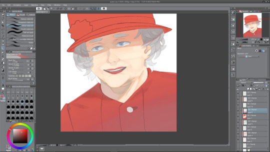
Painting Outfit II
I am nearing the end of the illustration, and next is to do the hat, which I thought would be difficult. Luckily so, I got kind of distracted by my linework—it was really messy still, therefore, I needed to clean it up, which took quite a while to be honest, though I think it was worth it. Essentially, I went over the hat lines with a thicker brush and then erased the thicker parts to correspond with the rest of the lines throughout the drawing. Now, it was a hat, not much I can think to shade really. I did the same gradient trick that I used with the outfit, and then also did a slight darker shade down the right hand side of the hat, to give it a slight beveled effect—make it look as though it was rounding off towards the edges, as a hat would do. I may still work on the hat some more later. I made the strip across the bottom of the hat a darker shade so that it didn’t look too boring. Now, for the white flower thing, I’m not sure what to call it, it was a challenge at first. I started by trying to make each of the points join together at the center where it would be darker, but as that looked terrible to me, I decided on a much more appealing way of painting it. As you can see, it looks quite soft and pastel-themed almost. I used a slightly large brush size to paint these blobs everywhere to create the effect of something that was puffed out. I’m really pleased with how it turned out, and I love the colours that I used in it. Again, looking at it now, the hat will probably need some more doing to it, but right now, I was roughly done with the painting.
Finished Queen Elizabeth Illustration with Cover
0 notes
Text
Because I can!
Here’s a gigantic review of the fifth part of the Spider-Man Clone Saga, issue by issue.
Note: These are the issues included with The Complete Clone Saga Epic, Vol. 5. I’ll try to keep most of these fairly brief because, while I enjoy this, I know no one reads ‘em and I don’t wanna go on forever.
New Warriors #62 - Feels somewhat inessential. Considering that, outside of the New Warriors books themselves, we don’t get too many references to Ben’s existence within the team, meh. Art is very 90′s.
Amazing Spider-Man Special - I’m a big fan of the art here. Lots of moody darks. We get officially introduced to Gabrielle Greer, and she’s a lot of fun. She plays off Ben really well in a way that makes one want to see where it goes. Both the generic agent-villains and Armstrong are pretty one-note, though.
Spider-Man Special - Despite some very solid art with nice, clean linework, this issue’s just filler. The agent-villains and Armstrong continue to be uninteresting. The Lizard is the only spot of excitement, and that’s only for the prospect of Ben facing him--that doesn’t happen in this issue.
Venom Special - Can someone explain to me how the hell Venom ended up in this mix of ‘specials’? Were they that desperate for a fifth Spider-related book for this storyline? That aside, the art on the Lizard here is really striking but the human characters (especially the faces) look a bit wonky. However, in terms of characterization this is probably the most fun to be had with Ben yet. We get to see he and Gabrielle play off each other more and get to see the juxtaposition of him with Peter. Whereas Peter would leave a civilian situation to play hero, Ben leaves to protect his and Peter’s identities as clones.
Spectacular Spider-Man Special - The dialog, especially from Armstrong, is pretty clunky in this one. As in, low-tier golden age comic book dialog. Oof. The penciller here (Claude St. Rubin) is very obviously doing his best, but his Lizard falls pretty flat and his Scarlet Spider is stiff. The ending is kind of... dumb. It implies that Gabrielle is sleeping with Armstrong to create unnecessary drama for us, the audience, based on preconceived notions of how we’ll judge that. It seems to be there to foster artificial shock rather than actually create drama for Ben. Overall, very meh.
Web of Spider-Man Special - Ben looks very blonde on the first page, which is a little early! Aside from the off colours, we also have comic book male anatomy going on like crazy: every dude is exceedingly, exceedingly buff. Like, the guy that the flirty co-worker is going out with is buffer than Ben, and yet the flirty co-worker makes a comment about how ripped Ben is? Just weirdly incongruent. However, I will say this issue’s Scarlet Spider is very well-done. Aside from art, there’s further proof that the whole Armstrong-naked-in-Gabrielle’s-apartment was more for the audience than for in-universe tension, since Ben basically sees a naked Armstrong in *his* apartment and doesn’t... really... seem to care. So why are we supposed to care? Honestly, of the five specials, the only ones worth reading are the first and third (the latter of which is supposedly a freakin’ Venom comic).
Web of Spider-Man #128 - Steven Butler (pencils) does a really great job here with both Spider-Men and Black Cat, with a lot of dynamic linework and good action shots. There are some well-done silhouette shots as well. In terms of plot, I’m very glad to be away from the largely self-contained Specials, and *extremely* glad to start getting some Spider-Man-and-Scarlet-Spider action. Watching the duo play off each other is a lot of great fun. The moment where Black Cat calls Peter a liar is rather poignant (in comic book terms) and I love where she snaps out of it to team up with the Spiders. The ending, as well, is well-done and I enjoy the two Spiders coming to terms with their situation.
Amazing Spider-Man #405 - Mark Bagley is very missed here (aside from the cover, which isn’t exactly his best work). While Darick Robertson does an admirable job, it’s very strange to (at this point in the series) not see Bagley’s work. Regardless of the art, however, this is a very essential Ben Reilly story. We finally get to truly explore Ben’s relationship with Seward, and see why we should care about him at all. Very, very solid issue.
Spider-Man #62 - Pat Broderick is, evidently, a fantastic penciller and I wish he’d done more of this book. Aside from that, we get an odd moment with Peter and MJ thrown into the middle of the book that (as far as I know?) doesn’t really get any pay off and just kind of feels like a reminder that Peter and Mary Jane exist. Regardless, this issue is a solid chapter three of ‘Exiled’, continuing the concurrent storylines with both Scarlet Spider and past Ben Reilly.
Spider-Man Unlimited #10 - Comic books should not be this long. While I like the reveal that Vulture’s youth has to be constantly fed to remain, far too much time is spent on it. Additionally, though I appreciate the time spent on seeing something of an untold Ben Parker tale and the resonating effect that has on Peter and Ben, I feel that that almost could’ve been an altogether separate story from the Vulture thing and probably worked just as well (if not better). What I’m really saying is, this book has no business being ‘Exiled part 4′ and should’ve been an anthology split between the Vulture story and the Ben Parker story.
Spectacular Spider-Man #228 - Bill Seinkiewicz has a lot of fun doing Spider-Man, and it shows. Especially on top of the (I’m sure masterful) work of Sal Buscema, his work always shines and that’s true for every issue of Spec the pair did. Anyway: this is the beginning chapter of ‘Time-Bomb’, the third major arc in this volume. I have a couple problems and a couple things I like about this concept (wherein Peter is brainwashed into attacking his wife with intent to kill, but is fully aware). Problems: It quickly gets tiring watching MJ and the unborn baby constantly used as bait to get the reader to care; Peter doesn’t do much either than scream about how he has to kill his wife (but oh God don’t let him) and it quickly gets repetitive. Things I like: Watching Peter’s horror (at least at first) is morbidly good drama; watching Peter in hunter mode is extremely cool, as that’s not something we normally get to see; and MJ’s resourcefulness is on full display here and I always love watching MJ be a badass normal.
Web of Spider-Man #129 - So, this is pretty much the one time within the main Spider-books in this volume that it’s relevant that Ben is part of the New Warriors. Steven Butler again does a good job with breakdowns, showing off some very fluid action from Spidey. Watching Peter pretty much wipe the floor with the Warriors because he’s not holding back is great, and is something I wish we could see in Spider-Man books more often. We again get to see Mary Jane being a complete badass, trusting her gut and having it win the day.
New Warriors #63 - Ben barely appears in this, and when he does he apparently gets the hots for Starfire (a teenager) because she bears some resemblance to MJ. All right... Otherwise, completely inessential.
New Warriors #64 - If you’re a fan of Thrash or Firestar, you’re in luck. Because they’re the only characters who do anything of interest in this entire issue. Again, Ben is not an important player, the villains are actually just stupid, and nothing of note to the Spider-Man mythos occurs. Why were the New Warriors issues included, again?
Amazing Spider-Man #406 - Bagley did the cover on this one again, and it looks great. Really miss that guy on the interiors... Anyway, we start with an extremely pseudo-science bullshit comic thing with cyberspace or whatever. While guest penciller Angel Medina gets some cool mileage out of the imagery here, the concept is just so out of left field for a Spider-Man story that i just kind of pretend it didn’t happen, since it isn’t super important to the overall plot. The new Doctor Octopus’ first appearance is extremely well-rendered. The final things of note here are getting to see the Parkers react to their baby moving, which is great; and new Octopus revealing Seward to be her father. Neat.
Spider-Man #83 - Peter being so giddy about feeling his child move is very sweet, and very in character for him. Though it’s kind of confusingly laid out, it seems like classic Spider-Man artist Gil Kane did this issue and it looks great. You can definitely feel the classic comic sensibility bleeding through.The layouts are super dynamic and fun, and we get an easy-to-follow, exciting battle between the Spiders and new Octopus.
Spider-Man Team-Up - Aside from the (shockingly relevant) ‘Cats’ parody and Ken Lashley’s depiction of Spider-Man, this issue isn’t overall super interesting or entertaining. Then again, I abhorred the issues of Marvel Team-Up I read, so maybe I just don’t like this format. Peter does quit the Bugle though, and it remains to be seen past this book whether or not that sticks or has real consequences.
Spectacular Spider-Man #229 - Sal Buscema and Seinkiewicz get a more even billing this time around, with a couple pages clearly done all on Buscema’s lonesome. It all looks great! The storyline falters a little, though, due to the very direct and less engaging ripping of the Master Planner climax. Though I liked the stakes, the way it was resolved (”You did it! You survived until I got here to save you, wow!”) felt really lack-lustre and like a passing of the torch to Ben that doesn’t really work. Beside that, I like the development of Peter giving up being Spidey “””for good””” and look forward to moving onto the Ben Reilly-centric Spider-Man stories.
0 notes
Text
Cold Dead Hands #1 Advance Review
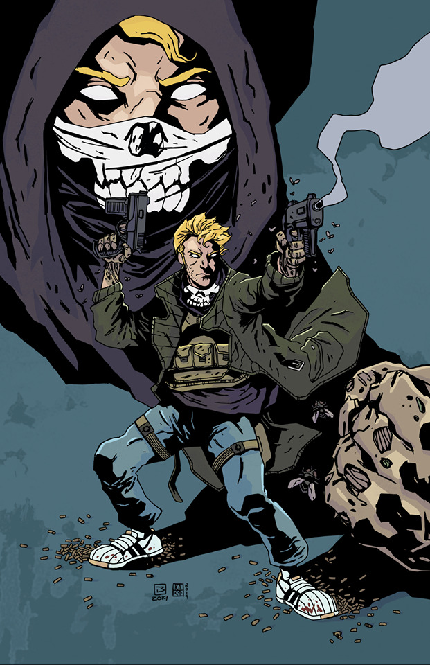
Cold Dead Hands #1 Advance Review Source Point Press 2020 Written by Garrett Gunn Illustrated by Lee Milewski Lettered by Justin Birch Aspiring mercenary, Kit Kelso, comes wrist-to-wrist with the deadliest hands in history. Oh yeah if you aren't familiar with Garrett and his writing you need to find the opportunity to introduce yourself to it. The man has a nice way with words, at least on paper, and the sheer raw talent, ability and creativity with him is exciting to see. From what I see right off the bat this is a mature audiences title just from the language and violence we see and considering the subject matter and the chosen profession of young Kit Kelso it's only natural. So if you want to read a story with some truly out of the box thinking then this is something you'll have to make sure your shop is going to have. The more I read this more intrigued I became and that is precisely what it is supposed to do. Start off with an eye catching moment and work our way to why that is occurring and then following things from there. The way we see the books structure is fantastic and the tools of the trade are here and subtly show us it's building blocks. The idea behind the story and how we see this and how we meet the characters is done superbly. You literally cannot get enough and you want more kind of immediately because suddenly you've been thrust into a world that is intriguing, fascinating and in frank honesty full of characters you want to know and or be. The way that this is being told is exceptionally well done. The story & plot development here as seen through how the sequence of events unfold and how the reader learns information pulls you in, gets your imagination fired up and thoroughly engages you in what's happening. The character development is phenomenal and I like that the whole tough guy routine is thrown out the window, okay the stereotype Goodfellas is anyway, and instead we see these men as real folks who have a job to do and then talk about mundane stuff. This allows the reader to be able to relate to them in some context or another. The pacing is superb and as it takes us through the pages revealing the twists and turns along the way we see how the story unfolds and how everything works together to create this near perfect ebb & flow to the story. The interiors here are cute. The linework is interesting and it's thick and there isn't too much attention to detail but there is this certain charm and charisma to it that I find endearing. It wouldn't surprise me either if a few characters were based on this creative team either. I am also impressed with the way we see imagery in the backgrounds. The warehouse for example and the shadows that fall across the floor from the moonlight outside is sensationally well rendered. The utilisation of the page layouts and how we see the angles and perspective in the panels show a superb eye for storytelling. The way that we see this even without the utilisation of backgrounds, which I want to see more of and think we need to see more of, we still get this nice sense of depth perception, scale and that overall sense of size and scope to the book. The colour work is pretty. The colour choices are sensational and the way we see the various hues and tones with the colours create the shading, highlights and shadow work through colour blocking is exceptional stuff. I love this already and I cannot wait to get my hands on a physical copy. Seeing the events occur how they do and seeing how things are coped with will surely entertain you. This is unlike anything you've ever read before and that is a feat unto itself as this kind of originality is harder and harder to find. Once again Source Point Press proves they are among the top houses for amazing storytelling.

1 note
·
View note
Text
Bronze Age Boogie #02

Bronze Age Boogie #02 Ahoy Comics 2019 Written by Stuart Moore Illustrated by Alberto Ponticelli Coloured by Giulia Brusco Lettered by Rob Steen PREVIOUSLY… 1975 B.C. Young Brita Constantina, daughter of a barbarian king, watches in horror as Martians invade the site of a battle against wizards. But Brita is quickly whisked away through time… 1975 A.D. …to the site of another Martian invasion…in an Age Undreamed Of! To her, anyway Well they say there is no rest for the wicked right and I guess you could consider Brita wicked then because she’s out of the fire and right back into the fire again. Right into the battle by Lynda Darrk. I have to say I love the 70’s aside from being when it began and wearing those funky bell-bottom suits with platform shoes and it’s very blaxploitation film genre with the slang to go with it. This is what Lynda reminds me of a mixture of Wonder Woman and Foxy Brown. It is so much freakin fun and this is why I think that Ahoy now firmly sits in my top choices of comic book companies. So the way that Brita and Lynda meet is interesting but meeting Jackson Li now that is something else altogether and yet another 70’s staple era genre favourite as well. He’s the complicated one that to be honest I wasn’t really expecting to see and I like that Stuart is mixing up gender rolls in ways that you don’t expect to see. This is the kind of thing that you notice but don’t think twice about, it’s low key and with the way it’s all written feels as natural as can be. After all what we learn troubles him well it’s a common ailment among men. Still the leader of this pack surely does know how to take charge and bring them all together. The way that this is structured is fantastic and hoe the overall ebb & flow of information and action are woven together is why he’s such a great writer. The man has street cred like no ones business after all. There is a lot of crazy stuff going on here and this Martian Invasion going on so that the incredulous seems entirely credible. While I don’t agree with one thing that happens it surely does make for awkwardly great moment before this segment ends. The man knows what he is doing with that’s for damn sure. The interiors here are really rather nice. I love how the linework is utilised to bring the characters to life. How we see Lynda’s top or vest has those faux fur shoulders it all just has this hugely weird appeal to it. Though I am more surprised by the fact that Brita’s look is so contemporary instead of feeling as if she stepped out of the dark ages. Then there’s the machinery aspect of the Martian suits and the creativity and imagination needed to bring those to life as well. While I am a big fan of seeing backgrounds utilised as often as possible there are times I let that slide and there are a number of times here I can do just that, not all mind you. The best scene however is page 12 if you want my opinion. The utilisation of the page layouts and how we see the angles and perspective show a stellar eye for storytelling. The colour work here is really as well. The shading, shadow and even the colour gradation that comes out of the way light sources are utilised are done extremely well. I mean from page 16 on wow. After the shocking events that close out the now we go back to seeing how the palace is being attacked by the Martians and the wizards chanting something and again two cliffhangers one issue this is some whacked out stuff and I gotta say I can’t get enough of it! The strength of storytelling here through the story & plot development, pacing and characterisation alongside the quality of these interiors, oh Ahoy Captain permission to come aboard?

1 note
·
View note
Text
Bloodshot #3
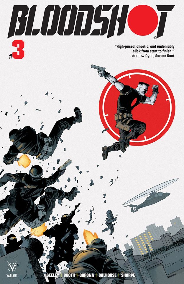
Bloodshot #3 Valiant Entertainment 2019 Written by Tim Seeley Pencilled by Brett Booth Inked by Adelso Corona Coloured by Andrew Dalhouse Lettered by Dave Sharpe Break out the popcorn before Bloodshot hits the big screen and witness the super-soldier unleashed! The origin issue of Eidolon, Bloodshot’s greatest nemesis in the making! Well this certainly isn't taking any kind of direction that I was expecting it to and that of course is a huge knock in it's favour! This is why I love Tim and what is able to do as he is such a master storyteller and the genre really doesn't matter much so long as he's enjoying what he does the work is going to be spectacular. Now the idea of all these government organisations all vying for control and taking what could be considered threats or obstacles to them is a good one for Bloodshot to be a part of. Normally I am down on the government conspiracy stuff but for this character is a completely appropriate angle or avenue to follow. I am a huge fan of the way that this is being told. The story & plot development and how we see the sequence of events unfold and how the reader learns information is extremely well done. After all the layering of this story already and it continues to grow in that sense makes for some genuinely interesting reading. The character development is on point here as we see Bloodshot, Ray, find new ways to deal with what he has been through and then apply that to his current situation is bloody brilliant to see. The pacing here is great and how the twists and turns that we see affect the ebb & flow to the books is so nice to see. From a flashback that's integral to the story which ties Ray and Eidolon together more closely than he could've imagined to the way we see this General Gayle trying to remain in control keeps the reader on their toes. I will say this much right here and right now, I want to see more of not only the creatures from the DNA Whisperer and Apanewicz because we don't see that he found him though he kept thinking the young woman was him so this needs more clarification please and than you. I love how we are introduced to characters new and returning, well returning from the first two issues anyway, in the book and how by playing their parts they become more integral to the story as it moves forward, now and later. I like Brett's pencils and how he loves to lay down his linework the way he does. He certainly doesn't shy away from the multiple variations in the linework to create this attention to detail that we see, and we see a lot of it. He has a very distinct style that hasn't varied much since he debuted in comics but I have noticed that his range in what he does has increased. The melting version of Ray is crazy good and it really makes one hell of an impact upon the reader. The utilisation of the page layouts and how we see the angles and perspective in the panels show a rather nice eye for storytelling. We see more than a fair amount of backgrounds being utilised here and it's marvellous as it helps to expand the moments and bring a sense of size and scope to the book. There is also some nice depth perception happening within these pages as well. Totally impressed with the inking done on top of that as well since I am sure it can't be easy to ink his work. Adelso is talented and what we see from him is outstanding. The colour work is brilliant to see. I love how we see a base colour and then the various hues and tones within it to show us the shading, highlights and shadows. The mask we see is hella awesome, the way whites are utilised along the blues and silvers all conspire to show off this bang on job with the colours shows some great knowledge of how the colours work. I am usually pretty stoked to see Bloodshot in any book that is his but Tim's approach, while yes a tie-in I suppose to the forthcoming feature film, is taking him in a bold new direction and that we've not seen anything quite like this before that has me through the roof with excitement.

1 note
·
View note
Text
Postal Deliverance #1

Postal Deliverance #1 Top Cow Productions 2019 Written by Bryan Hill Illustrated by Raffaele Ienco Lettered by Troy Peteri POSTAL returns to find Mark struggling with the responsibilities and horrors of being the new Mayor of Eden, as the newest member of their community has brought his own personal war with him. Mark’s mother, Laura Shiffron, tries to enjoy her retirement in Florida, but violence finds her… and violence might be the only way Laura Shiffron can find peace. This is Christmas in July for me! I doubt when Matt created this he thought it would become so beloved and influential to it’s audience. But it has and it is and to get another arc is fantastic because as a reader and a fan there is still plenty more left to explore with these characters and all the new dynamics that were left behind. The opening here is phenomenal as we see someone who has a unique set of skills have his life turned literally upside down. It is fun, interesting and has all the characteristics of a great thriller as it gets the adrenaline pumping. I love Bryan’s writing and the fact that he knows these characters inside and out only makes the fact that he’s in charge makes me believe this is going to be epic. The man knows how to write pure and simple and the way he’s able to structure the book demonstrates his skill and talent beautifully. So with the opening what it is and then following up on Laura creates this really really strong ebb & flow that is so powerful you’d almost feel you could surf a gnarly wave. Then we get to the meat of the issue as Mark and Maggie start their day in Eden. I love these two, they are damaged beyond belief and yet are perfect for one another. Maggie says it best here and I wholeheartedly agree with what she’s saying. There is work to be done of course as Mark has to welcome a new resident to Eden. Ah the price for a place in Eden isn’t for us know but it is nice to see that Mark is carrying on the tradition rather well. Oh this is where we see how things will become more interesting as this story continues. Erik Cayman welcome to Eden hope you survive your stay. Now I have been a fan of Raffaele’s for quite some time now and seeing the interiors here just reinforces why. The work here is masterful, stupendous, phenomenal and I could use all the words I know and use but it wouldn’t be enough to express what I feel looking at it. The linework is extraordinary and how the varying weights are utilised to showcase some of the most stunning attention to detail. Then there is the composition inside the panels as we see the utilisation of foregrounds and backgrounds as well as the angles and perspective in addition to the utilisation of the page layouts show a brilliant eye for storytelling. Then there’s the fact that Raffaele also does the colour work here. The use of colour gradation, light sources for the shading and shadows or rays of sunlight all conspire to really make this the kind of work that stands out from the crowd watching while others try to match it or catch up to this level and quality of work. The characterisation here is beyond exceptional to see. I mean we already know most of the players but to see them having grown in our absence is amazing to see. Laura’s boredom at having nothing to do while retired while predictable is fun to see as she finds a new way to entertain herself. Then the introduction of Erik who has a penchant for breaking the rules and is setting himself up for a fight and failure, he has a death wish already, is going to be what we want to watch unfold. This is one of the best books you are going to read, even if you’ve never read one before you’ll love this anyway and want to read what’s come before. If I weren’t waiting on my first disability cheque then I’d give you a money back guarantee it’s that good.

0 notes
Text
Danger Doll Squad Presents Amalgama Lives #3

Danger Doll Squad Presents Amalgama Lives #3 Action Lab Danger Zone 2019 Written by Jason Martin Illustrated by Marco Maccagni Coloured by Geraldo Filho Lettered by Justin Birch Amalgama may have reached Earth, but can she keep herself together – literally – long enough to get her revenge?? Oh yes I do believe that these guys have actually gone off the deep end! I am going to complain about that, that’s for damn sure after all this is one of those laugh out loud ridiculous and some kind of combination of The Simpsons and kids fart jokes so that even if you don’t want to laugh your going to anyway. You won’t be able to help yourself. Amalgama and Lazerbeek are quite a pair and that the strange bird creature has this kind of unwavering loyalty to her, him/it the little parasitic creature living inside the body, is interesting to see. That and Lazerbeek actually has a higher intelligence than any of us yet realise. Jason, I love you, and all these little nuggets that you throw in which serve so many different purposes is incredible to see. Yes they show that this body made from the girls powers and abilities retains much of their psychic imprint which this thing cannot avoid taking on itself. I also reminds us of times when were younger and enjoyed life, cartoons and comics unapologetically. The gags here are definitely both visual and cerebral and sometimes working in concert with one another and sometimes not. Either way the way that this is structured and how the story & plot development shows us the information, revelations and intentions is incredibly good, strong and fun! I was hoping that whatever reason things would play out the way that they have. Okay not literally because even I couldn’t have predicted the way this issue ends but still to have Amalgama arrive on Earth and to see how much fun she was having in a highly, see densely, populated area like this was hysterically good. It is also incredibly gross that she’s been connected that brain and how so since she defeated it last issue. There are so many things going on in my head with that and well some kind of envy for being inadequate comes to mind. I am a fan of the interiors here as well. Sure they can be over the top as well and don’t make a ton of sense but hey people guess what it’s comic books! The linework is great and it shows off Marco’s strong steady hand when it comes to his work. Plus his imagination and creativity shines in this book and in so small part because he gets to reimagine certain scenes from classics or just we see moments where the brains are coming out in a most peculiar place is the kind of stuff that makes readers laugh without thinking too much about it. Also I'm sure those billboards show off inside jokes that only certain people will get which makes it fun as well. The utilisation of the page layouts and how we see the angles and perspective in the panels show a very strong, solid eye for storytelling. I like the colour work too and that we can see the red and how it kind of reminds us of innards is well done. The colour blocking and the way light sources create shading and shadows is really nice to see. Alright so for whatever reason she has Dollface in that French Maid’s outfit is something she cannot help but wearing and it’s utterly delightful. So that she, Dollface, is facing off against Amalgama alone, well without the girls, and putting the clues together highlight what we already know about her. Dollface may be a witch from the past in this body but she’s sharp as a tack too. I love the characterisation we’re getting it just makes this more badass than it already is. Folks if I can find the fun, humour and intelligence in this story then you can too and it doesn’t matter who you are this is plain old fashioned fun. Plus go guest star go guest star!

0 notes