#anyway i read reviews that was an expectedly terrible idea
Explore tagged Tumblr posts
Photo

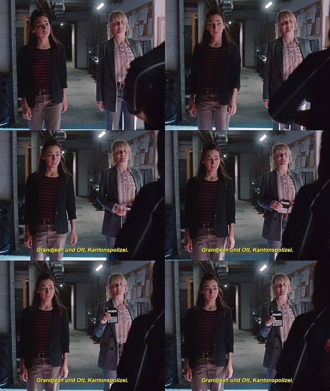
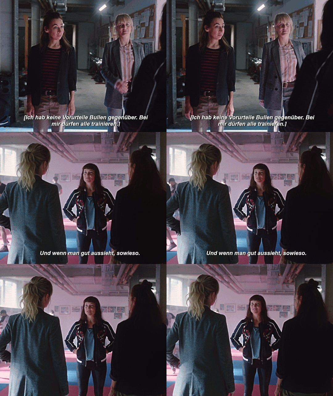


Tatort Zürich: Seilschaft (2023)
#tatort#tatort zürich#tessa ott#isabelle grandjean#mine*#gifs*#about every second episode a woman tries to flirt with them#it's a pattern#one day they will flirt back. i speak it into existence.#though tessa kind of did in sk but that was undercover wasn't it#anyway i read reviews that was an expectedly terrible idea#i know i'm biased bc i love them so much but c'mon that ep wasn't terrible#it was great! i had so much fun#they're growing as characters and i love it#someone tell me what to gif next or it'll be the pizza scene from sk#probably
30 notes
·
View notes
Photo





Visual Exercise 3 - Great Inspiration
The next assignment we got - ‘Great Inspiration’, was about recreating images by recognized photographers, and this is why it was called that way.
By first look, copying an image of a chair or just a single subject on a plain background seems easy peasy. BUT.
From the first trial I painfully discovered it is terribly hard to imitate a picture with all the details, lights and shadows, position... 😅 I feel it is almost impossible to copy the exact way the original photo was taken. So, during this project I felt overwhelmed, stuck, desparate, confused... but after all I kept on trying and will keep on exploring photographers’ techniques because thus I learn a lot about the perspectives of light, the importance of it and what results its specific use and the arrangement, positioning and representation of an object can bring. In fact, during the process of trying to imitate pictures I myself created a few quite fair captures that may not be as similar to the originals but look good on their own.
All in all, in a few posts I will share with you all my inspirations for work on the project and for further work I will keep on developing. I will also pluck up my courage to post some unsuccessful trials of the copycat and some separate photographs I have been taking while I have not been posting.
Here is a list of the photographers I researched before I started the recreation process. They were quite a lot and I collected a huge folder of photographs I desired to try redoing or just loved much and wanted to keep for my ‘ideas’ book. Quite a few of those grand artists (expectedly) just could not suit my capabilities of recreating such complicated images, which require skill, specific conditions, time and materials I could not afford.
Alexey Titarenko - ghostly vibes, ideas for creative use of exposures
Alma Haser - similar to Sylwia Kowalczyk’s work with crushed/folded paper and cut outs.
André Kertész - diverse work, different styles - new topographics, portraiture..
Arnold Newman
Bill Brandt
Cindy Sherman
Dan Dubowitz
David Hockney - at first I thought ‘oh, I like making collages, why not try redoing one of these joiners’... then I realized that these specific collages demand so much time and arrangement I could not do it before the deadline😅
Edward Weston - I tried recreating his nude portraits. Poses and shadows were extremely difficult. Still I am thinking of sharing some of the results.
Eugenio Recuenco
Fay Godwin
Gerhard Richter - paintings and photographs
Gregory Crewdson
Hannah Starkey
Henri Cartier-Bresson
Idris Khan
Irving Penn - new in my favourites.
Johannes Vermeer
Pablo Zuleta Zahr - super originial and atypical work, ✔️ to try list
Richard Kalvar - loved the humour; found works that will be useful for another project
Rineke Dijkstra
Robert Mapplethorpe - his work looked approachable because I had a male model available, but is also quite specific in terms of lighting and posing, only a professional could do it
Sarah Ann Loreth - love at first sight. Just clicked with my taste of images and love to fire. Her style is visible, noticable and memorable.
Sohrab Hura - genuinely pure and intriguing narrative photographer. Since she was one of the last artists I researched, I kept in mind continuing reading and reviewing her exhibitions.
Sugimoto - liked the abstract approach
Sylwia Kowalczyk - honestly, one of the strongest inspirations I found during this research in terms of style and type of art. I love constructed images. I could not manage to recreate one of hers for the project but started exploring the way I can do it and will soon finish a work inspired by this amazing woman.
Tacita Dean - unique use of film, yet I am not familiar how to work with it and could not include it in the project
Tom Hunter - loved his ‘Swan Songs’
Viveca Koh
William Eggleston
So, even though I could not recreate every artist’s image I definitely appreciated and enjoyed researching their art and saved a lot of ideas in my ‘ideas’ book to try. :) In fact, quite a few of them I will look up to again when it’s time for the final project (portraiture, I will hint nothing more:)). So research is always useful, especially a thorough one and followed by practice. 📸
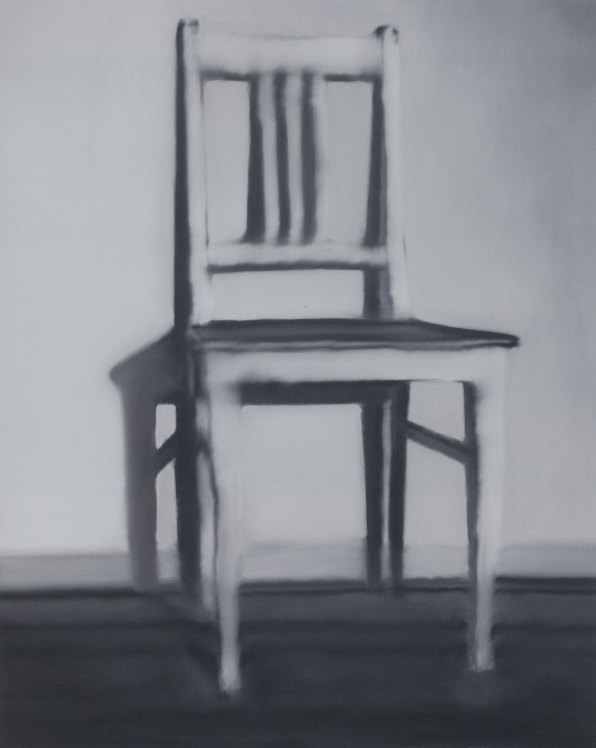
The first photograph I tried copying was Gerhard Richter’s küchenstuhl (kitchen chair). I had to start from somewhere so I thought ‘okay, I have a chair and a wall, I can try this’. Yes, but no as we say in Bulgaria. I had the original picture printed so that I could look up to it and adjust the light and the angles. Yet, as I did it on my own it was difficult holding the source of light (flash), a reflector (to darken the floor), and the camera all by myself. I took about a hundred pictures, realizing a new thing with every other photo taken: at first I hadn’t noticed the chair should be captured a little from the side. Then I saw the floor should be dark and there should be hardly any shadows on it, and thus I kept on noticing details I had to pay attention to. I tried capturing this photo with daylight (from the window) and with curtains shut (with flash). Anyways, when I saw the pictures on my laptop I realized I’ve made too many mistakes and knowing that I should not fix them on Photoshop, I decided to redo the photoshoot. The second time I had stronger daylight available and could adjust the position of the chair so that I got the right shadows; I took a series with the flash again in order to compare them on the laptop which has come out closer to the original and after all I do not remember which case was the most successful one.
An interesting story behind this first copycat was that initially I chose to do it because I wanted to recreate a painting. Then after recreating it I researched the picture and its artist (G. Richter) more deeply and found out there was a photograph by which the painting was made. And pleasantly surprising, in the photograph there was a similar column on the right of the chair just like in mine (and initially I worried about it being there). So one more time, research turns out quite useful.
(second row, last photograph) ⬇
The choice of picture for the second recreation was induced by my inspiration from the photographer who made it and the way the content is presented. I became a huge fan of Robert Mapplethorpe throughout this project, I enjoy his style very much and had quite a lot of his pictures in the recreation list. What drew me in to this exact photograph of his were the highlights and the way this part of the body, which is my favourite, is captured. I love looking at necks, jawbones, cheekbones - they are such an expressive part of a person’s look. And I think in this Mapplethorpe’s photograph they are depicted and emphasized through the shadows and highlights. The contrast, which I had problem with, plays a big role in the overall look of this image. When I printed mine it appeared flat, so I needed to strengthen the contrast between the whites and the blacks. So, if I am to recreate this picture again, I will use more sources of light to highlight the specific parts of the face and the neck. Overall, I am happy with the composition of my copy - I think this is the feature I’ve nailed in this recreation mostly.
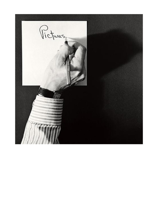
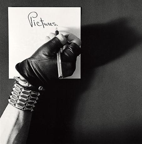
The next photograph also originates from Robert Mapplethorpe’s collection - Pictures/Self Portrait, 1977. Simple, and yet I had to recreate it twice because the first time I thought I have got the shadow right but in fact I had not. ➖ What I think I did not nail in this recreation: the position of the arm (left), the smooth edges of shadow and the small details highlighted on the hand (which can actually depend on the different body/hand). ➕ What I probably nailed: shirt, position of hand according to paper, text on paper, shape of shadow, angle of shoot.
All in all, I loved the simplicity in this picture and the way it clearly delivers a message: ‘Pictures.’. It may wrap up a person’s life, one’s hobby, passion, vision, anything. It makes you think. And the other version of this photograph kind of presents another side of the narrative, where the clothing plays a significant role in the reading of the picture. (shirt and a wrist watch (business) -> rocker gloves and a metal bracelet (rebel)). Everyone can be an artist.
Last but not least, I chose to recreate a picture of Sohrab Hura’s ‘Life is Everywhere’ project. It grabbed me the moment I saw it because it radiates some kind of magic, an honour, the way the photograph is hold. And I love the idea of a photo inside the photo - it somehow reveals the meaning of the images or people’s attitude towards them.
As long as I understood from Hura’s website, the story hidden behind this image of a hand holding a probably old photograph is about the mother of the photographer, who struggled with paranoid schizophrenia. If I have got it wrong about the picture at least I know it is from her work ‘Life is Everywhere’ that is inspired exactly by this tragedy in her life. The disease is not the reason why I wanted to recreate this image with the picture of my mother, thankfully. One reason is because I had her pocket picture I keep in my wallet and wanted to include her in my project. Reading the story, I found even more motivation and connection between the original and my recreation, so I was sure I was going to do it. Hura’s mother’s disease was believed to be caused by the break up with the father of the photographer. My mother went through a similar experience I am not going to elaborate on but I could relate to the story, excluding the severe psychologic disorder caused. Including her picture in my projects, holding it gently, honourably, I want to express my awe and admiration at her endurance and strong personality. She is my idol and I want to show it, so this is my interpretation of this copycat.
In terms of technical execution, I used a plain white wall as a background and had to move the hand away from it so that no shadow would appear on it. The hand was lit from above and a little on the right to achieve those highlights. I did not manage to get all the shadows and dark areas, but I think it is partially due to the lack of hair. I used a camera filter to get the vignette edges but they appeared a little too flat so obviously I had to strengthen them to achieve a similar look to the original.
In a nutshell, this project was a whole new experience to me which I did not expect to be so difficult for realization but after all I am happy with everything I learnt as for techniques, filters, lighting, photographers. I enriched my creativity and filled my ‘ideas’ book, doing my research, and thus have helped my next projects as well. Also I am glad I will have material to work on after this project is over and will now look at light in a different way and think more - how is this shadow achieved? where is this object lit from?...
🔦💡🕯📸🤔
💫📍📒
#photography#project#photography project#photography course#undergraduate#unilife#assignments#visual art#visual exercise#photograph#Famous Photographers#Gerhard Richter#Robert Mapplethorpe#Sohrab Hura#sylwia kowalczyk#art#improve#motivation#inspiration
4 notes
·
View notes