#and yes this is the mobile version. im only playing this version because I cant afford the switch version
Explore tagged Tumblr posts
Text

the funny lights
#not drizzile#ooc#also i got past the first day in twewy! i really like the music in this game and might listen to some of it later! shiki is still cool!#and yes this is the mobile version. im only playing this version because I cant afford the switch version#and id have to emulate it on ds#but really enjoying the game so far! although id appreciate it if i could save manually because i don't trust autosave#also i suck at the combat lol
8 notes
·
View notes
Text
thoughts on TYPE MOON stuff
well these are my the type moon stuff i have read or watched or whatever so far. this is my opinion only so its inherently correct argue with the wall or touch grass as the youth say SO here it goes drum roll
FATE EXTRA
boring as shit. no joke im sorry its just booty cheeks but of the not sexy kind. its beyond mid its so mid i cant even act like i enjoyed it. it has an interesting concept and world sure but everything else is doo doo butter.
only good part is nero being hot asf and ig whatever servant there is because i only used nero (lmao i aint playing it all over again) she was funny at times
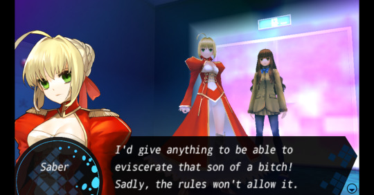
see shes hilarious at times... im sure CCC will change my mind... right? it has sakura what am i saying its PEAK
also fuck them for including arcueid in this crap
GARDEN OF SINNERS
i honestly dont have much to say about this one it never really clicked with me nor did i ever feel anything about it... BESIDES TOUKO
TOUKO IS SO HOT OMG
clears throat
that aside yea i genuinely dont have any opinion on this series of movies good or bad besides movies 3 and 5 which were my favorites
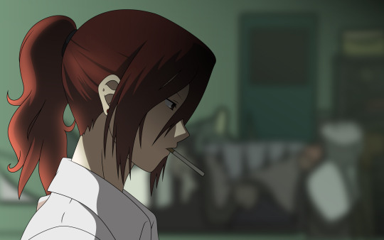
maybe i need to rewatch em one day and really try to get into it
FATE STRANGE FAKE
my favorite spin off in the whole fate franchise. it has some of my absolute favorite characters and GIL like what else would one even want in life amirite
some of my favorites are:
Richard: the absolute goat and one of my fav servants ever
Enkidu: i want a spinoff of gil and enkidu... is that so hard to ask??
Flat: my son
Jack: my uhhh child ig
alcides: the closest we will get to archer herc but just pure cool regardless
hansa: cyborg priest. nothing gets cooler then that
and many more im already too ti- FILIA - red to mention
i've only read up to volume 7 so i gotta get to reading the rest soon
its just pure chaos and is fun while doing so despite being slow as shit
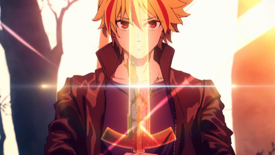
FATE GRAND ORDER
ok this is the most complicated series here in a way since its so incredibly mixed.
there are some of the highest peaks in fate and then some of the lowest lows so lets see
Highest peaks:
babylonia
Camelot
lb5 (YES olympus and atlantis im tired of acting like olympus isnt peak NO heian kyo its mid)
LB6
the rest of the lostbelts are good but not that good
goetia is an incredible villain
lowest lows:
first five singularities
solomon im sorry the stuff with goetia was peak but the rest was average
gameplay
gacha
serious lack of male summer servants like cmon i wanna see them abs
overall fgo is alright but some parts of it is straight up incredible HOWEVER all of it is seriously held back by being a gacha mobile game and has to work around that limitation
also it has barghest whom i absolutely adore
also fuck fgo for forgetting medea...
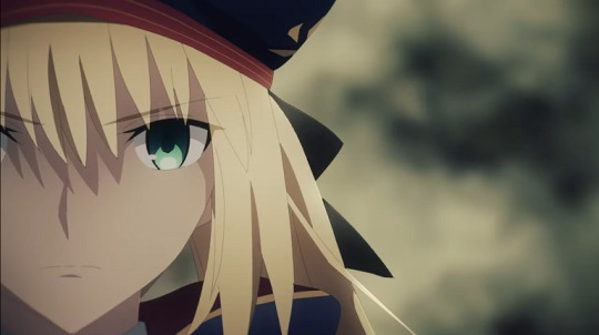
WITCH ON THE HOLY NIGHT
now this is peak. the most gorgeous tm work by far i have to say its simply an incredible read all around. even tsukire did not look or work or sound as good as mahoyo did even tho it came out almost ten(?) years after
on the story front i loved it too with a special shoutout to soujuuro being one of my favorite characters in TM (i say this often not my fault type moon keeps releasing bangers)
however mahoyo has two issues for me:
the story is clearly incomplete: i dont mean its just nonsense or whatever but when nasu said its the first of a trilogy you can just feel that in the story with alot of things being left in the air. this wouldnt be an issue really if mahoyo 2 wasnt basically dead....
i didnt vibe with the slice of life scenes as much as i usually do in nasu works: this isnt a flaw in the story more so i just didnt like em idk how else to word that
mahoyo is a great read however and i highly highly recommend you read it or else
it also has touko enough said
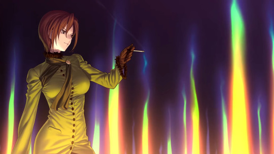
TSUKIHIME (original version)
Greatest of all time. Zenith of the medium. Hallmark of media. Gold standard of storytelling. Apogee of creativity. Vertex of invention. Crest of ingenuity. Acme of imagination. Pinnacle of innovation. Epic of epics. Legend among legends. Peak fiction
ok fr tho its actually incredible and you should read it right the fuck now
all of the characters are simply chefs kiss. while the visual novel is incredibly dated and the art is even worse you have to understand this is nasu and takeuchis first ever visual novel made on a barely existing budget.
boy do they make up for that.
the vn is split into two with a near side and far side.
while the near side is really good with arcueid and ciels route (ignore how ciel was actually really fucked over even in her own route its laughable and my girl deserved better) the far side is so much more better and really is where the soul of tsukihime and shiki the main character lies
i cba to review it properly besides saying PLEASE READ IT RN or ill cry and you dont wanna see that do you....
heres my ranking of the routes btw best to worse:
hisui
kohaku
akiha
arcueid
ciel
shoutout to satsuki you finally are gonna get the route you deserved
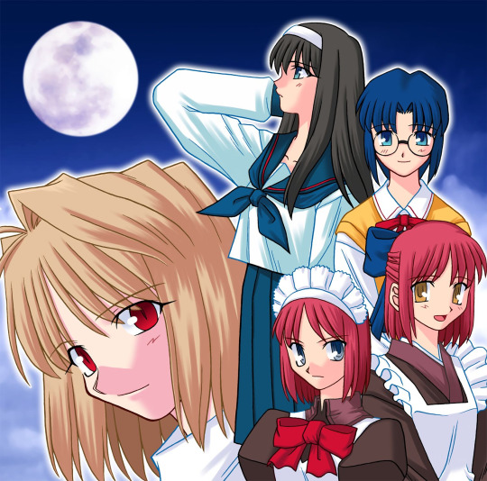
KAGETSU TOHYA
um it has some cool lore and some really good short stories and... yea thats about it...
dont have much else to add...
play it with a guide because the structure of the game is abysmal
FATE STAY NIGHT
what is there to be said about such a masterpiece? what else could be written about fsn that hasnt been written before? i am but an ant in the shadow of the giant that is FSN only seeking some crumbs to feed and live off of. idk what that means but it sounds cool.
FSN is simply tms best work all around. while i prefer tsuki over it and find the tsuki side of TM more interesting FSN overall is much stronger on most fronts but especially its main characters
Shirou emiya is simply the goat nothing else to be said tbh
heres my ranking of the routes:
issei route
heavens feel
ubw
fate
FATE ROUTE MUST BE REANIMATED RAHHHHHHHHHHHHHHHHHH SABER DESERVES TO HAVE A PROPER ADAPTATION RAHHHHHHHHHHHHHHHHH
we need more medea and kuzuki holy shit are they cute
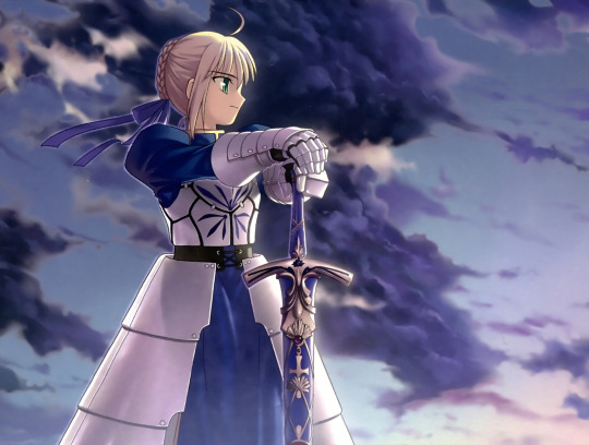
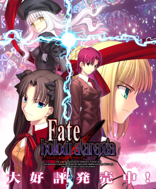
FATE HOLLOW ATARAXIA
thank you type moon for making a good kagetsu tohya. its actually impressive just how much better this is then KT like seriously what the fuck did they take to drop this banger of a vn
KT had such shit comedy i didnt even giggle throughout it but THIS
THIS is a emotional rollercoaster of a whole different kind.
introducing the third (arc and medea are first and second) love of my life Bazett and angra we go through an incredible main story intermingled with hilarious and wholesome slice of life scenes that never overstay their welcome
this vn completely changed my opinion on some characters especially illya who went from someone i was kinda 50/50 on to adoring her overall
ALSO MEDEA SCENES YES I WON MOTHERFUCKERS I WO- huh? whats that? fgo basically replaced her with medea lily?
one hour of sobbing later
if you have read fsn and not FHA then i must ask you.. wtf is wrong with you psycho? you like missing out on good things? that wouldnt be me is all im saying
read it.
(in case you're wondering yes there is someone i deliberately didnt mention because my opinion on them is too complicated)
TSUKIHIME REMAKE
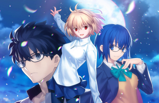
im not a fan of remaking classics on the level of tsuki. with all its flaws i still find the original to be good enough to not need a remake...
UNTIL I READ THE REMAKE
this is how you do it folks. the story was elevated on nearly every level and if it was the complete story id say its the best ever in existence ever forever fr. its just that good.
there are three things i really want to point out:
while maybe goin overboard i really liked the buffs all the characters received and in general the whole worldbuilding is so much better now with idea bloods and principles and vampire hierarchies and arcueid inflation scenes (heh) its just epic
ciel got a so much better route that actually feels like a ciel route and not just arcueid route 2 electric bugaloo (and getting fucking cucked)
noel is peak
this is peak type moon and when red garden comes out it will be even BETTER especially with satsuki route because satsuki deserves it
there are some other short stories i havent mentioned like garden of avalon, notes, MAGNITUNING (look it up you wont regret it) its all great and worth the time of reading
eventually i wanna play CCC and read some other stuff like maybe prillya DDD, fgo jp like lb7 traum and whatnot
i just wrote this for fun so dont really take anything i say seriously except for the teeny little part where im inherently correct.
uh if you are reading like or share or whatever tf it was idk
ciao
#fate stay night#type moon#kara no kyoukai#tsukihime#nerding out#arcueid brunestud#medea ily pls come back#fate extra#fate hollow ataraxia#fate grand order
14 notes
·
View notes
Text
hello herotaru newbies/ people interested in haniwa i am going to educate you about the wonderful thing that is shibarisa/ ariken / kenrisa/shibaari (yeah honeyworks fandom with multiple names for one ship bc we cant choose. i like shibarisa though so thats what ill be using)
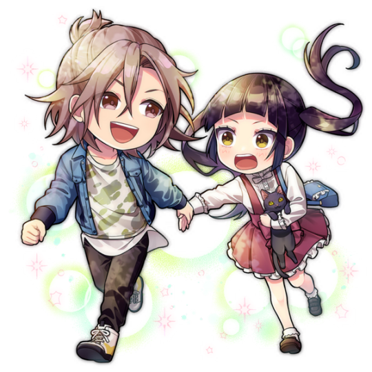
first, may i introduce you to the goddess of our world, takamizawa arisa


recognize her? if youre completely new, you might not, she did only appear for like 3 seconds in the first episode and like a few frames in the op
so, who is she? she’s voiced by Nao Toyama! she's currently a second year at sakuragaoka high school, part of the same friend group as hina, kotaro, koudai, and ken! (you might recognize them all if you’ve watched the ima suki ni naru movie~) she has a pretty concrete backstory! in middle school, she spoke up against bullies and in turn became the new bully target (and the original girl being bullied turned on her...) this can be seen in detail in Heart No Shuchou and the Heart No Shuchou novel.
This is very summarized, but basically, she knows A LOT about faking feelings and being someone that you aren't, having had to suppress a lot of her likes in order to fit in with the bully group.
Now bring in ken. (Voiced by Takuya Eguchi! ) Ken plays around with girls, not taking love seriouslly. He does it all to escape his home and the sullen atmosphere there is, rarely coming home ( and leaving aizou all alone ): ) (( and yes. shibasaki ken IS shibasaki aizou's actual older brother. yall clowns that dont believe it are so funny im dying)) Ken was interested a little in arisa since middle school, but since they weren't in the same class he didnt really step forward to do anything much, instead telling kotaro to watch arisa for him :)
So when they enter Sakuragaoka, they both are in the same class. Ken takes that opportunity to introduce himself, and slowly they become friends (with a little rough bumps along the way. You can see this in Ijiwaru na deai (sana version, i cant find the seiyuu version :( ) and the Ijiwaru Na deai novel. Also, Ken adopts his and Aizou’s cat, Kuro, because of Arisa :))) It leads to Ken falling truly in love with Arisa and confessing, and Arisa eventually accepting after first being friends (and going on a few dates :) (namaiki honey (ken pov)and Namaiki honey: another story(arisa pov)) (please watch them theyre so cute sobbign crying arisa saying that she’ll be the one confessing and ken being like i’ll wait forever for you crying sobbing they are EVERYTHING)
Besides those couple songs and novels, there isn’t much other content out there for them. Well, besides the honeyworks premium live events and POSSIBLY herotaru crumbs :’) BUT!! Shito has teased that there could POSSIBLY be a new shibarisa song !!!!!!!!!! (Remember Kuro? Kuro is often seen as a big part of their relationship, being in namaiki honey and also being a big part of their story. Who else could the black cat emoji be for?)
Anyways, honeyworks premium live (hanipre, honeyworks’ official mobile rhythm game) there are some REALLY CUTE shibarisa events, like one where Ken and Aizou lose Kuro and Arisa comes to help them, and one where its ken and arisa’s first anniversary and ken secretly takes a part time job so that he could buy arisa a gift :)))))) theyre literally so cute they are my everything

So, why did I spend time to introduce you to one of literally the best couples of haniwa? Well because thats what they deserve (ken is so whipped. Arisa is also but shes good at hiding it. ken doesnt hide it at all, whipped as fuck) They are just SO important. Like just the dynamic of two people with hard pasts finding each other and changing for each other. As shown in samishigariya (a must watch. i demand you go watch it right now. /srs)
So now I hope you love them too. They literally deserve their own show crying sobbing haniwa why
From this point on I will now introduce you to another aspect of them. If you don’t like aiyuu/ don’t ship it (aizou/yuujiro) feel free to ignore this because I’m now going to ramble SO MUCH about the CANON shibarisa/ aiyuu parallels and why they work so well (and also promote me and lisi’s roleswap AU :))) )
So. A big part of this comes from samishigariya so if you haven’t already, go watch it. Basically, it shows how Ken and Aizou used to be close, but as they grew and their family fell apart, their bond broke too. Eventually, both meet their most important person, quote on quote, the only one that found them (For Ken, that being Arisa (which if obviously romantic) and for Aizou... his unit mate, Yujiro.) Both are compared to moody kittens, sometimes there, yet quick to flee, but always there when their Shibasaki needs them. (Also. Aizou and Ken are canonically wearing a black dog hat and a shiba inu hoodie. You really can’t make this up, the cat/dog parallels are real.)
There’s even more things about the two that parallel each other besides those shown in the MV. Some can be seen as coincidences, but honestly there’s way too many that I’m thinking it’s got to be on purpose:
Both Arisa and Yujiro are from traditional families. Arisa’s family runs a shrine, while Yujiro’s family are Kabuki performers.
Both Arisa and Yujiro like sweets. This is more of an educated observation, though we know that Yujiro definitely likes sweets. It’s just, Arisa and ken go to crepe stands a lot and that one 3 star in hanipre with her eating a crepe makes me think she’d love sweets.
Both arisa and yujiro are tsunderes. (and both shibasakis are often more earnest and outgoing!! im looking @ u aizou, saying that you were glad that you went on the kyoto trip with yujiro even while yujiro refused to say that aloud )
BOTH COUPLES HAVE THE SAME SECRET SPOT: The spot where the beginning of namaiki honey happens/ where arisa agrees to be friends first is the SAME SPOT as the place that aizou drags yujiro to whenever they need a heart-to-heart in private. i literally cannot make this shit up
and the most important: both couples are pairs where 2 people, broken and hurting/ with a rough backstory, finding each other and helping each other grow.
like, these two pairs are SO SIMILAR you can come up with any scenario for either of them, and it’d PROBABLY work for the other. Literally. Just try it. In fact, this is exactly why our roleswap AU works so well. It literally fits both couples so perfectly (and you should check it out!!!!!!!!!!!! lisi’s writing for it is absolutely FANTASTIC)
Also. One more thing Not to forget. The latest Hanipre Valentines event: Yujiro seeing Ken and Arisa arguing in front of him, but then making up and having a heart to heart, agreeing to talk to each other clearly. And then Yujiro admitting that that was the kind of relationship he wanted. AND THEN YUJIRO THINKING ABOUT HOW KEN (who he didnt know was aizou’s brother) REALLY REMINDED HIM OF AIZOU. just some. food for thought
if you want to read more about the parallels, lisi has a really good post here!
ANyways yeah. Stan shibarisa. and maybe aiyuu i guess idk just know that the shibarisa/aiyuu parallels are very real and so important
also praying for more arisa and aizou interactions, its so wholesome, aizou accepts his future sister in law sobbigngn and she doesnt treat him like a celebrity or anything, she just treats him as shibasaki’s little brother, like family
and also praying for yujiro and ken interactions pls im beggind theyd be so funny
and maybe yujiro and arisa bonding over how dumb their shibasakis are
ahgfhjkjhdf just all of them together theyd make such a good family. real true shibasaki family.(yuko does not count. she remarried, shes basically not a shibasaki anymore) Kuro is also a very important member of this family. THE most important
SO ANYWAYS. hello herotaru people if ur still here. stan shibarisa. they are SO important and in love and my entire world.
#honeyworks#confession executive committee#heroine tarumono#heroines run the show#heroine tarumono kiraware heroine to naisho no oshigoto#shibarisa#ariken#kenrisa#takamizawa arisa#shibasaki ken#aiyuu
123 notes
·
View notes
Text
ok so im just gonna pick at fr from a web designer pov because looking at this site on mobile will drive me into madness if they don’t fix it at some point. The rest of this post will go under a read more because it’s both super long and image heavy.
before i hit mobile though, I’m going to point out some things i just don’t personally like in general with the site design (and yes i am conscious that they are slowly updating to a new look)
this will come as a shock to no one, if you’ve seen previous web design related posts by others anyways, but i cant. stand this menu
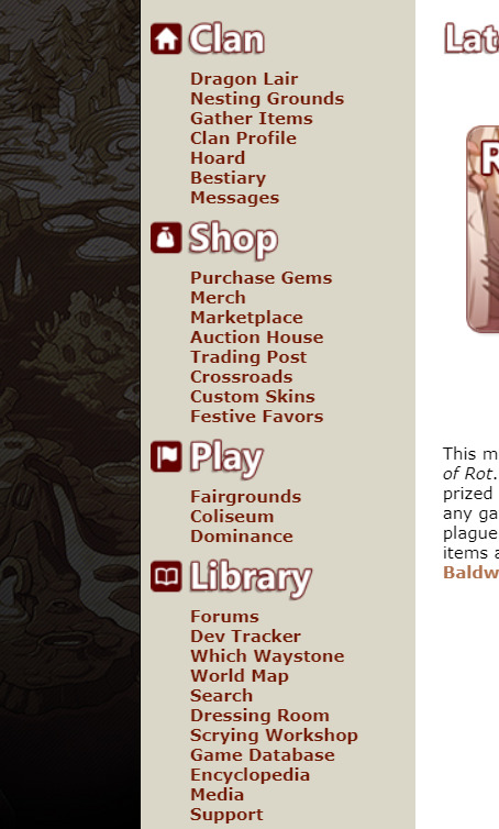
[ID: A cropped screenshot of Flight Rising’s Main Menu]
fr, understandably, has a shit ton of links. it’s a petsite with lore and all that, whatever. The thing that bothers me specifically is the length of links and where some are placed.
1. i BELIEVE this counts as an accessibility issue where longer links kinda trap shorter links, goes into misclicks to other pages in the site, etc. etc. 2. i don’t think. the search link should be under library personally ? Maybe make it its own category.
Dev Tracker & Media could go under this category, possibly add separate links to forum, player, and dragon searches with updated formatting
Dressing Room and Scrying Workshop could go under the “Play” category
Forums can be it’s own category with possible subcategories being: Announcements & News, Help Center, and Flight specific discussion forum, maybe more
Library category could then just be: Which Waystone, World Map, Game Database, and Encyclopedia.
Support should be it’s own category.
One thing on the shop category, and i hesitate to say this because im not CONFIDENT on this one, but I’m not sure Custom Skins exactly fits? or at least, it should be Purchase Gems -> Marketplace -> Custom Skins, not between crossroads and festive favors
Merch should probably go under purchase gems, and they should maybe uhh..... i guess change the name for it overall? because 1. “merch” alone does NOT look good with its placement, 2. its another actual money purchase thing and I think those should go on the same page
Along with that, in putting merch under that page, they could put previews of the merch with a button to go purchase instead of immediately going to their merch site (which to begin with it should open in a new tab if its going to a separate site?!!)
then this is a mix of both not liking it on laptop OR mobile,
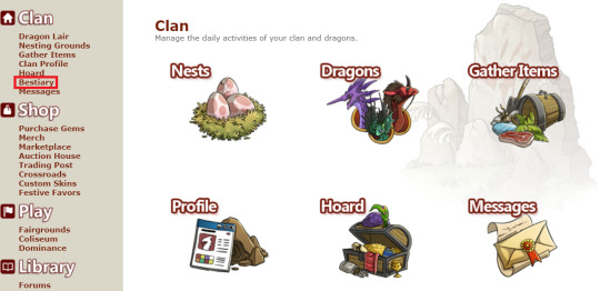
[ID: A cropped image of Flight Rising’s Clan Home page. The Bestiary link has a bright red box highlighting it]
Obviously these pages are old, but the graphics need to be updated, and there needs to be graphics for every link in the category-- seeing with this category alone there isn’t a graphic for the Bestiary already. On top of this they need to be in link order preferably. if they had a normal dropdown menu for mobile, mobile users wouldn’t be able to access the bestiary unless FR wanted to be STUPID and do further dropdown menus w their 200 links which would be STUPID and CLUTTERED
also in my opinion the Messages link isn’t necessary since we have the button at the top. If they put it there as an excuse for accessibility, they can just. add text to the buttons. like here’s a scuffed mockup but.

[ID: Screenshot of Flight Rising’s Messages, Friend Requests, and Alerts icons edited to have Messages, Friends, and Alerts written next to the icons]
for the friends tab, they could prolly add friend requests at the top like they do for baldwin alerts, then have an online status thing for friends below with buttons to PM, trade, delete friend, etc. I think you’re already able to disable the online status thing with page visibility? but like, make those options separate if you dont wanna block off your entire page, but dont want to be seen online.
For mobile, they can just make the icons bigger.
then. i THINK. last thing on laptop site.
[ID: A screenshot of Flight Rising’s Social Media links with old Logos to YouTube, Tumblr, Reddit, Twitter, Facebook, and DeviantArt]
update these fucking icons they are personally killing me, none of these logos are in use anymore (ALSO UPDATE THE TUMBLR THEME JESUS CHRIST)
ok now for mobile. what this post was originally for.
-
as you all know, if you visit this site on mobile, there is literally no form of a mobile version for it. It is just a condensed version of the computer version of the site which is...Very Bad!
Most of a sites visitors are going to be through mobile, i forget the exact percentage, but like it’s almost a given that people more readily have their phones with them than their laptop or tablet (which. im not going to bother with the tablet version, you can apply both computer and mobile criticisms to the site). in fact a lot of my time on FR is through mobile since I’m not at home 24/7 and I don’t tote my laptop around. Playing this game through it’s mobile site is Not Fun!
I like, won’t be too pissy or anything bc like. it’s a petsite and I’m making this post for fun. but also like it was made in 2014? 2013? so I’m not going to be u kno. angry. but it nearing the point of ten years with this site and there still isn’t a mobile friendly version. that is lazy. If anything, if they wanted a site update to be the anniversary thing, they should’ve made that update be
Mobile update as primary thing, because designing the site for mobile is a shit ton of work with the amt of pages they have to work through.
Dragon Profile page update (*LOUD SIGH*)
Clan page update
Hoard update (i have thoughts on this too but i wont dive into it this post)
Purchase Gems page update
Dev Tracker update
Forums update
“but that’s a lot to update” well. that wouldve made the anniversary being a website update considerably more worth it, because in my opinion having the dragon profile pages be the ONLY thing to happen during the anniversary was a waste and a bad decision, because other website updates are just. normal whatever updates. it made the anniversary SUPER underwhelming especially bc the past ones (to my knowledge) have only been major game mechanic updates like the eye & ancients update and i believe? the color wheel expansion was an anniversary thing? someone can correct me on that I haven’t played this game as long as most LMAO
as for how i personally would situate the mobile site. shitty graphic time, bc im not putting too much effort into this (warning this will be LONG)

[ID: Image 1. A crudely put together screenshot of the top half of a Mobile View of Flight Rising with comments on either side. It ends with the Latest News segments “Riot of Rot” and “Hoard & Vault Revamp”
Comment 1, Left side: “no banner make it a solid color that matches the burger menu. size the logo correctly etc. Comment 2, Right side: “burger menu w ONLY the categories, goes to the homepages of the categories” Comment 3, Right side: “TWO latest news posts, maybe a button to go see earlier news (which may b something to add to comp too)” Comment 4, Right side: “center dates and comments maybe idfk”
At the bottom of the image there is an added “button” that says “more updates button”]
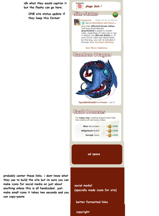
[ID: Image 2. The bottom half of the mobile view with comments on the left side. There is a put together white box that has the Plague Flight Logo and “plage dom !” written in it. Below it are the Site Status, Random Dragon, and Exalt Bonuses boxes from the site. Underneath that is a red box with “ad space” in the center, with a red footer at the bottom.
The footer contains, “social media! (specifally made icons for site)”, “better formatted links”, and “copyright”.
Comment 1: “idk what they would caption it but the flashy can go here.” Comment 2: “ONE site status update if they keep this format” Comment 3: “probably center these links. i dont know what they use to build the site but im sure you can make icons for social media on just about anything unless this is all handcoded. just. make small icons it takes two seconds and you can copy+paste”]
i dont even want to THINK about how the lair and all that would look on mobile, it was a chore doing the home page alone SOBS
anyways, in ref to these images though--
this is just slapped together and definitely wouldn’t be a final draft, it could use some tweaking
the flashy i refer to is the box that’s above the user box that says what flight is in dom, what festival is going on, etc.
when i mention building the site and “you can make icons for social media on just about anything” im referring to wordpress, wix, whatever is used to format the site. I really only have experience with wordpress thru elementor and divi (so far) so im not CERTAIN about other places but I feel it would be pretty common to have that tool. if not, making icons (or snatching some) is rlly not that hard, probably only costly depending on what their webdesigner(s) charge for icons
I’m not like certain on who does what, how the webdesigner(s) work with/price this site, etc. etc. this is just. going off of my own knowledge. and in general this whole post is my own knowledge abt shit i did no further research to FRs team specifically
i think this is basically it, i’ll reblog with more if i think of anything, but feel free to add things yourself or in general discuss things. again this post was made for fun so im not taking it seriously or demanding for these changes to be made, just personal annoyances and preferences.
This is also my first time doing picture IDs for a post so if I need to correct anything or the like let me know and I’ll edit it in the post!
#im afraid to put this in the tag but you can rb i dont care#but GOD this post ended up so much longer than i anticipated..............#the more i looked at the site the more i saw to point out LMAO#also i tried making this post more accessible bt if theres still some things that dont make sense please let me know#esp the picture ids#theres also so much more i could add whether it's inconsistencies or whatever but i do not !! have the time for that
4 notes
·
View notes
Text
Oh Wow! Im finally here with a headcanon birth chart and analysis for jamie!
i'm on mobile so I cant even put this long ass post under a read more i am so fucking sowwy but anyways a lot of this was inspired from dewmie-in 's meta posts and also i rlly love astrology so pls follow them first of all or else ur a fake fan shhfhgjsjkfkd
☀️ ♓︎ Pisces Sun ♓︎ ☀️
There is no doubt that Jamie is a pisces sun. Some of the well known characteristics of a piscean are being the artistic ones, the ones more in touch with their emotions and the absolute dreamers of the zodiac, I can assure you this as a mercury and moon piscean!
And it’s quite obvious that these traits 100% match up to jamie’s surface character being a big theater nerd, writer, poet, and as an actor, he HAS to understand emotion in all its forms! While being the more compassionate of signs, that also comes with sympathy, and maybe even empathy.
to which he expresses when he tells steven that a good story with a quality protagonist HAS to include said protagonists struggles as well, now this might be a reach but perhaps this was self projecting after his own struggles in kansas, maybe even foreshadowing ooOoOh
(“a real hero must struggle” jamie struggles living in kansas, moves back to beach city, nails his first production and gains management position @ the theater, aka his heroic ending i guess idk, then more theater related accomplishments as mentioned in letters to lars ofc)
☽♎︎ Libra Moon ♎︎☽
One of the biggest desires for any libra placement is balance, And the moon sign being the emotion sign, Libra moons desire an emotional balance as much as they do in their environment. Libra Moons can also be known as a “people person” while typically depending on the study of others to lean their own nature.
Jamie fits the Libra moon description being a sort of people person himself. Though he’s capable of keeping a friendly conversation with just about anyone, There’s also no doubt that this guy has severe anxiety that affects his communication with others along with his emotional stability (even affecting him physically). The thing is that he’s managed to keep the anxiety and his social skills much more balanced the more we see him or i guess as time passes, not one of them overpowering the other. (see venus in scorpio as to why he limits himself socially as much as he would his anxiety)
While he desires emotional balance that also comes with a feeling of frustration and defeat when things are even slightly out of balance (also a symptom of anxiety ; easily irritated/defeated) such as his improv performance in letters to lars, ending his performance within a minute after feeling overwhelmed as it started going south.
So while there are several moments of him maintaining an emotional balance he also has another side of the scale that’s less balanced (astrology word play lmao) such as a general lifestyle balance, also nonexistent for jamie (even though your lifestyle heavily affects your behavior) in a sense that he lacks of a healthy sleep schedule being a mailman AND an actor, one occurring from the early morning to the afternoon and the other job occurring at night. Probably irrelevent but its MY sleepover and Ill add as much necessary info in this birth chart reading as i please.
Im also including buddys book as an example because though it was only jamie being the faceclaim for buddy theres no denying that since historical friction theres at least some parallels between the two characters sharing the same traits (being writers, returning to beach city to prosper in their careers, being absolute drama kings)
♀️♏︎ Scorpio Venus ♏︎♀️
One of the biggest aspects to Jamie’s character INCLUDES being an absolute sucker for romance so lets get this bread and talk abt his relationships w/ everyone and his views on love uwu
Scorpio being a water sign means healing is one of the largest aspects to the sign. Healing nonetheless comes with a relation to trauma being from the planet representing death itself. Life and Death go hand in hand to define each other, ya feel me.
while were on the topic of death lets bring back the parallelism between jamie and buddy thats been around since historical friction. in the play buddy is presumed dead up until william reaches beach city. ok. so hear me out. perhaps that was foreshadowing for jamie’s traumatic near death encounter with topaz and aqua. remember how I said the water element represents healing as well as trauma??? It all kinda ties in yall...
ANYWAYS It’s safe to say that Jamie is a person that’s been through his rock bottom AND trauma already (his death if you will), struggling to live a happy, or even regular (lets face it as far as we know the only thing he came back to beach city with was sunglasses, bitch was broke) life in kansas, the abduction, its not something you can heal from overnight. While he does show symptoms of severe anxiety (to say the very least) even after the abduction he’s also grown closer to working on healing, moving on from his overwhelming fear of rejection by prospering in theater (him coming back to life if u will), and as for anything directly related to the abduction is unknown, but its very likely he’s working on moving on from that on his own as far as we know!!
which brings up the next trait of a scorpion venusian! They prefer to be a mystery in order to protect themselves as a result of fear of getting hurt for trusting/opening up too much. The first time we see jamie since the abduction is during the re-election in dewey wins, where he doesn’t seem affected at all. Yes, Jamie is a pretty open book for the most part (see dewmie-in’s analogy to in/out of the closet in historical friction) however theres also moments where he limits himself, or perhaps another side to himself, a far more passionate side…
Holding back tears during his drama zone and waiting until hes alone to be excited abt delivering his letter in love letters, playing it cool when earning theater director position in historical friction, not to mention his room SHOULD play a very huge role in his secretive side. (see brodingle’s post on jamie’s room, his casual side vs his passionate side)
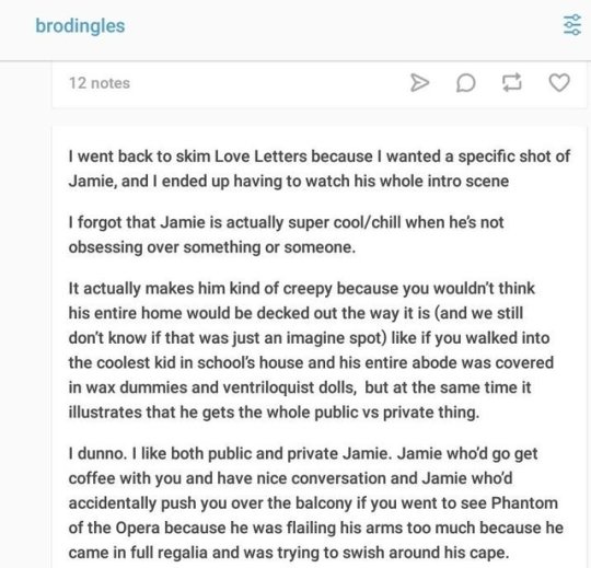
the venus in scorpio (or any scorpio placement rlly) also remains a secret not truly by choice, but theyre also studying others of interest. being an actor, Jamie should know a thing or two on body language and raw emotion as he sees it.
And finally, The venus is scorpio is a devoted, passionate, and emotionally attached lover. in love letters he falls for someone easily, and even if he learned in the end love at first sight isnt real he is most definitely the type to fall easily based on emotional connection alone! Also, his fear of rejection can easily play into his love life as well. Being in kansas getting constantly rejected and returning back home out of not just defeat but most likely homesickness as well. He missed his stable job. he wants stability, loyalty, commitment! yeah ok thts all i got for now ladies!
♂️♍︎ Virgo Mars ♍︎♂️
Mars being the planet of impulsiveness, energy, initiation and “doing it” being born under the sign of doing it efficiently and orderly gives a handful of traits that completely match up to Jamie and the way he puts out his energy into the world
Jamie has been the type to not just instantly put his energy into something new, but he’s also put his energy into mastering said thing! While Mars is the planet of impusiveness, Virgo is the sign of patience, the Virgo mars is a firm believer of practice makes perfect, and striving for overall perfect, which does in fact get overwhelming for Jamie the perfectionist.
In historical friction, though hesitant, he was not afraid to critique and analyze dewey’s writing skills. And although he was anxious again to go against deweys script and use pearls version instead, he went with pearls because he desperately needed to execute his first play flawlessly. this also occurs again in letters to lars, when his improv performance doesnt go as planned he doesnt just end it from there, in fact, he still has that sense of patience to critique his cast members on stage before getting completely irritated when they dont comply. imo its important to note this duality of patience and impulsiveness because this is an anxiety inducing combination that heavily matches up to Jamies energy.
it’s also important to bring Jamie’s room back in this, because while it was creepy as shit its also FILLED with books, and has really fancy stationery meaning he is in fact a writer. The Mars in Virgo is an attentive to detail oriented person, and being a writer, Jamie not only reads others’ works, he records his own with plenty of detail as seen in his love letter to garnet. Its in his nature by now to have an eye for detail as seen in his room, his costumes, his writing, etc.
Its very likely that his venus and his mars sign do sort of relate in a sense of the way he will present himself. The virgo mars wants a deep connection as the next person but refuses to express that “passionate side” as much as others, preferring to remain casual or present a “cool exterior” which plays into the venus in scorpio’s preference for a secretive side or to remain a mystery.
lets also not forget Jamie’s mime performance in Sadie’s Song. His body language easily read as excited and desperate for perfectionism. Theres no denying he spent time and energy into his act, probably studying mimes and all lol
plus the virgo mars being an attentive to detail type of person, scorpio venus’ silent study on their person of interest and libra moon’s dependance on the study of others to learn how to express emotion when and where and how all tie into each other. Jamie depends on detail before well, doing! he is the type to not just think before acting but hes also gotten quite anxious overthinking as well!
The Taurus Ascendant is a sucker for stability, loyalty, especially to their passions with change being their biggest weakness, very fitting to Jamie. Stability is what made Jamie return to beach city from Kansas because he was not used to such a drastic change in an unstable life, doing the absolute opposite of prospering in his acting career, another big desire for a taurus rising btw, they thrive for success!
They also need a sense of security and any chance at risking that security is a big no-no for the Taurus Ascendant. Jamie’s constant fear of rejection, his anxiety before a production that could make or break his career, he desires a sense of reassurance and security that will assure him that things will not turn out as horribly as his anxiety’s (cough drama zone cough) made it out to be.
⬆️♉︎ Taurus Rising ♉︎⬆️
now, in Reunited, hes completely moved on from garnet at this point. This takes places after the abduction, the only thing that would really be on his mind rn is healing and finding peace again with himself and in his surroundings. while hes handled this healing process alone (as far as we know) hes also learned about what he wants for himself including his love life. seeing garnet extremely happy and married and all makes him defeated for a moment not because “uUuuUUhH shes the one that got away!” its because he truly desires a passionate and devoted relationship as ruby and sapphires! which brings up the next topic!
In relationships, the Taurus Ascendant won't easily break up with someone they gave their heart to. Jamie wants a partner thats going to be as devoted and passionate as himself. He needs that sense of commitment and loyalty from someone and probably wouldn’t handle something as emotionless as one night stands for example! Any taurus placement has the same desires for romance as scorpio placements to be quite honest here, im just sayin as a venus in taurus and scorpio rising lmao.
🌊 Water Dominant 🌊
Ok so the thing is heres the thing. Out of all four astrological elements, Jamie exudes water energy the most, then earth, then fire, and lastly air. He’s not just an emotional person, he’s also an optimistic person, even when he overthinks things, he continuously looks into the future rather than his past so I think its important to note he also has that “psychic” aspect to him as well as having a strong sense of someone else’s emotions as much as his own.
let me also add in dewmie-in’s post where they point out tht jamie does in fact have a literal reocurring theme with water so even if he turns out to like not be a water sun sign in canon (highly doubt there will ever be a canon bday for him lmao the entire point of this post tho) theres no way hes gonna not be associated with water coincidentally. so if u didnt read their post tldr: being a fucking buffoon in the literal rain, throwing letters into the ocean, staring at the ocean on his free time, (aka during working ours, worlds okayest mailman) cries easily, buddy dying in water, jamie nearly being killed as instructed by a gem named aqua, jamie surviving in water after being THROWN off the ship. (i added a few more btw hshfhhdjd)
so yeah thats that on that, theres plenty more planet placements than that in a birth chart but i just felt like doing the usual ones i guess :P
#its literally going on 5am as i finish this#im so sorry if this is shit hsfhfnsjkf#im not what they call a writer#but i do love to talk abt things like astrology and my fave characters sjjffj
7 notes
·
View notes
Text
How to download terraria maps free ios 9.1

How to download terraria maps free ios 9.1 how to#
How to download terraria maps free ios 9.1 full version#
How to download terraria maps free ios 9.1 update#
You have a variety of metals, such as copper and. You have a lot of crafts, but in a single play, however, you are not even likely to go through all of the crafts because there are so many different ones. Terraria hacked world,terraria all items map,terraria all items map ios,terraria all items map android,terraria all items map mobile,terraria all items map 1.2. Terraria, a pixelated sandbox world, has a lot to offer gamers, and the game gets deeper the longer you play. Thank You For Stopping By And Have A Nice Day :Īndroid 1.2.4,terraria hack,how to hack terraria,terraria hacked world ios android 2016,terraria hacked world 1.2.4 mobile,terraria all items map download,terraria all items map xbox,terraria all items map pc,terraria all items map 1.3,terraria all items map 1.2.4
How to download terraria maps free ios 9.1 how to#
→ Terraria How To Make Your Own All Items World → Terraria Xbox360/ONE - ( ReZo All Items Map Pack ) ►Outro - (Hendersin - Catch Me If You Can) ►Main Music - ( ES_I Found You - Daxten ) (CLICK ON SKIP ADS, I USE ADF.LY TO GET LITTLE BIT OF MONEY TO SUPPORT THIS CHANNEL)Īll the links after ad.fly should be Mediafire - if you have a problem with the ads let me know I will try to provide another link. A download to a Journey character with everything unlocked and researched in Terraria 1.4. ReZoDriZzLeYT - rezodrizzleyt - ReZo DriZzLe YTĬHECK OUT MY NEW ALL ITEMS WORLD (SOON THIS WORLD WILL HAVE 1.3 ALL ITEMS). MAKE SURE TO CHECK OUT MORE OF MY VIDEOS, THEY MIGHT NOT BE THE BEST BUT AT LEAST THEY CAN HELP. Download Terraria World Map for iOS to the official World Map Companion App for tablet and smartphone devices, to accompany the Xbox ONE and PS4 versions of Terraria.
How to download terraria maps free ios 9.1 update#
Right the world is kinda messy but when the 1.3 update comes out it should be sorted out. But, if you really want to, you can create a character, use an inventory editor such as this one and add in the stats, items, and equipment you need. When 1.3 Update drops by this will have all the items. But what you CAN do is enjoy the content that is currently avaliable on other platforms. Hey There Guys - today I'm releasing my new all items map for terraria Andriod and IOS Version. thanks itneresting tho small world is only 45.9mbs total didnt it say it would be bigger then that Boards. Try My Documents / My Games / Terraria / Worlds. For Terraria v1.4.3: Download v1.4.12 » View recent changes. yes im trying to find the location of the world file i cant seem to hunt it down. First of all you get an attractive, role-playing game with a lot of adventures and action.
How to download terraria maps free ios 9.1 full version#
To get the full version of the game you need to spend close to 5. ⭐⭐ 1.4 All Items Map With Modded Stack Here And Cleaner - ⭐⭐ TerraMap Windows is an interactive Terraria v1.4.3 world map viewer that loads quickly and lets you pan, zoom, find blocks, ores, items in chests, dungeons, NPCs, etc. Company 505 gamed released the game Terraria, you can download it on Android, iOS.

0 notes
Note
henlo! can u post a gif tutorial cause your gifs are so pretty and look amazing, even on mobile which messes up with everythjng 😆
ahh anon u flatter me!! thank you for your kind words!!! i honestly have ways to go, but it means a lot that u say this thank you
so for starters i have a mac + photoshop cs5 so a lot of this tutorial will be based on what you do for that, but i’m sure u could do the same thing on pcs (actually pcs have more programs available so i highly recommend, if u have a pc, finding a tutorial that is based around pcs) and other photoshop versions too! but i think the general process is still the same, a different tutorial might just be more nuanced^^
1. Finding/downloading your video~so for normal mp4 videos on youtube i use this website. it’s pretty useful it can download from actually a wide variety of sites like naver (up till 1080p!) ~for v app videos i use this site~ts files i find on kpopexciting or kpop24hrs (u need an account for kpop24hrs i think to download video but! signing up isnt difficult and its nothing fishy. i use it a lot esp for older ts files it has a good archive, kpopexciting tends to be faster though.)~the higher quality files you find the better! i find that it tends to go mp4~honestly finding the right high quality video is a HUGE part of making gifs look nice2. Extracting your video~there are many many many ways to extract your video but I highly recommend downloading avisynth! There are ways to download it for pc! avisynth is beautiful because it doesn’t really reduce the quality of your video to the extent that photoshop does, plus it can extract 60fps from ts files. some gifs ive made through avisynth ( x x x ) if you’re interested in avisynth further, tumblr user @/brandinator is a good place to start! if you want to know more regarding how to use it and a different tutorial through that, let me know! ~now i’m not sure if there is an avisynth tutorial for mac anymore, BUT theres another great program, vapoursynth, that mac users can look into. here’s a tutorial that i’ve found~Before I got avisynth I used VLC player for ts files but I had to basically screenshot each frame individually. Some gifs I’ve made through this method ( x x x ). these gifs are 60fps only bc i found a user who uploaded the ts file in 60fps. usually you cant get 60fps w/o avisynth. but this is also me saying that if you cant get avisynth or vapoursynth, there are still ways to work around it i think! one of my fav giffers for the longest time didnt use either!! and sharpening and coloring were always on point.~I think pcs can use kmplayer? id look into that if you have a pc~for normal mp4 videos I just use photoshops ‘import video frames to layers’ option (under file in the menubar)! you can use avisynth as well, but for me it takes forever to extract what i want in avisynth (minimum like a minute ish), whereas ps can get the part of the video i want to gif in a couple of seconds. I think it’s self explanatory but basically you find the video you want to extract, find where u want ur gif to start, and for photoshop cs5, you hit the ‘shift’ key and let the part u want giffed in the video play. when youre done u lift the shift key and hit ‘ok’ (idk if it differs for different versions of ps). i extract all!!! frames!! it makes it look smoother too :)
3. Coloring/Sharpening/Cropping/Etc~now this is the step that I can’t really give a tutorial on because honestly it varies for everyone! but i feel that this is the step that a lot of ppl need guidance with (me included) because it is the hardest step, probably because it is so ‘up in the air’ for lack of a better word? there is no one right way of doing it the possibilities are literally endless but here are some tips~Coloring: ~most important rule: don’t whitewash ur gifs!! ~other than that, the world is yours. ~honestly have fun with this part! coloring is something that i haven’t fully learned yet ~i tend to play around mainly with the curves, selective color, hue/saturation, and color balance layers ~you can also download psds other ppl have made (i dont do this myself) and use those! ~also i feel that a lot of the times, the right coloring can make ur gif seem higher quality. coloring can also play a role in reducing gif size if u do it correctly. ~honestly this part is just a lot of experimentation, over the course of a gifset and over the course of time in general. some people find their coloring style easily, but i was not one of those people. ive spent a lot of time trying to figure out how to adjust what layers to get the colors that i want and i think only as of this era ive been able to execute the coloring i had pictured in my mind. so patience is a virtue!!! ~Sharpening: ~ah yes my biggest enemy: sharpening ~first things first, i sharpen my gifs using smart sharpen + topaz ~settings for my smart sharpen are 500%; 0.4 ~check the box that says ‘more accurate’ and i personally remove ‘gaussian blur’ ~some people also use topaz denoise, and/or topaz clean ~ honestly topaz is a lifesaver for me bc it smoothes out a lot of grain that can be introduced via coloring! also!!! it can reduce gif size by a lot!!!!!!!!!!! ~on topaz denoise i hit the ‘light’ setting on the side and adjust the settings accordingly ~idk how to use topaz clean even though I have it, because it refuses to work ~to apply topaz you have to hit ‘flatten frames into layers’ ~some gifs i’ve made with just topaz and no avisynth ( x x x x) ~there are ways to make it look nice without topaz but i’ve forgotten how after i got it ~id duplicate the frame then use smart sharpen and ‘gaussian blur’ under ‘blur’ ~then adjust the opacity levels in some way. ~my settings for the opacity levels aren’t good so i’ll refrain from sharing ~some gifs ive made through this method ( x x ) ~last but not least i’ll bring up avisynth again. avisynth is nice at preserving video quality ~a lot of ppl i know say they don’t even sharpen gifs out of avisynth ~here are some gifs i have made with avisynth + topaz ( x x x x x x x ) ~honestly when it comes to sharpening, im still floundering with it. my sharpening needs a lot of work but, amongst the people who i consider good sharpners, most of them use avisynth, topaz denoise and/or clean, and smart sharpen! so all the resources are here !
~Cropping: ~it’s super important to follow tumblr dimensions otherwise gifs come out looking grainy! even when they’re not ! (case in point: x in which i used 168 instead of 178 for the dimensions)~Timing: ~Timing is so important!!! I almost forgot!! Always make sure u dont have duplicate frames for starters! for 60fps source videos i use .03, for mp4s i typically use .04 but sometimes the frame rate is kinda funky so you may have to go slower accordingly! and the important thing about timing is that if u use smart object, when u save ur gif, it’ll be in a different timing? like .04 gets changed to .07 but in order to fix that, u can simply just save ur gif in the wrong timing, and then reopen the gif in ps, simply change the timing to what u want on all ur frames, and then save it again!! idk if that made any sense but laskdjf this was the biggest mystery for me for so long omg4. Saving the gif~personally the save settings I use are “Selective/Adaptive” ; “Diffusive”; Dither: 100%; 256 colors. sometimes this makes the gif super grainy so i use “pattern” instead of “diffusive” in those instances5. Pray Perseverance ~a lot of the time when you’re giffing, gifs won’t come out the way you want it (i’m sure for every gifset i’ve uploaded on tumblr, there’s a gifset that i started making and never finished because it looked really bad). idk sometimes it feels like photoshop has its own will, sharpenings wont always work the same way each time, video quality won’t be the way you want it, i’m honestly still very experimental right now I don’t have ps figured out at all. so yeah…sometimes all u can do is that when u hit that save for web button (that ruins everything alskf), pray that ps doesnt mess it up too bad ahahaha but also that even when it does, its okay and you can try again! or try something new!
this is a super generic guide! let me know if you need more information!
10 notes
·
View notes
Text
stupid dumb Blizzard/Overwatch discourse below the cut
okay so i never thought i would ever post about discourse, but here i am. but since literally nobody wants a giant thing on their dash, im gonna put this below the cut. i apologise to anyone on mobile who has to scroll past this. anyways this post is about this:

by @yubird
btw im in agreement with the statement of this image, so if you dont care, feel free to scroll by. i dont expect anyone to read this tbh.
first of all, i want to preface this with the fact that while i do not play Overwatch, nor do i follow any of the lore or news, i still want to present some criticism because by being a public company, Blizzard is showing their creations to the world, which are therefore open for all kinds of feedback, positive or negative or even constructive. this isnt me bashing on Blizzard; i think theyre doing great things with the amounts of diversity in Overwatch, and from what i know, they pay a lot of attention to detail when it comes to game design and extra assets and whatnot. i just want to critique the same face syndrome that a lot of people have been pointing out lately.
so earlier today i got in a debate with some friends of mine about the idea that all Overwatch women have the same face. im gonna compile some of my friends’ arguments and my own arguments here, as well as some counter-arguments which were presented to me by my friends or by people discussing this topic online.
this is just because i feel like everyone who points out this same face syndrome doesnt really know why it bothers them, so here are some points i want to make.
first of all, upon asking my friend what they thought of the debate, they said they agree that all the Overwatch women’s faces look the same, stating that they knew this because “i have eyes,” as they put it. i just thought this would be a funny thing to put here, and it in no way is meant to derail the legitimate arguments which they or i have.
some other things this friend said (slightly edited for grammar or missing context from previous statements):
“the female hero that looks the most different is Zarya but her face is just wider, they still all have very similar nose and eye shapes, their facial designs are very plain in-game”
“it’s similar to frozen in how yes they look different but they all look very similar”
“in the cinematics the women look very different but in-game it’s almost like there was one basic model that was slightly tweaked for each character” (this is a point that i will mention and address later on)
“like damn if youre gonna have ‘em look different for the cinematography you cant adapt even just a little more of that into the game itself?”
“did u notice how small the noses on the black characters were” (this is addressing the models which Blizzard released, which are seen below)


another friend of mine had these statements to offer (slightly edited for grammar or missing context from previous statements):
“Okay, like, how many paintings or images or films or books have been about ugly females? The answer is not whole hell of a lot. Art, in general whether we’re talking about games, books, paintings, poems, films, they all have a problem with making ugly female characters. Even characters that are supposed to be “ugly” are often just a different shades of beauty and people find that beauty later. Meanwhile, a man could use his ugliness to his advantage, like Shrek, or the Beast, two ugly characters that frighten and intimidate people. I can’t think of any other “ugly” female character in the popular culture other than Fiona [from Shrek], maybe you have one?”
“Overwatch is guilty, yes, but it’s more indicative of a systemic problem overall. When humans tell stories about females, their beauty in some form or another has to be addressed” (i appreciated this friend’s application of this issue to the bigger picture outside of Overwatch because it definitely needed to be addressed alongside Blizzard’s same face syndrome)
a third friend had these things to say on the topic (slightly edited for grammar or missing context from previous statements):
“I suppose they do only add traditionally beautiful girls on there. It’s totally fair to say that they put more effort into the model design of the dudes than the girls.”
“Yah there is definitely a focus on accessories and ensuring feminine traits in the girls.”
“In general creating more variety in the way people are presented helps everyone.”
some counter-arguments i received were (slightly edited for grammar or missing context from previous statements):
“Mercy has shallow cheeks and a long face, Mei has a short face with chubby cheeks, Ana has a distinct grandma face” (i personally feel like Ana looks about 35 at most)
“Mercy has a pointy chin, Pharah has a flat square chin”
“Tracer has a flatter round chin”
“Even that overlay of Mercy’s face onto [Brigitte]… The jaw? Different. Mercy has shallower cheeks. The chin? Not even close to the same shape. The nose? Mercy has a much thinner, longer nose.” (referring to the image below)

(from @arimarushunya)
i received other counter-arguments that were made during a verbal conversation, but i dont remember them. however, i will provide counter-arguments below during my argument.
i am pulling the next part of this post from a long discussion i had with a friend about this matter, and they provided good counter-arguments that are very important to include during my argument because i do not want anyone to think that i am not aware of other ways that people may look at this, nor do i wish for anyone to think that i refuse to listen to other views.
i agree with some of the counter-arguments, but i still stand by my criticism that there could be more effort put in. do i expect that, though? absolutely not. this is just my opinion and nothing more. just a commentary on some person’s irrelevant blog.
first of all, the fact that many of the men’s faces look literally so different from each other needs to be addressed. each one is very unique, or at least a good portion of them. for example:
Roadhog has a really round head.
Junkrat has a banana-shaped head.
McCree has a square jaw.
Hanzo has a very strong brow and jawline.
Torbjorn has a very compressed face.
Winston is a fucking gorilla for chrissake.
many of the male characters in Overwatch have something very unique and discernible from the other male characters. while i do concede that some male models are similar to each other, and some male models wear masks or are not even human (my mention of Winston is half-joking, as i know many people consider him to be a different category, but i also think it should be noted that there are no non-human (or at least, non-human-like) women in Overwatch), i think that the amount of distinctly different male models in comparison to the amount of distinctly different female models is….. annoying. lazy. boring. embarrassing, even.
my biggest point is that the people who have an issue with this same face syndrome is that we’re tired of seeing the same model with tiny changes made to it. you can only look at the same woman with slightly different features so many times before you start to ask, “is this it?” give us something new to look at, Blizzard!
now, a counter-argument i received was that you dont really look at the face much in game. my friend said, ��faces, in a game where faces are barely seen, barely matter. in the cinematics they matter a lot.” while i acknowledge the truth behind the argument that you dont look at the characters’ faces much while playing, i still think that the faces do hold some significance, because otherwise all the male models would have the same faces in-game. Blizzard has taken the time to carefully create these incredibly unique models for each male character, but when it comes to creating the female characters’ models, Blizzard sort of gives up and barely changes the default model they seem to use. this isnt a matter of unimportance as it is a matter of laziness.
the best example of this is with Brigitte, who is the most recent addition to the heroes gallery. in her cinematic, she is seen as broad-shouldered with a round face, round eyes, olive or tan skin, a round chin, thick lips, green/hazel eyes and brown hair. however, when it comes to her in-game model, well… she doesnt exactly live up to that. her in-game model has reddish hair, brown eyes, a slender face, a pointed chin, light skin, almond-shaped eyes, and a thin upper lip. she almost doesnt look like the same person! you can see the differences in the image below.

(from @flambxyant)
now, some people commented on the post that this image is from that the engines used for the cinematics and the game are different. and while i concede that these arent the same, and therefore it would be difficult to make an exact replica of the cinematic version of Brigitte in the game engine, i feel like she still falls short of what could be accomplished. if the problem was truly the difference in the engines, then you would see a similar change in the male models between the cinematic engine and the game engine. however, Blizzard seems to have no problem replicating models in both engines, except for when it come to the female models. thats the problem that people have; they arent being nit-picky, as some may argue – this is an actual issue that many people are noticing.
as seen in previous images, Brigitte has been compared to Mercy, who is a popular support character in the game (Brigitte is also a support character), as well as to D.VA and Tracer, who are not support characters (im not really sure what the categories are other than support tbh). the issue which is being presented is that many of the Overwatch women have very similar faces; even if they have some unique features, the female models in Overwatch still do not stray too far from the base model which is clearly detectable in all of them. you do not really see this as clearly in the male models, as each of them has been changed to express the character’s personality or background. it is more difficult to pick up on a character’s personality or background when looking at the female models; you can kind of gauge that Ana is older and may have been in a war because she has vaguely wrinkled skin and an eye patch, but other than that, the women of Overwatch arent exactly telling their stories unless you read their lore.
another issue i have to address is that, while all of the characters have a unique backstory, not everyone playing Overwatch is interested in that; some people just want to play the game. and when you have a heroes gallery with a plethora of unique male models to choose from, and then basically the same face on all of the female models, it feels kind of…. lacking. like, “oh wow, a new character!” but how new is the character if youre just looking at the same model with slight changes in the face and a repaint? you might as well just be getting a different skin and slapping it onto one available option.
my issue here is that having unique lore doesnt counteract the fact that the female models all look very similar to each other. when youre playing the game, youre looking at the model. sure, you get different weapons and armour, but it’s the same figure. and honestly, i kind of get the feeling that Blizzard tries to give each female model a sense of uniqueness by changing their armour or clothes instead of their model shape or size.
it just doesnt feel right when you compare it to how unique each male model is. you feel refreshed when looking at each male character because they all have a unique silhouette; theyre easily discernible from the others. however, the female models all have rather similar silhouettes: tall and slender. this isnt to completely disregard Mei and Zarya, but really, those two are essentially the only unique silhouettes out of all the of female models.
while im not disparaging the fact that Blizzard has created unique lore for each character, i still feel like having as much model diversity in the female models as is in the male models would be nice. like, i think everyone can agree that having different silhouettes in the male models is really refreshing to look at, and in turn, having different silhouettes in the female models would be just as pleasant.
i feel as though Blizzard is apprehensive about going out of their comfort zone when creating female models. they kind of seem to default on slender, attractive faces with thin noses. this isnt to say that non-slender faces or big noses cant be attractive; i am saying that Blizzard sticks to western beauty standards when creating their female models. my friend made a counter-argument that the target audience is men, and therefore the women characters are often going to be designed to appeal to this audience. while i understand the reason why Blizzard would do this, as appealing to this audience will likely raise their profits and positive reception, i still feel like they are missing out on a lot of potential that the company has. like, let’s be real here……. if there are people who will main Junkrat and want to bone down with his nasty ass, then im pretty sure that there would be people who would enjoy a less conventionally attractive female character.
i have an issue with the fact that Blizzard wont even attempt to create a unique female model. it’s almost as if they made Zarya and Mei and were like “thats good! no more!” but yet they will make a gorilla; and a really fat guy; and a skinny, unkempt, hunched over dude. but they wont even try to accomplish anything like that when creating a female model. sure, Ana is sort of hunched over to indicate her age, but she still maintains a relatively dainty posture.
Overwatch gets praise for the diversity seen in their characters, and while my friend made a counter-argument that it might just be for national diversity – or racial diversity, or whatever you wanna call it when people come from different parts of the world – i still feel like this diversity is lacking in the women of Overwatch. the men of Overwatch have all sorts of body types: short, tall, skinny, fat, muscled, disabilities, etc…… but the women have significantly less body types: you have Zarya, who is broad-shouldered and has muscles; you have Mei, who is plus-sized – or fat, or thicc if you prefer; you have Ana who is old and sort of shows it; you have Sombra who is slightly shorter than the rest of the characters, but not by much; you have Moira who is slightly taller than the rest of the characters, but not by much….. but generally, all of the women of Overwatch look pretty much the same. theres not much diversity seen there.
now, again, do i expect Blizzard to change the way they design female characters? no, because as my friend stated, “…their current formula is working out quite well…” i just wish that when people look at the characters in Overwatch, they could have something new to see in each and every character. it’s tiring to see pretty much the same woman with different clothes when the men of Overwatch are so distinct from each other.
and yes, while i do not play Overwatch, or any video games for that matter, that doesnt mean my argument is pointless. sure, i dont expect anything to come of it, but it’s at least food for thought, you know? and if you think about it, the lack of diversity in the female models in Overwatch doesnt do much good in showing the creative abilities of Blizzard, which is a public company and therefore trying to sell their product to an audience who very likely wants to buy something unique and impressive. thats not to say Overwatch isnt impressive – i actually find the art style to be extremely attractive, and the fact that it is such a popular game goes to show that the company is doing something right. but that doesnt mean that the game is flawless; it just means the flaws are often overlooked or just accepted by the consumers and creators.
you see, when i look at a character and see how unique and detailed their physical design is in comparison to other characters that it is associated with, i am able to tell that the person who made that character put a lot of time, care, and thought into that character in order to make it stand out as its own individual. when looking at how similar the women of Overwatch look to each other, i cant help but feel that there is a lack of time, care, and thought going into them. you can tell the creators thought a lot about each man in Overwatch, as they all look like individuals compared to one another; however, this isnt very present when looking at the women of Overwatch.
you see, you need to put care and effort into all of your characters in order for people to take your diversity seriously. if youre presenting all of the same models for the women, but really unique models for the men, sure, you have representation for women, but it kind of feels like you see women as identical and incapable of being as unique as men can be, which is just lazy and kind of sexist. and im not trying to get into a really stupidly obnoxious “this is sexist!” argument, because tbh i hate those, but like…. i just wanna see some new stuff brought to the table. something to really make you go, “wow, that character really stands out from the others!”
i dont feel like my opinion of the game – or really anyone’s opinion of the game – would change if Overwatch were to have more diverse female models, but i do think that people, no matter what their opinions of the game were, would at least be able to look at the character and be able to tell that at least the creators put thought and care into each character. while there definitely is care and thought seen in each character, i dont really see an issue with some people wishing there was just a bit more for the women of Overwatch.
anyways that basically all i have. if you made it this far, i appreciate you reading all of this. feel free to message me or something about this (on @nuketowncryptid since i dont have any messaging system set up on this blog because it’s pointless) if you wanna talk about it. anyways, thank you so much for reading what i have to say. you dont have to share this if you dont want to, and again, i really dont want to have anyone feel like im pushing my opinions on them; i just wanted to share my thoughts on the subject. overall, im just glad to see people are at least enjoying the game because in the end, thats what really counts.
#feel free to scroll past this my dudes#im not trying to sway you or annoy you in any way#also i feel like writing this is really good for me because i need to work on my argumentative essay skills#but anyways im sorry if this annoys you#brigitte discourse#overwatch#blizzard#same face syndrome#overwatch discourse#blizzard discourse
0 notes