#and well it has british humor and a lot to work with stylistically
Explore tagged Tumblr posts
Visit Tumblr Blog
Explore Tumblr blogs with no restrictions, modern design and the best experience.
Last Seen Tumblr Blogs


Fun Fact
BuzzFeed published a report claiming that Tumblr was utilized as a distribution channel for Russian agents to influence American voting habits during the 2016 presidential election in Feb 2018.
Text
cbs ghosts is never gonna be the whole package that bbc ghosts is, and they are 2 completely different entities. bbc ghosts works on multiple levels, and cbs ghosts doesnt have what it has, and needs to be looked at that way. They’re not the same show. from the trailers, ive made a LOT of assumptions about cbs ghosts, most of them pessimistic. one thing ive taken away from the trailers is that i dont think that it doesnt know what it wants to be; its not a carbon copy of bbc ghosts. although they take characters directly from bbc ghosts, as well as jokes and presumably whole plotlines from what ive seen of promo images, they’ve had to make some changes of course, and I can’t get behind some of them. Also, the trailers makes it look so bright and fake, while bbc ghosts feels very real to me (the characters and general look of the show). the effects look fake from the clip they showed of the ghosts going through a wall, while i think bbc ghosts makes that look very real. i dont want it to be awful, but i dont know how optimistic i can be. i want it to be good tho, because if its good, the Six Idiots will earn more $$$ right? also like the team doesnt seem bad (tho there is some terrible cases of overacting in the trailer) and i dont want to see their show flop. and hell, maybe theyll form a troupe like the Six Idiots did in Horrible Histories lol. but idk the characters just seem flat so far of course (but im really hoping nothing stereotypical) and the house looks fake (is it a set? or a real house?) and ive got some MAJOR concerns all around, but i do really love the world of Ghosts, and im hoping that cbs Ghosts is decent, and im hoping whether its good or bad, it prompts people to watch bbc ghosts as well. but we’ll find out tonight how it is. It has potential. Also the trailers had really good music
#wish people werent so obnoxious about valid concerns tho#Anyway#cbs Ghosts isn’t bbc Ghosts and we can’t treat them like the same show.#ive talked about what bbc ghosts has that makes it work btw and the short version is the Six Idiots#makes all the difference to write and star in your own creation with some of your closest creative mates#and well it has british humor and a lot to work with stylistically#and so much heart#plus a great plot and writing and actors and team and everything#id love the plot of cbs ghosts if i didnt know anything about bbc ghosts i think#but theres so much cbs ghosts doesnt have#like characters#specifically Thomas#bbc ghosts#cbs ghosts
18 notes
·
View notes
Text
Review: 'Project Runway' Finale Caps Off Christian Siriano's Great First Season - NPR

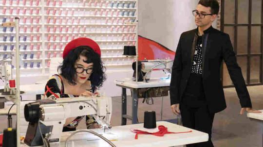
Christian Siriano watches over the work of Hester Sunshine on Project Runway. Barbara Nitke/Bravo hide caption toggle caption Barbara Nitke/Bravo Christian Siriano watches over the work of Hester Sunshine on Project Runway. Barbara Nitke/Bravo The 17th season of Project Runway concluded Thursday night, handing the win to Sebastian Grey. It was the show's first run without Heidi Klum and Tim Gunn, who reigned while Runway ran on Bravo and then on Lifetime. Back on Bravo now, it features model Karlie Kloss in the host role, and designer (and former Project Runway winner) Christian Siriano in the mentor role. Not only did the season wind up being a strong argument that a show like this can continue with a new host, but it almost became an argument for changing hosts as the first, not the last, option for shows that have grown stale. I surprised myself with my affection for it, and certainly with my affection for Siriano, not my favorite back when he was a contestant. Kloss is still getting her feet under her, but she's been just fine at this job — at least as good as Klum was when she was new to it. She has a warm presence, friendly and supportive, and she seems very happy to be there. But the big surprise, at least to me, has been Christian Siriano. He's proved to be, while entirely different from the rightly beloved Tim Gunn, a funny and smart and honest mentor, one who brings the right amount of reality-show zazz while also making all kinds of sense. Success doesn't flatter everyone, but it's flattered him. When Siriano won the fourth season of the show back in 2008, he was the show's youngest winner at only 22 — and it showed. He could be impatient, full of himself and negative about work he didn't feel like doing for clients he didn't feel like serving. He was criticized for careless comments about drag queens and transgender people when he was first famous. After his victory, though, he vowed to get better, and then he worked and worked and worked. He kept making high-end fashion, but he also made shoes with Payless and a line for Lane Bryant, which kept his name in front of a large audience, not unlike the one he had on television. His clothes appeared on red carpets more and more, and he got a new wave of attention in 2016 when he made a gown for Ghostbusters star Leslie Jones, who had complained that designers didn't want to dress her. He went on to dress eight women for the Emmys that fall, across a variety of ages, races, body types and styles.

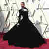
After that, it seemed like he was inescapable at any high-end celebrity event, and he made some of the most admired looks appearing anywhere — including Billy Porter's stunning velvet tuxedo gown for the Oscars, which may well be the red-carpet look of the year. Even if he weren't a Runway alum, Siriano would have been a great candidate for this position based simply on the position he occupies in fashion right now. They'd have been lucky to get him. At the same time that they brought on this really strong fashion mentor who is as current as current gets, the producers cast contestants who were, for the most part, pleasant. There was very little interpersonal drama and a lot of focus on the development of the clothes (fashion writers Tom & Lorenzo have written well on this all season), and by the time we got to the end, the finalists — Sebastian Grey, Garo Sparo and Hester Sunshine — all seemed perfectly qualified and on friendly terms. It really did come down to whose collection worked out best. It could have been any of them. In the finale, Garo had a little too much trouble with execution, so he was set aside, and it came down to Sebastian and Hester, both of whom made very good final collections in their own styles. Sebastian makes more classic, elegant clothes, always impeccably made but not dull. The leather work in his final collection was distinctive and grand. Hester, on the other hand, finally seemed to get a handle on her "clown picnic" aesthetic, very playful and colorful, and put together a collection that didn't seem as gimmicky as some of her work during the season. She's also a brilliant stylist, using accessories maybe as well as anybody on the show ever has. She peaked at the right time, and she managed not to include some of the things she's gravitated toward that haven't worked (she got mostly over her love of sheer dresses with ugly pasties/bust cups, for instance). When Kloss and judges Nina Garcia and Brandon Maxwell talked about Sebastian and Hester, joined by guest judge Diane von Furstenberg, their debate made a lot of sense. Sebastian's line was more perfected. It was more cohesive. It was more of a complete idea. But Hester, they acknowledged, is very good at another element of selling clothes: being a personality who represents the brand well. This didn't come off as crass, as if she might win solely because she's more camera-friendly. It came off as realistic, in that she might win because she made a terrific collection and there's a unity of her persona and her clothes that help make a designer a star. Marketing is real; being good at it is real. They chose Sebastian as the winner, but the show hadn't positioned any "I'm going to riot if this person wins" options, as there sometimes have been in the past.

All of this — all of it — was part of a sense across the season that Project Runway had both become a better show than in recent years, one wildly more relevant to actual current fashion. Not only did it feature the newsmaking Siriano, but judge Brandon Maxwell is the one who designed Lady Gaga's multi-phase Met Gala outfit, probably the most talked-about look of the year from the most fussed-over celebrity fashion event of the year. Somehow, 16 seasons down, Project Runway leveled up. Don't get me wrong: Tim Gunn was a very good mentor. He was gentle, wise, encouraging. He approached mentoring like a teacher, which is what he was. But if anything can invigorate a show like this after 16 seasons, it's someone who does the job really differently, but also does it well. Siriano has a different vibe in the workroom, maybe a little more like a boss overseeing apprentices. He's bracingly honest in a way that can puncture notions that are better in theory than in practice; I laughed when a designer explained his plan to contour an outfit with zippers and Siriano said, "You're going to put a zipper right on the boob?" And the ego of his younger self has, perhaps with the help of his success, become less defensive and more confident, so that he enjoys gently teasing designers about situations where he tells them what they need to do and he turns out to be right — but he never seems mean about it, ever. He warns them off their bad ideas with a good-humored despair, often falling back on something like "you're killing me" when he's worried about their choices. It was such a delightful surprise to discover that changes I was initially worried about might be just what I needed to start loving the show again. It's good enough when a successful host change lets you continue to enjoy a show (as happened to me with The Great British Baking Show), but when it reinvigorates a show in which you've lost interest, that's something special. Tim and Heidi are working on a new project for Amazon — and I'll watch that, too. Still love 'em both! Still in their corner! But what a pleasure it's been to return to an old favorite that's given itself a lift. Read More Read the full article
0 notes
Text
Legibility
When we hear mention of legibility, we think of clarity and how easily a thing can be read – can be made out. We think of something like Robin Kinross’ example of a test for legibility given in his book Modern Typography. In this example, two typefaces (Didot versus Garamond) are held next to each other and incrementally distanced from an impartial reader until one of the two typefaces can no longer be seen (22-23).
But legibility is not limited to this, nor are the tests of legibility always a matter of distance and discernibility. Kinross offers a helpful definition in chapter three, by which considerations for legibility might benefit: “…it was only when the general theoretical climate in psychology had changed that legibility could be accepted as the comprehension of meaning: not recognition, but reading” (32).
��More than just recognition, legibility came to be understood as practice toward the best method for engaging a reader: “The project of legibility research raised the prospect of a typography that could do something more than be beautiful: it might be effective” (33). Thinking about legibility in these terms – in in providing a pleasurable and fruitful experience for the reader engaging with the work – gives us a wider range of creativity that is made clearer through the implication of hard standards. That is, being effective is a general enough idea to allow for all sorts of exciting experimentation, yet, at the same time, to the point enough, that the person striving for legibility must also work within clear bounds that structure his care and respect for the reader (Kinross 34).
In chapter three of Post-Digital Print, Alessandro Ludovico gives plenty of examples of how this careful creativity of legibility (fruitful pleasurable engagement with a text) can take place. There are probably many ways that we could think about legibility through Ludovico’s examples. I want to consider some conceptual as well as physical ideas that he provides.
Humor and imagination are a pair of conceptual pathways for improving legibility. Ludovico cites the “brilliant 2009April Fools’ Day announcement, explaining that the highly respected British newspaper, the Guardian, had decided to switch entirely to Twitter” (57). While the story was ultimately exposed as being false, the humor of the stunt also exposes certain anxieties – as humor often does – concerning the rapidly technologizing world. Instead of merely putting together an article of a what-if? formula, the designer in this case has made the imagined to look legibly real, also exposing the taken for granted authority of announcement with such a look.
Similarly, in chapter two, there is the example of the happy, though fake, special edition of the New York Times made by The Yes Men (51-53). In this case, legibility is configured through the imagination – wishful thinking even – of a group; while, at the same time, the imagination itself – again, wishful thinking – is made more legible. The possibility for such a happy day is better realized insofar as it is seen in material reality and bearing all the weight of the New York Times. This provides a clear example for how print can be a radical force for change, insofar as it can empower people to see a hoped for thought as legitimate.
Chapter two gives examples for affective legibility, or (say) holistic legibility – engaging the reader through more than just the eyes. I have in mind Fluxus and “‘Fluxus boxes’ filled with organized collections of games, concepts, plastic objects and miscellaneous printed materials” (39). Chapter three offers the example of “Marcus Weskamp’s online artwork Newsmap, a powerful visual representation of the news mediascape. Using data from Google News, the site’s mapping technique divides the screen into columns (topics) in which the size of each article’s headline is in direct proportion to its popularity” (65) This instance, while still considering legibility in a way that is focused on engaging the eyes, does so in a fresh way.
Returning to the idea that publication can make an imagination or idea legible, the article “Typeface as Programme,” touches on a similar thought: namely, that through technology’s making publication more accessible to the masses, more people are now able to see themselves as writers and publishers; hence, a new idea of the self is made more possible, more legible: “Democratisation is another important part of these developments. The sudden general availability of processes through computerisation has continued to increase the number of people who have access to and start engaging in them.”
Furthermore, the two online articles for this week deal with legibility as it relates with process, beauty, and perfection. In the “Prints and the Pauper,” we get short, though detailed, recounting of China’s painstaking printing process. Stylistically and aesthetically, this process would remain a standard-bearer for some time; however, the amount of time and effort needed in order to bring about the end product was so much that a different a kind of legibility threatened success: namely, the fact that something unwritten for all its requirements is illegible in that it does not exist yet. For this reason, Gutenberg’s press would outshine all contenders for printing. Though perhaps not as beautiful, it was, nevertheless, more than capable at making the baseline requirement for mass legibility – that is, having a lot of output.
Returning again to “Typeface as Programme,” we get the example of computer programmer and perfectionist, Donald Knuth: “When in 1977 due to financial restrictions the new edition of volume 2 (of The Art of Computer Programming) was to be reproduced with a new optical typesetting system rather than the already disappearing Monotype machines…he decided there was no point in continuing to write them since the finished products were just too painful to look at.” Complementary to Knuth’s work ethic toward a perfected visual presentation of his scientific content is the chart he provides in his book. The chart proceeds the table of contents and demonstrates how the reader should go about reading the book and completing its exercises, taking into account variables such as sleepiness and confusion. These considerations engage the concept of legibility on a more holistic level that, while more restrained or minimal, have a similar methodology to that of the earlier mentioned Fluxus boxes.

from The Art of Computer Programming, 1997 Addison-Wesley
0 notes