#and then the others bc i can't copy paste the pinterest post
Explore tagged Tumblr posts
Note
please please please ive always wanted to be a a part of editblr but idk how to even start like with the coloring and the editing so a tutorial or any tips would be greatly appreciated i really want to start making grahlpgics and rentrys but i just don't know how 😞
also i love your stuff !
Heyyyya! So, first of all, I unfortunately don't use PSDs which is most likely what you've been seein everywhere. I'd suggest askin someone else about those bc I dunno 😭
BUT! I can show you how I color mine using photopea.
There's a search (magnifying glass) icon, and you search up "gradient map." For me there are two options, the correct one will gateway to this:
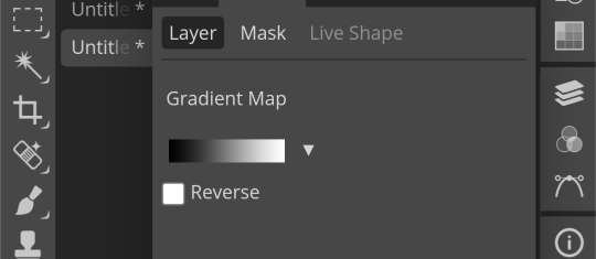
Then, just for practice, here's a color pallette to practice with. For me, it's easier to copy the lightest color first then the darkest one last because you start off with the darkest usually when putting them into the gradient map.

Hex codes for this: 400E2B A61439 018868 FE5C43 FEB17D
(Note: you can find lots of great color pallettes on Pinterest, and add as many colors as you want. It will just be easier with less!)
So now that you have your colors, you press on the gradient map. These two things circles are what you press, the square part of the gradient comes first and then the second thing circled will be accessible.
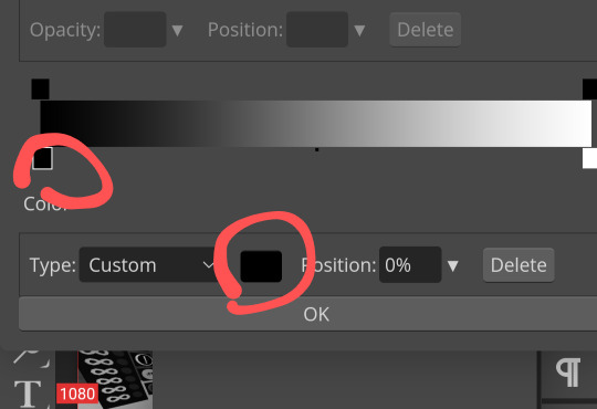
Once you press it, you can paste your hex code in here:
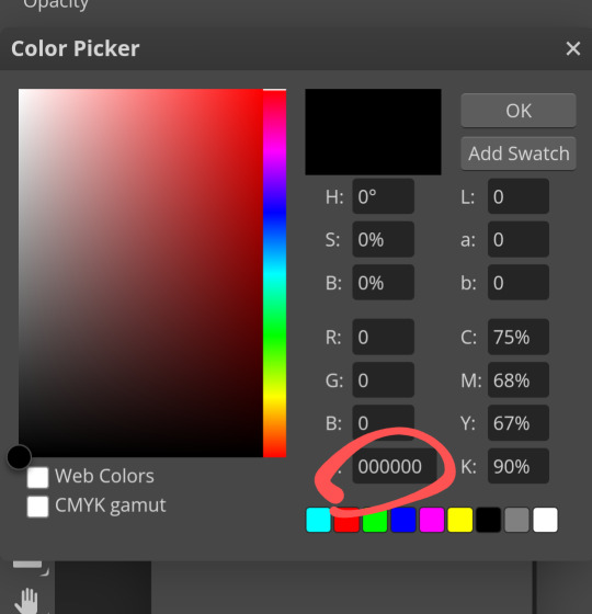
Then repeat this with the other colors, going down the gradient line as you do!
Here's what the gradient map should look like:
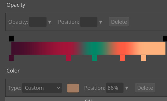
Ofc, when you aren't just practicing, you can order or however you want.
Again, I would ask someone abt PSDs because this isn't the most efficient 😔
Now, for tips on editing. I've gotten asked for a lotta tutorials but they're too hard for me to manage so I'll squeeze some answers into here.
1. For resources, there are a lot on Tumblr. However! You can search up "rentry resources" on Pinterest, and there will be pins that you can click that will take you to plenty of resources. However, if it says to credit when using a resource, obviously do that lmao 😭
2. When it comes to gif graphics, ezgif.com is a go-to. When it comes to putting already moving gifs into a frame and not wanting a background, I usually use the "remove background" feature that can be located after pressing "effects" on the home screen. Now, I wanna make this VERY clear before we continue: color in the background/around your frame before putting the gif behind it. Make sure!!! Make sure that the background is a UNIQUE color compared to the actual graphic. If it isn't, the background remover will remove parts of the actual graphic.
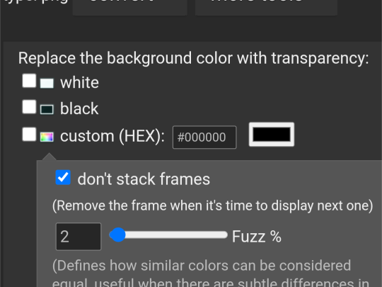
This is where you'll put the color of what you want to be REMOVED from the graphic. You might have to play around with it for a bit though.
As for making the gif graphic that goes into this, I use inshot personally. Since the canvas won't always fit and inshots default background is black, I say try to aim for a black background to remove. If not, make sure that the graphic will fit so that it covers the entire canvas.
Example/walkthrough:
4. You can always make differences if you dislike your graphic. It's okay to take a while and go back, and even restart. You'll see a lotta people here talk about how some ways are easier than others, but honestly just play around because you might find things better for yourself compared to others.
5. When starting out on Editblr, I'd suggest NOT immediately beginning with having requests open. It can make it start out as stressful and drive you away from it. Begin with just making graphics for yourself or of things YOU'RE passionate about. Editing should be more about your enjoyment than having something shiny to show off, y'know? (That was cheesy asf)
ANYWAYS! I HAAAATE EXPLAINING THINGS! (Because I'm bad at it lmao, not in general, you're all good dw❤ /p.) Even I can't decipher what I've said here, but to be fair I wrote this during a meltdown so I get an A for effort.
Also, if you make a promo post, PLEASE TAG ME!!! /NF!!! I'll be more than happy to follow you 😮
#“dont use the same color for the removable background” *PROCEEDS TO DO JUST THAT IN THE EXAMPLE*#im a bad example kids. dont do what i did😭#⛓️┈┈┈•༶ talking
25 notes
·
View notes
Text
cinderella has the lowest high note of all the disney princesses and like. doesn't that just sound fake? you'd think that because she's the second disney princess, and sandwiched by the two highest singers (snow white and aurora), she'd also sing pretty high but. no. she is the most solidly an alto of all of them. anyway i stan my alto queen.
#for reference: cinderella is g3-db5#snow white is d4-b5#aurora is c4-a5#and then the others bc i can't copy paste the pinterest post#ariel is c4-d5#belle is g3-eb5#jasmine is c4-f5#pocahontas is g3-e5#mulan is ab3-d5#tiana is g3-e5#rapunzel is g3-e5#anna (who isnt part of the line up but i digress) is a3-e5#elsa (again not part of the line up) is f3-e5#which tracks bc if you have idina menzel. you use as much of her voice as you can#and moana is gb3-d5#it also means that the cinderella and moana have the same midpoints of their voices which. wild#disney princess#disney cinderella#it's FASCINATING to me
18 notes
·
View notes
Text

my theme / graphics / design F.A.Q. @ my anons and a few others who've been asking some questions + some help, i just compiled every question into one post 👍
disclaimer: i am very much an amateur in making graphics so i still don't know everything there is to know, but i think it's good to make graphic design and editing seem more accessible and less intimidating! so like don't go to me for actual professional advice
.001 | header templates if you don't really feel like reading and just want to experience everything for yourself, here's a bunch of templates i made today. play around with them if u want :> i used canva since it's available both on mobile and pc but if you prefer to use a different app you can just check the specs/see if your app has similar functions
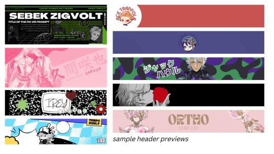
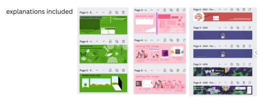
TEMPLATE LINKS (I won't know who's made copies of the templates so it's fine if you're worried about being exposed): [1: SEBEK] [2: SAKUYA (PINK)] [3: FIRST YEARS] [4: TREY AND IDIA]
if someone is interested in using any of these as inspo or as a base i don't mind, and i don't need credit either 👍 but if you wanna let me know bc i'm a bit nosy go ahead
.002 | what apps would you recommend for editing? (mobile and desktop)
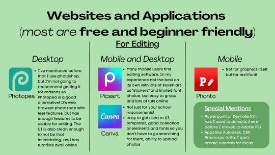
Desktop:
photopea , if you want a browser alternative to PS. i tried it out for maybe twenty minutes and a bunch of the basic features i need in PS are present there, it's definitely good if you want to experiment more as opposed to other apps. here's a tutorial for it
Mobile and Desktop:
picsart [desktop] [google play] [apple app store]: i think a lot of people start out with picsart and i totally get it! it's very easy to use, there's also a lot of tutorials for it on YouTube :> > list of tutorials from their blog > this playlist of tutorials by tutorial edits
canva [desktop] [google play] [apple app store]: so so elite i love canva. there are times where i do prefer the freedom that powerpoint gives me but canva is just convenient. anyway she's good both for ur powerpoints in class and pretty decent for editing. the templates i made above are my first time doing edits (not for school) with canva and i think they turned out alright! > official canva tutorials > this pinterest user's short-form canva tuts > canva search keywords lists: [one] [two] [three] [four]
Mobile Only:
phonto [google play] [apple app store]: ily phonto, here's a tutorial
apps like krita or autodesk or csp or medibang or procreate are likely usable as well, i just don't exactly have advice for them since i don't use them
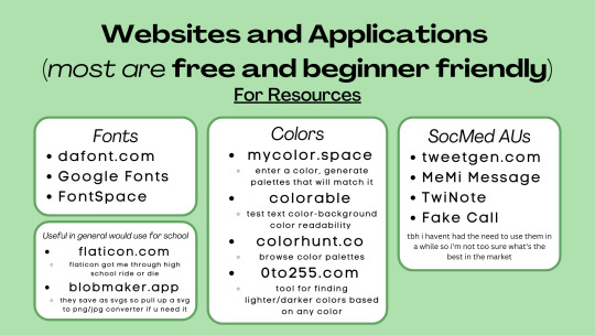
Websites for Fonts:
dafont.com
Google Fonts
FontSpace
freejapanesefont.com
font identifiers [whatthefont] [fontsquirrel]
Websites for images/elements:
flaticon
blobmaker.app (saves as svg, use a svg to png/jpg converter if you don't use an app that allows svgs)
getwaves.io (saves as svg, use a svg to png/jpg converter if you don't use an app that allows svgs)
haikei.app (basically a combination of blobmaker, getwaves, and a few other apps)
Colors:
mycolor.space
colorable
colorhunt.co
0to255.com
colormind.io
color tool
css drive (upload image, generate palette)
SocMed AU purposes:
tweetgen
MeMi Message (google play and apple appstore)
TwiNote (google play and apple appstore)
Fake Call
i used to use social maker and social dummy but i can't find them anymore lol
.003 | squiggly? refer to blobmaker, getwaves, and haikei for squiggly :>
.004 | pretty themes for tumblr desktop you can search the following tumblr blogs
theme-hunter
magnusthemes
ricecodes
kosmique
.005 | how can i make my theme prettier? decorating your text posts:
coolsymbol.com
kaomoji
copy paste dividers
post dividers [making your own, tutorial using photopea] [masterlist of dividers by firefly-graphics]
how to get gradient text on tumblr posts + gradient recs
theme banners/headers:
specs of the tumblr header: 640 x 360 pixels on mobile, 3000 x 1055 pixels on desktop
premade headers: [headers by spidaerman] [headers by ridleey] [alt link] [headers by villanaelle]
.006 | how to add *that* thing to the tumblr header theme
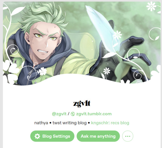
for this part let's use canva again. the mobile theme header is 640x360px but you can totally adjust it to be bigger (but maintaining the same width to height ratio)
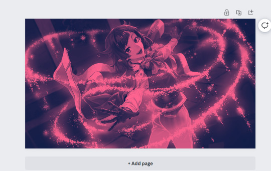
so let's say this is the picture you want as your header, how do we add the details at the bottom? you can pretty much get any shape you want, whether it be from canva elements or one of the sites i mentioned or any other source you have. for this tutorial let's just use the ones on canva
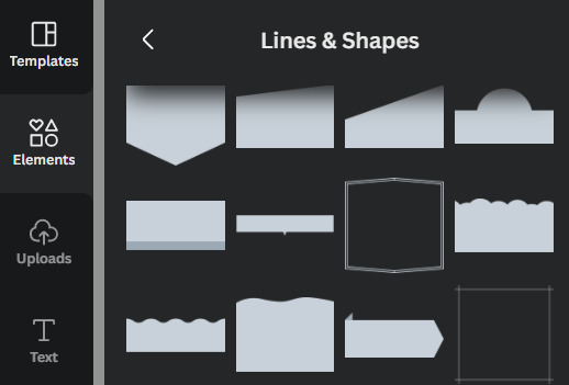
by scrolling through the elements portion, in this instance the lines & shapes portion, you can find a few that would work well
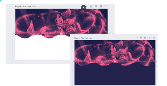
when you choose what you want, adjust it both size and color wise, and make sure there's a substantial enough amount of space for other details of your blog to fit (icon if you're not hiding it, blog name)
remember to save the color of the element! copy paste that hex code! or just have it somewhere where you can look back at it easily
when you're satisfied, save it! then go on tumblr -> settings -> select the blog that you want to edit
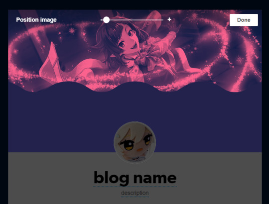
place the banner, and if you did it right it should be a perfect fit, but you can zoom in if you want! :> but wait we're not yet done! the colors don't create *that* effect yet
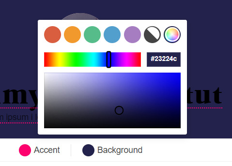
change the background color to match the bottom color of the header! (and the accent as and text colors as well, if you want!)
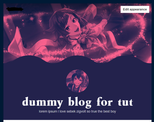
and we're done!
i think these are all the questions i've gotten so far? hopefully it helps!

170 notes
·
View notes
Note
hi there!! your ayato gfx was absolutely stunning i stared at it for a good minute just processing everything!! i've always been interesting in dabbling in gfx but i'm tech noob at best, an idiot at worst. do you have any advice for someone looking to start out? like resources, software etc. thank you sm and have a wonderful day/night
hello, sweet anon! first of all, thank you so much for your kind words! :)
note: text-heavy!
PEP TALK?
before we proceed, i just want to preface that getting into gfx design can be extremely frustrating. it is a part of the arts and as anything relating to the arts, it takes time and a LOT of practice. you, yourself is the biggest critic of your own work and you're also learning 21612198 tools. you will want to tear your hair out. you might have to learn theories and concepts that traditional artists learn in class to improve your own work. that being said, it is also very rewarding and fun, hehe
so what i always say to someone who wants to get into gfx design is, to just have fun. make the things you want and don't stop making them. the more you make, the more you improve. you can always learn the essentials of gfx design ofc!! but it's kinda boring so use whatever fandom as the subject to make it more fun
SOFTWARE
so the most well-known program that it's used in gfx is adobe photoshop and illustrator (there's more but those are the main two). it is not free and you gotta pay a subscription. if you can't afford it, you can always pirate it. BUUUUT, there's nice, free alternatives out there such as: GIMP (app), Photopea (browser based). it doesn't have everything photoshop does, but it's a nice way to dip your toes in!
RESOURCES
- your best resource is literally youtube and google haha! there are so many good videos you can search up and you can follow along. this is risky imo bc you can spend more time watching than doing, which defeats my points above.
- behance is a platform by adobe where you can find some resources, tutorials, and portfolios of other artists. it is a HUGE source of inspiration for me. i go on that website like at least once a week lMAO.
- pinterest is also a website i peruse often for inspirations! but at the same time, i'm torn bc there's a lot of stolen work here. so just keep that in mind
- the iconic gif tutorial by anue and this gaming gif tutorial by senka (yyh) is a GREAT way to start gfx design tbh. you'll learn to mess around with various tools when you make gifs!
GENERAL + IMPROVEMENT TIPS
i really wish i can just tell you the topics and tools you should learn but there's so much that it can get overwhelming. so take it at your own speed:
- like i mention above, learn the fundamentals. this is gonna be boring but use your favorite subject to make it fun!
- ok hear me out but as a beginner: copy and emulate. there's a reason why artists do master studies. you learn how the old and new masters paint, analyze their techniques and apply them to your own. it's pretty much the same in gfx design. emulate your favorite designs, learn why they use the colors they do and why they placed a certain font there. try to remake your favorite posters that you've seen and ask yourself why did they do that?
but ofc this is strictly for studying! this does not mean should plagiarize and post the same poster, but ayato version or something LOL. the line between plagiarism and inspiration/homage can be blurry but you need to make sure you are using this chance to learn and develop your own style! :)
- write down your ideas! sketch them out! whatever is in your brain might come out completely different on paper. and that's natural! it just help to visualize things
- PEN TOOL IS YOUR BEST FRIEND. i use this shit for EVERY single project so know it like the back of your hand.
- keep your past works and use it for self-critiques or just to look back and see how far you've come
CONCLUSION
remember, it will suck for a little bit while you learn all the tools in your software. you might not be able to materialize your ideas bc you don't know how to do something. it's ok!! you will get there once you're more experienced. just keep making gfx and ask for critiques. you will learn a ton! or sometimes, just walk away and let your brain rest. sometimes, we make a better product when you let it sit for a bit.
you got this, anon :) shoot me an ask/DM if you need anything else!
8 notes
·
View notes
Note
Book anon here to say today is a happy day because it is dk and vernon day ^0^ the fact they share bdays makes my heart so big like djakdnaks that's the best thing really! (I say this as I don't like celebrating my own birthday lol but that shiz makes me soft) like how can it not get better than sharing a birthday with your fellow bandmate who is also your buddy :'))
Back on topic, I am happy that in the fandoms I'm in, update blogs or accounts are well loved so no drama there but I agree on cc peeps, my gosh the decline of them is obvious for the past 2 years =/ I remember 2018 the carat fandom here was HUGE with creators and lots of notes but now...its hard to see more than 200 for some and while numbers don't matter because you should ALWAYS be doing this for fun, its so shocking to see the interaction go so low and its more likes. I do have a theory as to why this is the case and it might be due to nowadays, people on Tumblr find reblogging alot to be "too much" akaspamming. I would know because some told me I do this and I'm like ??? I am simply reblogging content I like and if it means hitting the rbelog limit so be it djajdjw. Legit idk why its seen as bad nowadays when everyone used to reblog alot and no one complained so maybe this could be why? Again a theory but it would make sense and its a shame if this is the case :c I admit I like stuff because I sometimes do reblog it for a color theme but mostly I hit the reblog limit so I want to reblog it later xD
But let's not get into people that take others work as their own -.- now I get giving credit for say icons (I do this for icons and headers I use because its the least I can do. I would link it but idk how to do it on Tumblr lol) but taking someone's say gif and just posting it on twitter to share is like ??? You do know there is a share button that SHARES THE ORIGINAL LINK BACK RIGHT? Smh i can't with people. That's why I try to make sure for icons at least I know its not a repost and try to stay away from pintrest as best as I can (also svt on pintrest? Are they making moodboards or smth? I leave Tumblr for a bit and this is what I come back to lol)
Oof I wrote too much again sjamdna I'm living up to my emoji huh? XD but yes my tooth is better! It hurt again last night but today we are good!
I'm late answering this but yeah the fact that dk and vernon share a Birthday is super sweet! it's fun that they get to do their birthday live together as well ^^
but yeah i joined carat tumblr around late 2017/early 2018 (i made this side blog during oh my era but I'd been reblogging svt stuff on main before then) and I'm p sure most if not all the cc's i originally followed are inactive now :( obviously like you said content creators should make content for fun and bc they want to and not for the notes, but it's understandably disheartening when less people are interacting with it and even the people who do still see your content are (at least seemingly) less enthusiastic about it (ie liking but not reblogging it, less ppl writing things in the tags or replies, etc.)
but that's so wild to me? I've never heard anyone say someone is reblogging too many things like... how do you expect to see posts if people don't reblog stuff?? id welcome that extra content on my dash dhfjfh. i guess you can go in specific tags but like. idk reblogging is the main function of tumblr i don't know why there are people sort of against it/not as willing to use it (i mean... i suspect at least one factor is other social media platforms relying more on algorithms and likes to show people new content and ppl are just more used to that maybe?)
i feel like to some extent people feel entitled to have every or any gif or fanart or fan content on their platform of choice, but like if an artist posts something on tumblr but not on twt or instagram it doesn't HAVE to be on twt or insta. people can make a tumblr (or whatever platform) account if that's the only place a creator is active and they really want to see their content. and if people want to share something cool to another platform it is not hard to just post a link to the original post and tell people to check it out. like i do that every once in a while if there's a translation that doesn't allow reposts, but i still want ppl to know that trans exists if they wouldn't normally. and yeah!! you're gonna get less engagement that way!! but that's when you need to question whether your intention is really to share something cool w people who wouldn't normally see it or if you just want clout from this cool thing for yourself
and obviously not everyone who reposts things wo credit or permission has such innocent intentions as "i want to share this cool thing" but i think in a lot of cases it is something similar to that where ppl see something and they want to use it or share it for whatever reason and they just forget that it's something an actual person took the time to create and chose to share it. fan creations, unless otherwise specified, are not like memes in that they're intended to be shared and edited and copied to hell and back
but yeah pinterest is the worst in terms of reposts. like very little if any of the content on there (at least that's fandom related) is original content. the vast majority is reposts from other platforms without credit. a few weeks ago i saw someone on twt post like an old SVT photo or something and someone asked where it was from and they were like 'idk i saw it on pinterest' and when i tell u my blood boiled dhfkfj like!! ok!! so you're reposting a repost and u have no idea what the original source is... great
but yeah i have no idea what SVT is gonna do with pinterest... guessing it's just gonna be pledis posting official/behind photos that they also post on twt anyway. it really looks like it's something bh made them create given other bhl artists also have pinterests they're all following each other. also pledis didn't even officially announce the new account opening anywhere as far as I've seen so like. i think they really don't care dhfkfj
i really don't know what bh thinks they're gonna gain though like. ik there are active fandom pinterest users but i think most of them also have other social media like twt or insta. like they're not cracking open a huge new market, and LITERALLY NO ONE expects any musician or celeb to have an official Pinterest so. it's just so unnecessary dhfkgj
I'm glad your tooth is feeling better!!!
#melia.ask#ask#📖 anon#oof prime example of me getting carried away and writing too much#this was meant to be a quick break from studying#theres another ask in my inbox which is short anyway but i really have to get back to hw and studying ;-;#long post
1 note
·
View note