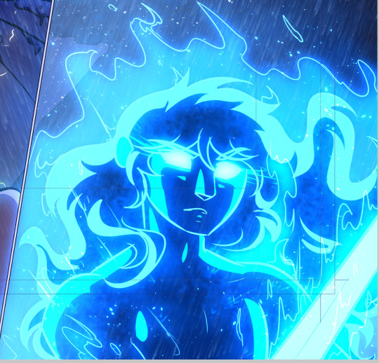
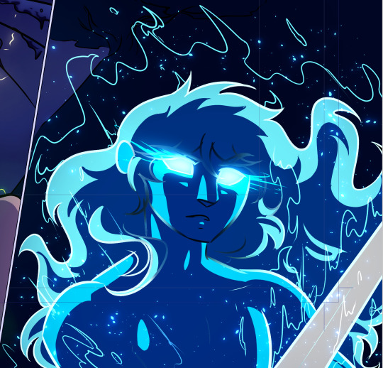
#and then overlay or hard light or soft light or whatever layer blend setting looks best
Explore tagged Tumblr posts
Visit Tumblr Blog
Explore Tumblr blogs with no restrictions, modern design and the best experience.
Last Seen Tumblr Blogs


Fun Fact
Tumblr.com rank in the US is 25.
Note
Hey viv, i need advice on picking colors like how do u usually pick colors for artwork cuz when i pick colors they look ugly, do you have to use specific colors or smth?(srry if i was asked you too many questions last time they really helped me improve)
Alrightt I’m gonna give some general pointers below (since tbh colorpicking will vary HEAVILY based on what youre going for so there’s rarely much step by step that’s set in stone-
Anyways first, I’d recommend having color references, these can be like artworks, photographs, colorpalettes, etc that have a similar vibe to what you’re going for
I’ll put an example of each-


Can’t exactly put the full last one yet cause I’m gonna post that soon uh- (but you get the idea)
Those basically function as the base / main guiding point for what you wanna achieve :00
Secondly, make FULLLLL use of blending modes (mess around with the opacity, saturation, lightness, etcc)
I’ll list down some i commonly use & their functions
Multiply: darkens the piece
Hard light: whatever color you put on this layer will essentially push that piece towards that color
Hard light & multiply (when filled w dark colors) can both be used to create more emphasis / value to the piece, but in my experience, the difference I observed is that multiply doesn’t increase the saturation of the piece as much as hard light does
For instance:


Small difference but it has an eventual effect on the piece
Overlay: increases contrast in relation w the hue of the color used
Soft light: basically the diet version of hard light, but kindof can also function as a less contrasty overlay
Add: lightens the colors below, good for lighting / glow
Color dodge: similar to add, but if you lower the opacity, it looks a little different
Hopefully the explanation was understandable :'DD I'm no means any professional but these are just based on my personal trial & error and what I end up settling in for now :00
Once again if you have any questions, feel free to ask!
74 notes
·
View notes
Note
How do you texture your layouts?
(I don't know if that's the right term sorry..)
no worries! im not the best at breaking down my process, but i'll try to explain it as best as i can under the cut :)
once everything for the layout/graphic has been grayscaled, i make one or two layers for colouring specifically. this mostly just helps to give it a more consistent/vibrant colour
left img is with colour & textures, right img is with no colour / only textures

!! possible eyetsrain warning below !!
as for texturing, i gather whatever overlays/texures i want to use (pinterest and tumblr are good places to look for those) and import them into the file. make sure all of them are on seperate layers as well if possible!
i prerer using different layer/blend modes on different textures, as well as changing the opacity of the textures. i personally like to use overlay, exclusion, and hard/soft light the most, but it helps to experiment~
different programs/apps have different names for each layer mode, but heres the ones i used in the example layout + their opacity lvls. (I use ibispaint x, btw)

in my opinion, layer modes are the most important, as they affect how the layout/graphic looks the most.
the left img is with all of the layer modes set to "overlay" at 100% , the right image is with all of the layer modes set to what is shown in the image above. big difference, right?
the bottom image is also with all layer modes set to "overlay", but with the opacity also set to what is shown in the image above.

i didnt do it with the example, but i also sometimes add a black and white Noise layer, it makes everything look a bit more static-ey which is just a personal thing i like ♡ :)
im not really sure how to end this, like i said i have no idea how to explain my process (im not good with words or technical stuff) but uh hope this helped in someway!
#𓏴 — “ a look behind the curtain? ”#sorry if this wasnt very clear i tried my best =w=" /lh#im not sure if tumblr ruined my image formatting or its just a me issue but oh well
3 notes
·
View notes
Note
helloo i was wondering how you usually pick colors for your artworks? If you don't mind answering
So the thing is Im hilariously bad at picking colors and knowing what looks good aesthetically, so what I usually do is put a gradient map (or several of them) with different blending modes until it looks right. I go with overlay/soft light most of the time. If I'm struggling really hard, I check the values so I can figure out what's wrong (you can do that by adding a layer in white/gray/black/whatever shade as long as it's completely desaturated, and set the blending mode to "color". Dont just turn down the saturation) In the csp assets store there are color sets you can download too and color pick from there. Oh also whenever I deal with 2 complementary colors I try to always make one of them darker and/or less saturated so that it doesnt clash too much (so if I draw with red/green I'll make the green more muted and darker and the red will be more saturated) I think that's all I can answer... hopefully it was somewhat helpful Im like the worst person to ask when it comes to aesthetics LOL it's always trial and error whenever I pick colors
12 notes
·
View notes
Note
hi! do you have tips and advice for making gifs? i love your gifs so much!
awww thank you so much, that really means a lot to me as I'm still rusty and a bit insecure because I've learned how to make gifs like 10 years ago? things didn't changed that much in terms of method and yet it's still scary, but at the end people like you make it worth!! 🥺🥺🥺
a little disclaimer: I'm colorblind, I can see colors okay! but I just see them a little bit different than most people so sometimes my edits may seem a little weird and that's the reason
Okay It will definitely be a long answer so I'll put under the cut ☺️
My advices would be:
- Just go for whatever scene you like the most, and try to focus on things you enjoy. I like to gif what I love, things I find beautiful as it gives me so much joy to look at the final result 😌
- Fortunately tumblr is full of people willing to share their knowledge and skills and there is lots and lots of blogs with the main theme being tutorials or even inspo and sources, so I always try to follow them to keep up with whatever is trending and just to learn new tricks and tips, some of my faves are @completeresources @gifmakerresource @allresources and @chaoticresources
- Be patient with yourself, if you are trying a tutorial and it is giving you a hard fight you can always stop and try again another time. It happened to me more than once that a tutorial or a particular idea I was trying gave me such a bad fight that I ended up so frustrated, exhausted, angry and feeling shitty but then I would pick another time to give it try and the thing worked hahahaha, so don't forget to respect your time and wellbeing
In terms of tips and tricks:
- Always use high quality videos, like the best quality available as it really makes a difference in terms of the final result
- Oh always resize your gifs!!! I use the crop tool and then I adjust the image size to keep it high quality, I think this is BY FAR the best tutorial as it explains quite well if you are new to editing
- So far I have tried many many different methods over the years, my fav is to cut the scenes I want to edit and for this use any video editing software really and after choosing a couple of scenes I import all of them to Photoshop (my version is the 2022 edition) and then I use the video timeline method (i don't really remember where I learned it but I found this really good tutorial that might be helpful)
- I slow down the gifs I make (idk how to explain it in english I'm sorry) but I set the speed for something in between 50% to 70%, depending on the scene
- In terms of colouring I don't really have a specific preset or fav PSD, I adjust them one by one just trying to focus on what the scene gives and then I work my way around it depending on what I'm trying to achieve or how do I want my gifset to look like (a good example was the Ron one on my last gifset i didn't wanted to look so yellow as it would be too different from the other gifs, it was a nightmare) BUT I guess I tend to use lots and lots of adjustment layers like I start with brightness/contrast, curves, and levels and then I proceed to selective colors, hue, vibration and saturation, sometimes I even use gradients and/or solid color layers with different blending options like soft light, overlay, opacity and fill settings to correct colors (I always use the color wheel principles of opposites and/or complementaries)
- Use smart sharpening!!! Peopel are so brilliant that they gave us actions, it is literally just a click away from all the trouble to do it manually, and it speeds up my process. Personally I have been using this amazing one I found quite recently, and it's really doing wonders to my edits
anyway thank you so much for being so kind and supportive, my ask box and dm are always open if you have any doubts or just want to exchange ideas. Really hope it helps you ❤️
7 notes
·
View notes
Note
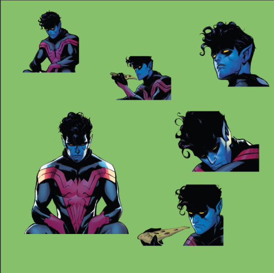
May I ask how you did the edit of Nightcrawler in Uncanny Spider-Man #1?
I liked it a lot
Sure, I've talked about how I do edits before but I can't find that post right now so here's a bit of a quick guide below the cut:
Launch Photoshop or Photopea or possibly GIMP.
Copy/screen grab the panels you want to use and paste them into en empty document. If you're smart you just grab the panels you know you're going to use. I don't.
Remove the background. I use a variety of tools for this, including the polygonal lasso tool, the magic wand and the eraser. How hard this is will depend a lot on the original art. I also sometimes paint over speech bubbles or other stuff like that at this stage. You should end up with something like this (the green is a separate background layer):
4. Create a new document with a width of 540 px (native size for tumblr, divide by half or a third if you're doing several pictures next to each other) and a height of whatever but not too tall, IIRC the recommended max height for one image is 810 px. Create multiple documents if your images are going to be different heights.
5. Paste the picture you want to use into the new document, resize to taste. It should look like this:
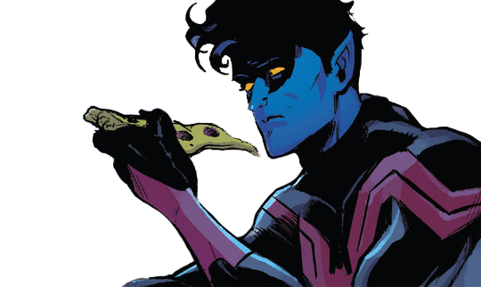
Now, from this step forward my process depends a lot on what edit I'm doing and the effect I'm going for, so I'll describe what I did with this edit in particular. I have a bunch of free for non-commercial use textures and assets I use for this purpose, which I've accumulated through the years from sites like Creativemarket.
6. I added a gradient layer to the background, in this case using colours picked from the middle image. I sometimes use online colour scheme generators or just pick something I like too, it depends on the edit.
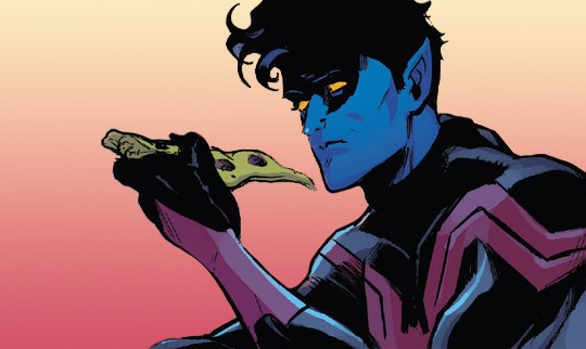
7. I added a black and white texture image as a new layer. I then added a gradient map to that layer using the same colours as the background gradient, set the layer opacity to 47% and set the layer blending mode to overlay.

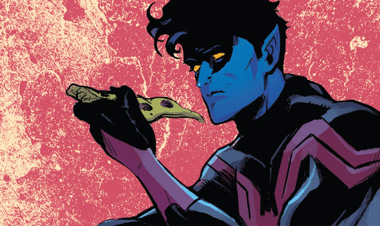
8. I added a new texture image with raster dots (you can also make these in PS but I'm lazy so) and set that layer's blending mode to soft light.


And there you have it! I did more or less the same thing for every image in that edit, rotating, resizing and swapping out assets as needed.
8 notes
·
View notes
Note
Hi! Would you share some tips on how to achieve the colouring of this gif set maybe? /720060252150808576/for-pscentral-event-16-pride-colorsand It looks so beautiful! I love how you coloured Buck so much! Have a great weekend!
hi!! first of all, sorry this took a minute. life, you know. anyways thank you so much for your kind words, i'm so glad you liked the set!! and i'm always happy to share techniques and resources so never hesitate to ask!
since you asked for tips and not a tutorial, i'm going to assume you have a handle on the basics and try to keep this fairly general. if you want a more in-depth explanation for anything just let me know!
so most of this was achieved with a combination of adjustment layers (mostly the love of my life selective color) and color/gradient layers, and a whole lot of layer masking. my first tip is use timeline mode and familiarize yourself with the stopwatch controls, particularly the layer mask position stopwatch. i'm just gonna direct you to the first half of this tutorial if you're unfamiliar. this set would've taken me waaaay longer if i'd had to rework the masks frame by frame, since i was moving the masks for multiple layers on each gif
now for the colors themselves, tip #2 is don't rely only on solid color/gradient layers for colorful gifs. it's certainly possible to get something decent with just a base coloring and a fill layer set to blending mode>color, and that may be what you want depending on context (that's exactly what i did with poker buck in the first gif!). but that's gonna be a really stark (heh) effect, and for the brother, babygirl, and bisexual gifs i wanted them to look soft and warm and glowy, so for those i adjusted the backgrounds to fit with my blue/purple/pink palette AND used color fills and gradients on top of that
for example, on the gif of buck and maddie hugging, in addition to my base coloring i have two selective color layers to shift the background from yellow/red closer to pink and bring out the blue in buck's shirt, a violet photo filter to tone down the reds even further, and and pink solid color layer set to soft light at 49% opacity (all of those were masked so that maddie's face wasn't bright pink or whatever)
that's all under the gradient layer that went on top (which is set to hard light, 50% opacity). below on the left is that same gradient set to color, 100% opacity, without any of the other adjustment layers underneath. it certainly doesn't look bad, but it's a very different look to the one on the right, which is the one i went with


this brings me to my next tip, which is play around with blending modes. i'm sure you know they all have wildly different effects, but don't shy away from any of them, cause today might just be the day that hard mix gives you the look you want. like normally when i'm doing a glowy gradient on top of everything i go for lighten or screen, but i happened to mostly use hard and soft light in this set (this video is a godsend for understanding the different blending modes - if you have a free afternoon i definitely recommend browsing this guy's channel. you will learn so much)
the last thing i'll mention is the gradient i used. rather than generating a gradient fill in photoshop i took this texture (which i wish i could link the source to but it's from a pack i downloaded ages and i have no idea where i got it):

made it bi:

and then stretched/rotated it differently in each gif so that there was some variation. having that softness and slight variations in vibrance and luminosity helped with the overall warm glowy feel i was going for, which i don't think i would have have gotten just by using a gradient fill layer
and that's about it for the colorful gifs in that set. as for the others, the first gif really is as straightforward as it looks: a blue->purple gradient set to color on poker buck, and a pink overlay on buck in turnouts, blended so that the colors overlap and mesh together.
the black and white ones were also very simple. this tutorial explains how to do the colorful outline thing if that's new to you. that's all i did for the small b&w gifs. for the baby boy and braincells gifs i used the same technique only instead of using a a black->color gradient map in the group set to lighter color, i used the same gradient as above set to multiply over the black and white gradient map
i hope at least some of that was helpful!! again if i need to elaborate on anything i'm happy to. my 'process' is really more me throwing things at a gif to see what sticks so i may not always be able to give the most coherent explanation but i will try! thanks again for the ask anon and have a great rest of your week 💖
4 notes
·
View notes
Text
first, it's already a great start! it looks so cute :3 i have a bunch of tips and tricks, and i broke them down into similar categories. bit of a warning, i'm self taught, so how good/helpful these will be is uncertain
set up
this is all the boring stuff before you actually draw. the main thing is make everything easy to access for you and streamline it, so you can focus more on drawing than fiddling with settings
pen pressure setting: procreate has a universal pressure sensitivity that i recommend playing with until you find what works for you. for example, if you find you struggle with getting darker strokes, move the line a bit to the top left. the default of a linear curve from bottom left to top right works just fine though. for reference, these are my pressure curves (the right one is from a different software)
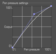
i don't recommend copying mine from the left since it's to make drawing darker without much pressure since i have tendinitis
canvas size and resolution: honestly the "screen size" preset is pretty good for anything. you can also change the canvas size and resolution once you're in, so if you realize you need something bigger or smaller, it's an easy fix. my general rule of thumb is at least 2000px for the smallest dimension and at least 100 dpi. my default is 2480 x 3508px at 300dpi, and i downscale it to about half the size at 72 dpi for posting because the files are too big. if you notice your lines look a bit "jaggy" and it's not from the brush texture, that's pretty good indicator that your resolution/dpi is a bit too low
shortcuts and gestures: highly recommend putting anything you notice you use a lot as a gesture or in the quick menu which i think is tap and hold by default. this can be actions like flipping the canvas horizontally or switching to the eraser brush
brushes: anything goes! try out a bunch and settle on a couple that are your go to's. this also applies to brush settings. tweak settings to your liking! if you didn't already know, you can have preset sizes and opacities on the slider by tap the slider and then the plus icon. if you're lost, there are only three main brushes you'd need for anything: a hard round brush like monoline (caligraphy), a pressure opacity brush like round brush (painting), and a soft airbrush like soft brush (airbrushing). the main reasoning is that you can get the variation for hard and soft edges for anything.
technical tips
these are more for tricks specific to digital art than the "how to draw X" kind
liquify: need to make small adjustments like moving the nose, but you don't want to redraw it? liquify is your best friend! it's under the magic wand/adjustments setting. liquify also works on multiple layers
reference window: under the actions setting and canvas, you can toggle the reference window. by default it shows a small version of your canvas, but you can use it to put a picture to use as reference. very handy when drawing a character! (side note: you can also color pick from your reference by tapping and holding over the reference)
flipping the canvas horizontally: also under the canvas tab is the "flip horizontal" action. it does what it says on the tin. it's benefit is that flipping the entire piece sorta refreshes how you see it. the oddities jump out more since your eyes got used to seeing it in its normal orientation
layer effects and blend modes: by default, every new layer is a normal layer, but you can change it to one of the many different types. there are way better explanations and tutorials explaining what each does, so i'm just gonna go over the ones i use most: multiply: it'll make what's underneath darker using whatever color you use. it's best for applying shadows quickly add: it'll brighten what's underneath with the color you're using. i like using it for bright highlights or lighting, but it's often too strong to my taste, so i lower the layer opacity afterwards overlay: it's kinda like a tint for what's underneath. if you use a blue overlay layer, everything will have a bluish tint to it. i use it to quickly change the setting (sunset, night, etc) and to add the bluish hue to the bottom characters and a yellowish hue to their faces
post processing: these are the fancy effects done at the very end to add the extra cherry on top. all of these are under the adjustments tool. the first four let you change the colors after the fact. again, there are much better explanation than what i can provide, but my go to's are: noise at ~5-8% and for more finished pieces perspective blur and chromatic aberration at ~3-5%. none of these are necessary. i just find them fun to use
foundational tips
these are the general drawing tips not exclusive to digital art
references: references are great! whether it's for poses, outfits, settings, or the character themself, references make drawing much easier
construction: everything can be broken down into simpler shapes, and by building off of simpler shapes, it's easier to notice and adjust things compared to something like a fully drawn face. what guidelines you choose to use are entirely up to you. as long as they're helpful, that's what matters!
stop to think: sometimes, it can be really easy to get lost in drawing and go on autopilot. slowing down and trying to draw with intention often helps to combat drawing what you think you see vs what you actually see
resources
marc brunet has been my resource for learning pretty much everything
emiliodekureart has amazing tutorials on drawing figures in movement
marco bucci has amazing tutorials on painting and lighting
chommang has easy to follow tutorials on drawing various faces and poses
proko has phenomenal and in depth videos on fundamentals and anatomy
i hope this helps! this was very long, and i hope it wasn't overwhelming or anything
I love art. I love doodling. Sketching. This took me under 3 minutes to scratch out on my tablet…but getting past this point is so hard for me!
I use Procreate on my iPad … to my fantastic, artistic peoples…what are some tips and tricks (and maybe some YouTube videos) you use that can help a newer digital artist??
27 notes
·
View notes
Note
how did you do the fancy gradient linework for vash in starfire form? and also, what was your logic behind which parts should be white and which should be black? i've been curious about it for a while, but it only occurred to me that i could ask now
That's a fun one! Drawing Vash's nova mode was an on-the-fly learning experience, so the effect I ended up using was more "whatever works best to my eyes" than anything planned.
Without the colored lineart overlay, with standard black lineart like everyone else, he looked like this:
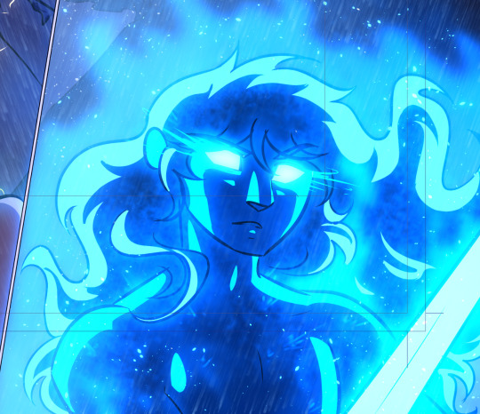
Not bad, but I really wanted that powerful glowing-from-within look that light lineart can provide, so the first thing I did was take the whole lineart layer, duplicate it and recolor it to his glowy blue shade. This is also the layer I drew the outline of the fire on.
This looked good almost everywhere, but I didn't like what it did to his facial features. It felt weird to make his mouth and nose sort of reverse-outlined, so I soft-erased all the parts that just looked wrong to me.

That was better, but it needed intensifying. So I did two opposing things: I made another copy of the lineart layer, recolored it a dark blue, set it to multiply and whited out the parts I thought looked best with light lineart -

AND I went back to the very base lineart folder and I recolored all his base lineart (outside the deliberately dark sections) to a pale blue to intensify the glow.

The general rule I used was that anywhere a shadowed section touched the outline of the figure (chin, nose, the hair around his face) the lineart needed to be dark to blend with the shadow effect. Underneath all the fire and rain it looks like this:
I also had to play with it when showing him in profile, because I hold that his nose and mouth just didn't look right with white outlines, but I REALLY liked what the white outline did to the eye glow. You can see how I mostly kept to my rule about darkening the lineart where it touched a shadowed section - like the line of his right arm where it touches the shadow of his leg, or the curve of his left shoulder when it overlaps with his chest or the shadows on his hair. Because his facial features were mostly shadowed, I felt comfortable darkening the lineart on them specifically. It also made the effect feel better and more coherent than just darkening the facial features in isolation.

In the version below, you can see why lightening the lines uniformly starts looking really weird in the face area and makes the expression hard to parse. A nose is mostly defined by its shadow and a mouth by the contrast between light teeth and a dark, shadowed interior - if those shadowed areas are flipped to being bright instead it makes the entire face look Off. The lines of the nose no longer make sense, and we see the lightened interior of the mouth as where the teeth must be when that's not at all where they go.
What's cool is that clearly I'm not the only person who noticed this problem, because they used a similar effect in the W.I.T.C.H. comic when a character glowed in a similar fashion! Every other line is full radiant, but the facial features are kept outlined in a color darker than their surroundings!
Fun stuff!
225 notes
·
View notes
Text

hi anon thank you for the ask! i’m gonna start with links to some blending tutorials that i have found really helpful (especially when first starting): tutorial by @yenvengerberg, tutorial by @jackarthurdavenport, tutorial by @sith-maul, tutorial by @nelsonnicks
also there is a high change this might not make sense, writing and like making sense in general are ummm not my best skills sdfjsdlfkj so if anything really doesn’t make sense or is confusing just let me know and i will do my best to clarify!
I. PICKING SCENE
so i think one of the most important parts of blending (at least for me) is not actually the making of the gif but picking scenes. there are a few things i keep in my when i’m starting to pick scenes to gif:
first is the overall brightness of the scene. it can be really hard to blend a bright scene such as an outdoor scene with a dark scene like a nighttime scene (it’s not always impossible but take a lot more work with the coloring)
and it helps if each scene has i guess the best way to put it is little contrast?? like if it’s a dark scene that does have any little part it’s just not gonna show and the same with a light scene that has little to no darker spots

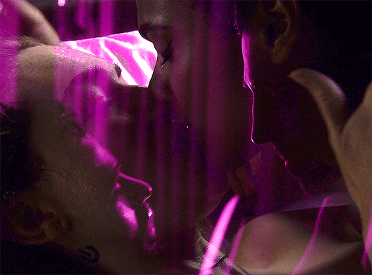
you can see this with this blending. you only really see the green gif and the other gif is really hard to see

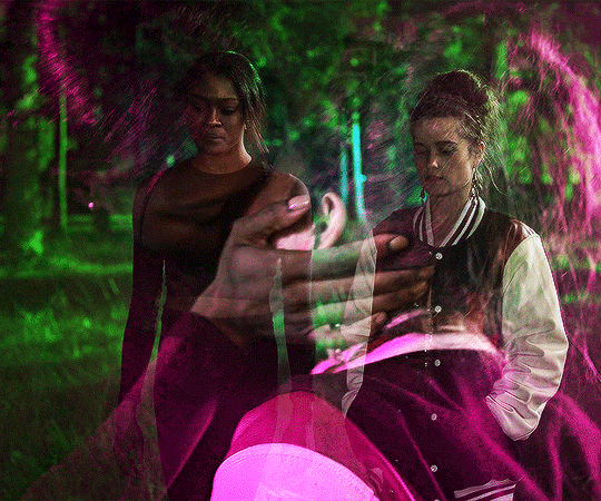
here is another example that could work better. you can’t really see the overlay gif of lito and hernando at first but does show up really well when the other gif is darker
II. CROPPING AND PLACEMENT
once you have the scene you can go through your typical process to load your gif and then crop. sometimes i won’t crop right away and will just change the gif size to the height i want so i can place around with the placement of each gif a little more
but whatever you decided to do once you have finished you will copy and paste one of the scenes onto the other one. i usually do with frames because that’s how learning but some of the tutorials i listed show how to do this on timeline
if you are using frames, you will select all of your frames and then go to the menu on the top right of the timeline and choose copy frames

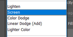
once you have it copied go to the other scene, select all frames and go to the same menu then hit paste and choose the option below
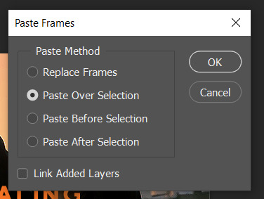
then change one of the groups to screen (you can also try lighten but i normally use screen)
this is normally where I place around with placement if i’m not sure. to do this you select one of the gif groups and hit ctrl + t to be able to move the gif around. Once i’m happy with the placement i will crop and go on to coloring.
III. COLORING
i normally make only one scene visible when coloring and check how it looks with the other gif throughout my coloring process.
and for some gif instead of doing my normally coloring i will use a black and white gradient map and then a color fill set to color


you can an example of this in the gif below
when i am done with coloring both gifs i will do a final check to see if i need to change anything. if i’m okay with how everything looks i will just add a final brightness/contrast layer over both gifs
if i’m not happy i have a few thing that i will do:
sometimes if one gif is showing more than the other, i will reduce the opacity of the brighter on
you could also place around with the coloring of each gif to help the blending by increasing brightness or contrast. i would be careful with this (especially brightness) because it could affect skin tone
if there are certain spot that needs to be dark, i will make a new layer set it to soft light, and paint with black until you are happy. when doing this i normally use a soft brush set to 25% opacity. you can also change the opacity of this layer as well!
without layer
with layer

once you are done playing you can add any final touches (like typography and whatnot) and then save as you normally would.
if you get discouraged or frustrated know that it definitely gets easier! the more gifs the better idea you get a scene of what will and won’t work. also, i have definitely had times where i’ve scraped the scenes i’m working with because they just aren’t working. a lot of blending if it is trial and error. it helps once you find your favorite types of blending and whatnot. like i really like to have at least one of the gifs i’m working with have some movement. i don’t know why exactly, but i just know those gifs end up being some of my favorites!
here is example and some of my favorite blending! (also i didn’t psds save for the calliette love trope set which is why it still has the text)

if you want some additional resources on blending or gifing in general you can check out my resource blog @oblivionresource i would recommend looking at the resources on @usergif they have a lot of good resources and tutorials!
#ps asks#*tutorial#uservivaldi#uservalentina#userrobin#usernanda#useremi#tuserabbie#userelio#tuserlucie#usershreyu#usersalty#tuserrex#tuserbea#userrsun#tuserheidi#usermarsy#userrainbow#userkosmos#userk8
250 notes
·
View notes
Text
💗 updated editing tutorial! 💕
i haven’t made an editing tutorial in a long time, so i thought it would be time to make an updated one!
before we jump in, i want to note a few things:
1) i use a drawing tablet for my edits, but editing is 100000% possible without one. that’s how i made edits for the majority of the time i’ve had this blog
2) i use photoshop 2018, there are places you can find where you can 🏴☠️ it
3) this editing tutorial doesn’t cover my rendering process & setting up scenes. if anyone wants to see how i do all of that, let me know and i’ll try to make a tutorial!
________________________________________________________
background
this wouldn’t be a necessary step for everybody, but 99% of my edits have a transparent spot somewhere in the background for me to edit a background into. once i’m in photoshop, i’ll start out with finding a background on pinterest and putting it behind my render/edit layer

________________________________________________________
fixing clipping/smoothing
next order of business is just fixing some clipping issues and smoothing out harsh lines i don’t want. i personally think it’s important to duplicate the layer i’m working on just incase i make a mistake/do something i regret later!
for blending things out, i use this brush and use straight (up+down/side to side) motions. personally whenever i use circular motions to blend with this brush, it always looks a little bit funky. i’ll also use this brush at 18%-22% strength

________________________________________________________
shading
for my shading layer, i’ll add a layer and set it to soft light blending mode at 65%-75% opacity. while shading, i’ll use the hard round pressure size brush with 35% smoothing (i’ll usually keep this same smoothing in every step of my editing process). after laying down the areas i want shaded, i’ll blend everything out with the same blending brush i mentioned earlier with the same strength. also, if you laid down shading on an area you don’t want, you can just go ahead and erase what you don’t want after blending!
instead of using black for shading, i’ll use a very dark blue if most of the highlights are yellow/orange. you could use a color wheel to see which color you might want to shade with (if your highlights are one color, you might want to pick its complementary color)

⭐ something i find really important with shading is to pay attention to the lighting. i don’t know how to explain it further than that, but if it’s something you struggle with there are guides/tutorials like these that you could sort of use for reference!
also, i messed up in my before image and forgot the nose shadow and some eye shadows before blending everything out. for the eyes, i’ll shade the under eye area and under the eyelid on the eyeball. for the nose, i’ll match the angle of this shadow to the angle of the neck shadow (i hope this makes sense!)
________________________________________________________
highlighting
for highlighting, i’ll add a new layer and set it to overlay blending mode at 100% opacity. i’ll use the hard round pressure size brush throughout this step.
much like shading, i’ll like to use the complementary color for whatever i used for shading. in this edit, i’ll be using a very very light yellow for highlighting.

⭐ usually i’ll also do my hair highlighting in this step and on the same layer, but i’ll get to that here in a minute!
________________________________________________________
some extra goody bits
literally don’t know what else to name this step. for this, i’ll add a new layer with normal blending mode at 100% opacity with the same brush used in the previous two steps. now, what i actually do is add things like stark highlights (eyes, nose, etc) eyelashes, etc. just some extra goody bits

________________________________________________________
hair part 1
you know the drill, add a new layer. i set this layer at normal blending mode, 100% opacity, and use the hard round pressure opacity and flow brush at 60% flow. usually, i’ll set my brush size to 3-5pt, it really just depends on the edit. to add bits of hair here and there, i’ll mimic the motion of the surrounding hair and pick a color in that area (hopefully this makes sense!).
sometimes i’ll completely draw new large sections of hair, but that’ll be for another day since this edit doesn’t call for it.

hair part 2
remember how i said something about highlighting hair? here it is. also, remember how i mentioned using the same blending brush throughout this entire process? this is the only time it changes, and the only thing i change is bump the strength to 50%-55%. let’s go ahead and add a new layer set to the overlay blending mode at 100% opacity. the type of brush you use to actual put highlights down doesn’t matter, but i almost always use the same color as the highlighting i used earlier. also, the size of my brush tends to vary edit to edit, but typically i’ll use a smaller brush for alpha hair and a slightly larger brush for clay.
once i put down the highlights, i’ll take the blending brush and sort of go ham back and forth through the sections. when doing this, i always try to do my best to mimic the direction/flow of that section of hair while i’m blending.

⭐ if i want more stark highlights in some spots, i’ll add a new layer with normal blending mode at 100% opacity and take a brush with either white or a very bright highlight color. i’ll lay down smaller highlighting sections than shown here and blend the same way as mentioned before. i’ll also usually add some white/lighter strands of hair here and there
________________________________________________________
rimlighting
this step is a lot like the highlighting step, but instead of highlighting large section i’ll highlight edges (again, paying attention to the lighting in the edit). just like with highlighting, i’ll add a new layer with the overlay blending mode at 100% opacity with the hard round pressure opacity and flow brush and use light-dependent colors (like with the previous highlighting step, it’ll be a light shade of whatever color).

________________________________________________________
background
curves
as of writing this, i’m getting tired, so i’m sorry if my explanations are shorter and lazier. however, we’re moving on to editing the background now!! to make shadows and highlights pop in the background, i’ll utilize the curves adjustment layer (i don’t know what it’s actually called) and change the properties until it’s darker. in the sections that i want lighter, i’ll erase those parts on the layer!

some color! pizazz!
for this, i’ll add a layer set to the soft light blending mode at 100% opacity and literally just add some colors with the soft round pressure opacity and flow brush here and there where i want more soft/glowy lighting. if i want things to look more glowy, i’ll basically do the same thing but on a new layer set to the overlay blending mode and in smaller/more specific spots

________________________________________________________
finishing touches
i don’t think i really need to go too in-depth here, but to finish off an edit i’ll mess around with color balance, adding noise, and seeing if there’s anything in the edit i want to add/fix. for color balance, i really just mess around with the different tones until i’m satisfied with what i got.
when adding noise to the edit, i’ll actually add a new layer set to the soft light blending mode at 100% opacity and either fill in the edit with a medium gray or slightly tinted medium gray. after that, i’ll add noise to that layer and set the noise to 7.5% amount.

and there we go!! that’s about it for this updated editing tutorial. i apologize if it’s all over the place and if i haven’t explained some things clearly. if anyone wants a more concise explanation of any step mentioned here/anything else regarding how i edit, please let me know and i’ll do my best!!
147 notes
·
View notes
Note
How do you get that soft glowy look on your art?
airbrushing and multiply layers! i know a lot of art tutorials say not to use the airbrush to shade, but it can be pretty handy when you utilize it correctly- usually on a big brush size. big brush, usually a light color (pastel yellow or pink) on soft light/overlay/glow whatever. i also use the airbrush set as an eraser to help dull out the edges of hard shadows to make them fade out and become a gradient
i think something that contributes to it is the way i color stuff. take the normal color layer, duplicate it, and make one of those duplicated layers a single unifying color - lets say pink. if i lower the opacity of the normal colors, itll blend w the pink and make all the colors slightly pink toned. that def could help w the softness
i also dont really ever do lineart? at least, not anymore, i definitely did in my older stuff. everythings just refined sketches on the base soft pencil tool
16 notes
·
View notes
Note
Hi there! This might be an odd question, but would you ever consider posting a tutorial on how you color your artwork? They look beautiful and I would love to learn how you do it.
Hey, not a weird question, maybe a weird answer: I don't really know how I do it. I'll try to explain anything that might not be obvious though. This can't really be a tutorial but I hope it helps.
That last pic looked like this before my edits, all colours on one layer due to using lasso tool to only work in select areas of colour.

I tend to fill in very lazily with a paintbucket fill (you can see it in the shape shading on their face scales) but here's the more specific stuff at this point:

I make a lot of use of the fill tool settings in CSP. For example, if you uncheck "Apply connected pixels" it will fill the new colour over everything in the piece that has the colour you filled over. I will go around and select cutout shapes of shadow, not caring if I go over the lines, and then use this option to make sure it fills in only the skin colour or only the hair colour:


Instantly like this.

But the full pic looks like this, which is partly due to this paper texture and chromatic aberration filters I use, but also... hmm

Posterisation layer in CSP converts the entire pic to hard edges and often creates some fun colours so I frequently use them on low opacity or only on specific parts of the image. Here I put light airbrushed white around the edges and set it to posterize so it wouldn't soften so uniformly and would blend in wth the colour variation already underneath. You can also see I took a hard brush to the edges of their horns. I don't really like to blend so it's probably not hard to see things like that, the ropes too, it's just hard brush over lines.
The other thing is I use gradient maps. It's a tool that maps specific colours to the values in the image, and I'll usually do these wild eye burning rainbow ones like this, which looks pretty ridiculous at first:

But with opacity lowered to about 15 on a soft light or overlay layer you get some fun variation of colour. I almost always use these to touch up. If you don't want to make your own the CSP asset store has tons of free ones.

Not sure how helpful any of that was because to be honest... I don't consciously have techniques. I just do whatever is easiest for me and forget it the next week. Thanks for the ask though!
97 notes
·
View notes
Text
How I think CC Clothing Creators should do to shadow map
1. What is shadow map?
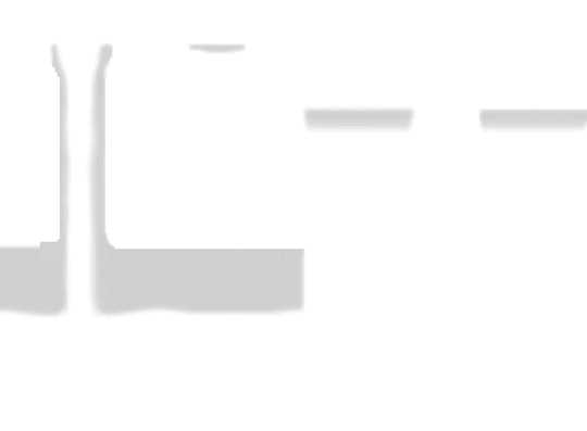
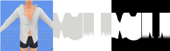
Take this shirt from Island Living for example and export shadow map in DDS format.
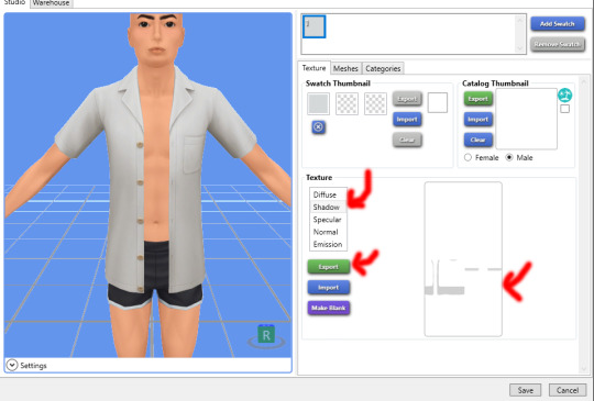
In game, shadow gives clothing layers, 3D-ness or enhance the 3D-ness that texture or normal map already gave. Shadow like this is easy to achieve without the need of MXAO from ReShade.
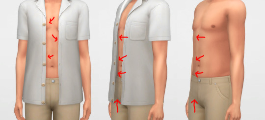
What is the problem here? Look, when I have an accessory undershirt in black on without the EA shirt, it’s looking normal, but when it is on there are some pixels breaking up, even for pants

I’m a perfectionist, I don’t want my cc pant or cc undershirt to look like that when pair with other shirts. And if you don’t see it as a problem, that is fine, you can stop reading right now and go on with your days, I’m not offended by it ^^, it is your own stylistic choice at the end of the day.
2. How shadow map behaves?
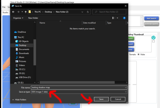
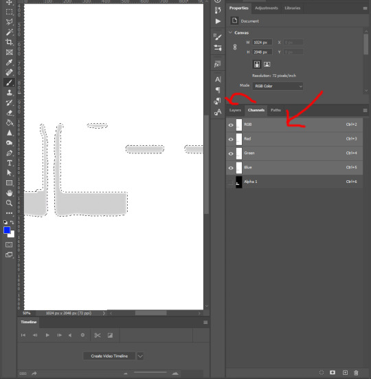
Open that shadow map we exported in DDS format into Photoshop, take a look.

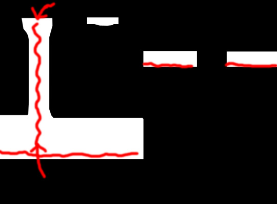
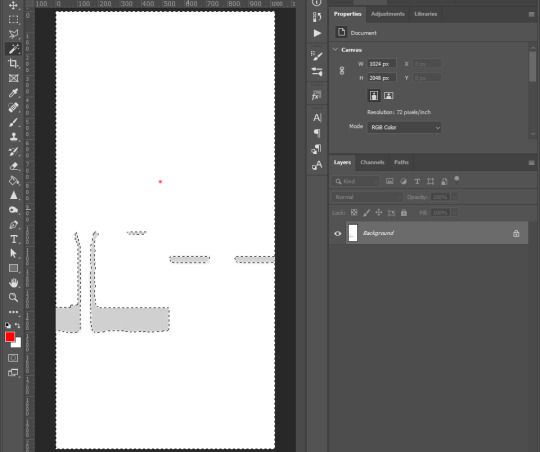
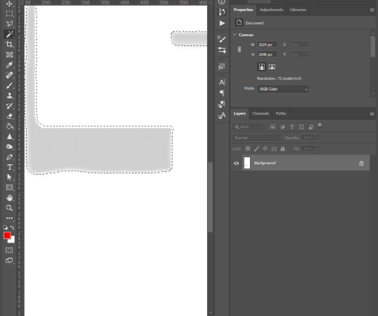
The image show the grey which is the shadow where it should be on the body, the white area is NOT TRANSPARENT, it is white color where shadow does not belong.
Now, click on Channels, click on Alpha 1 layer, the Alpha 1 image is the key
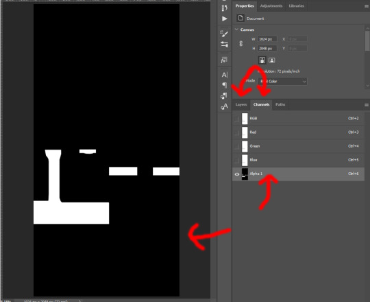
The Alpha layer is in black and white and sometimes in grey colors. Black is to hide everything of that area on RGB layer, white is to show everything of that area on RGB layer, Grey is like a slider, lighter grey will show more of that area while darker will show less.
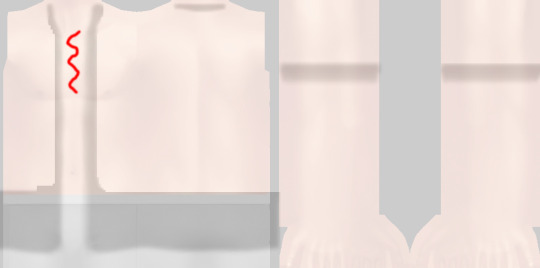
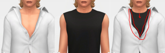
And now if I put a male template on original rgb shadow map with 40% opacity, there are area of the chest, below shirt, below arms are white on Alpha layer which I highlighted red. That means that the white on RGB layer of shadow map still visible as white!
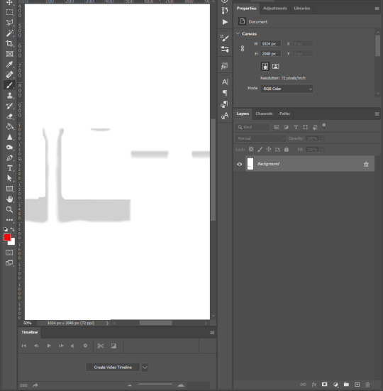
How is that the problem you ask? Here I have a image filled deepest true black (#000000) and add noise to it with Filter -> Noise -> Add Noise..., amount is 1% with monochromatic unchecked. This represents the black undershirt above with textures (grainy). Now if I paste a white layer (#FFFFFF) on top of black layer and set the blending mode to Soft Light.

There are a lot of breaking pixels with strange colors appear, like black undershirt and white shirt above ingame!
Because of how the shadow map still keep that area between chest remaining white, how Sims4 works, in my belief is they softlight or overlay the white onto whatever underneath, skins, black undershirt, that then will happen. Remember, this effect will visible when underneath is dark and muted colors, bright and light colors are hard to see.
This is how EA do shadow map on their clothings, by blocking the shadow, the arms, the chest, and bottoms of the shirt.
3. How to solve this problem?
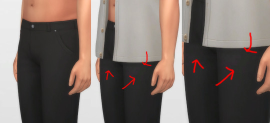
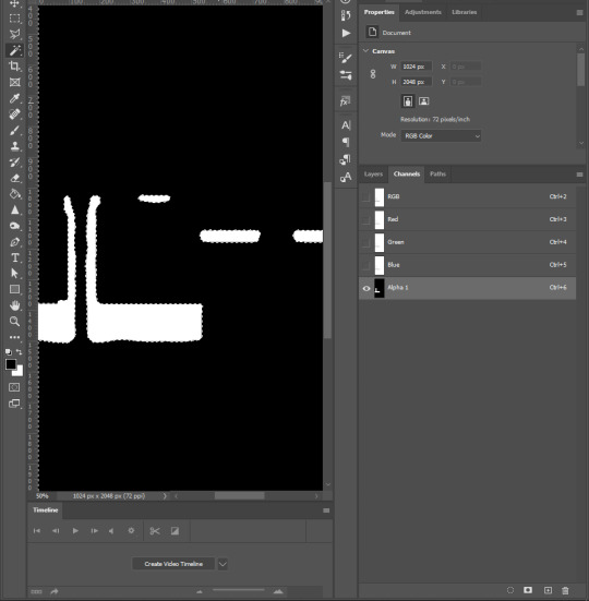
Now here is my opinion, we should not blocking the shadow the way EA did, but by framing it around, close to the shadow.
Here is one of my shirt, its shadow map and how I do the alpha layer.
When I frame the shadow, there will still breaking up pixels AROUND that FRAME, but in between the chest doesn’t have white so it doesn’t breaking up any pixels! That is the best I can think of and do to reduce the issue, let me know if you have better way.
4. How to do it?
Step 1: For new blank shadow map starter, follow other shadow tutorials on how to paint grey color on image where your clothing projects shadow on the body. Merge everything so RGB image have grey shadow area and white area.
Step 2: Right-click on this icon on the left collumn, choose Magic Wand Tool
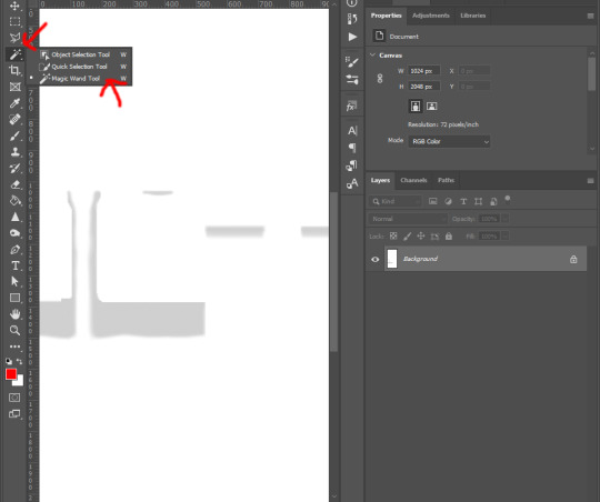
Step 3: Left-click on any white area, there will be marching ants around the grey shadow.
Step 4: Right-click on the same place and choose Select Inverse from list
Step 5: Go to the top tool bar of Photoshop, Select -> Modify -> Expand..., and enter from 5 to 8 pixels depend on your grey shadow blur or your desire. Hit OK
Step 6: Go to Channels tab next to Layers, click on Alpha 1, if you don’t see Alpha 1, click the icon on bottom right corner (blue arrow point to) to create Alpha layer
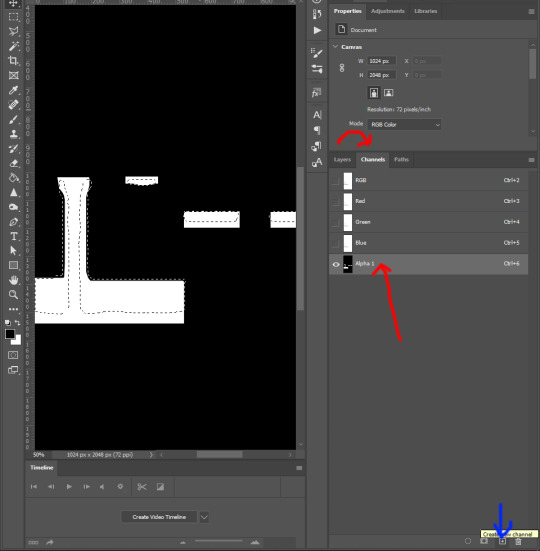
Step 7: Hold Shift + F5 or go to Edit -> Fill... on top tool bar of Photoshop. Then Contents -> White, hit OK

Step 8: Right click on the black area of the image, choose Select Inverse. Repeat step 7 : Hold Shift + F5 or go to Edit -> Fill... on top tool bar of Photoshop. Then Contents -> Black, hit OK
Step 9: Click on RGB layer, then Layers tab, Ctrl + D to deselect the marching ants, and save the work as DDS file
and yeah you’re done ^^.
You want to do this with every piece of cc, hairs, accessories, necklaces, bracelets, tops, bottoms, gloves, shoes, because of how sort layer work for items in CAS, lower sort layer items will get affected by higher sort layer items if shadow map was what it was.
Credit to one of Grimcookies’ old post about how shadow map should be done in Alpha Layer
#syaovu#sims#ts4#ts4 tutorial#s4 tutorial#shadow map tutorial#tutorial#resources#how cc clothing creators should do to shadow map#long post#gif
489 notes
·
View notes
Text
My art process: start to finish
For @sisterdragonwithfeathers and anyone else who wants some art tips :)

Step 1: sketch your art. Don’t need to be too fussy, just get it all down. I do traditional sketches and upload them to Krita but for digital sketching I like to use the airbrush in a bright color.
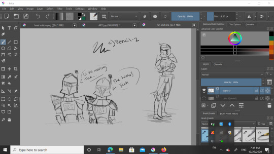
Step 2: Yes, another sketch but this time it’s digital. I lowered the opacity on the OG and used “c) Pencil-2″ but you can see it highlighted in blue in the 1st pic. Here I adjust proportions a bit if needed, maybe clean it up a ~tiny~ bit, but I’m going for a sketchy look for this piece.

Here i used “b) Basic-5-size” but I customized it a bit to fit my style. It’s highlighted but my thumbnail is just scribbles so it should look like the paintbrush to the left of it. Also I basically just unchecked “flow” and checked “softness” in brush settings to customize. The soft brush lineart over the digital sketch layer gives it a nice look. Next step!
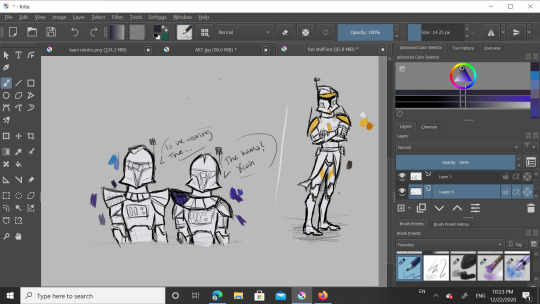
Add a new layer under both the lineart and sketch layers and use that same basic brush for the base color (here it’s white) and then either use that or the pencil to block in some flat colors. I have color pallets there but I didn’t use them that much. You’ll see in a sec, but understand that I mainly only colored Cody here because blue in the next few steps gets a little funky.
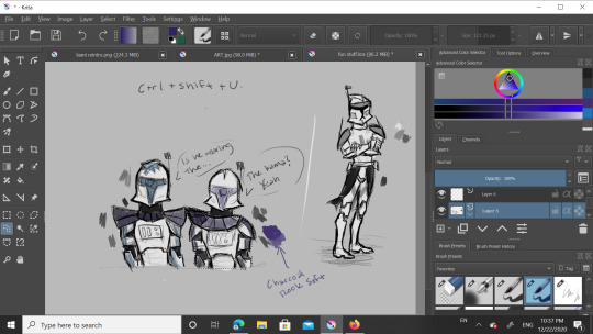
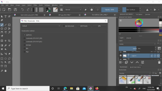
Be not afraid, I say confidently, as this is my third time doing this. Anyway to get grayscale like this just smash Control+Shift+U and a menu will shove its way onto your screen. I used “lightness” which should be the first option. Ignore the blueish markings, I was just playing around with a layer above to see what shade of blue to use later.
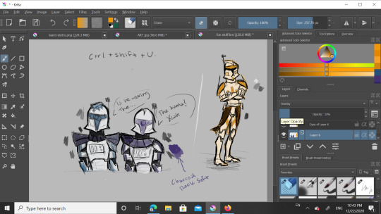
Ok, new layer. I recommend not being a di’kut like me and actually naming your layers. There’s alot. See the leftmost column on the toolbar? Good, now look at the magnifying glass at the bottom and go 2 up to the squiggly shape. It’s a lasso so you can outline what you want to color- I had to do each clone seperately for this one- and when you color it in it won’t go outside your selection. For 501st bois I tend to use a dark blue but for 212th I use a bright orange. Now that you have clone shaped blobs of color, change blend mode from Normal to Overlay. Lower the opacity until you like it, I do around 40%

You did it! You got through the hard part. Smooth sailing from here, just add details, speech bubbles, WHATEVER, just go crazy! In my last piece I had a white glow around Rex and Ahsoka. For that I made a new layer below all the others, used “grainy chalk” in very light grey on Add blending mode. Also, for the armor texture I use the soft charcoal in white on Add mode and lower the opacity. That’s it, you’re done.
Feel free to follow these steps, adjust them to your style, or do something completely different. If anyone wants to draw this particular piece as practice, go ahead but please don’t post it without crediting me.
That’s all for now, have a great day/night y’all!
15 notes
·
View notes
Note
Hi Lauren!! Sorry if this is a dumb question/bad explanation, but how do you get the text effect where there's bold colorful text over a gif but the text is transparent in a different color? (like in some of your JATP gifs, for example the yellow association one!) Is it just the blending mode on the text layer, like soft light/hard light or something? Thank you and thank you for your gorgeous gifs <33
no it's not a dumb question at all!! i know exactly what you're talking about i just hope my explanation will be good 😂 i'll put this under a read more if ya don't mind
SO first off i type whatever i wanna type with whatever font i wanna choose but make sure the text is in white. THENNN i set that layer to difference. duplicate that layer and change it from difference to color. then go to layer > layer style > gradient overlay. i change my gradient to whatever colors i want it to be THENN i change the blend mode to multiply BUT i have played around a lot in the past and used different modes. it really just depends on what look you're going for and what you like!!!
i hope this was a good explanation and if not let me know and i'll try to break it down a bit more. thank you for the kind words too!! 🥰
1 note
·
View note
Text
Digital Art Process
**this is for my art class pls ignore lol**
Step 1: Sketch
I always start off with a very rough sketch to get a crude idea of what I’m going for. Normally I do this on whatever scrap paper I have lying around. I normally work in black ballpoint pen so I don’t fret over details and so I can work in tone

Step 2: References
Next up I gather references that fit the scene landscape/colour/feeling
These ones are from Game of Thrones


Step 3: Blocking Colours
For most landscapes I work using 1047x884px at 300dpi
Normally I start with the horizon and land (dark at bottom, light at top) and then using a gradient (light from the bottom dark towards the top) add the sky, everything in this will be using the same brush unless specified

Next I work form background to midground to foreground noting that the closer the object gets the darker it will become

Once I’ve done that I add in the detailing to the ground, in case went over it with a oil paint texture brush and added snow to the ground and tree branches

Step 4: Details
I add a picture set on overlay at 40ish percent to add some more life to the background, I also add 2 adjustment layers, hue and saturation and black and white so the image blends in better

Here’s the image I used

And here’s how it looks added in
Next I add details and lighting to the mid and foreground using a clipping mask for efficiency

here I added wood grain and a lighter shade for a bit more dimension. I also applied a subtle gaussian blur to the midground
After that I sketch in a person to add a bit more life to the drawing

I also add a shadow on a sperate layer with it set to normal with around 20-35% opacity and a gaussian blur effect added
Finally I add an overlay to add some texture, I add an hue and saturation adjustment layer using a clipping mask and shift the hue a bit and desaturate it

for a large majority of my art I use this texture on a layer set to overlay at about 25-30% opacity

Here’s how it looks after the texture is applied
Step 5: Lighting and Atmosphere
I add some ambient lighting in 2 passes with both layers being set to overlay at around 35% opacity. For this a use the default soft round brush set to around 400ish px (depends on the drawing). I always have these layers on top of everything with the exception of texture.
Pass 1 is more of a general light

Pass 2 is to add more of a specific light

Next up I add more specific lighting

In this case I added some light to the lantern. For this type of light I bounce between hard light, soft light or overlay and adjust the opacity depending on my specific need. Again I use the default soft round brush
I add some atmosphere (I adjust the opacity of these layers to my liking)
here I used a cloud brush from Kyle’s concept brushes and I went over in two passes
Pass 1 - Mist across the horizon to add more of a general feel

Pass 2 - A surrounding Mist to add more ‘dynamic’

Lastly I convert the image to greyscale to check value and tone (here’s a link as to why that’s very important)

And its done!

1 note
·
View note